
The Pizza Hut Logo Evolution: Nostalgia and Brand Equity
If you grew up in the 80s or 90s, the Pizza Hut logo wasn’t just a graphic. It was a destination.
It was the promise of a scorching hot cast-iron pan, red plastic cups, and a specific smell of dough and parmesan that you can probably recall right now.
For entrepreneurs and business owners, the Pizza Hut logo presents one of the most turbulent and educational case studies in existence.
It’s a story of building massive equity, throwing it away in a moment of corporate madness, and then—miraculously—clawing it back by admitting a mistake.
In the current landscape of logo design trends, where everyone is rushing toward minimalism, Pizza Hut did something radical: they went backwards. And it worked.
Here is the definitive breakdown of the Pizza Hut visual identity, and more importantly, what you can steal from it for your own business.
- Pizza Hut’s red roof is a powerful, enduring brand asset that triggers instant recognition and nostalgia.
- The 1967 Lippincott design built massive equity by integrating logo with restaurant architecture.
- 2014’s “sauce splash” rebrand failed—it looked generic, reduced name prominence, and diluted brand stature.
- Reverting to the retro 1967 mark (2019) restored emotional connections and proved nostalgia marketing’s value.
- Practical lesson: identify a unique visual “roof,” respect brand equity, and favour evolution over radical rebrands.
1958: The “Pizza Pete” Era (The Necessity of Mascots)
Before the Red Roof became a global icon, there was Pizza Pete.
When the Carney brothers founded the company in Wichita, Kansas, in 1958, branding was less about “systems” and more about distinctiveness. The original logo featured a cartoonish mascot, “Pizza Pete,” tossing a dough disc, accompanied by somewhat jagged, uneven typography.
Why It Worked Then
In the 1950s, mascot logos were the gold standard. They humanised businesses. For a small operation, Pete communicated two things instantly:
- Action: We prepare the food fresh (by tossing it).
- Friendliness: This isn't a stiff restaurant; it’s a fun place.
However, from a modern design perspective, it was cluttered. It lacked scalability. If you tried to put Pizza Pete on an app icon today, he’d look like a smudge. But for a startup in the 50s? It did the job.
Design Note: Don't dismiss “cluttered” startup logos. Sometimes, in the early days, you need to be literal to explain what you do. The abstraction comes later.
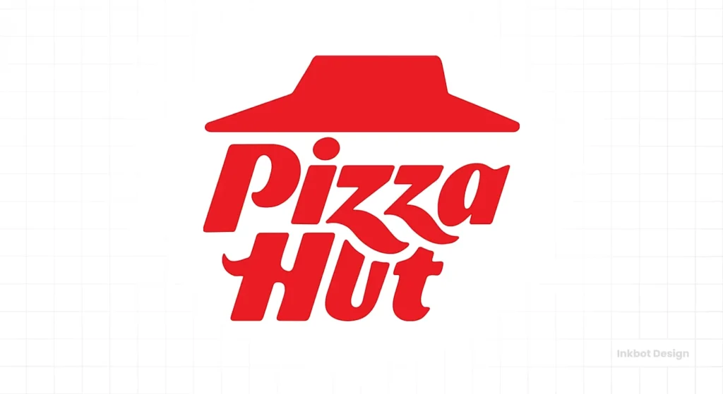
1967–1999: The Golden Era of the Red Roof
This is the logo you’re thinking of. This is the titan.
In 1967, Pizza Hut hired Lippincott, a legendary design consultancy, to professionalise the brand. This move coincided with the physical standardisation of their restaurant architecture. The resulting logo defined the brand for over 30 years.
The Architecture of the Identity
The genius of this design wasn't just the graphic—it was the integration with the physical world. The Carney brothers had mandated a specific roof style for their franchises to make them visible from the highway. The logo simply took that physical asset and flattened it.
- The Typography: A custom “Slab Serif” typeface. It wasn't clean like Helvetica. It was funky, slightly uneven, and heavy. It looked as if it had been drawn with a thick marker pen.
- The Roof: A sharp, geometric hat sitting atop the text.
- The Underline: Grounding the text, creating a contained unit.
The Psychological Impact
This logo utilises a specific combination of geometry and psychology.
The distinctive asset was the roof. By using the roof in the logo, they created a feedback loop. You see the sign, you see the building, you eat the pizza. The two became inseparable.
1999–2014: The “Pepsi Generation” Shift
In the late 90s, everything had to look “extreme.” The internet was booming, culture was speeding up, and static, heavy logos felt “old.”
Pizza Hut (then under the ownership of Tricon, later Yum! Brands) decided to update the classic. They introduced the “Brush” logo.
The Changes:
- The Tilt: The logo was tilted upwards and to the right. In design semiotics, this implies motion, speed, and a forward-thinking approach.
- The Script: The slab serif was modified to resemble handwriting even more closely, loosening its structure.
- The Colour: They introduced a yellow contour/stroke to add vibrancy.
My Verdict: It wasn't terrible. It retained the roof. It retained the core font DNA. It was a product of its time. It said, “We are still Pizza Hut, but we deliver faster now.” For a transitional logo, it held up reasonably well, though it lacked the stoic authority of the 1967 version.
2014–2019: The “Flavour of Now” Disaster
Here is where I get frustrated. This era serves as a warning sign to every entrepreneur reading this: Do not fix what isn't broken just to look like a tech company.
In 2014, Pizza Hut launched a massive “Flavour of Now” campaign. They introduced balsamic glazes, curry flavours, and a new logo. The logo was a disaster of “flat design.”
The “Sauce Splash”
They took the iconic roof, turned it white, and placed it inside a swirling circle of red that was supposed to represent tomato sauce.
Why It Failed:
- Generic: It looked like a generic icon you’d buy on a stock photography site for $5.
- Loss of Stature: By trapping the text inside a circle, the text had to shrink. The brand name became secondary to the “splash” graphic.
- Disconnect: It felt like a frozen pizza brand, not a restaurant experience.
This was a classic case of over-designing. They tried to communicate “artisanal sauce” but ended up communicating “cheap app icon.”
2019–2024: The Return of the King (Retrofuturism)
In 2019, Pizza Hut admitted defeat. Or rather, they recognised the gold mine they were sitting on.
They scrapped the sauce splash and reverted to the 1967 classic logo, with only minor tweaks for digital optimisation.
Why Go Backwards?
We are currently living in an era of Nostalgia Marketing. The demographics who grew up eating Pizza Hut in the 90s (Millennials and Gen X) are now the ones with purchasing power and families.
By bringing back the old logo, Pizza Hut triggered a “Proustian Rush” (a sudden involuntary memory). Seeing that specific, funky font and the red roof subconsciously reminds customers of simpler times, Book It! pins, and arcade games.
The Modern Tweak:
While it appears identical to the 1967 version, the red tone has been slightly enhanced for RGB screens, and the spacing has been refined. It is “Retrofuturism” at its finest—looking back to move forward.
2025: The Global Unification (The “Italic” Era)
Just when we thought the “Return of the King” was the final word, 2025 brought a curveball. While the US market largely adhered to the strict 1967 revival, Pizza Hut International introduced a distinct evolution for markets such as the UK, Canada, and South Africa.
This wasn't a rebrand; it was a “tune-up.”
The Visual Shift
The 2025 update takes the classic “roof” logo and tilts it forward.
- The Italicisation: The entire wordmark is slanted to the right. In design semiotics, italics always equal speed and urgency. It’s a subtle nod to the delivery-first economy.
- The “Z” Flourish: The Zs now feature elongated tails that swoop down, interacting with the letters below. It adds a custom, almost calligraphic feel that separates it further from standard typography.
- Monochrome Red: Gone is the black text. The new international mark is often deployed in a single shade of red, simplifying the print costs and digital rendering.
The Strategic Logic
Why change it again? Global Consistency. Prior to this, international markets were a mess—some still using the failed 2014 “splash” logo, others using the 1999 “brush” logo, and others the 2019 “retro” logo. This 2025 refresh forces a unified visual language. It bridges the gap between the nostalgic 1967 structure and the dynamic energy of the modern delivery market.
My Verdict: It’s a smart compromise. It retains the equity of the roof (the “lid”) but sheds the static, heavy feel of the 60s for something that feels more modern. It proves that you can respect heritage without being trapped by it.
Deconstructing the Visual Elements
If you are looking to commission a logo or refresh your existing one, consider the mechanics behind the Pizza Hut identity.
1. The Colour Psychology of #EE3124
Pizza Hut owns Red. Specifically, a vibrant, aggressive red.
| Element | Color Psychology | Business Application |
| Red | Urgency, Hunger, Excitement, Heart Rate Increase. | Used to stimulate appetite and encourage table turnover. |
| Black | Authority, Solidity, Contrast. | Grounds the logo so it doesn't vibrate visually too much. |
| Yellow (Legacy) | Happiness, Warmth, Cheese. | Used as an accent to suggest ingredients (cheese/crust). |
For food brands, Red and Yellow are the “Ketchup and Mustard” theory. They trigger hunger. Pizza Hut leans harder into Red to suggest “heat” and “sauce.”
2. The “Hut” Typography
The font is technically a custom slab serif. But look closely.
- It is imperfect. The lines aren't perfectly straight.
- It creates a vibe of “hand-tossed.”
- If they had used a standard font like Helvetica or Futura (which many modern brands do), it would feel cold and corporate. The funkiness of the font implies the messiness of pizza.
3. The Roof (The Container)
The roof acts as a “lid” for the logo. It keeps the eye contained. In design terms, having a strong geometric shape (such as the triangle/trapezoid of the roof) makes the logo recognisable even in silhouette.
Test: If you blacked out the text and just showed the roof shape, 90% of people would still say “Pizza Hut.” That is the definition of brand equity.
Business Lessons for Entrepreneurs
You aren't Pizza Hut. You don't have a billion-dollar marketing budget. So, what practical lessons can you take from their journey?
1. Identify Your “Roof”
What is the one visual asset you own? Is it a specific colour? A mascot? A shape?
- Action: Look at your current branding. If you cover up your business name, is there anything left that identifies you? If not, you have a weak identity.
2. Don't “Bland” Yourself
There is a temptation to make your logo resemble Google, Airbnb, or Uber—clean, sans-serif, and minimalist.
- The Trap: When everyone zigs, you should zag. Pizza Hut failed when it tried to resemble a tech app (2014). They succeeded when they embraced their weird, funky heritage font.
- Advice: If you run a bakery, a mechanic shop, or a consultancy, let your logo have some grit and personality. Don't scrub away the character.
3. Respect Your Equity
If you have been in business for 10 years or more, you have equity. Your customers recognise your sign.
- The Warning: Before you rebrand, audit what your customers love. If you change your logo drastically, you are essentially breaking the visual contract you have with your market.
- The Solution: Evolution, not revolution. Unless your reputation is toxic, try to refresh your look rather than completely overhaul it.
4. Nostalgia is a Weapon
If your brand has a history, take pride in it. “Since 1985” isn't just text; it's a trust signal.
- Strategy: Can you revive an old colour palette? An old packaging style? Vintage implies quality and survival.
Comparative Analysis: The Era Breakdown
Here is a quick reference guide to the shifts in strategy.
| Era | Visual Strategy | The “Vibe” | Success Score |
| 1958 (Pizza Pete) | Literal / Illustrative | “Mom & Pop Shop” | 6/10 (Good for start, bad for scale) |
| 1967 (The Roof) | Architectural / Geometric | “Established Institution” | 10/10 (Timeless) |
| 1999 (The Brush) | Dynamic / Kinetic | “Fast & Digital” | 8/10 (Good transition) |
| 2014 (The Splash) | Flat / Generic | “Cheap App Icon” | 3/10 (Brand dilution) |
| 2019 (The Return) | Nostalgic / Bold | “Classic Quality” | 9.5/10 (Strategic genius) |
How to Audit Your Own Logo (The Pizza Hut Test)
If you're wondering if your logo needs a refresh, run it through this rubric.
1. The Silhouette Test:
If you turn your logo solid black, is it still recognisable? (Pizza Hut passes because of the roof).
2. The Scale Test:
Does it work on a billboard? Does it work as a 16×16 pixel favicon? (Pizza Hut 2014 failed this; the text was too small inside the circle.)
3. The Personality Test:
Does it look like your industry, or does it look like a bank?
- If you sell pizza, it looks tasty.
- If you sell legal services, look stable.
- Don't mix them up.
4. The Trend Test:
Are you using a trendy font that will look dated in 3 years? (Pizza Hut's 1967 font is timeless because it is custom and weird.)
Need a Professional Opinion? If you’re staring at your logo and realising it fails the Silhouette Test, it might be time for an intervention. You can explore our Logo Design Services to see how we build identities that last.
Conclusion: The Power of “Coming Home”
The Pizza Hut logo evolution teaches us that “new” is not always “better.”
For a brief moment in 2014, Pizza Hut lost its soul. They tried to be something they weren't. They chased the flat design trend and ignored the millions of neurological connections people had with the Red Roof.
By returning to the 1967 design, they didn't just change a graphic; they signalled a return to quality. They signalled that they understood who they were: a place for families, for Friday nights, for pan pizza.
The takeaway for you: Build a brand with strong bones. Respect your history. And if you make a mistake, be brave enough to go back to what worked.
If you are building a brand from scratch, aim for the “Roof”—a distinctive asset that you can own for decades. If you are rebranding, tread carefully. Don't discard your history just to conform to Silicon Valley's current aesthetic.
Frequently Asked Questions (FAQ)
Who designed the original Pizza Hut logo?
The famous “Red Roof” logo, designed in 1967 by the architectural and design firm Lippincott, is a notable example. They were tasked with creating a consistent look for the expanding franchise.
Why did Pizza Hut change its logo in 2014?
They were trying to reverse declining sales by rebranding as “The Flavour of Now.” They introduced new artisanal ingredients and a “modern” logo to appeal to millennials. It largely failed to resonate.
What font is used in the Pizza Hut logo?
It is a custom-designed typeface. It is technically a “slab serif,” characterised by thick, block-like serifs. It was designed to look slightly hand-drawn and rustic, rather than mechanically perfect.
What does the Red Roof symbolise?
It represents the physical architecture of the early franchise buildings. The Carney brothers (founders) mandated that franchise buildings have that specific roof shape to be visible from the road.
Is the “Pizza Pete” logo still used?
Rarely. It is sometimes used on vintage merchandise or special “heritage” boxes, but it is no longer the primary face of the brand.
Why is the Pizza Hut logo red?
Red stimulates appetite, urgency, and excitement. In the fast-food industry (colour psychology), red and yellow are the dominant colours because they encourage customers to eat and leave quickly (high turnover).
Did the 1999 logo change hurt the brand?
Not really. The 1999 “brush” logo was a successful evolution. It modernised the brand for the digital age without losing the core elements (the roof and the name).
What is “Retrofuturism” in logo design?
It is a trend where brands revive old logos but optimise them for modern screens. Burger King, Kodak, and Pizza Hut have all done this recently—rejecting modern minimalism for vintage character.
How much did the Pizza Hut logo change cost?
While the exact fee for the 2014 rebrand isn't public, corporate rebrands of that size usually cost hundreds of thousands (if not millions) of dollars in agency fees, plus millions more in rollout costs (signage, boxes, uniforms).
Should I use a mascot in my logo, like Pizza Pete?
Generally, no. Mascots are hard to scale on mobile screens. However, a “mascot character” can be a great secondary brand asset (like the Michelin Man), but it shouldn't necessarily be the primary logo.
Ready to Build Your Own “Red Roof”?
Your business deserves a visual identity that builds equity, not one that chases fleeting trends. Whether you need a brand-new look or a strategic refresh, we help small businesses stand out and punch above their weight class.
Request a Quote today, or browse our portfolio at Inkbot Design. Let’s design something that lasts.

