What the 10 Best 1960s Logos Teach Modern Brands
1960s logos represent the golden age of strategic modernism, where designers embraced geometric precision and minimalism to create timeless corporate identities.
Pioneers like Paul Rand, with his work for IBM and Saul Bass, with the AT&T logo, created simple, powerful marks designed for clarity across new mass media like television.
This era moved beyond literal illustration, as seen in the abstract Chase Bank logo (1961), proving that a logo’s true power lies in strategic thinking, not just aesthetic style.
- 1960s logos prioritised radical simplicity and memorability—designs stripped to one clear idea that survived poor reproduction and diverse media.
- Designers treated logos as systems—consistent elements (colour, type, patterns) created cohesive, scalable brand identities beyond a single mark.
- Strategic intent and confidence ruled: abstract, timeless concepts solved business problems, avoiding literal clichés and fleeting stylistic trends.
The Criteria: What Makes 1960s Logos “Great”?
Before we dive in, let’s establish the ground rules. We’re not judging these on nostalgia. A logo is great if it works as a business tool, period. Our criteria are ruthlessly practical.
- Simplicity & Memorability: Can a child draw it from memory after seeing it for five seconds? If not, it’s too complicated.
- Scalability & Reproducibility: Does it look as good embroidered on a shirt as on a 50-foot billboard? Crucially, does it survive being photocopied or faxed into oblivion?
- Timelessness: If you strip away the ’60s context, does the core concept still feel bright and modern? A truly great logo exists outside of time.
- Strategic Intent: Was it a pretty picture, or did it solve a tangible business problem? Did it unify a company, clarify its purpose, or give it a competitive edge?
These logos weren’t just designed to be liked. They were designed to work.
The Top 10: Deconstructing the Masters of Mid-Century Branding
Here are ten logos that didn’t just define their decade; they wrote the rulebook for modern corporate identity. Each contains a lesson as relevant today as it was 60 years ago.
1. Canadian National Railway (1960) – The Power of a Single, Unbroken Line
Designer: Allan Fleming
The Problem: In the late 1950s, Canadian National Railway was a sprawling, state-owned entity with an identity crisis. Its logo was an old-fashioned, fussy maple leaf. It looked like something from the 19th century, not a modern transport company ready for the future. They needed a symbol that screamed efficiency, modernity, and national connection.
The Solution: on a flight, Allan Fleming sketched the solution on a cocktail napkin—a story that has become legend. He reduced the letters “C” and “N” to their absolute essence, linking them with a continuous, flowing line. The line itself is the hero. It represents the rail line connecting a vast country, the constant movement of goods, and the interconnectedness of the business.
There are no extraneous details. No maple leaf, no beaver, no hint of a train. Just the pure kinetic energy of a line moving from left to right. It is a masterpiece of reductionism, a symbol so abstract yet perfectly descriptive of the company’s function.
The Modern Takeaway: Your logo is not a checklist of everything you do. Find the most important idea about your business—movement, connection, security—and express it in its simplest possible form. Simplicity isn’t a style; it’s a declaration of confidence.
2. Chase Bank (1960) – The Birth of the Abstract Mark
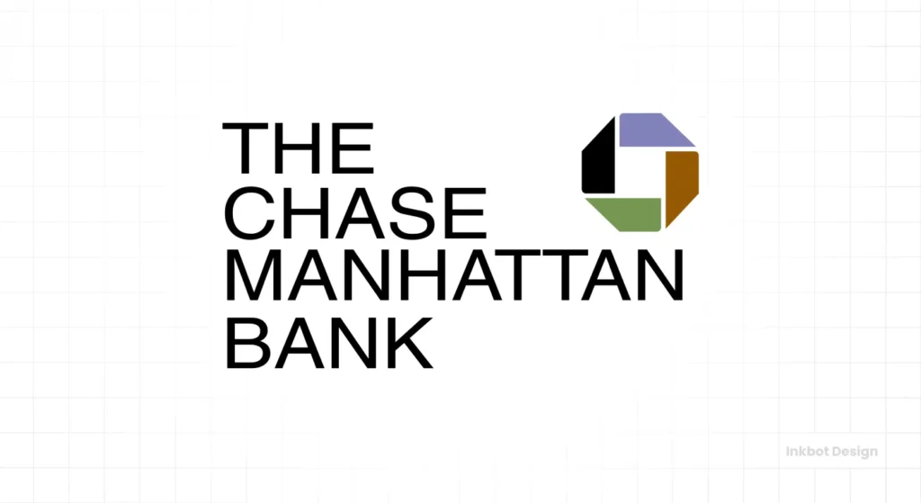
Designers: Chermayeff & Geismar
The Problem: How do you create a logo for a bank? The obvious answer is to use cliché symbols: coins, dollar signs, pillars of strength. Chase Manhattan Bank, formed from a merger, needed an identity that felt modern, international, and trustworthy, without resorting to tired financial imagery that would look dated in five years.
The Solution: Tom Geismar and Ivan Chermayeff did something radical. They created a logo that had absolutely nothing to do with banking. The Chase symbol is an entirely abstract geometric form—a multicoloured octagon containing a white square. It’s meant to evoke a Chinese coin, a bank vault, or simply a container for money. But its true power is that it means nothing and, therefore, can mean everything.
By avoiding literal representation, they created a symbol that could represent the idea of Chase: security, global reach, and stability. It was bold, unique, and impossible to confuse with any other bank. It was also incredibly easy to reproduce, a key concern for a company with thousands of branches and millions of printed documents.
The Modern Takeaway: Stop trying to depict your product or service literally. A logo for a coffee shop doesn’t need a coffee bean. A logo for a tech company doesn’t need a circuit. A strong, abstract mark can build far more equity and feel far more premium than a literal illustration ever could.
3. The Woolmark (1964) – Perfection in Pure Form
Designer: Francesco Saroglia (often attributed to others, but he won the competition)
The Problem: New, cheap, synthetic fibres like polyester and nylon threatened the wool industry. They needed a global certification mark—a stamp of quality that would instantly communicate “100% pure new wool” to consumers in any country, regardless of language. It had to be simple, elegant, and universal.
The Solution: The Woolmark is arguably one of the most perfect logos ever created. It’s a continuous, looped form that looks like a skein of yarn, expertly rendered to create a sense of softness, dimension, and infinity. It has no beginning and no end. Drawn with five thick lines, it is visually balanced and hypnotic.
It is a pure concept. It feels like wool without showing a sheep. It communicates quality without using a single word. It is so perfectly resolved that it was discovered, not designed.
And here’s where my blood begins to boil. You just know that if this were designed today, a committee would get involved. Someone in marketing would demand they make it “pop” with a gradient. An executive would ask if the lines could be thinner. They would ruin its perfection through a thousand tiny, fearful cuts. The Woolmark is a testament to trusting the purity of a single, brilliant idea.
The Modern Takeaway: When you have a perfect idea, dare to leave it alone. Don’t crowd it with details or try to explain it. The strongest concepts need no adornment. Fight the urge to “add more.”
4. Mobil (1964) – Making a Typeface Unforgettable
Designers: Chermayeff & Geismar
The Problem: The American roadside was a battlefield of visual noise. Gas stations were plastered with competing signs, all screaming for attention. Mobil Oil needed a way to cut through the clutter with a clean, modern identity instantly recognisable from a moving car at 60 miles per hour.
The Solution: Instead of a complex symbol, Chermayeff & Geismar focused on the company name itself. They created a simple, bold, sans-serif logotype. The genius, however, was in a single detail. They made the “o” a perfect red circle, while the other letters were blue.
That red “o” became a visual hook. It broke the pattern, drew the eye, and became synonymous with the brand. It was a simple, almost childishly clever trick, but it worked brilliantly. It suggested the red of a stoplight (or a cherry), creating a mnemonic device that lodged itself in the public consciousness. The entire identity system was built around this simple wordmark, from the station architecture to the circular sign pumps.
The Modern Takeaway: You don’t always need a fancy symbol. Sometimes, the most powerful branding move you can make is to own a colour or a specific typographic detail. Find that one small element that can make your name uniquely yours and be ruthlessly consistent with it.
5. IBM (1960s era) – The System is the Brand
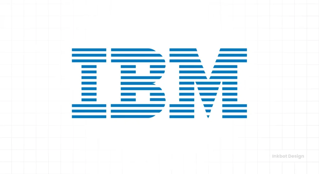
Designer: Paul Rand
The Problem: IBM in the mid-20th century was the face of the future. They were a sprawling, complex technology giant. Their old logo, a blocky, solid slab-serif, felt heavy and earthbound. They needed an identity that reflected their business’s dynamism, precision, and forward-thinking nature.
The Solution: Paul Rand, a titan of corporate design, didn’t just give IBM a logo; he gave them a visual language. He took the existing slab-serif letterforms and, in 1960 introduced the 8-bar version (later refined to 13 bars in 1972). The horizontal stripes were a stroke of genius. They suggested the scan lines on a video screen, the lines on a printout, or the data processing speed.
The stripes transformed the heavy letters into something light, technological, and energetic. More importantly, this was a system. The striped motif could be applied to everything from packaging to posters, creating a unified and unmistakable brand presence. Rand famously said the stripes were a way to solve a practical reproduction problem on early photocopiers while adding visual interest.
A great logo shouldn’t be a rigid stamp applied to things; it should be a flexible framework. Building an authentic brand identity requires more than a single mark; it needs a comprehensive system. This is a core part of any professional logo design process.
The Modern Takeaway: Think beyond the logo. A successful brand is a system of elements—colour, typography, pattern, imagery—that work together. Your logo is the star player, but it needs a strong team around it to win.
6. American Airlines (1967) – The Swiss Style Takes Flight
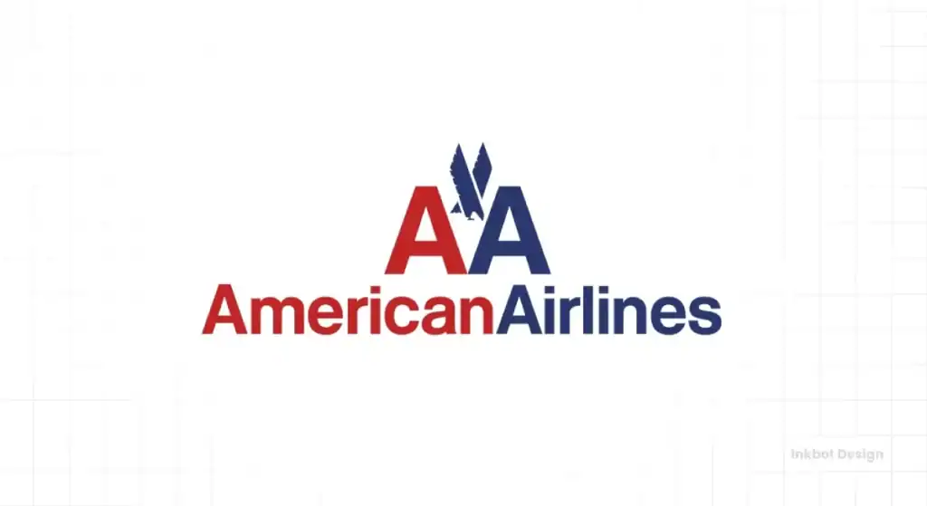
Designer: Massimo Vignelli
The Problem: In the Jet Age, airlines were selling modernity, speed, and above all, safety. American Airlines’ old logo was a complex eagle with fussy details. It looked like a government seal, not a sleek, modern transport company. They needed to project an image of absolute clarity, efficiency, and authority.
The Solution: Massimo Vignelli was a devout modernist and a master of the International Typographic Style (or Swiss Style). His solution for American Airlines was brutally logical and straightforward. He took the two letters of the name—A, A—and set them in Helvetica, the quintessential modernist font.
He combined the brand’s colours, red and blue, and abstracted the national bird, the eagle, into a simple X-shaped form between the letters. The result was clean, consequential, and unapologetically direct. There was no ambiguity. This was not a brand that was messing around. It conveyed precision and trustworthiness through pure, rational design.
The Modern Takeaway: Clarity is the ultimate sophistication. A simple, direct, and well-crafted typographic logo can convey more authority than any complex illustration in a world full of visual clutter. Don’t be afraid to let a strong typeface do the heavy lifting for your brand.
7. Bell System (1969) – The Logo as a Container
Designer: Saul Bass
The Problem: By the late 60s, “Ma Bell” was a monolithic telecommunications giant, encompassing hundreds of local companies. Its existing logo, a literal illustration of a bell in a circle from 1900, was hopelessly antiquated. They needed a mark to unify the system under one modern, powerful, and versatile symbol.
The Solution: Saul Bass, a film and graphic design legend, didn’t just update the bell; he perfected it. He stripped away all the details, reducing the bell to its essence—a simple, clean silhouette—and contained it within a perfect circle.
The design was so simple it felt elemental. It could be shrunk to the size of a pinhead on a telephone or blown up to cover the side of a building, and it would lose none of its impact. It worked flawlessly in a single colour. It was less a picture of a bell and more the idea of a bell.
This logo’s subsequent fate is a tragedy. After the Bell System was broken up in the 1980s, the new companies abandoned this mark of perfection for soulless, committee-designed globes and swooshes. They traded a timeless icon for a momentary trend, one of the cardinal sins of branding.
The Modern Takeaway: A strong, containing shape can give your logo immense power and versatility. Circles, squares, and hexagons provide a solid foundation and make a mark feel unified and complete. And if you ever have a logo that is this good, don’t let a marketing department “refresh” it to death.
8. Westinghouse (1960) – Engineering with a Human Touch
Designer: Paul Rand
The Problem: Westinghouse was a massive industrial corporation dealing in everything from nuclear power to home appliances. How do you create a mark that feels technologically advanced and accessible to the average consumer? You need to bridge the gap between heavy engineering and the human experience.
The Solution: Paul Rand’s genius was his ability to inject wit and humanity into cold corporate modernism. The Westinghouse logo is a perfect example. The “W” monogram is constructed from a series of circles and lines that look like a circuit board, a plug, or electrical hardware. It feels precise and engineered.
But look closer. All the forms are rounded. The dots give it an almost playful, friendly feel. It’s not sharp and intimidating; it’s approachable. This simple combination of rigid structure and soft execution created a mark that felt trustworthy and human. The logo says, “We are experts in complex technology, but we make products for people.”
The Modern Takeaway: Even the most technical or B2B brand needs a human element. Your customers are people. Find a way to inject a bit of warmth, wit, or personality into your mark. Technical precision and human approachability are not mutually exclusive.
9. Pan Am (1958, refined 1960s) – The Symbol of an Age
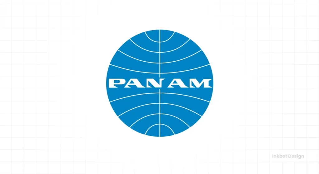
Designers: Chermayeff & Geismar
The Problem: Pan American World Airways wasn’t just an airline; it was the unofficial flag carrier of the United States and the very symbol of the Jet Age. It represented glamour, adventure, and American global reach. Its identity needed to capture this sense of aspirational, blue-sky optimism.
The Solution: The Pan Am “Blue Globe” is less a logo and more a cultural artefact. The design is straightforward: a blue circle overlaid with thin latitudinal and longitudinal lines, bisected by the clean, sans-serif wordmark. It was elegant, confident, and universally understood.
It wasn’t just stamped on planes; it was a passport to a more glamorous world. The colour, a specific shade now known as “Pan Am Blue,” became synonymous with the sky and the promise of travel. The logo’s power was in its context. It appeared in films, newsreels, and advertisements, becoming a shorthand for the peak of American mid-century confidence.
The Modern Takeaway: Your logo doesn’t exist in a vacuum. It absorbs meaning from the experiences your customers have with your brand. Aim to create a mark that doesn’t just identify your company but embodies the core promise you make to your customers.
10. Batman (1964) – The Pop Culture Anomaly
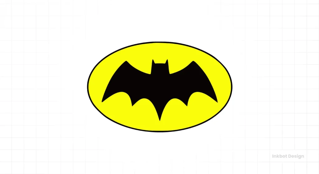
Designer: Carmine Infantino (as editor/artist)
The Problem: This is our wild card. By the mid-1960s, Batman’s chest symbol had undergone numerous sloppy variations. For DC Comics’ “New Look,” they needed a definitive, consistent, and bold symbol that was easy for a stable of different artists to reproduce accurately on a tight deadline. It also needed to be a high-contrast target on the comic book page.
The Solution: Editor/artist Carmine Infantino oversaw the redesign, placing the now-iconic black bat symbol inside a bright yellow oval. This was a brilliant piece of practical design. The yellow field made the bat shape instantly recognisable, even in a small, poorly printed comic panel. It solved the reproduction problem by giving artists precise, contained shapes to draw.
This logo demonstrates that the principles of corporate identity design are universal. It solved problems of clarity, memorability, and reproducibility—the same challenges facing Chase Bank or Canadian National. It was a functional solution, not just a stylistic choice, and it became the definitive Batman symbol for over 30 years.
The Modern Takeaway: Good design principles are industry-agnostic. Whether you’re selling financial services or superhero stories, the goal is to create a clear, memorable mark that works everywhere. Don’t get hung up on your industry’s clichés; focus on the fundamental principles of good communication.
The Common Thread: What Can We Steal From The 60s?
Looking at these ten examples, the pattern is clear. The genius of 1960s logo design has nothing to do with a “retro” aesthetic. It was a mindset rooted in discipline and strategic clarity.
If you want to apply these lessons to your business, forget the vintage fonts and focus on the thinking.
- Radical Reductionism: These designers were masters of subtraction. They stripped away every line, every curve, every detail that did not serve the core concept. What can you remove from your logo?
- Systematic Thinking: They didn’t just deliver a JPG. They offered a visual system. An identity is how a logo behaves in the wild, not how it looks on a presentation slide.
- Conceptual Clarity: These logos are built on a single, powerful idea. A continuous line. A perfect loop. A red circle. What is the one idea at the heart of your brand?
- Confidence: The most striking quality of these marks is their confidence. They are unapologetically simple. They don’t scream for attention because they don’t need to. They know their own value.
Stop asking your designer to make your logo “pop.” Ask them to make it brighter, more precise, and more disciplined.
That’s the real lesson from the 1960s. It’s not about looking back. It’s about a timeless approach to solving business problems with intelligent design. A great logo is not a fashion accessory. It is a tool for building a great business.
The History of Graphic Design. Vol. 2. 1960–Today
You can’t shape the future of design if you’re ignorant of its past. This book is the definitive playbook of the modern era. It’s a massive visual map, deconstructing the seminal works and profiling the masters from the 1960s to today. Stop designing in a vacuum and get the context.
As an Amazon Partner, when you buy through our links, we may earn a commission.
Ready to apply these timeless principles to your own brand? A logo is the tip of the iceberg. We build entire brand identity systems designed to work as hard as you do. If you’re tired of trends and ready for a brand that lasts, look at our logo design services or request a quote to discuss your project. We build brands based on strategy, not nostalgia. You can also learn more about our philosophy at Inkbot Design.
Frequently Asked Questions About 1960s Logo Design.
What style of design was popular for logos in the 1960s?
Who were the most famous logo designers of the 1960s?
Several designers rose to prominence for their revolutionary corporate identity work. The list is topped by figures like Paul Rand (IBM, Westinghouse), Saul Bass (Bell System, AT&T), Massimo Vignelli (American Airlines), and the firm Chermayeff & Geismar (Chase Bank, Mobil).
Why were 1960s logos so simple?
Simplicity was a functional necessity. Logos had to be reproducible across various media, from print and television to low-quality faxes and photocopies. Complex designs would degrade and become illegible. Minimalism wasn’t just an aesthetic choice but a practical solution for scalability and recognition.
What is the International Typographic Style (Swiss Style)?
The Swiss Style is a graphic design philosophy that emerged in Switzerland in the 1950s and became globally influential in the 60s. It is characterised by cleanliness, readability, and objectivity. Its core tenets include grid layouts, asymmetrical arrangements, and the exclusive use of sans-serif typefaces. The American Airlines logo by Vignelli is a perfect example.
How did technology influence 1960s logos?
The rise of television and advances in printing and reproduction technologies were huge factors. A logo had to be clear on a small, black-and-white TV screen. It had to survive being photocopied. This forced designers to create bold, simple marks that wouldn’t lose their integrity when reproduced poorly.
Are the 1960s logo design principles still relevant today?
Absolutely. The core principles of simplicity, scalability, memorability, and strategic intent are more important than ever. In an age of tiny mobile screens and favicon branding, a simple, bold logo is far more effective than a complex illustration.
What is the difference between a logotype and a logomark?
A logotype (or wordmark) is a logo based on the company’s name, often using a custom or specific typeface (e.g., Mobil, IBM). A logomark (or symbol) is a graphic icon representing the company without words (e.g., the Chase Bank octagon, the Woolmark).
Why did companies start using abstract logos in the 1960s?
As corporations became larger and more diversified, a literal logo (e.g., a picture of a factory) no longer represented their entire business. An abstract mark, like the one for Chase Bank, could stand for the company’s values and ethos without being tied to a specific product, making it more timeless and flexible.
How much did a logo from a top designer cost in the 1960s?
Top-tier corporate identity projects were significant investments. For example, Saul Bass was reportedly paid $100,000 in 1969 for the Bell System redesign, which would be over $800,000 in today’s money when adjusted for inflation. This fee covered extensive research, design, and a comprehensive brand standards manual.
What killed the modernist logo trend of the 1960s?
The trend never truly died, but it evolved. The late 70s and 80s postmodernism introduced more eclectic and expressive styles. In the 90s and 2000s, the digital age brought trends like gradients, shadows, and more complex illustrations. However, the recent trend towards “flat design” for digital interfaces represents a significant return to the core modernist principles of the 1960s.

