A Simple Breakdown of the 7 Logo Design Types
Choosing a logo feels like a monumental decision.
Business owners get bogged down in colours, fonts, and a tidal wave of opinions from their cousin, their neighbour, and that person they met at a networking event.
The whole process becomes a quest for the “perfect” logo.
Let’s be clear: there is no perfect logo. There are only appropriate logos. The conversation needs to shift from “What do I like?” to “What does my business need to accomplish?”
Understanding the 7 primary types of logos isn’t about giving you more options to agonise over.
It’s about giving you a strategic decision framework, eliminating the noise, and building your business. These aren’t just styles; they are tools designed for specific jobs.
- Logos should be appropriate for your business needs rather than simply what you like.
- Choosing the right logo type starts by understanding your business name and industry context.
- A Combination Mark is often the best choice, providing versatility and enhancing brand recognition.
Before You Choose a Type: Answer These 2 Questions First
Before looking at a single design, you can narrow your options from seven to about two or three by answering these simple questions.
Question 1: What is your business name? Is it long and complicated, like “International Business Machines”? Or is it short, catchy, and unique, like “Google”? Is the name abstract, or does it describe what you do? The length and memorability of your name are the single most significant factors in choosing a logo type.
Question 2: What is your industry context? Who are you talking to? A corporate law firm requires a different visual language than a children’s daycare. A tech startup trying to signal innovation has different needs than a heritage bakery trading on 100 years of tradition. Context dictates what your audience expects and what will resonate as credible.
Answer these two questions honestly, and your best logo options will become almost self-evident.
The 7 Logo Design Types, Demystified
Here are the fundamental categories. Think of them as blueprints. The magic is in the execution, but the blueprint determines the structure.
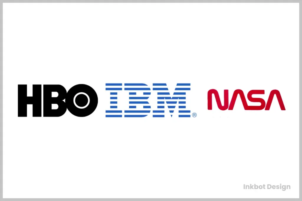
1. The Lettermark (or Monogram)
What is it?
A Lettermark is a typography-based logo comprised of the initials of a company. The focus is on creating a visually engaging and memorable monogram from a few letters.
The Prime Examples
International Business Machines becomes IBM. The National Aeronautics and Space Administration became NASA. Home Box Office becomes HBO. These companies have long names that are a mouthful to say and a nightmare to fit on a business card.
When to Use It
Use a Lettermark if your business name is long or difficult to remember. It acts as a visual shorthand, streamlining a complex name into a punchy, easily recalled identifier. It also creates a clean, simple, and corporate feel.
The Potential Pitfall
For a new business, a Lettermark can be a challenge. You must spend time and money teaching people what the initials stand for. Without the established brand recognition of HBO, “SBC” (Smith’s Bookkeeping Co.) is just three meaningless letters to a potential customer.
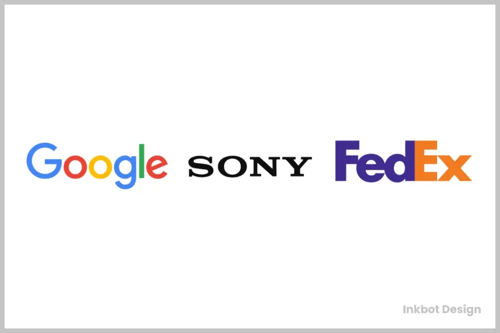
2. The Wordmark (or Logotype)
What is it?
A Wordmark is a font-based logo that focuses on the business name alone. The typography itself becomes the visual signature of the brand.
The Prime Examples
Google, Coca-Cola, Visa, and FedEx are prime examples. Their names are unique and memorable, so the most powerful thing they can do is make that name the hero. The distinctive script of Coca-Cola or the clever hidden arrow in the FedEx logo are inseparable from the brand.
When to Use It
Use a Wordmark if you have a short, distinct business name. This is the most direct way to build name recognition. If you want people to remember your name, put it front and centre. A custom font or unique typographic treatment can give it a tremendous personality.
The Potential Pitfall
A Wordmark depends entirely on the name’s strength and the typography. A Wordmark will be forgettable if your name is generic (“General Services Inc.”). If the font choice is poor, the entire brand can look amateurish. It doesn’t work for long names.
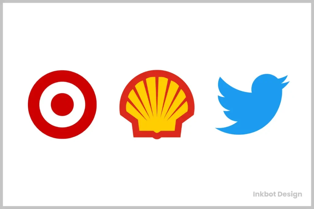
3. The Pictorial Mark (or Brandmark)
What is it?
A Pictorial Mark is an icon- or graphic-based logo. It’s a literal, recognisable image that represents the brand.
The Prime Examples
The Apple logo is an apple. The old Twitter logo was a bird. The Target logo is a target. The image directly represents a real-world object that has been simplified and stylised.
When to Use It
A Pictorial Mark can be a powerful and efficient way to communicate an idea or brand value. It transcends language barriers, which is excellent for global brands. Once established, the symbol alone is enough to trigger brand recognition.
The Potential Pitfall
This is a high-risk choice for a new business. You are betting that people will connect a simple image to your company name. It can also be dangerously literal.
If you start a company called “Dog Walkers” and use a dog as your logo, what happens when you expand into cat sitting? The image you choose today could limit you tomorrow.
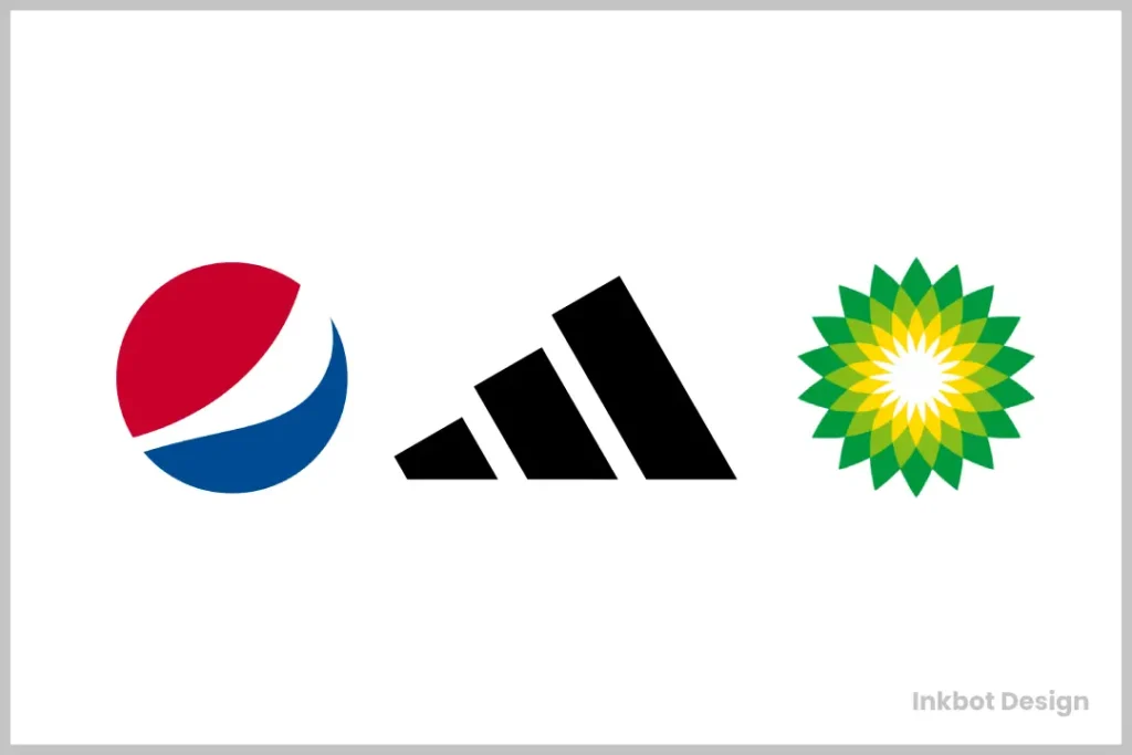
4. The Abstract Mark
What is it?
An Abstract Mark is a non-representational symbol. Instead of being a recognisable object like an apple or a bird, it’s a conceptual or geometric form created specifically for the brand.
The Prime Examples
The Nike Swoosh isn’t a picture of anything. It’s a shape meant to imply motion and speed. The Pepsi globe and the Adidas three stripes are other world-famous examples. They are unique shapes that have acquired meaning through decades of marketing.
When to Use It
Use an Abstract Mark if you are a large, often global, company that needs to convey a feeling or big idea without being tied to a specific object. It allows you to create something truly unique and avoids the cultural misinterpretations that can come with a Pictorial Mark.
The Potential Pitfall
Here lies the biggest trap for entrepreneurs: The “Hidden Meaning” Fallacy. People try to cram complex narratives into a simple shape. “The three circles represent our founding principles, and the line cutting through them signifies our disruptive approach…” Stop. No one will ever see that.
Without a multi-million dollar advertising budget to infuse it with meaning, an abstract mark is just a meaningless shape. It can be cold, generic, and utterly forgettable for a small business.
5. The Mascot
What is it?
A Mascot is a logo that involves an illustrated character. This character acts as a brand ambassador or “spokesperson.”
The Prime Examples
KFC’s Colonel Sanders, the Michelin Man, and Mailchimp’s Freddie the chimp. These characters give the brand a friendly, approachable face. They can be animated, used in marketing campaigns, and connect with customers more personally.
When to Use It
Use a Mascot if your brand targets families, children, or wants to project a fun, welcoming, and accessible vibe. They are excellent for creating a memorable personality and are highly effective at events and on social media.
The Potential Pitfall
Mascots can easily look dated or unprofessional if not executed with high skill. Trends in illustration change quickly, and a poorly designed mascot can make your brand look cheap. They also don’t fit serious or traditional industries; you wouldn’t hire a law firm with a cartoon alligator as its logo.
6. The Combination Mark
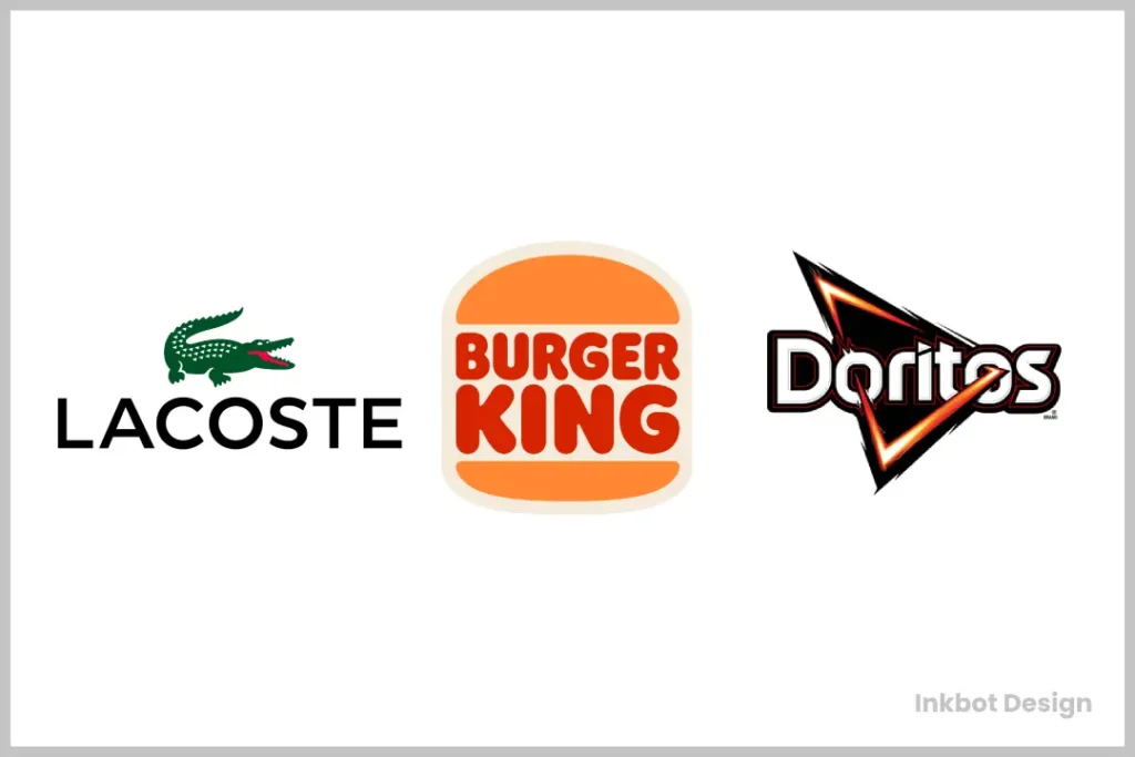
What is it?
A Combination Mark is exactly what it sounds like: a logo that combines a wordmark or lettermark with a pictorial mark, abstract mark, or mascot. The text and symbol are laid out together to form a single logo.
The Prime Examples
Lacoste has its crocodile next to the brand name. Burger King’s name is nestled inside a stylised bun. Adobe combines its abstract “A” symbol with the wordmark.
When to Use It
For most businesses, the Combination Mark is the best and safest choice. It’s the ultimate workhorse. It pairs your name with a visual symbol, teaching the consumer to associate it. Over time, as brand recognition grows, you gain the versatility to use the emblem or the wordmark on its own.
The Potential Pitfall
The most significant risk is clutter. If the relationship between the symbol and the text isn’t well-considered, the logo can become too busy and difficult to read, especially at small sizes. A clear hierarchy is essential; the text or the symbol must be the hero, not both.
7. The Emblem
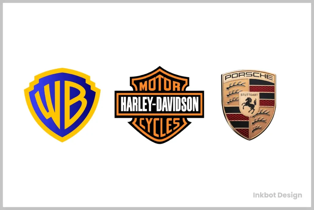
What is it?
An Emblem is a logo whose company name is inseparable from a symbol or icon, often enclosed within a shape like a badge, seal, or crest.
The Prime Examples
The Starbucks siren is inside its circular crest, the Harley-Davidson badge is on it, and the Ford signature is on its oval. These logos have a traditional, established, and often classic feel.
When to Use It
Use an Emblem to communicate tradition, heritage, and a sense of belonging or official authority. They are popular with universities, government agencies, car manufacturers, and coffee shops that want a “small-batch, established in…” vibe.
The Potential Pitfall
Emblems are notoriously poor regarding scalability—a logo’s most important technical aspect. Because the text and symbol are intertwined with fine details, they often become illegible when shrunk down for a favicon, an app icon, or embroidery on a shirt. A modern emblem must be designed with simplicity in mind from the start.
A Simple Matrix for Choosing Your Logo Type
Still unsure? Let’s cut to the chase.
- If your name is long and unwieldy… -> Start with a Lettermark.
- If your name is short and unique… -> A Wordmark is your strongest option.
- If you need maximum versatility and want to play it safe… -> A Combination Mark is the default best choice for 90% of businesses.
- If you want to project tradition or community… -> An Emblem can work, but demand that your designer show you what it looks like at 16×16 pixels first.
- If you target families and want to be super friendly… -> Consider a Mascot.
- If you have a billion-dollar marketing budget to invent meaning… -> Then, and only then, should you commission an Abstract Mark.
The Real Job of a Logo (That Most People Get Wrong)
A logo is not art. It is a strategic tool.
Its primary job is not to explain what you do. It’s not to tell your company’s life story. It’s not to win a design award.
The job of a logo is to identify. That’s it.
It is a simple, memorable “face” for your business. It’s a visual shortcut to who you are, stored in your customer’s brain. The Nike swoosh meant nothing the first time someone saw it. Decades of branding, marketing, and delivering on a brand promise gave it meaning. Your logo works the same way.
Stop trying to make your logo say everything. Make it simple, make it memorable, and make it appropriate for your industry. Then get back to the real work: building a brand experience that gives that simple mark all the meaning it will ever need.
Choosing the right logo type is the first step in creating a powerful brand identity. It sets the foundation for your entire visual system. If you’re ready to move from theory to execution, the team at Inkbot Design specialises in creating logos that are not just beautiful, but strategically sound.
Explore our logo design services to see how we translate business goals into iconic brands. Or, if you’re ready to start the conversation, you can request a quote directly. We’re here to provide the clarity your brand deserves.
Frequently Asked Questions (FAQs)
What are the 7 types of logos?
The 7 main types of logos are Lettermarks (or Monograms), Wordmarks (or Logotypes), Pictorial Marks (or Brandmarks), Abstract Marks, Mascots, Combination Marks, and Emblems.
What is the most popular type of logo?
The Combination Mark is arguably the most popular and widely used business logo type. It offers the best of both worlds by pairing the company name with a visual symbol, which provides versatility and helps build brand recognition effectively.
What’s the difference between a lettermark and a wordmark?
A lettermark uses the initials of a long company name (e.g., IBM), while a wordmark uses the full, stylised company name (e.g., Google). The choice depends entirely on the length and uniqueness of your business name.
Can a logo be just a word?
Yes. A logo that is just a word is called a Wordmark or Logotype. This option is very effective if the company has a short and distinctive name, like Visa or FedEx.
How do I choose the right logo for my startup?
A Combination Mark is the safest and most strategic choice for most startups. It immediately connects your business name with a unique symbol, building recognition on two fronts. This provides the most flexibility for future branding needs.
What is the difference between pictorial and abstract marks?
A pictorial mark is a simplified icon of a recognisable, real-world object (e.g., Apple’s logo is an apple). An abstract mark is a unique, non-representational shape created specifically for the brand (e.g., Nike’s swoosh).
Why is a scalable logo so important?
A logo must be scalable to remain clear and legible at all sizes. It will appear on everything from a massive billboard to a tiny 16×16 pixel favicon in a web browser tab. Like many emblems, a logo with too much detail will become an unreadable smudge at small sizes, weakening your brand’s presence.
Is it a bad idea to have a mascot logo?
It’s not a bad idea, but it’s a specific one. Mascot logos are excellent for brands that want to appear friendly, fun, and approachable, especially those targeting families. However, they can feel unprofessional or out of place in more corporate or serious industries like finance or law.
Can my logo be two types at once?
Yes, that’s what a Combination Mark is. It combines a text-based element (Wordmark or Lettermark) with a graphic element (Pictorial, Abstract, or Mascot).
Do I need a symbol in my logo?
No, you don’t. A strong Wordmark (like Google’s) or Lettermark (like NASA’s) can be incredibly powerful without any accompanying symbol. The need for a symbol depends on your business name and branding strategy.
What makes a logo timeless?
Timeless logos are built on simplicity, memorability, and appropriateness. They avoid trendy fonts, colours, and effects that will look dated in a few years. They focus on a single, strong idea executed flawlessly.
Where can I get a professional logo designed?
Professional logo design is a service offered by branding agencies and freelance graphic designers. A dedicated agency like Inkbot Design can provide a comprehensive branding process beyond just the logo to create a complete visual identity for your business.

