25 Famous Wordmark Logos & The Lessons They Teach
A wordmark is not “just your name in a font.”
If I’ve heard that once, I’ve heard it a thousand times from clients who think a “simple” logo should be cheap and easy. It’s not.
A wordmark, or logotype, is a logo composed entirely of the text of a company’s name. No symbol, no mascot, no abstract shape. The typography is the entire brand identity.
And that’s precisely what makes it so difficult. When you have no graphic crutch to lean on, every single detail—the curve of a ‘G’, the space between an ‘E’ and an ‘x’, the thickness of a line—carries the full weight of your brand.
Getting this right is the difference between being a timeless icon (Coca-Cola) and a forgettable, generic startup (half the tech world).
I’ve been in the branding and logo design industry for over 20 years. This is what makes my skin crawl.
- The “Default Font” Syndrome. A founder types their name in Poppins or Montserrat, calls it a day, and wonders why they blend in. Your logo is not a menu.
- Sacrificing Readability for “Style.” That edgy, abstract, unreadable black-metal-band font might look cool to you. It looks like a mistake to everyone else. If I can’t read it, you’ve failed.
- The “We’re Like Google” Complex. Google earned the right to have a simple wordmark after becoming the most dominant company on earth. Your brand-new dog-walking business in Dorset has not. A wordmark is a strategic choice, not a default one.
- Ignoring Scalability. It looks great on your 27-inch monitor. Now, what happens when it’s an app icon? Or embroidered on a polo shirt? A wordmark that breaks or becomes illegible when shrunk is a useless one.
If you can avoid those four traps, you’re already ahead of the pack. Now, let’s break down what a wordmark actually is and who has done it right.
- Wordmarks are not "just a font": custom typography creates ownership and uniqueness—don’t rely on default typefaces.
- Readability first: stylish choices that hinder legibility fail; clarity must serve function across sizes and media.
- Kerning and tiny custom details matter: the space between letters and subtle tweaks make a mark ownable.
- Match personality and context: typography should reflect brand soul—serif for heritage, rounded for playfulness, etc.
- Wordmarks are strategic, high‑risk choices: they work if the name is short, memorable, and backed by investment in craft.
What Is a Wordmark (And What It Isn’t)?
In the design world, we use specific terms. Getting them right helps you ask for the right thing.
A wordmark (or logotype) uses the full, custom-styled name of the company. Think Google or Coca-Cola.
Its cousins are often confused, so let’s clear that up with a quick table.
| Logo Type | What It Is | The Classic Example |
| Wordmark (Logotype) | The full company name, styled as the logo. | Google, Visa, FedEx |
| Lettermark (Monogram) | Uses the brand’s initials, not the full name. | IBM, NASA, HBO |
| Brand Mark (Symbol) | A graphic symbol with no text. | Apple (the apple), Nike (the swoosh) |
| Combination Mark | A Brand Mark and a Wordmark combined. | Adidas, Mastercard |
This article focuses only on the wordmark. It’s the most naked and exposed form of branding, and that’s why it’s so hard.
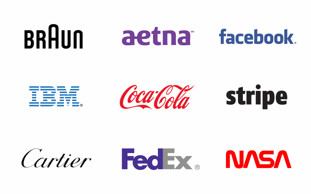
The 25 Best Wordmark Logos: A Designer’s Breakdown
I’ve hand-picked these 25 not just because they’re “famous,” but because each one teaches a specific, valuable business lesson. I’ve grouped them by their core strategic strength.
Category 1: The Custom Script Icons
These logos use custom script lettering to become globally recognised symbols. They are pure personality.
1 – Coca-Cola
The undisputed king. Written in 1887 in Spencerian script, it is 100% unique. It’s fluid, dynamic, and feels ‘classic’. It’s so iconic, they can replace the name with other words in the same script, and you still know it’s Coke.
- The Lesson: Ownability trumps trends. While everyone chases minimalism, Coke’s “maximalist” script has been unchanged for 130+ years. Don’t be afraid to have a personality.
2 – Disney
This script is pure magic and nostalgia. It’s supposedly based on Walt’s own signature (though it’s a stylised, art-directed version). It’s friendly, whimsical, and instantly recognisable.
- The Lesson: Your logo can (and should) evoke an emotion. Disney isn’t selling movies; it’s selling “magic.” The logo does that before you even read the word.
3 – Cadbury
That rich, flowing “C” and the distinctive loops. The Cadbury script (based on the signature of William Cadbury) just feels like smooth, melting chocolate. Paired with the iconic purple (Pantone 2685C), it’s a masterclass in multi-sensory branding.
- The Lesson: Your wordmark doesn’t exist in a vacuum. It works in partnership with your brand colours and other assets to create a complete picture.
4 – Kellogg’s
Bold, confident, and slightly playful. The conjoined ‘ll’ and ‘gg’s’ are iconic, and the way the ‘K’ stretches over the ‘e’ gives it a sense of heritage and authority. It looks like a “seal of approval.”
- The Lesson: Heritage and trust can be communicated through typography. This looks like a signature from a person you trust.
5 – Virgin
This logo is pure rock-and-roll. It’s a fast, energetic, scrawled signature. Legend has it that it was sketched on a napkin. Whether true or not, it perfectly captures the brand’s rebellious, “challenger” ethos. It’s raw, personal, and breaks all the rules of “clean” corporate design.
- The Lesson: A logo can be raw and full of energy. It doesn’t have to be neat. The Virgin scrawl is an attitude, not just a name, perfectly matching its disruptive approach to music, air travel, and beyond.
Category 2: The Timeless Serif Giants
Serif fonts (with the little “feet” on the letters) communicate tradition, authority, trust, and elegance.
6 – Vogue
Perhaps the most elegant wordmark ever created. It uses a custom version of the Bodoni typeface, known for its extreme contrast between thick and thin lines. It’s high-fashion, exclusive, and unforgivingly stylish.
- The Lesson: Know your audience. Vogue doesn’t need to be warm and friendly. It needs to be aspirational and elite. The logo is the bouncer at the most exclusive club in town.
7 – The New York Times
This is pure, unadulterated authority. The custom, complex Blackletter (or “Gothic”) script is a direct link to the history of newspapers. You don’t read it; you respect it.
- The Lesson: Don’t run from your heritage. In an age of digital “blanding,” The NYT’s logo is a powerful anchor to 170+ years of journalistic integrity.
8 – Sony
Simple, strong, timeless. The genius of the Sony logo is in its “visual balance.” It’s a custom-designed serif (a “slab serif”) that feels perfectly weighted. It’s solid, reliable, and high-quality, just like their products.
- The Lesson: Simplicity doesn’t mean “default.” This logo was obsessed over for months to get the spacing, weight, and balance perfectly right.
9 – Canon
Look closely. The ‘C’ has a unique, sharp ‘barb’ on the top, pointing inward. The “O”s are slightly wider than a perfect circle. These tiny customisations make it unique. It’s strong, technical, and precise.
- The Lesson: Customisation is everything. From 20 feet away, it’s “Canon.” From 2 feet away, you see the details that make it 100% ownable.
10 – Zara
This one is controversial, and I love it. They recently changed to this high-contrast, tightly-spaced (some would say “claustrophobic”) serif. It’s a direct nod to high-fashion editorial spreads (like Vogue’s). It’s divisive, but it makes a statement.
- The Lesson: A logo can be a “filter.” It signals who the brand is for. By adopting this high-fashion aesthetic, Zara told the world it was moving upmarket.
Category 3: The Clean, Modern Sans-Serifs
Sans-serif fonts (without the “feet”) are the backbone of the digital age. They are clean, scalable, approachable, and modern.
11 – Google
The 2015 update to “Product Sans” was genius. It’s a custom-designed geometric sans-serif that is friendly, simple, and infinitely scalable. It’s designed to be legible on a 2-inch watch screen and a 50-foot billboard. The slight ‘e’ (a nod to their old logo) keeps the playfulness.
- The Lesson: Function must dictate form. Google’s primary interface is a screen. Their logo is now perfectly optimised for that screen, at any size.
12 – Netflix
The “Netflix Sans” wordmark, with its subtle curve on the ‘t’ and the bold red, is a ribbon of cinema. It’s built to look like the classic “CinemaScope” logo. It’s modern, but with a deep, respectful nod to film history.
- The Lesson: Your logo can tell a story. This isn’t just a font; it’s an homage to the industry it’s disrupting.
13 – Uber
Uber’s journey to this logo was painful (remember the weird “atom” symbol?). They finally landed on a simple, custom sans-serif wordmark. Why? Because after all their brand damage, they needed something clear, direct, and un-fussy. “Uber. We get you there.”
- The Lesson: When your brand is in trouble, clarity beats cleverness. A simple wordmark can be a “reset button” to rebuild trust.
14 – Panasonic
This is one of my personal favourites. It’s so clean, so balanced. It’s the visual equivalent of “high-fidelity audio.” It’s technical without being cold, and modern without being trendy. Just a perfectly crafted, timeless piece of design.
- The Lesson: Sometimes, “boring” is brilliant. This logo doesn’t shout; it performs. It’s all confidence and capability.
15 – 3M
Another work of “boring” genius. The ‘3’ and the ‘M’ are custom-designed to nestle together perfectly. The bold, thick font (it’s a variation of Helvetica) feels industrial, strong, and reliable. This is a company that makes things.
- TheLesson: A logo can be a “lockup.” The way the two characters are combined makes them a single, inseparable unit.
Category 4: The “Hidden Genius” Marks
These are my favourites. They look like simple wordmarks, but they contain a hidden “aha!” moment that makes them unforgettable.
16 – FedEx
The king of negative space. If you’ve never seen it, look at the space between the ‘E’ and the ‘x’. There is a perfect arrow, symbolising speed, direction, and precision. It’s a wordmark and a brand mark in one.
- The Lesson: Your logo is not just the letters; it’s the space between them. This is 10-out-of-10 design.
17 – Subway
The arrows on the ‘S’ and ‘Y’ aren’t just for style. They represent the “in” and “out” of the subway station, or the “to-go” nature of the food. It’s dynamic, suggesting movement and speed.
- The Lesson: You can add conceptual meaning with simple graphic touches. The arrows turn a static word into an action.
18 – Mobil
The “o” in Mobil is red. Why? Because in a sea of blue and black (like its parent, Exxon), the red ‘o’ is a beacon. It’s a “focal point” that draws the eye and also represents the “drive” (like a red light turning green).
- The Lesson: A single pop of colour can be the logo. It’s a simple, brilliant differentiator.
19 – Amazon
Okay, this is technically a combination mark, but the wordmark itself is clever. The arrow from ‘a’ to ‘z’ isn’t just a “smile”; it communicates their core value proposition: “We sell everything from A to Z.”
- The Lesson: A logo can communicate your entire business model in a single, clever graphic gesture.
Category 5: The Unmistakable Personalities
These wordmarks don’t fit into neat boxes. They are 100% custom typography designed to be as unique as the brands themselves.
20 – LEGO
Those big, bubbly, friendly “balloon” letters. It’s written in a custom font that screams “fun,” “play,” and “safe for kids.” It’s soft, rounded, and enclosed in a red square—like a building block.
- The Lesson: Your logo’s feeling should match your product’s feeling. This logo looks like it’s fun to play with.
21 – eBay
The original “zany” tech logo. The overlapping, baseline-shifting letters and bright colours were meant to represent the fun, eclectic, “flea market” nature of the site. Even in its modern, cleaner version, it retains that personality.
- The Lesson: A “perfectly designed” logo isn’t always the goal. Sometimes, “quirky” and “imperfect” is the right way to reflect your brand’s community.
22 – Calvin Klein
The “cK” is a lettermark, but the full “Calvin Klein” wordmark (often in a thin, wide-spaced sans-serif like Futura) is a masterpiece of ’90s minimalism. It’s clean, spare, and sexy.
- The Lesson: The spacing (kerning) of a logo is as important as the font. The wide-open spacing in the cK logo feels premium and expensive.
23 – IBM
Yes, this is a lettermark, but it functions as a wordmark for the company. The 8-bar “stripes” (designed by Paul Rand) were created to give the logo a sense of speed, technology, and “scan lines” on a screen.
- The Lesson: Even a simple, bold font can be modified to add conceptual meaning. The stripes turn a boring acronym into a high-tech icon.
24 – Crate & Barrel
This logo is the epitome of clean, functional, modernist design. It’s a simple, perfectly balanced, black-and-white sans-serif (a variation of Helvetica). There are no tricks, no hidden gimmicks.
- The Lesson: Your wordmark can be a “perfect container.” The Crate & Barrel logo is intentionally neutral and timeless. It doesn’t scream for attention. It steps back and provides a clean, sophisticated, and trustworthy frame for the stylish, modern products it sells. It’s all about quiet confidence.
25 – NASA
Like IBM, this is a lettermark. The original “worm” logotype (from 1975) is a cult classic of minimalist design. The ‘A’s have no crossbar, and the letters are all one continuous, futuristic line. It was so simple and forward-thinking.
- The Lesson: Don’t be afraid to be bold and minimalist. The “worm” logo looked like it came from the future, which is exactly what NASA was selling.
The Big Question: Is a Wordmark Right for Your Business?
Here’s the brutal truth: probably not.
At least, not if you’re a brand new, unknown entity with a generic name. A wordmark’s primary job is to build name recognition. If your name is “Apex Solutions” or “Global Tech,” a wordmark will do nothing for you.
A wordmark strategy works best if:
- You have a short, distinct, memorable name (e.g., Google, Visa, Sony).
- You are in a traditional, conservative industry (e.g., law, finance) where a symbol might seem frivolous.
- You are a personality-driven brand (e.g., a fashion designer) where the name is the product.
- You have a massive advertising budget to make your name famous (e.g., every brand on this list).
Still think it’s for you? Use this checklist.
The Wordmark Test: A Checklist
| Checkpoint | Yes | No |
| Is my company name short (ideally 1-2 words)? | ✅ | ❌ |
| Is my name unique and memorable (not generic)? | ✅ | ❌ |
| Am I willing to invest in custom typography (not just a font)? | ✅ | ❌ |
| Does the name itself explain what I do (or is it purely abstract)? | ✅ | ❌ |
| Do I need my logo to work perfectly on a tiny app icon? | ❌ | ✅ |
| Am I relying on my logo alone to explain my business? | ❌ | ✅ |
Analysis: If you have more ‘Yes’ than ‘No’ ticks, a wordmark might be a viable strategy. If you have more ‘No’ ticks, you should be looking at a Combination Mark or a Brand Mark to help do the heavy lifting.
The Anatomy of a Great Wordmark
As you can see, no great wordmark is “just a font.” They are all, without exception, customised.
Here are the four elements we designers obsess over.
- Custom Typography: The best wordmarks (Coca-Cola, Disney, Google) have their own custom-designed typefaces. This is the ultimate form of “ownability.” You can’t just type it.
- Kerning (The Space Between): This is the secret weapon. It’s the art of adjusting the space between individual letters to create a visually harmonious and balanced unit. The FedEx arrow is a result of obsessive kerning.
- Scalability: A great wordmark works as a 16px “favicon” in a browser tab and on the side of a 30-foot lorry. This means the spacing, “apertures” (the holes in letters like ‘e’ and ‘a’), and line weights have been tested to their limits.
- Personality & Context: The logo for a bank (heavy, stable, serif) should feel different from a toy company (bubbly, rounded, fun). The typography must match the brand’s soul.
How Most Wordmark Logos Fail
If you’re considering a wordmark, watch out for these traps. I see them every week.
- Chasing Trends: Remember all those “bubbly” Web 2.0 logos? Or the “geometric sans-serif” trend that made every tech startup look identical? Trends die. A custom, timeless mark doesn’t.
- Using a “Stock” Font: If you just type your name in Helvetica and call it a day, you don’t have a logo. You have text. Anyone can copy it, and it has zero brand equity.
- Illegibility: That “cool” font is unreadable. That “tight” kerning makes the letters blur together. If your customers have to squint to read your name, you’ve already lost.
- No Brand, No Name: The biggest failure? Having a generic name (e.g., “Quality Solutions”) and using a generic wordmark. It’s a “double-zero.” It has no visual hook and no name hook. It’s invisible.
A wordmark is a high-risk, high-reward strategy. When it’s bad, it’s forgettable. But when it’s great, it’s an icon.
So, What’s the Real Lesson Here?
A wordmark is not a “simple” or “cheap” logo option. It is, in fact, one of the most difficult and sophisticated forms of logo design.
You’re not just designing a graphic; you’re designing the very letters that form your name, the most fundamental piece of your identity. You’re creating a signature that will represent you for decades.
This list proves that the best wordmarks are the result of intense customisation, strategic thinking, and a small dash of hidden genius. They are obsessed over.
It’s a lot to consider. And frankly, most entrepreneurs are too busy building their business to obsess over the kerning of a single letter. That’s our job.
If you’re staring at your own company’s name and feeling… uninspired… it might be time to have a conversation about what that name could really look like.
Frequently Asked Questions (FAQs)
What is a wordmark logo?
A wordmark (or logotype) is a logo that consists solely of the company’s name, designed in a specific, often custom, typography. Examples include Google, Coca-Cola, and Visa.
What is the difference between a wordmark and a logotype?
They are the same thing. “Logotype” is the more traditional, technical term; “wordmark” is the more common, modern term. Both refer to a text-only logo.
Is a wordmark a good logo?
A wordmark can be an excellent logo if you have a short, memorable, unique name and you invest in custom typography. It’s a poor choice for new businesses with long or generic names.
Why is the FedEx logo so famous?
The FedEx logo is famous for its “hidden” arrow, created using negative space between the ‘E’ and the ‘x’. It’s a brilliant example of conceptual design, symbolizing speed and precision.
What font does Google use for its logo?
Google uses a custom-designed font called “Product Sans,” which is a geometric sans-serif typeface. They created it in 2015 to be highly legible and scalable on all screen sizes.
Are wordmark logos cheaper to design?
No. This is a common myth. Because a wordmark has nowhere to hide, the designer must custom-craft the typography, which can be more time-consuming and require more skill than creating a logo with a symbol.
What’s the difference between a wordmark and a lettermark?
A wordmark uses the full company name (e.g., “Sony”). A lettermark uses the company’s initials (e.g., “IBM” for International Business Machines).
When should I use a wordmark?
Use a wordmark when your primary goal is to build name recognition and your company name is distinct and memorable.
What makes a wordmark “timeless”?
Timeless wordmarks avoid popular trends. They focus on balance, readability, and unique custom details (like the Coca-Cola script or the Sony slab serif) that make them 100% ownable.
Can I just use a font from my computer for my logo?
You can, but you shouldn’t. Using a default “stock” font means your logo is not unique, cannot be trademarked, and will blend in with thousands of other businesses using the same font.
What is the most famous wordmark logo?
Arguably, Coca-Cola. It has been in use for over 130 years with minimal changes and is one of the most recognised brand assets on Earth.

