
10 Best 1960s Fonts That Aren't (All) Psychedelic Nonsense
Ask someone to picture a 1960s font, and you’ll likely get a description of something bubbly, swirly, and barely legible. Think Austin Powers. Lava lamps. Peace signs.
That picture isn't wrong, but it's dangerously incomplete.
The 1960s weren't one big, groovy love-in. It was a decade of violent collision between two opposing worlds: the rigid, buttoned-down corporate establishment and the radical, rule-breaking counterculture. This war was fought with images and ideas, and typography was the frontline.
Getting this wrong is businesses' biggest mistake when trying to get a “retro” look. They grab a generic psychedelic font and slap it on their coffee shop logo, completely missing the point. The result is a shallow cliché, not a powerful brand identity.
This list isn't just about “groovy” fonts. It's about the iconic typefaces that truly defined the decade, from the boardrooms of Madison Avenue to the concert posters of San Francisco. Understanding the difference is how you build a brand with depth.
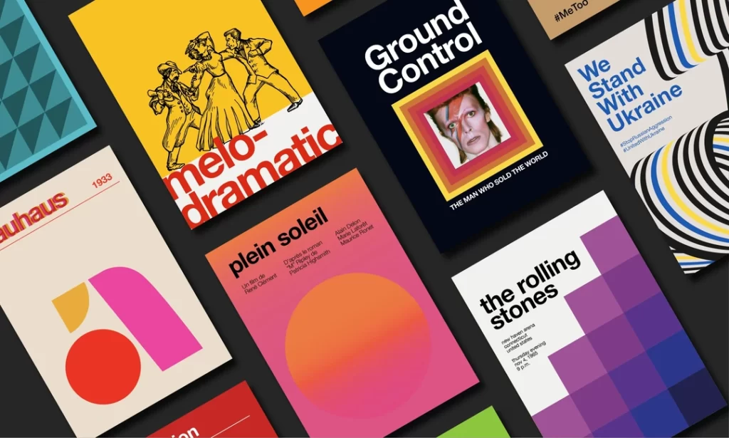
- 1960s typography split between Swiss corporate modernism (clear, grid-based sans-serifs) and psychedelic counterculture (expressive, decorative letterforms).
- Helvetica, Futura, Avant-Garde, Cooper Black exemplify the decade’s range—from corporate authority to friendly, nostalgic pop.
- Choose fonts strategically: match cultural meaning to audience and avoid mixing contradictory signals.
- Modernise retro fonts by pairing bold 60s display types with clean contemporary body fonts, layouts, and photography.
Before We Begin: The Two Sides of the 1960s Type Coin
To use 60s fonts effectively, you first need to understand the battlefield. Every primary typeface of the era falls into one of two camps.
The Establishment: Swiss Style & Corporate Modernism
This was the look of Big Business, Big Government, and Big Ideas. Driven by the International Typographic Style (or Swiss Style), this movement worshipped clarity, order, and objectivity. It was a reaction against the chaos of war, a belief that design could be a universal, rational force for good.
The principles were simple: use grid-based layouts, favour clean sans-serif fonts, and remove all personal expression. This was the typography of companies like IBM, American Airlines, and NASA. It was the font of progress, power, and unflinching confidence.
The Rebellion: Psychedelia and Expressive Freedom
Then there was the rebellion. In places like San Francisco's Haight-Ashbury, designers, artists, and musicians threw the Swiss rulebook onto the fire. Inspired by the swirling forms of Art Nouveau, optical art, and the mind-bending effects of psychedelic drugs, they created a new visual language.
For this movement, legibility was a bourgeois concept. The goal wasn't clear communication; it was to evoke a feeling, a trip. The letterforms were bent, melted, and squeezed to become part of the illustration. This was the typography of protest, rock and roll, and revolution.
The 10 Best 1960s Fonts for Modern Design
Here are 10 typefaces that represent the whole, chaotic spectrum of the 1960s. Some were born in the decade, and others were rediscovered and given new lives. Each one is a powerful tool if you know how to use it.
1. Helvetica: The Corporate Titan
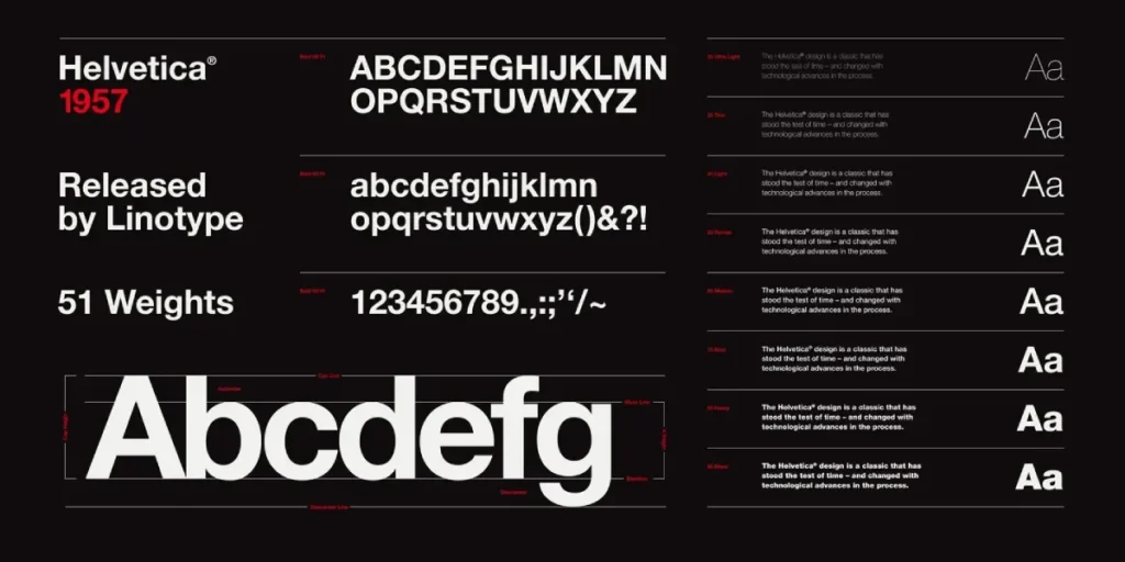
- Designer & Year: Max Miedinger & Eduard Hoffmann, 1957
- The Vibe: Clean, neutral, ubiquitous modernism.
- Why It Defined the 60s: While designed in the late 50s, Helvetica owned the 1960s corporate world. It became the default typeface for any company wanting to appear modern, efficient, and trustworthy. Massimo Vignelli’s work for American Airlines and the New York City Subway system cemented its status as the face of rational design.
- How to Use It Today: It’s still a workhorse. Use it for minimalist branding, tech startups, or any business that needs to communicate absolute clarity and authority. It’s the perfect, neutral canvas for a strong brand message.
- Watch Out For: Helvetica’s strength is its neutrality, which can also be its weakness. It can feel sterile or generic. The font has no personality, so your logo, colour palette, and imagery must do all the work.
2. Avant-Garde Gothic: The Geometric Rule-Breaker
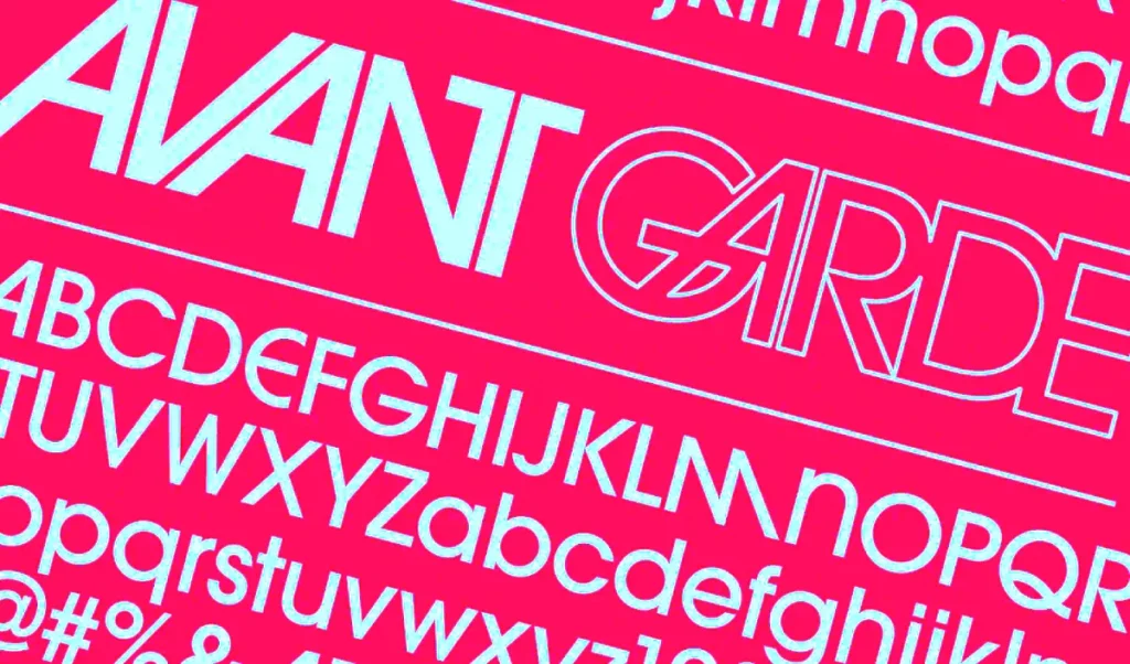
- Designer & Year: Herb Lubalin & Tom Carnase, 1968
- The Vibe: Geometric, stylish, tightly-spaced perfection.
- Why It Defined the 60s: This font began life as the logo for the provocative Avant-Garde magazine. The logo was so popular with its tight-fitting, overlapping letter combinations (ligatures) that the designers were pressured into creating a complete typeface. It captures the sleek, confident, high-fashion aesthetic of the late 60s.
- How to Use It Today: It's a killer font for logos and headlines, especially in fashion, publishing, and high-end lifestyle brands. Its unique ligatures (like the stacked ‘AV’) can create an instantly iconic logotype.
- Watch Out For: It was designed for display. The extreme tightness of the letter spacing makes it a nightmare to read in long paragraphs. Keep it for short, impactful statements.
3. Cooper Black: The Big, Friendly Giant

- Designer & Year: Oswald Bruce Cooper, 1922 (but reborn in the 60s)
- The Vibe: Soft, chunky, approachable, and undeniably groovy.
- Why It Defined the 60s: An old font from the 20s, Cooper Black, was adopted by 60s pop culture as the friendly face of fun. Its soft, rounded serifs were the opposite of cold, clinical Helvetica. It appeared on The Beach Boys' seminal album Pet Sounds and countless advertisements for everything from candy to cars.
- How to Use It Today: Perfect for brands that are playful, bold, and want to evoke a sense of nostalgic warmth. It’s fantastic for packaging, social media graphics, and logos for food or lifestyle brands.
- Watch Out For: It’s a design cliché for a reason. Pair it with modern colours, sharp photography, and clean, negative space to avoid looking dated. Use it with a wink.
4. Futura: The Font of the Future
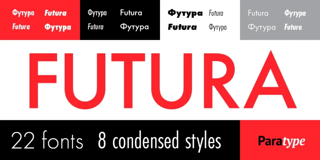
- Designer & Year: Paul Renner, 1927 (but became the font of the Space Age)
- The Vibe: Geometric, clean, aspirational, and scientific.
- Why It Defined the 60s: If Helvetica owned the boardroom, Futura owned the launchpad. Based on pure geometric shapes (circles, squares, triangles), it was the perfect typeface for the optimism and ambition of the Space Race. Stanley Kubrick used it extensively in 2001: A Space Odyssey, and, most famously, NASA used it for the plaque left on the Moon by the Apollo 11 astronauts.
- How to Use It Today: An excellent choice for tech companies, science-focused brands, or any business about innovation and looking forward. It feels both timeless and futuristic.
- Watch Out For: The sharp, geometric forms sometimes feel cold or impersonal. It often benefits from being used in all caps for headlines to maximise its architectural impact.
5. Eurostile: The Sci-Fi TV Screen
- Designer & Year: Aldo Novarese, 1962
- The Vibe: Wide, square, technological, and dystopian.
- Why It Defined the 60s: Eurostile was designed to capture the feeling of technology. Its “squarish” shapes with rounded corners made it look like the text on a cathode ray tube monitor or a spaceship's control panel. It became the go-to font for 60s science fiction movies and TV shows.
- How to Use It Today: Fantastic for logos and headlines in the gaming, automotive, or consumer tech industries. It conveys a sense of power, speed, and futuristic efficiency.
- Watch Out For: Its wide, extended letterforms make it incredibly inefficient for space and almost unreadable in body text. Use it for headlines, labels, and logos only.
6. Arnold Böcklin: The Psychedelic Flashback
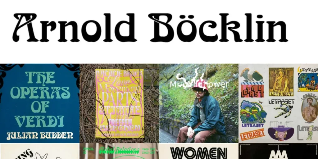
- Designer & Year: Otto Weisert, 1904 (revived in the 60s)
- The Vibe: Swirly, organic, decorative, and deeply trippy.
- Why It Defined the 60s: This is where things get weird. Psychedelic poster artists like Wes Wilson and Victor Moscoso rejected the clean lines of modernism and looked back to the Art Nouveau movement of the early 1900s. They rediscovered fonts like Arnold Böcklin and made them central to the visual identity of the counter-culture.
- How to Use It Today: Handle with extreme care. Use it very sparingly for an authentic psychedelic feel. It could work for a cannabis brand, a music festival, or a retro apparel line. It’s more of a graphic illustration than a font.
- Watch Out For: Legibility is almost zero. This font is about vibe and visual texture. Don't ever use it for important information.
7. Bookman Swash: The Friendly Funk
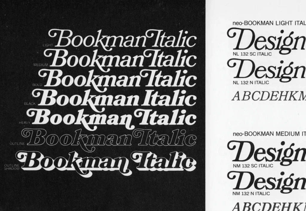
- Designer & Year: Ed Benguiat (ITC version), 1975 (based on older designs popularised in the late 60s)
- The Vibe: Warm, rounded, with funky, expressive swashes.
- Why It Defined the 60s: As the 60s bled into the 70s, Bookman (especially versions with swash alternates) offered a middle ground. It wasn't as rigid as Helvetica but was far more readable than the psychedelic stuff. It had a warm, literary, and slightly funky feel that defined the look of soft rock album covers and book jackets.
- How to Use It Today: An excellent choice for brands that want to feel creative, approachable, and authentically retro. It works well for author logos, craft businesses, and vintage-inspired packaging.
- Watch Out For: The swashes are powerful. Overusing them will make your design look cluttered and messy. Use them strategically as accent elements to add flair to a headline.
8. Baby Teeth: The Bubbly Rebel
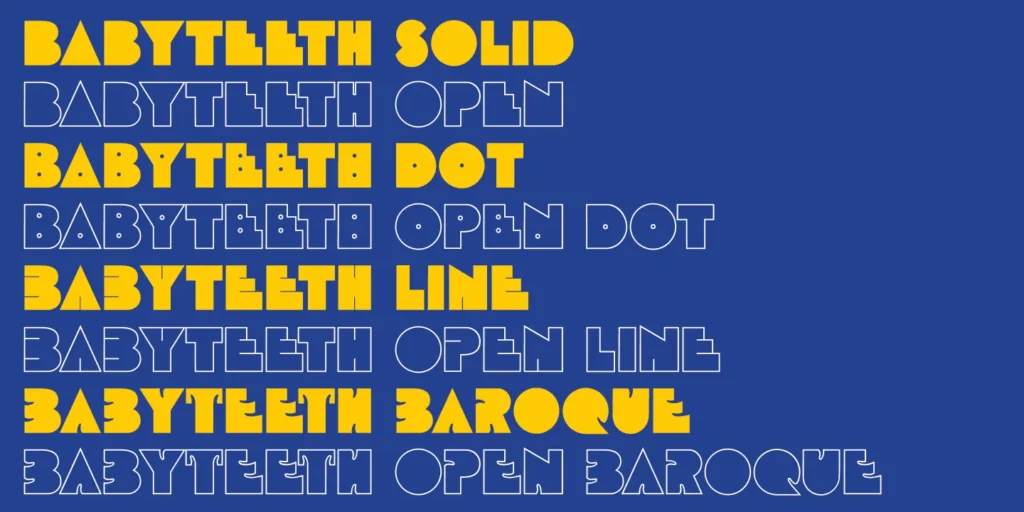
- Designer & Year: Milton Glaser, 1966
- The Vibe: Playful, rounded, geometric, and bold.
- Why It Defined the 60s: Designed by the legendary Milton Glaser (creator of the I ♥ NY logo), Baby Teeth is a perfect example of Pop Art typography. It's clean and geometric like modernism, but it's also fun and expressive. It famously appeared on the cover of The Who’s album The Who Sell Out.
- How to Use It Today: Use it for brands that need to feel fun, energetic, and unapologetically retro. It's great for children's products, candy packaging, or any design that needs a burst of bubbly personality.
- Watch Out For: Its playful nature can quickly look juvenile. It needs a sophisticated colour palette and layout to feel intentional rather than amateurish.
9. Filmotype Jupiter: The Mod All-Rounder
- Designer & Year: Ray Baker, late 1950s/early 1960s
- The Vibe: Casual, quirky, and slightly condensed upright script.
- Why It Defined the 60s: This font captures London's Carnaby Street's optimistic, consumer-driven “Mod” culture. It felt hand-drawn and personal, a friendly alternative to the imposing sans serifs of the corporate world. It was used all over advertising and packaging that wanted to feel fresh and modern.
- How to Use It Today: Excellent for cafes, independent boutiques, or lifestyle brands that want a touch of nostalgic, handcrafted charm. It’s friendly without being overly decorative.
- Watch Out For: As a lighter, condensed face, it can lose impact at small sizes. It works best for subheadings, callouts, and short blocks of text where its personality can shine.
10. Souvenir: The 70s Font That Started in the 60s
- Designer & Year: Morris Fuller Benton, 1914 (reborn by Ed Benguiat in 1967)
- The Vibe: Soft, rounded, friendly, almost cartoonish.
- Why It Defined the 60s: The revival and release of ITC Souvenir in the late 60s was a sign of things to come. It was the ultimate rejection of cold modernism. With its super-soft serifs and friendly curves, it was the typographic equivalent of a hug. It set the stage for the entire aesthetic of the 1970s.
- How to Use It Today: For projects that need a gentle, non-threatening, and deeply nostalgic feel. Think retro t-shirts, friendly blog headers, or branding for anything that doesn't take itself too seriously.
- Watch Out For: Souvenir was so massively overused in the 70s that it became a joke among designers. If you use it, you must do so with self-awareness. It's a statement.
How to Use 1960s Fonts Without Looking Like a Cliché
Picking a font from this list isn't enough. Execution is everything. Here’s how to do it right.
Tip 1: Pick a Lane—Corporate or Counter-Culture?
Don't mix your signals. Use a modernist font like Helvetica or Futura within a clean, grid-based layout if your brand is about reliability, precision, and trust. You can explore the psychedelic options if your brand concerns creativity, rebellion, and free expression. A swirly font on an investment firm's website is a strategic disaster.
Tip 2: Context Is Everything
Who is your audience? A font like Cooper Black might be perfect for an Instagram-focused brand targeting millennials who love nostalgia. It would be entirely inappropriate for a B2B technology company selling to CTOs. Match the font's ingrained cultural meaning to your brand's personality and audience's expectations.
Tip 3: Pair with Modern Elements
The best way to use a retro font is not to go full retro. Contrast is your friend. Pair a bold, 60s headline font like Avant Garde with a clean, modern body font like Lato or Open Sans. Use a 60s-inspired colour palette, but apply it to a contemporary website layout with high-quality digital photography. This creates an inspired and intentional look, not dated and dusty.
Nailing the Retro Vibe Is a Job for a Pro
The 1960s were a decade of incredible typographic diversity. Choosing the right font is a strategic brand decision, not just a stylistic one. It requires understanding the history, the cultural baggage, and the subtle signals these letterforms send.
It's easy to create a cheap parody of the past. It’s much harder to thoughtfully extract a historical aesthetic and make it feel fresh, modern, and powerful for your business today.
If you're trying to build a brand that feels both timeless and unique, you don't have to do it alone. At Inkbot Design, we live and breathe this stuff.
We build brands that work. Look at our graphic design services or request a quote when you’re ready to get serious about your brand's design.
Frequently Asked Questions About 1960s Fonts.
What is the most famous 1960s font?
Helvetica is arguably the most famous and influential font of the 1960s. Its adoption by major corporations and its central role in the International Typographic Style made it the defining look of the decade's modernism.
What fonts were used by hippies?
Hippie and psychedelic designers of the 60s often used revived Art Nouveau fonts like Arnold Böcklin, or they created hand-drawn lettering that was distorted and expressive. The goal was to create a feeling rather than ensure legibility.
What is a “groovy” font?
A “groovy” font typically refers to typefaces with soft, rounded, and often bubbly or balloon-like letterforms. Cooper Black is the quintessential example, but the term can also apply to many psychedelic and pop-art-inspired fonts from the era.
What font did NASA use in the 1960s?
NASA famously used Futura for much of its branding and materials during the Apollo program, including the commemorative plaque left on the moon in 1969.
How can I make a 60s font look modern?
To make a 1960s font look modern, create contrast. Pair a bold 60s display font with a simple, neutral sans-serif for body text. Use it within a clean, minimalist layout and with a contemporary colour palette and high-quality photography.
What's the difference between Mod and Psychedelic fonts?
Mod typography, like Filmotype Verna, tends to be cleaner, quirkier, and more aligned with consumer culture and fashion—playful but still legible. Psychedelic typography is far more expressive and distorted, prioritising artistic effect over readability, often inspired by Art Nouveau and drug culture.
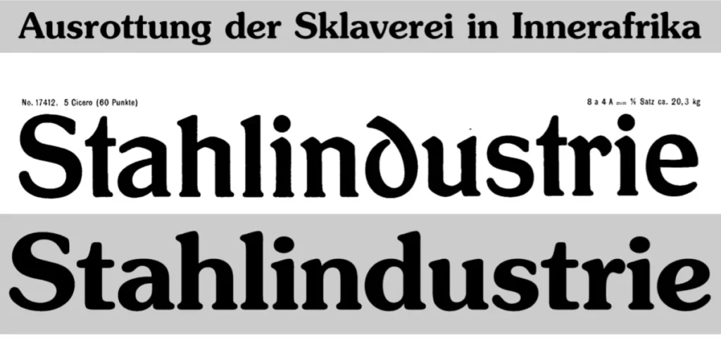
Was Times New Roman used in the 1960s?
Yes, Times New Roman, designed in 1931, was a standard and widely used serif font for books, newspapers, and magazines throughout the 1960s. However, it doesn't define the era's progressive design trends in the same way that fonts like Helvetica or Futura do.
Is using a 1960s font for my logo a bad idea?
Not at all, but it must be a strategic choice. A font like Futura can look timelessly modern, while a font like Cooper Black makes a clear statement about being playful and retro. The key is to ensure the font's personality aligns with your brand's core values.
Where can I get high-quality 1960s fonts?
What font is on the Mad Men logo?
The Mad Men logo uses a classic, elegant serif font called Baskerville for the main title, with the supporting text often set in a clean sans-serif similar to Helvetica, perfectly capturing the corporate aesthetic of the early 1960s advertising world.
Choosing the right typeface is the first step to building a memorable brand. If you want to translate timeless style into modern success, our team can help. Explore our graphic design services to see how we build stand-out brands.

