The 25 Best Retro Fonts: From 50s Chic to 90s Grunge
“Retro” isn’t a font style. It’s a time machine. And most businesses are using it with all the precision of a sledgehammer. They slap a curvy font on their logo and call it “vintage,” hoping to buy a slight second-hand coolness.
The result? A brand that feels inauthentic. A coffee shop with a 70s disco font. A tech startup using a 90s grunge typeface. It’s the visual equivalent of your dad wearing a backwards baseball cap to look young. It doesn’t work.
Using a retro font isn’t about looking old. It’s about borrowing a specific feeling from a particular time. The sleek optimism of the 50s. The rebellious energy of the 60s. The digital hiss of the 80s. Each decade had its own voice, culture, and look.
This isn’t just a list of 25 fonts. This is a guide to using them with intent. So you can borrow the right vibe for the right reason.
- Using retro fonts requires intentionality; it's about evoking a specific feeling rather than merely looking outdated.
- Choose a retro font that aligns with your brand's values to avoid appearing inauthentic or amateurish.
- Pair vintage styles with modern fonts to maintain legibility and a balanced design aesthetic.
Before You Time-Travel: A Quick Warning
Picking a font from this list without a strategy is like choosing a random ingredient in a supermarket. You might get lucky, but you’ll end up with a mess. Here are two non-negotiable rules.
Retro is a Tool, Not a Theme Park
Your brand is not a 70s-themed party. A single, well-chosen retro font for a headline or logo is a powerful statement. Using retro fonts for everything—headlines, body copy, navigation—is a visual disaster. It screams amateur and kills legibility. Use the font to add a specific flavour, not to build the entire meal.
Match the Decade to Your Brand’s DNA
Don’t choose a font because it looks “cool.” Ask what it communicates. A 1950s font like Futura communicates structure, reliability, and mid-century sophistication. A 1990s font like Trixie communicates chaos, rebellion, and an anti-corporate attitude. If your brand values are about reliability and trust, using a 90s grunge font is brand malpractice.
The 1950s: Post-War Optimism & Mid-Century Modern
The 50s were about looking forward. Design was clean, structured, and infused with the jet-age optimism of a world rebuilding. Think clean lines, geometric shapes, and elegant scripts that felt classic and new.
The Vibe: Clean, structured, and optimistic.
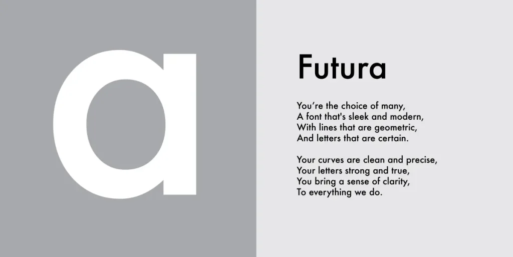
- Futura: The quintessential geometric sans-serif. Designed earlier but hit its stride in the 50s. It’s clean, efficient, and forward-thinking. Perfect for brands that want to convey a sense of timeless modernism and reliability. Think Volkswagen ads.
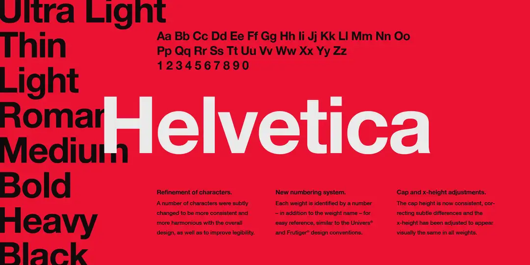
- Helvetica: Born in 1957, Helvetica became the face of corporate modernism. It’s neutral, transparent, and unbelievably versatile. Use it for a classic, no-nonsense feel that communicates clarity and pragmatism.
- Bodoni: A high-contrast serif that drips with elegance and high fashion. While much older, its use in 50s magazines like Harper’s Bazaar cemented its chic, upscale status. Ideal for luxury brands, fashion labels, and anything that needs to feel sophisticated.

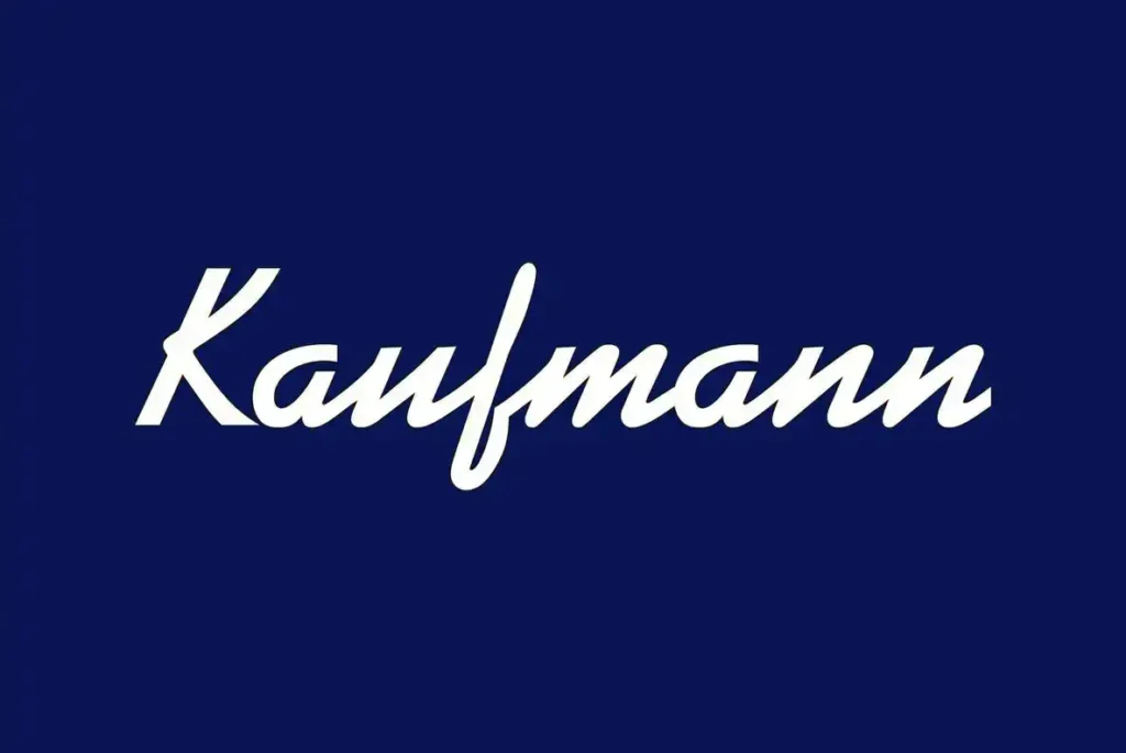
- Kaufmann Script: A classic connecting script font that feels personal and upscale without being overly formal. It mimics the sign-painter style of the era. Use it for logos or headlines that need a human touch, like for a bakery or a bespoke tailor.
- Ribbon 131: A sharp, geometric slab serif that screams “atomic age.” It’s a bit quirky but has a strong, mechanical feel. It works well for brands with a slightly nerdy, engineering-focused edge or a modern brewery looking for a distinctive label.
The 1960s: Counter-Culture & Psychedelic Curves
The 60s threw the rigid rules of the 50s out the window. Design got groovy, rebellious, and expressive. Typography became fluid, bubbly, and often pushed the boundaries of legibility for a pure, unadulterated vibe.
The Vibe: Rebellious, groovy, and breaking the mould.
- Cooper Black: The undisputed king of 60s and 70s soft, bubbly type. It’s friendly, approachable, and has a bold, chunky presence that’s impossible to ignore. Perfect for brands that want to feel fun, retro, and playful. Think old sitcom titles and The Beach Boys’ Pet Sounds cover.

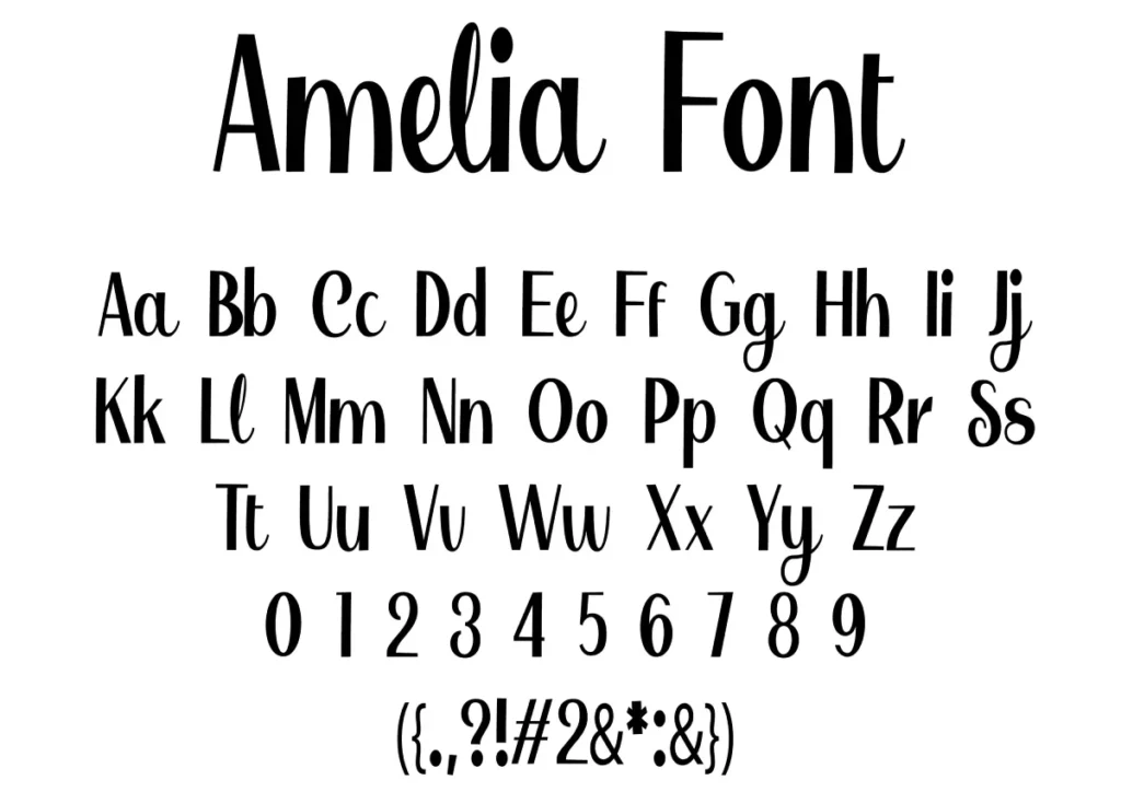
- Amelia: A decorative, rounded, and slightly condensed font that perfectly captures the “flower power” aesthetic. It’s stylish and free-spirited. Use it sparingly for logos or headers for a whimsical, creative, and explicitly retro brand.
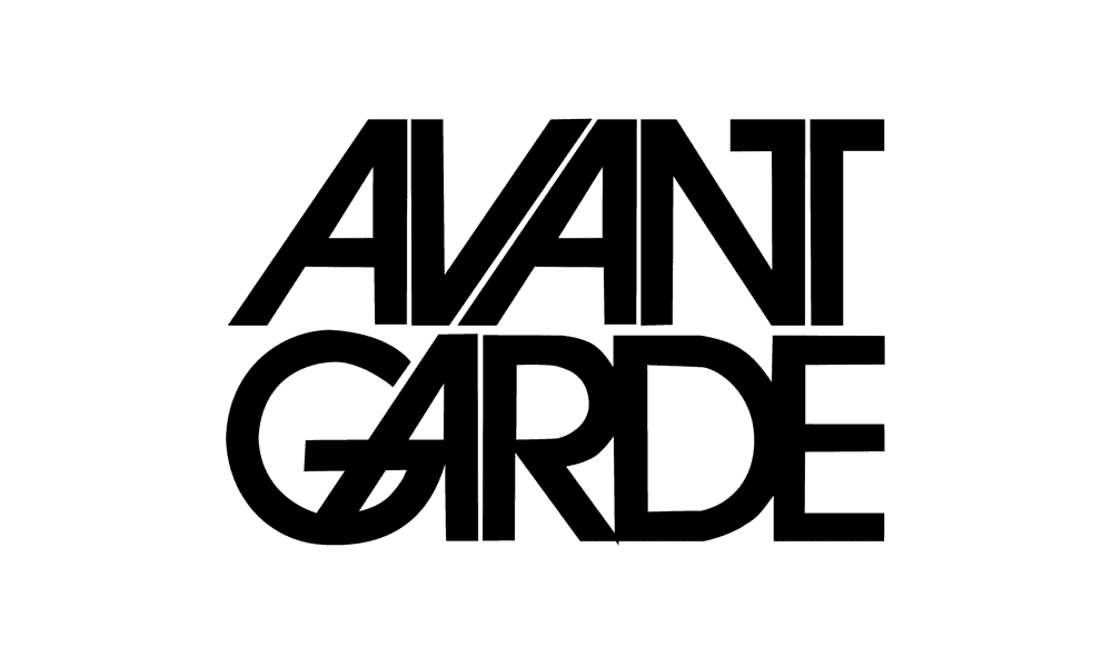
- ITC Avant Garde Gothic: The ultimate geometric font of the era. Its clean circles and sharp lines defined late 60s and 70s modernism. Depending on the context, it can feel sleek and high-fashion or funky and retro. Great for fashion brands, magazines, and logos that need a strong geometric base.
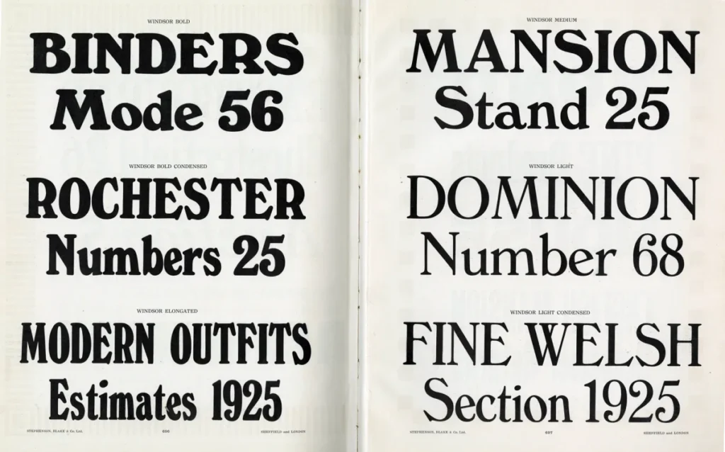
- Windsor: A friendly serif with distinctive, rounded details and angled stems. It feels warm, classic, and a bit storybook-like. It has been used on title cards for Woody Allen films for decades—an excellent choice for a brand that wants to feel established, literary, or artisanal.
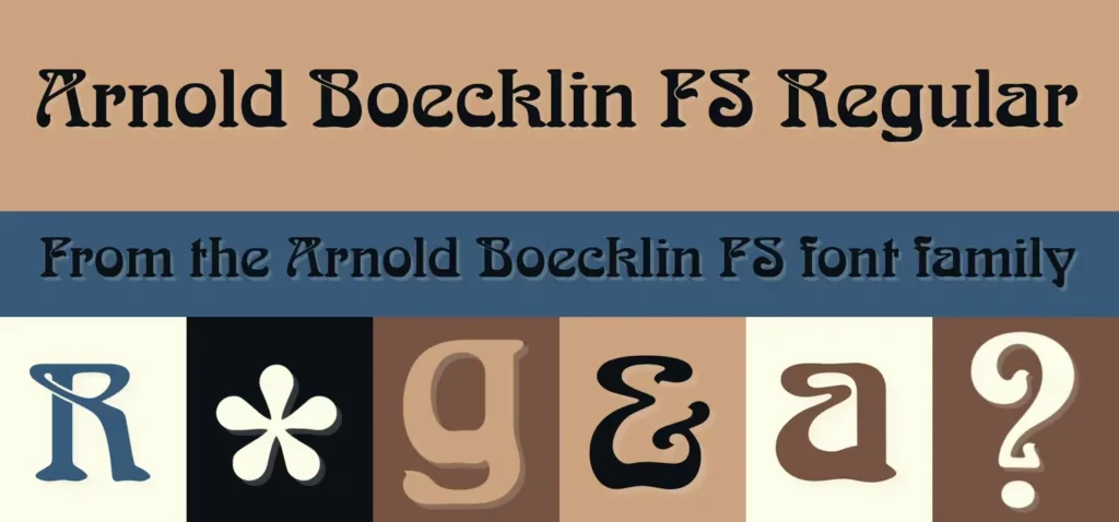
- Arnold Böcklin: The definitive Art Nouveau-revival font of the psychedelic 60s. Its swirling, organic forms were plastered over concert posters and album covers. It’s pure vibe. Use it only if fully committed to a psychedelic, counter-culture aesthetic.
The 1970s: Disco, Funk, and Earthy Tones
The 70s doubled down on the boldness of the 60s. Typography was confident, chunky, and often felt designed to be seen under a disco ball. You know a lot of tight spacing, heavy weights, and fonts with immense personality.
The Vibe: Bold, confident, and unapologetically loud.
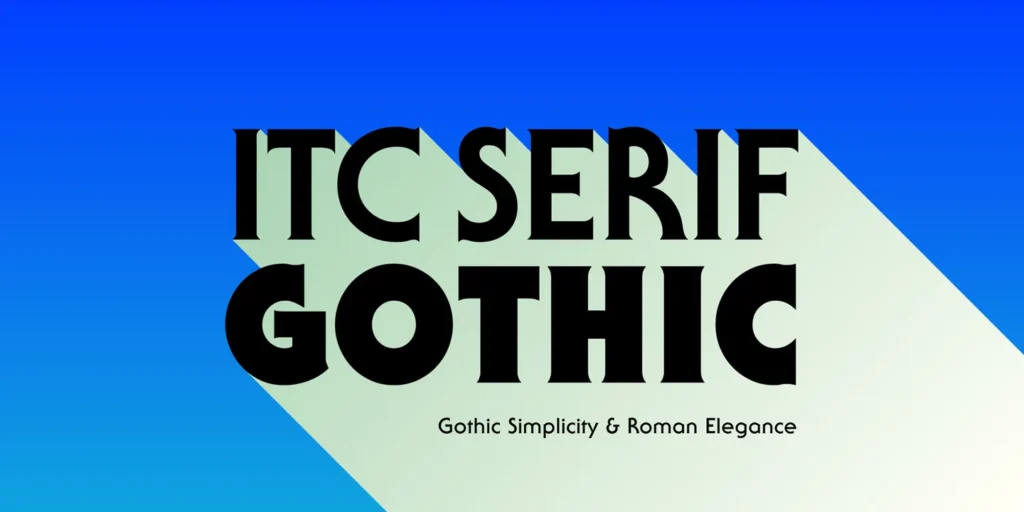
- ITC Serif Gothic: A unique hybrid of serif and sans-serif. It’s groovy, slightly spooky, and has an unmistakable 70s edge. It was used on everything from movie posters to album covers. Works great for film titles, band logos, or any brand with a cool, alternative identity.
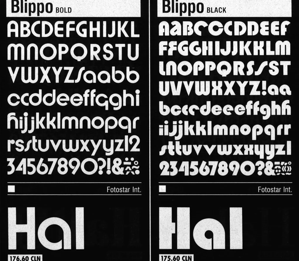
- Blippo: A bold, rounded sans-serif that is pure 70s fun. Blippo is the font used for game shows and toy packaging. It’s playful and commands attention. If your brand is loud, fun, and doesn’t take itself too seriously, Blippo is a solid choice.
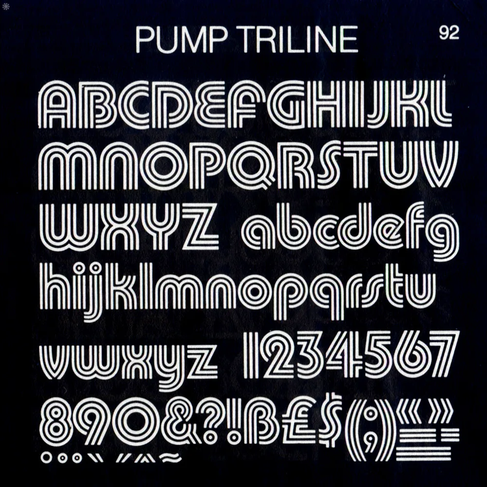
- Pump Triline: A bold, geometric font with a distinctive triple-line design. It has a high-tech, disco-funk feel that is instantly recognisable. This is a display font through and through. Use it for a logo or a very short headline where you need maximum impact.
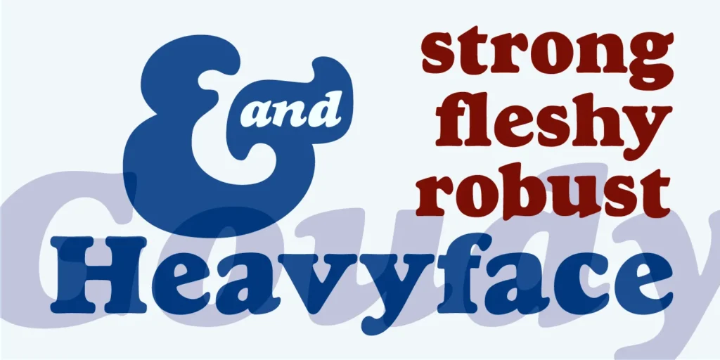
- Goudy Heavyface: A heavy, condensed serif with a warm, earthy feel. It’s less “disco” and more “70s folk-rock.” It feels sturdy and handmade—an excellent option for brands focusing on natural products, craft, or music.
- Yagi Double: A sci-fi-inspired font with a “double” stroke design. It belongs on a vintage Atari console or a sci-fi paperback. Perfect for tech-adjacent brands or creative studios wanting a nostalgic, futuristic look. Nailing this specific aesthetic takes a careful hand; it’s the detail we focus on in our graphic design work.
The 1980s: Pixels, Neon, and Blockbuster Action
The arrival of personal computers, video games, and synth-pop changed everything. 80s typography is a mix of digital-inspired pixel fonts, sharp geometric sans-serifs, and glamorous scripts straight out of Miami.
The Vibe: Digital dreams, sharp edges, and a touch of glam.
- ITC Benguiat: You know this one, even if you don’t know its name. It’s the Stranger Things font. It has a fantasy, adventure feel that’s pure 80s paperback novel. It’s perfect for anyone wanting to evoke nerdy, cinematic nostalgia.

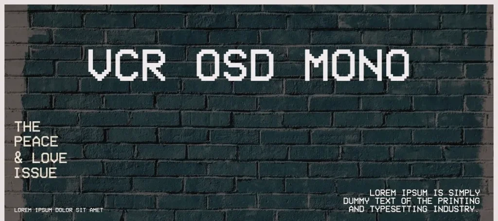
- VCR OSD Mono: A monospaced pixel font that perfectly mimics the on-screen text of old VCR players and computer terminals. It’s pure, unfiltered digital nostalgia. Use it for tech brands, music labels, or anything that wants an authentic, low-fi 80s tech vibe.
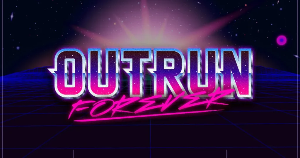
- Outrun: Not a specific font, but a style defined by the classic 80s arcade game. Think chrome, neon grids, and sleek, italicised scripts. Fonts like “Lazer 84” capture this perfectly. This is for brands that are all about the vibrant, synthwave aesthetic.
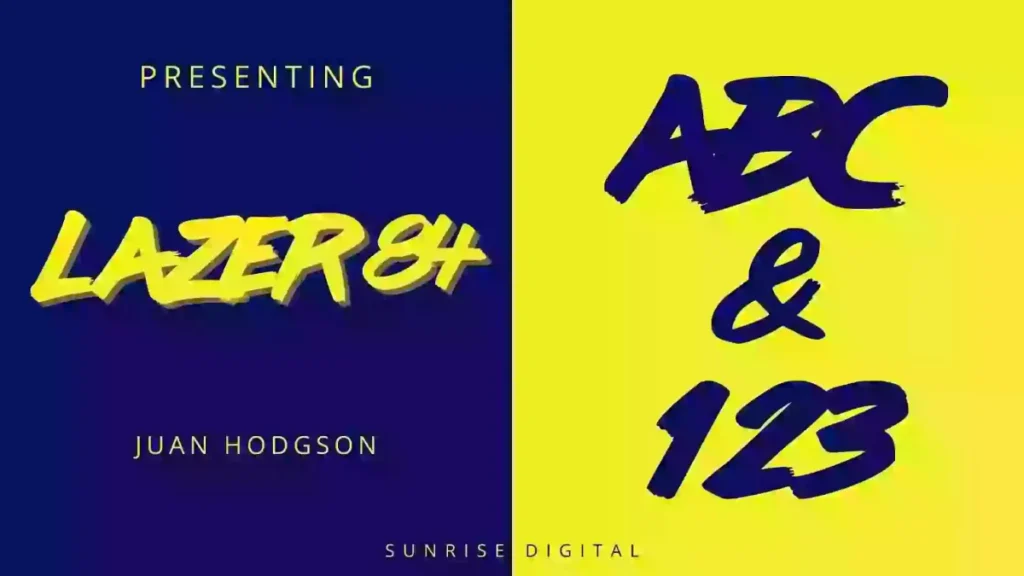
- Lazer 84: A brush script font that embodies the 80s retro-futuristic look. It’s energetic, fun, and looks fantastic with a neon glow effect. Ideal for event posters, YouTube branding, or any business that lives in the world of 80s pop culture.
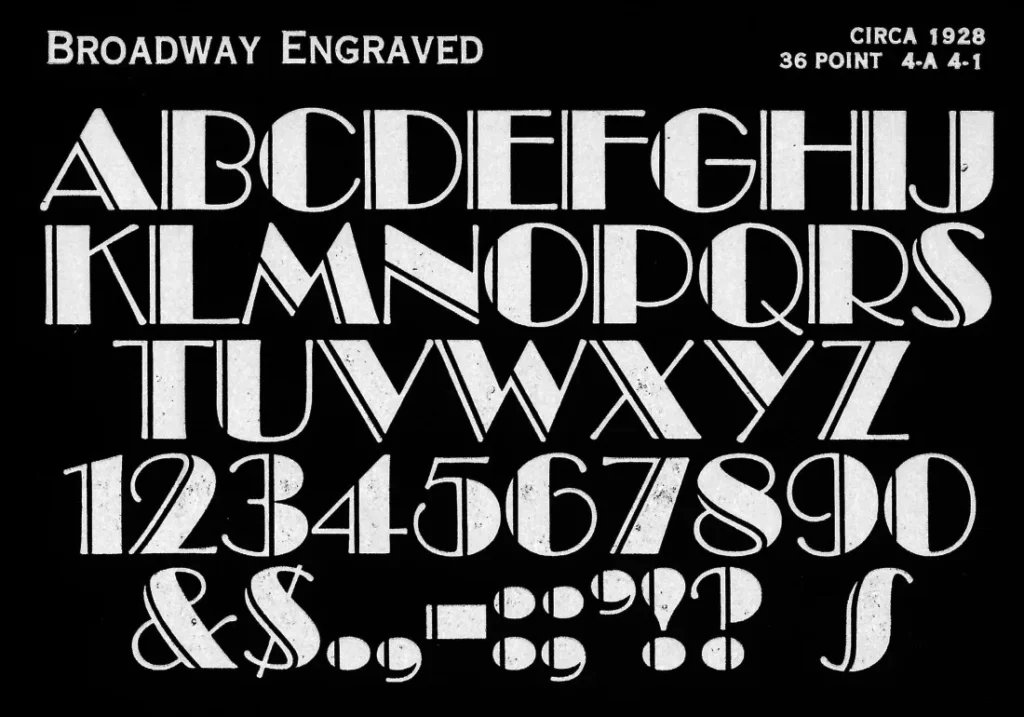
- Broadway: An Art Deco font from the 20s that had a massive resurgence in the 80s. Its dramatic, high-contrast geometric forms were perfect for the decade’s obsession with glamour and luxury. Great for a bar, hotel, or fashion brand that wants a touch of sophisticated decadence.
The 1990s: Grunge, Rave Culture, and Digital Anarchy
The 90s were a reaction to the slick commercialism of the 80s. Design became deconstructed, chaotic, and experimental. The rise of desktop publishing and programs like Photoshop meant designers could break, distort, and layer type in ways they never could before.
The Vibe: Deconstructed, distressed, and done with rules.
- Keedy Sans: A chaotic serif font that breaks all the rules. The letterforms are inconsistent and jarring, perfectly capturing the experimental, “anti-design” attitude of the early 90s. Use this only if your brand’s core identity concerns rebellion and deconstruction.
- Mason Serif: Originally named “Manson,” this font has a dark, gothic, and slightly unsettling feel. It was widely used in the 90s for alternative music and subculture magazines. It’s an edgy choice for a brand that wants to appear mysterious or historical with a modern twist.
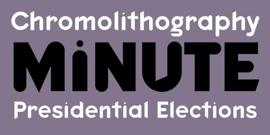
- FF Blur: A font that looks exactly like its name. Designer Neville Brody created it by applying a blur filter in Photoshop. It captured the motion and energy of 90s rave culture and digital experimentation. It’s a statement font, best used for a single, impactful word.
- Fobia: A condensed, geometric font with a cold, industrial feel. It’s reminiscent of 90s sci-fi movies and rave flyers. It works well for modern tech companies, electronic music labels, or streetwear brands that want a minimalist but edgy look.
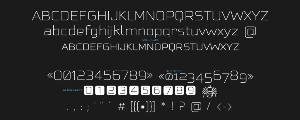
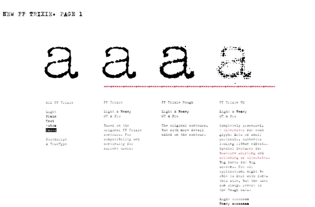
- FF Trixie: The quintessential grunge typewriter font. FF Trixie looks like it was hammered out on a faulty machine, left in the rain, and photocopied three times. It defined the lo-fi, analogue aesthetic of the 90s, serving as a gritty backlash to the slick digital perfection of the 80s. It’s ideal for any brand wanting to project a raw, unfiltered, and authentic identity—think independent record labels, artisanal distilleries, or any business built on a foundation of authentic storytelling.
How to Use Retro Fonts Without Looking Cliché
You have the list. Now for the hard part: execution. Here are three rules to keep your design from looking like a bad costume.
Rule 1: Use It as a Statement, Not a Paragraph
The most impactful retro fonts are display fonts. They are designed for logos, headlines, and posters. Do not, under any circumstances, set your website’s body copy in Arnold Böcklin or Keedy Sans. Your message will be completely unreadable, and you will look like an amateur. One strong headline is enough.
Rule 2: Pair with a Clean, Modern Counterpart
Pair a retro font with a simple, modern font to make it feel intentional and not dated. If you use the bold, curvy Cooper Black for your main headline, use a clean, neutral sans-serif like Open Sans or Lato for your body text. This contrast creates visual balance and makes the retro choice feel like a deliberate stylistic flourish.
Rule 3: Context is Everything
Finally, consider where the font will live. A funky 70s font might look brilliant on a beer can, but utterly bizarre on a financial consultant’s business card. The font must serve the brand’s personality, its industry, and the expectations of its audience. If there’s a disconnect, the whole message falls apart.
Ready to Build a Brand That Lasts?
A font is more than an aesthetic choice; it’s a strategic business decision. It sets the tone for your entire brand. A retro font can inject personality and tap into powerful cultural memories, but only when used with precision and a deep understanding of its context.
If you’re staring at this list and wondering if ITC Benguiat makes you look adventurous or just derivative, it might be time for an expert opinion. We build brands that use design with intent. At Inkbot Design, we go beyond just picking what’s cool; we find what’s right for your business.
Frequently Asked Questions About Retro Fonts
What defines a font as “retro”?
A retro font is a typeface that imitates a style from the recent past, typically from the 1950s through the 1990s. It’s not just an old font; it’s a font that intentionally evokes a particular era’s specific cultural and design aesthetic.
Can I use a retro font for my logo?
Absolutely. Many retro fonts, especially bold display styles, are excellent for logos because they are distinctive and full of personality. The key is to ensure the font’s vibe matches your brand’s core message.
What’s the difference between “retro” and “vintage”?
Generally, “vintage” refers to something that is authentically old. “Retro” refers to something new but imitating an old style. The terms are often used interchangeably in typography, but “retro” usually implies a more modern reinterpretation of a past style.
How do I pair a retro font with another font?
The best practice is to create contrast. Pair a highly decorative retro display font (for a headline) with a simple, clean, and legible sans-serif or serif font (for body text). This ensures your design is both stylish and functional.
Are retro fonts unprofessional?
Not at all. A well-chosen retro font can make a brand feel established, cool, or authentic. A poorly chosen one can make it feel dated and unprofessional. The professionalism comes from the strategic intent behind the choice.
What is the most popular retro font?
Fonts like Helvetica and Futura have remained timelessly popular since the mid-20th century. For a more stylistic “retro” look, Cooper Black has seen a massive resurgence in recent years for its friendly, bold appearance.
Can I use these fonts for commercial projects?
It depends on the font’s license. Many classic fonts require a commercial license for business use. Always check the End User License Agreement (EULA) before using a font for your brand to avoid legal issues.
What decade’s font style is trending right now?
Trends cycle constantly, but recently there’s been a strong resurgence of 70s-style typography (chunky serifs, funky curves) and 90s-inspired aesthetics (grunge, experimental layouts).
Should my entire brand use a retro theme?
It’s a risky strategy. Unless your business is explicitly about nostalgia (like a retro arcade or vintage clothing store), it’s often more effective to use retro elements as an accent within a modern branding framework.
If you want to move beyond simply picking a “cool” font and start building a truly intentional brand, our team is here to help. We live and breathe this stuff. Request a quote from Inkbot Design when you’re ready to create a visual identity that works as hard as you do.


