Minimalist Web Design: Why Less is More in Websites
Minimalist web design is a strategic discipline that improves user experience (UX) and conversion rates by intentionally removing non-essential elements.
It leverages core principles like ample negative space, a clear visual hierarchy, clean sans-serif typography, and a limited colour palette to reduce cognitive load for visitors.
By creating an uncluttered path to the primary call-to-action (CTA), this approach guides users effectively, boosting engagement and driving measurable business results.
- Minimalist web design focuses on essential elements, enhancing clarity and user experience, leading to higher conversion rates.
- Embracing minimalism reduces visual clutter, making navigation easier and improving cognitive load for users.
- Key features of minimalist design include white space, strategic typography, and purposeful colour usage.
Historical Context of Minimalism in Design

Minimalism as a design philosophy traces back to the Bauhaus school in the early 20th century.
The Bauhaus movement emphasised functionality and “less is more.” These principles have shaped modern design across various fields.
In the digital realm, minimalism found its footing in the 1990s as the internet became more accessible. Designers sought faster, cleaner, and more user-friendly interfaces.
The shift towards minimalism helped reduce visual clutter, aligning with user-friendly approaches that remain important today.
As minimalism gained traction in design and architecture, its influence extended into digital spheres. The transition from complex, image-heavy websites to cleaner, text-focused designs in the early 2000s marked a notable shift.
This evolution coincided with the rise of broadband internet, allowing designers to try whitespace and typography without limited bandwidth constraints.
The principles of minimalism resonated with developers seeking efficient and effective user interfaces, leading to its widespread adoption in web design strategies globally.
Why Less is More in Web Design

For many of us nowadays, our online experience feels cluttered. So much is fighting for our attention – ads, notifications, pop-ups. When a site opts for minimalism, it feels like a soothing oasis.
Some key advantages minimalist web design offers include:
Focus
By stripping away extraneous elements, minimalism focuses attention on what matters most. Be ruthless in cutting elements that distract from your core message and purpose. Remove anything that competes unnecessarily with the most important content or functionality.
With fewer competing elements, users' eyes will naturally be drawn to the primary value you offer. Essential content, calls to action and conversion paths will become crystal clear.
Clarity
With less visual noise, minimalism brings increased clarity. Users instantly understand what your site is for and how to use it.
Navigation choices become apparent when you pare back secondary menu items. Forms guide users seamlessly when you limit them to only essential fields. The instructional copy gets absorbed quickly when written concisely and clearly.
By eliminating clutter, minimalism ensures no core content gets lost in a sea of peripheral elements.
Elegance
Thoughtful, strategic reduction creates a refined elegance. Minimalism feels clean, sophisticated and timeless when done right.
Carefully considered design choices like spacing, typography, grid alignment and colour usage take on greater significance with fewer competing elements.
Whitespace allows the remaining pieces to breathe. Every element earns its place by adding value. Nothing distracts from the gracefully pared-down core experience.
Accessibility
With fewer bells and whistles, minimalism naturally optimises for accessibility. More users can easily access and navigate your content.
Simple, logical layouts make navigation more understandable for all—reduced motion and animation lower barriers for those susceptible to vestibular disorders. Accessible colour contrasts become easier to manage. Minimalist sites enhance experiences for more users universally.
Performance
More straightforward sites load faster. Minimalism enhances site performance, which boosts SEO rankings and user experience.
Limiting bloat, such as unoptimised images, excessive fonts, and cluttered code, streamlines performance. Sites feel snappier, boosting engagement and conversion metrics. Quickly loading sites feel more modern, encouraging return visits.
Scannability
We skim-read online. Minimalist sites – with concise copy and clear visual hierarchy – cater to how we consume content today.
Short paragraphs, generous whitespace, and strategic formatting like bullet points enhance scannability. Thoughtfully highlighted key text guides eyes through important content quickly. Minimalism creates visual interest even when users only partially read.
Differentiation
In a busy online world, minimalism stands out. It creates visual interest through simplicity rather than complexity.
Minimalism makes a bold statement by swimming against the tide of flashy, cluttered sites competing for attention. It signals confidence and focus on user needs above distracting bells and whistles.
The power of subtraction captures users’ interest by giving them less to process. Savvy users appreciate minimalism for respecting their time and attention.
Flexibility
Minimal foundations allow for flexibility. You can build on top of a simple base without clutter.
When you cut interfaces and experiences down to the essentials, you create room to expand and evolve elegantly. New features and content can be added while retaining simplicity by building on solid, minimal foundations.
Future possibilities unfold organically without having to undo previous clutter. Minimalism sustains sites through growth and iteration.
Psychological Benefits of Minimalist Design
Minimalist design reduces the mental load for users. By presenting fewer elements and distractions on a page, users find it easier to process information. This leads to better focus and less mental fatigue.
Studies show that clean, open spaces in design can improve mood and provide greater clarity in decision-making.
In essence, minimalism aligns human-computer interaction with our natural inclinations for order and simplicity.
Minimalism not only decreases mental load but also helps with completing tasks. Users encounter fewer elements and options, reducing potential decision paralysis.
This streamlined experience supports typical user goals, such as finding information quickly or completing transactions easily.
Moreover, minimalist design can contribute to lower bounce rates, as visitors are more likely to stay engaged with structured and easy-to-spot content.
Overall, these psychological benefits are grounded in research confirming simplicity's positive impact on user satisfaction and retention.
Characteristics of Minimalist Web Design

Minimalism may seem simple, but much thought and refinement go into executing it effectively. Here are the critical qualities of minimalist sites done right:
Restraint
Every element should add value. Restrain the impulse to add more. Determine the absolute essentials.
Show discipline in limiting buttons, icons, options, and links to strictly what's necessary. Every additional element should serve a distinct purpose, not just fill space.
Building restraint into design systems is helpful. Establish the most minor viable UI and expand cautiously only when truly needed.
White Space
Blank space reduces visual noise. Don't fear empty areas; leverage them.
Whitespace directs focus by isolating key content and visual elements. Use it generously, even if it feels uncomfortable at first. White space amplifies each component by allowing it to stand out.
Let whitespace be a design element, not just a passive filler. Carefully craft blank spaces to draw attention just as you would with an image or text block.
Typography
Text is central to minimalism. Make deliberate choices to amplify content.
Robust vertical rhythm through thoughtful line spacing and sizes creates visual interest. Consistent styles, but with purposeful variation for hierarchy, add contrast without clutter.
Condensing and expanding whitespace between letters and words makes copy more consumable while still feeling simple.
Colour
Use colour strategically as an accent, not the main event. Keep palettes simple.
One brightly coloured call-to-action button draws the eye amidst muted shades. Understated colour reinforces the minimalist aesthetic while allowing selective pops of vibrancy.
Limiting palettes to just a few harmonious tones retains simplicity. Stay intentional about when and how to deploy bright colours for the most significant effect.
Photography
Clean, striking images reinforce the minimalist aesthetic.
Every photo should enhance visual clarity and purpose. Fill frame space generously with compelling subject matter.
Carefully controlled colour palettes in imagery align with the overall minimal style. Provide just enough context to be understood without distracting elements.
Layout
Thoughtful grids, columns, and alignment enhance minimalism.
Precise alignments and white space make each component crisper. Items feel considered and intentional, not slapped together arbitrarily. Consistent margins and spacing add hidden order.
Grid systems lend flexibility within minimalist frameworks. Elegant responsive layouts retain simplicity across device sizes.
Microinteractions
Small but delightful interactions paired with reduction please users.
Subtle animation on hover or focus can add life to pared-down UIs. Icons that indicate state changes capture attention without clutter.
A current page indicator that transforms during scrolling lends dynamism but still feels restrained. Delight comes from adding motion without distraction.
Hidden Navigation
Hide lesser-used menu items to spotlight primary paths.
Revealing secondary links only on hover or menu expansion creates clarity. Show users what they need while hiding advanced options under the hood.
Forcing choices between a few prominent routes makes selections obvious. Hidden links reduce noise while retaining easy access.
Scrolling
Scrolling through minimalist sites feels cinematic; no clicks are required.
Long-form scroll encourages users to proceed through logical content chunks. Progress bars or highlights add feedback during the scroll without interruption.
As Tom Grinstaff notes, “Scrolling is reading. Don't interrupt.” Smooth scrolling preserves continuity between sections, heightening engagement.
Mobile Optimisation
Reductionism and restraint primarily serve small mobile screens.
Progressive disclosure and hidden menu options prevent overwhelming users. Tapping reveals more opportunities only on demand. Mobile forces vitality – every element must earn its place.
Concise single-column layouts avoid awkward alignment or tiny tap targets on small screens. Restraint allows adaptable flow between breakpoints.
Technical Implementation of Minimalist Design
Implementing minimalism requires careful technical steps. Opt for lightweight coding practices, ensuring swift loading times and smooth interactions. Modern CSS frameworks like Flexbox and Grid help create clean, responsive layouts.
Mobile-first design is key, ensuring that the minimalist approach translates well across devices. Tools optimising images and scripts maintain the lean aesthetic, delivering an efficient and pleasant user experience.
Beyond design principles, implementing minimalist design involves practical considerations.
Utilise caching strategies and content delivery networks (CDNs) to optimise loading speeds. Streamlined code reduces server requests, enhancing performance.
Leveraging vector graphics instead of raster images preserves quality at various screen resolutions, aligning with the minimalist idea of efficiency.
Modern JavaScript frameworks can also aid in creating engaging yet lightweight interactions, ensuring minimalism does not compromise function or user engagement.
Examples of Brilliant Minimalist Web Design
The best way to appreciate minimalism is to experience it. Let's look at real sites employing minimalism skillfully and extracting key takeaways:

Airbnb
The hero images instantly convey Airbnb’s purpose. Booking forms are decluttered with only essential fields, and hidden navigation spotlights core actions while maintaining access. The mobile layout distils even further.
Takeaways:
– Hero focus guides users
– Decluttered forms simplify tasks
– Hidden nav prioritises primary actions
– Mobile refinement enhances minimalism

Medium
Medium's content has maximum impact with stripped-down sidebars and toolbars. Typography, colour and whitespace amplify readability. The UI adapts seamlessly for mobile reading and consumption.
Takeaways:
– Distraction-free reading experience
– Adaptive UI across devices
– Generous whitespace for skimming
– Clean frames highlight content

Apple
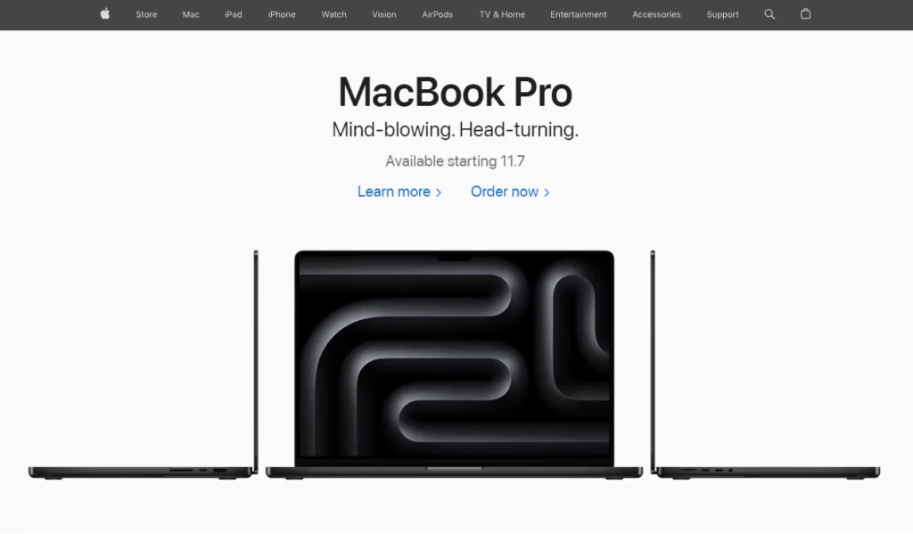
Apple's site focuses enormously on imagery paired with a simple but striking copy. Animations and videos draw you in when scrolling. The footer is nearly blank, shifting focus to campaigns.
Takeaways:
– Strong visuals set the tone
– Concise copy provides detail
– Animation and video engage users
– Reduced footer declutters the experience

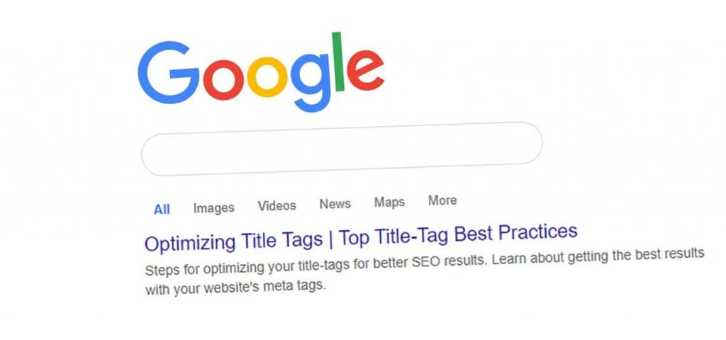
Google demonstrates the power of a minimalist homepage focused solely on its core search product. The desktop layout adapts seamlessly to mobile. Only critical links appear in the footer.
Takeaways:
– Single product focus
– Adaptive UI across devices
– Pare back secondary links

Basecamp
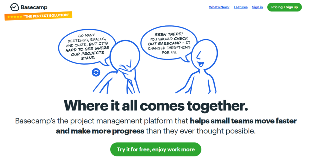
Strong typography and whitespace enhance Basecamp's minimalist aesthetic. Pops of colour highlight only the most essential actions. Carefully chosen illustration reinforces messaging.
Takeaways:
– Whitespace creates breathing room
– Restrained colour draws attention
– Purposeful imagery aligns with style

GitHub
GitHub focuses almost entirely on showcasing user content. Forms, navigation and headers take a backseat. The aesthetic adapts beautifully across device sizes.
Takeaways:
– Content-first to engage users
– Fluid responsive design
– Decluttered frames spotlight content
Minimalism vs. Other Design Trends
Minimalism contrasts sharply with trends like maximalism, which embraces excess and complexity.
While maximalism thrives on bold colours and detailed designs, minimalism focuses on simplicity and functionality.
Another trend, brutalism, offers a raw, unpolished look, rejecting the sleek aesthetics of minimalism.
These design philosophies cater to different audiences and purposes, demonstrating the breadth of creative approaches in web design.
Tips for Adopting a Minimalist Mindset

Minimalism requires practice and restraint. Adopting a minimalist mindset takes work but pays dividends for your sites. Here are tips to guide you:
Start with purpose
Establish one clear objective and orient everything around that north star.
Declare the most critical goal of your site. Let this focus guide design decisions. If elements don't directly serve the purpose, scrutinise their necessity.
Focus relentlessly
Continuously question what enhances the purpose vs distracts from it.
Be vigilant about anything that pulls attention away from your established purpose. Recognise when interesting ideas or elements stifle your core message. Restraint leads to a more significant impact.
Embrace emptiness
Don't fear white space; leverage it to create focus.
Allow breathing room between elements. If sections feel crowded, spread components out. Whitespace amplifies importance by isolating essential items.
Declutter aggressively
Cut anything that isn't essential.
Err on the side of removing elements, even if they seem friendly. Fewer pieces create clarity, even if it feels too sparse at first. You can always add back selectively later.
Pare back navigation
Spotlight primary paths hide secondary ones.
Prominently feature only the most critical navigation links. Tuck away advanced options under “More” expandable menus. Limiting choices focuses decisions.
Reduce motion
Use subtle animation for highlighting only.
Reserve motion for functional feedback, like transient notifications. Avoid overactive animations that feel distracting rather than informative.
Make mobile a priority
Constraint breeds creativity—mobile forces necessary reduction.
Designing mobile-first naturally promotes minimalism. Visually complex patterns fail on small screens. Mobile provides helpful constraints to focus efforts.
Edit, edit, edit
Write shorter, tighter copy.
Edit text vigorously to crystallise ideas. Avoid generic filler or promotional language. Every word should add value and clarity.
Limit colour palette
Let one colour be the visual accent.
Use a single vibrant shade as your hero colour for primary buttons or highlights. Apply colourful accents very intentionally for maximum impact.
Select images carefully
Choose photos that align with the aesthetic.
Curate photos with an eye for minimalism. Tight crops, negative space and solid colours enhance the clean style.
Whitespace is your friend.
Use it generously to direct attention.
Treat space as an asset to establish visual hierarchy, not just empty filler between components. Craft whitespace intentionally.
Sometimes, less is more.
When in doubt, subtract. Seek elegance through simplification.
Err on the side of restraint and reduction until proven essential. Limiting scope provides focus. Do less, but better. Let quality trump quantity.
FAQs About Minimalism in Web Design
What are some of the benefits of minimalist web design?
Minimalism offers many benefits, including increased focus, clarity, elegance, accessibility, performance, scannability, differentiation and flexibility. It serves the modern mobile experience exceptionally well. Minimalism creates sites and apps that feel refined and intentional by reducing clutter and distraction. Well-crafted simplicity captures user attention in a busy digital world.
What are some critical characteristics of minimalist design?
Essential characteristics include visual restraint, generous use of whitespace, typographic focus, strategic colour schemes, purposeful photography, thoughtful layouts, subtle micro-interactions and hidden navigation. These qualities require careful planning and refinement to execute elegantly. Done right, they work together to create uncomplicated but engaging user experiences.
What makes minimalism so effective for mobile sites?
The constrained screens of mobile devices make minimalism particularly effective. More elements compete for attention on small screens, so reducing visual noise ensures clarity. Minimalism also loads faster on mobile. Hidden navigation, concise copy, restrained layouts, and simplified workflows serve the unique constraints of mobile contexts exceptionally well. Minimalism adapts seamlessly across device sizes.
What are some tips for adopting a minimalist mindset?
Tips include orienting around a clear purpose, focusing relentlessly on the essential, embracing emptiness and white space, decluttering aggressively, prioritising mobile and editing copy and content rigorously. Adopting minimalism requires practice in subtraction and restraint. However, the benefits of elegant simplicity are well worth the diligence and discipline.
How can you add visual interest while still keeping a minimalist look?
Strategic use of photography, subtle animations, cinematic scrolling, adaptive layouts, and selective use of bright colours can add visual punch while retaining a minimalist aesthetic. When adding interest, remember how each component complements the reduced core experience. Enhance dynamism through intentional flourishes, not cluttered overstimulation.


