
10 Typography Quotes for Graphic Design Inspiration
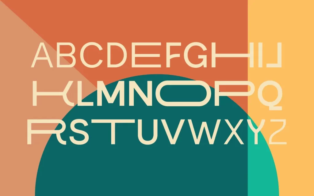
Typography quotes are concentrated doses of wisdom from design masters, offering inspiration and reinforcing the timeless principles of visual communication.
From Massimo Vignelli’s focus on clarity to Paul Rand’s strategic insights and Steve Jobs' reverence for the art, these statements distil decades of experience.
These maxims remind designers that typography is not mere decoration but the fundamental skill of giving language a visible voice, shaping meaning, and creating a powerful emotional impact.
- Typography is essential for visual communication, shaping meaning and evoking emotional responses.
- 2026 will see a trend towards minimalism, with refined typography and negative space prioritised.
- Serif fonts are making a comeback, valued for readability and sophistication in design.
- Variable fonts offer flexibility, enabling designers to create diverse typographic expressions efficiently.
- Creativity in typography engages audiences, making design both functional and visually impactful.
The Ultimate Dose Of Inspiration in Typography Quotes
The design world constantly evolves, with new trends that shape aesthetic styles and visual culture each year. As we get close to 2026, several critical graphic design trends will likely define the look and feel of the year ahead.
One overarching trend is the continued minimisation of typography. Font sizes and styles are becoming increasingly refined and subtle across branding, advertising, web design, and beyond.
This ties into the ongoing embrace of negative space and airy, uncluttered layouts. While typography remains a core design element, there is a shift toward restraint and using text more sparingly to create visual breathing room.
Relatedly, there is a movement toward more simplified, stripped-down typeface styles. Bold, chunky fonts give way to thin, delicate fonts and a lighter typographic touch overall. This includes both display fonts and body copy. Designers are letting the visuals talk more and dialling back on typographic flair.
This ties into the rise of gradient colours, which lend a soft, blurred effect to blended graphics. Paired with minimalist typefaces, gradients can create a hazy, ethereal aesthetic. Vintage pastel colours are also increasingly popular for creating a soothing, relaxed mood.
Mobile-first responsive design continues to be central, with mobile optimisation a must for our digital world. Typography and layouts need to adapt seamlessly for optimal smartphone and tablet viewing. As screen sizes shrink, clean, compact typography becomes increasingly essential.
While trends may come and go, thoughtful typographic design, strategic use of negative space, and keeping the user experience in mind will always be pillars of effective graphic design. Paying attention to emerging styles can inspire innovation and allow designers to stay current while always keeping timeless principles in mind.
Keep it diverse

“Building a good font collection is like populating one's wardrobe. It requires a balance between versatility and expressivity… everyday accessories, and special outfits, for special occasions.”
Jean-Baptiste Levee
2026 marks a shift in typography trends, moving from strict sans serif and symmetrical styles to more expressive and variable font designs. This reflects a growing appreciation for typography's creative potential beyond pure functionality.
Handmade, artisanal fonts have risen in popularity for several years now. But 2026 will see designers embrace even more dramatic flourishes and imperfections to capture the charm and character of human penmanship. New fonts feature elaborately swirling ligatures, uneven baselines, smeared edges, and other intricacies to emulate the natural rhythms of handwriting.
At the same time, variable fonts allow typographers to fine-tune the weight, width, slant and other attributes along a continuous spectrum. This enables subtle typographic expression, which is impossible with traditional static fonts. Designers can stretch, condense and modulate letterforms to evoke moods and tones within a single typeface.
The expanding diversity of font styles reflects a more playful, experimental attitude emerging in the design world. Typography is appreciated as an art form, not just a transparent vehicle for communication. The type conveys personality and emotion. It sets a tone and affects reader responses on a visceral level.
This new creative freedom does require artistic skill and a keen eye for detail from typographers. But the possibilities are endless for innovating new fonts and font variations. 2026 will be a year for graphic designers to unleash their imagination and push typography in new creative directions. The visual landscape will flourish with more humanistic, expressive and surprising type designs that capture the artistry of the written word.
Simplicity is an ever-growing trend

“My world is black and white. I like straight lines and curves. I am happy in that world.”
Bruno Maag
With their small embellishments on letters, Serif fonts have long been overlooked in favour of sleek and modern sans-serif fonts. But after decades out of favour, serif fonts are making a significant comeback in 2026.
This resurgence can be seen across visual design and typography. Serif fonts like Baskerville, Palatino, and Times New Roman are being embraced again for their classic, distinguished look. What once felt stuffy and old-fashioned now feels grounded, reliable, and rich.
The key to serif fonts' renewed popularity lies in their high readability. The extra strokes on letters help lead the eye smoothly from one character to the next. This makes serif fonts ideal for long text passages, like books and articles. Studies show serif fonts can be read up to 10% faster than sans-serif.
Proper spacing is crucial when using serif fonts. Careful attention should be paid to kerning – the space between letters. Consistent spacing creates an even texture that further aids readability. Similarly, leading – the distance between lines – should provide enough separation between descenders and ascenders. With optimal letter and line spacing, serif text achieves a lovely rhythm on the page.
Beyond readability, serif fonts impart sophistication and authority. Brands leverage this effect on their websites and print materials to make the right impression. Law firms, banks, universities, and other institutions can reinforce their professionalism and gravitas with serif typography.
With personalities ranging from stately to whimsical, serif fonts inject visual interest. Pairing them with a minimalist design creates an appealing contrast. From logos to signage to menus, serifs bring warmth and humanity through their handcrafted origins.
So whether aiming for credibility, excellent readability, or old-world charm, serif fonts are back in vogue. Their stylish versatility makes them a top choice for web design, branding, editorial, and more in 2026.
A simple makeover

“The beauty of type lies in its utility; prettiness without readability serves neither the author nor the reader.”
James Felici
Phototype brutalism has emerged as one of the most notable font trends of 2025. This contemporary take on the stark, bold sans serif styles popular in the 1970s is characterised by high-contrast, dramatic letterforms that pack a visual punch.
After years of dominance by playful, bubbly typefaces, phototype brutalism represents a pendulum swing back toward stark, imposing typography. Designers are embracing the gritty, urban feel of phototype brutalism to make a bold statement and add an air of stoic authority to their work.
Phototype brutalism is about dropping ascenders and descenders for a dramatic, truncated effect. Letterforms are ultra-bold and set tightly together, creating a sense of visual tension. Phototype brutalism evokes past eras' no-nonsense, pragmatic simplicity by stripping away flourishes and playfulness.
Yet this revival also incorporates modern innovations in typography. Contemporary phototype brutalism fonts mix weighted and oblique letterforms to create eye-catching displays. Dramatic highlights, shadows, gradients, and textures add new dimensions. The influence of glam rock and genderfluid aesthetics brings a flair for the dramatic.
This innovative styling makes phototype brutalism highly legible and impactful for headings, posters, and short copy. Coupled with its nostalgic institutional vibe, many design experts predict this trend will dominate not just in 2026 and beyond. While the hyper-bold letterforms may soften over time, phototype brutalism’s straightforward, no-fuss aesthetic seems poised for an extended stay in the limelight.
A visual appeal is never enough

“Display type is a visual voice. Without, reading, it imparts its message.”
Laura Worthington
Animation has become ubiquitous across industries in the modern era, with the design sector being one of the biggest beneficiaries of this burgeoning trend. Animation studios specialise in infusing creative flair and visual dynamism into web content and designs. Many designers today are leveraging text-hovering techniques to deliver enhanced user experiences.
However, animating entire blocks of text warrants careful thought and consideration. Due to technical constraints, animated text sometimes fails to render correctly on mobile screens.
When crafting optimal animated text, beginning with legible, comprehensible lettering styles and fonts is wise. While shifting, morphing letterforms can captivate users' attention. Restraint is prudent regarding the speed and frequency of motion.
If overdone, extensive text animation risks confusing users and disrupting reading comprehension. Animation is best deployed to selectively highlight critical messages, titles, CTAs, and other essential text-based elements.
Successful execution requires finding the right balance between mesmerising motion and clarity. The most effective animated text leverages movement to grab interest while remaining easy to parse at a glance. With mobile usage exploding, designers must test animated text on various devices and optimise delivery.
Some tips include allowing sufficient line spacing, not overloading pages with multiple concurrent animations, and keeping animations relatively subtle and contained. While animated text introduces challenges, it can take web content to the next level, amplifying visual impact and user engagement when thoughtfully implemented.
Kinetic Typography as a Storytelling Tool
Right, so we've talked about animating text. Hover effects and simple fades are fine, but that's just scratching the surface. The real game-changer is kinetic typography. Look, this isn't just making text move; it's making text perform. The words themselves become the actors in your story.
Think about it. Instead of a static block of text, the words appear in sequence, guiding the viewer's eye exactly where you want it. You can have a word slam onto the screen to make a point, or have a sentence drift in gently to create a softer mood.
It’s the difference between someone reading a script and a great actor delivering the lines with perfect timing and emotion. The message doesn't just get read, it gets felt.
This is massive for things like social media ads, where you have seconds to grab someone's attention. A well-executed kinetic type video can stop the scroll dead. It's also brilliant for explainer videos, where you can literally build the narrative on screen, word by word.
The key isn't just the movement itself, but the timing, the easing, and the way the text interacts with the space. It’s a proper skill, but get it right, and your message becomes ten times more memorable.
Variability is every designer's new best friend

“Form and function together create typographic excellence.”
R. Roger Remington
Variable fonts are revolutionising the world of typography and graphic design. As the name suggests, variable fonts allow for variation and flexibility within a single font file. Whereas traditionally, each font had only one weight, width, and style, variable fonts contain a range of possibilities along different axes like weight, width, slant, and even optical size.
This lets designers quickly access a spectrum of font variations rather than switching between separate font files. A single variable font can morph and adapt seamlessly from thin to black, condensed to extended, and upright to italic. This grants designers immense creative freedom when fine-tuning typography for different uses.
The efficiency of variable fonts is another considerable advantage. Using a single variable font reduces file size and loading times compared to loading multiple fonts. This makes them well-suited for web and app design. They also streamline workflows for designers, saving time and effort switching between fonts.
While variable fonts unlock new potential, they build on the rich history and craft of typography. Many variable fonts incorporate a range of stylistic traits, from calligraphic pen strokes to the warmth and imperfections of vintage wood type. This allows designers to imbue typography with extra versatility and character.
Looking ahead, there is still so much uncharted territory when it comes to pushing the creative boundaries of variable fonts. Typographers and type foundries continue to experiment with innovative new axes and possibilities. Variable fonts enable custom font variations never seen before.
As variable fonts become more widely adopted, they promise to shape the future of responsive, adaptive, and expressive typography.
Let the users be your judge

“Your choice of typeface is as important as what you do with it.”
Bonnie Siegler
Using smaller text sizes in typography continues to grow in popularity. However, many designers still rely on multi-lined headers to convey messages effectively. The notion that a single word can entice users is a myth – more information generally leads to higher engagement.
When stacking multiple lines of text, careful typeface selection is critical. Choose fonts that allow proper line spacing and maximise readability. With this style, the flow of text across lines requires special attention.
Since stacked text forms vertical blocks, positioning the blocks on the left and right sides creates balance. This aids in aligning other elements for a cohesive, engaging design.
Proper alignment also enables the eye to flow smoothly across lines. Avoid ragged edges and inconsistent spacing between letters, words and lines. Generous leading between lines and strategic letterspacing improve scannability. Stacking lines of text in columns or sections with divider lines further enhances organisation and readability.
Convey tonality through strategic font choices. Display fonts with personality. Suit headlines, while cleanserif or sans serif body copy fonts improve legibility. Avoid overly elaborate scripts and handwritten styles for stacked text. Finally, be selective with typographic effects like shadows, outlines or gradients.
When overused, effects reduce legibility. With mindful, creative execution, stacked text captures users' attention and succinctly communicates messages.
Highlight the added visual appeal

“Type is what meaning looks like.”
Max Phillips
Highlighted typography, where letters are embellished with colourful highlights, outlines, shadows or other effects, has been a popular design technique in the graphic design industry for decades. While this style diminished in popularity, it seems poised for a significant comeback in 2024.
Though highlighted lettering never faded from use, it lost its place as a significant design trend and was mainly relegated to novelty fonts or selective usage. After years of minimalism dominating graphic design, highlighted typography is ready to reclaim its place as a versatile and visually engaging design element.
The possibilities with highlighted typography extend far beyond introductory highlighted text. Designers today are exploring creative ways to incorporate highlighted letters, including animating them, separating letterforms from their backgrounds, and experimenting with bold colours and gradients. This allows for eye-catching headings, titles, logos, and other key text elements.
The striking, graphic nature of the highlighted text makes it ideal for short textual content, like headlines, logos, invitations, social media graphics, and more.
The vivid colours and textures make the letters stand out and capture viewers' attention. Long blocks of highlighted text can become visually overwhelming, so restraint is recommended.
As brands and designers seek to produce engaging visual content, highlighted typography presents an opportunity to add visual excitement and energy.
This dramatic typography treatment injects vibrancy and personality into designs. Clever and strategic use of highlighted letters, words and phrases can capture interest and unforgettably communicate ideas.
Functionality over everything

“Type design is about function. Drawing pretty shapes isn't enough.”
James Todd
Layering text and images is one of the hottest trends in web design for 2026. This technique adds visual interest and depth to otherwise flat and dull website content.
Overlaying text on photos or videos is a form of layering that creates a cutout or see-through effect. The background image or video is partially visible through the letters, adding intrigue and texture. This lettering style is sometimes called a ghost effect or faded overlay text.
Utilising layering and overlays makes web content appear multi-dimensional and more dynamic. The overlapping elements blend to form a cohesive visual story rather than looking like disjointed, separate pieces.
Applying this effect to short phrases or single words in large display typefaces is best when using layered text. The text should be simple and legible to keep the underlying image manageable. Complex fonts or lengthy passages distract the viewer from fully appreciating the layered composition.
Overlay text works best when the background image has a solid focal point or minimal extra details. Busy backgrounds make it harder to read the text, undermining the visual impact.
For the most evident results, avoid adding additional effects like gradients, shadows, or outlines to the text or background elements. Simple, unfussy overlays have the most incredible visual pop.
With thoughtful typography choices and strategic placement over photos, layering creates appealing textural effects for modern web design in 2026 and beyond. This innovative technique transcends boring, expected layouts.
The Rise of 3D and Textural Typography
For what feels like an eternity, the design world has been obsessed with flat design. Clean, minimal, and let's be honest, sometimes a bit sterile. The thing is, designers are now getting their hands dirty with 3D tools, and it's completely changing the game for typography. We're talking about taking letters off the flat page and giving them weight, depth, and texture.
With software like Blender and Cinema 4D becoming more accessible, you can now create letterforms that look like they're made of actual, physical materials. Imagine a brand name that looks like it's forged from chrome, or a headline that appears to be carved from a block of ice. You can add imperfections, reflections, and shadows that make the typography feel tangible, like something you could reach out and touch.
This isn't for your body copy, obviously. Don't be a madman and write a whole blog post in letters that look like they're dripping with honey. This is for impact; it's for the hero section of a website, a magazine cover, or a massive poster.
It's a statement piece. It gives typography a sense of presence and permanence that flat text just can't compete with, creating an immediate, visceral reaction that makes a design stick in someone's mind.
Simple yet sophisticated

“Typography is an art. Good typography is Art.”
Paul Rand
Gradients in typography add visual interest and draw the reader's eye to essential parts of the text. This typographic technique subtly guides the reader through the content by using colour to highlight important words or phrases. When used thoughtfully, gradients can be an effective tool to improve readability and clarity.
There are many creative ways to implement gradients into typography. A simple linear gradient that transitions from light to dark can put the focus on a header or subject line.
Radial gradients emanating from a central point emphasise key terms by making them appear illuminated. More complex gradient patterns, like meshes and geometric shapes, add artistic flair. The colours selected for the gradient also impact the tone and feeling conveyed.
While some may see gradients as flashy or overdone, they can significantly enhance textual content when used with purpose. On the web, gradients integrate with flat, simple designs to add visual flair without overwhelming the user. The technique brings dimensionality and vitality to typography in a way that static, flat text cannot.
Gradients guide the reader, add emphasis, and bring energy to the text. But their power is subtle. When done right, gradients attract attention to the most meaningful parts of the text in an intuitive way.
They highlight critical information without being distracting. This makes gradients in typography one of the most underappreciated techniques for improving readability and engagement. With creative application, gradients elevate textual content on the web.
Customisation—the new trendsetter

“Type is a dance, and the designer is the choreographer, sort of.”
Richard Lipton
Typography is an integral part of graphic design that should be carefully considered. The urge to overly customise or ornament lettering can often lead designers astray. When a typographic design isn't working, it's usually best to leave the letterforms themselves untouched and straightforward. Radical alterations to the letter shapes often create more problems than they solve.
The choice of typeface is one of the most critical early decisions a designer makes. Typefaces have their personalities and connotations that influence how text is perceived. A thoughtful designer selects a typeface that enhances the message rather than fights against it. They understand that typography is about clarity and communication, first and foremost.
Some modern designers are bucking conventions and taking a more experimental approach to typography. Eager to stand out, they distort and manipulate letterforms to create custom display faces. While this can produce visually arresting results, these fonts usually lack versatility. Their eccentric shapes often reduce legibility and impact.
Moreover, the costs associated with commissioning original typefaces put them out of reach for many clients. As a result, they remain restricted to brands with deep pockets.
Moderation and restraint are valuable virtues in typography. Skilful designers know when to embellish and when to leave well enough alone. Though typographic fashions come and go, legible, reader-centric typefaces tend to stand the test of time.
Rather than chasing trends, designers are usually better off choosing a suitable typeface for the message and audience. Pushing typography beyond its functional purpose risks muddying meaning and communication. Typographic designs are usually most substantial when the letterforms themselves take a backseat to the words they spell out.
AI and Generative Typography
Look, let's talk about AI. People are either scared it's going to take their jobs or they think it's some sort of magic wand. It's neither. Thing is, AI is a tool, and if you're smart, you'll see it as the most powerful leverage you've ever had in your design toolkit, especially with typography.
This is where generative typography comes in. You're not just picking a font anymore; you're setting parameters and letting an algorithm generate completely new letterforms or entire font systems for you. It can create thousands of variations in minutes.
Think about the grunt work, like creating perfect kerning pairs for an entire font family. That's a soul-destroying task that AI can now handle, freeing you up to focus on the bigger picture.
And it's not just about saving time. AI can suggest font pairings you'd never have considered, based on analysing thousands of successful designs. It can generate countless layout options for A/B testing, so you're not just guessing which headline works best, you're using data to prove it.
This isn't about replacing creativity; it's about augmenting it. It handles the science so you can concentrate on the art.
Importance of typography

Typography is a crucial graphic and logo design element every digital designer should master. More than just making designs look artistic, thoughtful typography makes content more visually engaging and readable.
Creative use of fonts, sizes, weights, spacing, and alignment allows designers to add visual interest, hierarchy, and character to their work. Typography can guide the viewer's eye through a design, highlight important information, set the right tone, and make content more scannable.
In website design, typography brings clarity to page content. Readers can more easily scan and comprehend text when headings, body text, and captions use complementary but distinctive styles. Consistent typographic choices also contribute to a website's overall aesthetic.
Typography is often a central component for establishing identity for logos and branding. The shape and feel of a brand's name in a thoughtfully crafted font evoke particular emotions and ideas in consumers' minds.
In short, incorporating strong typography is critical for polished, professional design across all media. It takes graphic design from a purely visual exercise to one where aesthetics enhance functionality and readership. Designers who harness the power of typography create more impactful work that speaks to their audience.
A creative method of communication
Websites communicate their purpose through visual design. When you first land on a site, elements like typography, colour schemes, and layout quickly indicate whether it's a business, engineering, or other type of site.
Font styles signify formality or approachability. Colour palettes convey moods like vibrant, profound, or elegant. The arrangement of text, images, and whitespace implies priorities and values. All these details shape users' initial impressions and set expectations about the website's offerings.
Effective web design matches aesthetics to function. Business sites prioritise sleek professionalism. Engineering sites could emphasise technological precision with a technical aesthetic.
Careful use of typography, colour, and layout allows websites to nonverbally introduce their industries, brands, and goals to visitors. Visual presentation is a subtle yet influential communication between websites and users.
Grabs the attention of users
Choosing the right font is essential for quality typography. The font should be legible and match the tone of the content. Extremely plain or ornate fonts distract readers.
Font selection directly impacts the presentation and readability of web content. Thoughtful choices allow the content to shine while enhancing the user's browsing experience. Style, colour, and text size create typography that effectively communicates your message.
Designing for Accessibility and Inclusivity
Right, this is important. We can talk all day about beautiful typography, but if a decent chunk of your audience can't read it, what's the point? This isn't just about being a good person; it's about not being bad at business. Ignoring accessibility means you're willfully ignoring potential customers. It's that simple.
The first, most basic thing is colour contrast. If you're using light grey text on a slightly less light grey background, you've already failed. People with visual impairments won't see a thing.
The Web Content Accessibility Guidelines (WCAG) give you clear ratios to hit. It's not a suggestion; it's the rulebook for making things that actually work for human beings.
Then there's scalability. Your text needs to be responsive, meaning a user can zoom in on their phone without the entire layout breaking. This means using relative units like rems instead of fixing your text size in pixels.
Finally, your font choice matters immensely. Some stylish fonts are a complete nightmare for people with dyslexia because the letter shapes are too similar. Choose typefaces with clear, distinct characters and generous spacing. It makes the experience better for everyone, not just for a select few.
Shows your professionalism
Choose typography wisely to elevate your web content. The fonts, sizes, and styles you select showcase your design skills and integrate your professional values into the project. Typography is more than just making text look nice – it enhances quality and reflects your proficiency as a designer. With careful typography choices, you can take your web content to the next level.
Conclusion
Typography and its evolving trends have always been about pushing the boundaries of traditional styling approaches and perceptions. The art of lettering is a core element of typography that enhances the aesthetic quality of content and maintains readability and accessibility. Every design approach inevitably includes typography as a foundational component.
But typography offers more than just increased readability – it is also a powerful web content and branding marketing tool. Creative and strategic use of fonts, sizes, weights, colours, and styles allows designers to grab attention, set a desired tone, and communicate ideas more effectively.
As new genres emerge and technologies advance, typographic trends will continue to challenge norms and provide innovative ways to captivate audiences. Designers must stay up-to-date on the latest styles while also understanding the timeless principles of typography. The possibilities are endless for those willing to experiment with type and take risks to transform perceptions.
In summary, typography is so much more than embellishment. It is a strategic and integral part of impactful design across all media. Typographic trends come and go, but skilful typography will always be critical in cutting through the digital noise to deliver messaging creatively and clearly.
Designers should view typography as an opportunity to push boundaries, challenge assumptions, and guide audiences seamlessly through content.


