7 Web Design Basics Your Business Website is Probably Missing
Most small business websites are useless.
There, I said it. They’re pretty digital brochures that do little more than occupy a domain name. They cost money, they take time, and they generate next to nothing in return.
They exist because a business owner was told they needed a website. So they got one. They picked a template, argued over the shade of blue for three weeks, and uploaded a blurry photo of their office building. Job done.
But that website doesn’t do anything. It doesn’t generate leads. It doesn’t make sales. It doesn’t answer customer questions.
This guide is for people who are tired of having a digital paperweight. It’s about the web design basics that actually matter for business growth.
- Define one clear primary action for the site; every design decision must serve that business goal.
- Build strategy and information architecture first—map user journeys before choosing colours or templates.
- Prioritise UX: mobile‑first, fast load times, predictable navigation, and strong visual hierarchy.
- Use authentic content and readable copy with clear CTAs; ditch stock photos and write for humans.
First, Stop Asking the Wrong Questions
The entire web design process for most businesses starts on the wrong foot. It begins with questions about aesthetics.
“What colour should the button be?” “Can we make the logo bigger?” “Do you like this font?”
These are details. They matter, but they are not the foundation.
“What colour should the button be?” is less important than “Where does the button go?”
One question is about decoration. The other is about strategy.
A perfectly coloured button in the wrong place is invisible. A simple, default-blue button placed exactly where a user expects to find it will make you money.
Stop obsessing over paint colours before you’ve approved the architectural drawings.
It’s not about having a website but what the website does.
Before you speak to a designer or open a DIY builder, you need a one-sentence answer to this question:
What is the most crucial action a visitor should take on this website?
Is it to fill out a contact form? Buy a product? Sign up for a newsletter? Book a call?
Every single design decision must serve that one goal. A website is a tool built to solve a specific business problem. Define your situation first.
The Foundation: Strategy & Structure
This is the part everyone wants to skip. The boring groundwork determines whether your website will succeed or fail. Don’t skip it.

Information Architecture (IA): Your Website’s Blueprint
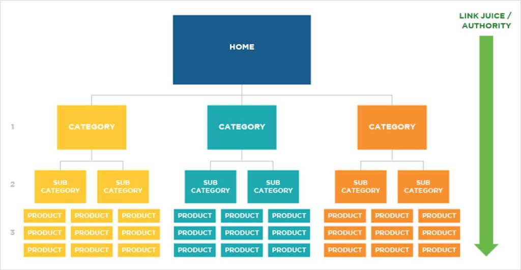
Information Architecture is a fancy term for organising your website’s content in a way that makes sense. It’s the blueprint. It dictates how information flows and how a user navigates from point A to point B.
You wouldn’t build a house without a blueprint, yet businesses throw thousands of pounds at websites with no structural plan.
Your IA isn’t a list of pages. It’s a map of user pathways.
Before you think about design, grab a pen and paper. Map out the journey. If a customer lands on your homepage looking for pricing, what clicks do they need to make to find it? How many steps does it take? Can you reduce them?
The Homepage Isn’t a Welcome Mat; It’s a Dispatch Centre
Here’s one of my biggest pet peeves. People treat their homepage like a polite greeting. It’s not.
The primary job of your homepage is to be a brutally efficient sorting mechanism.
Imagine three different people landing on your site simultaneously:
- A potential customer who knows their problem but has never heard of you.
- An existing customer looking for support.
- A journalist is looking for your contact details.
Your homepage must serve all three, instantly. It needs to act as a dispatcher, pointing each visitor to the exact internal page they need with zero friction or thought. It’s not a place to tell your life story.
Navigation That Doesn’t Make People Think
Your website navigation is not the place for cleverness. It’s the place for predictability. Users should be able to navigate your site with the part of their brain that runs on autopilot.
Use standard, established patterns.
- The logo is in the top-left corner, linking to the homepage.
- Main navigation across the top or on the left.
- Contact or use the “Request a Quote” button at the top-right.
When a user has to search for your navigation menu actively, you’ve already lost their trust and attention.
The Core Principles That Actually Drive Results
Once your strategy and structure are solid, you can focus on the design principles that guide the user and create a seamless experience.

Visual Hierarchy: Telling People Where to Look
Not everything on a page can be necessary. When you try to make everything stand out, nothing does.
Visual hierarchy is the art of using size, colour, contrast, and placement to guide the user’s eye to the most important element first, then the second, and so on.
A bold headline is more powerful than five small, competing text blocks. A single, brightly coloured “Buy Now” button is more effective than three buttons of the same colour. Your design must make the primary action obvious at a glance.
UX vs. UI: The Difference Between the Blueprint and the Paint
People use these terms interchangeably, but they are fundamentally different.
User Experience (UX) is the overall experience. Is the site logical? Is it easy to use? Can I accomplish my goal without getting frustrated? Bad UX is trying to push a door that says “pull.” It’s a structural problem. A company like Stripe has phenomenal UX; they make a complex payment processing service easy to navigate.
User Interface (UI) is the visual and interactive layer. It’s the buttons, the colours, the fonts, the sliders. It’s the look and feel. Good UI is the clear “Pull” sign on the door handle.
Here’s the key: Spectacular UI cannot fix broken UX. A beautiful website that is confusing to navigate will fail. Always solve the structural UX problems before you start decorating with UI.
Readability is King: Why Your Font Choice Matters More Than Your Logo
You can have the most persuasive copy in the world, but nobody will read it if it’s hard to read.
Readability is paramount. This isn’t about choosing a “pretty” font; it’s about selecting a functional one.
- Use sans-serif fonts for body text on screens (like Arial, Helvetica, Open Sans). They are generally easier to read on digital displays.
- Ensure sufficient font size. A good baseline for body copy is 16px. Anything smaller forces people to strain.
- Give text room to breathe with adequate line spacing (around 1.5x the font size is a good start).
The goal is zero-friction reading. If a user has to squint, you’ve failed.
White Space is Not “Empty” Space
White space, or negative space, is one of the most powerful tools in design. It is an active element, not a void to be filled.
It gives content room to breathe. It reduces cognitive load, making your pages feel less intimidating and more focused. It draws the eye towards the essential elements by separating them from everything else.
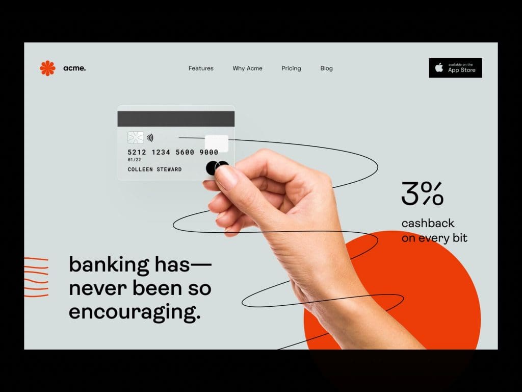
Look at Apple’s product pages. They use vast white space to make the product the undisputed hero. They understand that what you don’t show is as important as what you do.

The Technical Basics You Can’t Ignore
A beautiful design on a broken technical foundation is worthless. These are the non-negotiables that happen behind the scenes.
Mobile-First is Non-Negotiable
In 2025, over 60% of all website traffic came from mobile devices. If your website doesn’t work flawlessly on a phone, it doesn’t work.
This is why designers now use a “mobile-first” approach. You first design the experience for the smallest screen, then adapt it for larger screens like tablets and desktops.
This forces you to be ruthless with your priorities. You can only focus on the most essential content and actions on a small screen. It’s not about simply shrinking your desktop site; it’s an entirely different, more focused strategic approach.
Speed Isn’t a Feature; It’s a Requirement
A slow website will kill your business.
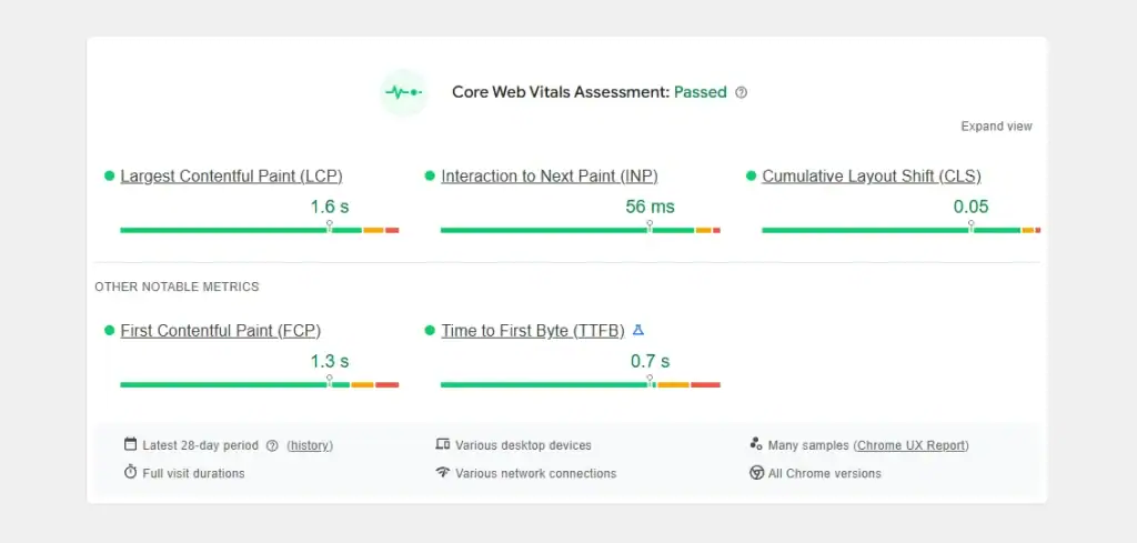
Data from Google shows that as page load time goes from 1 second to 3 seconds, the probability of a visitor leaving increases by 32%. Go up to 5 seconds, and it jumps to 90%.
Every single second counts. The most common culprit for slow sites is huge, uncompressed images. A beautiful, high-resolution photo is useless if it takes ten seconds to load and drives away the customer before they see it.
Page speed is also a massive factor for search engine optimisation. Google explicitly rewards fast websites and penalises slow ones. A quick site is no longer a “nice to have.”

Content: The Reason Anyone Visits Your Site in the First Place
Your design exists only to present your content. If the content is bad, the design doesn’t matter.
Ditch the Corporate Stock Photos
For the love of all that is good, stop using stock photos of smiling, ethnically diverse models pretending to be in a board meeting.
They are the visual equivalent of corporate jargon. They build zero trust and signal that your company is generic and has nothing real to show.
Use real photos.
- Photos of your actual team.
- Photos of your office or workshop.
- Photos of your product being made or used.
- Photos of your happy customers (with their permission).
Authenticity is magnetic. Generic is invisible.
Write Copy for Humans, Not for Google
Yes, SEO is essential. But you must write for a human first. Your copy needs to be clear, direct, and persuasive to a person.
Use simple language. Avoid jargon. Address your customers’ pain points directly and explain clearly how you can solve them.
And most importantly, every page needs a clear Call to Action (CTA). Never leave a user wondering what to do next. Tell them precisely what you want them to do: “Request a Quote,” “Buy Now,” “Download the Guide,” “Schedule a Consultation.” Be direct.
Universal Principles of UX
Stop following step-by-step guides that only teach you tactics. This book teaches you how to think. It’s the definitive encyclopaedia of the 100 universal principles of UX, from human biases to design laws. It’s the essential reference for mastering the ‘why’, not just the ‘how’.
As an Amazon Partner, when you buy through our links, we may earn a commission.
When DIY Becomes a Business Liability
Those drag-and-drop website builders are tempting. They promise a professional result for a low monthly fee.
And for a simple hobby blog, they can be fine.
However, for a business, they present a significant risk. The “Template Trap” is the belief that a good-looking template is a substitute for a unique strategy. It’s not. Your business isn’t a template, and your website shouldn’t be either.
Getting all the basics we’ve discussed right—the IA, UX, UI, hierarchy, speed, and content strategy—is a complex, interconnected process. This is where a professional approach stops being an expense and becomes an investment in a tool that generates revenue. This strategic thinking is the core of professional web design services.
The Bottom Line: Your Website is a Tool, Not a Painting
Stop treating your website like a piece of art to be admired. It is a tool in your business’s arsenal, and its performance should be measured.
Does it bring in leads? Does it make sales? Is it fast, straightforward, and easy to use?
Focus on ruthless clarity. Obsess over speed. Define a single, clear purpose for every page. If you get these web design basics right, you’ll have more than just a website. You’ll have a growth engine for your business.
Frequently Asked Questions (FAQs)
What is the most essential part of web design?
Strategy. Before any design work begins, you must clearly understand the website’s primary business goal and the target audience’s needs. A beautiful design without a solid strategy will fail.
What is the difference between UX and UI design?
UX (User Experience) is the overall functionality and usability of the site—how it works. UI (User Interface) is the visual look and feel—how it looks. Good UX is the foundation; good UI is the finish.
How important is mobile-friendliness?
It is non-negotiable. With over 60% of web traffic coming from mobile devices, a website not designed for mobile first is effectively broken for most visitors.
How can I make my website faster?
The single most significant factor is usually image size. Use tools to compress your images before uploading them. Other factors include efficient code, good hosting, and minimising the use of plugins or third-party scripts.
What is a “call to action” (CTA)?
A CTA is a specific instruction to the user, designed to prompt an immediate response. Examples include “Buy Now,” “Sign Up,” or “Learn More.” Every page on your site should have a clear CTA.
Do I really need a blog on my business website?
A blog is a powerful tool for SEO and for demonstrating your expertise. It is one of the best ways to attract organic traffic if you can commit to consistently creating valuable content for your audience.
How much should a small business website cost?
Costs vary wildly based on complexity. A simple brochure site might cost a few thousand pounds, while a complex e-commerce site costs tens of thousands. The price should be considered an investment relative to the potential return it can generate for your business.
What is “above the fold”?
“Above the fold” refers to the portion of a webpage visible without scrolling. While it was once a critical concept, it’s less important today as users are accustomed to scrolling. A compelling opening is more important than cramming everything into the initial view.
How many pages should my website have?
As many as are necessary to communicate your value and guide the user to your primary goal, and no more. Focus on quality and purpose over quantity. A clear 5-page website is better than a confusing 50-page one.
What is the best platform on which to build a website?
For businesses that need flexibility and scalability, WordPress is the industry standard. For straightforward sites, platforms like Squarespace or Shopify (for e-commerce) can be viable starting points, but they often have strategic limitations.
Your website should be your hardest-working employee, not just a line item on your budget. If you’ve realised your current site isn’t pulling its weight, it might be time for a strategic overhaul.
Look at the award-winning work at Inkbot Design to see what a strategically-driven website looks like. When you’re ready to build a site that delivers results, you can request a no-obligation quote here.

