Is User Friction in UX Design Costing You Sales?
Your website is likely frustrating to use.
It’s losing you money right now, at this very second, not because of your product or your price, but because you’re making it a pain in the neck for people to buy from you.
This isn’t some great mystery. It’s called user friction.
In simple terms, user friction is any effort, big or small, that you demand from a person using your website or app. It’s every click and field they have to fill in, and at the moment, they have to think, “What am I supposed to do now?”
Most business owners are entirely blind to the friction they create. You’re too close to it. You know how your site works, so you can’t see the daft little roadblocks and annoyances that make a new visitor want to tear their hair out and close the tab.
This isn’t just about making things “nice.” This is about money. Every single point of friction is a leak in your bucket.
- User friction significantly impacts sales by creating unnecessary obstacles during online transactions.
- Good friction adds value, while malignant friction serves no user purpose and drives customers away.
- Three main types of friction include cognitive, interaction, and emotional, each requiring targeted solutions.
- Conduct usability tests and analyse data to identify and eliminate friction points for a smoother user experience.
Not All Friction is The Enemy

Before you try to bulldoze every step out of your processes, you need to understand a critical distinction.
Some friction is not only good; it’s necessary. The real problem is the thoughtless, pointless friction that serves no one.
“Good” Friction: The Necessary Speed Bump
Good friction is deliberate. It’s a thoughtfully placed obstacle that serves a valuable purpose for the user, the business, or both. It makes the user pause and think, which can be a powerful tool.
Think about it:
- Safety: Two-factor authentication is friction. It’s an extra step, but stops someone from draining your bank account. The value is obvious.
- Confirmation: That little box says, “Are you sure you want to delete these 3,294 files permanently?” That’s good friction. It prevents catastrophic mistakes.
- Perceived Value: A high-end coaching programme that requires a detailed application form has a lot of friction. But that friction qualifies leads and makes the programme feel exclusive and valuable to those who get in.
Good friction is a trade-off. The user puts in more effort in exchange for security, certainty, or higher value. It’s a fair deal.
Malignant Friction: The Unforgivable Roadblock
This is the villain of our story. This is the friction that kills your business.
Malignant friction serves no user-centric purpose. It exists only because of lazy design, internal politics (“the marketing department says we have to ask for their fax number”), or a complete disregard for the customer’s time and attention.
It’s the sign-up form with 15 fields when all you need is an email. It’s the navigation menu with 20 confusing options. It’s the website that takes ten seconds to load because you uploaded a photo the size of a small moon.
This is the friction that makes people leave and never come back. It respects no one and helps no one.
Three Places Friction Festers in Your Business
Friction isn’t some abstract fog. It manifests in specific, painful ways. If you want to fight it, you must know where it hides.
1. Cognitive Friction: “What am I supposed to do here?”
This is the friction of thinking. It happens when a user lands on your page and has to burn calories to determine what’s happening actively—their brain stalls.
It’s caused by:
- Jargon and unclear language: You call it a “Synergistic Value Optimisation Platform.” They call it “confusing rubbish” and leave.
- Inconsistent Design: The ‘Next’ button is green on one page and blue on the next. The logo is in a different place on every page. This throws people off.
- The Paradox of Choice: You present 12 different pricing plans, each with microscopic differences. The user can’t decide, so they decide to do nothing at all.
The fix is simple, but not easy: Use plain English. Write for a human, not a search engine or your board of directors. Be ruthlessly consistent with your design. If you offer choices, make them few and distinct.
2. Interaction Friction: “Why is this so difficult?”

This is the friction of doing. It’s about the physical and mental effort required to act on your site.
Here’s a pet peeve of mine: password requirements. You know the ones. “Password must be 12 characters, contain an uppercase letter, a number, a special symbol, the phase of the moon, and the maiden name of your firstborn.”
This isn’t absolute security; it’s security theatre. It guarantees the user will either forget the password instantly or give up entirely.
Other classic examples include:
- Making someone click seven times to do something that should take two.
- Forms that don’t work correctly on a mobile phone.
- CAPTCHAs that ask you to identify traffic lights in a blurry, rain-soaked image as if you’re training a bloody AI for free.
The fix: Map out your most important user journeys—signing up, checking out, and contacting you. Question every single step. Ask yourself, “Does this have to be here? Can I remove it?” The answer is almost always yes.
3. Emotional Friction: “I don’t trust this one bit.”
This is the friction of feeling. The gut instinct tells a user something is off, that your site looks sketchy, or that you’re about to rip them off.
It’s triggered by:
- Amateurish design: A site that looks like it was built in 1998 with flashing text and clashing colours does not inspire confidence.
- A lack of social proof: No testimonials, case studies, or reviews. It makes you look like a ghost town.
- Surprises: Hitting the user with a massive shipping fee on the very last page of the checkout is a classic way to create emotional friction and lose a sale. A recent study from the Baymard Institute shows that 48% of users who abandon checkout do so because extra costs (shipping, taxes, fees) were too high.
The fix: Invest in professional design. It’s not just about looking pretty; it’s about looking trustworthy. Be transparent with your pricing from the start. Showcase genuine praise from real customers.
How to Find What You’re Not Seeing
You can’t fix a problem you can’t see. The biggest challenge for most business owners is that they are completely desensitised to the friction on their site. You need fresh eyes.
The £50 Usability Test: Just Watch Someone Use Your Site
This is the cheapest, fastest, and most brutally effective diagnostic tool you will ever use.
Find someone who has never seen your website before. A friend, a neighbour, someone you find on a user testing site. Give them £50 for their time. Buy them a coffee. Then, give them a simple task: “Try to buy our best-selling product,” or “Find our phone number and contact us.”
Then, shut your mouth and watch.
I once did this with the CEO of a mid-sized e-commerce company. He was adamant his site was perfect. We sat a user down—let’s call her Brenda—and asked her to find their customer service phone number.
The CEO sat there, sipping his lukewarm coffee, getting progressively more agitated. It took Brenda almost five minutes of frustrated clicking around the footer and help pages. The CEO was mortified.
He’d never realised the link was buried under three layers of menus. That one 15-minute session sparked a complete overhaul of their support section.
Don’t guess. Watch. You will learn more in 15 minutes of observation than in 15 days of staring at spreadsheets.
Stop Guessing: Use Heatmaps and Session Recordings

If watching one person is insightful, watching a thousand is revolutionary.
Tools like Hotjar or FullStory let you do this.
- Heatmaps show you where people are clicking, tapping, and scrolling. Are they clicking on things that aren’t links? That’s a sign of a confusing design. Are they ignoring your main call-to-action button?
- Session Recordings are video replays of a user’s journey on your site. You can watch as they get stuck, “rage click” on a broken button, or U-turn back and forth between two pages in confusion. It’s like having a direct window into their frustration.
The data doesn’t lie. It will show you exactly where the friction is hurting people.
Perform a Checkout Autopsy
Your checkout process is the most critical funnel in your business. It’s where you make money. It should be the most frictionless place on your entire website.
Go through your checkout process as if you were a brand-new customer. Better yet, get someone else to. Scrutinise every single field, every single click.
- Why do you need their phone number? Is it essential right now?
- Do you force them to create an account before they can buy? The Baymard Institute notes this is responsible for 24% of cart abandonments.
- Is it clear, simple, and fast on a mobile device?
Your checkout should be a smooth, greased slide, not an uphill obstacle course. If you want a masterclass in this, a professional web design service focuses intensely on optimising these critical flows. It’s not just about looks; it’s about the plumbing of commerce.
Practical Fixes: How to Start Sanding Down the Rough Edges
Identifying friction is one thing. Fixing it is another. Here’s a no-nonsense list to get you started.
Rule #1: Delete, Don’t Just Redecorate
The first instinct for many is to rearrange things. Move this button, change that colour. That’s weak.
The most powerful way to reduce friction is to remove the element causing it entirely.
- Do you need that 10-field sign-up form? Or can you start with an email and get the rest later?
- Does this process need seven steps? Or can you combine three of them?
- Do you need a pop-up begging for a newsletter subscription three seconds after someone lands on your site? No. The answer is no. Kill it.
Challenge the very existence of every step, every field, every pop-up. Be ruthless.
Talk Like a Human, Not a Corporation
Scrub your website of corporate jargon and robotic language. No one gets excited to “Submit a Query.” They want to “Send a Message” or “Get a Quote.” Use simple, clear, active language. Your button copy should describe the action the user is about to take. Clarity reduces cognitive friction to zero.
Fix Your Damn Forms
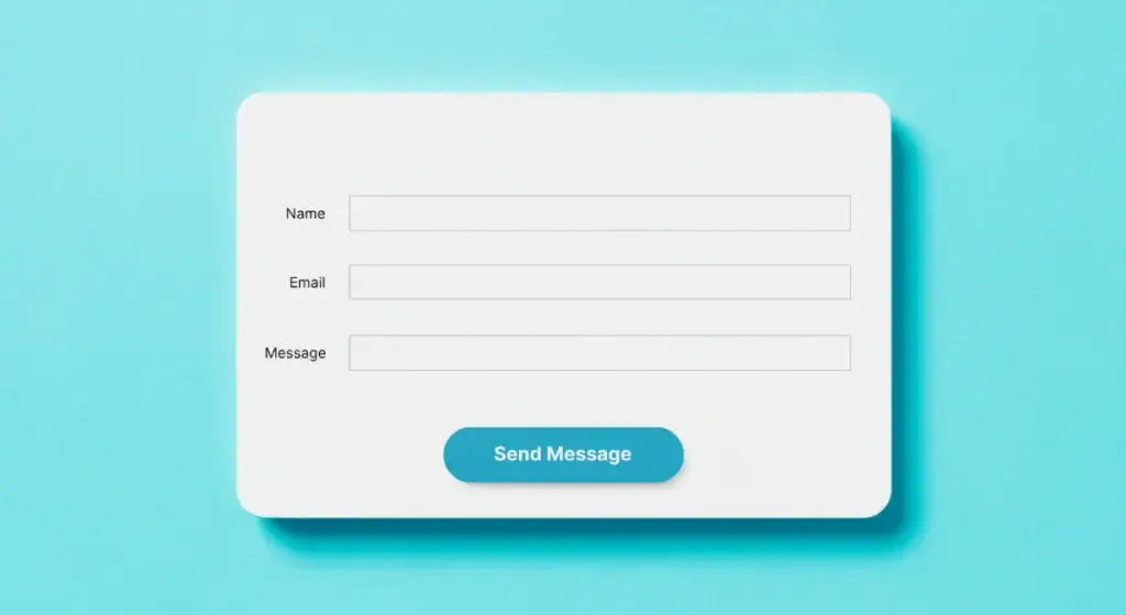
Bad forms are a plague. Here’s the cheat sheet:
- Use a single-column layout. It’s easier to scan.
- Clearly label each field and put it above the field, not inside, as placeholder text that disappears.
- Use smart defaults wherever possible (e.g., pre-select the user’s country).
- Only ask for the information you need right now to complete the task. You can always ask for more later.
Speed Isn’t a Bonus, It’s a Feature
A slow-loading website is the ultimate form of friction. It’s disrespectful. According to Google, the probability of a user bouncing increases by 32% as page load time goes from 1 second to 3 seconds.
Every millisecond counts.
Use tools like Google’s PageSpeed Insights to diagnose what’s slowing you down and fix it. Compress your images. Optimise your code. It’s not optional.
The Final, Brutal Truth About Friction
Here’s the rub.
User friction is rarely a simple design oversight. It’s usually a symptom of a much deeper disease: selfishness.
It’s the tangible evidence of a company that thinks about its departments, processes, and data-hoarding desires before it ever thinks about the human being on the other side of the screen.
A site with high friction is a site that is screaming, “My internal needs are more important than your experience.”
And in today’s market, that’s a death sentence. Your customers don’t owe you their patience. They will simply leave and give their money to someone who respects their time.
Stop making excuses. Stop blaming your marketing. Take a long, hard, honest look at the experience you’re providing. Find one piece of malignant friction on your site today, and kill it. Then do it again tomorrow.
Need a Hand with This?
My observations here are based on years of seeing what works and what doesn’t. If this kind of direct thinking resonates, you’ll enjoy our other articles on the Inkbot Design blog.
If you want this level of scrutiny applied directly to your business, that’s precisely what our web design services are for. We build sites designed for the customer first, because that’s the only way to make a lasting business. Request a quote if you’re ready to get serious about fixing the leaks.
Frequently Asked Questions (FAQs)
What is user friction in simple terms?
User friction is any aspect of using a website or app that requires effort from the user. It can be a click, a decision, a form to fill out, or even time waiting for a page to load.
Is all user friction bad?
No. “Good friction” is a deliberate step that adds value, such as a confirmation message to prevent errors or a security check like 2FA. “Bad friction” is any unnecessary obstacle that frustrates the user without providing any benefit.
What is the most significant cause of user friction?
The most common cause is a business-centric mindset instead of a user-centric one. Companies design convenient processes (e.g., collecting lots of data upfront) rather than what is easy and intuitive for the customer.
How does user friction affect my conversion rate?
Directly and negatively. Every point of unnecessary friction increases the likelihood that a user will give up and abandon their task, whether making a purchase, filling out a lead form, or signing up for a service. Reducing friction is one of the fastest ways to improve conversions.
What is an example of cognitive friction?
A pricing page with five vaguely named plans and a massive table of features is a classic example. The user has to work hard to compare them, gets overwhelmed, and often chooses to do nothing.
What’s an example of interaction friction?
Forcing a user to re-enter their shipping address when it’s the same as their billing address, or having a form with tiny, hard-to-click buttons on a mobile phone.
How can I measure user friction on my site?
You can use tools like heatmaps (Hotjar) to see where users click, session recording tools to watch their journey, and Google Analytics to track drop-off points in your funnels. However, the best way is to conduct a simple usability test by watching a real person try to use your site.
Should I remove my sign-up form to reduce friction?
Not necessarily, but you should simplify it. Only ask for the absolute minimum information required. For e-commerce, always offer a “guest checkout” option to avoid forcing users to create an account, which is a significant friction point.
Can good design reduce friction?
Yes, significantly. Good design isn’t just about aesthetics but clarity, hierarchy, and intuitiveness. A clean, professional design builds trust (reducing emotional friction) and clarifies what to do next (reducing cognitive friction).
How much does a slow website impact friction?
Massively. Page load speed is one of the most severe forms of friction. If a user has to wait more than a few seconds for a page to load, there’s a very high chance they will leave before engaging with your content.
Is CAPTCHA considered user friction?
Yes, it is a prevalent and often frustrating interaction friction designed to stop bots. While necessary in some cases, newer versions (like Google’s reCAPTCHA v3) are designed to be less intrusive to human users.
What’s the first step I should take to reduce friction?
Go through your most crucial user journey (e.g., the checkout process). Pretend you are a new customer and write down everything that feels slightly confusing, annoying, or slow. That’s your starting list.


