Ranking the 25 Best US Bank Logos, From Genius to Generic
Let’s be honest. Bank logos are meant to be boring.
You’ve come to the wrong place if you’re an entrepreneur looking for wild design inspiration. The world of financial branding is a graveyard of creativity, littered with blue rectangles, stoic eagles, and bland, soulless typography.
But that’s not an accident. It’s a strategy.
The biggest mistake a business owner can make is chasing a “professional” look by copying the most generic tropes in their industry. This leads to a forgettable brand that blends into the background noise, wasting your best chance to make a first impression.
The solution isn’t to create something loud and obnoxious. It’s to understand the strategy behind why these colossal financial institutions look the way they do. By deconstructing the visual identities of the most prominent players, you can learn to think like a brand strategist and build a logo with real intent.
This isn’t a gallery for pretty pictures. We’re about to dissect 25 of the most significant US bank logos to extract brutally honest, real-world lessons for your business.
- Boring, timeless logos often outperform trendy designs for trust, stability, and longevity in financial branding.
- Colour is the fastest way to differentiate—bold, uncommon hues cut through a sea of blue.
- Choose a wordmark if your name is distinctive; use a symbol only with a clear, defensible story.
- A great logo can’t save a broken business; branding must align with real operational substance.
What Makes a Bank Logo “Good”? (It’s Not About Being Pretty)
Before we start the teardown, we need to agree on the metrics. Judging whether you’d hang a bank’s logo on your wall is pointless. These aren’t art projects; they are calculated tools of commerce designed to do a particular job.
The Unspoken Trinity: Trust, Stability, and Scale
Every effective financial logo, without exception, must communicate three things. Get these wrong, and nothing else matters.
- Trust: “Your money is safe here.” This is the foundational message. The design cannot feel flimsy, trendy, or untrustworthy.
- Stability: “We aren’t going anywhere.” This communicates longevity and permanence, fighting the primal fear of a bank collapsing. Many use thick fonts, solid shapes, and heritage cues.
- Scale: “We are a large, serious institution.” The branding must feel appropriate for a company managing billions, or even trillions, of dollars. It must look as good on a skyscraper as on a debit card.
A Quick Litmus Test for Logo Effectiveness
Beyond the trinity, you can run any logo through this simple filter:
- Recognisability: Can you draw a crude version of it from memory? The Chase octagon or the Wells Fargo stagecoach? Yes. The generic swoosh of your local credit union? Probably not.
- Timelessness: Will it look dated in 10 years? The best logos avoid contemporary design fads, opting for classic typography and simple forms that age gracefully.
- Appropriateness: Does it feel like a bank? A playful, script font might be great for a bakery, but it would be terrifying for a financial institution.
The Definitive List: 25 US Bank Logos, Deconstructed
Time for the main event. We’ll go through the list, grouped by the archetypes, and break down what works, what doesn’t, and why.
The Abstract Architects
1. JPMorgan Chase: The Abstract Octagon of Power
- Founded: 1799 (as The Bank of the Manhattan Company)
- Assets: ~$3.4 Trillion
The Chase octagon is arguably the pinnacle of abstract corporate logo design. Created in 1961 by Chermayeff & Geismar, it was designed to be bold, modern, and meaningless.
That’s right. It doesn’t mean anything specific. It’s an abstract shape—a square with four cutouts—that suggests motion, a vault, or a collective hub. Its strength lies in its ambiguity. For over 60 years, Chase has poured billions into this symbol, and now it is an unmistakable beacon of global finance.
Lesson: A simple, unique geometric shape can become an incredibly powerful brand asset if you commit to it for the long haul.
2. Citibank: The Red Arc ‘Umbrella’
- Founded: 1812
- Assets: ~$1.7 Trillion
The result of the 1998 merger of Citicorp and Travelers Group, the Citibank logo is a clever combination. The word “Citi” features a red arc over the “t” that represents the Travelers’ red umbrella logo, creating a visual link to the past.
It’s a brilliant piece of visual problem-solving, designed by Pentagram’s Paula Scher and famously sketched on a napkin in a meeting. It’s simple, has a story, and the red arc provides a unique, ownable visual element in a sea of blue.
Lesson: Mergers can create messy brands. A clever logo can bridge the gap between two histories and create a unified identity.
3. KeyBank: The ‘Key’ That Unlocks… Something
- Founded: 1825
- Assets: ~$187 Billion
KeyBank’s logo is on the nose, but it works. It’s an abstract, stylised key. The design is clean, the red colour is confident, and the concept is easy to grasp: KeyBank is the “key” to your financial success.
While it lacks the conceptual depth of the Chase mark, its directness is a strength. You see it, you get it. The custom typography feels dated now, but the core symbol remains solid and recognisable.
Lesson: A literal interpretation of your brand name can work if executed simply and boldly.
4. Wells Fargo: The Stagecoach of Yesterday
- Founded: 1852
- Assets: ~$1.7 Trillion
Wells Fargo’s branding is a masterclass in leaning on heritage. The stagecoach isn’t just a picture; it’s a symbol of frontier-era security, reliability, and reach. It evokes a time when sending money across the country was a dangerous, physical act, and Wells Fargo was the one you trusted to get it there.
While the bank has faced modern-day reputational challenges, the strength of that historical imagery endures. The red and gold colour palette further reinforces this sense of warmth and value. It feels quintessentially American.
Lesson: If your company has a genuine, compelling history, don’t hide it. Use it as your greatest branding asset.
5. Bank of America: The Overly-Patriotic Quilt
- Founded: 1904 (as Bank of Italy)
- Assets: ~$2.5 Trillion
The Bank of America “Flagscape” logo, introduced in 1998, attempts to weave the American flag into a dynamic symbol of fields or a quilt. It’s meant to represent the diverse communities the bank serves.
Conceptually, it’s a stretch. Visually, it can feel busy. However, its patriotic colours and sheer ubiquity have made it instantly recognisable. It’s a logo that works through brute force and a massive marketing budget more than design elegance.
Lesson: A complex idea doesn’t always translate into a simple, powerful logo. But with enough exposure, even a flawed concept can become iconic.
The Old Guard
6. BNY Mellon: The 1784 Pike
- Founded: 1784
- Assets: ~$444 Billion
As the oldest bank in the United States (founded by Alexander Hamilton, no less), BNY Mellon has every right to lean on its heritage. Their logo features a simple, modern pike symbol. It’s an arrow pointing forward and a historical nod to the pikes used by early sentinels.
The design successfully balances historical significance with a clean, modern aesthetic. It feels ancient and forward-looking, which is a difficult needle to thread. The dark teal colour is also a sophisticated choice that stands out from the typical corporate blue.
Lesson: You can reference history without looking old-fashioned. Modernise a historical symbol to get the best of both worlds.
7. U.S. Bank: The Simple Shield
- Founded: 1863
- Assets: ~$663 Billion
U.S. Bank’s logo is about as straightforward as it gets. A clean, modern shield containing the letters “U.S.” with a red slash that adds a touch of dynamism. The shield is a universal symbol of protection and security, perfect for a bank.
It’s not exciting. It’s not flashy. And that’s the point. It is solid, dependable, and utterly unambiguous. The bold, sans-serif font is strong and legible, reinforcing stability.
Lesson: Sometimes the most obvious symbol is the right one. Don’t overcomplicate the message when a classic mark will do the job.
8. M&T Bank: The Straightforward Shield
- Founded: 1856
- Assets: ~$203 Billion
Like U.S. Bank, M&T uses a shield. Theirs is even simpler—a monolithic green shape with the company’s wordmark inside. The colour choice (a rich green) is a key differentiator, helping it stand out and conveying ideas of wealth and growth.
The lockup of the M and T within the shield is compact and well-executed. It’s a no-nonsense logo for a no-nonsense bank, and its simplicity is its greatest strength.
Lesson: A distinct colour can transform a common symbol into a unique brand asset.
9. Morgan Stanley: The Blue Box
- Founded: 1935
- Assets: ~$1.2 Trillion
Morgan Stanley’s logo is corporate, blue, and exactly what you’d expect from a top-tier investment bank.
The design is sharp, geometric, and professional. It projects an image of precision, intelligence, and elite performance. It’s a logo that feels perfectly at home on the glossy cover of an annual report.
Lesson: Your logo’s aesthetic should match the expectations of your target client. A sharp, professional, slightly cold aesthetic is often the right call for high finance.
10. American Express: The Centurion’s Box
- Founded: 1850
- Assets: ~$265 Billion
The American Express “blue box” logo is a masterpiece of timeless design. While the wordmark inside has been updated over the years (the most recent by Pentagram in 2018), the core concept of the bold, stencilled text inside a solid square has remained.
The logo feels like a stamp of approval, a seal of quality. The colour gradient adds a touch of modernity, but the foundation is pure heritage. It’s one of the world’s most recognised and respected corporate identities.
Lesson: Don’t mess with a classic. If you have an iconic logo, evolve it carefully rather than replacing it.
The Populist Players
11. Capital One: The Boomerang Swoosh
- Founded: 1994
- Assets: ~$475 Billion
The Capital One logo is divisive. The “swoosh” or “boomerang” is a well-worn design cliché, often associated with the dot-com era. However, in the context of a bank, the red swoosh adds a dose of energy and dynamism absent from its more conservative peers.
It’s meant to signify forward momentum and a proactive approach. Paired with a bold, friendly blue wordmark, the overall effect is accessible and retail-focused. It feels more like a credit card company than a traditional bank, which is right for their brand.
Lesson: A cliché can sometimes be effective if it helps you stand out in a conservative industry and aligns with your brand’s personality.
12. Discover: The Orange Dot ‘Sunrise’
- Founded: 1985
- Assets: ~$149 Billion
Discover’s boldest move is its colour. The bright orange is impossible to ignore in a world saturated with blue, red, and green. It feels optimistic, friendly, and energetic. The simple sans-serif wordmark is clean and modern.
The orange “O” at the end can be a standalone mark, representing a sunrise or a coin. It’s a simple, versatile system that positions Discover as a brighter, more positive alternative in the financial space.
Lesson: Colour is your loudest, cheapest branding tool. Choosing a distinctive colour is the fastest way to differentiate yourself from the competition.
13. Truist: The Twin ‘T’s of a Messy Merger
- Founded: 2019 (Merger of BB&T and SunTrust)
- Assets: ~$535 Billion
The Truist logo results from the massive 2019 merger of SunTrust and BB&T. The name was widely panned, and the logo—two ‘T’s inside a square—has struggled to gain affection. The deep purple is distinctive, but the mark feels generic and corporate.
It’s a textbook example of design by committee. It’s safe, it’s symmetrical, and it says very little. It represents the merger (two T’s coming together) but fails to communicate a compelling message to the customer.
Lesson: A logo born from a corporate compromise rarely inspires. The best brands have a clear point of view.
14. PNC: The Colourful Abstract
- Founded: 1845
- Assets: ~$557 Billion
PNC’s logo is a welcome break from the monotony of single-colour bank logos. The abstract triangle, composed of smaller orange and blue triangles, represents the different facets of the bank coming together to serve the customer.
It’s a warm and surprisingly dynamic logo for a large financial institution. It feels more human and less monolithic than many of its competitors, suggesting a focus on people and communities.
Lesson: Don’t be afraid to use multiple colours if your brand is about bringing different elements together.
15. T.D. Bank: America’s Most Convenient… Chair?
- Founded: 1855 (Toronto-Dominion Bank)
- Assets: ~$367 Billion (US)
The T.D. Bank logo is known for its distinctive green colour and armchair icon (used more in marketing than the logo itself). The blocky, green TD letters are solid and recognisable, but the real brand equity is in their tagline and customer experience promise: “America’s Most Convenient Bank.
The branding is less about a clever symbol and more about a consistent colour and a promise. The logo is just the container for that much bigger idea.
Lesson: A simple logo can be incredibly effective when backed by a powerful and consistently delivered brand promise.
The Modern Minimalists
16. Ally Bank: The Purple Wordmark
- Founded: 2009 (Formerly GMAC)
- Assets: ~$196 Billion
As a digital-only bank born from the 2008 financial crisis, Ally needed a different brand. Their solution was brilliantly simple: a lowercase, sans-serif wordmark in a friendly, approachable purple.
There is no symbol. There is no stuffy corporate baggage. It’s a masterclass in minimalist, direct-to-consumer branding. The lowercase letters feel conversational and human, positioning Ally as a partner or an “ally” rather than a towering institution.
Lesson: Sometimes, the strongest statement is to remove the unnecessary. A well-chosen font and colour can be your entire logo.
17. SoFi: The Simple Sans-Serif
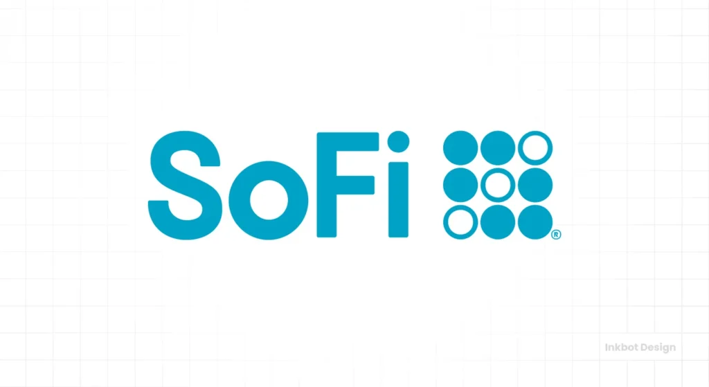
- Founded: 2011
- Assets: ~$30 Billion
Like Ally, SoFi (Social Finance) uses a clean, geometric sans-serif wordmark. Their logo is simple, tech-forward, and feels more like a fintech startup than a bank—which is precisely their positioning.
The rounded letterforms give it a slightly softer, more modern feel. The blue is a nod to financial tradition, but the execution is pure 21st century. It’s designed to be read easily on a smartphone screen.
Lesson: If you are a tech-focused disruptor, your visual identity should reflect that. Embrace minimalism and digital-native design.
18. Goldman Sachs: The Timeless Box
- Founded: 1869
- Assets: ~$1.6 Trillion
The Goldman Sachs signature is just that—the company’s name in a custom serif font, enclosed in a simple box. It’s been in use for over 50 years. This isn’t a logo; it’s a seal of approval.
It exudes quiet confidence and untouchable prestige. It doesn’t need a symbol or a flashy colour. The name itself is the brand. This is a power move, a design choice only available to a company at the absolute pinnacle of its industry.
Lesson: When your name carries immense weight, let it do the talking. Don’t clutter it with unnecessary design elements.
19. Charles Schwab: The Direct Approach
- Founded: 1971
- Assets: ~$8.5 Trillion (Client Assets)
Charles Schwab’s logo is straightforward in definition. It’s the founder’s name. That’s it. The typography is strong and legible, but the core idea is approachability and accountability. You’re not dealing with a faceless corporation but with Charles Schwab.
This approach builds personal trust and aligns perfectly with their brand of empowering the individual investor. It’s honest and unpretentious.
Lesson: Using a person’s name as your brand can create a powerful sense of personal connection and trust.
20. Fidelity: The Pyramid of Progress
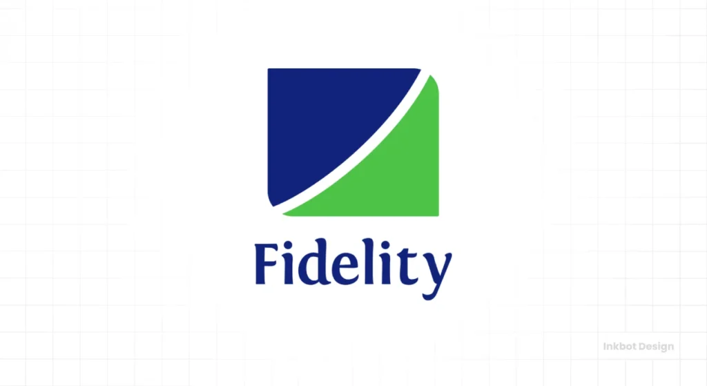
- Founded: 1946
- Assets: ~$11.7 Trillion (Administered)
Fidelity’s logo is a pyramid, a timeless symbol of strength, stability, and growth. It’s an excellent choice for an investment company focused on long-term wealth building.
The execution is clean and modern, and the green colour reinforces the themes of growth and finance. It’s a simple, powerful symbol perfectly encapsulates the company’s mission.
Lesson: Choosing a symbol with profound, universal meaning can give your logo instant conceptual weight.
The Honourable Mentions (And Oddballs)
21. Huntington Bank: The Hexagonal Tree
The logo combines a hexagon (stability, community) with a tree (growth). It’s a thoughtful, well-executed concept that feels both stable and organic.
22. Citizens Bank: The Forward Arrow
The logo’s “arrow” shape, pointing right, is a simple and effective way to communicate progress, forward-thinking, and a focus on the future. The green adds a friendly, positive feel.
23. Fifth Third Bank: The “5/3” Numeral
The name is odd (stemming from the merger of Third National Bank and Fifth National Bank), but they embrace it. The logo makes the unique name the hero, turning a potential weakness into a memorable brand element.
24. SunTrust (Pre-Truist): The Sun Ray
Before the Truist merger, SunTrust had a fantastic logo. The stylised sun was warm, optimistic, and directly related to the name. It was a strong, positive identity that was sadly lost.
25. First Republic Bank (A Post-Mortem): Stability… Until It Wasn’t
First Republic’s logo was a classic eagle, a symbol of quality and leadership. Their branding was all about premium service and unwavering stability. It’s a stark reminder that a logo is only a promise. No matter how solid, the brand identity fails when the underlying business fails.
The Four Archetypes of US Bank Logos
As you look at enough of them, you start to see patterns. Most US bank logos fall into one of four categories. Understanding these archetypes helps you decode the visual language of the entire industry.
The Old Guard: Heritage and History in Every Pixel
These are the institutions that lean heavily on their long history. Their logos use classic symbols like shields, eagles, and architectural elements to project an image of unwavering permanence. They communicate stability by reminding you they’ve been around forever.
The Abstract Architects: Corporate, Clean, and Unambiguous
This is the dominant style for the mega-banks. These logos use simple, abstract geometric shapes to represent a core brand concept—unity, global reach, a pathway forward. They are modern, clean, and built for massive scale.
The Modern Minimalists: Digital-First and Direct
Favoured by online-only banks and investment firms, this approach often ditches symbols entirely. The focus is on a clean, strong wordmark set in a modern sans-serif typeface. It’s a no-nonsense approach that says, “We are efficient, tech-forward, and straightforward.”
The Populist Players: Accessible and Consumer-Focused
These brands want to feel less like a cold, intimidating institution and more like a friendly retail partner. Their branding often uses brighter colours, softer shapes, and more approachable typography to feel accessible to the average person.
Key Takeaways for Your Business (Steal These Ideas, Not the Logos)
Looking at these 25 logos reveals powerful patterns. You don’t need a trillion-dollar balance sheet to apply the same strategic thinking to your brand.
Lesson 1: Boring Can Be a Superpower
The most enduring logos on this list are often the simplest. They resist trends and focus on communicating one thing—stability. For businesses that handle people’s money, health, or critical data, a “boring,” stable, and timeless logo is infinitely better than a trendy one that will look dated in three years.
Lesson 2: Your Name Is Your Logo (Or It Should Be)
Look at Ally, SoFi, and Charles Schwab. They demonstrate the power of a strong wordmark. Ask if you need one before spending time and money developing a symbol. A unique name in a distinctive typeface can be a powerful, clean, and confident logo.
Lesson 3: Colour Is Your Loudest, Cheapest Tool
The financial world is a sea of blue. Discover’s orange, M&T’s green, and Ally’s purple immediately stand out. A brave colour choice can do more for brand recognition than the cleverest symbol. Look at your competitors’ colours and pick something different.
Lesson 4: Abstract is Fine, But Have a Story (Even a Simple One)
The Chase octagon works because it’s unique, and they’ve stuck with it for 60 years. The Citibank arc works because it tells the story of a merger. A generic, meaningless swoosh doesn’t work. If you choose an abstract mark, ensure a simple, clear rationale is behind it.
The hard part is figuring out which lessons apply to your brand. It’s the core of what we do in our logo design services. We don’t just draw pictures; we build strategic assets.
Conclusion
A great logo won’t fix a broken business model. First Republic proved that. But a bad or generic logo broadcasts a lack of strategic thought from a mile away. It tells potential customers that you don’t sweat the details.
So stop trying to be clever. Stop chasing trends. Start trying to be clear.
What is the most critical message your brand must communicate? Is it speed? Is it security? Is it luxury? Is it approachability? Answer that one question, and you’re 90% of the way to a logo that works.
Call to Action
Looking at these financial giants can be intimidating. But the principles of good design—clarity, strategy, and appropriateness—are universal. The same thinking in the Chase octagon can be applied to your business, regardless of scale.
It might be time for a chat if you’re ready to stop guessing and build a brand identity that works as hard as you do. Look at what we offer on our logo design page or, if you know what you need, jump straight to requesting a quote.
FAQs
What is the most common colour for US bank logos?
Blue is by far the most common colour used in bank logos. It is psychologically associated with trust, security, and stability, making it a safe and traditional choice for financial institutions.
Why do so many banks use abstract symbols in their logos?
Abstract symbols allow a large, multifaceted company to represent a broad concept (like global reach, unity, or motion) without being tied to a specific, literal image. A well-designed abstract mark is also unique and highly ownable.
Should my business have a symbol or just a wordmark logo?
Use a wordmark-only logo if your company name is unique and memorable. Use a symbol if your name is more generic, needs a scalable icon for apps and social media, or you want to visually communicate a specific, non-obvious idea.
Who designed the famous Chase Bank logo?
The iconic Chase octagon logo was designed in 1961 by the renowned design firm Chermayeff & Geismar & Haviv, which also created famous logos for NBC, Mobil, and PBS.
How often should a bank (or any business) redesign its logo?
A logo should only be redesigned when it no longer represents the company’s strategy, looks significantly dated, or is technically challenging to use in modern (primarily digital) applications. A timeless logo may only need minor refreshments every 10-20 years, not complete overhauls.
What makes a bank logo look “trustworthy”?
Trustworthy logos often use strong, stable shapes (squares, shields), clear and legible typography (like bold sans-serifs or classic serifs), and colours that convey security (like blue and deep green). Simplicity and professional execution are key.
Why do some new banks like Ally and SoFi use lowercase letters?
Using a lowercase wordmark is a deliberate choice to appear more friendly, accessible, and less intimidating than traditional, uppercase financial logos. It positions the brand as a modern, human-centred alternative.
Is using red in a financial logo a bad idea?
Not necessarily. While red can sometimes be associated with debt or loss, it also conveys strength, leadership, and energy. Banks like Wells Fargo and Citibank use it effectively to stand out and add dynamism to their brands.
What can a small business learn from Bank of America’s logo?
The main lesson is the power of consistency. While the BofA logo’s concept can be complex, its consistent application across thousands of branches and millions of cards has made it undeniably recognisable. Commit to your brand identity.
Why did you include a failed bank like First Republic?
To make a critical point: a logo is a promise, not a guarantee. First Republic’s branding perfectly communicated stability and premium quality, but the brand collapsed when the business reality no longer matched that promise. Your operations must support your branding.


