What 80 Years of Superhero Logos Teach About Timeless Design
Forget your expensive branding seminars and dense marketing textbooks for a moment.
Some of the most potent, effective, and lasting lessons in brand identity aren't found in a boardroom but in comic book pages.
Most articles that tackle this subject are just glorified fan lists. They rank logos based on which hero they think is the “coolest.” This isn't one of those articles.
This is a practical breakdown for entrepreneurs and small business owners. We will treat these superhero logos like what they are: world-class corporate marks.
These symbols have achieved global recognition that most companies can only dream of. They do it not through complexity or trendy gimmicks, but through a ruthless commitment to core design principles.
We will dissect the top 10 and extract the actionable advice you can use for your brand.
- Timeless logos follow core design principles of simplicity, recognisability, and versatility, ensuring strong brand communication.
- A logo serves as a visual identity, conveying the brand's core message and values in an instant.
- Effective logos are memorable across formats, adapting successfully to various applications without losing clarity.
What Makes a Superhero Logo Work? The 3 Core Principles
Before we start the countdown, we need to agree on the criteria. A great logo, whether for a Kryptonian hero or a plumbing business, is judged on its performance. For decades, these superhero logos have excelled in three key areas.
1. Unmistakable Silhouette
This is the acid test. Can you recognise the logo if rendered in a single, solid colour? Can you identify it from 50 yards away?
A great logo has a distinct, ownable shape. One of my biggest pet peeves is the modern obsession with adding gradients, shadows, and fiddly details that make a logo utterly dependent on its full-colour rendering.
That's not a logo; it's an illustration. The best marks are simple, bold, and defined by their outline.
2. Narrative in a Nutshell
A logo is a visual elevator pitch. It should communicate a core truth about the brand in the fraction of a second it takes to see it.
The bat symbol communicates darkness and fear. The lightning bolt communicates speed.
These symbols tell you the character's story without a single word. Your logo should do the same for your business. It must hint at your value, industry, or ethos.
3. Brutal Versatility
This is where most amateur logo designs fail.
A logo doesn't just live on a website header in a controlled environment. It has to work everywhere. It needs to be clear as a tiny 16×16 pixel favicon. It needs to be legible when embroidered on a polo shirt.
It must be powerful on a billboard and clean when printed in black and white on an invoice. If your logo falls apart at different sizes or in other applications, it's a failed design.
The Definitive Top 10 Superhero Logos & Their Branding Lessons
With our principles established, let's analyse the best of the best.
1. Superman: The Masterclass in Hope & Simplicity
You can't start this list with anything else. The Superman “S” shield is arguably the most recognised symbol on Earth after the Christian cross and the Coca-Cola script. It has been the gold standard for nearly 90 years.
The Design Breakdown
- Shape: A simple, powerful pentagon—the shape of a shield—implying strength and protection.
- Typography: The stylised ‘S' is not just a letter; it's a flowing, organic shape that suggests grace and power. It's perfectly nested within the shield.
- Colour: The primary red and yellow palette is optimistic, bold, and energetic. It’s the visual definition of a primary hero.
The Business Takeaway
Your logo should be a symbol of your core promise. The Superman shield doesn't just stand for “Superman”; it stands for hope, truth, and justice. It is the visual embodiment of his brand promise. What is your business's most critical promise to its customers? Your logo should be designed to evoke that feeling.
2. Batman: The Masterclass in Fear & Evolution
If the Superman shield is about stability, the Bat-Symbol is about brilliant evolution. While the core concept—a bat silhouette—has remained, it has been constantly re-imagined for over 80 years, yet it is always, instantly, Batman.
The Design Breakdown
- Core Concept: A bat. It’s primal, nocturnal, and taps into a universal sense of fear and mystery.
- Adaptability: The symbol has been broad, narrow, stylised, and integrated with ovals. It proves that a core idea can be flexible without losing its identity. It's always the bat, from the blocky 1940s version to the sleek Nolan-era mart.
- Use of Negative Space: Many logo versions are just black shapes. Its silhouette carries the meaning entirely, making it incredibly cheap and easy to reproduce.
The Business Takeaway
A strong core concept allows your brand to evolve without breaking. Business landscapes change. Your visual identity might need a refresh over the years. With a simple, powerful core symbol, you can update your branding to feel modern without losing all the recognition and equity you've built.
3. Wonder Woman: The Masterclass in Integrated Symbolism
The “WW” emblem is a masterstroke of efficient design. It's a monogram, a symbol of heritage, and a statement of character all at once. It’s one of the cleverest logos on this list.
The Design Breakdown
- Monogram: It clearly forms the initials “WW” for Wonder Woman, making it directly identifiable.
- Symbolism: The sharp, eagle-like shape speaks to her Amazonian heritage and American patriotism (the character was created during WWII). It feels powerful and majestic.
- Shape Language: The upward-pointing chevrons create a sense of strength, victory, and flight.
The Business Takeaway
Strive for elegance and efficiency in your design. Can you make one element work with three? The Wonder Woman logo combines her initials and core story into a cohesive mark. Look at your own logo. Are there redundant elements? Can you simplify it to convey your message more directly and elegantly?
4. The Punisher: The Masterclass in Brutal Honesty
Not all brands are friendly. The Punisher's skull logo is the most direct and unambiguous brand promise in the history of fiction. You see this symbol, you know exactly what you will get: something brutal and uncompromising.
The Design Breakdown
- Primal Symbolism: A skull is a universal signifier of death. There is zero ambiguity here.
- Minimalism: It is almost always rendered in stark black and white. No gradients, no fancy effects. Its power is in its raw simplicity.
- Intimidation Factor: The elongated teeth and hollow eyes give a more menacing feel than a simple anatomical skull. This is a deliberate design choice to project threat.
The Business Takeaway
Don't be afraid to have a strong, niche personality. The Punisher logo isn't trying to appeal to everyone. It is designed to appeal to a particular audience and to repel another. Too many businesses try to be blandly agreeable, and they become forgettable. A strong brand knows who it's for and, just as importantly, who it's not for.
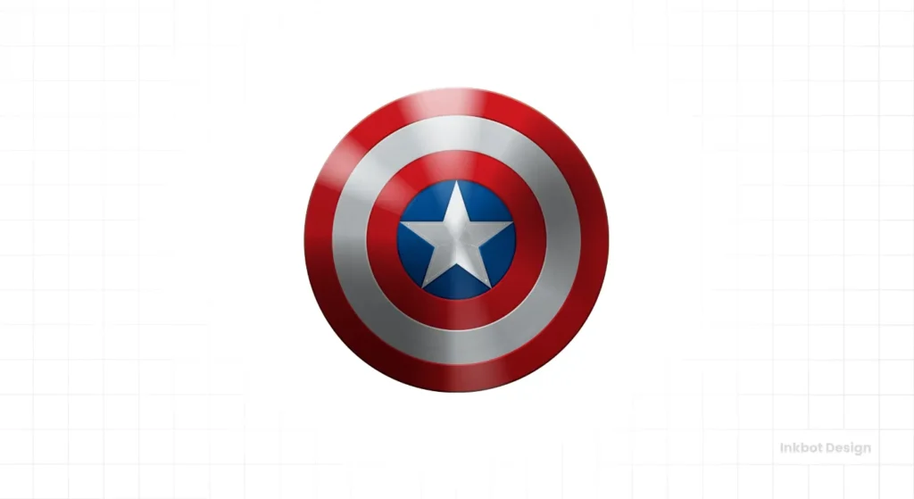
5. Captain America: The Masterclass in Balanced Geometry
Captain America's shield is a lesson in perfect design harmony. It's a circle, a star, and a target. It is both defensive (a shield) and offensive (a weapon), perfectly mirroring the character.
The Design Breakdown
- Geometric Perfection: The concentric circles and central star create a sense of perfect balance and order. It's visually pleasing and easy for the eye to process.
- Layered Symbolism: It represents America (star and stripes), protection (shield), and a goal (target).
- Colour Palette: The red, white, and blue are instantly recognisable and tie directly into the brand's core identity.
The Business Takeaway
Balance and structure build trust. The shield's design feels stable, reliable, and trustworthy. This isn't an accident; it results from its clean, balanced geometry. For businesses in finance, law, or healthcare sectors, a logo with strong, balanced geometric principles can subconsciously communicate stability and professionalism to clients.
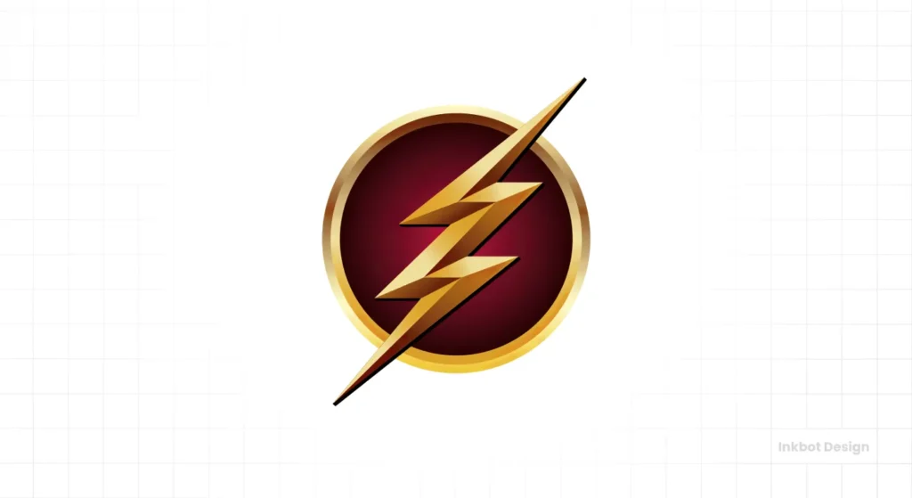
6. The Flash: The Masterclass in Conveying Motion
How do you show “speed” in a static image? The Flash's logo has been the definitive answer for decades. It’s pure energy.
The Design Breakdown
- Dynamic Shape: A lightning bolt is the natural symbol for speed, electricity, and sudden impact. Its sharp, angular lines inherently create a sense of movement and energy.
- Containment: Placing the bolt within a circle (often a red or white) gives the energy a focal point. It contains the power, making the symbol feel more like a focused emblem than a random zap.
- Simplicity: It’s a lightning bolt. A child can draw it from memory. This is a key trait of a truly iconic logo.
The Business Takeaway
Use shape language to communicate your key attribute. Your logo should feel fast if your business's unique selling proposition is speed. If it's security, it should feel solid. If it's creativity, it should feel organic or abstract. The shapes and lines within your logo communicate a message, so ensure it's the right one.
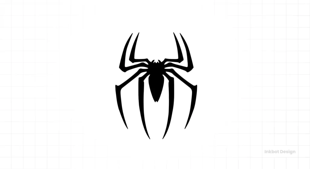
7. Spider-Man: The Masterclass in Unsettling Shapes
Spider-Man's logo, both the front and back versions, is brilliant because it's slightly unsettling. Spiders are creepy, and the logo doesn't shy away from that. The angular, leggy shape is instantly recognisable and unique to the character.
The Design Breakdown
- Ownable Shape: No one else has a brand mark like this. The specific shape of the spider is so distinct that it can be stylised in hundreds of ways and still be recognisable.
- Contextual Brilliance: The symbol is literally a representation of the character's name and powers. It’s the most literal logo on this list and works perfectly.
- Dual Identity: He famously has two spider symbols—a smaller one on his chest and a larger, more graphic one on his back. This shows how a brand can have a primary and secondary mark for different applications.
The Business Takeaway
Find what makes you different and own it. The Spider-Man logo works because it embraces a spider's slightly weird, creepy nature. What is the unique, maybe even strange, aspect of your business? Don't hide from it. Make it the centrepiece of your visual identity. It will make you far more memorable than your generic competitors.
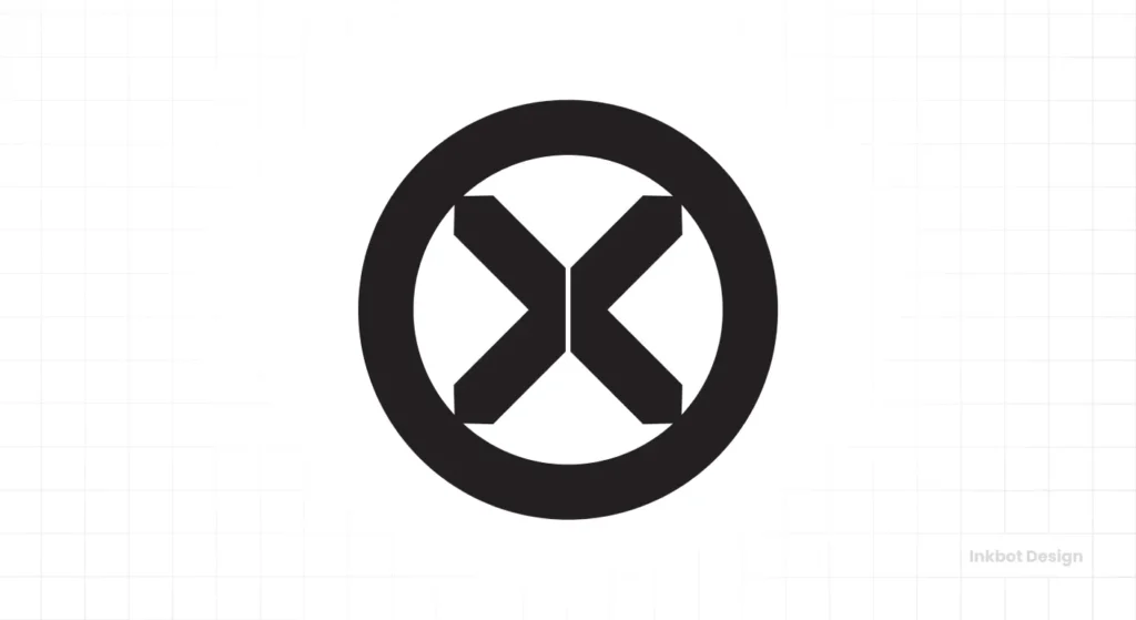
8. X-Men: The Masterclass in Minimalist Team Branding
The X-Men logo is a testament to the power of a single letter. It’s not just the initial of a team name; it's a symbol for an entire movement and a genetic marker. It’s typography as branding at its finest.
The Design Breakdown
- Minimalism: It’s often just an ‘X' inside a circle. It can't get much simpler than that.
- Conceptual Depth: The ‘X' stands for Professor Xavier, the X-Gene (the source of mutant powers), and their status as “excommunicated” from human society. It carries immense narrative weight.
- Team System: The ‘X' becomes a unifying element that can be applied to countless uniforms, vehicles, and locations, creating a cohesive brand system for a massive team.
The Business Takeaway
A simple mark can unite a complex organisation. If your business has multiple departments, products, or locations, a strong core symbol can be the visual glue that holds everything together. It allows for variation while maintaining a clear, unified brand identity. Think of the FedEx logo and its hidden arrow—different colours for different services, but always the same core wordmark.
9. Green Lantern: The Masterclass in Abstract Representation
Unlike most logos on this list, the Green Lantern symbol doesn't represent a person, an initial, or an animal. It represents an object and an idea: the power battery that fuels the hero's ring.
The Design Breakdown
- Abstract Symbolism: The logo is a stylised representation of a lantern. It’s clean, geometric, and abstract enough to feel cosmic and powerful.
- Containment & Power: The two horizontal bars contain the power represented by the central circle, hinting at the controlled will of the user.
- Memorability: The simple, clean geometry makes it extremely easy to remember and reproduce, a key test of logo effectiveness.
The Business Takeaway
Your logo doesn't have to be literal. You don't have to show a picture of what you do. An abstract mark can represent a core benefit, a feeling, or a key tool of your trade. For tech companies, consultancies, and service-based businesses, an abstract logo can convey innovation and conceptual thinking far better than a literal image.
10. Fantastic Four: The Masterclass in Numerical Identity
The Fantastic Four did it long before tech startups made numbers in circles cool. This logo establishes a team identity with nothing more than a number, proving that even the simplest concepts can become iconic.
The Design Breakdown
- Typographic Simplicity: It's just the number ‘4'. The classic version uses a bold, strong, sans-serif font that feels modern.
- Team Identity: It clearly and simply states that this is a team of four individuals. It's a brand of a collective unit.
- Versatility: The number-in-a-circle motif is incredibly flexible and has been adapted across decades of comics, movies, and merchandise without losing its core identity.
The Business Takeaway
Don't underestimate the power of a simple, bold statement. Sometimes, the most effective brand mark is the most direct one. Can you own a core number, concept, or initial in your business? You can build an influential and recognisable brand asset by claiming a simple typographic or numerical element and using it consistently.
Beyond the Cape: Applying These Lessons to Your Brand
The common thread through all 10 logos is a ruthless dedication to fundamentals. Simplicity. A clear story. Rock-solid versatility.
These aren't “comic book” principles. They are branding principles.
Look at your own business logo right now. Be honest. Does it have a clear, unmistakable silhouette? Can you tell its story in a single sentence? Have you ever printed it in black and white, or looked at it at the size of a postage stamp? Does it hold up?
Getting this right isn't about artistic flair but strategic communication. It's the foundation of a memorable brand. This is the core of what we do in our Logo design process at Inkbot Design—moving beyond what's pretty to what works.
The Bottom Line
The best logos in the world don't just decorate a product or a page; they communicate. They are hardworking tools for recognition, storytelling, and building trust.
They do heavy lifting for the brand, so the rest of the marketing doesn't have to work as hard.
Your business might not be saving the world from intergalactic threats, but it can—and should—have a world-class symbol representing it with clarity and power.
Frequently Asked Questions About Superhero Logos
What is the most recognised superhero logo?
The Superman ‘S' shield is widely considered the most recognised superhero logo globally, and one of the world's most recognised symbols.
Why has the Batman logo changed so many times?
The Batman logo's evolution reflects the changing tone of the character and the artistic style of each era. It adapts from the campy 1960s to the dark and gritty modern interpretations, demonstrating the flexibility of a strong core concept.
What makes a good logo timeless?
Timeless logos are built on simple, universal shapes, balanced composition, and a core concept rather than a fleeting design trend. Simplicity is key; complex designs often look dated quickly.
Should my business logo be literal or abstract?
This depends on your business. A literal logo (e.g., a wrench for a plumber) is direct and easy to understand. An abstract logo (e.g., the Nike swoosh) can convey a feeling or concept, like motion, and can be more unique and memorable over time.
How important are colours in a logo?
Colours are essential for conveying emotion and brand personality. However, a truly great logo must work in a single colour first. The design's fundamental strength should be its shape and composition, not its colour palette.
What is the biggest mistake people make when designing a logo?
The most common mistake is trying to say too much. They add too many elements, colours, and ideas, resulting in a cluttered, confusing, and forgettable mark that is difficult to reproduce.
Why do so many superhero logos use shields or circles?
Circles and shields are visually stable and pleasing shapes. They act as a container, making the symbol feel complete and unified. They also subconsciously communicate protection, community, and wholeness.
Can a logo just be a letter or a number?
Absolutely. The X-Men and Fantastic Four logos prove this. A single letter (monogram) or number can be compelling if designed with a strong, ownable style and used consistently.
How is a superhero logo different from a corporate logo?
Functionally, they are not that different. Both are designed to be instantly recognisable symbols representing the entity's values, identity, and “promise”. The main difference is that superhero logos often represent a single individual's ethos.
What is negative space in a logo?
Negative space is the space around and between the main elements of a design. Clever use of negative space, like in the FedEx logo's arrow, can add a secondary image or meaning subtly and memorably.
Let's Build a Symbol That Works.
You've seen what makes a logo iconic. It's not magic; it's a commitment to clear, simple, and robust design. It might be time for a professional approach if you're tired of a forgettable business logo or failing to tell your story.
A great logo is an investment in recognition. Explore our Logo design services to see how we build lasting brands, or request a quote when you're ready to get serious about your company's most important symbol.


