Paul Rand: The Architect of the Modern Brand
Most entrepreneurs treat graphic design like a coat of paint—a final, superficial layer applied once the “real” business work is done.
This is a primary reason why 90% of small businesses fail to build any meaningful brand equity.
They treat their visual identity as an afterthought, then wonder why they are trapped in a perpetual price war with competitors who look exactly the same as them.
Paul Rand, the man who shaped the visual landscape of 20th-century American commerce, had a very different view.
“Design is the method of putting form and content together. Design, just as art, has multiple definitions; there is no single definition. Design can be art. Design can be aesthetic. Design is so simple that’s why it is so complicated.”
To Rand, design wasn’t an ornament; it was a strategy. It was the logic of the business made visible.
If you are still looking for a logo that “tells a story” or follows the latest TikTok aesthetic trend, you are doing it wrong. You are wasting capital on decorations that will be obsolete by next Tuesday.
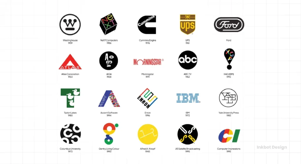
Rand’s work for IBM, ABC, UPS, and Steve Jobs’ NeXT didn’t just look “clean.” It functioned. It solved the problem of identification in a crowded marketplace.
In this guide, we will dissect the Randian philosophy, ignore the academic fluff, and show you how to apply these billion-dollar principles to your own SMB.
- Design is strategic, not decorative; it makes business logic visible and solves identification problems in crowded markets.
- Function over form: a logo must identify reliably, be simple, scalable and work in black and white.
- Visual continuity matters; unified systems like IBM’s stripes reduce recognition cost and endure across media.
- Play and geometric rigour create memorability; wit and precise internal geometry give timeless distinctiveness.
Who Is Paul Rand?
Paul Rand (1914–1996) was an American graphic designer and art director, widely considered the father of the modern corporate identity. He pioneered the “Swiss Style” (also known as International Typographic Style) in the United States, replacing decorative commercial art with a functional, minimalist approach rooted in European Modernism.

The three core elements of Paul Rand’s philosophy include:
- Function over Form: A logo’s primary job is to identify, not to explain.
- The Principle of Play: Using simple geometric shapes and wit to create memorable visual metaphors.
- Visual Continuity: The belief that a brand must be a unified system, not a collection of disparate images.
The Myth of the “Meaningful” Logo
One of the most pervasive mistakes I see when auditing new clients at Inkbot Design is the obsession with “meaning.” Founders spend weeks trying to find a logo that explains their entire business model, their mission statement, and their cat’s middle name.
Paul Rand famously debunked this. He argued that a logo derives its meaning from the quality of the product or service it represents, not the other way around.
“A logo is a flag, a signature, an escutcheon, a street sign. A logo does not sell (directly), it identifies. A logo is rarely a description of a business. A logo derives meaning from the quality of the thing it symbolises, not the other way around.” — Paul Rand.
Why Your Logo Doesn’t Need to “Tell a Story”
Data from the Nielsen Norman Group suggests that users form an opinion about a brand’s credibility within milliseconds of seeing its visual interface. If that interface is cluttered with “storytelling” elements that obscure the brand’s identity, cognitive load increases, and trust plummets.
The Amateur Way vs. The Rand Way
| Feature | The Amateur Way (Fluff-Driven) | The Rand Way (Logic-Driven) |
| Primary Goal | To explain what the company does. | To identify the company uniquely. |
| Complexity | High. Many colours, gradients, and icons. | Low. Minimalist shapes and high contrast. |
| Longevity | Follows current trends (e.g., “Blanding”). | Built on geometric principles that don’t age. |
| Client Process | Asks for 20 options to “see what sticks.” | Presents one solution based on a deep logic. |
The IBM Case Study: Visual Continuity as a Business Asset
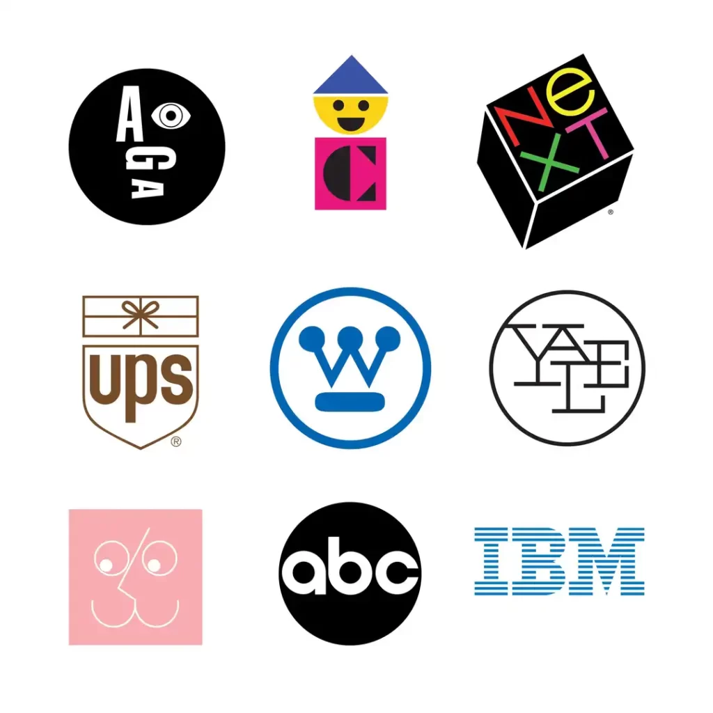
In 1956, Thomas J. Watson Jr. hired Paul Rand to overhaul IBM’s fractured visual identity. At the time, IBM was a disparate collection of departments with no cohesive look. Rand didn’t just give them a new logo; he gave them a visual language.
His most famous iteration, the 8-bar logo (1972), was a masterclass in technical constraint. The horizontal stripes weren’t just a “cool effect.” They were designed to solve a specific problem: the letterforms “I”, “B”, and “M” were inherently unbalanced. The stripes unified the letters, creating a sense of speed, stability, and authority.
“In essence, it is not what it looks like but what it does that defines a symbol.”
Paul Rand
Real-World Evidence: The Value of Design
A 10-year study by the Design Management Institute found that design-led companies (like IBM and Apple) outperformed the S&P 500 by an extraordinary 211%. This isn’t a coincidence. By following Rand’s lead on logo design and branding, these firms reduced the “cost of recognition.” Their customers didn’t have to think; they just knew.
If you are considering a rebrand or logo redesign, you must ask: Are you adding stripes because they look good, or because they solve a structural problem in your identity?
The NeXT Logo: How to Charge $100,000 for One Design
In 1986, Steve Jobs was ousted from Apple and started NeXT. He needed a logo. He approached Rand, who was already one of the most famous graphic designers in the world.
The interaction is legendary. Jobs asked Rand for several options. Rand replied:
“No. I will solve your problem for you, and you will pay me. You don’t have to use the solution. If you want options, go talk to other people.”
Rand charged $100,000 (roughly $250,000 in today’s money) and delivered exactly one solution: a black cube tilted at 28 degrees.
The Power of the Presentation Book
Rand didn’t just email a JPEG. He produced a detailed book that walked Jobs through the psychological and logical steps taken to reach the final design. He explained the use of the word “next” (a common word that required a unique visual treatment) and why the “e” was kept lowercase (to signify “education” and “expertise”).
This process is a core part of our logo design process at Inkbot Design. We don’t throw ideas at the wall. We build a logical case for why a specific mark is the only right answer for your business.
The Technical Nuance: Rare Attributes of Rand’s Work
To understand Rand, you have to look past the symbols and into the technical execution. He was obsessed with the “Rare Attributes”—the tiny details that most SMB owners ignore.
1. Rasterisation and Scalability
Rand’s logos were designed to work on everything from a 16px favicon (though they didn’t exist at the time) to a massive billboard. The UPS “bow” logo (used from 1961 to 2003) used a very specific line weight that ensured the “package” icon wouldn’t disappear when printed on low-quality cardboard boxes or small delivery uniforms.
2. The Internal Geometry
If you deconstruct the ABC logo, you’ll find it’s built entirely on a circle. There are no arbitrary curves. This geometric rigour creates a sense of “correctness” that the human eye perceives as professional, even if the viewer can’t explain why. This is the foundation of logo design psychology.
The State of Branding in 2026: Rand vs. The Machines
We are currently in a crisis of “Bland-ing.” Thanks to the rise of DIY design tools and Generative AI, every tech startup looks the same. They use the same sans-serif fonts, the same “safe” blue palettes, and the same generic icons.
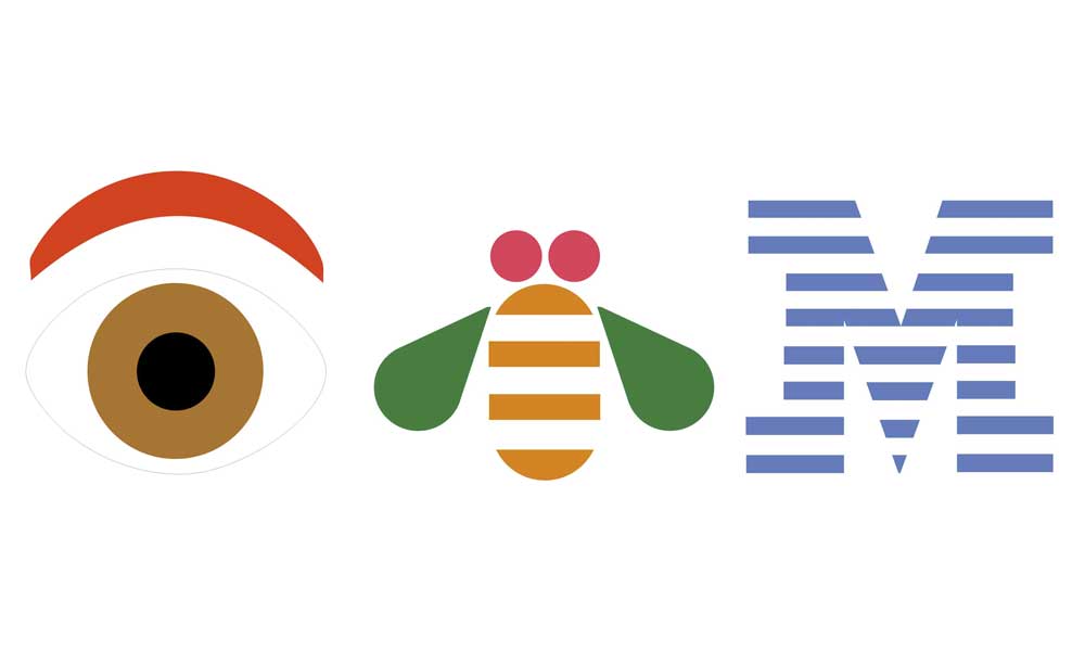
In 2026, the value of a Paul Rand-inspired approach is skyrocketing. Why? Because AI can only “average out” existing data. It can create a “good” logo, but it cannot create a “meaningful” identity because it lacks the ability to use the Principle of Play.
Rand used wit. He used the “IBM Rebus” (Eye-Bee-M) to make a massive corporation feel human. AI does not yet understand irony or visual puns. To stand out in 2026, you need to lean into the “Unique Attributes” that a machine cannot replicate: human intuition and strategic provocation.
Why Your “Cheap” Logo is Expensive
In my fieldwork as a Creative Director, I once audited a B2B SaaS client who had spent £500 on a logo from a “top-rated” freelancer on a gig site. On the surface, it looked fine. But when we tried to apply it to their product UI, it failed.
- The gradients didn’t render correctly on mobile screens.
- The “meaningful” icon looked like a smudge when scaled down to an app icon.
- The typography was a free font that lacked the character sets needed for its expansion into the European market.
They didn’t save £5,000; they lost £50,000 in delayed launches and wasted marketing spend. This is the cost of ignoring Rand’s “Function First” rule. To avoid these pitfalls, consider requesting a quote for a professionally engineered identity.
Decoding the 7-Step Rand Test for Logos
Before you sign off on your next design, put it through the “Rand Test.” If it fails more than two of these, bin it.
- Is it distinctive? Does it stand out, or is it just another “swoosh”?
- Is it visible? Can you read it from 50 paces?
- Is it adaptable? Does it work in black and white? (If a logo needs colour to work, it’s a bad logo.)
- Is it memorable? Can a child draw it from memory after seeing it once?
- Is it universal? Does it avoid cultural clichés that might date it?
- Is it durable? Will it look “cool” in 2035?
- Is it simple? Have you removed everything that isn’t essential?
The Different Types of Logos: Which Would Rand Choose?
Rand was a proponent of the Minimalist Mark. While there are many different types of logos, he almost always gravitated towards:
- Wordmarks: Custom typography that carries the brand (IBM).
- Pictorial Marks: Simple symbols that represent the name (Apple, though designed by Rob Janoff, followed Rand’s principles).
- Abstract Marks: Geometric forms that create a unique “flag” (Chase Bank).
He despised the “Emblem” style (like the Starbucks logo) for modern corporate use, as he felt they were too fussy and difficult to reproduce at small scales.
The Verdict
Paul Rand changed the world by proving that “Design is Everything.” It is the difference between a commodity and a brand. If you are an entrepreneur who is sceptical of “designers,” good. You should be. Most designers are decorators.
But if you want to build a business that scales, you cannot afford to ignore the logic of the world’s 100 famous logos. You need a partner who understands that a logo is a functional tool, not a piece of art.
“Design is the silent ambassador of your brand.”
At Inkbot Design, we apply the same forensic rigour to our services that Rand applied to the IBM stripes. We don’t do fluff. We do identity.
Frequently Asked Questions (FAQ)
Who was Paul Rand?
Paul Rand was a seminal American graphic designer known for creating iconic corporate logos for IBM, ABC, UPS, and NeXT. He is credited with bringing European Modernist principles—simplicity, logic, and functionality—to the American advertising and branding industry in the mid-20th century.
Why is Paul Rand important to modern business?
Rand transformed design from a decorative art into a strategic business tool. He proved that a cohesive visual identity could increase brand recognition, command higher prices, and simplify corporate communication, providing a blueprint that modern giants like Apple and Google still follow.
What is the “Rand Test” for logos?
The Rand Test is a set of criteria used to judge a logo’s effectiveness. It focuses on distinctiveness, visibility, adaptability, memorability, universality, durability, and, most importantly, simplicity. If a logo is too complex to be easily remembered or reproduced, it fails the test.
Did Paul Rand really only give Steve Jobs one logo option?
Yes. For the NeXT logo project, Rand famously refused to provide multiple options, stating that he would solve the problem and Jobs could either use the solution or not. This highlighted his belief that design is a logical conclusion, not a subjective choice.
What is “The Principle of Play” in Rand’s work?
Rand believed that “play” (using wit, humour, and visual puns) was essential to making design engaging. By incorporating simple geometric shapes in unexpected ways—like the eye and bee in the IBM rebus—he made large corporations feel approachable and human.
How did Paul Rand influence the “Swiss Style”?
Rand was a primary conduit for introducing the International Typographic Style (also known as Swiss Style) to the US. This style emphasises cleanliness, readability, and objectivity, utilising mathematical grids and sans-serif typography (such as Helvetica) to create orderly and functional designs.
Why did Paul Rand use stripes in the IBM logo?
The stripes in the IBM logo were a technical solution to a visual problem. The letters “I”, “B”, and “M” varied significantly in width and weight. The horizontal bars unified the letterforms, created a sense of “speed,” and made the heavy letters feel lighter and more modern.
What is the difference between a logo and a brand, according to Rand?
To Rand, a logo is a symbol of identification, like a flag. A brand is the sum total of the company’s experience and reputation. The logo doesn’t “create” the brand’s meaning; it acts as a vessel that holds the meaning created by the company’s products and services.
Can I use Paul Rand’s principles for a small business?
Absolutely. In fact, SMBs benefit most from Rand’s principles because simplicity is cheaper to maintain and easier to scale. A simple, functional logo works better on social media, business cards, and signage than a complex, “meaningful” illustration.
What was Paul Rand’s view on design trends?
Rand was notoriously “allergic to fluff” and trends. He believed that if a design was based on logic and geometry rather than current fashions, it would be timeless. His logos for IBM and ABC have remained virtually unchanged for over 50 years.
What is the “Logo Presentation Book” method?
Instead of just showing a final graphic, Rand created detailed books that explained the step-by-step logic, geometry, and psychology behind his designs. This method ensures the client understands why a design works, rather than just deciding if they “like” it.
How does Paul Rand’s philosophy apply to AI design?
Rand’s philosophy is the antidote to generic AI design. While AI can generate infinite variations, it cannot apply the strategic wit or technical problem-solving that Rand pioneered. A Randian approach focuses on the “Unique Attribute” of a brand, which AI often misses.


