How to Build a Mobile-Friendly Website That Actually Sells
I’ve probably audited a few hundred small business websites in the past five years. My honest assessment? At least 80% of them are failing.
They might look okay on a phone. They might even pass Google’s basic “mobile-friendly” test. But they are not built to convert a mobile user. They are actively costing their owners money.
I see the same mistakes every single day.
- The “Shrink and Pink” Job: Someone took the desktop site and just… made it smaller. The text is minuscule. The buttons are impossible to tap. It’s lazy, and it tells your customers you don’t value their time.
- The Treasure Hunt CTA: Your “Book a Call” or “Buy Now” button is buried three scrolls down, hidden in a paragraph of text. Your customers aren’t detectives. They’ll just leave.
- The Unforgivable Pop-up: A massive “Join Our Newsletter” box that takes over the entire screen, with a ‘close’ button so small it’s functionally a trap. This is a one-way ticket to a 90% bounce rate.
- The 10-Second-Load: That beautiful, 4MB uncompressed hero image on your homepage? It just made someone on a patchy 4G connection give up and go to your competitor.
- The “Desktop-First” Mindset: Still thinking of mobile as an “add-on” or a “nice-to-have.” This isn’t 2015. Your mobile site is your primary website.
Your website is your best salesperson. Right now, for the 60%+ of your audience on a phone, that salesperson is ignoring them, fumbling for their notes, and making it impossible to buy.
This guide is the antidote. It’s not a list of vague platitudes. It’s a practical, no-fluff audit and a strategic roadmap for entrepreneurs and business owners who are tired of guessing. This is how you stop losing money and start building a mobile-friendly website that actually works.
- Most small business sites are technically responsive but fail to convert because they aren’t designed for mobile-first usability.
- Mobile-first means designing for thumb reach, single-goal completion under 30 seconds, and prioritising one clear CTA.
- Speed and Core Web Vitals (LCP, INP, CLS) are critical—optimise images, reduce JS, and use decent hosting to avoid lost customers.
- UX basics: readable text (≥16px), large tappable targets, sticky CTAs, minimal form fields, and avoid intrusive full-screen pop-ups.
- Run simple audits: Google Mobile-Friendly, PageSpeed (mobile), one-handed task test, and incognito load to spot urgent red flags.
What “Mobile-Friendly” Actually Means

There’s a massive gap between what most people think “mobile-friendly” means and what it actually means for your business.
What you think it means: My website loads on a phone, and I can (maybe) read it if I pinch and zoom.
What it actually means: A user can land on your site, understand your value proposition, find what they need, and complete a primary goal (buy, contact, book) in under 30 seconds, using only their thumb, with zero friction.
It’s not a technical checkbox; it’s a complete user experience philosophy.
The most common “solution” you’ll see is Responsive Design. This is where the website layout automatically “responds” and reflows to fit the screen size. It’s the technical baseline. But it’s not the full story.
The “Shrink and Pink” job is, technically, responsive. It’s also useless.
The real shift in thinking, the one that separates successful sites from failing ones, is adopting a mobile-first design approach. This is the single most important concept you need to grasp. Instead of designing a beautiful, complex desktop site and then trying to cram it onto a small screen, you start by designing the mobile version first.
This forces you to be ruthless. It forces you to answer the question: “What is the one thing a user must be able to do here?” You build for the smallest, most constrained environment first, ensuring the core message and primary CTA are front-and-centre. Then, you progressively enhance the design for tablets and desktops, adding secondary information and visual flair.
This isn’t just a design trend. It’s the strategic framework Google uses to rank your site.
Table 1: Mobile Design Terminology (The Jargon-Free Version)
| Term | What It Is | The Brutally Honest Take |
| Responsive Design | A website layout that fluidly changes to fit any screen size. (Uses CSS media queries). | The Bare Minimum. This is standard practice. Having this doesn’t make your site good, but not having it makes it an instant failure. |
| Adaptive Design | The server detects the device (e.g., iPhone, Android Tablet) and loads a different, pre-built template for that device. | Mostly Obsolete. It was a stepping stone. It’s inflexible, expensive to maintain, and can’t keep up with new device sizes. Avoid. |
| Mobile-First Design | A strategy, not a technology. You design the mobile experience first, then adapt it for larger screens. | This is the correct approach. It forces clarity, prioritises speed, and aligns with how both users and Google now operate. |
| Mobile-Friendly | A catch-all term. It should mean a site built with a mobile-first strategy that is responsive, fast, and usable. | A dangerously vague term. Use it as the goal, not the method. The method is “mobile-first” and “responsive.” |
Why You’re Losing Money: The Hard Data Doesn’t Lie
If you’re an entrepreneur, you care about the bottom line. So let’s talk numbers. Ignoring your mobile experience isn’t a small oversight; it’s a catastrophic business error.
1. Google Runs the World (And It’s a Mobile World)
Ever since 2019, Google has been using Mobile-First Indexing. This means Google predominantly uses the mobile version of your content for indexing and ranking.
Let that sink in.
If your mobile site is a stripped-down, hard-to-read version of your desktop site… that’s what Google judges you on. If you’ve hidden key content or text on your mobile version to “clean it up,” you’ve just told Google that content isn’t important.
Your desktop site is now, for all intents and purposes, a secondary consideration for search ranking.
2. Your Customers Are Overwhelmingly Mobile
The stats are no longer emerging; they’re established facts.
- Global Traffic: Mobile devices (excluding tablets) generate over 60% of all website traffic globally. In many B2C sectors, it’s closer to 70% or 80%.
- Local Search: According to Google, 76% of people who search on their smartphone for something nearby visit a business within a day.
- The “Near Me” Intent: Those “near me” searches are almost exclusively mobile. If your cafe, shop, or consultancy firm has a mobile site that won’t load a map or a phone number, you’ve lost that customer.
3. Speed Equals Revenue (And Slow Kills)
Mobile users are not patient. They’re trying to solve a problem right now.
- Google data shows that as page load time goes from 1 second to 3 seconds, the probability of a bounce (a user leaving) increases by 32%.
- Go from 1 second to 6 seconds? The bounce rate probability jumps by 106%.
- Think about your own site. When was the last time you tested it on a 4G connection, not your office Wi-Fi?
A slow site is the digital equivalent of locking your shop door for 10 seconds just as a customer tries to walk in. They won’t wait. They’ll just go next door.
4. Bad UX Destroys Conversions
This is the big one. Mobile conversion rates traditionally lag behind desktop. But why? It’s not because people don’t like buying on their phones. It’s because businesses make it painful to buy on their phones.
We ran an A/B test for an e-commerce client last year. Their mobile site was responsive but clunky. The “Add to Cart” button was small and “below the fold” (you had to scroll to see it).
The Change: We simply made the header “sticky” (it stays at the top when you scroll) and put a large, clear “Add to Cart” button in it.
The Result: A 45% increase in mobile conversion rate in 30 days.
This wasn’t a complete redesign. It wasn’t magic. It was simply acknowledging the user’s context and making the primary action unmissable. Your bad mobile design is leaving that 45% (or more) on the table.
The Anatomy of a Genuinely Mobile-Friendly Website (The UX Audit)
Okay, theory’s over. Let’s get practical. A truly mobile-friendly website is a perfect blend of User Experience (UX) and technical performance. We’ll start with the UX—what your customer actually sees and feels.
Grab your phone and open your website. Be honest. Does it pass these tests?
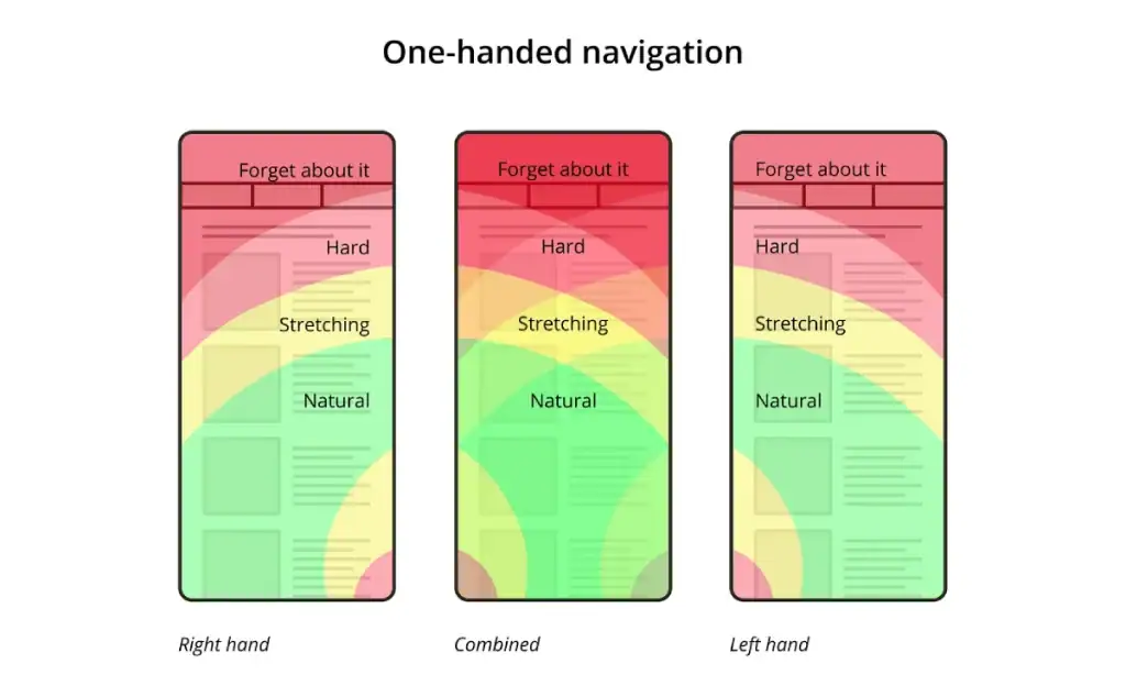
The Thumb is King: Designing for How People Actually Hold Their Phones
Stop designing for a mouse pointer. Start designing for a thumb.
People hold their phones in three main ways: one-handed (thumb-scrolling), cradled (one hand holds, the other index-finger-taps), and two-handed (typing). The one-handed grip is the most common for browsing.
This creates the “Thumb Zone”—the area of the screen that is easy to comfortably reach with the thumb of the hand holding the device.
- Easy (Green): The bottom-centre arc of the screen.
- Stretch (Yellow): The middle of the screen.
- Hard (Red): The top corners (especially the top-left for right-handers).
Now look at your site. Where is your most important navigation? Where is your “Contact” button?
If your main menu is a “hamburger” icon (three lines) tucked into the top-left corner, you are forcing 80% of your users to perform a hand-shuffle just to see what you do. This is a terrible first impression.
A good mobile-friendly website puts primary navigation and key CTAs within the easy green zone. This is why you see apps like Instagram, X (Twitter), and TikTok have their main navigation bar at the bottom of the screen.
They’re not stupid. They have billions in research. You’re not smarter than them. Put your navigation where people’s thumbs already are.
Table 2: The Thumb Zone Audit
| UI Element | Bad Placement (Hard to Reach) | Good Placement (Easy to Reach) |
| Main Navigation | Top-left hamburger menu. | A “sticky” bottom bar with 3-5 key icons (e.g., Home, Services, Contact). |
| Primary CTA | Buried in a paragraph. | A “sticky” footer or header button. (e.g., “Get a Quote”). |
| “Add to Cart” | Below the product image, requiring a scroll. | “Sticky” button that appears as soon as you scroll past the main image. |
| Phone Number | On a “Contact Us” page only. | In the header and footer, as a “click-to-call” link. |
Readability: Stop Making Me Pinch and Zoom
If I have to pinch-to-zoom to read your “About Us” page, I’m gone. It’s an instant signal that you didn’t care enough to make your site usable.
- Body Font Size: Your main paragraph text should be a minimum of 16px. Period. For some fonts, 17px or 18px is even better. This isn’t a design choice; it’s a usability mandate.
- Line Height (Leading): Text needs to breathe. Your line spacing should be at least 1.5x the font size. This prevents text from feeling like a dense, unreadable wall.
- Contrast: This is a huge one. That light grey text on a slightly less light grey background might look “minimal” and “clean” on your 27-inch design monitor, but on a phone screen in bright sunlight, it’s invisible. Use a contrast checker tool. Your text must have sufficient contrast against its background.
Tappable Targets: The “Fat Finger” Problem
A mouse pointer is 1px. A human thumb is… not.
You must design for imprecise, “fat-fingered” tapping.
- The Rule: Apple’s guideline is a minimum tap target of 44 x 44 points. Google’s is 48 x 48 density-independent pixels.
- The Translation: Don’t make buttons or links tiny.
- The Real Rule: The space between tap targets is just as important as the size of the targets themselves.
Real-Life Example: “The Cafe on the Corner”
- The Bad Site: The cafe uploads its menu as a PDF. You have to download it, pinch, zoom, and scroll around a document designed for an A4 piece of paper. To order, you have to find the phone number, copy it (if you can), and then paste it into your phone dialler. This is a four-step process full of friction.
- The Good Site: The menu is a simple, single-column HTML page. The font is 18px. Each menu item category (e.g., “Sandwiches,” “Coffee”) is a large, obvious button. At the bottom of the screen, there is a sticky bar with two buttons: “Call to Order” (click-to-call) and “Find Us” (opens Google Maps). This is a one-tap process.
Which business is getting the lunch order?
The CTA: Your “Money Button” is Invisible
The Call to Action (CTA) is the most important button on any given page. It’s the action you want the user to take.
- It must be obvious. Use a bright, contrasting colour.
- It must be clear. The text should be an action. Not “Learn More” (passive). Use “Get Your Free Quote,” “Book Your Call,” or “Shop the Sale” (active).
- It must be visible. As discussed in the “Thumb Zone,” the best place for this is often in a “sticky” element that stays visible as the user scrolls. They should never have to hunt for the “buy” button.
If a user can scroll to the bottom of your services page and not know what to do next, your page has failed.
The Technical Minefield: Why Your Site Feels Broken (The Tech Audit)
A beautiful-looking mobile site that takes 12 seconds to load is not a good mobile site. It’s a failure. The technical backend is just as important as the visual frontend.
This is where Google gets really judgmental with its Core Web Vitals (CWV). These are the three (now 3.5) metrics Google uses to measure the experience of loading your page.
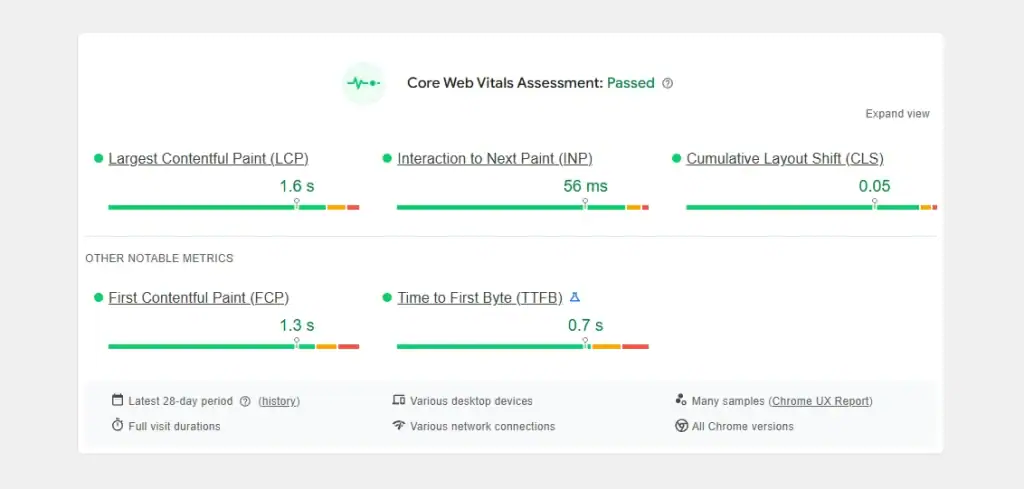
Page Speed: The Silent Killer
Your goal is to have your site usable in under 3 seconds on a mobile connection. This is achieved by focusing on a few key things.
- Image Optimisation: This is the #1 problem I see. That 4MB hero image? It needs to be a 300KB .webp or .avif file. This is non-negotiable. Images must be compressed, resized to the correct dimensions (not using HTML to shrink them), and “lazy-loaded” (so they only load as the user scrolls down to them).
- LCP (Largest Contentful Paint): This is a Core Web Vital. It measures how long it takes for the largest element (usually that hero image or a text block) to become visible. This needs to be under 2.5 seconds.
- INP (Interaction to Next Paint): This is the new kid on the block, replacing an older metric. It measures how responsive your page is. When a user taps a button or an accordion menu, how long does it take for the page to visually react? It should be instant. If there’s a lag, you fail. This is often caused by heavy JavaScript.
- Hosting: Stop using that £2/month shared hosting. If your server is slow to respond, nothing else matters. Decent hosting is a baseline investment.
CLS (Cumulative Layout Shift): The “Rage-Click” Fixer
This is the third Core Web Vital and my personal pet peeve.
CLS measures how much your page jumps around while it’s loading.
You’ve all experienced this. You go to tap a button, and just as your finger is about to hit the screen, an ad loads above it, shoving the entire page down, and you end up tapping something else.
It’s infuriating. And Google hates it.
This is caused by not specifying dimensions for images (so the space “pops” in when the image finally loads) or by loading in ads, cookie banners, or other content without reserving a space for it first. A good mobile-friendly website loads with zero “jumping.”
Forms: The Ultimate Conversion Grinder
If your conversion goal is a “Contact Us” form, that form is your business. And on mobile, most of them are terrible.
- Field Count: Get rid of every non-essential field. Do you really need their “Company Name” and “Fax Number” (I’m not kidding, I still see this) just for an initial enquiry? All you need is Name, Email, and Message.
- Correct Keyboard: This is a simple HTML fix that 50% of sites get wrong.
- If the field is for an email, use type=”email”. This makes the “@” symbol appear on the mobile keyboard.
- If the field is for a phone number, use type=”tel”. This brings up the number pad.
- If it’s a number, use type=”number”.
- This saves the user a tap and removes a point of friction.
- Label Your Fields: Don’t use “placeholder text” (the grey text inside the box) as the label. As soon as the user taps into the field, the label vanishes, and they forget what they’re supposed to be typing. Use a proper <label> tag above the field.
Real-Life Example: “The E-commerce Blunder”
We audited a client’s e-commerce store with a high mobile cart abandonment rate. The reason was obvious: their checkout form was a nightmare.
- It was one single, long page.
- It asked for a “Billing Address” and “Shipping Address” separately, even if they were the same, forcing the user to fill out 12+ fields.
- The credit card field was just one box, type=”text”.
- Tapping “Next” didn’t auto-scroll to the next field.
The Fix:
- We broke the form into a 3-step “accordion” (Shipping -> Billing -> Payment). It felt shorter.
- We added a “Same as Shipping” checkbox that hid the billing form.
- We used the correct keyboard types for email, phone, and postcode.
- We implemented “autofill” tags so Chrome and Safari could fill in the user’s saved details with one tap.
The Result: Mobile checkout completion rocketed by 62%.
The 5-Minute Self-Audit: How to Test Your Own Site (Right Now)
You don’t need to be a developer to spot the major red flags. Do this right now.
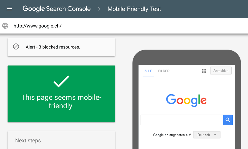
- The Google Test:
- Go to Google’s Mobile-Friendly Test tool.
- Put in your URL.
- This is a simple Pass/Fail. If you fail this, you are in big trouble. But as I’ve said, passing this does not mean your site is good. This is just the “is it responsive?” check.
- The PageSpeed Test:
- Go to Google’s PageSpeed Insights.
- Put in your URL.
- Crucially, click the “Mobile” tab at the top. Ignore the “Desktop” score; it’s irrelevant.
- Look at your “Performance” score (out of 100) and the Core Web Vitals (LCP, INP, CLS).
- If your performance score is red (0-49) or orange (50-89), you are losing customers. Simple as that.
- The “One-Hand, One-Goal” Test:
- Open your phone. Lock it.
- Now, unlock it and try to complete one primary goal on your website (e.g., find the price of your main service, book a table, buy your flagship product).
- Do this using only one hand (your non-dominant one, if you want a real challenge).
- Time yourself. Does it take more than 30 seconds?
- Do you have to pinch-and-zoom at any point?
- Do you have to perform a “hand-shuffle” to reach the top-left menu?
- Be honest. Was it a pleasant experience, or was it frustrating?
- The “Incognito Mode” Test:
- Open a “Private” or “Incognito” window in your phone’s browser.
- Load your website. This clears the “cache” and shows you what a new visitor sees.
- How long does it really take to load?
- What pop-ups (cookie banners, newsletter sign-ups) get in the way? Are they easy to dismiss, or do they block the entire page?
Table 3: The Mobile-Friendly Website: Red Flag Checklist
Use this checklist. If you tick more than three of these, your website needs professional help.
| Area | Red Flag Check |
| First Impression | The site takes longer than 4 seconds to load on a 4G (not Wi-Fi) connection. |
| A pop-up (cookie or newsletter) covers more than 25% of the screen. | |
| The ‘close’ button on the pop-up is tiny or hard to see. | |
| Navigation | Main navigation is in a top-left hamburger menu. |
| Menu links are small and close together (hard to tap). | |
| No “click-to-call” phone number in the header or footer. | |
| No obvious “Search” bar (for sites with >20 pages). | |
| Readability | I have to pinch-and-zoom to read any paragraph text. |
| Text is grey on a white/light-grey background and hard to read. | |
| Text runs the entire width of the screen (no side margins). | |
| Interaction | Buttons are small (less than 44px) or don’t look like buttons. |
| The page “jumps” or “shifts” as it loads (high CLS). | |
| Tapping a button or menu has a noticeable lag (high INP). | |
| I have to scroll to find the main Call to Action (CTA). | |
| Forms | The “Contact” or “Checkout” form has more than 5-6 fields. |
| Tapping the “Email” field doesn’t bring up the email keyboard (@). | |
| Tapping the “Phone” field doesn’t bring up the number pad. | |
| Form labels disappear when I tap inside the field. |
If you ran this audit and your screen is now full of red flags, don’t panic. You’ve just identified the biggest growth opportunity in your business.
Feeling overwhelmed? This is, quite frankly, what we do. A professional web design service isn’t about picking colours; it’s about solving every single one of these problems. Don’t waste another month guessing.
Stop “Fixing.” Start Thinking “Mobile-First.”
You can’t just patch a “desktop-first” website into a high-performing mobile experience. You’ll be playing whack-a-mole with usability issues forever.
The real solution is to change your entire mindset.
Your next redesign—whether it’s next month or next year—must begin on a mobile-sized artboard. Start by designing the smallest, most constrained version of your site.
This strategic shift does something magical.
- It Forces Clarity: You can’t fit 10 “key features” and 5 CTAs on a 375px screen. You have to choose the one that matters. This simplifies your entire business message.
- It Prioritises Speed: You’re forced to think about speed from day one. You’ll question every large image and every fancy animation because you know it will kill your mobile performance.
- It Improves Your Desktop Site: Here’s the secret. A clear, fast, and simple mobile-first design scales up into a clear, fast, and simple desktop site. You end up removing all the fluff that was cluttering your message anyway.
A mobile-friendly website isn’t a “feature” you add. It’s the new foundation. It’s the solid ground you build your entire digital business on.
The Bottom Line: Your Customers Are Judging You
Your website is a proxy for your business.
A mobile-friendly website that is fast, clear, and easy to use tells your customer: “We are professional. We are thoughtful. We value your time. We are easy to do business with.”
A slow, clunky, pinch-and-zoom nightmare of a site tells them: “We are disorganised. We don’t care about details. We are difficult to work with.”
Which message are you sending?
If you ran the audit and found more than a few red flags, it’s time to stop losing money. Your website isn’t a brochure; it’s a machine for generating leads and sales. And right now, its most important part is broken.
Take a look at the web design work we do at Inkbot Design. You’ll notice our portfolio isn’t just pretty pictures; it’s a collection of conversion-focused, mobile-first sales tools.
If you’re serious about fixing this, request a quote. We’ll give you a blunt, honest audit of your current site and a no-fluff plan to build one that actually works.
FAQs
What’s the real difference between “mobile-friendly” and “responsive”?
Responsive design is the technical method (the site reflows to fit the screen). “Mobile-friendly” is the result (the site is fast, easy to read, and effortless to use on mobile). You can be responsive but not friendly (e.g., tiny buttons).
Why is “mobile-first” design so important?
It forces you to prioritise. By designing for the smallest screen first, you must focus on the most critical content and user actions. This results in a faster, cleaner, and higher-converting site for all users.
How can I test my website’s mobile speed accurately?
Use Google’s PageSpeed Insights and look at the “Mobile” tab. Test your site on an actual 4G or 5G connection (not Wi-Fi) using an Incognito window to see how it loads for a new visitor.
What is the “Thumb Zone” and why does it matter?
It’s the area of a phone screen that can be comfortably reached by the user’s thumb (usually the bottom-centre). Placing key navigation and CTAs (like “Buy Now”) in this zone dramatically reduces friction and increases conversions.
My site passed Google’s Mobile-Friendly Test. Am I good?
No, not necessarily. That test is a simple Pass/Fail for basic responsiveness. It does not test for page speed, Core Web Vitals (like CLS), or usability (like tap-target size or CTA placement).
What’s the ideal font size for a mobile website?
Your body text (paragraphs) should be an absolute minimum of 16px. Many modern designs use 17px or 18px for maximum readability.
What is CLS (Cumulative Layout Shift)?
It’s a Google metric that measures how much your page content “jumps around” as it loads (e.g., when an ad pops in). High CLS is frustrating for users and hurts your search ranking.
How many form fields are too many on mobile?
If it’s not absolutely essential, cut it. For a first contact, Name, Email, and Message are often all you need. Every extra field you add will cause some users to give up.
Are pop-ups bad for a mobile-friendly website?
Large, “interstitial” pop-ups that cover the main content are terrible for UX and are penalised by Google. If you must use one, make it a small, unobtrusive banner that is easy to dismiss.
What is a “sticky” CTA?
It’s a Call to Action button (e.g., “Get Quote”) that “sticks” to the top or bottom of the screen, remaining visible even as the user scrolls. It’s one of the most effective ways to improve mobile conversion rates.
My developer says my site is responsive, but it feels slow. What’s the problem?
The problem is likely technical, not layout. The most common culprits are large, uncompressed images, slow server/hosting, or bloated JavaScript files that slow down the page.
Where should my main navigation menu be on mobile?
The top-left “hamburger” menu is the worst spot (hardest to reach). The best practice is a “sticky” bottom bar with 3-5 icons for your most important pages (e.g., Home, Services, Contact).