The Mercedes Logo: A 100-Year Masterclass in Brand Evolution
Most iconic logos aren’t born. They’re forged.
They are the product of rivalries, economic depressions, world wars, and boardroom compromises. They are chipped away and polished over decades until nothing but the essential truth remains.
Few symbols tell this story better than the Mercedes-Benz three-pointed star.
For entrepreneurs and business owners, the history of this logo is more than a fun piece of trivia. It’s a raw, practical case study in branding. It’s a lesson in patience, ambition, and simplification’s brutal, beautiful power.
Forget the myth of a single perfect sketch. The real story is far more valuable.
- The three-pointed star symbolises Daimler’s ambition to power land, sea and air—an authentic core idea distilled into a simple geometric mark.
- Mercedes and Benz merged in 1926, combining rival logos into a compromise that later required extensive simplification.
- Over 90 years the brand removed clutter—especially the laurel wreath—proving subtraction creates stronger, timeless design.
- Key branding lessons: start with a core meaning, choose the simplest visual, apply consistently, and refine as you evolve.
It Started as Two Separate Companies
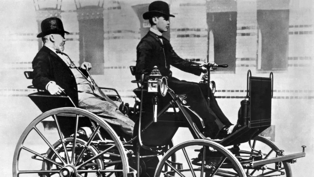
Before there was Mercedes-Benz, there were two fierce competitors.
On one side, you had Daimler-Motoren-Gesellschaft (DMG), founded by Gottlieb Daimler; on the other, Benz & Cie., founded by Karl Benz. In the late 19th century, both men independently invented some of the world’s first automobiles, operating in towns less than 60 miles apart in Germany.
They were rivals in every sense of the word. They developed their own technologies, cars, and distinct brand identities for decades. The world-famous logo we know today results from these two companies, and their two unique symbols, colliding.
The Star: DMG’s Quest for a Symbol
Gottlieb Daimler was an engineer obsessed with a single, grand vision: creating engines that would power vehicles on land, on water, and in the air. This wasn’t just a mission statement but the entire business plan. But for years, his company lacked a symbol to represent this ambition.
The Famous Postcard Anecdote
As it’s often told, the origin story is rooted in a simple family memory. In 1872, long before DMG was a powerhouse, Gottlieb Daimler worked in Cologne. He marked a picture of his house on a postcard sent to his wife with a three-pointed star, remarking that one day a star would shine over his own factory, signifying prosperity.
It’s a charming tale. But charming tales don’t build global brands. The key isn’t the postcard itself; it’s the ambition the star represented.
From Postcard to Radiator Cap
Gottlieb Daimler died in 1900, before a proper logo was established. His sons, Paul and Adolf Daimler, recalled their father’s star anecdote years later. They adapted the idea while wrestling with the need for a memorable trademark.
In 1909, DMG registered a three-pointed and a four-pointed star as trademarks. They chose the three-pointed star to represent their father’s core vision. By 1910, the three-pointed star began appearing on the radiators of their vehicles.
What Does the Three-Pointed Star Actually Mean?
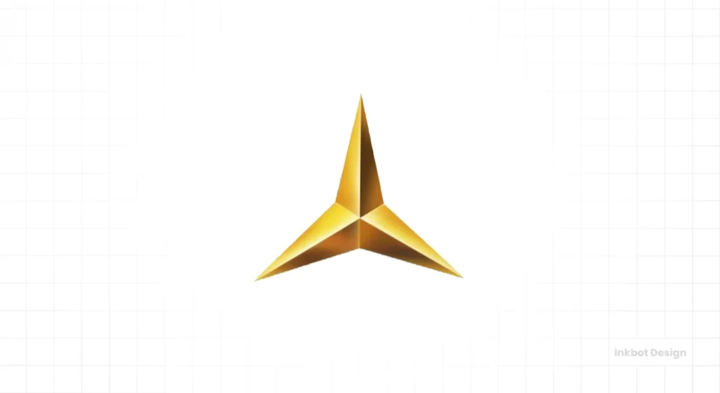
The meaning behind the Mercedes three-pointed star is surprisingly direct: domination of the land, the sea, and the air.
Each point on the star represents a realm where Daimler’s engines were intended to operate.
- Land: Automobiles, trucks, and trains.
- Sea: Motorboats and marine applications.
- Air: Aeroplanes and airships.
This wasn’t some marketing spin added after the fact. It was the founding vision of the company, elegantly captured in the simplest possible geometric form. It represented a future they were actively building.
The Other Half: The Benz & Cie. Logo
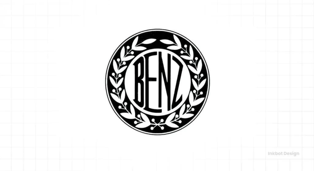
While the Daimler sons were trademarking their star, their rival Karl Benz built his brand identity.
The first Benz & Cie. logo was a gear wheel, a very literal symbol of engineering. However, as the company gained a reputation, it needed something more elegant.
In 1909, the same year DMG registered the star, Benz & Cie. registered a new logo. They replaced the industrial gear wheel with a laurel wreath, a classical symbol of victory and excellence. The name “Benz” sat confidently in the centre. The wreath was a clear statement to the market: we are the champions, the winners in the automotive field.
When Two Rivals Become One: The 1926 Merger
The First World War devastated the German economy. In the aftermath, luxury goods like automobiles were nearly impossible to sell. For DMG and Benz & Cie., survival meant doing the unthinkable: joining forces.
In 1926, the two great rivals officially merged to form Daimler-Benz AG. And with that merger came a design challenge: how do you combine two established, competing logos into one?
Their solution was a shotgun wedding.
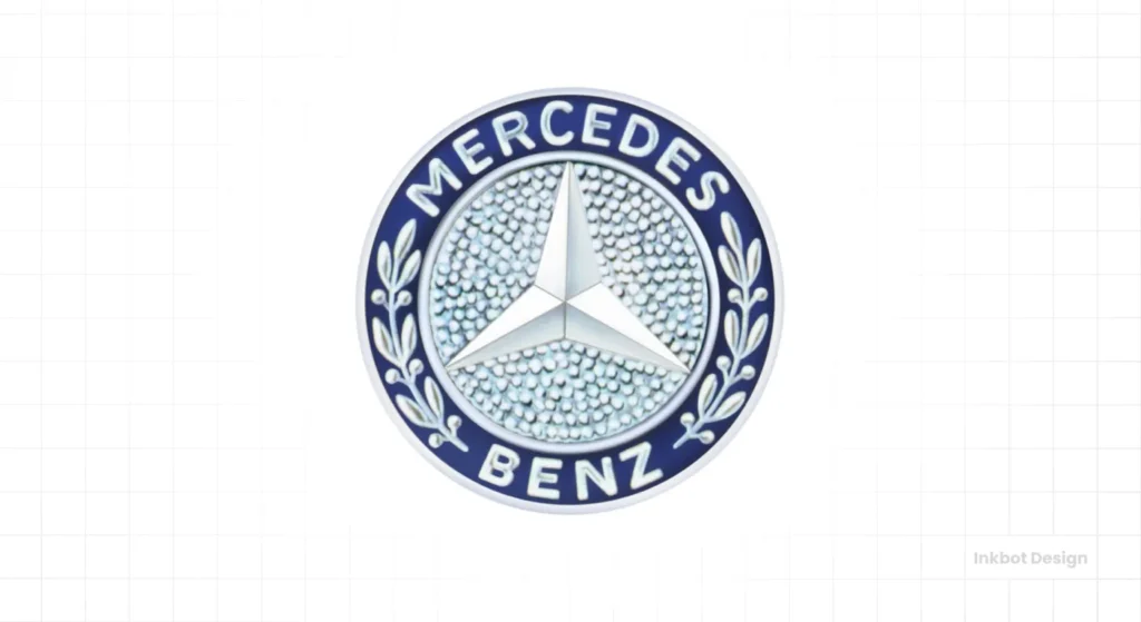
They placed the DMG three-pointed star squarely inside the Benz laurel wreath. The names “Mercedes” (a brand name DMG had been using successfully since 1901) and “Benz” were included within the circle.
Frankly, it was a mess by modern design standards. It was cluttered and redundant, trying to tell two stories simultaneously. But it was a necessary compromise—a visual treaty honouring both sides of the new company.
The Great Simplification: A 90-Year Journey to a Circle
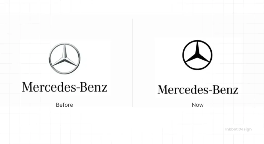
The real genius in the Mercedes-Benz brand story isn’t the creation of the star or the wreath. It’s the disciplined, decades-long process of stripping the combined logo to its bare essence.
The 1926 merger logo was the starting point, not the destination.
- 1933: The first significant simplification occurred. The laurel wreath was slimmed down, becoming a simple circle border. The star became much more prominent. This design coincided with the rise of the legendary “Silver Arrows” racing cars, which helped cement the star alone as a symbol of speed and victory.
- 1989: The company made another significant leap. For many applications, they dropped the wordmarks and the wreath entirely, leaving just the strong, confident three-pointed star, often enclosed in a circle.
- Today: The modern Mercedes-Benz logo is the ultimate expression of this journey. It’s a clean, three-dimensional silver star, instantly recognisable with or without the company name. It is elegant, powerful, and utterly devoid of anything non-essential.
It took over 90 years to go from a cluttered wreath to a pure, simple star. That journey holds the most important lessons for any business owner.
3 Brutal Branding Lessons from the Mercedes Logo
Studying this history is pointless unless you can apply its lessons to your business. The challenges you face today are the same ones Daimler and Benz faced a century ago: how to stand out, convey quality, and evolve.

Lesson 1: Your Origin Story is a Spark, Not a Blueprint
The Daimler postcard story is excellent. But they didn’t try to design a postcard logo with a star on it. They extracted the core idea—ambition, the future, universal reach—and found the simplest possible symbol for it.
Too many startups try to cram their entire founding myth into a logo. The result is a complex, confusing mark that no one can remember. Your logo should represent your core promise, not your whole biography.
Lesson 2: Mergers are Ugly, but Brands Must Adapt
The 1926 logo was a compromise, born from economic desperation. It wasn’t perfect, but it served a vital business purpose: uniting two companies.
Your business will change. You may acquire another company, pivot your services, or change your target audience. Your brand identity has to be flexible enough to evolve with you. Holding onto a logo that no longer represents your business out of pure nostalgia is a strategic error.
Lesson 3: The Bravest Design Choice is Subtraction
The most powerful act in the Mercedes logo’s history was removing the laurel wreath. It was a decision to let go of the past to create a stronger future. They chose the star’s simplicity over the wreath’s combined history.
Look at your own branding. What could you remove? What words, images, or elements are cluttering your message? Often, the path to a stronger brand isn’t about adding more, but having the courage to take things away. The principles of creating a powerful, enduring symbol are timeless, and they’re at the core of what we do. To see how we apply these principles of clarity and simplification, explore Inkbot Design’s logo design services.
So, Should Your Logo Take 100 Years to Perfect?
No, of course not. The market moves too fast for that.
However, the principles that guided the Mercedes-Benz star are more relevant than ever.
- Start with a core, authentic meaning. What is the most critical idea your business stands for?
- Choose the simplest possible visual representation of that idea.
- Apply it consistently, everywhere, for years.
- Be willing to refine and simplify as your business matures.
The Mercedes logo isn’t just a shiny ornament on a luxury car. It’s a testament to a clear vision, the willingness to adapt, and the profound power of getting simpler over time. It didn’t just happen—it was forged.
Frequently Asked Questions about the Mercedes Logo
What do the 3 points on the Mercedes logo mean?
The three points represent the ambition of Daimler-Motoren-Gesellschaft (DMG) to provide engines for universal motorisation on land, at sea, and in the air.
Who designed the original Mercedes logo?
A mark inspired by the three-pointed star Gottlieb Daimler once made on a postcard. His sons, Paul and Adolf Daimler, officially adopted this idea and registered it as a trademark for DMG in 1909.
When did Mercedes and Benz merge their logos?
Mercedes (used by DMG) and Benz & Cie. merged in 1926, forming Daimler-Benz. Their first combined logo, which placed the DMG star inside the Benz laurel wreath, was created that same year.
Why is the Mercedes logo a star?
The star was chosen to symbolise the Daimler family’s goal of having their engines dominate the land, sea, and air. It was a simple, powerful symbol of their global ambition.
What was the Benz logo before the merger?
Just before the 1926 merger, the Benz & Cie. logo was the word “Benz” enclosed within a laurel wreath, symbolising victory and automotive excellence.
Why is the Mercedes logo silver?
The silver colour is famously linked to Germany’s “Silver Arrows” racing cars from the 1930s. The legend is that the team scraped the white paint off their vehicle to meet weight limits, revealing the shiny silver aluminium bodywork. Colour became synonymous with Mercedes-Benz’s performance and cutting-edge engineering.
Did the Mercedes logo ever have four points?
Yes, when DMG trademarked the three-pointed star in 1909, they also registered a four-pointed star. The four-pointed star was used sparingly and eventually became the logo for a subsidiary company, DASA, in the 1980s, representing their activities on land, sea, air, and space.
Who is the “Mercedes” in Mercedes-Benz?
“Mercédès” was the daughter of Emil Jellinek, an early automotive entrepreneur who was a key distributor and racer of DMG cars. He raced under the pseudonym “Monsieur Mercédès” and had so much success that DMG registered “Mercedes” as a brand name in 1901.
Has the Mercedes logo ever changed?
Yes, dramatically. It began as two logos (the DMG star and the Benz wreath). They combined in 1926 into a complex mark and have been progressively simplified over the last century into the clean, modern star used today.
What is the font used in the Mercedes-Benz logo?
Mercedes-Benz uses a proprietary corporate typeface called Mercedes-Benz Corporate A S. It is a sans-serif font designed for clarity and elegance.
Build a Brand That Endures
The story of the Mercedes-Benz logo is a lesson in focus and evolution. It proves that a powerful symbol isn’t about capturing everything you are today, but representing the ambition of where you want to go. The principles of starting with a core idea and simplifying over time are universal.
Your brand’s journey might not involve rival German engineers, but the goal is the same: to create a mark that is clear, memorable, and stands the test of time. If you’re ready to forge a symbol with that kind of staying power, the team at Inkbot Design is prepared to help.
