10 Common Logo Design Mistakes Killing Your Brand
Your logo is the hardest-working employee in your company. It never sleeps, it represents you on every invoice, and it is the first thing a prospect sees before they decide to trust you.
Yet, most entrepreneurs treat it like a last-minute chore.
I have spent years repairing the damage caused by “budget” branding. I’ve seen £50 logos cost companies £50,000 in lost revenue, legal fees, and rebranding costs.
A poor logo isn’t just an aesthetic “shame”—it is a functional failure that creates friction in the customer’s journey.
According to a landmark study by McKinsey & Company, companies with high design scores outperformed the S&P 500 by 219% over a ten-year period.
If you are making these mistakes, you are actively leaving money on the table.
- Use vector files (.AI, .EPS, .SVG) not raster images to ensure scalability and print‑ready quality.
- Keep logos simple and distinctive; avoid complexity, generic tropes and design‑by‑committee results.
- Ensure legibility and versatility: black‑and‑white versions, responsive marks and original, trademarkable artwork.
What are the Worst Logo Design Mistakes?
Logo design mistakes are technical, conceptual, or strategic errors in a brand mark that hinder legibility, scalability, and memorability. These errors often stem from a lack of technical training, over-reliance on trends, or failing to align the visual identity with the business’s core objectives and target audience.
The three core elements of a failed logo are:
- Technical Fragility: Using file formats or structures that break when scaled or printed.
- Cognitive Dissonance: A visual style that contradicts the brand’s price point or industry.
- Legal Liability: Using elements that cannot be trademarked, leading to “Cease and Desist” letters.
1. The Raster Disaster: Designing in Pixels
The most common technical error I see is designing a logo in software like Photoshop. This creates a “raster” image—a grid of pixels. If you try to blow that logo up for a shop sign or a vehicle wrap, it turns into a jagged, blurry mess.
Professional logo design and branding must always be executed in vector format (using software like Adobe Illustrator). Vectors are based on mathematical paths, meaning they can be scaled to the size of a skyscraper or shrunk to the size of a postage stamp without losing any quality.
Real-World Example: I once audited a client who had a stunning logo for their Instagram profile. When they went to print their first trade show backdrop, the printer told them the file was unusable. They had to pay for a full “vector reconstruction,” which delayed their launch by two weeks and cost them triple the original design fee.
The Fix: Always demand .AI, .EPS, or .SVG files from your designer. If they send you a .JPG or .PNG as your master file, they aren’t a professional; they are an amateur with a subscription. Learn more about vector vs raster images to avoid this trap.
2. Typographic Torture: Poor Font Choices and Kerning
Typography is 70% of logo design. An amateur chooses a font because it looks “cool” or “fun.” A professional chooses a font based on its personality, legibility, and technical performance.
One of the most frequent logo design mistakes is “default font syndrome.” Using fonts like Comic Sans, Papyrus, or even the overused Helvetica without modification tells the world you didn’t care enough to differentiate.
The Kerning Crisis:
Kerning is the space between individual letters. Bad kerning (often called “keming”) can lead to embarrassing misinterpretations.
Real-World Example: In 2019, Zara updated its logo, moving the letters so close together that they overlapped. While it was a “fashion-forward” move, it was widely mocked by designers for ignoring the basic principles of legibility. In a B2B context, if your logo is difficult to read, your brand appears disorganised and untrustworthy.
3. Complexity Overload: The “Everything but the Kitchen Sink” Approach
Entrepreneurs often want their logo to tell their entire life story. They want a mountain to represent their location, a rising sun to symbolise “new beginnings,” and a handshake to signify “trust.”
This is a recipe for disaster. A logo is not an illustration; it is a symbol.
The Squint Test:
If you squint at your logo and it becomes a grey blob, it has failed. A great logo, like Nike or Apple, remains recognisable even when it is blurry or shrunk down to 16 pixels on a mobile screen.
Complexity kills scalability. When you add too many lines, gradients, and fine details, they disappear when the logo is small, leaving you with a messy “smudge” on your business cards.
The Fix: Stick to one core idea. If you have three elements, delete two of them. This is a vital part of the logo design process.
4. Colour Blindness: Designing Without a “Black and White” Version
If your logo relies solely on colour to work, it’s broken.
There will be many times when your logo needs to be printed in one colour:
- Invoices and receipts.
- Embroidered shirts.
- Newspaper ads.
- Faxes (yes, some industries still use them).
- Engraved trophies or signage.
The Technical Trap:
Amateurs use gradients and “glows” to hide poor composition. When those effects are removed for a single-colour print, the logo loses its identity.
Real-World Example: Look at the FedEx logo. It works in full colour, but it is just as powerful when stamped in black ink on a cardboard box. This versatility is why it is often cited among the 100 famous logos that define branding excellence.
| Feature | Amateur Way | Professional Way |
| Colour | Starts with rainbows and gradients | Starts in Black and White |
| Scalability | Becomes a blob at small sizes | Remains legible at 1cm width |
| File Formats | .JPG or .PNG | .AI, .EPS, .SVG, .PDF |
| Font | Default or “Gimmick” fonts | Bespoke or highly refined type |
| Concept | Literal (A car for a car wash) | Symbolic or Abstract |
5. Trend Chasing: Designing for 2024, Irrelevant by 2026
Following trends is the fastest way to look dated. Remember the “swoosh” logos of the early 2000s? Or the “glossy 2.0” bubbles of 2010? They look ancient now.
When you follow logo design trends, you are essentially putting an expiry date on your brand. A rebrand is expensive and disruptive. You want a logo that lasts 10 to 20 years, not 10 to 20 months.
The State of Logo Design in 2026:
We are currently seeing a massive shift toward “Hyper-Minimalism” and “Variable Branding.” Brands are moving away from static icons toward “living” logos that adapt to different digital environments.
If you design a rigid, complex logo today, you are already behind the curve. Freshness in 2026 isn’t about adding “cool” effects; it’s about responsive logo design that functions across VR, AR, and mobile interfaces.
The Logo “Stress Test”
A great logo isn’t just pretty—it’s functional. Can your current logo survive these 5 critical real-world scenarios? Toggle “YES” for every test you pass.
6. The “Franken-Logo”: Design by Committee
This is the silent killer of great brands. A founder has a vision, the marketing manager wants a different colour, the spouse thinks it should be “friendlier,” and the cousin who “knows a bit of Photoshop” adds a star.
The result? A “Franken-Logo.” It is a stitched-together mess that satisfies everyone in the room but resonates with no one in the market.
Design is not a democracy. It is a strategic tool. If you ask ten people for their opinion on a logo, you will get ten different answers based on personal preference, not business strategy.
The Fix: Trust the expert you hired. A professional logo design service will guide you based on logo design psychology and market data, not subjective “feelings.”
7. Generic Tropes: The “V-Man” and the “Global Swoosh”
There are certain symbols that have been used so many times that they have lost all meaning.
- The “V-Man” (a stylised human with uplifted arms) for “Human Resources” or “Health.”
- The “Global Swoosh” for “Tech” or “Logistics.”
- The “Lightbulb” for “Innovation.”
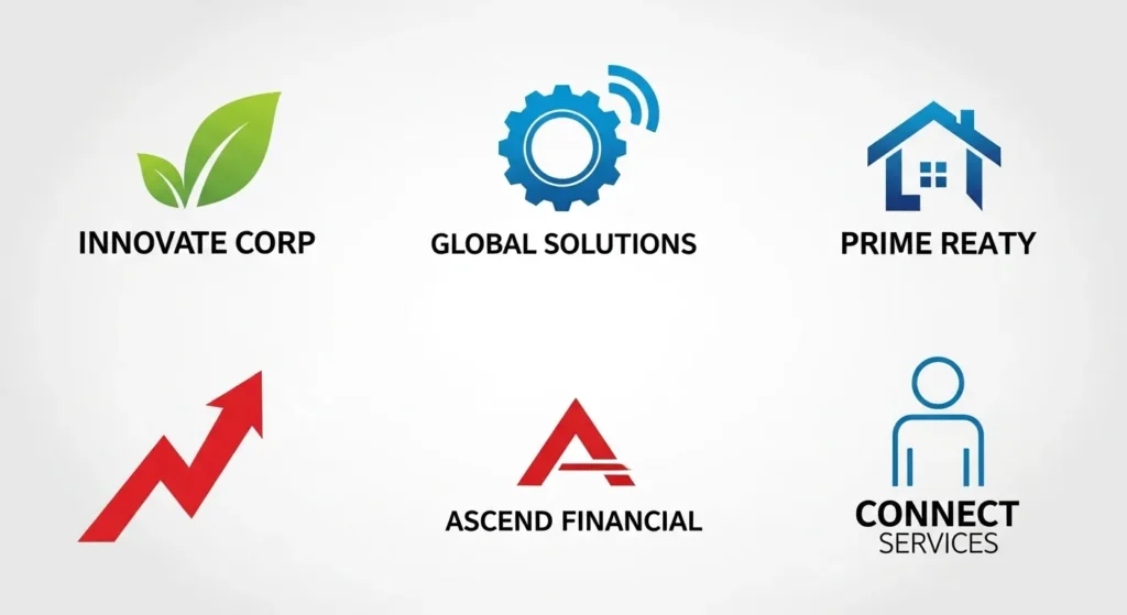
When you use these tropes, you are telling the market that you are “just another” company in your sector. You fail the “distinctiveness” test.
Data Point: Research by Nielsen shows that consumers are 4x more likely to remember a brand that uses a unique, non-generic visual metaphor. If you want to stand out, you have to stop blending in.
8. Ignoring the “Responsive” Requirement
In 2026, your logo will appear on a 32-inch 4K monitor and a 1-inch Apple Watch face. If you have one single file for both, you are making a massive mistake.
A “Responsive Logo” is a system of marks that simplifies as the screen size gets smaller.
- Full Logo: For desktop and large print.
- Simplified Logo: For tablets and medium print.
- Logo Mark (Icon): For social media profile pictures and favicons.
Without a responsive system, your logo becomes an unreadable speck on mobile devices. If you aren’t sure if you need this, check out our guide on a rebrand vs logo redesign.
9. Poor Colour Psychology: The “Vibe” Mismatch
Colour isn’t just a decoration; it’s a biological trigger.
- Blue triggers trust and calm (why most banks use it).
- Red triggers urgency and appetite (why fast food uses it).
- Yellow triggers optimism but can cause eye strain.
I once saw a luxury funeral home use a bright, neon shade of yellow for “Sales.” It was a psychological disaster. It felt cheap and frantic when it should have felt dignified and serene.

The Financial Cost:
Getting your colours wrong affects your conversion rate. A study by the Institute of Practitioners in Advertising (IPA) found that emotional branding is twice as profitable as purely rational messaging. If your colours send the wrong emotional signal, you are fighting an uphill battle.
Before you commit to a palette, understand the logo design cost isn’t just about the designer’s time—it’s about the research into how those colours will perform in your specific market.
10. The Legal Nightmare: Using Stock Art or Unlicensed Elements
This is the most dangerous of all logo design mistakes. Many “budget” designers on platforms like Fiverr use stock icons from sites like Shutterstock or Freepik.
The Problem:
- Zero Uniqueness: Thousands of other businesses use the same icon.
- Zero Ownership: Most stock sites forbid the use of their assets in logos. You cannot trademark a logo that contains stock art.

Imagine building your business for five years, only to receive a letter from a massive corporation stating your logo is too similar to theirs, or from a stock site demanding licensing fees. You would have to rebrand overnight—changing your signs, website, stationery, and fleet.
The Fix: Always ask your designer for a “Transfer of Copyright” document and proof that the work is original. If the price seems too good to be true, it’s probably because they are cutting corners with your legal safety. Visit our contact page for a quote on original, trademark-ready work.
The Consultant’s Reality Check
In my fieldwork, I often see business owners who are terrified of “losing” their old, bad logo because they think they have “brand equity.”
If your logo is a rasterised, clunky, 1990s-style mess, the only “equity” you have is a reputation for being outdated.
I once audited a client in the engineering space who was struggling to win high-value contracts. Their logo appeared to have been created in Microsoft Paint.
After a strategic redesign that aligned them with their actual price point (£100k+ contracts), their lead conversion rate increased by 40% in six months.
People judge the quality of your service by the quality of your visuals. It’s not “fair,” but it is a fact of human psychology. If your logo appears amateurish, the assumption is that your work is likely amateurish as well.
The Verdict
A logo is a technical representation of your brand. If it’s buggy, it crashes your reputation. Avoid the “Franken-Logo,” stop chasing 2024 fads, and for the love of your profit margins, ensure your designer is working in vectors.
Your brand deserves better than a “good enough” icon. It deserves a strategic asset that communicates authority and builds trust at a glance.
Would you like me to review your current logo or assist you in initiating the process of a professional redesign? Explore Inkbot Design’s Services
- Request a Branding Quote
- Browse more Branding Insights
FAQ: Common Logo Design Questions
Why shouldn’t I use a logo maker or AI for my brand?
AI and automated logo makers rely on existing patterns and templates. While they might produce a “clean” image, they cannot provide the strategic differentiation or legal protection required for a serious business. You risk having a generic logo that is identical to your competitors.
What is the best file format for a logo?
For master files, .AI (Adobe Illustrator) is the gold standard. For web use .SVG is best for scalability, while .PNG is used for transparency. Never use .JPG for a logo if you can avoid it, as it creates a solid white background and loses quality over time. Read more about logo file formats.
How many colours should a logo have?
Generally, 2 to 3 colours are the limit for most successful brands. This ensures the logo is easy to process and cheaper to print. However, the most important thing is that the logo works in a single colour (black or white) first.
How do I know if my logo is outdated?
If your logo uses heavy gradients, drop shadows, or overly complex illustrations, it is likely dated. Modern design favours “flat” or “semi-flat” styles that perform better on mobile screens and digital interfaces.
Can I trademark a logo I bought for £50?
Unlikely. Most low-cost logos use pre-made elements or stock art, which cannot be legally trademarked. A trademark requires the work to be original and “non-functional.” If you didn’t pay for original design time, you probably don’t own the rights.
What is the difference between a logo and a brand?
A logo is a symbol that identifies your business. A brand is the total “gut feeling” a customer has about your business. The logo is the “face,” but the brand is the “personality.” Both must be aligned to be effective.
How much should a professional logo design cost?
Prices vary wildly based on the size of the business and the scope of the project. However, for a professional SMB logo that includes research, strategy, and a full suite of files, expect to invest between £1,500 and £5,000. Learn more about logo design cost.
What is a “Responsive Logo”?
It is a logo designed to adjust its level of detail based on the viewing context. It might be a complex version on a website header, but a simple “lettermark” as a favicon on a mobile browser. This ensures legibility across all devices.
Why is typography so important in a logo?
Fonts carry emotional weight. A serif font (like Times New Roman) feels traditional and authoritative, while a sans-serif (like Arial) feels modern and clean. The wrong font can completely misrepresent your brand’s “voice.”
How often should a company redesign its logo?
A well-designed logo should last 10 to 15 years. You shouldn’t “chase trends,” but you should consider a “refresh” if your business model changes significantly or if your visuals no longer represent your current market position. Learn about rebrand vs logo redesign.
What is the “Squint Test” in logo design?
The squint test is a method used to assess legibility. By squinting at the design, you remove the fine details and see only the core shape. If the shape is still recognisable, the logo is strong. If it becomes a blur, it’s too complex.
Does my logo require a symbol?
Not necessarily. Some of the world’s most famous brands use “Wordmarks” (just the name in a specific font), like Google, Sony, or Coca-Cola. A symbol is only necessary if it adds value or aids in memorability. Explore various types of logos for more options.
