The 15 Best Sites for Logo Design Inspiration
You’re staring at a blank screen. Or a blank piece of paper. Or maybe just into the middle distance, hoping a brilliant idea for your new logo will materialise out of thin air.
Someone, somewhere, once told you to “look for inspiration.” So you open a new tab and type “logo design inspiration” into Google.
And so it begins.
You fall down a rabbit hole of endless scrolling, pinning, and saving. Two hours later, 50 “cool” logos are saved to a folder, but you’re no closer to a decision. In fact, you’re more confused than when you started. You’ve just consumed the visual equivalent of junk food—and now you have a creative stomach ache.
Let’s fix that.
This isn’t just another list of websites. This is a guide on how to use them without losing your mind or your brand’s identity. The goal isn’t to find something to copy; it’s to learn how to deconstruct what works and why. It’s about active analysis, not passive scrolling.
- Use "Active Deconstruction": analyse the idea, audience, and scalability—don’t just passively scroll through logos.
- Choose the right inspiration sites for purpose: Behance for case studies, Dribbble for trends, LogoLounge for archives.
- Follow the 4-step process: define strategy, gather broadly, cull to 10–15, and articulate why each choice works.
- Aim for effectiveness over aesthetics: a logo must communicate, be versatile, and remain timeless—not merely "inspired."
The Big Mistake: Confusing Looking with Seeing
Most people look at hundreds of logos. Very few actually see them.
Looking is passive. It registers a shape, a colour, and a font. Seeing is active. It’s understanding the thinking, the strategy, and the cleverness behind the design.
The perfect example is the FedEx logo. For years, you’ve looked at it on vans and packages. But have you ever truly seen it?
Look again at the white space between the ‘E’ and the ‘x’. There is a perfectly formed arrow hidden there, pointing forward. It represents speed, precision, and forward direction—the very essence of their business. Once you see it, you can’t unsee it.
That is the difference between looking and seeing.
You will apply this “Active Deconstruction” filter to every logo you consider for inspiration. For every design you save, you must be able to answer three simple questions:
- What’s the one big idea? Is there a clever visual pun, a negative space trick, or a simple, powerful concept? If you can’t spot it, it doesn’t have one.
- Who is this for? Does the design scream “high-end law firm” or “playful kids’ daycare”? The aesthetic choices must match the intended audience.
- Would it work in black and white on a postage stamp? This is the ultimate test of versatility. A great logo is simple, scalable, and recognisable in its most basic form.
The logo is just a pretty picture if you can’t answer these. Delete it and move on.
Curated & Critiqued: The 15 Best Logo Inspiration Sites
Here are the platforms worth your time, organised by what they’re actually good for. Use them with the “Active Deconstruction” mindset.
1. Behance: For the Full Story
- Best For: Understanding the entire brand identity system, not just the logo.
- Persona’s Pro Tip: The real value of Behance is in the case studies. Don’t just look at the final logo. Search for “Brand Identity” projects and scroll through the entire presentation. A professional designer will show you the strategy, the development sketches, and how the logo is applied to websites, business cards, and packaging. You’re seeing the thinking, not just the result.
- The Catch: It’s a time sink. A single, well-documented project can take you 20 minutes to absorb correctly. Use it when you have dedicated time for deep research.
2. Dribbble: For the Bleeding Edge
- Best For: Spotting emerging visual trends, slick animations, and impressive technical skill.
- Persona’s Pro Tip: Dribbble is where designers show off to other designers. Use it to gauge technical possibilities—like how a logo might animate—but take the actual concepts with a massive grain of salt. Follow specific designers whose work you admire and look for their “process shots” that reveal how a mark is constructed.
- The Catch: This is the epicentre of style over substance. Many of the most popular “shots” are self-initiated projects that have never been tested against a real-world client brief. It’s a place for aesthetic inspiration, not necessarily business strategy.
3. Brand New: For Brutal Honesty
- Best For: Learning to think and talk critically about logo design.
- Persona’s Pro Tip: This is the most valuable resource for developing your design eye. Run by the design firm UnderConsideration, it reviews major corporate rebrands with unflinching, expert analysis. The gold is in the comments section, where professionals debate the merits and failures of each project. Read them. You’ll learn the vocabulary of design critique.
- The Catch: The tone is jaded and professional. This isn’t it if you’re looking for warm, fuzzy encouragement. It’s a masterclass in critical thinking.
4. LogoLounge: For the Deep Archive
- Best For: Granular, keyword-based research on specific logo subjects and styles.
- Persona’s Pro Tip: This is what professional logo designers use. You can search a massive database of over 400,000 logos by keyword (e.g., “eagle,” “shield,” “leaf”), designer, or industry. Pay special attention to their annual Trend Reports, which are among the most respected in the industry because they’re based on an enormous dataset of submissions.
- The Catch: Full access requires a paid annual subscription ($100/year). It’s an essential tool for full-time designers, and a worthwhile investment for a business owner serious about getting their identity right.
5. Identity Designed: For Pure Quality
- Best For: A concentrated dose of impeccable, strategy-led branding work.
- Persona’s Pro Tip: This is a curated gallery, not an open-for-all platform. The quality is consistently exceptional. Notice that every project featured is a complete visual system. This teaches a crucial lesson: a logo doesn’t exist in a vacuum. It’s the cornerstone of a larger brand identity.
- The Catch: Because it’s so tightly curated, it’s not updated as frequently as other sites. It’s a fine dining experience, not a buffet.
6. Pinterest: For Taming the Chaos
- Best For: Creating and organising visual mood boards after you have a clear strategic direction.
- Persona’s Pro Tip: Pinterest is a tool, and like any tool, it can be misused. Never start with a vague search like “logo ideas.” The algorithm will trap you in a feedback loop of generic trends. Instead, use it after you’ve defined your brand attributes. Search for specific things like “authoritative serif typography for finance” or “organic packaging textures.” Create secret boards and be ruthless in your curation.
- The Catch: This is the home of the “Pinterest Clone” effect. Without a strong strategic filter, you will inevitably drift towards the most popular, overused styles, dooming your brand to look like a dozen others.
7. Awwwards: For Digital-First Brands
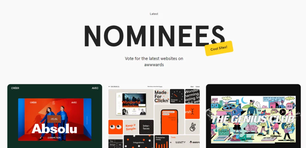
- Best For: Seeing how logos and brand identities function in a live, interactive digital environment.
- Persona’s Pro Tip: Don’t just look at the logos of the winning sites. Analyse how the logo informs the website’s layout, typography, colour palette, and motion design. A modern brand identity is dynamic; this is the best place to see that in action.
- The Catch: The focus is almost exclusively on web design. If your brand lives primarily in print or a physical space, the inspiration here might be less direct.
8. The Dieline: For Products on a Shelf
- Best For: Logo inspiration for any business that sells a physical product.
- Persona’s Pro Tip: A logo on a screen is one thing; a logo on a crowded supermarket shelf is another. The Dieline showcases the best packaging design and forces you to think about your logo in a three-dimensional context. How does it compete for attention? How does it communicate the product’s value instantly?
- The Catch: Its focus is so specific that it’s of limited use for service-based or digital businesses.
9. World Brand Design Society: For a Global Perspective
- Best For: High-quality, award-winning student and professional work outside the North American/Western European bubble.
- Persona’s Pro Tip: Use this site to break out of your regional design echo chamber. You’ll see different cultural takes on colour, typography, and symbolism. It’s a brilliant way to find unique ideas that haven’t been endlessly recycled on Dribbble.
- The Catch: It’s a vast collection, and the site’s search and filtering tools aren’t as sophisticated as platforms like Behance.
10. Typewolf: For Typography Nerds
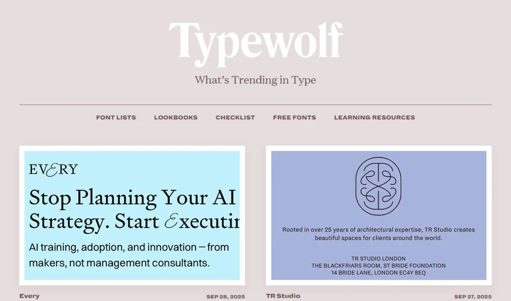
- Best For: Inspiration for wordmarks and understanding what fonts are trending among top designers.
- Persona’s Pro Tip: Founder Jeremiah Shoaf has impeccable taste. Don’t just look at the fonts; study the font pairings. The relationship between the headline and body copy font is a huge part of brand identity. Typewolf is the best resource for how pros create harmonious and enjoyable typographic systems.
- The Catch: This is a specialist tool. It’s a deep dive into typography, which might be too granular if you’re in the early brainstorming stages.
11. Fonts in Use: For Typographic Context
- Best For: Seeing how a specific typeface has been used in real-world projects.
- Persona’s Pro Tip: Found a font you think you love on a font-selling website? Search for it on Fonts in Use before you commit. You can see how it has been applied to logos, book covers, and websites. This helps you gauge if a font is versatile, if it’s a fad, or has been overused to the point of becoming a cliché.
- The Catch: It’s a searchable archive, not a curated gallery. The quality of the design work featured varies wildly. You are there to research a specific font, not for general browsing.
12. Logopond: For Raw Creativity
- Best For: Browsing a classic, community-driven gallery of logo concepts.
- Persona’s Pro Tip: Logopond has been around for ages. Ignore the most recent uploads and sort the gallery by “Most Liked” of “All Time.” You’ll see a history of online logo design trends and discover clever concepts that have influenced designers for over a decade.
- The Catch: The quality is a mixed bag as an open community platform. You have to sift through a lot of amateur work to find the professional-grade gems.
13. Muzli 2 (by InVision): For Serendipity
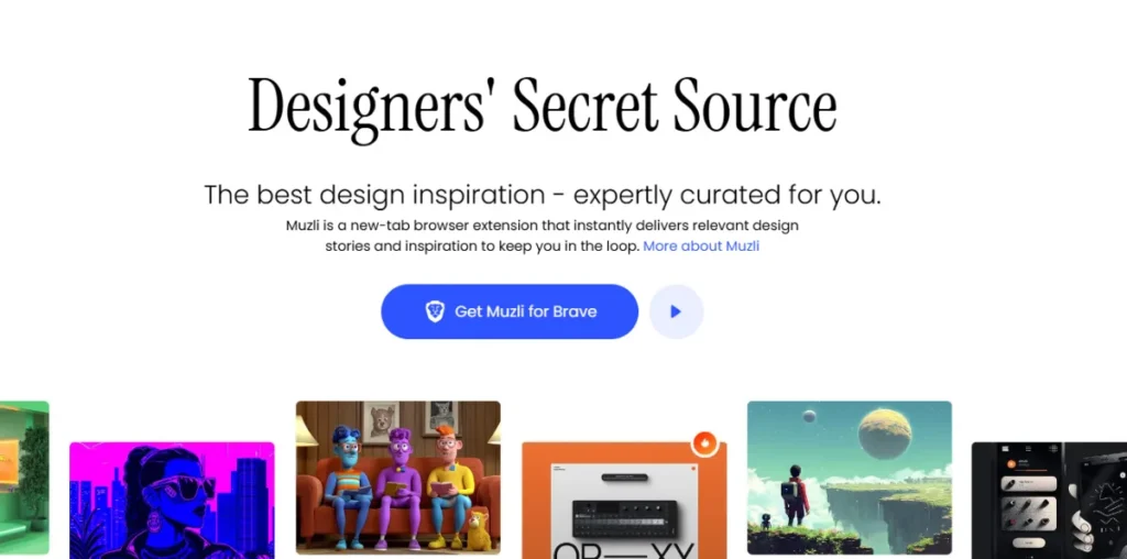
- Best For: A quick, broad-spectrum dose of what’s new and interesting across the eesign world.
- Persona’s Pro Tip: Muzli is a browser extension that replaces your new tab screen with a curated feed of design content. Its strength is its ability to create serendipitous connections. You might be looking for logo ideas and stumble upon a colour palette from an architecture blog that’s perfect for your brand. Use the built-in colour filter to narrow the firehose.
- The Catch: It’s designed to be a rabbit hole. It can be a massive productivity killer if you don’t use it with discipline. Open it, spend 10 minutes, grab anything that resonates, and close it.
14. From Up North: For Curated Galleries
- Best For: A well-curated visual feed without the social media noise of other platforms.
- Persona’s Pro Tip: The “Logos & Logotypes” gallery is a fantastic, no-fluff stream of quality work. Think of it as a professionally curated Pinterest board. It’s great when you want inspiration without reading lengthy case studies or navigating complex interfaces.
- The Catch: It’s light on context. You see the final product but get very little insight into the strategy or process behind it. Use it for aesthetic ideas, not for strategic learning.
15. Designspiration: For a Different Angle
- Best For: Discovering ideas based on colour.
- Persona’s Pro Tip: The standout feature here is the ability to search by colour. You can select up to five colours, and it will pull up a feed of images that match your palette. This is an incredible tool for breaking out of a creative rut and exploring how different colour combinations create moods.
- The Catch: Its keyword search is less effective than other sites. Go to Designspiration for its unique colour search; use Behance or LogoLounge for topic-based searches.
How to Turn Inspiration Into Action (Without Copying)
Looking at websites is easy. The hard part is synthesising that research into a clear direction.
Follow this simple 4-step process to bridge the gap.
- Define Your Strategy First. Before you look at a single logo, write down 5-7 adjectives that describe your brand’s desired personality. Are you “playful, affordable, and loud” or “authoritative, luxurious, and discreet”? This is your filter.
- Gather Broadly. Set a timer for 90 minutes. Pick three sites from the list above that best suit your needs. Gather screenshots of anything that aligns with your strategy adjectives. Don’t overthink it.
- Cull Ruthlessly. Drag all your screenshots into one document. Now, be brutal. Look at your collection and delete anything that doesn’t feel right. You’re trying to find a consistent theme. You should have no more than 10-15 core images by the end.
- Articulate the “Why”. This is the most critical step. For your top 5 images, write one sentence each explaining why it works for your brand, referencing your strategy words. For example: “I like this logo’s bold, classic serif font because it feels authoritative and trustworthy.
This final collection of images and sentences is the foundation of your design brief. This process is the first step in creating a professional logo design brief. Getting this right makes the entire design process faster and more effective, whether you’re working with a freelancer or an agency like Inkbot Design.
Your Logo Doesn’t Need to Be ‘Inspired’, It Needs to Be Effective
Inspiration is just a starting point. It’s a tool for clarifying your own thinking.
The goal is not to find a logo you like. The goal is to create a logo that works.
A working logo communicates your brand’s core message instantly. It connects with your ideal customer. It’s versatile enough to look good on a billboard and as a tiny favicon in a browser tab. It’s timeless enough not to look dated in three years.
So stop searching for a logo you like. Start looking for one that works.
Frequently Asked Questions (FAQs)
What is the best free website for logo design inspiration?
Behance is the best free resource because it provides full brand identity case studies, giving you context beyond just the logo. Pinterest is also free, but requires more discipline to be used effectively.
How do I get logo ideas if I have a creative block?
Start with words, not pictures. Write down a list of keywords related to your business, your values, and your audience. Then, use a site like LogoLounge to search for those specific keywords to see how other designers have approached similar concepts.
What’s the main difference between Dribbble and Behance?
Behance is built for comprehensive portfolio presentations and detailed case studies (the “why” and “how”). Dribbble is designed to share quick snapshots of work-in-progress or final designs (the “what”), often focusing on visual trends and technical execution.
How do I avoid choosing a logo that’s too trendy?
Actively look for inspiration on sites that value timelessness, like Identity Designed or the archives of Brand New. When you see a style repeated everywhere on Dribbble or Pinterest, make a note to avoid it. A good test is to ask, “Would this have looked good 10 years ago?” If the answer is no, it will likely look dated 10 years from now.
Should I look at my competitors’ logos for inspiration?
You should conduct a competitive analysis to understand the visual landscape of your industry, but not for direct inspiration. The goal is to see what everyone else is doing so you can consciously choose to be different and stand out.
How many inspirational examples should I give to a designer?
Quality over quantity. It’s more helpful to provide 3-5 examples with clear explanations of why you like each, rather than a folder of 50 images with no context. Your written explanation is more valuable than the image itself.
Can I use an inspiration site logo for my business?
Absolutely not. The logos on these sites are copyrighted work owned by the designer or their client. Using them would be copyright infringement. Their purpose is for research and inspiration only.
What is a mood board for a logo?
A mood board is a collage of images, textures, colours, and typography that defines your brand’s overall aesthetic and emotional feel. It’s a tool used before logo design begins to ensure everyone agrees on the creative direction.
Is it better to have a wordmark or a symbol for a logo?
This depends entirely on your business name and industry. A wordmark can be very powerful if you have a short, unique name (like Google or Sony). A strong, memorable symbol can be more effective if your name is long or generic.
Why is looking at typography sites important for logo inspiration?
Because over 70% of logos are either entirely typography (wordmarks) or have typography as a significant component (combination marks). The font choice is one of the most critical decisions in brand identity design, as it conveys immense personality.
Feeling clearer about what you want, but unsure how to make it? A collection of inspiring images is a great start, but turning that vision into a professional brand identity is where the real work begins. We should talk if you’re ready to build a brand that works as hard as you do.

