The Evolution of Jaguar Logo Design: From Leaper to JLR Rebrand
When people talk about the “Jaguar logo,” they’re often confused. And the recent corporate rebrand has only muddied the waters.
Are they talking about the “Leaper”—the iconic, pouncing hood ornament? Or the “Growler”—the roaring cat face on the grille? Or the simple, elegant wordmark on the boot?
The answer is: yes.
And that’s the first lesson. Jaguar doesn’t just have a logo; it has a brand identity system.
As a designer, I have a few pet peeves. I can’t stand when clients ask for a “timeless” logo. Nothing is timeless. “Enduring” is the goal. I hate branding by committee, which almost killed Jaguar in the 1970s. And I truly despise when a luxury brand chases a tacky digital trend—I’m looking at you, 2012 “liquid metal” logo.
The history of the Jaguar logo isn’t a clean, linear design story. It’s a messy, chaotic, and fascinating case study in brand survival. It’s a story of forced evolution, corporate acquisitions, identity crises, and the sheer, raw power of a symbol that refuses to die.
For any entrepreneur who thinks a logo is just a quick job on a cheap platform, this history is required reading. This is a comprehensive examination of 100 years of high-stakes logo design and branding.
- Jaguar uses a three-part identity system: Leaper, Growler, and wordmark, each with distinct roles and contexts.
- The Leaper evolved from hood ornament to digital primary symbol, embodying motion, ambition, and brand soul.
- 2012's liquid metal rebrand failed; 2021 return to flat, simple marks modernised usability and longevity.
- 2024 JLR corporate rebrand separated house identity from consumer brands, strengthening Jaguar as standalone luxury.
A Brand Forged in Speed, Re-Forged by War (The “SS” Origins)
Before there was Jaguar, there was the Swallow Sidecar Company.
Founded in 1922 by two motorcycle enthusiasts, William Walmsley and William Lyons (later Sir William Lyons), the company initially manufactured motorcycle sidecars. They were stylish, well-made, and popular.
They soon moved on to building custom bodies for cars like the Austin Seven. Their first “logo” wasn’t a logo at all, but a name: “SS,” for Swallow Sidecar.
In 1931, they produced their first complete car, the “SS 1.” The logo was a simple “SS” in a hexagonal badge, often with wings sprouting from the sides—a common motif for speed at the time.
In 1935, the company launched the “SS Jaguar 100,” a stunning two-seater sports car. This was the first time the name “Jaguar” appeared. According to company legend, Sir William Lyons wanted a name that evoked the cat’s grace, power, and agility.
The “SS” logo and the “Jaguar” model name co-existed for a few years.
Then, World War II happened.
By 1945, the “SS” initials had become irrevocably toxic, associated with the worst of Nazi Germany.
This wasn’t a gentle rebrand. This was an emergency pivot. The “SS” name had to be scrubbed from existence immediately. The company was renamed Jaguar Cars Ltd.
Lesson for Entrepreneurs: Your brand’s name and logo exist in the real world. You cannot control the context. If your name becomes toxic, limiting, or associated with something horrendous (even by accident), you must be prepared to kill it. No amount of brand equity is worth fighting a toxic association.
The Birth of Two Icons: The Leaper and The Growler (1945 – 1980s)
With a new name, Jaguar needed a new identity. Sir William Lyons, a man obsessed with style, didn’t just commission a logo; he commissioned a symbol.
This is where the famous split identity begins.
1. The Leaper: A Symbol of Motion
The most famous Jaguar icon, the “Leaper,” wasn’t actually the company’s official logo for decades. It was a hood ornament (or “mascot”).
It was sculpted in the late 1930s by automotive artist F. Gordon Crosby and first offered as an optional extra. Post-war, it became the brand’s definitive symbol.
From a design perspective, the Leaper is a masterpiece:
- Implied Motion: The animal is captured mid-leap. It’s all potential energy, speed, and elegance. It’s going somewhere.
- Silhouette: It’s instantly recognisable from any angle, even as a simple black shape. This is the hallmark of a great symbol.
- Aspiration: It’s not just a cat; it’s a predator. It represents ambition, power, and the pursuit of the impossible.
The Leaper was the soul of the brand, affixed to the bonnet of legendary cars like the XK120, the E-Type, and the Mark II saloon.
2. The Growler: The Practical Badge
While the Leaper was leaping off the bonnet, Jaguar required a practical logo for the grille, steering wheel, wheel hubs, and print advertisements.
Enter the “Growler.”
This is the front-facing, roaring head of a jaguar, almost always presented in a circle (a “roundel”).
Where the Leaper is about grace and potential power, the Growler is about confrontational power. It’s roaring right at you. It’s aggressive, bold, and confident.
For decades, these two “logos” co-existed. The Leaper was the brand’s poetic, three-dimensional mascot. The Growler was the brand’s two-dimensional, practical badge. This dual-logo system was a brilliant move, allowing the brand to be both elegant and aggressive, depending on the context.
The Wilderness Years: British Leyland and the Fight for Identity (1970s – 1980s)
In 1968, Jaguar was forced into a series of catastrophic mergers, ultimately being absorbed by the British industrial conglomerate British Leyland.
This was the dark age for Jaguar. Quality plummeted. The brand was starved of cash, and its cars became infamous for unreliability.
What happens to a premium logo in a non-premium era? It gets tainted.
The Leaper and the Growler were still there, but they were now attached to poorly built, rust-prone vehicles. The logo’s reputation was actively destroyed by the product it represented.
Lesson for Entrepreneurs: A great logo on a bad product is just lipstick on a pig. Your brand identity is a promise. If your operations, product, or service consistently fail to meet that promise, your logo will eventually become a symbol of that failure.
Worse still, pedestrian safety regulations began to kill the hood ornament. The beautiful, sharp, metal Leaper was seen as a danger. It was phased out in many markets, leaving the Growler and the wordmark to do all the work.
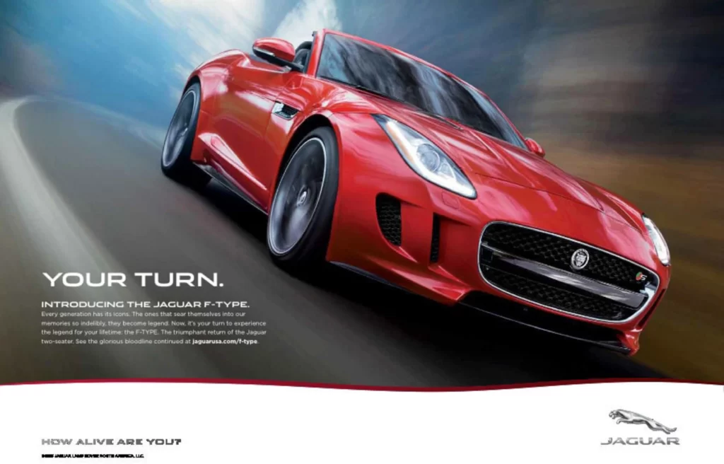
The Ford Era: Polishing the Silver (1990 – 2008)
Jaguar was de-merged from British Leyland and privatised in 1984, but it was still struggling. In 1990, Ford bought the company, slotting it into its new “Premier Automotive Group” alongside Aston Martin, Volvo, and Land Rover.
This era was a mixed bag. Ford invested billions, and quality significantly improved.
The logo, however, entered a strange “retro” phase. Ford’s strategy was to lean heavily on Jaguar’s “British-ness.” This resulted in cars like the S-Type and X-Type, which were modern (often based on Ford platforms), dressed in nostalgic, rounded, 1960s-era styling.
The logos were refined during this period (a notable update happened around 2002):
- The Growler got more detail, more shading, and a more “premium” metallic look. The classic red background was often used.
- The Leaper (now mostly relegated to a badge, rather than an ornament) was also given a more metallic definition.
- The Wordmark was a refined, elegant serif font—very traditional, very “wood and leather.”
My Take: This is where the brand got safe. It was polished, competent, and of high quality… but it felt like a reproduction. The logo reflected this—it was a slightly over-polished, backwards-looking version of itself. It lost its dangerous edge.
The Tata Takeover & The 2012 “Liquid Metal” Rebrand
By 2008, Ford’s luxury experiment had come to an end. It sold Jaguar and Land Rover (JLR) to Tata Motors.
This was the real turning point. Tata’s leadership understood something crucial: Jaguar couldn’t survive by selling its past. It had to be a modern, forward-thinking, desirable brand. It needed to ditch the “old man’s car” image, fast.
This brings us to the 2012 rebrand. This was a massive shift.
- The Leaper as Primary Logo: For the first time, the Leaper was officially promoted from a mascot to the primary brand identifier. It was the hero.
- The “Liquid Metal” Fiasco: The Leaper and Growler were both redesigned with a “liquid metal” 3D, skeuomorphic effect. They were given a metallic sheen, heavy gradients, and a chiselled, embossed look. The Growler’s red background was often swapped for a technical-looking silver or black.
- The Wordmark Revolution: This was the most significant signal. Jaguar ditched the serif. They introduced a new, custom sans-serif font. It was sharp, sleek, minimalist, and cold.
My Take (Pet Peeve Alert): That 3D metallic effect. Ugh. It was a terrible decision. It was chasing a digital design trend (Apple’s skeuomorphism) that was already on its way out. It looked incredible on a 30-foot-high motor show display, but it looked cheap and tacky as a 100px logo on a website. It was hard to reproduce, scaled poorly, and screamed “2012.”
The new Leaper’s form was impressive—more muscular and defined. But the execution was a trend-chasing misstep.
The wordmark, however, was a stroke of genius. Moving from serif (tradition, heritage) to sans-serif (technology, modernity, future) was a powerful statement. It declared, “We are no longer the company that makes wood-panelled saloons. We make performance machines from aluminium.”
Deconstructing the Big Three: A Modern Analysis
To understand Jaguar’s brand today, it is essential to understand its three-part logo system. Each element has a distinct job. As a small business, you can learn a great deal from the “logo trinity.”
Here’s a breakdown of how they function:
| Logo Element | Primary Use Case (Historic) | Primary Use Case (Modern) | Core Brand Message | My Design Rating |
| The Leaper | Hood Ornament (Physical) | Primary Brand Identifier (Digital, Print, TV) | Pace, Elegance, Ambition, Forward-Motion | A+ (Form), C- (2012 Execution) |
| The Growler | Grille Badge, Steering Wheel (Roundel) | Secondary Badge, Wheel Caps, Social Media Icon | Power, Heritage, Aggression, Confrontation | B+ (Iconic, but can look dated) |
| The Wordmark | Boot Lid, Print Ads (Logotype) | Primary Logotype, Website Header, All Comms | Modernity, Precision, Understated Luxury | A (The 2012+ font is excellent) |
Analysis: The Leaper (The Soul)
The Leaper is the brand’s soul. Its strength is its implied motion. The animal is always pouncing forward, never backwards. This is a powerful, optimistic message. When safety laws forced it off the hood, it lost its physical function. But this was a blessing in disguise. It forced the Leaper to become a pure symbol. It now lives on the back of the car, in print, and on screen, as the primary logo.
Analysis: The Growler (The Face)
The Growler is the brand’s “face.” It’s confrontational, symmetrical, and powerful. It’s a classic automotive roundel, designed to be looked at head-on. In the digital age, it has found a perfect new job: social media avatars and favicons. Its circular, self-contained shape makes it ideal for the small, square, and round spaces of the internet.
Analysis: The Wordmark (The Voice)
The wordmark is the brand’s “voice.” The shift to a custom, sharp sans-serif font (“Jaguar MODERN”) was the most critical part of the 2012 rebrand. It’s clean, precise, and feels engineered. It’s the logo that can be most consistently applied everywhere, from the website header to the lettering on the back of the car. It’s the glue that holds the modern identity together.
Technical Specifications: The 2026 Visual Language
For designers and partners working with the brand in 2026, the technical requirements have shifted away from the “Liquid Metal” gradients of 2012 toward a “flat-yet-vibrant” digital-first execution.
The “Exuberant” Colour Palette
The 2026 palette is built on “Primary Colours” (Yellow, Red, and Blue) but executed with a high-fashion, desaturated twist.
| Colour Name | HEX Code | Use Case | Brand Emotion |
| Leeds Gold | #D4AF37 | Primary Logo / EV Accents | Ultra-luxury, warmth |
| Exuberant Blue | #1E3A8A | Digital Interfaces / HMI | Innovation, depth |
| Strikethrough Red | #B91C1C | Performance Badging | Energy, urgency |
| Parian White | #F3F4F6 | Background / Clean Space | Minimalism, clarity |
Typography: The “Jaguar Modern” Evolution
The 2024 wordmark introduced a geometric sans-serif that many critiqued for its “fused” appearance. In 2026, this font—known internally as Jaguar Exuberant—is used with extreme letter spacing (kerning).
- Case Logic: The mix of upper and lower case (e.g., the ‘G’ and ‘u’) is intentional, designed to create a “visual melody” rather than a readable word.
- The ‘u’ and ‘n’ Relationship: Note how the ‘u’ in the wordmark is a direct inversion of the ‘n’ in other brand assets. This symmetry is a hallmark of Modernist design.
The “Reimagine” Strategy & The 2021 Logo Refresh
In 2021, JLR announced its “Reimagine” strategy. The plan? To make Jaguar an all-electric, ultra-luxury brand by 2025.
This is another “post-war” moment. It’s a total pivot. And it required another logo update.
Thankfully, they learned their lesson.
The 2021 logo refresh is a masterclass in “less is more.
- The 3D Crap is Gone: Hallelujah. The tacky, metallic, 3D “liquid metal” effect was thrown in the bin.
- Back to Flat: The Leaper and Growler are now rendered as simple, flat, single-colour logos. This is a return to an elegant, sophisticated, and versatile design. It works perfectly on a 16px favicon, a phone app, a billboard, or laser-etched into a piece of wood.
- Subtle Refinements: The wordmark was refined again, this time with subtle changes. It’s now even cleaner, more spaced out, and more “premium.” It’s less “techy” (like the 2012 version) and more “luxury,” without resorting to an old-fashioned serif.
This 2021-present logo is the strongest the identity has ever been. It has finally unified its past (the Leaper symbol) with its future (the modern execution and wordmark). It’s clean, confident, and enduring.
The 2024 ‘JLR’ Rebrand: A ‘House of Brands’ Pivot
In 2024, news hit that JLR was rebranding. Many panicked, thinking the Jaguar logo was dead. They were wrong.
This wasn’t a Jaguar rebrand. This was a brand architecture move.
The parent company, Jaguar Land Rover, rebranded its corporate identity to a simple, stark, sans-serif “JLR”.
This is a classic “House of Brands” strategy, just like LVMH (which owns Louis Vuitton, Dior, etc.) or P&G (which owns Gillette, Tide, etc.).
The new “JLR” logo is intentionally sterile and corporate. Its job is to get out of the way and let the product brands—Range Rover, Defender, Discovery, and Jaguar—have all the personality.
So, what does this mean for the Jaguar logo? The Leaper, the Growler, and the wordmark are here to stay. In fact, this move strengthens them. They are no longer just a ‘badge’ on a ‘JLR’ product; ‘Jaguar’ is now the standalone brand, free to be fully electric and ultra-luxury.
This is a smart, if overdue, move. It untangles the corporate mess. The ‘JLR’ logo is boring, as it should be. It’s for investors and letterheads. The Jaguar logo is for customers.
Jaguar vs the World: A Competitive Brand Analysis
While competitors like Aston Martin and Porsche have leaned into “Heritage Refinement”—making their classic logos sharper and more detailed—Jaguar has taken the opposite path: “Radical Simplification.”
| Feature | Jaguar (2026) | Porsche (2026) | Aston Martin (2026) |
| Primary Logo | Geometric Wordmark | Refined Crest | Flat Wing Device |
| Brand Strategy | Radical Disruption | Heritage Evolution | Performance Luxury |
| Visual Complexity | Very Low (Minimalist) | High (Crest Details) | Medium (Refined Lines) |
| Typography | Custom Sans-Serif | Classic Serif-Hybrid | Elegant Sans-Serif |
This positioning makes Jaguar an outlier. By 2026, this has successfully decoupled the brand from “traditional car enthusiasts” and re-attached it to “luxury lifestyle adopters.” The logo doesn’t say “fast car”; it says “expensive, modern object.”
The 2024 Wordmark: A Brand Identity Crisis, Live in Public
Just when the “Reimagine” strategy was set to define Jaguar’s all-electric future, the brand made one of the most baffling design decisions I’ve seen in my career.
In late 2024, Jaguar unveiled a new primary logo. And it’s a disaster.
Let’s be clear. They didn’t just update the font; they also updated the layout. They butchered the brand.
The 2021 “flat design” refresh was a smart move. It was a mature, confident cleanup. This… this is a panic move.
They have removed the Leaper from the primary brand identity. Let me repeat that. The most iconic, elegant, and powerful symbol in their arsenal—the soul of the brand—has been demoted to a tiny “maker’s mark” that might appear on a grille.
In its place is a new “device mark” (corporate-speak for a wordmark) that resembles a logo for a tub of frozen yoghurt.
It’s a soft, rounded, lowercase-heavy sans-serif that is so friendly, so approachable, and so cheap-feeling that it defies all logic. It’s a mix of upper and lower case letters (“JaguaR”) that feels more like a 1970s sci-fi novel than an ultra-luxury car brand.
It has been rightly compared to logos for budget consumer electronics, Nintendo’s Amiibo toys, and department store shopping bags.
My Take: This isn’t just a bad logo. It’s an act of self-harm. It’s a complete abdication of 100 years of brand equity. The 2012 “liquid metal” logo was tacky, but at least it seemed to be trying to evoke a car. This new wordmark is a generic, soulless, trend-chasing catastrophe that has zero connection to “grace, pace, or space.”
And the campaign? It’s worse.
Dubbed “Copy Nothing,” the launch creative features smug, confrontational models in bizarre couture, looking miserable against neon backgrounds. It’s a derivative mess, a lazy pastiche of perfume ads and the famous 1984 Apple commercial. It’s pretentious, elitist in the worst way, and utterly devoid of joy.
This whole exercise screams “branding by a committee” that has been terrified by a consultant who told them they need to appeal to Gen Z.
The lesson here is stark. In the quest to “reimagine” yourself, it is entirely possible to throw away the very thing that makes you special.
Exuberant Modernism: The Blueprint for Jaguar’s 2026 Identity
By early 2026, the dust had settled on the initial shock of the Exuberant Modernism shift. This isn’t just a design style; it is a total departure from the “heritage-first” approach that defined the Ford and Tata eras for decades. In the world of high-end design, Jaguar has moved from being a “defender of the past” to an “architect of the future.”
The philosophy rests on four new visual pillars:
- Device Mark: The new, controversial wordmark.
- Strikethrough: A linear graphic motif.
- Exuberant Colours: A palette that rejects traditional “British Racing Green.”
- Maker’s Mark: A circular monogram.
This “Exuberant” approach is designed to feel “unconstrained” and “bold.” In 2026, we see this most clearly in the physical application on the new four-door Jaguar GT. The car doesn’t feature a chrome Leaper on the hood; instead, it uses the Strikethrough—a series of horizontal lines—integrated into the rear lighting and interior textures, creating a “brand signature” that doesn’t rely on a literal animal.
Designer’s Insight: When you look at the 2026 branding, stop looking for the cat. Start looking for the rhythm. The brand is now communicated through texture and motion rather than a static badge. It’s a high-risk gamble on “brand recognition through vibe” rather than “brand recognition through icons.”
Beyond the Leaper: The Strikethrough and the Maker’s Mark
In the 2026 brand architecture, the Leaper has been “promoted” to a historical “Maker’s Mark.” It is no longer the company’s primary face but a seal of quality, much like the “H” on a Hermès bag or the “CC” for Chanel.
The Strikethrough: The New “Logo”
The Strikethrough is a series of horizontal bars. To the untrained eye, it appears to be a ventilation grille. To the 2026 consumer, it is the primary identifier. You will find it on:
- B-Pillars of the new electric range.
- Digital Boot-up Screens in the infotainment system.
- Corporate Stationery as a watermark.
The Maker’s Mark: The New Monogram
The Maker’s Mark consists of a “J” and “R” encased in a circle. It is a symmetrical device that can be rotated. It serves as the “Growler’s” replacement for small-format applications, such as wheel hubs and social media favicons. By using a monogram, Jaguar aligns itself with Louis Vuitton and Gucci, moving away from “automotive” branding and into “pure luxury.”
What Entrepreneurs Can Learn From 100 Years of the Jaguar Logo
You don’t need a £5 billion budget to learn from Jaguar’s history. Here are the real-world lessons for your small business.
1. Be Prepared to Kill Your Darlings (or Your Name).
The shift from “SS” to “Jaguar” is the most extreme example of a rebrand. If your brand name is holding you back, toxic, or simply wrong for your future, you must have the courage to change it. Your attachment to it is irrelevant.
2. A Symbol Can Outlive Your Product.
The Leaper is more famous and has a better reputation than many of the cars it was attached to (especially during the British Leyland years). A strong, evocative symbol can anchor your brand through good times and bad. It’s the vessel you pour your reputation into.
3. Ditch the Tacky Digital Trends.
The 2012 “liquid metal” logo serves as a perfect warning. It was a skeuomorphic nightmare that aged like milk. Your logo must be simple. It must work flat, in one colour. Don’t chase trends in 3D, gradients, or shadows. A strong form will outlast any rendering fad.
4. Evolve, Don’t Just Abandon.
With the exception of the “SS” name, Jaguar never threw the baby out with the bathwater. They kept the cat. They refined the Leaper. They modernised the Growler. They updated the font. This is how you build brand equity over the course of decades. Don’t rebrand every three years for the sake of it. Evolve. Refine. Simplify.
5. Your Logo System Matters More Than Your Logo.
Jaguar’s greatest strength is its system.
- The Leaper (Primary Symbol) for emotion and recognition.
- The Growler (Secondary Mark/Icon) for small spaces and badges.
- The Wordmark (Logotype) is for clarity and professionalism.
Your business needs this, too. You need a primary logo, a simplified icon (or secondary mark) for social media, and a clear, strong wordmark. A single, complex logo cannot effectively perform all three tasks.
6. Know Your Brand vs. Your Business.
The 2024 JLR rebrand is the ultimate lesson. JLR” is the business name (the ‘House’). Jaguar” is the product brand (the ‘Brand’). Your customers build a relationship with the brand. Your investors care about the business. Don’t confuse them. A sterile corporate identity can be a powerful tool to let your customer-facing brands shine.
The Final Leap: Your Brand’s Future
The history of the Jaguar logo is a story of survival. It survived a world war, a name change, a catastrophic merger, a safety-regulation culling, a tacky 3D phase, multiple corporate takeovers, and now, a corporate restructuring.
Today, the identity is simpler and stronger than ever, poised to lead the brand into an all-electric future.
It proves that a logo isn’t just a static image you commission and forget. It’s the most concentrated version of your brand’s story, its ambition, and its promise. It must be rigid enough to withstand your failures and flexible enough to celebrate your successes.
Looking at your own logo, does it feel ready for the next 10 years? Or is it stuck in its own “liquid metal” phase?
If your brand identity isn’t performing as expected, it may be time for an evolution.
Ready to Reimagine Your Brand?
The Jaguar story demonstrates that even the largest brands need a strategic partner to navigate change. At Inkbot Design, we don’t just create logos; we build enduring brand identity systems designed to last.
- Explore our professional logo design services to see how we help businesses evolve.
- Need to talk strategy? We’re here to help. Request a free quote and let’s discuss your brand’s future.
- Want more no-fluff branding advice? Check out more articles on our blog.
Jaguar Logo FAQs
Is the Jaguar Leaper gone for good?
No, the Leaper remains part of the brand’s “DNA.” However, in 2026, it is used as a Maker’s Mark or a secondary “heritage” seal rather than the primary logo. You’ll find it subtly embossed on interior leather or the rear decklid, but not as a chrome hood ornament.
What does the 2026 “Strikethrough” logo mean?
The Strikethrough represents “Copy Nothing”—the idea of striking through the past to create something entirely new. It is a graphic representation of motion and the “Exuberant Modernism” philosophy.
Why is the 2024 Jaguar wordmark lowercase?
The mix of lowercase and uppercase letters is a deliberate design choice to create visual symmetry. It aims to make the word “Jaguar” look like a unique graphic rather than just text.
What font does Jaguar use in 2026?
The brand uses a bespoke, proprietary typeface called Jaguar Exuberant. It is a geometric sans-serif characterised by wide spacing and “liquid” letterforms.
When did Jaguar stop using the Leaper hood ornament?
Jaguar began phasing out the physical Leaper hood ornament in various markets starting in the late 1960s due to new pedestrian safety regulations. By the 2000s, it had become a standard-fitment hood ornament, which is why it was “promoted” to be the primary 2D logo.
What was the original Jaguar logo?
Before it was known as “Jaguar,” the company was called “SS Cars Ltd.” The original logo featured a stylised “SS” inside a hexagon, often accompanied by wings. After World War II, the “SS” name was dropped due to its toxic association, and the company was rebranded as Jaguar Cars Ltd.
Why did Jaguar change its logo in 2012?
The 2012 rebrand was a significant strategic move to modernise the brand and ditch its “old-fashioned” image. It introduced a new sans-serif font to look more technological and rendered the Leaper in a trendy (but now dated) “liquid metal” 3D style.
How does the JLR logo differ from the Jaguar logo?
JLR is the corporate “House” identity—sterile, silver, and professional. Jaguar is the “Consumer” brand—bold, colourful, and artistic. They are never used together on the same product.
Who designed the Jaguar Leaper?
The original Leaper hood ornament was sculpted in the late 1930s by renowned automotive artist F. Gordon Crosby. It has been refined and redesigned many times since.
What font does Jaguar use for its logo?
Since 2012, Jaguar has used a custom, proprietary sans-serif font (sometimes called “Jaguar MODERN”). It was refined again in 2021. Before 2012, Jaguar used a custom, elegant serif font to reflect its “heritage” image.
Is the Jaguar Leaper logo still used?
Yes, absolutely. The Leaper is the primary brand identifier for Jaguar. It’s used as the primary logo across all digital marketing and print, and as a badge on the rear of its vehicles.
What’s the difference between the Jaguar and “SS” logo?
The “SS” logo was the original brand for “Swallow Sidecar” (SS) Cars. The “Jaguar” name was just a model (the “SS Jaguar 100”). After World War II, the “SS” logo and name were abandoned entirely, and the entire company was renamed “Jaguar.”
