Strategic Web Design: Why Your Site Is a Decision Environment, Not a Brochure
A prospect who has already heard good things about your firm lands on your homepage, spends about forty seconds working out whether you handle firms of their size, fails to find the answer, and closes the tab.
No form abandoned. No bounce that tells you anything. You never knew they were there.
That is the failure mode strategic web design exists to prevent, and it has almost nothing to do with how the site looks.
The reflex, especially mid-rebrand, is to treat the website as the place your new identity gets shown off – the logo lands, the palette is applied, the photography is refreshed.
That instinct produces a handsome brochure. A brochure displays claims. It does not prove them, and at the point a buyer is deciding whether to risk a conversation with you, display is not the job.
If you are rebuilding a professional firm’s brand for a growth phase or a sale, the site is the first and highest-stakes place where new positioning gets tested – and most tests fail silently.
A good web design agency treats the homepage as the moment of decision, not the moment of decoration.
- Treat the site as a decision environment: answer what you do, who it’s for, why you differ, and why you can be trusted.
- Structure content around the buyer’s decision sequence, not the firm’s org chart or a rebrand moodboard.
- Put named, specific proof beside the claim where doubt arises and reward returning visitors with deeper evidence.
- Design for mobile discovery and desktop decision to protect paid demand as traffic falls and visit costs rise.
What Strategic Web Design Actually Is

Strategic web design builds a website as a buyer’s decision environment: a structured space engineered to demonstrate a firm’s positioning, answer its evaluation questions, and reduce perceived risk at the exact moment a prospect decides whether to make contact. It prioritises commercial clarity over visual display.
Three things separate it from ordinary web design:
- It is organised around the buyer’s decision sequence – what the firm does, who it is for, why it differs, and whether it can be trusted – not around the firm’s internal org chart.
- It treats every page as evidence, not assertion: proof, specifics, and named outcomes replace adjectives.
- It is built to be evaluated over multiple visits because considered purchases are rarely decided in one visit.
Strategic web design builds a website as a buyer’s decision environment, proving a firm’s positioning and credibility at the moment of risk evaluation rather than merely displaying it.
Why the Economics of B2B Websites Have Changed
The brochure-website model assumed cheap traffic, reliable clicks from Google, and a sales team that could explain the value once a prospect arrived. That world is receding, which is precisely why the site now has to carry weight it never used to.
The Contentsquare 2026 Digital Experience Benchmark, an analysis of large-scale web traffic and behaviour, found that 59% of benchmarked websites saw traffic decline across 2025 while the cost of each visit rose 9% year on year, alongside a 5.1% fall in conversion rates.
Read those three figures together, and the implication is uncomfortable: fewer visitors, each one more expensive to acquire, and a smaller share of them converting.
When qualified attention becomes both scarcer and costlier, a website that merely sits there as a polished container is quietly destroying the economics of every campaign feeding it.
There is a second pressure. Buyers now run most of their evaluation before they ever speak to you.
They form a shortlist privately, and AI summaries increasingly answer the informational questions that once brought people to your pages – meaning the visits you do get are later-stage, higher-intent, and less forgiving.
A prospect arriving now has often already decided you are plausible; the site’s job is to confirm it quickly or lose them to a competitor who did so faster.
That reframes the spend. Strategic web design is not an aesthetic upgrade sitting in the rebrand budget. It is a way of protecting the value of the demand the firm has already paid to create.
The commercial logic behind a website redesign starts here, not with a moodboard.
The 5 Working Parts of a Decision Environment
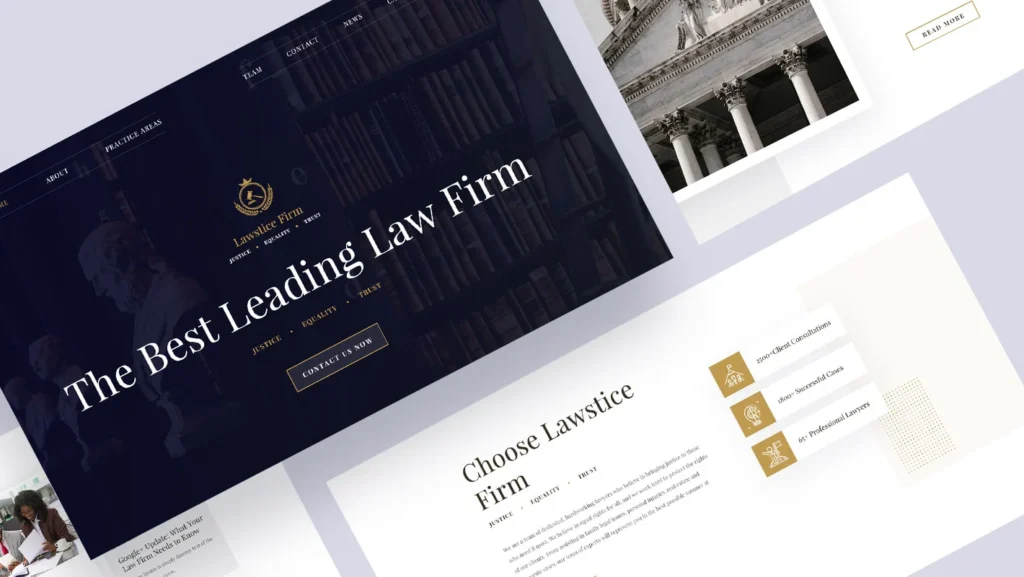
A decision environment is not a feeling; it is a set of tasks the site must perform, in roughly the order the buyer performs them.
Miss one, and the buyer supplies the missing answer themselves – usually the least generous one.
1 – Relevance, established in the first screen
The first job is to answer the question “Am I in the right place?” before the visitor decides for you.
A prospect who cannot tell within seconds whether you serve firms of their size and sector will assume you do not – and act on the assumption.
Trust cannot begin until relevance is confirmed, which is why the specific, unglamorous line – “we advise mid-market UK manufacturers on cross-border tax” – beats any tagline about excellence.
It lets the right buyer self-identify and the wrong one leave, which is the point. Say who you are for. Say it first.
2 – Differentiation, the buyer can actually act on
The second job is to make the difference legible.
Most professional firms describe themselves in terms that three competitors could also claim, which forces the buyer to treat the category as interchangeable and decide on price.
Strategic web design surfaces the one or two things that are true of you and awkward for rivals to copy, then states them plainly enough to repeat.
This is where positioning either survives contact with a sceptic or dissolves into wallpaper.
Clear website design principles exist to serve this legibility, not to decorate around it.
3 – Proof, positioned where the doubt lives
The third job is to answer “why should I believe you?” at the moment the doubt arises, not on a testimonials page nobody visits.
In 17 years of brand work, the pattern I see most often is firms hoarding their strongest proof – the named client, the recovered figure, the retained mandate – somewhere the buyer never reaches while the decision is live.
Proof belongs beside the claim it supports.
A specific outcome next to the service that produced it does more than a wall of five-star quotes, because it lets the buyer picture their own case.

4 – An environment built for the second visit
The fourth job is to reward return.
Considered purchases are rarely settled in one sitting – one behavioural dataset recorded 52.8% of visits as returns, with returning visitors converting at 2.9% against 1.7% for new ones.
The site is not a billboard glimpsed once; it is a place a buyer returns to when they are closer to making a decision, often with a colleague.
Design for that second, more serious visit, and the deeper evidence – the case detail, the methodology, the credentials – has somewhere to land.
5 – Mobile discovery, desktop decision
The fifth job is to respect where each stage happens.
With roughly 69.9% of traffic arriving on mobile but desktop converting around 74% higher, the pattern is clear: buyers discover you on a phone and decide on a laptop.
Designing for mobile compliance alone treats every visit as equal.
Strategic web design treats the mobile visit as the moment to earn relevance and the desktop visit as the moment to close credibility – the same firm, two different jobs.
Sound user-experience design is what holds those two moments together.
Where Professional Services Rebrands Go Wrong Online
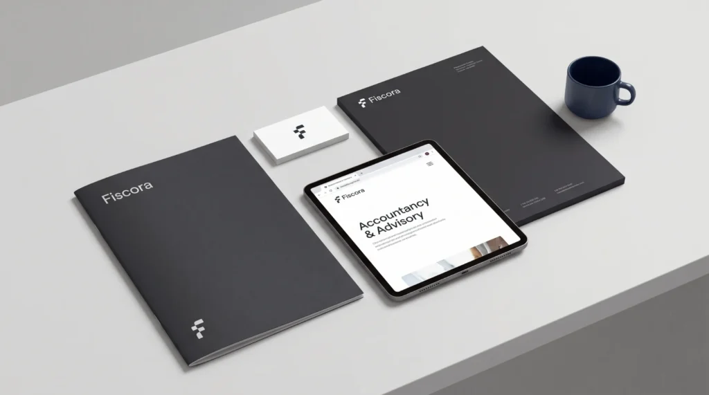
Here is the misconception that costs firms the most: that underperforming websites fail because they look dated. They rarely do.
They fail because, at the precise point a prospect is evaluating risk, the site leaves the visitor to work out – unaided – what the business does, who it is for, why it is different, and whether it can be trusted.
A beautiful site that answers none of those losses to a plain one that answers all four.
Picture a 40-partner accountancy firm rebranding ahead of a merger. The instinct is to spend the budget on identity: new mark, new typography, a photography shoot, then apply all of it to the existing site structure.
The rebrand launches. It looks current. And it converts no better than before, because the underlying problem was never aesthetic.
The failure has a specific shape. The homepage still opens with the firm’s history rather than the buyer’s question.
The services still read like a list of the firm’s offerings rather than the buyer’s problems.
The proof still sits three clicks from the claim it should be standing next to. A rebrand that repaints those pages without re-sequencing them has brought a better-looking version of the same silent failure.
A sceptical Managing Partner reads this and thinks two things.
First: “Our site looks fine, so this isn’t us.” That is exactly the trap – looking fine is not the same as deciding well, and the two are routinely confused because one is visible and the other is not.
Second: “We win most of our work on referral anyway.” Perhaps – but a referred prospect still checks the site before calling, and 29% of buyers report abandoning a purchase after a poor experience. The referral gets them to the page. The page still has to survive the visit.
“A rebrand that repaints the pages without re-sequencing them has bought a more expensive version of the same silent failure. The brand is not what the firm displays. It is what the buyer concludes on the second visit, alone, with the tab still open.”
What to Do Before You Brief a Designer
Before anyone opens a design tool, resolve the argument the site has to win.
Write the four sentences a buyer needs – what you do, who it’s for, why you’re different, and why you can be trusted – and make three partners write them independently. If they disagree, the site cannot possibly be clear, because the firm is not.
Fix that first; no amount of layout rescues an unresolved position.
Then run the proof audit. For each of your top three services, find the single strongest piece of evidence – a named outcome, a recovered figure, a retained mandate – and check how many clicks separate it from the claim it supports.
If the answer is more than zero, the proof is in the wrong place.
Only then does design begin, and it begins as a website design process organised around the buyer’s decision sequence rather than the firm’s internal structure.
Get the sequence right, and the aesthetics have something true to finish.
The Verdict: The Site Decides Before You Do
A brochure shows a buyer what you want them to see.
A decision environment answers what they need to know to say yes – in the order they ask it, with proof where the doubt lives, built to reward the second visit when the decision is real.
That is the whole distinction, and for a firm mid-rebrand, it is the difference between a site that looks like the new brand and a site that earns it.
The strongest positioning in the world fails silently if the site makes the buyer do the work of believing it.
Do one thing this week: pull up your homepage on a laptop, read only the first screen, and ask whether a stranger in your target sector would know within seconds that you are for them. If the answer is no, the rebrand has not started where it needed to.
A Brand Equity Audit™ shows you exactly where the site is losing commercial ground before you spend a penny redesigning it.
Strategic Web Design FAQs
What is the difference between strategic web design and a normal website?
A normal website displays a firm’s information; strategic web design builds a decision-making environment that demonstrates the firm’s positioning and answers a buyer’s risk questions at the moment of evaluation. The first shows claims. The second sequence of evidence to make a considered purchase feel low-risk.
Why isn’t our website winning us better clients despite looking modern?
A modern-looking site can still fail if it leaves the buyer to work out what you do, who you serve, and why you differ. Appearance and clarity are different things. Most underperforming professional-services sites lose the buyer on relevance and proof, not on aesthetics.
Should we redesign our website before or during a rebrand?
Resolve positioning before either. A rebrand applied to an unchanged site structure repaints the pages without re-sequencing them, producing a better-looking version of the same silent failure. Settle what you do, who for, and why you differ first – then design around that decision sequence.
Is strategic web design worth the investment for a law or accountancy firm?
Yes – because acquisition costs are rising while conversion falls, so each hard-won visit must do more work. The Contentsquare 2026 benchmark recorded a 9% rise in cost per visit. A credible site protects the value of the demand you have already paid to generate.
How does a website reduce a buyer’s perceived risk?
It answers evaluation questions when doubt arises – placing named, specific evidence alongside the claim it supports rather than on a distant testimonials page. Considered buyers return before deciding, so the site must reward a second, more serious visit with deeper evidence rather than repeat the first-visit pitch.
When should a professional firm treat its website as a priority?
When preparing for growth, acquisition, or repositioning – moments when the firm’s positioning is under scrutiny, and the site is the first place a buyer tests it. Roughly 29% of buyers abandon after a poor experience, so a high-stakes transition is the worst time for a site that fails silently.
