Accounting Firm Website Design: Build a Trust System, Not a Brochure
Most accounting firm websites are built as digital brochures that describe services and hope. The firms winning larger clients build something else: a trust-and-qualification system that lets the right prospect decide, quickly and safely, that this firm understands businesses like theirs. This guide shows how to design one, stage by stage.
 By Stuart Crawford
 Reviewed by Tabitha Ayers
Updated 13 min read
On this page13 min left
- How Accounting Firm Website Design Actually Wins Clients
- What You Need in Place First
- Stage 1: Position the Site Around the Client's Moment of Uncertainty
- Stage 2: Sequence Trust Cues So Credibility Lands Before the Ask
- Stage 3: Build Sector- and Moment-Specific Landing Pages
- Stage 4: Design Data Reassurance Into the Conversion Path
- Stage 5: Publish Named, Dated, Answerable Expertise
- The Judgement Layer: Where the Rules Run Out
- The Step Everyone Gets Wrong: Building Before Positioning
- The Verdict
- Frequently asked questions
A prospective client with a £6m turnover business lands on your homepage, reads “proactive, partner-led accountancy for ambitious businesses,” and closes the tab.
Nothing was wrong with the sentence. Everything was wrong with the job the page was doing.
It described you. It did nothing to help that person decide whether you understood a business like theirs, which was the only decision they could make.
That is the core failure of most accounting firm website design.
The site is built as a brochure: a place to state services, list credentials, and wait. But a brochure answers the firm's question (“what do we offer?”) when the buyer is asking a different one entirely — “can I trust these people with my numbers, and do they get businesses like mine?”
A firm that wants to move upmarket, win larger engagements, and break past the sub-£1m fee bracket is competing on credibility. The website is where credibility is either built or quietly lost.
Consider the baseline. The UK Government's 2026 UK Business Data Survey found that 78% of UK businesses reported having a website in 2025–26.
Having one no longer distinguishes anyone. Among your prospective clients, the digital baseline is even higher — the same survey reports 92% of small businesses and 97% of medium-sized businesses have a website.
Your buyers operate in a digital-first commercial world and judge your firm against it.
If moving upmarket is the goal, the website is not a marketing afterthought — it is the same terrain a specialist accountancy firm rebranding agency works on when repositioning a practice for larger clients.
How Accounting Firm Website Design Actually Wins Clients
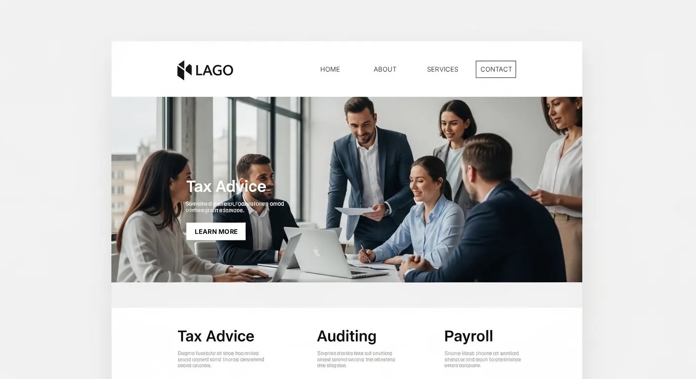
A high-performing accounting firm website is achieved in five stages: (1) positioning the site around the client's moment of uncertainty, (2) sequencing trust cues so credibility is established before the ask, (3) building sector- and moment-specific landing pages, (4) designing data reassurance and secure handling into the conversion path, and (5) publishing named, dated, answerable expertise for conversational search.
- The site's job is qualification, not presentation: it helps the right client self-select and the wrong one self-exclude.
- Trust in accountancy is built in a specific order — relevance first, proof second, ask last — and reversing it kills conversion.
- Data reassurance is now conversion design, not a compliance footnote, because buyers share sensitive financial information before they trust you.
Accounting firm website design works best as a trust-and-qualification system that helps the right prospective client quickly decide the firm understands their business.
What You Need in Place First
Before touching a single page, three things must be in place, and most firms skip at least one. This is the honest entry condition the design guides omit.
First, a defensible position — not “we help ambitious businesses” but something a competitor could not honestly copy: “we act for owner-managed construction firms between £2m and £15m turnover, and we've moved forty of them off spreadsheets.”
A website cannot qualify clients if the firm has not decided who it is qualifying. The generic firm produces a generic site by necessity, because there is nothing specific to say.
Stage 1: Position the Site Around the Client's Moment of Uncertainty
Start the site from the client's problem, not the firm's departmental structure.
A prospective client does not arrive thinking, “I need corporation tax and payroll and VAT services.”
They arrive thinking, “I'm about to cross the VAT threshold, and I don't know what changes,” or “my current accountant only calls me at year-end, and I've outgrown that.”
The site's architecture should mirror those moments, not the firm's internal service list.
You know this stage is done right when a visitor can find, with one click, a page that names their exact situation.
The failure mode is the “Services” mega-menu — Accountancy, Tax, Advisory, Payroll — which forces the buyer to translate their problem into your taxonomy. Most won't. They'll leave.
“An accountancy website organised around the firm's departments asks the client to do the firm's thinking. An accountancy website organised around the client's decisions does the client's thinking for them. The second one wins the enquiry every time, because it has already proven it understands the problem.”
Stage 2: Sequence Trust Cues So Credibility Lands Before the Ask

Build trust in a fixed order: relevance, then proof, then request.
Most accountancy sites reverse this — they open with a “Book a call” button before the visitor has any reason to believe the firm understands them. The button is not the problem. Its position in the sequence is.
Relevance comes first: before any mention of the firm, the page should state the visitor's situation.
A construction firm with subcontractors, landing on a page titled “CIS and subcontractor payments — what you're actually liable for,” knows in two seconds it's in the right place.
A page headed “Our Services” makes them guess. Proof comes second — named outcomes, sector testimonials, evidence, not adjectives. The request comes last.
You know this stage is done right when every CTA on the site is preceded, on the same page, by a reason to act.
The failure mode is trust cues used as decoration — a wall of logos with no context, testimonials that praise “great service” without naming an outcome. Generic proof reassures no one.
Stage 3: Build Sector- and Moment-Specific Landing Pages
Create pages that answer a specific client question, not broad service pages that answer none. This is where the MTD opportunity lives right now.
Making Tax Digital for Income Tax began on 6 April 2026 for sole traders and landlords with qualifying income above £50,000, and the threshold is scheduled to fall to £30,000 from April 2027 and £20,000 from April 2028. Those clients have urgent, specific, un-Googled-yet questions.
A generic “Making Tax Digital services” page answers none of them. Pages built around the client's actual question do: “Do I need to use Making Tax Digital for Income Tax?”, “MTD support for landlords”, “Moving from spreadsheets to MTD-compatible software.”
Each is a landing page featuring a readiness check or consultation CTA for clients above the relevant threshold.
This is the trust-and-qualification principle in miniature — the page is designed around the client's moment of uncertainty, not the firm's service catalogue.
You know this stage is done right when each page can rank and convert on its own, landed on cold from search. The failure mode is one bloated service page trying to be everything, ranking for nothing.
Stage 4: Design Data Reassurance Into the Conversion Path
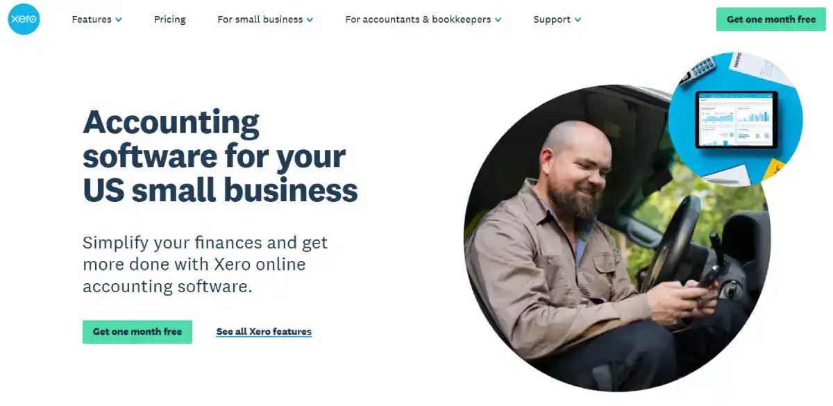
Treat privacy and secure handling as conversion design, not legal boilerplate. An accountancy buyer is asked to share turnover, profitability, payroll, and tax affairs — often before any relationship exists.
The UK Business Data Survey found 86% of UK businesses handled digitised data in 2025–26, and, critically, 73% said they would be uncomfortable with their business data being used to train external AI models. That discomfort is now part of the buying decision.
The trust cues here cannot be cosmetic.
The UK Government's Cyber Security Breaches Survey 2025/26 found that 43% of UK businesses reported experiencing a cybersecurity breach or attack in the previous 12 months. In the UK Government's 2025 survey, 36% of businesses in the professional, scientific or technical sector reported being victims of at least one cybercrime in the preceding year.
A site sitting near sensitive enquiry and document-sharing workflows must earn confidence, not assume it.
Concretely: ask only for the information genuinely needed at first enquiry, explain what happens after a document upload or consultation request, provide a credible privacy notice, and use secure portals for financial documents rather than treating email attachments as the default.
You know this stage is done right when your enquiry form asks for less than a competitor's and reassures more.
“Every extra field on an accountancy enquiry form is a small trust tax. A prospect deciding whether to share their turnover with a firm they've known for ninety seconds reads a ten-field form as a warning. Ask for the minimum, explain what happens next, and the form stops feeling like surveillance and starts feeling like the beginning of a professional relationship.”
Stage 5: Publish Named, Dated, Answerable Expertise
Write content that answers the layered questions clients actually ask, with visible authorship and dates.
Google expanded AI Mode to the UK in 2025 and then to more than 180 countries and territories in English, using what Google describes as a query fan-out approach — breaking a complex question into subtopics and issuing multiple searches.
The response to this is not publishing generic AI-written tax articles at volume. It is the opposite.
Create genuinely useful, clearly authored pages that answer real client questions:
- “Should I change from sole trader to limited company?”
- “What records do landlords need for Making Tax Digital?”
- “What should I expect when changing accountants?”
Give each named expertise a clear date and honest caveats. A page like that earns its ranking the slow way — by being the thing a real person would send to a friend who asked the question. Google's systems and its AI Mode reward the same thing, for once.
There is a live differentiation angle here, too. The UK Government's 2026 Business Data Survey found that 41% of businesses handling digitised data reported using AI for at least one purpose, yet 17% of AI-using businesses said they had no policy in place.
ACCA has advised that firms should establish firm-wide policies for responsible AI use and consider informing prospective clients when AI tools will be used in their work.
A credible site avoids the vague “AI-powered accounting” claim. Instead, it explains which client-facing tasks remain led by qualified people, where automation helps, and how client data is protected. Technology-enabled, professionally accountable.
That is a position competitors reciting “modern and mobile-friendly” cannot occupy.
The Judgement Layer: Where the Rules Run Out
The five stages are the structure. The judgement is knowing how much trust a specific buyer needs before they'll act — and that varies by fee level.
A £2,000-a-year sole trader will enquire on a clear, relevant landing page.
A £40,000 owner-managed business moving accountants will not; they need to see named senior people, a described transition process, and evidence of businesses at their scale before they'll pick up the phone.
Design the trust ladder to the height of the client you actually want.
This is also where the two objections a sceptical Managing Director raises must be answered honestly.
First: “Isn't this just good marketing dressed up?” No — marketing persuades; a qualification system filters. Its purpose is partly to screen out the wrong enquiries early, so that partner time is spent on fits.
Second: “We win work by referral, so does the website matter?” It matters more. A referred prospect Googles you before they call. The referral gets them to the site; the site decides whether the referral survives contact.
The Step Everyone Gets Wrong: Building Before Positioning
Here is the sequence error that quietly ruins the result: firms commission the design before they've fixed the positioning.
They brief an agency on colours, layout, and a “modern feel,” get a beautiful brochure, and wonder why the quality of enquiries hasn't improved.
The prevailing view — that a website project is a design project — is held by intelligent people because the deliverable is visual, so the visible work feels like the real work.
It isn't. The design is the visible part, and the smallest part. The trust-and-qualification logic — who you serve, in what order you prove it, which client moment each page answers — is decided before anyone opens a design tool, and none of it shows up in a mockup.
A firm that designs chooses wallpaper before building the wall. The replacement directive is blunt: decide who the site is qualifying, and how it proves relevance, before design begins—positioning first, pixels last.
Accessibility belongs in this same “invisible first, obvious later” category. WebAIM detected 56,114,377 accessibility errors across one million homepages in its 2026 analysis — an average of 56.1 detectable errors per homepage.
For an accountancy firm, labelled forms, sufficient contrast, and keyboard navigation are not embellishments; they are part of whether a prospective client can actually complete an enquiry. It is a competitive opening precisely because most sites ignore it.
The Verdict
A brochure describes. A trust-and-qualification system decides — with the client, on their behalf, in the order they need.
That is the whole argument of this guide, and it is not a stylistic preference.
It is how high-trust professional-service buyers behave: they de-risk before they enquire, sharing sensitive financial information only once a firm has proven it understands businesses like theirs.
The UK data makes the stakes concrete — 78% of firms have a website, 73% of businesses are uncomfortable with how their data is handled, and 36% of the professional sector reported a cybercrime. A brochure ignores all three. A trust system answers each.
The firms moving upmarket are not the ones with the prettiest homepages. They are the ones whose sites let the right client self-identify — “these people get a business like mine” — before a single form is filled. That is a positioning and sequencing discipline first, a design task second.
Get the order wrong, and the best design in the world produces a beautiful page that converts nobody worth having.
The single action to take today: open your own homepage and ask one question — does the first screen help a prospective client recognise their situation, or does it describe you? If it describes you, you have a brochure.
To find exactly where your brand is losing commercial ground and what to do about it, request a free Brand Equity Audit™ — a structured, written diagnostic delivered within 48 hours, no sales call.
Frequently asked questions
Why is a website no longer enough for an accounting firm?
Because 78% of UK businesses reported having a website in 2025–26, according to the UK Government's Business Data Survey, having one no longer differentiates a practice. The differentiator is whether the site builds credibility and qualifies enquiries, rather than simply describing services like a digital brochure.
How does a trust-and-qualification website differ from a brochure site?
A brochure describes the firm's services and wait. A trust-and-qualification site helps the right prospect decide that the firm understands their business, the sequence's relevance, the proof, and then request. It is designed around the client's moment of uncertainty, not the firm's internal departmental structure.
What is the biggest mistake in accounting firm website design?
Building the design before fixing the positioning. Firms brief a “modern, professional” site, receive a polished brochure, and see no change in the quality of enquiries. Positioning — who the site qualifies and how it proves relevance — is 70% of the work and invisible in a mockup.
Should my accounting firm build Making Tax Digital landing pages?
Yes — because Making Tax Digital for Income Tax began on 6 April 2026 for those with qualifying income above £50,000, with the threshold falling to £30,000 in 2027 and £20,000 in 2028. Build pages that answer specific client questions, not a single generic MTD service page.
How do I make my accountancy website work with Google AI Mode?
Publish clearly authored, dated pages that answer the layered questions clients actually ask, with named expertise and realistic caveats. Google's AI Mode uses a query fan-out approach, breaking questions into subtopics, so genuinely useful, specific answers outperform generic AI-written articles published at volume.
Is data security really part of website conversion?
Yes, because accountancy buyers share turnover, payroll, and tax affairs before a relationship exists. The UK Business Data Survey found 73% of businesses are uncomfortable with their data training external AI models. Minimal enquiry forms, secure portals, and clear privacy notices materially affect whether prospects enquire.
What's the difference between trust cues and decoration?
Trust cues give the visitor a reason to believe the firm understands them; decoration fills space. A logo wall with no context and testimonials praising “great service” reassures no one. Named client outcomes and sector-specific proof, placed before any request, actually build credibility.
When should a CTA appear on an accountancy website?
After the visitor has a reason to act, never before, a “book a consultation” button converts far better once a page has named the visitor's situation and shown a testimonial from a similar business. A cold homepage CTA asks for commitment before establishing any relevance.
How should I talk about AI on my accounting firm's website?
Avoid vague “AI-powered accounting” claims. ACCA advises firms to establish responsible AI policies and consider informing clients when AI tools are used. Instead, explain which tasks remain led by qualified people, where automation helps, and how data is protected — technology-enabled, professionally accountable.
Does my website matter if I win work through referrals?
Yes — it matters more. A referred prospect almost always visits your site before calling. The referral gets them to the website; the website decides whether that referral survives contact. A weak site can lose a warm referral before any conversation happens.
How many fields should an accountancy enquiry form have?
As few as genuinely necessary at first contact, a prospect deciding whether to share turnover with a firm they've known for ninety seconds reads a long form as a warning. Ask for the minimum, explain what happens next, and use secure portals for documents rather than email.
Is website accessibility worth prioritising for an accounting firm?
Yes — WebAIM detected an average of 56.1 accessibility errors per homepage across one million homepages in 2026. Labelled forms, sufficient contrast, and keyboard navigation determine whether a prospect can complete an enquiry at all. Most competitors ignore it, making it a competitive opening.