Human-Centred Website Design: Create Empathy-Led Experiences
Most websites treat visitors like data points rather than real people. They bombard users with pop-ups, confusing navigation, and content that feels like it was written by robots for robots.
But here’s what research tells us: 95% of our purchase decisions stem from emotions, not logic.
This creates a massive opportunity for brands willing to flip the script. Instead of designing websites that prioritise metrics over people, smart companies are building experiences that connect with users on a human level.
They’re asking better questions like “How does this make someone feel?” rather than “How many clicks can we get?”
This results in higher engagement, stronger brand loyalty, and customers who want to stick around. That’s because human-centred design is all about understanding that behind every screen is a person with feelings, frustrations, and goals.
When you design with empathy, you create experiences that work better for everyone.
- Human-centred design prioritises genuine user emotions over metrics for better engagement and loyalty.
- Transparent communication builds trust through clear, honest information and supporting evidence.
- Emotionally charged microcopy enhances user experience by addressing their feelings at key moments.
- Incorporating social proof creates credibility, reassuring potential customers through genuine user experiences.
Display Relatable Visuals
People respond to what feels familiar. That’s why visuals showing real-life situations tend to land better than product shots on white backgrounds.
When done well, lifestyle photography can build stronger emotional connections and help visitors imagine how a product fits into their lives. It also creates trust. If people can see how something works in context, they’re more likely to believe in its value.
Here’s how to approach this:
- Avoid overly staged photos.
- Aim for natural visuals and show your product in settings your customers relate to. Think beyond the “smiling at the camera” type of image.
- Show people using your product daily, like doing everyday things, solving real problems, or enjoying small moments.
- Make sure diversity and inclusion are considered as well. Visitors should be able to see themselves in your content.
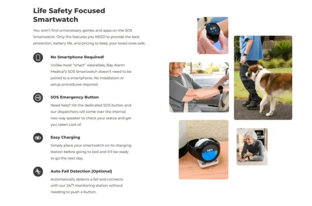
Bay Alarm Medical, a brand that provides personal safety devices, does this well on their medical alert smartwatch product page.
Instead of showing the device alone, they feature older adults wearing the watch in realistic scenarios, like walking the dog, doing the shopping, or relaxing at home.
These visuals directly reflect the concerns of their customers and show how the product supports independence and peace of mind.
Use Transparent Communication and Trust Signals
People don’t want to feel sold to. They want clear, honest information that helps them make the right decision.
When a website communicates openly and backs up its claims with evidence, it builds trust. Visitors feel more confident knowing what a product does, how it works, and why it’s safe or effective.
That’s where trust signals come in. They support your message without overwhelming users with jargon or hype.
Here’s how to approach this:
- Focus on clarity and proof.
- Use short, easy-to-read statements that explain your product’s benefits.
- Add visual icons or badges highlighting clinical support, certifications, or third-party testing.
- Avoid vague claims like “scientifically proven” unless you show the data.
- If your product solves a sensitive or health-related problem, clarify how and why it helps.
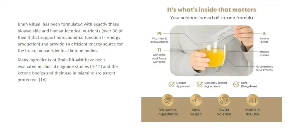
Brain Ritual, a brand that makes supplements for people managing migraines, does this well.
On their science-focused migraine formula landing page, they explain the product’s ingredients and benefits in a direct, simple way. They include visuals like icons and quick facts to show clinical backing, making it easier to trust the product at a glance.
This gives visitors the confidence to explore further without feeling pressured or confused.
Leverage Emotionally Charged Microcopy
Microcopy (those small bits of text on buttons, forms, and error messages) often goes unnoticed. However, when used with care, it can shape how people feel while using your site.
Emotionally charged microcopy helps users feel understood, supported, or reassured at key moments. It’s especially powerful in easing friction or reinforcing positive feelings when they matter most.
Here’s how to approach this:
- Think about what your users might be feeling at each step. Are they nervous about sharing personal information? Unsure about the following action?
- Use short, clear language that speaks to those feelings. Instead of “Submit,” try something warmer like “Get My Results.”
- If someone hits an error, avoid technical jargon and offer a helpful message with a calm, friendly tone.
- Keep things human, but don’t overdo it. Forced cheerfulness or trying too hard to be clever can backfire.
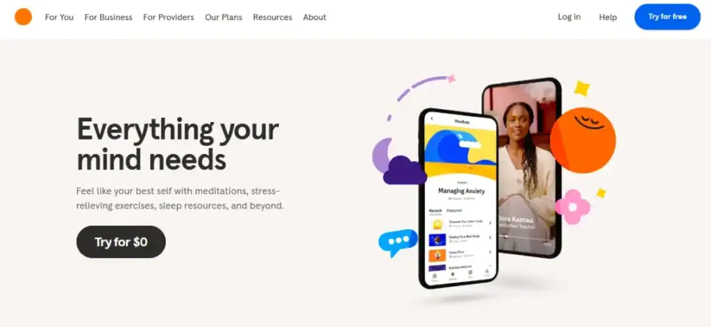
One strong example comes from Headspace, a meditation and mental health app.
The microcopy is clear, kind, and thoughtful when you land on their website. Phrases like “Everything your mind needs” or “Feel like your best self” gently encourage users, especially those who might already be overwhelmed. It’s subtle but effective, reducing anxiety and helping users feel seen, even in a short text.
Incorporate Social Proof
Most people won’t purchase without first seeing what others think. Whether it’s a quick scan of star ratings or reading full reviews, social proof plays a significant role in building confidence.
When real users share their experiences, it adds credibility that no brand message can match. It shows your product works in the real world, not just in theory.
Here’s how to approach this:
- Prioritise quality over quantity.
- Include clear, specific reviews about real outcomes, not just generic praise.
- Add names, photos, or locations to make the feedback more genuine.
- If your product targets a particular group, feature voices from that group to create stronger relevance.
- Highlight stats like how many people have purchased, recommended, or rated the product.
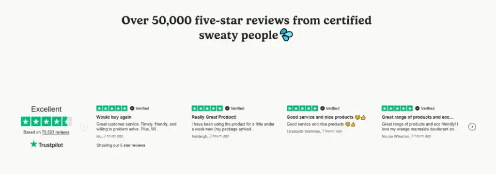
A good example is Wild, a UK-based brand offering sustainable personal care products.
Almost every page on their website features customer reviews with names and star ratings, but they also go further. They highlight customer stories, show media coverage, and mention their Trustpilot rating prominently.
This mix of peer feedback and third-party recognition helps new visitors feel more confident trying something new, especially when switching to a natural product, which might feel like a risk.
Final Thoughts
These tactics work because they recognise a simple truth: behind every click is a human being making an emotional decision. When you design with that person in mind, everything else follows.
Start with one tactic that resonates most with your audience, test it properly, and build from there.
Always remember to put your customers’ needs before your assumptions.
FAQs on Human-Centred Website Design
What exactly is human-centred website design?
Human-centred website design is an approach that prioritises the needs, behaviours, and emotions of real users throughout the entire design process. Rather than focusing solely on business goals or technical constraints, this methodology places genuine human experiences at the core of every design decision. It involves understanding users’ motivations, pain points, and contexts through research and creating solutions that genuinely serve their needs while remaining accessible and inclusive to diverse audiences.
How does empathy differ from sympathy in web design contexts?
Empathy in web design means actively understanding and experiencing users’ perspectives, emotions, and challenges as if you were in their position. It requires designers to step into users’ shoes and feel their frustrations when navigating a confusing checkout process or their delight when effortlessly finding precisely what they need. Sympathy, conversely, is simply feeling sorry for users’ difficulties without necessarily understanding the deeper emotional and practical implications. Empathetic design creates solutions born from genuine understanding, whilst sympathetic design might only address surface-level problems.
What practical methods can teams use to build user empathy?
Successful empathy-building requires diverse research approaches, including user interviews, ethnographic studies, journey mapping, and persona development based on real data. Teams should conduct usability testing sessions where they observe users’ facial expressions, body language, and verbal feedback in real-time. Creating empathy maps that capture what users think, feel, see, and do helps teams visualise emotional experiences. Additionally, “day-in-the-life” shadowing, accessibility audits using assistive technologies, and regular feedback collection through surveys and support channels provide ongoing empathy insights.
How can organisations measure the success of empathy-led design initiatives?
Measuring empathy-led design success requires both quantitative and qualitative metrics. Key performance indicators include improved user satisfaction scores, reduced support ticket volumes, increased task completion rates, and lower bounce rates on critical pages. Qualitative measures involve analysing user feedback sentiment, conducting follow-up interviews to understand emotional responses, and tracking accessibility compliance improvements. Advanced organisations might measure emotional engagement through tools that assess micro-expressions or conduct longitudinal studies to understand how empathetic design changes user behaviour and loyalty over time.
What are the most common barriers to implementing human-centred design in organisations?
Primary barriers include insufficient budget allocation for user research, tight project timelines that skip discovery phases, and organisational cultures prioritising internal preferences over user needs. Technical teams sometimes resist design changes that require additional development time, whilst stakeholders may struggle to see immediate ROI from empathy-focused initiatives. Additionally, lack of design expertise, inadequate user research skills, and difficulty accessing diverse user groups for testing can significantly hinder implementation. Overcoming these requires executive buy-in, dedicated research budgets, and gradual cultural shifts towards user-centric thinking.
How does accessibility intersect with empathy-led website design?
Accessibility is fundamentally an empathetic practice that ensures websites work for users with diverse abilities, including visual, auditory, motor, and cognitive impairments. Empathy-led design naturally incorporates accessibility by considering how screen readers experience navigation, how colour-blind users perceive essential information, or how users with motor difficulties interact with interface elements. This approach goes beyond compliance checklists to create genuinely inclusive experiences. Designers must empathise with users who might navigate entirely through keyboard shortcuts or rely on voice commands, ensuring these interactions feel as natural and efficient as traditional mouse-based navigation.
What role does emotional design play in creating empathy-led experiences?
Emotional design acknowledges that users don’t just complete tasks—they feel emotions throughout their journey. Empathy-led experiences are intentionally designed for emotional states, whether reducing anxiety during a medical appointment booking, creating excitement during product discovery, or providing reassurance during financial transactions. This involves carefully considering visual design elements like colour psychology, typography that conveys an appropriate tone, micro-interactions that provide delightful feedback, and content that speaks to users’ emotional needs. Successful emotional design makes users feel understood, supported, and valued rather than frustrated or confused.
How can teams balance business objectives with user-centred design principles?
The most successful approach recognises that user satisfaction and business success are interdependent rather than competing priorities. Users with positive experiences are more likely to convert, recommend services, and remain loyal customers. Teams can achieve this balance by identifying shared goals, such as reducing customer service costs through better self-service design or increasing sales through improved user trust. Conducting cost-benefit analyses demonstrating how user research prevents expensive redesigns and using A/B testing to prove that empathetic design improvements drive business metrics helps align stakeholder priorities with user needs.
What specific techniques help designers develop deeper user understanding?
Advanced techniques include creating detailed user journey maps that capture emotional highs and lows, conducting contextual inquiries where researchers observe users in their natural environments, and developing “jobs to be done” frameworks that understand underlying motivations. Design thinking workshops involving cross-functional teams help build shared empathy whilst creating user story mapping sessions to ensure features address real user needs. Regular “user empathy walks” where team members use their products under constrained conditions (such as using only keyboard navigation) provide a firsthand understanding of different user experiences.
How should teams approach empathy when designing for diverse global audiences?
Designing for global audiences requires cultural empathy beyond translation to understand different social norms, technological contexts, and communication styles. Teams must research local user behaviours, payment preferences, privacy expectations, and accessibility standards across various regions. This involves partnering with local user research specialists, conducting region-specific usability testing, and understanding how cultural values influence design preferences. For example, information hierarchy, colour associations, reading patterns, and trust indicators vary significantly across cultures. Successful global empathy requires avoiding assumptions and investing in localised research rather than applying Western design patterns universally.

