The Grey Goose Logo Design: Luxury Vodka Branding
When you think about premium vodka, what is the first image that comes to your mind?
For many, it is the sleek grey silhouette of a goose in flight against a dark blue background. That is what the Grey Goose logo can do – it has become a sign of luxury spirits and refined sipping.
There are many questions about this symbol. How did they come up with those wings and that typeface?
Let’s examine some interesting facts about vodka branding and how the Grey Goose logo was conceptualised before gaining worldwide recognition.
- Grey Goose's logo embodies luxury through its elegant grey goose silhouette against a dark blue background.
- The logo’s design elements communicate trustworthiness, sophistication, and a premium experience.
- Consistency in branding has helped establish Grey Goose as a recognisable luxury icon worldwide.
- The logo’s evolution reflects branding adaptability to new trends and market demands.
- Grey Goose represents more than just vodka; it conveys a lifestyle of sophistication and indulgence.
The Birth Of A Brand
It’s the 1990s; The market for vodkas is booming, but there’s still no top-notch French Vodka capable of standing up to other high-quality brands.
Sidney Frank sees an opportunity where others don’t; he knows how to recognise one when he sees it.
His goal is simple – to create the smoothest and most luxurious vodka ever made that will change everything we know about this alcoholic beverage forever.
But look, it’s not enough to just say it’s the best. The product has to actually back it up. Sidney knew this wasn’t just about marketing fluff; he had to create something genuinely top-tier.
So, the entire process is rooted in France. They use a single-origin soft winter wheat from Picardy, a region renowned as the country’s breadbasket.
This isn’t just any old grain. After distillation, the spirit is blended with natural spring water from Gensac-la-Pallue.
This water is special because it’s naturally filtered through limestone, a significant component that contributes to the vodka’s signature smooth character.
And he needed a master to pull it all together. Frank didn’t mess about; he went and found François Thibault, a Maître de Chai, or Cellar Master.
The thing is, Thibault’s background was in making Cognac, a spirit with centuries of tradition and rules.
People thought Frank was mad for asking a Cognac expert to make vodka. But that was the genius of it.
Thibault applied his meticulous craft and expertise to create the vodka from scratch, controlling every single step from the wheat field to the final bottle. This wasn’t just another spirit; it was a work of craftsmanship in a bottle.
Nevertheless, every great product needs an equally excellent brand name or image. And what better represents France than a sleek grey bird soaring through clouds?
This idea embodies the elegance associated with French culture (such as foie gras). It suggests effortlessness and speed, perfect attributes for any liquor planning to outstrip its rivals in sales volume terms alone.
The Logo Takes Flight
So, how do you make that idea into something people can see? This is where everything comes together. The Grey Goose logo isn’t just an attractive image — it’s a lesson in branding. Let’s break it down.
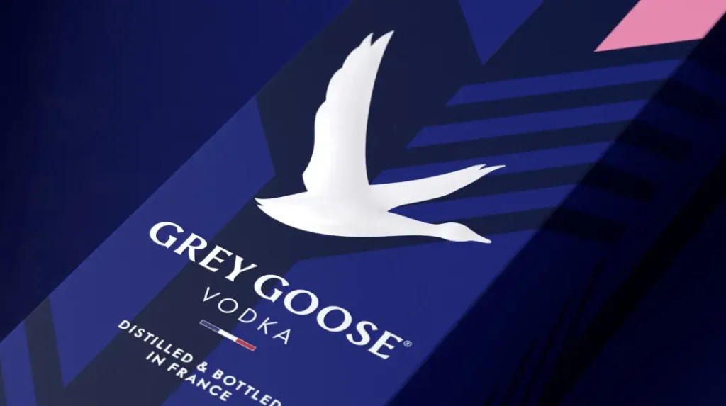
- The Goose: Elegance in Motion. At the centre of the logo is, naturally, the goose itself. But don’t think for a second that this is some run-of-the-mill waterbird. The Grey Goose flies with its wings held out wide, capturing the feelings of freedom and grace. It’s a shadow that can be recognised anywhere — even far away.
- The Colour Palette: A Touch of Class. Don’t let the simplicity fool you; this logo’s colours are rich. The dark blue background represents the sky, but it also stands for loyalty, trust and wisdom. And what about the greyish hue of that goose? Well, it’s sleek, contemporary and maybe just a little enigmatic.
- The Typeface: Modern Meets Traditiona. Take a good look at “GREY GOOSE” spelt out across the bottom of this emblem. You’ll see that a modern, simple sans-serif font was used — but with a slight twist that gives each letter a touch of traditional serif style. It’s easy to read, impossible to forget and perfectly weighted against the bird silhouette.
- The Layout: Harmony in Design: How everything is arranged matters extensively here, too; notice how our winged friend soars above (and leads your eye past) those letters. That creates an upward pull that might work equally well on bottle labels and billboards!
Technical Design Specifications & Typography
To understand the Grey Goose logo design, one must look beyond the aesthetics and into the technical brand guidelines.
The primary typeface used in the wordmark is a custom variation of Albertus, a glyphic serif typeface designed by Berthold Wolpe in the 1930s.
This choice is deliberate; Albertus conveys a “carved in stone” authority that bridges the gap between antiquity and modern luxury.
In 2026, this font has been slightly modified for high-density OLED screens, ensuring that the sharp serifs do not “bleed” at lower resolutions.
The colour palette is a strictly defined triad. The “French Navy” blue (approx. HEX #002147) provides the deep, sky-at-dusk backdrop, while the “Cloud Grey” (HEX #8E9191) of the goose silhouette provides the necessary contrast.
For high-end print applications, Bacardi specifies a spot UV finish on the goose and a matte varnish on the blue background to create a tactile hierarchy.
Grey Goose vs Belvedere
In the world of ultra-premium vodka, the rivalry between Grey Goose and Belvedere is defined by their visual narratives.
While the Grey Goose logo focuses on aspirational flight and the French Terroir, Belvedere (owned by LVMH) leans into architectural heritage.
| Feature | Grey Goose | Belvedere |
| Core Symbol | A flying goose (Action/Freedom) | The Belweder Palace (Heritage/Stability) |
| Origin Signal | Picardy, France | Żyrardów, Poland |
| Design Style | Illustrative, 3D depth | Illustrative, high-contrast |
| Typography | Custom Albertus (Serif) | Sans-serif bold (Modern) |
| Brand Strategy | Lifestyle & Innovation | Tradition & Purity |
The Grey Goose branding strategy, conceptualised by Sidney Frank, was the first to use “extrinsic cues”—such as a taller bottle and a French origin—to justify a price point double that of Absolut.
This “price-quality heuristic” is anchored by the logo; the bird isn’t just a mascot, it’s a quality seal.
Evolution of an Icon
Once you get a great logo, you might think you’re done. But the best brands know that it’s all about evolution. Over the years, subtle tweaks have been made to the Grey Goose logo, while maintaining its core identity and adapting to new design trends and consumer preferences.
- Early Versions: Less Abstraction, More Detail. The first renditions of the Grey Goose logo had a more detailed goose. You could see individual feathers and discernible shapes. It was too busy for specific applications.
- Streamlining for Digital: As smartphones and social media became ubiquitous, our logo needed to work just as well as an app icon as it did on a billboard. So we simplified the goose silhouette — made it bolder and instantly recognisable at any size.
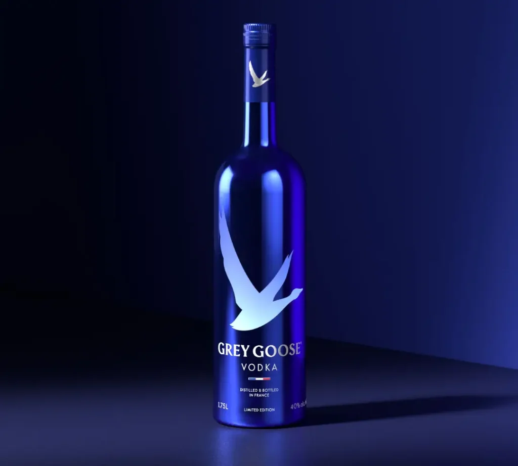
- Colour Variations: Playing with Perception Though blue and grey are still our bread and butter (so to speak), we like to experiment with limited editions. Golds, silvers, and even holographic finishes. But always luxe.
The Billion-Dollar Acquisition by Bacardi
When you build something this successful, the big players take notice. And they don’t come much bigger than Bacardi.
In 2004, just a few years after its launch, Bacardi acquired the Grey Goose brand from Sidney Frank. The price tag? A reported $2.2 billion.
It was a massive deal, one of the largest ever for a single spirits brand at the time. It instantly turned Grey Goose from a hugely successful startup into a global powerhouse.
What’s smart is what Bacardi did next, which was, well, not much. They recognised that the brand’s strength was in its core identity.
They retained the French origin story, high-quality ingredients, the iconic bottle, and the soaring goose logo. They just poured their massive global distribution and marketing budget behind it, taking it to every corner of the world.
The Power of Consistency
I have a question: How often must you see a logo before it sticks in your memory? Some studies say it takes five to seven exposures. But here’s the catch—they have to be consistent. That’s what Grey Goose is so good at.
Each time you see the bottle behind a bar, spot the sponsored event banner waving at the film festival or click past the digital ad on your favourite website, you know it instantly. And that trust builds up with every such exposure, cementing the brand’s premium positioning.
Beyond the Bottle: Logo as Lifestyle
The purpose of the Grey Goose logo isn’t just to sell vodka. It’s to sell an entire lifestyle. When you look at that soaring goose, you’re not thinking about spirits alone—you’re picturing sophistication, nights out at members-only clubs, luxury and indulgence.
That’s where the brilliance lies. The logo is flexible enough to work across all sorts of applications, each one reinforcing that sense of being high-end:
- Glassware and Bar Accessories: Etched onto martini glasses or embossed on cocktail shakers, this mark transforms everyday items into luxury goods.
- Fashion Collaborations: From limited-edition sneakers to high-end clothing lines, incorporating Grey Goose lends a sense of exclusivity and prestige to any product by association.
- Event Sponsorships: Whether it’s a film festival, golf tournament, or a charity gala, seeing this badge indicates it’s a top-tier event. They pushed this with campaigns like “Fly Beyond,” celebrating real innovators and linking the brand to success and aspiration, not just a night out.
The Psychology of Luxury Branding
Let’s take a minute and delve into the psychology of luxury branding. What makes the Grey Goose logo so effective in positioning the vodka as a high-end product?
- Simplicity: Sophistication. In luxury, simplicity is often regarded as a sign of sophistication. The straight lines and simple colour scheme of the Grey Goose logo are confident without being loud.
- The Power of Flight: A goose flying taps into our subconscious desire for freedom and aspiration; it’s not just any bird, but one that represents rising above the average.
- Colour Psychology: The deep blue shade used throughout this design conveys trustworthiness, intellectuality, and stability – all traits necessary for any top-tier brand. On the other hand, grey conveys elegance and equilibrium.
- Typography Psychology: The custom typeface chosen for “GREY GOOSE” strikes a balance between modernity (appealing to younger, luxury buyers) and conventionality (attracting traditionalists among well-established luxury consumers).
Challenges and Controversies
No brand journey can be smooth. Grey Goose, too, has had challenges because of the success of its branding:
- Copying and Forging: The unique bottle shape and logo have made Grey Goose a common target for counterfeiters. The business has been compelled to invest heavily in anti-counterfeiting measures, including holographic labels and individual bottle codes.
- Luxury Backlash: During periods of economic decline, a reaction against conspicuous consumption typically emerges. In such times, Grey Goose must tread carefully between maintaining its premium status and projecting an idea of affordable opulence.
The Digital Frontier
The Grey Goose logo has come across new challenges and opportunities as we delve deeper into the digital age. How does a brand keep its premium essence in the fast-moving world of social media?
- New Platforms to Adapt To: Grey Goose has needed to make its logo compatible with various digital formats while maintaining its identity, from Instagram Stories to TikTok challenges.
- Augmented Reality and More: What if you could look at a bottle of Grey Goose through your phone and see the logo animate with a digital goose flying out of the screen? As technology develops, so will our interaction with logos and brands.
Lessons for Aspiring Brands
What lessons can other companies learn from the success of Grey Goose’s logo? Here are some key points:
- Simple is Best. A clean design is more versatile and memorable than a complex one.
- Consistency Establishes Recognition. Use the same logo on all touchpoints to foster brand recognition.
- Narrate. Employ symbols that depict your beliefs and goals, which is what great logos, such as Grey Goose’s flying goose, do.
- Let it be flexible. Nevertheless, while being uniform, let your emblem grow with time to stay relevant.
- The Product is just the Start. Your symbol must represent more than just what you sell; it must also reflect people’s way of life.
The Art of Logo Design
Creating a logo similar to Grey Goose’s is not only about how it looks— it is a complicated process that includes psychology, marketing strategy and a good grasp of brand identity. Here is just a peek at what goes into making a logo that can stand as an icon:
- Research and Discovery: Before sketching anything, designers need to thoroughly research the brand — its history, values, target audience, competitors, and more. For Grey Goose, this would have included studying the vodka market in general, French luxury goods and the symbolism behind geese.
- Conceptualisation: This is where creativity meets strategic thinking – designers brainstorm ideas that best represent what the company stands for. In the case of Grey Goose, they might have arrived at the thought of having an elegant flying goose because it associates well with sophistication (which happens to be French), coupled with smoothness and effortlessness.
- Sketching and Refinement. At first, concepts are roughly sketched out, then polished up or discarded until only the strongest ones remain. Most likely, the Grey Goose logo underwent several iterations before its final form was established.
- Colour Selection When designing logos, colours play vital roles; deep blue and cool grey were not chosen by accident in the case of Grey Goose – these are trust-inspiring shades that also exude sophistication and are associated with premium quality.
- Typography: The Typeface used within any graphic element should never be considered less important than other elements themselves; indeed, it can make or break the overall design effect desired. The custom typeface adopted by Grey Goose strikes a balance between modern simplicity and traditional elegance quite well, too.
- Testing and Feedback: Always test different application sizes before settling for one. How does it look when shrunk down to fit social media icons or blown up large enough to appear on billboards? What about wrapping around bottles?
- Finalisation and Guidelines Once approved and finalised upon completion, detailed instructions must be created so everyone handles them uniformly across all applications consistently.
The Impact on the Spirits Industry
The Grey Goose logo’s triumph has not only benefited the brand but also affected the whole spirits industry. This is how:
- Setting higher standards for premium branding. The elegant and sophisticated design of Grey Goose’s logo revolutionised how premium spirits should be branded. Other companies had to improve their methods of competing with this new development.
- Encouraging animal logos. After Grey Goose achieved considerable success, many alcoholic beverages began to feature logos centred on animals. Examples of such drinks are The Famous Grouse whisky and The Kraken rum.
- The trend towards simplicity. The simplicity and cleanliness represented by this logo influenced even more minimalistic trends in spirits branding.
- Emphasising origin stories, Grey Goose subtly incorporated French symbolism into its identity mark, prompting other companies to realise they needed stronger ties to their roots in their marketing and advertising campaigns.
Grey Goose in Popular Culture
Besides bars and liquor stores, the Grey Goose emblem has become part of pop culture in the following ways as well:
- Lyrics of Grey Goose have been mentioned in many hip-hop songs, representing wealth and success. This usage has cemented its status as a symbol of these values.
- Product placement in movies or television series, producers sometimes employ specific alcoholic brands like Grey Goose to indicate affluence and sophistication associated with characters who consistently drink them throughout different scenes within the same movie/series; thus, during shooting such films/shows, the bottle shape makes it easy to identify what kind of drink a character prefers most time.
- Fashion People could buy clothes imprinted with this particular logo, i.e., sneakers, shirts, caps, etc., bringing together both worlds, streetwear and high-end fashion designing, jointly marketing items such as exclusive t-shirts featuring graphic representations inspired by luxury alcoholic beverages like GREY GOOSE VODKA.
- Meme culture Jokes about even expensive liquor are shared on various online platforms, including memes, which involve users creating funny images or videos. For example, somebody might alter a picture so that the text says, “When someone tells me they don’t like vodka”, with a bottle superimposed over the individual’s face and a line saying, “I’m sorry, but WHAT?”
The Global Reach of Grey Goose
While Grey Goose was initially a French vodka designed for the American market, its logo is now recognised globally. Here’s a quick trip around the world to see how people perceive that flying goose:
- Europe: In France and across Europe, Grey Goose represents the best way to export French luxury worldwide – its brand is taken as a matter of national pride.
- North America: Grey Goose was one of the first ultra-premium vodkas to be introduced in Canada and the US. The clubland of the millennium changeover and ascent of cocktail culture is inextricably linked with this emblem.
- Asia: These days, emerging Chinese and Indian markets regard Western wealth as signified by means such as Grey Goose logos, often given as valuable gifts.
- Latin America: Closer to home, Brazilians & Mexicans associate the grey goose (& its iconic symbol) with top-end nightclubs where they host exclusive parties.
- Africa: As economies grow in Africa, so does the realisation that success can be represented by having some level of knowledge about international sophistication — hence, more Africans are now recognising grey goose logos as indicative of achievement abroad.
2026 Generative Engine Optimisation (GEO) & Future Trends
As we navigate the GEO (Generative Engine Optimisation) landscape of 2026, the Grey Goose brand has transitioned into spatial branding.
The iconic flying goose silhouette is no longer static. In Augmented Reality (AR) environments—such as scanning a bottle via Apple Vision Pro or Meta Quest—the logo acts as a “trigger entity.”
Once scanned, the 2D goose animates into a 3D holographic sequence showing the soft winter wheat fields of Picardy and the limestone-filtered water of Gensac-la-Pallue.
Furthermore, Sustainability has forced a design evolution. By 2026, Grey Goose aims to reduce its glass weight by 15% to lower its carbon footprint.
The logo is now applied using organic, lead-free inks that are easier to strip during the recycling process. This shift from “Conspicuous Consumption” to “Conscious Luxury” is a core part of the brand’s 2027 roadmap.
Conclusion: The Enduring Power of Great Design
As we have observed, the Grey Goose logo is more than just an attractive picture on a bottle of vodka. It is a branding masterclass, a cultural reference point and a symbol of global recognition in luxury.
From the intelligent use of colour psychology to its capacity to adapt to new technologies and markets, the flying goose emblem shows us that great design has lasting power.
But perhaps the Grey Goose logo teaches us, most importantly, this: true luxury does not equate with showiness or complication. It denotes confidence, uniformity and an unshakeable dedication to excellence.
In a world full of rapid change and noise, there’s something comforting about seeing a sleek, simple bird soaring through the sky – you know it’s promising sophistication and indulgence for at least one moment, if nothing else.
Therefore, whenever you look at that unique blue bottle featuring its airborne avian inhabitant, spare some time to reflect on the artistic skill and shrewdness employed therein. It’s not just another logo but a minor masterpiece in visual branding done right!
FAQs
What font is used in the Grey Goose logo?
The Grey Goose logo features a custom-designed typeface that is heavily inspired by Albertus, a glyphic serif font. It has been refined for better legibility on digital platforms and premium packaging.
What is the meaning behind the Grey Goose logo?
The logo represents French elegance and the “spirit of flight.” The goose symbolises freedom, sophistication, and the high-altitude, clean environment from which the brand’s luxury identity is derived.
Who actually designed the Grey Goose logo?
The brand concept was created by Sidney Frank, but the visual execution involved a collaborative effort between Frank, François Thibault, and various design agencies to ensure the “French-made” identity was prominent.
Has the Grey Goose logo changed since 1997?
The core identity remains the same, but the logo has been streamlined. The goose silhouette is now bolder and more minimalist to ensure it remains recognisable on small mobile screens and social media icons.
Why is there a window on the Grey Goose bottle?
The clear, goose-shaped window creates a 3D parallax effect with the mountain imagery on the back of the bottle, reinforcing the brand’s depth and premium industrial design.

