Why Your Event Branding Fails (And a Simple Framework to Fix It)
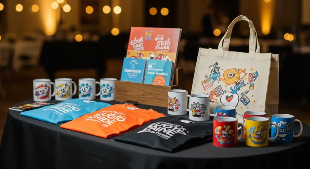
That pile of branded stress balls, cheap pens, and ill-fitting t-shirts you ordered for your last conference? That wasn’t event branding. That was you spending a lot of money on things destined for a landfill.
Most entrepreneurs and business owners confuse decorating a space with branding an experience. They believe something magical will happen if their logo is visible on enough surfaces. It won’t.
Effective event branding isn’t a shopping list. It’s a strategic system.
It’s the deliberate act of creating a cohesive, memorable experience that starts when someone sees your first ad and continues long after they’ve gone home. It’s designed to make people feel a certain way and, more importantly, do something that helps your business grow.
- Branding is a strategic system, not logo placement; design a cohesive experience across pre, during, and post phases.
- Adopt circular, sustainable assets to avoid waste and signal corporate competence through material and lifecycle choices.
- Prioritise neuro-inclusive, sensory-graded design and clear wayfinding to reduce cognitive load for all attendees.
- Define a single measurable goal, a core message, and a distinct visual identity before any production begins.
The Circular Event: Sustainability as a Brand Pillar

The era of “disposable branding” is over.
In 2026, if your event generates a skip-full of PVC banners and plastic badges, your brand isn’t just outdated—it’s a liability. Sustainability is no longer a footnote in the planning doc; it is the visual and ethical backbone of the identity itself.
Circular event branding replaces “take-make-waste” materials with modular, compostable, or high-value reusable assets that align a company’s environmental values with its visual presence.
Beyond Recyclable: The Circular Framework
Many brands fall into the trap of “Greenwashing”—using recycled paper but then coating it in plastic lamination. True circular branding requires a Lifecycle Assessment (LCA) of every asset you produce.
- Modular Scenography: Instead of custom-built stage sets that only fit one venue, design modular frameworks. Use aluminium frames with tension-fabric graphics (SEG). These are lightweight (reducing shipping emissions), and the fabric can be upcycled into other products or recycled through dedicated textile programmes.
- Substrate Innovation: Shift from foam-core boards to honeycomb cardboard or mycelium-based signage. These materials are not only 100% compostable but also offer a unique, tactile aesthetic that communicates “innovation” more effectively than a standard plastic board.
- Digital Integration: The most sustainable sign is the one you don’t print. Use E-ink displays for session rooms. They consume minimal power, look like paper, and can be updated in real-time, eliminating the need for hundreds of printed room signs.
Expert Perspective: In 2025, a study of B2B conference attendees found that 74% of C-suite executives viewed “visible waste” (excessive packaging, non-recyclable signage) as a sign of operational inefficiency within the hosting company. Sustainability in branding is now a proxy for corporate competence. If you can’t manage your event’s footprint, how can you manage a client’s multi-million pound contract?
The “No-Swag” Swag Strategy
If you must give something away, it must have “Emotional Durability.” This means an object that is so high-quality or useful that the recipient would never consider throwing it away.
- Digital Assets: Offer high-value templates, exclusive software access, or carbon offset credits tied to the attendee’s badge.
- The “Library” Model: Instead of pre-filling bags, create a “swag shop” where attendees take only what they want. This typically reduces production requirements by 40–60%.
By adopting a circular approach, you turn your event’s physical footprint from a “marketing expense” into a “brand proof-point.” You are proving, in three dimensions, that your company is ready for the future.
The Cohesive Experience Blueprint: A No-Nonsense Framework
You need to shift from disjointed tactics to a cohesive system to stop wasting money and getting a return. Think of your event as a complete story with a beginning, a middle, and an end. The branding is the theme that connects it all.
Designing for Every Brain: Neuro-inclusive Event Branding
In 2026, a truly high-performing brand identity isn’t just seen; it is felt and processed.
Neuro-inclusive design has moved from a “nice-to-have” accessibility feature to a core requirement for high-level event branding. If your visual system triggers sensory overload, you aren’t being inclusive; you are being exclusionary.
Neuro-inclusive event branding is the practice of designing environments and communications that cater to cognitive diversity—including autism, ADHD, and dyslexia—by controlling sensory inputs like colour contrast, lighting, and acoustic density.
The Sensory Load Audit
Most event branding fails because it is “too loud.” We don’t just mean the volume of the speakers; we mean the visual noise. High-contrast patterns, flickering LED screens, and clashing colour palettes can create an immediate “flight” response in neurodivergent attendees. To build a brand that resonates, you must implement a sensory-graded identity.
- Colour Tempering: While your primary brand might use “High-Octane Orange,” your event environment should utilise muted tonal variations for wayfinding and long-duration spaces. Reserve the high-energy colours for “impact moments” only.
- Typography for Clarity: Use fonts with high x-heights and open counters (like Atkinson Hyperlegible) for critical information. Avoid “all-caps” for long-form signage, as it creates a “block” effect that is difficult for dyslexic readers to decode in a busy environment.
- Zonal Branding: Define your event spaces through sensory “volumes.”
- High-Stim Zones: Bright branding, upbeat music, and high-density signage (e.g., the Expo Hall).
- Low-Stim Zones: Soft branding, biophilic elements, and minimal visual clutter (e.g., the Networking Lounge).
The Role of Wayfinding in Cognitive Ease
Wayfinding is not just about arrows; it’s about spatial predictability.
A neuro-inclusive brand uses consistent icons and colour-coded paths that reduce the cognitive load required to navigate a space. If an attendee has to stop and think about where the bathroom is, your branding has failed them.
Use high-contrast iconography and ensure that physical signs are placed at a consistent height and lighting level to assist those with visual processing differences.
By prioritising cognitive accessibility, you aren’t just helping a minority; you are creating a “frictionless” experience for everyone. A tired, stressed CEO has the same cognitive processing needs as someone with ADHD.
Designing for the “edges” makes the middle better for everyone.
Phase 1: The Foundation (Before a Single Ticket is Sold)
This is the most crucial phase, which happens long before the event. This is where you lay the strategic groundwork. Rushing this is like building a house with no foundation.
Start by answering three questions:
- What is the single most crucial GOAL? Be specific. “Brand awareness” is a useless, fluffy vanity metric. A fundamental goal is “Generate 50 qualified sales leads”, or “Secure 10 interviews with industry press”, or “Drive 1,000 sign-ups for our new beta.” Every decision from here on out must serve this one goal.
- What is the CORE MESSAGE? You need a clear sentence summarising the event’s promise to the attendee. For a tech conference, it might be, “The one place to see the future of AI before it happens.” For a user summit, “Become a power user and double your productivity.” This message dictates the tone, the content, and the atmosphere.
- What is the VISUAL IDENTITY? Your event is a sub-brand of your leading company. It should feel related but distinct. This involves creating a specific event logo or lockup, a unique colour palette that complements your primary brand, and a clear typographic hierarchy. This isn’t just about looking good; it provides a visual shorthand that makes your event instantly recognisable across all platforms. This is where a solid brand identity is non-negotiable.
Phase 2: The Immersion (During the Event)

This is where you bring the foundation to life. The goal is to create a multi-sensory experience where every touchpoint reinforces your core message. Consistency is everything.
The gold standard for this is Salesforce’s Dreamforce conference. They don’t just decorate a convention centre; they build an entire world.
The nature-themed stages, the cloud motifs on everything from carpets to coffee cups, the consistent use of their friendly font—it’s all part of a single, immersive system. You feel like you’ve stepped inside the Salesforce brand for four days.
The opposite of this? Fyre Festival. They had world-class pre-event branding. The social media campaign was a masterclass in building hype and desire. But the on-site experience was a catastrophic failure.
That jarring disconnect between the slick, exclusive brand promise and the reality of disaster relief tents and cheese sandwiches didn’t just ruin an event; it destroyed reputations and became a global punchline.
Your key touchpoints for immersion include:
- The check-in and registration experience
- Directional signage and wayfinding
- Stage and set design
- Staff and volunteer apparel
- The user interface of the event app
- Presentation and keynote templates
- Even the music and lighting choices
Every detail either adds to your brand or subtracts from it. There is no neutral ground.
The Mirror World: Branding for Spatial Computing & Hybridity
The distinction between “in-person” and “virtual” has dissolved.
In 2026, attendees in the room are wearing Augmented Reality (AR) glasses, and remote attendees are joining via Spatial Audio environments.
Your event branding must exist in the “Mirror World”—a digital twin of your physical space that is perfectly synced.
Spatial branding is the design of 3D, interactive brand assets that exist within AR/VR layers, enabling “limitless” environmental storytelling that complements the physical venue.
Designing for the “Z-Axis”
Traditional branding is 2D (banners, screens). Spatial branding adds depth.
- AR Wayfinding: Instead of looking for a physical sign, attendees look through their glasses or phones to see a 3D “trail” leading them to their next session. This trail can be branded with your event’s unique motion-graphic language.
- Persistent Virtual Assets: A remote attendee should see the same stage design, lighting, and “brand atmosphere” as a physical attendee. This requires a Unified Asset Library. Your physical stage designers and your 3D environment artists must work from the same “Brand Bible.”
- Gamified Identity: Allow attendees to “unlock” brand layers. Walking past a specific sponsor booth might trigger a spatial animation or a “digital token” (NFT) that appears in their AR field of view.
The biggest fail in hybrid events is the “Second-Class Citizen” effect—where the virtual platform looks like a 2010 Zoom call while the physical event looks like 2026. To fix this, use Volumetric Capture for your speakers. Seeing a “holographic” version of a keynote speaker in a spatial environment is infinitely more “on-brand” than a flat video feed. It maintains the premium nature of your event identity across all dimensions.
Phase 3: The Echo (After the Last Person Leaves)
The event isn’t over when the lights go out. In fact, some of the most valuable work happens now. The “Echo” phase reinforces the message and nurtures the connections you just made.
Your event branding must remain perfectly consistent in all post-event communication.
The visual style and tone of voice used in follow-up emails, surveys, and content recaps should instantly transport attendees back to the positive experience they had.
This is how you turn attendees into loyal advocates. You provide them with session recordings, photo galleries, and community forums that all live under the same cohesive brand umbrella.
This reinforces the value you delivered and keeps the conversation going, nurturing leads and building a true community until the next event cycle begins.
The Anatomy of Great Event Branding: Your Tactical Checklist
Once your strategy is set, you can start creating the actual assets. Here’s a practical, no-fluff checklist of what you’ll likely need.
Master the Senses
- Event Logo & Lockups: A distinct mark for the event that works alongside your primary company logo.
- Colour Palette & Typography: The specific colours and fonts will define the event’s look and feel.
- Keynote & Presentation Templates: Ensure every speaker’s presentation looks like it belongs at your event.
- Website & Registration Pages: The first central touchpoint for most attendees. It must be flawless.
- Social Media Graphics: A complete kit of templates for promotion, announcements, and live-event updates.
If your event “sounds” like a generic hotel lobby or, worse, a chaotic construction site, you are actively damaging your brand equity. Sonic branding is the intentional use of sound to reinforce your brand’s personality and guide attendee behaviour.
Sonic event branding uses a “Brand Anthem,” specific functional sounds (audio cues), and curated ambient textures to reduce stress and increase brand recall by up to 46%.
The Three Layers of Event Audio
- The Brand Anthem: This isn’t just a “walk-on” song for the CEO. It’s a 2–3 second Sonic Mnemonic (like the Netflix “Ta-dum”) that plays at the start of every session, video, and announcement. It signals to the brain: “Pay attention; something important is happening.”
- Functional Audio Cues: Instead of a jarring “voice of god” announcement, use branded audio cues to signal the end of a break or the start of a workshop. These sounds should share the same “tonal DNA” as your brand anthem—perhaps using the same instruments or frequency range.
- Atmospheric Soundscapes: * Registration: Use “High-Frequency, Up-Tempo” sounds to drive energy and move people through the line quickly.
- Networking: Use “Mid-Range, Low-Density” textures (think Lo-Fi beats or generative ambient) that mask background chatter without competing with human speech frequencies (300Hz to 3kHz).
- The “Deep Work” Zone: If you have a workspace, use “Pink Noise” or “Biophilic Soundscapes” (running water, wind) to aid focus.
The Science of “Audio Moats”
In a busy expo hall, sound bleeds from every booth, creating a “grey noise” that induces fatigue. A master-branded event uses Directional Audio (Sound Beaming). This technology allows you to “beam” sound to a specific spot.
When an attendee stands in front of a brand activation, they hear the story perfectly; when they step six inches to the left, it’s silent. This creates a “private brand moment” in a public space, significantly increasing engagement.
Master the Environment (Physical & Digital)
- Directional Signage (Wayfinding): Clear, on-brand signs are among the most critical factors in a positive attendee experience. Confusion is the enemy.
- Stage & Set Design: The backdrop for your main content. It sets the entire tone.
- Digital Banners & Waiting Room Screens: The digital environment is the only one for virtual or hybrid events. It needs to be just as immersive.
- Event App Interface: The app is your direct line to the attendee. Its design should be a seamless extension of the event’s brand identity.
Create Tangible Touchpoints (If You Must)
Most swag is a waste. But if you create physical items, they must pass a simple test: “Is this genuinely useful or beautiful?” If the answer is no, save your money.
Good examples include:
- Lanyards & Badges: These are non-negotiable. Design them to be clear, helpful, and visually striking. On-site badge printing can enhance the experience by personalising attendee credentials, reinforcing your brand, and allowing last-minute adjustments for VIPs or walk-ins.
- Workbooks or High-Value Notebooks: A well-designed notebook that people will actually use is infinitely better than a cheap pen.
- Apparel: Staff apparel should be professional and easily identifiable. If giving it to attendees, the quality must be high enough that they’d consider wearing it in public.
How to Know If Your Event Branding Actually Worked
You don’t measure the success of event branding by how many people said, “The banners looked nice.” You measure it with cold, complex data tied to your original goal.
- Social Media Mentions & Sentiment Analysis: Were people organically sharing photos of your event? Look for pictures of the stage design, the signage, and the cool badges. Positive user-generated content is a sign that you created an environment people wanted to be associated with.
- Post-Event Survey Feedback: Don’t just ask about the speakers. Ask questions like, “How would you describe the event’s atmosphere?” or “Was the event easy to navigate?” The answers will tell you if your branding created the feeling you intended.
- Lead Quality & Conversion Rate: If your goal was lead generation, this is the only metric that matters. Did the event attract the right audience, and are those leads converting into customers?
- Press & Media Coverage: Did the unique, cohesive branding help your event stand out and get noticed by industry publications? A strong visual identity makes for a much better story.
Proving the Spend: Advanced ROI & Sentiment Modelling
The old way of measuring event branding—counting mentions in a post-event survey—is dead. In 2026, Quantitative Brand Attribution is the standard.
We no longer ask “did they like the logo?” We measure how the brand identity influences micro-behaviours and long-term conversion cycles.
Advanced event ROI is calculated by combining Biometric Sentiment Data (gaze tracking/dwell time) with Multi-Touch Attribution to track how event interactions shorten the sales cycle compared to digital-only leads.
The Hierarchy of Attribution
To truly understand your brand’s impact, you must look beyond the “Happy Sheet” survey. You need a data stack that tracks the attendee’s journey through the brand environment.
| Metric Layer | What it Measures | 2026 Tooling |
| Passive Sentiment | Facial expression analysis at key brand touchpoints. | AI-enabled CCTV / Heatmapping |
| Visual Salience | Which brand elements (logos, taglines) actually drew the eye? | Eye-tracking glasses (sample groups) |
| Dwell Time | How long did people engage with a branded installation? | BLE (Bluetooth Low Energy) Beacons |
| Conversion Lift | The difference in Lead-to-Close speed for event vs. non-event leads. | CRM Integration (Salesforce/HubSpot) |
Sentiment Data Modelling: The “Vibe” as a Variable
Using Computer Vision, organisers can now track the aggregate “mood” of a room.
If the “Echo” phase of your branding (post-keynote) shows a 20% spike in positive facial sentiment compared to the “Foundation” phase (registration), you have empirical proof that your brand narrative is working.
This isn’t about tracking individuals—it’s about anonymised aggregate data. It lets you adjust your branding in real time.
If the heatmap shows people are ignoring your “Lead Gen” wall because the lighting is too harsh or the branding is too aggressive, you can pivot on day two.
It’s Not About the Budget, It’s About the Brains
You don’t need a Salesforce-sized budget to pull this off. A small, local meetup with a smart, consistent brand identity can be far more impactful than a massive, chaotic trade show that wasted a fortune on disjointed tat.
Creativity and consistency are your most powerful tools. A clever core message executed flawlessly across key touchpoints—like the website, the check-in desk, and the stage design—will always beat a massive budget on a hundred mediocre items.
Your event is your brand in three dimensions. It’s a living, breathing representation of what you stand for. The only question is, are you building a landmark or just another pop-up tent?
Ready to Build a Landmark?
If you’re tired of seeing event budgets vanish into thin air with nothing to show for it, it’s time to build a proper brand foundation first. A strong brand identity is the engine behind any successful event.
At Inkbot Design, we build those brand foundations.
Check out our professional brand identity services to see the level of detail required, or, if you’re ready to get serious, request a no-nonsense quote today.
Frequently Asked Questions (FAQs)
What is event branding?
Event branding is the strategic process of creating an event’s cohesive and memorable identity. It covers all visual, verbal, and experiential touchpoints—from pre-event marketing to the on-site experience and post-event follow-up—to achieve a specific business goal.
What is the difference between event branding and event marketing?
Event marketing is the activities used to promote the event (e.g., running ads, sending emails). Event branding is the core identity and message that marketing communicates. The branding is the what; the marketing is the how.
How do you create an event branding strategy?
Start by defining a single, measurable business goal. Then, develop a core message that communicates the event’s value. Finally, create a distinct visual identity (logo, colours, fonts) that aligns with the goal and message.
What are the key elements of event branding?
The key components include the event logo, colour palette, typography, messaging and tone of voice, website design, social media graphics, on-site signage, stage design, and all attendee communication.
Why is consistency so important in event branding?
Consistency builds recognition and trust. Every touchpoint—from the website to a name badge—looks and feels part of the same system, creating a professional and immersive experience that makes your brand more memorable and credible.
How do you brand a virtual event?
You apply the same principles to the digital environment. This means branding the registration pages, email communications, virtual platforms (lobby, waiting rooms), digital banners, presentation templates, and downloadable resources to create a cohesive digital experience.
Can I use my company’s main brand for an event?
Yes, but creating a distinct sub-brand for the event is often better. This allows you to give the event its own personality while still feeling connected to the parent company. It usually involves an event-specific logo lockup and a secondary colour palette.
How much does event branding cost?
The cost varies dramatically based on scope. A simple identity for a small webinar could be a few thousand dollars, while branding a multi-day international conference is a significant six-figure investment. The key is to see it as an investment in achieving a business goal, not an operational cost.
What are some common event branding mistakes to avoid?
The biggest mistakes are: simply slapping your logo on everything without a strategy, having an inconsistent visual style across different materials, and creating a great online brand that doesn’t match the on-site experience.
How do you measure the ROI of event branding?
You measure it against the goal you set in the strategy phase. Key metrics include lead quality and conversion rate, social media sentiment and engagement, specific feedback from post-event surveys, and press/media mentions.


