25 Famous Symbols with Meanings: The Semiotics of Branding
Most business owners treat symbols like decoration. They browse a stock library, pick a generic globe or a handshake, and slap it on their website, assuming they have communicated “trust” or “global reach.”
They haven’t. They have communicated laziness.
During my years as Creative Director at Inkbot Design, I have seen reputable companies damage their credibility by using symbols they do not understand.
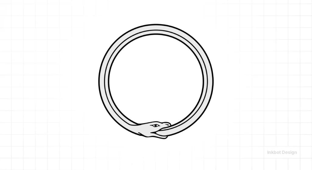
I once audited a financial firm using a variation of the Ouroboros (a snake eating its own tail) in their logo. They thought it meant “infinity.” To the educated eye, it meant “self-destruction” and “stagnation.” Not exactly the vibe for a wealth management fund.
Symbols are not just pretty shapes. They are cognitive shortcuts. The human brain processes visual data 60,000 times faster than text.
When you get the symbolism right, you bypass the consumer’s scepticism and speak directly to their subconscious. Get it wrong, and you are just noise.
This is not a fluff piece about “expressing yourself.” This is a forensic look at famous symbols with meanings, their origins, and whether you should use them—or run a mile.
- Symbols are cognitive shortcuts; get them right to bypass scepticism and speak to the subconscious.
- Functional symbols must be legible at small sizes, resonate culturally, and be unique enough to trademark.
- Avoid literal, clichéd or misappropriated icons; research cultural meanings and historical baggage first.
- Create distinctive, metaphorical symbols rather than generic stock icons; simplicity and storytelling amplify value.
What Are Symbols? (And Why They Make You Money)
In strict semiotic terms, a symbol is a visual object that represents an idea, process, or entity independent of the object’s literal shape.
Unlike an icon (which resembles the thing it represents, e.g., a printer icon resembling a printer), a symbol relies on cultural conditioning. There is no logical reason why a circle with a line through it means “no.” We have simply agreed that it does.
The Three Components of a Functional Symbol
If you are commissioning a logo or building a brand identity, your symbols must satisfy three criteria:
- Legibility: Can it be identified at 16×16 pixels? (See our guide on Vector vs Raster images for why this matters).
- Resonance: Does the target audience possess the cultural context to decode it?
- Uniqueness: Is it distinct enough to be trademarked?
If you fail on these, you don’t have a symbol; you have a smudge.
The “Semiotic” Brand Challenge
You use emojis every day, but do you know the hidden psychological triggers behind them? Test your knowledge of Brand Symbolism in this 7-question challenge.
Question…
Quiz Complete!
You scored X/7
The Takeaway: Symbols are powerful shortcuts to the brain. A logo isn’t just a picture; it’s a feeling. If your brand symbol isn’t telling the right story, you are confusing your customers.
The Tech & Modern Utility Symbols
The icons that run the world.
1. The Power Button
Origin:
This is a masterclass in binary logic. In the early days of engineering, switches were labelled "On" and "Off." As electronics became global, language barriers became an issue. Engineers looked to the binary system, where 1 represents "flow of power" (on), and 0 represents "no flow" (off).
In 1973, the International Electrotechnical Commission (IEC) standardised the symbol. They superimposed the "1" inside the "0" to represent a "Standby" state—power is available but not fully active.
The Branding Lesson:
Simplicity travels. The power symbol is understood in every language without a single word of text. If your logo design process relies on text to explain what you do, you have already failed.
2. Bluetooth
Origin:
This is my favourite example of "Easter Egg" design. The technology was developed to unite the PC and cellular industries. Jim Kardach, one of the founders, was reading about Vikings at the time.
The name comes from King Harald Bluetooth (Blåtand), who united disparaging Scandinavian tribes in the 10th century. The symbol is a bind-rune, combining the Younger Futhark runes for H (ᚼ) and B (ᛒ).
The Branding Lesson:
Storytelling adds value. Bluetooth could have been called "Personal Area Network Protocol." It would have died. By anchoring the tech in a narrative of "unification," they created a legacy.
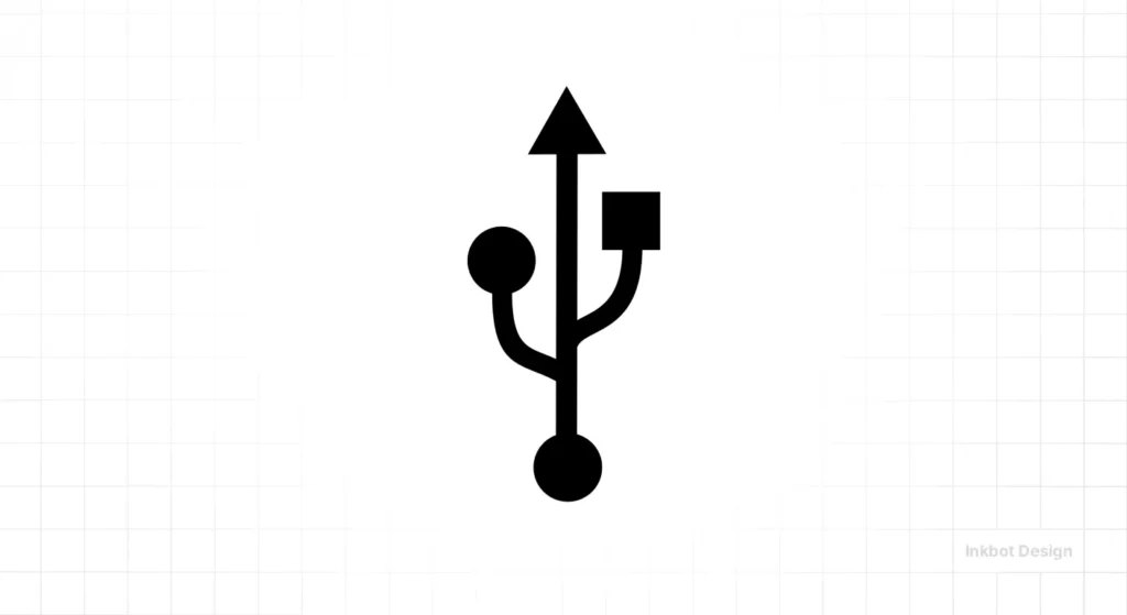
3. The USB Symbol
Origin:
The USB icon is modelled after the Trident of Neptune (or Poseidon). The designers replaced the three points of the spear with a square, a circle, and a triangle. This signifies that one single connector can attach to multiple distinct devices (printers, drives, cameras).
The Branding Lesson:
Metaphors clarify complexity. If you offer a complex SaaS product, don't list features. Find a visual metaphor that explains the utility of the connection.
4. The @ Symbol (The "At" Sign)
Origin:
Before email, this was a purely commercial accounting symbol, meaning "at the rate of" (e.g., 5 widgets at £2 each). Ray Tomlinson chose it for the first email in 1971 because it was rarely used in computing and provided a clear separation between the user and the host machine.
The Branding Lesson:
Repurposing is powerful. Tomlinson took a dusty, boring accounting ligature and turned it into the defining symbol of the digital age.
5. The Wi-Fi Symbol
Origin:
Created by Interbrand for the Wi-Fi Alliance. It represents a point spreading out waves, mimicking radio signals. It is technically a visual representation of "broadcasting."
The Branding Lesson:
Feedback loops. The symbol is effective because it conveys strength and power. The number of curved bars lit up gives the user immediate feedback on signal quality. Good design is functional, not just aesthetic.
The Ancient & Mystical Symbols
Context is everything. These symbols carry thousands of years of baggage.
6. The Yin and Yang (Taijitu)
Origin:
Rooted in Taoism, this represents a dualistic perspective. The dark swirl (Yin) is associated with shadows, femininity, and the trough of a wave. The light swirl (Yang) represents brightness, passion, and growth. The dots indicate that each side carries the seed of the other. Absolute purity does not exist.
The Branding Lesson:
Balance. This is often used in wellness and holistic medical branding. However, it is a cliché. Unless you are actually teaching Taoism, stylise this concept rather than copying it directly.
7. The Ankh
Origin:
An ancient Egyptian hieroglyph meaning "life" or "breath of life." It looks like a cross with a loop at the top. It was often depicted being held by gods to someone’s lips, offering them the afterlife.
The Branding Lesson:
Be careful with religious iconography. While the Ankh is largely secularised now (mostly thanks to pop culture and goth subculture), using it for a life insurance company might feel a bit... funeral-heavy.
8. The Eye of Providence (All-Seeing Eye)
Origin:
You see this on the US dollar bill. Originally a Christian symbol representing the eye of God watching over humanity (enclosed in a triangle for the Trinity). Conspiracy theorists love to link it to the Illuminati or Freemasons.
The Branding Lesson:
Association matters more than intent. You might intend to convey "oversight" and "security." Your customers might see "surveillance" and "conspiracy." Avoid this in cybersecurity branding.
9. The Ouroboros
Origin:
A serpent or dragon eating its own tail. Found in ancient Egyptian and Greek iconography. It represents the infinite cycle of nature’s creation and destruction.
The Branding Lesson:
As mentioned in my intro, this is risky for business. It implies a closed loop, no growth, or cannibalisation. Great for a philosophy book cover; terrible for a startup pitching "exponential growth."
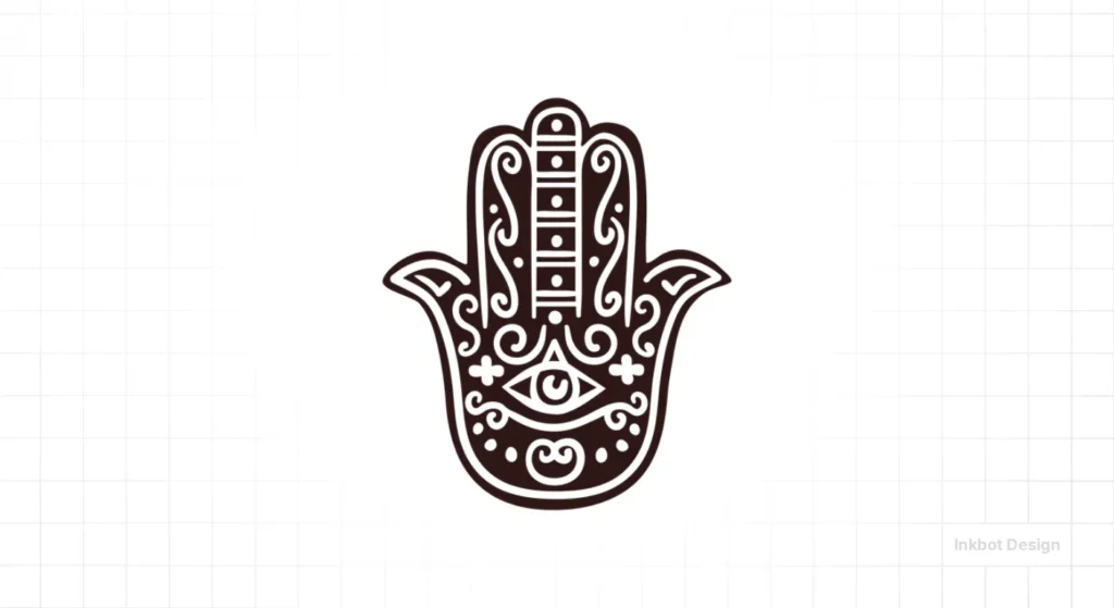
10. The Hamsa (Hand of Fatima)
Origin:
A palm-shaped amulet is popular throughout the Middle East and North Africa. It is a protective sign intended to ward off the "Evil Eye."
The Branding Lesson:
Cultural appropriation vs. appreciation. If you are selling authentic Middle Eastern goods, it's a good fit. If you are a white-label cosmetics brand in Slough, using the Hamsa will make it look inauthentic and tacky.
The "Cautionary Tale" Symbols
The ones that get misused the most.
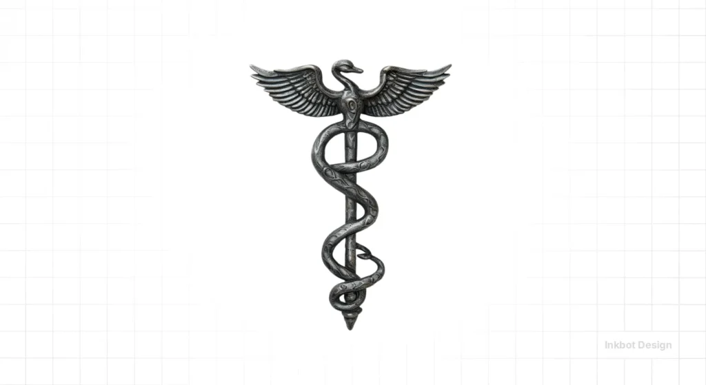
11. The Caduceus vs. The Rod of Asclepius
The Meaning:
Here is the biggest embarrassment in American healthcare.
- Rod of Asclepius: A single snake wrapped around a staff. Asclepius was the Greek god of healing. This is the correct symbol for medicine.
- The Caduceus: Two snakes wrapped around a winged staff. This is the staff of Hermes, the god of commerce, trickery, thieves, and liars.
The Branding Lesson:
Check your sources. A massive portion of US medical institutions use the Caduceus (the symbol of liars and thieves) because a US Army officer confused them in 1902. Do not replicate this error. If you are in healthcare, use the single snake.
12. The Swastika

Origin:
Before the 1930s, this was a sacred symbol of divinity and spirituality in Indian religions (Hinduism, Buddhism, Jainism). The word originates from Sanskrit, specifically svastika, meaning "conducive to well-being."
The Corruption:
The Nazi party appropriated it, tilted it 45 degrees, and turned it into the most hated symbol in human history.
The Branding Lesson:
Meaning is fluid. You cannot "reclaim" a symbol that has been weaponised to this extent in the West. It is a stark reminder that a logo's meaning is defined by the actions of the organisation behind it.
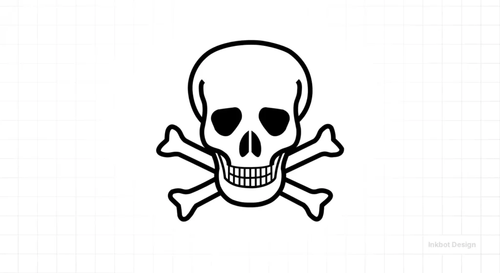
13. The Skull and Crossbones
Origin:
Historically used to mark the entrances of cemeteries (Memento Mori - "Remember you must die"). Later adopted by pirates (The Jolly Roger) to incite fear without firing a shot. Now, strictly regulated as the GHS hazard symbol for acute toxicity.
The Branding Lesson:
Contextual fear. In fashion (Alexander McQueen), it’s edgy. In the food and beverage industry, it is illegal unless the product is actually poisonous.
The Universal Human Symbols
The ones that transcend language.
14. The Heart
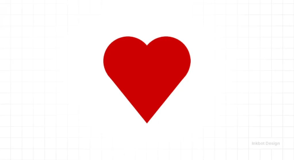
Origin:
Why does it look like that? A real human heart looks like a lump of muscle. Theories range from the shape of the (now extinct) Silphium plant seed used for birth control in ancient Cyrene, to the shape of buttocks or breasts. It wasn't associated with romantic love until the Middle Ages.
The Branding Lesson:
The most overused symbol on earth. If you use a heart, you must do something radical with the negative space or texture. See the "I Love NY" logo by Milton Glaser—it worked because it was the first to use the symbol as a verb.
15. The Peace Sign
Origin:
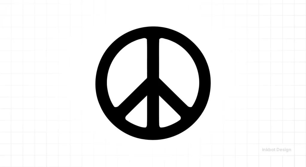
Designed by Gerald Holtom in 1958 for the British Campaign for Nuclear Disarmament (CND). It is a composite of the semaphore signals for the letters "N" and "D" (Nuclear Disarmament), enclosed in a circle.
The Branding Lesson:
You don't always need a literal icon. A dove is literal. The peace sign is abstract, yet it became the defining logo of a generation.
16. The Dove
Origin:
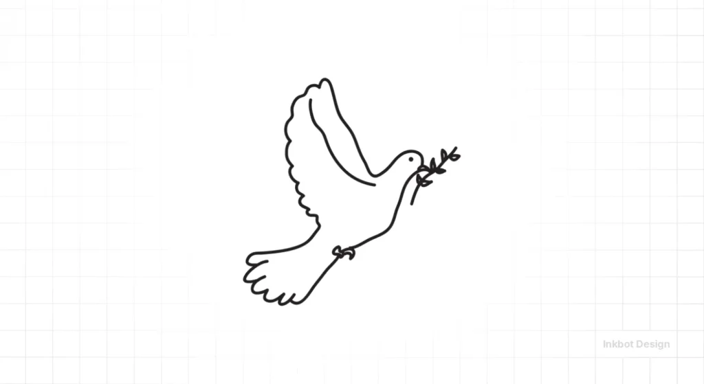
Biblical (Noah’s Ark) and Pagan origins. It represents peace, purity, and new beginnings.
The Branding Lesson:
Soft power. Non-profits and charities use this effectively. It implies passivity and gentleness. Not recommended for litigators or security firms.
17. The Barber Pole
Origin:
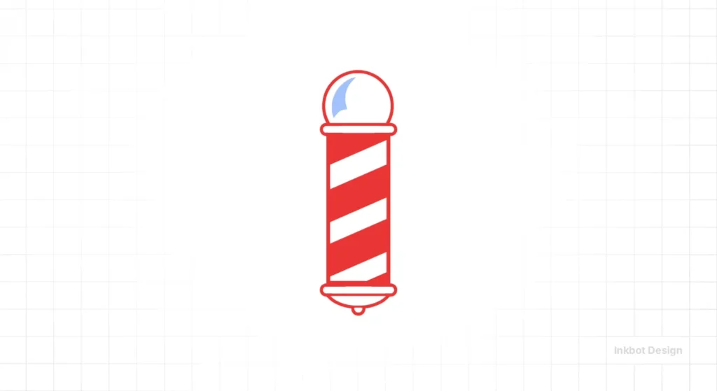
Grim history. In the Middle Ages, barbers performed surgery and bloodletting (extracting blood to cure illness). The pole represents the stick the patient squeezed to make their veins pop. The red is blood, the white is bandages.
The Branding Lesson:
Legacy survives logic. We no longer bleed people at the barber, but the symbol remains the global standard for the industry.
Commercial & Abstract Symbols
Symbols created purely for utility or trade.
18. The Dollar Sign ($)
Origin:
Most likely derived from the Spanish Peso (PS). Scribes eventually wrote the P on top of the S, evolving into the $ sign.
The Branding Lesson:
In design, the dollar sign is often considered "cheap." High-end luxury brands rarely use the symbol in their marketing; instead, they state the price or use the currency code (e.g., USD). Discount warehouses use the symbol. Know your position.
19. The Copyright Symbol (©)
Origin:
Established by the Copyright Act of 1909 in the US. A functional legal indicator.
The Branding Lesson:
Visual clutter. Don't put this in your logo. It looks paranoid and amateurish. Your trademark protection comes from registration, not from ruining your logo aesthetic with a tiny "c".
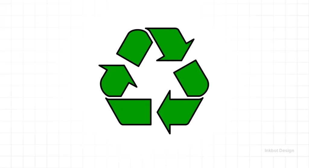
20. The Recycling Symbol (The Mobius Loop)
Origin:
Designed by student Gary Anderson in 1970 for a contest. It represents the three stages of the recycling hierarchy: Reduce, Reuse, and Recycle.
The Branding Lesson:
Public domain power. Anderson didn't copyright it. It became a global standard because it was free to use. Sometimes, ubiquity is worth more than licensing fees.
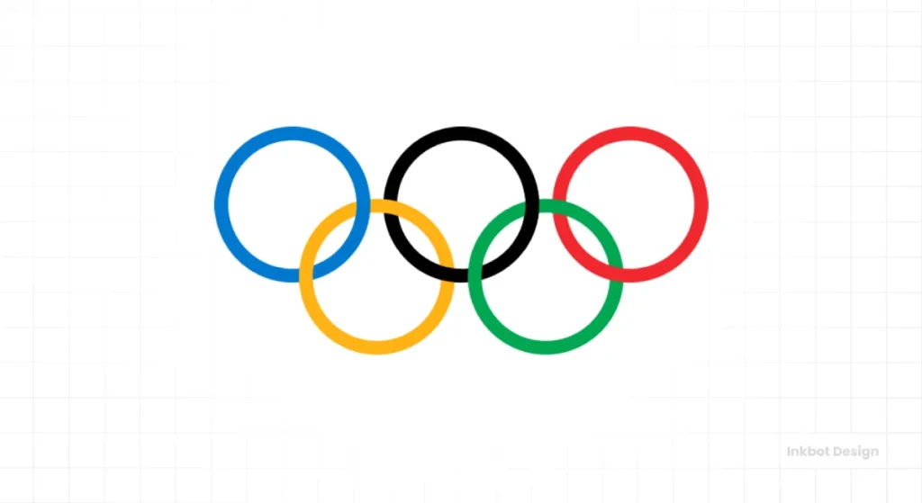
21. The Olympic Rings
Origin:
Designed by Pierre de Coubertin in 1913. The five rings represent the five inhabited continents. The colours (blue, yellow, black, green, and red), combined with the white background, included every colour from every national flag in existence at the time.
The Branding Lesson:
Inclusivity through abstraction. It doesn't favour one nation. It is arguably one of the most famous logos in history, thanks to its pure conceptual execution.
22. The Infinity Symbol (Lemniscate)
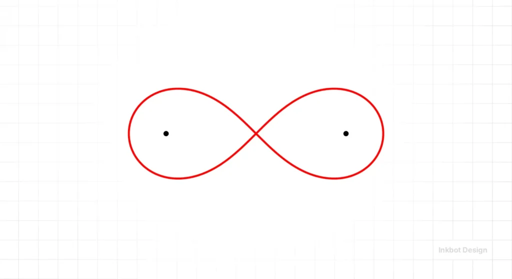
Origin:
Introduced by mathematician John Wallis in 1655.
The Branding Lesson:
Similar to the Ouroboros but more positive. Used often by tech companies (Meta) to suggest limitless connection. It is becoming generic, however.
23. The Male/Female Symbols (Mars and Venus)
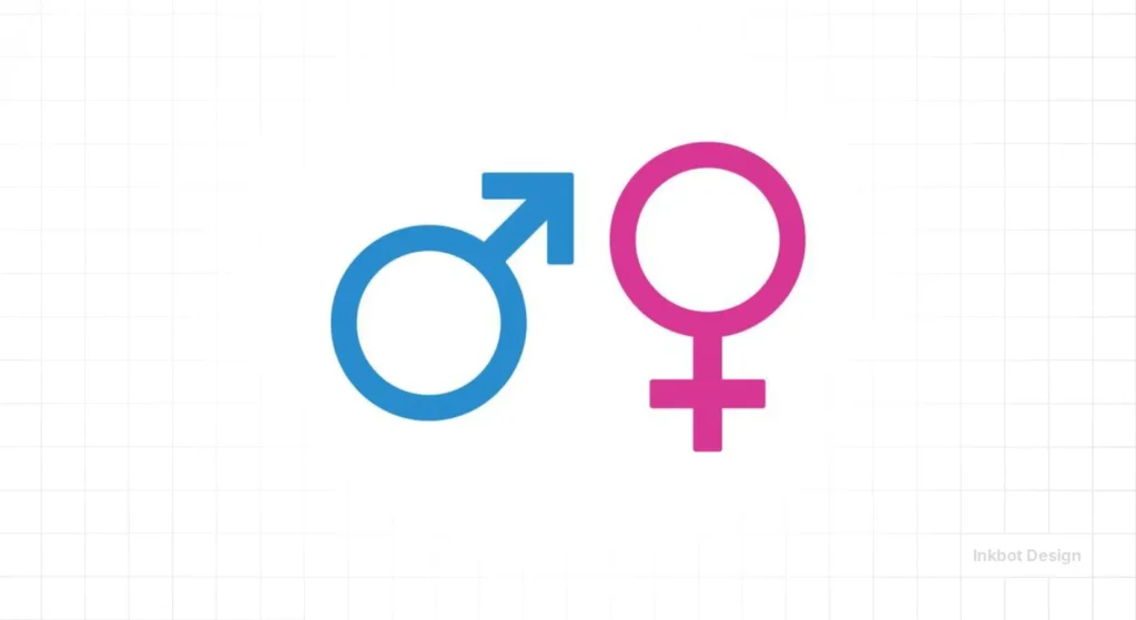
Origin:
Derived from astrological symbols. The male (shield and spear) is Mars. The female (hand mirror) is Venus.
The Branding Lesson:
These are rapidly becoming outdated in many progressive sectors. Modern UX design often prefers gender-neutral iconography or avatars rather than these rigid biological symbols.
24. The Biohazard Symbol
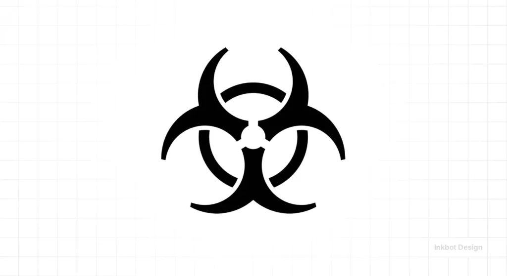
Origin:
Developed by Dow Chemical in 1966. The design criteria were fascinating: it had to be "memorable but meaningless", so it could be learned. It had to look the same from all angles (rotationally symmetric).
The Branding Lesson:
Distinctiveness saves lives. The symbol looks like nothing else in nature. It commands attention because it is unnatural.
25. The Check Mark (Tick)
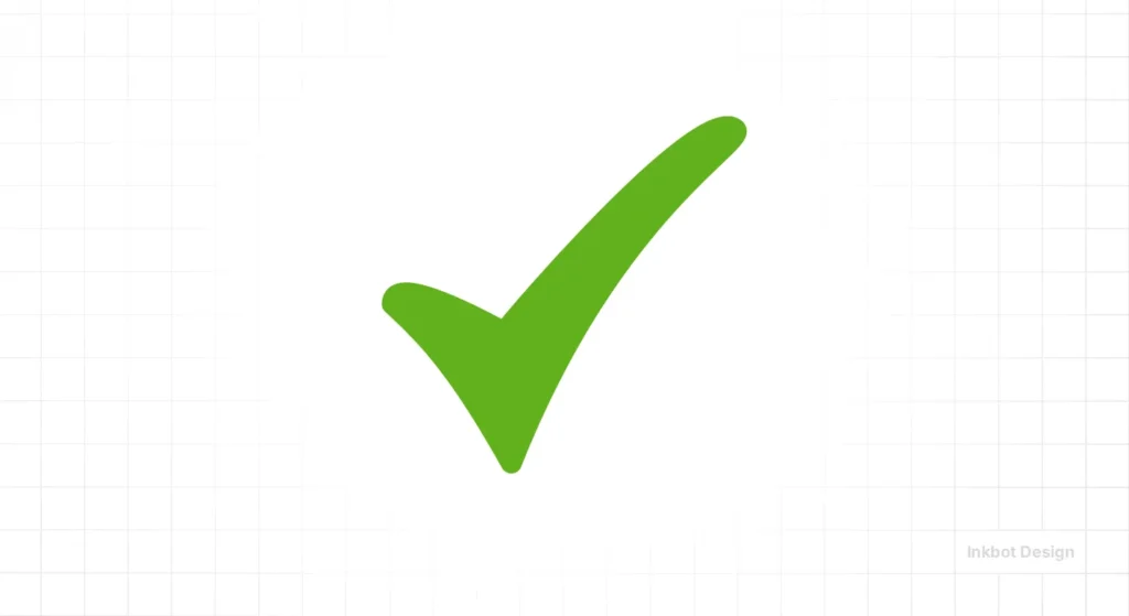
Origin:
From the Latin veritas (truth). Romans abbreviated it to 'v'. Over time, ink pens would start the stroke heavy and trail off, creating the check shape.
The Branding Lesson:
The ultimate validation. Green check marks release dopamine in the user's brain. Use them in your UI design to confirm successful actions.
Don't Be Literal
In our fieldwork at Inkbot Design, we often see SMBs trying to say too much. I recall a logistics client who wanted a logo containing a truck, a globe, a clock (for speed), and a handshake.
It looked like a scrapyard.
We stripped it back to a single abstract arrow moving through a box. That symbol conveyed "movement" and "logistics" without showing a literal lorry.
The most famous symbols work because they strip away the noise. The Apple logo isn't a computer. The Nike Swoosh isn't a shoe.
The State of Symbolism in 2026
We are currently seeing a shift away from the "Flat Design" that dominated the 2010s. In 2026, symbols are regaining volume—a trend often referred to as "spatial design" or "new skeuomorphism."
Because AI generates so much flat, generic content, brands are moving toward symbols that feel tactile, human, and slightly imperfect. If you are looking to rebrand, consider symbols that have weight and texture, rather than just flat vectors.
| The Amateur Approach | The Professional Approach |
| Uses generic stock icons (Globe, Light Bulb). | Creates custom geometry based on brand DNA. |
| Relies on literal interpretation (Tooth icon for dentist). | Uses abstract concepts (Sparkle/Smile curve for dentist). |
| Uses complex illustrations that fail at small sizes. | Optimises for the "Favicon Test" (16x16px legibility). |
| Ignores cultural context (e.g., the use of white for weddings in Asia). | Researches cross-cultural semiotics. |
The Verdict
Symbols are high-leverage assets. A great symbol acts as a vessel for your brand's reputation. When people see the Mercedes star, they don't think about the sheet metal; they think about the engineering prestige. That meaning wasn't there from the start—it was built up over decades.
However, you must begin with the right vessel. If your symbol is generic, offensive, or confusing, you are filling a leaky bucket.
Stop guessing. If you want a brand identity that actually functions as a business asset rather than a decoration, you need professional eyes on it.
Frequently Asked Questions (FAQ)
What is the difference between a logo and a symbol?
A logo is the broader brand identifier, which often includes the company name (wordmark) and a symbol (logomark). The symbol is the graphic icon (like the Nike Swoosh) that can stand alone, while the logo is the complete lockup.
Why are symbols more effective than text?
The brain processes images 60,000 times faster than text. Symbols bypass the language processing centres of the brain, creating an immediate emotional or psychological association (Signifier vs. Signified).
Can I use the Peace Sign in my logo?
Technically, yes. The Peace Sign is not trademarked and is in the public domain. However, because it is so universally recognised, it is difficult to trademark a logo that relies heavily on it. It’s better to create something unique.
What does the "C" in a circle mean?
It stands for Copyright. It indicates that the creative work is intellectual property. You do not need to include this symbol in your logo design for it to be protected; protection is automatic upon creation in many jurisdictions, though registration is recommended.
Is the Caduceus the correct symbol for medicine?
No. The Caduceus (two snakes, wings) is the symbol of Hermes (commerce). The correct medical symbol is the Rod of Asclepius (one snake, no wings). Many US organisations use the wrong one due to a historical error.
Why do brands use the colour blue so often?
Blue symbolises trust, security, and calm. It is the most popular colour for financial and tech brands (PayPal, Facebook, IBM) because it is non-threatening and universally liked. See our guide on Logo Design Psychology.
Are there symbols that are offensive in other cultures?
Yes. For example, the "Thumbs Up" gesture is offensive in parts of the Middle East and West Africa. The colour white signifies death in many Asian cultures, whereas it signifies purity in the West. Always research your target markets.
How much does a custom symbol design cost?
Costs vary wildly from £50 (Fiverr) to £50,000+ (Agencies). A professional, research-backed symbol usually falls in the mid-to-high four-figure range. Read more on Logo Design Cost.
What is a "favcon" and why does my symbol need to fit it?
A favicon is the tiny icon in your browser tab. It is usually 16x16 or 32x32 pixels. If your symbol is too complex, it will appear blurry at this size. Good symbols are scalable.
Can I trademark a generic symbol, such as a heart?
No. You cannot trademark a universal shape. You can only trademark a specific stylisation of that shape. If your heart symbol resembles the standard emoji, your trademark application will likely be rejected for lack of distinctiveness.

