Developing a Design Language System: Beyond the Logo
I have seen the inside of more businesses than I care to count, and I can tell you exactly when a company is about to hit a growth ceiling. It isn’t when their sales team quits. It isn’t when their server crashes.
It is when their “About Us” page looks like it was designed in 2025, their product dashboard looks like 2015, and their mobile app looks like a completely different company acquired them.
This is the “Frankenstein Effect.” It happens when you treat your brand as a static sticker—a logo you slap on things—rather than a living, breathing operating system.
You might have a 50-page PDF called “Brand Guidelines” sitting in a Dropbox folder somewhere. But let’s be honest: your developers haven’t opened it in six months, and your marketing intern is guessing the hex code for your primary blue.
If you are serious about scaling, a logo is not enough. You need a Design Language System (DLS).
This isn’t just for Google or Airbnb.
If you are an SMB owner or an entrepreneur, the lack of a system is currently costing you money in repetitive work, design debt, and confused customers. Let’s fix it.
- Design Language Systems are living infrastructure, not static logos—provide reusable components, code, and governance to ensure consistent brand experiences.
- Build by audit, define visual principles, create an MVP library, document usage, and use tokens to sync design and code for rapid, consistent updates.
- Governance prevents rot: use a federated librarian model, bake accessibility into components, and iterate to reduce design debt and speed-to-market.
What is a Design Language System?
A Design Language System (DLS) is a collection of reusable, functional elements—guided by clear standards—that can be assembled to build any number of applications.
Unlike a static style guide, which tells you what things should look like, a DLS provides the actual tools and code to consistently make them look that way.
The three core components of a DLS are:
- Design Library: The visual assets (colours, typography, icons, grids) are usually hosted in tools like Figma or Sketch.
- Component Library: The coded counterparts of those assets (React components, CSS classes, HTML snippets) that developers use.
- Documentation (Governance): The rules that dictate when and how to use these components (e.g., “Use the primary button for sales actions, secondary for navigation”).
Consultant’s Note: Think of Lego. The individual bricks are your components. The instruction booklet is your documentation. The final castle is your product. Without the system, you are just handing your team a pile of clay and hoping they all sculpt the same brick. They won’t.
The Expensive Truth: Why You Need a DLS
You might be thinking, “We are a team of twelve. Do we really need a system?”
Yes. In fact, you need it more than the giants do. Large corporations can absorb the cost of inefficiency. You cannot.
1. The Cost of Design Debt
Every time a developer has to “hard-code” a button style because they can’t find the standard one, you accrue debt. Six months later, you decide to change your brand colour. Now, instead of changing one line of code in a central system, you have to hunt down 500 instances of that blue across three different websites. This is design debt. It slows you down. It breaks things.
2. Consistency Builds Trust
According to a report by McKinsey & Company, companies that excel in design outperform industry benchmarks by as much as two to one. Why? Because consistency signals competence. If your checkout page looks different from your landing page, the user subconsciously hesitates. “Is this secure? Is this the same site?” That hesitation kills conversion rates.
3. Speed to Market
With a DLS, you stop designing from scratch. You design by assembly. A new landing page doesn’t take three days; it takes three hours because you are just snapping pre-approved blocks together.
DLS vs. Brand Identity: What’s the Difference?
This is where most people get confused. They hire an agency for brand identity, get a logo and a font file, and think they are done.
Your brand identity is the soul of the organisation. It defines who you are, your voice, and your visual distinctiveness. The DLS is the body responsible for performing the work.
| Feature | Brand Guidelines (The Old Way) | Design Language System (The New Way) |
| Format | Static PDF or Slide Deck | Living URL / Cloud-based Hub |
| Audience | Designers & Marketers | Designers, Developers, Product Managers |
| Content | “Here is the logo and font.” | “Here is the button code and usage rules.” |
| Update Frequency | Once every 3-5 years | Weekly or Monthly (Iterative) |
| Enforcement | Manual policing | Programmatic / Shared Libraries |
| Outcome | Visual Reference | Functional Infrastructure |
If your visual identity is the blueprint, the DLS is the warehouse full of pre-fabricated walls and windows ready to be installed.
The Anatomy of a Design Language System
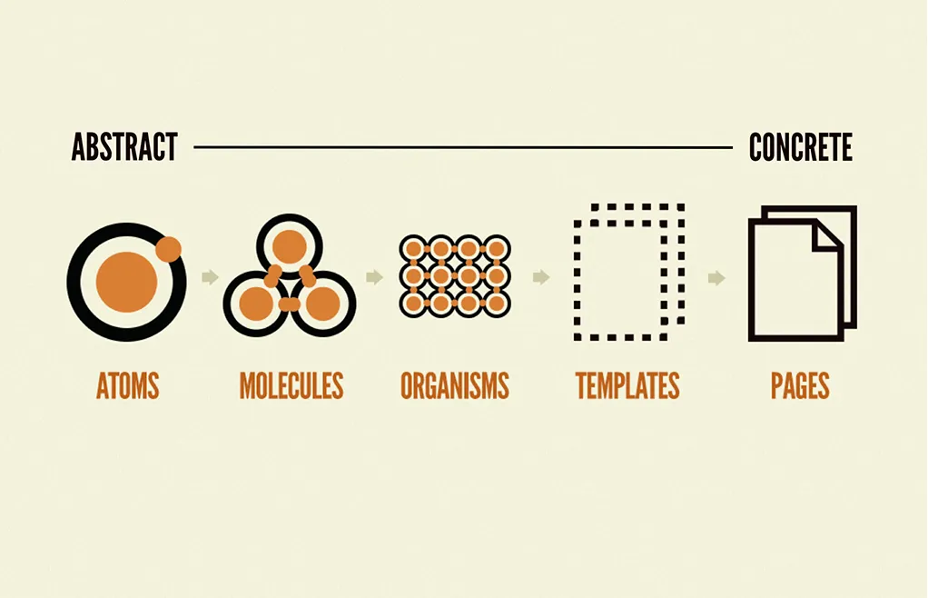
To build a system that works, you need to break your brand down into its smallest parts. We use a methodology often referred to as “Atomic Design” (coined by Brad Frost), but we apply it with a business lens.
1. Foundations (The Atoms)
These are the non-negotiable raw materials of your brand. They cannot be broken down further.
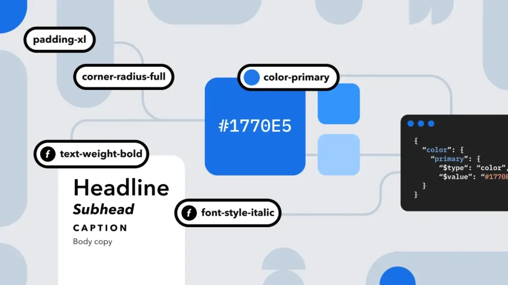
- Colour Palette: Do not just pick “Red.” Define Primary-Red-500 for main actions, Red-100 for backgrounds, and Red-900 for text. Semantic naming is vital here.
- Typography: Define your type scale. H1 is not just “Big.” H1 is 32px on mobile and 48px on desktop, with a line height of 1.2.
- Spacing & Grid: The invisible glue. A 4px or 8px grid system ensures that everything aligns mathematically.
- Iconography: A set of consistent symbols. If your arrows are rounded, your checkmarks should also be rounded.
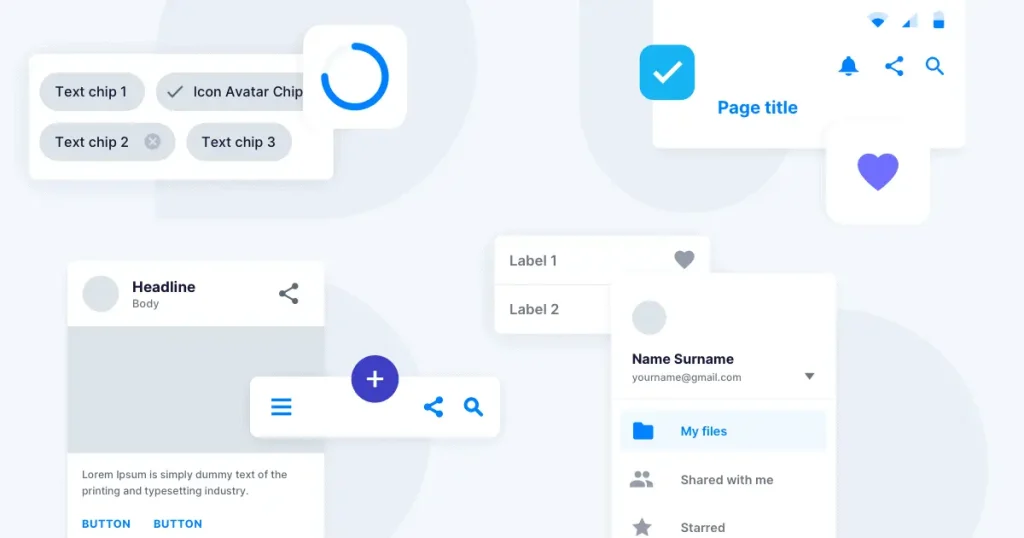
2. Components (The Molecules)
This is where atoms combine to form functional UI elements.
- Buttons: A button is a container (atom) + text (atom) + colour (atom).
- Form Fields: Input box + label + error message state.
- Cards: Image + Headline + Excerpt + “Read More” link.
3. Patterns (The Organisms)
These are complex sections made of multiple components.
- Navigation Bar: Logo + Menu Links + Search Bar + CTA Button.
- Footer: Copyright + Social Links + Newsletter Signup.
- Product Grid: A repeating layout of “Card” components.
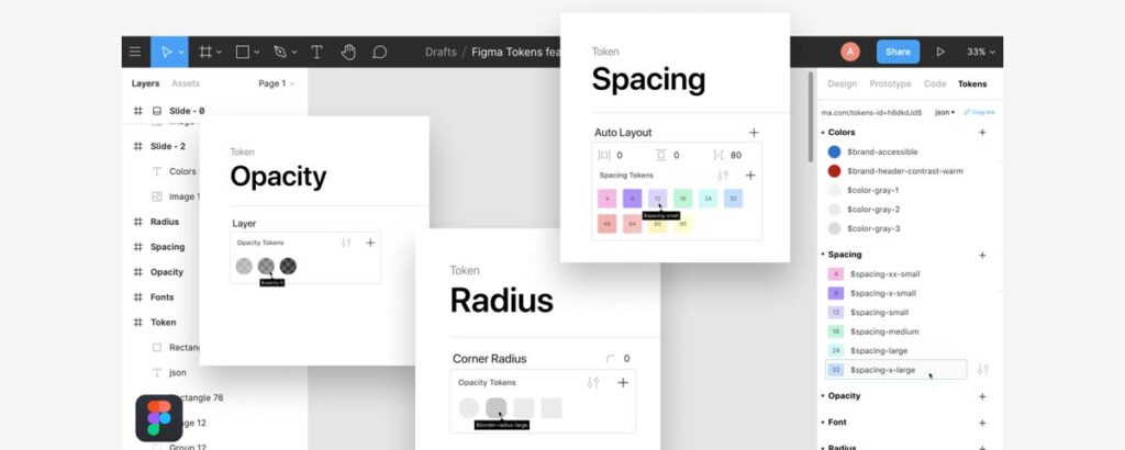
4. Design Tokens (The Code Connection)
This is the technical secret sauce. Design Tokens are the bridge between your design tool (Figma) and your code.
Instead of a developer writing #FF0000 in their CSS file, they write a token variable, such as $color-primary-action.
Why does this matter?
If you decide to rebrand next year and change your red to blue, you update the token value in one place. The entire system—iOS app, Android app, Website, Web App—updates automatically. Without tokens, you are manually finding and replacing thousands of lines of code.
How to Build Your DLS (Step-by-Step)
You do not need a team of 50 designers. You need a process.
Step 1: The UI Audit
You cannot clean a room until you turn on the lights. Conduct a visual audit of your current digital presence.
- Screenshot your homepage, checkout, blog, emails, and app.
- Place them on a digital whiteboard (such as Miro or FigJam).
- The Horror Check: Group similar elements. How many different “Submit” buttons do you have? I once audited a client who had 14 different styles of buttons across one website. That is 13 mistakes.
Step 2: Define the Visual Principles
Before you design components, define the rules.
- Is your brand “Loud and Playful” or “Quiet and Corporate”?
- If it’s playful, your buttons might have rounded corners (border-radius: 20px).
- If it’s corporate, they might be square (border-radius: 2px).
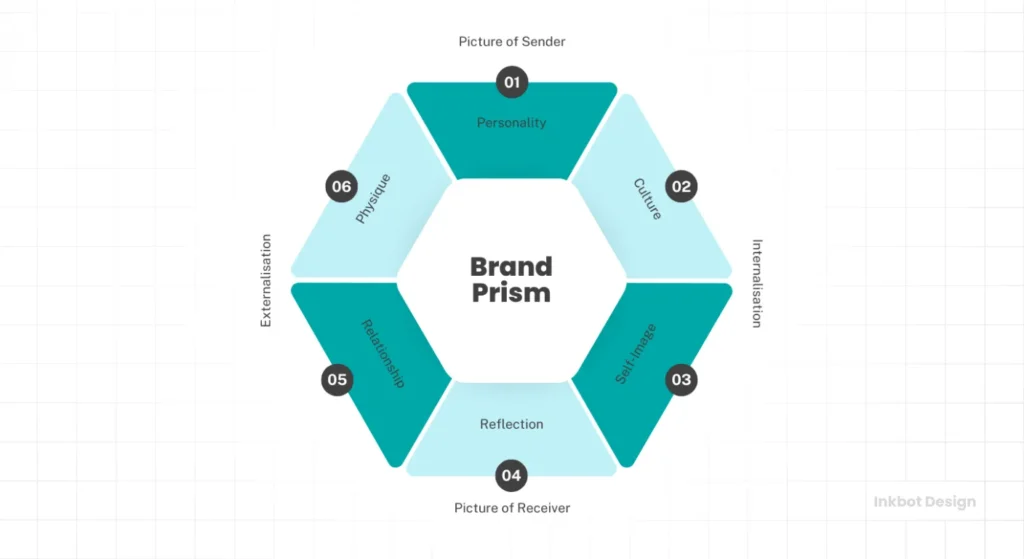
- Consultant’s Tip: Refer to your Kapferer’s Brand Identity Prism to ensure your UI choices align with your core brand personality.
Step 3: Build the “MVP” Library
Do not try to build everything at once. Start with the “MVP” (Minimum Viable Product) of your system.
- Typography Scale (Headings + Body).
- Colour Palette (Primary, Secondary, Neutral, Alert).
- Buttons (Primary, Secondary, Ghost).
- Inputs (Text fields, Checkboxes).
Step 4: Documentation is King
A component without documentation is just a drawing. You must explain how it works.
- Dos and Don’ts: “DO use the Primary Button for the main action on the page. DON’T use more than one Primary Button per view.”
- Accessibility Notes: “Ensure text contrast ratio is at least 4.5:1.”
Governance: Preventing the “Rot”
The number one reason Design Systems fail is not bad design; it is bad governance. A DLS is a living product. If nobody owns it, it rots.
The “Wild West” Scenario
Without rules, a developer needs a dropdown menu. They don’t see one in the system, so they build a custom one. A designer wants a new shade of purple, so they add it. Six months later, you are back to the Frankenstein effect.
The Federated Model
For most SMBs, a “Federated” model works best. You don’t need a dedicated “Design System Team.” Instead, assign a “Librarian” from your existing team.
- The Rule: No new component is added to the master library without the Librarian’s approval.
- The Contribution: If a designer needs a new component, they design it, test it, and submit it to the system for approval. The Librarian checks it for consistency (Does it use the grid? Is the naming correct?) and then merges it.
Real-World Case Studies
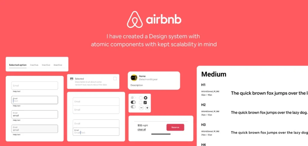
Success: Airbnb
Airbnb is the gold standard. Their “Design Language System” (which they famously wrote about) enabled them to transition from a chaotic, slow-moving engineering culture to one where designers and developers shared a common language. They treated code as a design material. The result? They can launch new features across Web, iOS, and Android simultaneously with near-perfect visual parity.
Failure: The “Generic Corp” Rebrand
We often see companies spend £50,000 on a brand guidelines document. They launch a new website. However, they often overlook their legacy portal—the one customers use to pay bills. The customer logs in and feels like they’ve stepped back into 1998. The disconnect creates friction. The customer assumes the billing portal is neglected or insecure. Churn increases. This is the hidden cost of ignoring a systemic approach.
The State of Design Systems in 2026
The landscape has shifted. Two years ago, Design Systems were manual labour. Today, we are seeing the rise of AI-Driven Design Ops.
AI Generative UI
Tools are emerging that can take your Design Tokens and automatically generate the React or Vue code for them. This means the gap between “Design” and “Code” is becoming non-existent.
“Headless” Design Systems
We are seeing a move towards “Headless” systems—where the logic and the styling are separated entirely. This allows brands to have a core “brain” of design logic that can push different “themes” to different sub-brands without rebuilding the core structure.
For Entrepreneurs, this means you can launch a second or third sub-brand for a fraction of the cost of the first one, simply by “skinning” your existing DLS.
Tools of the Trade
You don’t need to buy expensive enterprise software. The stack for a modern DLS is accessible.
- Figma: The undisputed king of interface design. Its “Auto Layout” and “Variables” features are built specifically for Design Systems.
- Storybook: An open-source tool for developing UI components in isolation. It serves as a “living style guide” for developers.
- Zeroheight: A documentation platform that syncs with Figma and code. It creates a beautiful, searchable website for your DLS that anyone in the company can view.
- GitHub: Where the actual code lives. Version control is essential.
Debunking the Myth: “Systems Kill Creativity”
I hear this constantly from creative teams. “If we have to use the same blocks, everything will look the same. It’s boring.”
This is lazy thinking.
A Design Language System does not kill creativity; it kills drudgery.
Do you really want your senior designer spending four hours debating the pixel-width of a “Submit” button? Or do you want them to solve complex user experience problems?
By automating the basics (buttons, inputs, spacing), you free up mental energy for the high-impact creative work. The system handles the “how”; the creative team handles the “why.”
Observation: Look at Spotify. Their system, “Encore,” is rigid. Yet, their marketing campaigns and “Wrapped” experiences are wildly creative. The system provides the stage; the creativity is the performance.
A Note on Accessibility (The Legal Risk)
Accessibility (a11y) is no longer a “nice to have.” It is a legal requirement in many jurisdictions (including the UK and EU) and a moral imperative.
A DLS is your best defence against accessibility lawsuits. By baking accessibility into the component level, you ensure compliance at scale.
- Don’t rely on developers to remember aria-labels every time.
- Do build the aria-label requirement into the Input Component in your DLS.
- Don’t hope designers check contrast.
- Set your colour tokens so that text colours only work on backgrounds that meet WCAG AA standards.
The Verdict
You can continue to operate with a folder full of loose JPEGs and a PDF that nobody reads. You can accept that every new landing page will look slightly “off” and take twice as long to build as it should.
Or, you can treat your design as infrastructure.
A Design Language System is an investment in efficiency. It reduces the “Cost of Retrieval” for your team. It eliminates the debates about hex codes. It ensures that when a customer interacts with your brand—whether on a watch, a phone, or a desktop—they are meeting the same entity.
The market is too crowded for inconsistency. If you want to build a brand that lasts, stop drawing pictures and start building a system.
Ready to stop the design chaos?
Most businesses don’t know where to start because they are too close to the mess. We can help you audit your current assets, define your tokens, and build a DLS that scales.
Request a Quote for Your Design System
Frequently Asked Questions (FAQ)
What is the difference between a Style Guide and a Design System?
A Style Guide is a static document (usually a PDF) that outlines visual rules, such as logos and fonts. A Design System is a comprehensive, living infrastructure that includes a style guide, reusable code components, design patterns, and governance rules for implementation.
How much does it cost to build a Design Language System?
The cost varies based on complexity. However, the initial investment is often offset by the reduction in technical debt. For an SMB, the cost of not having one (wasted developer hours, inconsistent branding) is usually higher than the build cost within 12 months.
Can a small business benefit from a Design System?
Absolutely. Small businesses often have limited resources. A DLS enables a small team to produce work comparable to that of a large team by reusing components rather than reinventing the wheel for every new webpage or email.
What are Design Tokens?
Design Tokens are the “variables” of a design system. They store design decisions (like colours, spacing units, and typography values) in a format (like JSON) that can be distributed to any platform (Web, iOS, Android), ensuring instant updates across all products.
What tools are required for a Design Language System?
The standard modern stack includes Figma for the visual library, Storybook for the code component library, and Zeroheight or a custom wiki for documentation.
Who should manage the Design System?
In large companies, a dedicated “Design Ops” team manages it. In smaller organisations, a “Federated” model works best, where a lead designer and lead developer share responsibility for approving updates and maintaining standards.
Does a Design System limit creativity?
No. It automates repetitive tasks (such as designing buttons and forms), freeing designers to focus on high-value creative problems and user experience strategy. It provides a consistent canvas for creativity.
How do I start creating a Design Language System?
Start with a UI Audit. Gather screenshots of all your digital products to identify inconsistencies. Then, standardise the basic “Atoms” (colour, type, icons) before moving on to complex components.
What is Atomic Design?
Atomic Design is a methodology coined by Brad Frost. It breaks interfaces down into Atoms (basic elements), Molecules (groups of atoms), Organisms (complex sections), Templates (page layouts), and Pages (final instances).
How does a Design System help with Accessibility?
A DLS enables you to integrate accessibility standards (such as WCAG contrast ratios and screen reader tags) directly into the components. This ensures that every time a component is used, it is accessible by default, reducing compliance risk.