12 Creative App Design Trends (That Aren’t Just Shiny Distractions)
Most “app design trend” articles are a complete waste of your time.
They’re a parade of visual fads, written by designers to impress other designers, with zero regard for your budget, your users, or your bottom line.
This isn’t a list of fads. This is a practical guide for entrepreneurs.
We’re going to analyse 12 trends that are gaining traction, but we’ll look at them through a ruthless business lens: Does this actually help the user? Does it strengthen the brand? Does it drive a conversion?
The hard truth is that your app branding isn’t about chasing gradients; it’s about building a consistent, trustworthy, and usable experience.
Your app is your brand’s most personal touchpoint. Let’s make sure it’s working for you, not against you.
Here are the 12 trends worth your attention.
- Prioritise functional, business-driven trends over visual fads; design must serve users, brand, and conversion.
- AI-driven personalisation and predictive UI reduce friction and boost conversions but risk privacy and creepiness.
- Accessibility (A11y) must be core—expands market, avoids lawsuits, and improves usability for everyone.
- Simplified onboarding and actionable data visualisation shorten Time to Value and increase activation and retention.
- Use advanced microinteractions, purposeful 3D, and consistent ecosystem design sparingly—only when they serve clear user value.
1. AI-Driven Personalisation & Predictive UI
What It Is: This is the evolution of “Welcome back, [Name].” True AI-driven UI doesn’t just customise content; it predicts intent and changes the interface itself. It anticipates what the user will need next and surfaces that function before they even look for it.
Why It Matters (The Business Case): It’s the ultimate friction-killer. By removing steps from a user’s journey, you dramatically increase the likelihood of conversion. It’s the difference between a user hunting for the “Pay Bill” button and the app surfacing a “Pay Your £50 Bill Now?” card the moment they log in.
- Real-World Example: Think of Spotify’s Discover Weekly or Netflix’s “Top Picks for You.” These are basic. The next level is apps like Google Maps, which proactively suggests “Time to leave for your 2 PM meeting” based on your calendar and live traffic.
- My Practical Take (The Risk): There’s a fine line between “helpful” and “creepy.” Get the prediction wrong, and you frustrate the user. Overstep on data privacy, and you’re not just creepy; you’re a liability. This requires a lot of data and smart engineering. Don’t attempt this half-heartedly.
2. Advanced Microinteractions & Haptics
What It Is: Microinteractions are the tiny, contained moments of feedback that confirm a user’s action. Think of the “pull-to-refresh” animation, the ‘like’ heart explosion on X (formerly Twitter), or the subtle “swoosh” when you send an email. Advanced haptics use the phone’s vibration motor to add a tactile layer to these interactions.
Why It Matters (The Business Case): They make an app feel “alive” and responsive. They provide immediate, non-visual confirmation, which builds user confidence. A simple “buzz” when a toggle is switched, or a “click” when a wheel is spun, makes the digital interface feel tangible and higher quality.
- Real-World Example: The Headspace app uses gentle animations and sounds. Banking apps like Revolut often give a satisfying ‘thud’ or ‘buzz’ when a payment is confirmed. This isn’t just decoration; it’s an emotional and physical confirmation of a completed task.
- My Practical Take (The Risk): Annoyance. Too many wiggles, buzzes, and swooshes are distracting. If your app feels like a hyperactive child, users will get fatigued. Every microinteraction must have a purpose—to confirm, to delight, or to guide. If it does none of those, cut it.
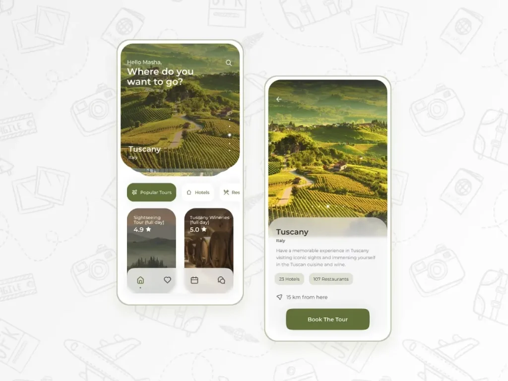
3. Immersive, Practical Augmented Reality (AR)
What It Is: For years, AR was a gimmick. Now, it’s a utility. This trend isn’t about catching virtual monsters; it’s about layering useful digital information onto the real world. Think “try before you buy” for furniture, makeup, or trainers.
Why It Matters (The Business Case): It solves the single biggest problem with e-commerce: “What will this look like on me or in my home?” By letting users visualise a product in their own space, you demolish a huge barrier to purchase and, critically, reduce returns.
- Real-World Example: The IKEA Place app is the classic. It lets you see if that EKTORP sofa actually fits in your living room. Similarly, L’Oréal’s Style My Hair and Warby Parker’s virtual try-on apps directly increase conversion by removing guesswork.
- My Practical Take (The Risk): This is expensive. Very expensive. Building a smooth, accurate AR feature is not a weekend job. If your product doesn’t benefit from spatial visualisation, this is a multi-million-pound distraction. Don’t add AR just to have it.
4. The Rise of “Functionalism” (Neo-Brutalism)
What It Is: You might have seen “Brutalism” in design blogs—all hard edges, clashing colours, and stark typography. It was mostly a defiant, artistic statement. “Functionalism” is its grown-up, useful cousin. It strips the UI down to its absolute bare essentials. It prioritises function, speed, and information clarity above all else.
Why It Matters (The Business Case): Speed and clarity. In a world of digital noise, an app that is brutally simple, loads instantly, and presents information without fluff can be a massive competitive advantage. It builds trust, especially in fintech or utility apps where users value security and efficiency over artistry.
- Real-World Example: Look at apps like ‘Things 3’ (a to-do app) or some new-wave fintech apps. They use basic system fonts, high-contrast black-and-white (or off-white) colour schemes, and zero decorative elements. Every pixel is there to serve a function.
- My Practical Take (The Risk): It can easily be mistaken for “lazy” or “unfinished.” This style only works if it’s an intentional brand choice. If your brand is playful, warm, or luxurious, a functionalist UI will feel cold, cheap, and completely off-brand.
5. Data-Rich, Simplified Visualisation
What It Is: Users are drowning in data. This trend is about making that data digestible and, more importantly, actionable. It’s not about complex 3D pie charts; it’s about simple, clear bar graphs, progress rings, and headline numbers that tell a story at a glance.
Why It Matters (The Business Case): It empowers your user. When a user understands their behaviour—be it spending, fitness, or screen time—they feel in control. An app that provides this clarity becomes an indispensable tool, driving massive long-term retention.
- Real-World Example: Fitness apps like Strava or the Apple Fitness “rings” are perfect examples. They don’t just show you “steps”; they show you progress, streaks, and comparisons in a way that motivates you. Banking apps like Monzo or Revolut do the same for spending.
- My Practical Take (TheRisk): Misleading data. A “pretty” chart that obscures the truth is worse than no chart at all. The design must serve the data, not distort it. Prioritise legibility and honesty. If a user makes a bad decision based on your confusing chart, you’ve lost their trust.
6. Voice User Interface (VUI) Integration
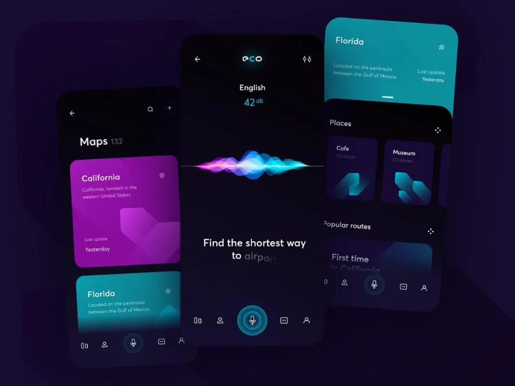
What It Is: Moving beyond just talking to Siri or Alexa. This trend involves building voice command and search capabilities directly into your app. It allows users to navigate and perform actions hands-free, simply by speaking.
Why It Matters (The Business Case): Accessibility and convenience. It’s a game-changer for users with motor impairments. For everyone else, it’s a “power-user” feature that adds a layer of speed. Think of a user cooking who wants to add an item to their shopping list app, or someone driving who needs to find a playlist.
- Real-World Example: Spotify’s “Hey Spotify” feature lets you search for songs and podcasts without touching the screen. Banking apps are experimenting with “Check my balance” or “Pay [Contact] £20” voice commands.
- My Practical Take (The Risk): Accuracy is everything. If your VUI misunderstands the user more than once or twice, they will never use it again. It’s 100% failure or 100% success, with no middle ground. This requires robust natural language processing (NLP), which is a significant technical investment.
Trend vs. Practical Impact
As an entrepreneur, you need to cut through the noise. Here is my breakdown of these first six trends, their real business goal, and the “gotcha” you must avoid.
| Trend | Primary Business Goal (What you’re really buying) | My Practical Take (The “Gotcha”) |
| 1. AI-Driven UI | Increased Conversion: By removing friction and anticipating needs. | The Creepiness Factor: Requires massive data and can backfire if predictions are wrong or feel invasive. |
| 2. Microinteractions | Increased Perceived Quality: Makes the app feel “solid” and responsive, building trust. | The Annoyance Factor: Overuse is distracting and makes the app feel slow and childish. Purpose is key. |
| 3. Practical AR | Reduced Returns & Higher AOV: Solves the “try before you buy” problem, increasing purchase confidence. | The Cost Factor: Wildly expensive to build and maintain. Useless for 90% of business models. |
| 4. Functionalism | Speed & Trust: Conveys efficiency and no-nonsense clarity, perfect for utility/fintech. | The “Lazy” Factor: Can easily look unfinished or cheap if it clashes with a non-minimalist brand identity. |
| 5. Data Visualisation | Long-Term Retention: Empowers users and makes your app an indispensable daily tool. | The Distortion Factor: A confusing or “pretty” chart that misleads the user is worse than nothing. |
| 6. VUI Integration | Accessibility & Convenience: A powerful “hands-free” utility that can be a key differentiator. | The Accuracy Factor: It must work 99% of the time. If it’s clumsy, it’s a useless, expensive failure. |
Let’s continue.
7. Purposeful 3D & Depth
What It Is: This is the antidote to my “gratuitous 3D” pet peeve. This isn’t about floating blobs. This is about using 3D and “depth” (layers, shadows, parallax) to create a spatial hierarchy that helps users understand the interface. It’s about making product models interactive or creating a more intuitive navigational space.
Why It Matters (The Business Case): For e-commerce, it’s a direct sales tool. Allowing a user to spin, zoom, and inspect a 3D model of a product is the next best thing to holding it in their hand. For other apps, subtle depth can separate content layers (like a pop-up modal) from the main screen, making the UI easier to navigate.
- Real-World Example: E-commerce apps for trainers or high-end electronics. The Apple Card app famously uses a 3D model of the card that spins as you view transactions. It’s slightly gimmicky, but it reinforces the “premium” feel.
- My Practical Take (The Risk): Performance. 3D assets are heavy. They can kill your app’s load time and drain the user’s battery. If you do this, it must be highly optimised, and it must serve a function that a 2D photo couldn’t.
8. Typography as the Core Design Element

What It Is: This trend moves typography from being “the text” to being “the main visual.” It’s about using bold, expressive, or custom fonts as the primary graphic element of the app. The layout, hierarchy, and entire brand personality are conveyed through the choice and arrangement of type.
Why It Matters (The Business Case): It’s a massive brand differentiator. In a sea of apps using the same safe, sans-serif system fonts (like Roboto or San Francisco), a unique typographic identity makes your app instantly recognisable. It can convey authority, playfulness, elegance, or urgency with a single glance.
- Real-World Example: News apps like The New York Times or Medium use their iconic serif fonts to communicate authority and a premium reading experience. High-fashion or design-led portfolio apps often use experimental typography as their main feature.
- My Practical Take (The Risk): Legibility. An “artistic” font that no one can read is a catastrophic failure. This trend requires a very skilled designer who understands the balance between expression and legibility, especially on small, high-glare mobile screens.
9. Accessibility as a Core Feature (A11y)
What It Is: This shouldn’t be a “trend,” it should be a baseline requirement. But alas, here we are. This is about intentionally designing for all users, including those with visual, motor, or cognitive impairments. This means high-contrast colour palettes, scalable text, screen-reader-friendly layouts, and clear, tappable targets.
Why It Matters (The Business Case):
- You expand your market: You make your app usable for millions more people.
- You avoid getting sued: Accessibility lawsuits are increasingly common.
- It’s just good design: Design that’s clear for users with impairments is clearer for all users. A high-contrast design works better for everyone, especially in bright sunlight.
- Real-World Example: Apple’s iOS is a masterclass in this. Features like Dynamic Type (letting users set their system-wide font size) and VoiceOver (screen reader) are deeply integrated. Well-built apps respect and adapt to these settings.
- My Practical Take (The Risk): The only risk is not doing it. The “risk” is thinking of this as an “extra” you can add later. It’s not. It must be planned from the very first wireframe. Retrofitting accessibility is 10x harder and more expensive.
10. “Aurora” Backgrounds & Complex Gradients
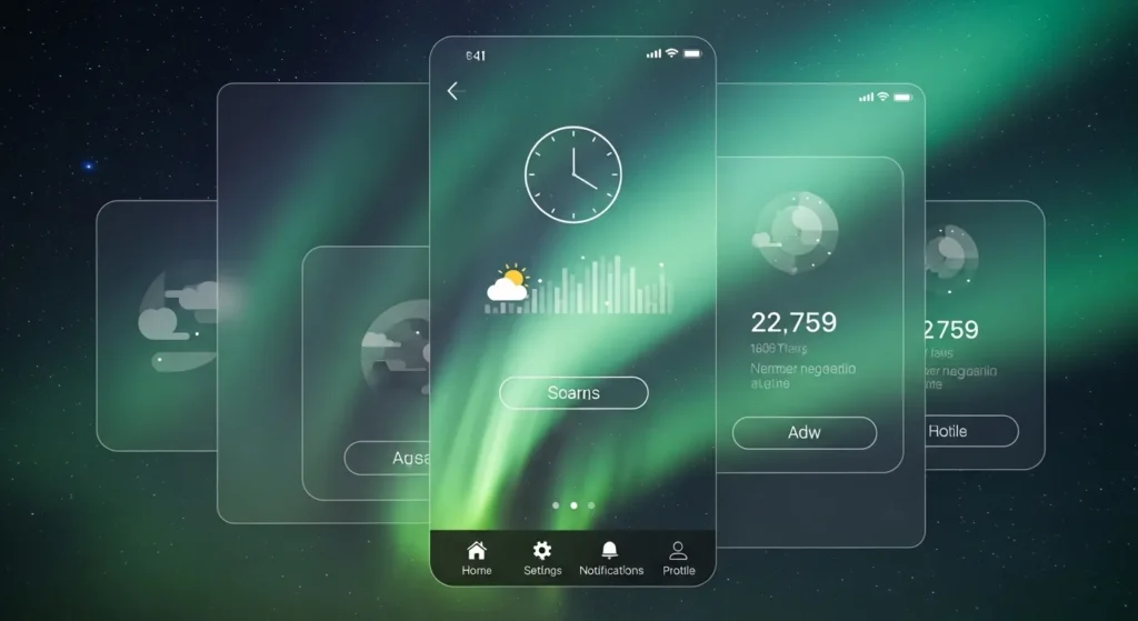
What It Is: The simple, two-colour gradient is evolving. This trend is about using multi-coloured, soft-focus, mesh-like gradients that often animate slowly. They’re named “Aurora” because they mimic the soft, ethereal look of the Northern Lights.
Why It Matters (The Business Case): It’s pure mood and brand expression. These backgrounds are fantastic at creating an atmosphere—calm, energetic, futuristic, or warm. For wellness, finance, or tech apps, this can set an immediate emotional tone that a static colour or photo background just can’t.
- Real-World Example: Wellness apps like Calm and Headspace use these to create a serene, non-distracting environment. Many new tech startups use them to look modern and vibrant.
- My Practical Take (The Risk): They can look dated fast. This is the most “trendy” item on the list. If not done with skill, it can look like a default PowerPoint template. It also needs to be subtle; if the background animation is too fast or the colours are too jarring, it just distracts from the actual content.
11. The “Eco-System” Consistent UI
What It Is: This is less a single-app trend and more a multi-platform strategy. It’s the practice of designing your app’s interface to be seamless and consistent across every device: phone, tablet, desktop, watch, and even TV. The layout adapts, but the brand and core interactions remain the same.
Why It Matters (The Business Case): It creates a “lock-in” effect (in a good way). When a user knows how to use your app on their phone, they instantly know how to use it on their desktop. This seamless transition makes your service incredibly “sticky” and embeds it into your user’s entire life, not just their pocket.
- Real-World Example: Apple’s ecosystem (Notes, Fitness, Music) and Google’s Workspace (Docs, Sheets, Drive) are the kings of this. A user can start a note on their phone and finish it on their laptop without ever thinking about how to use the interface.
- My Practical Take (TheRisk): It’s a massive design and development overhead. You’re not just building one app; you’re building and maintaining 3-5 versions of it. This is a strategy for established businesses looking to build a “moat,” not for a startup launching its first MVP.
12. “Less is More” Onboarding

What It Is: The death of the 10-screen introductory “swipe-through” carousel. Modern users have zero patience. This trend is about onboarding users by doing. It either drops them straight into the app with a single “key-task” highlighted, or it uses a “progressive onboarding” model, where tips are revealed contextually as the user explores.
Why It Reports (The Business Case): Higher activation rates. The “Time to Value” (TTV) is the time it takes for a new user to understand why your app is useful. Long onboarding carousels make TTV high, leading to massive drop-off. Getting them to their “Aha!” moment in seconds is the single most important thing your app can do.
- Real-World Example: Most modern social media apps (like TikTok) drop you right into the content. You learn by using. Productivity apps will often give you a blank slate with one flashing button: “Create New Project.” It focuses the user on the one action that matters.
- My Practical Take (The Risk): If your app is truly complex (e.g., a pro-level video editor or financial tool), a total lack of guidance can be just as alienating. The key is to find the one thing a user needs to do to get value, and focus your entire onboarding on making that single action happen.
Trends are Tools, Not Rules
Stop chasing fads. Your user doesn’t care about “functionalism” or “aurora gradients.” They care that your app solves their problem quickly and doesn’t make them feel stupid.
Your app is the most direct, personal connection you have with your customer. Its design should be a direct extension of your brand promise. If your brand is “simple and reliable,” your app better be simple and reliable. If your brand is “creative and inspiring,” your app should feel that way.
This is where so many businesses go wrong. They see their app as a technical utility, separate from their core brand. In reality, your app’s design is your brand. Getting this right isn’t just “picking colours” or following trends; it’s a foundational business strategy.
If you’re tired of trends and ready to build an app that’s a true, hardworking extension of your brand identity, then perhaps we should talk. We focus on building cohesive brand experiences, from your logo right through to your last pixel.
You can learn more about our core branding services or, if you’re ready to get specific, you can request a quote directly.
And if you’re not ready for that, at least do yourself a favour and read more of our no-nonsense advice on the Inkbot Design blog.
Creative App Design Trends (FAQs)
What are the most important app design trends for 2026?
The most important “trends” aren’t visual; they’re functional. AI-driven personalisation, accessibility (A11y) as a core feature, and simplified, fast onboarding are having the biggest impact on user retention and conversion.
Is Dark Mode still a popular app design trend?
Dark Mode is no longer a “trend”; it’s a “feature.” It’s an accessibility and user-preference standard, like “silent mode.” Your app should support the user’s system-level choice (light or dark) rather than forcing one on them.
What are microinteractions in app design?
Microinteractions are small, subtle animations or haptic (vibration) feedback that confirm a user’s action. Examples include the ‘like’ animation, the ‘pull-to-refresh’ swoosh, or the subtle ‘click’ you feel when toggling a switch. They make an app feel responsive.
How does AI affect app design?
AI is moving UI from “customisable” to “predictive.” Instead of just showing a user’s name, AI-driven apps anticipate the user’s next move and surface the relevant feature or content before the user has to look for it, dramatically cutting friction.
Why is typography so important in mobile app design?
On a small screen, text is often the primary element. Your choice of font (typography) dictates legibility, but it also carries your entire brand personality. A bold, unique font can make your app instantly recognisable.
What is “functionalism” or “neo-brutalism” in app design?
It’s a minimalist design style that prioritises function, speed, and clarity above all else. It uses high-contrast, simple layouts, and system fonts, with zero decorative elements. It’s popular for fintech and utility apps where users value speed and trust.
How much do app design trends really matter for a small business?
Very little. Your business should focus on three things: 1) Does the app work flawlessly? 2) Is it incredibly easy to use? 3) Does it look and feel like your brand? Chasing a visual trend like “aurora gradients” is a low-priority distraction.
What’s the difference between UI and UX design trends?
UI (User Interface) Trends: These are visual. They include things like colour palettes (gradients), font styles, and 3D elements.
UX (User Experience) Trends: These are functional and strategic. They include things like AI-driven personalisation, VUI (voice), and simplified onboarding. UX trends typically have a much bigger impact on your business.
How does app branding connect to app design?
Your app’s design is your app branding. The colours, fonts, speed, and even the “voice” of your error messages all combine to create a brand experience. A good app design is just a consistent execution of your core brand strategy.
What is ‘A11y’ in app design?
A11y is an abbreviation for “Accessibility” (11 letters between ‘A’ and ‘y’). It’s the practice of designing your app to be usable by people with disabilities, including visual, motor, or cognitive impairments. This includes high-contrast colours, scalable text, and screen-reader support.
Is AR (Augmented Reality) a necessary trend for e-commerce apps?
It’s not “necessary,” but it is powerful for specific products. For furniture, makeup, or clothing, AR’s “try-on” feature can dramatically increase conversions and reduce returns. For most other products, it’s an expensive gimmick.
What is the best way to onboard new users to an app?
The 10-screen “tutorial” is dead. The best way is “progressive onboarding” (showing tips contextually as the user explores) or dropping the user directly into the app’s core function. Your goal is to get them to their “Aha!” moment (the moment they find value) as fast as humanly possible.

