10 Famous Airline Logos and Their Branding Lessons
An airline logo has nowhere to hide.
It’s slapped on the side of a 250-foot metal tube, hurtling through the sky at 600 miles per hour. It has to be identifiable from a mile away, across a rain-swept airfield.
It gets shrunk down to a 16×16 pixel favicon. It’s printed on flimsy napkins and cheap boarding passes. It’s the single most visible asset a multi-billion-dollar company owns.
There is no room for ambiguity. No space for fluff. An airline logo is the ultimate test of a brand’s core identity.
Forget pretty pictures. This is about brutal, functional, high-stakes design. And for anyone running a business—I don’t care if you’re selling coffee or coding software—there are profound lessons to be learned from them.
- An airline logo must be instantly recognisable from a mile away, requiring simplicity and boldness in design.
- Timeless logos outlive trends, demonstrating a brand's core identity and confidence in its lasting appeal.
- A successful logo is a potent symbol that encapsulates brand values without being overly complex.
- Consistency in branding builds trust; abandoning successful logos for trends can harm brand equity.
The Unwritten Rules of a High-Flying Logo
Before we get into the list, you need to understand the game. These logos don’t succeed by accident. They play by a set of unwritten, unforgiving rules.
Rule #1: It Must Work on a Tail Fin from a Mile Away
This is the acid test. It has failed if a symbol isn’t instantly recognisable on a tail fin, through jet fuel haze, bad weather, or from the other side of the terminal.
This forces a ruthless commitment to simplicity. Intricate details, fine lines, and subtle gradients are useless here. It demands a bold, clear, singular idea.
Rule #2: It Must Outlive its CEO
Airlines are institutions. They measure their existence in decades. A logo that chases a five-minute design trend is a catastrophic waste of money.
The best logos could have been designed in 1970 or 2030. Timelessness isn’t a vague aesthetic goal; it’s a financial imperative.
It’s proof that the brand is confident in what it is, not just what’s popular right now.
Rule #3: It’s a Symbol, Not a Biography
A great airline logo doesn’t try to tell you its life story. It doesn’t show a plane. It doesn’t show happy passengers. It doesn’t show its destination map. It provides a single, potent symbol that your brain can latch onto.
The crane. The kangaroo. The widget. That symbol becomes a mental shortcut for the entire brand experience. Trying to cram more meaning only dilutes that one idea’s power.
The Top 10: An Unsentimental Review
Right, let’s get to it. This isn’t just a beauty pageant. This is a review of what works, what doesn’t, and the lessons you can steal for your business.
1. Lufthansa: The Blueprint for Corporate Identity
This isn’t just a logo; it’s the blueprint. The stylised crane, designed by Otto Firle in 1918, is one of the oldest and most respected airline marks.
But the logo itself is only half the story. The real genius came in the 1960s with designer Otl Aicher, who built one of the world’s first and most comprehensive corporate identity systems around it.
Every element—the specific yellow and blue, the Helvetica typeface, the layout grids—was obsessively specified.
It created a look that was unified, authoritative, and unmistakably German. It was modern, efficient, and serious. The crane provides the heritage; the system provides the power.
The Lesson: Your logo is the start of a system, not the end. A significant mark is made ten times more powerful by the consistent colours, fonts, and rules that support it.
2. Delta Air Lines: The Power of the Widget
The Delta “widget” is a masterclass in geometric simplicity. First introduced in 1959, the three-dimensional triangle was designed to represent the delta wing of a jet, but its power lies in its directness.
It points up. It points forward. That’s it. What more must you say in a business defined by movement and direction?
Over the decades, the widget has been refined, flattened, and recoloured, but its core form has remained. It’s incredibly versatile, as a bold statement on a red tail fin or a tiny icon on a booking app.
It’s a symbol of precision, reliability, and momentum. It’s not trying to be clever or emotional; it’s a mark of pure, functional confidence.
The Lesson: Your logo should point the way. A simple, directional symbol telegraphing your core purpose can be far more powerful than a complex picture.
3. American Airlines: A Tale of Two Eagles
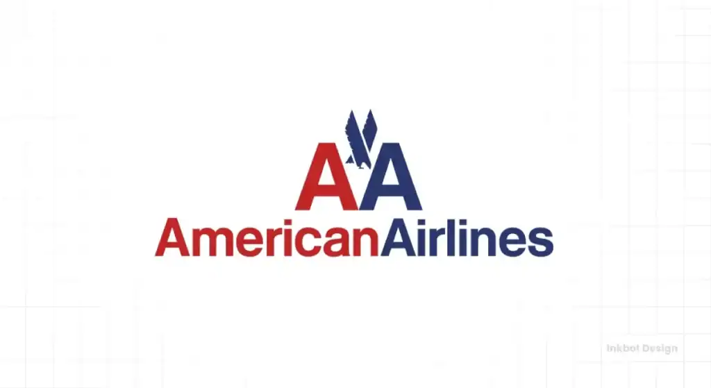
This one is a story. For nearly 50 years, American Airlines used a masterpiece of modernist design created by Massimo Vignelli in 1967.
The iconic ‘AA’ with the eagle was simple, powerful, and ridiculously effective. The typography was timeless Helvetica. It was everything a logo should be.
Then, in 2013, they threw it all away for a soulless, gradient-filled swoosh called the “Flight Symbol.” They traded a symbol of confident, post-war American power for a design that looks like a generic app icon.
They abandoned Helvetica for a custom font that saved them pennies on licensing but cost them their soul. It’s a textbook case of a company getting insecure and looking for a modern fix when it didn’t need one.
The Lesson: Know what equity you’re throwing away before you “modernise.” Sometimes the most modern thing you can do is stick with a classic that works.
4. Qantas: You Can’t Argue with a Kangaroo
Some branding challenges are more complex than others. Naming your airline after a hard-to-spell acronym (Queensland and Northern Territory Aerial Services) is one. Luckily, your national symbol is a kangaroo.
The Qantas “Flying Kangaroo” is pure genius in its simplicity. It’s uniquely, unapologetically Australian. It’s a symbol of forward movement, a leap across the globe.
Over the years, they’ve refined, stylised, and made it sleeker but never abandoned it. They understood they were sitting on a visual goldmine. Why would you trade a kangaroo for some abstract swoosh?
The Lesson: If you have a powerful, unique story or symbol, don’t overcomplicate it. Your job is to polish it, not replace it.
5. British Airways: The Power of an Abstract Mark
The BA “Speedmarque” is a masterclass in creating a rich, meaningful symbol from a simple abstract shape. Introduced in 1997, the ribbon flows with elegance, motion, and fabric—a nod to the Union Jack flag without being a literal, chest-thumping flag.
It replaced the “Speedbird” symbol, a heritage mark from a predecessor airline. The move was initially controversial, but the ribbon has become a powerful and recognised asset.
It feels premium, confident, and British in a modern, global way. It works beautifully on a tail fin, adding a sense of motion even when the plane is parked.
The Lesson: You don’t need a literal object to convey a feeling. When done well, an abstract mark can communicate complex ideas like elegance, speed, and heritage far more effectively than a picture of a thing.
6. KLM: Old, Simple, and Trusted
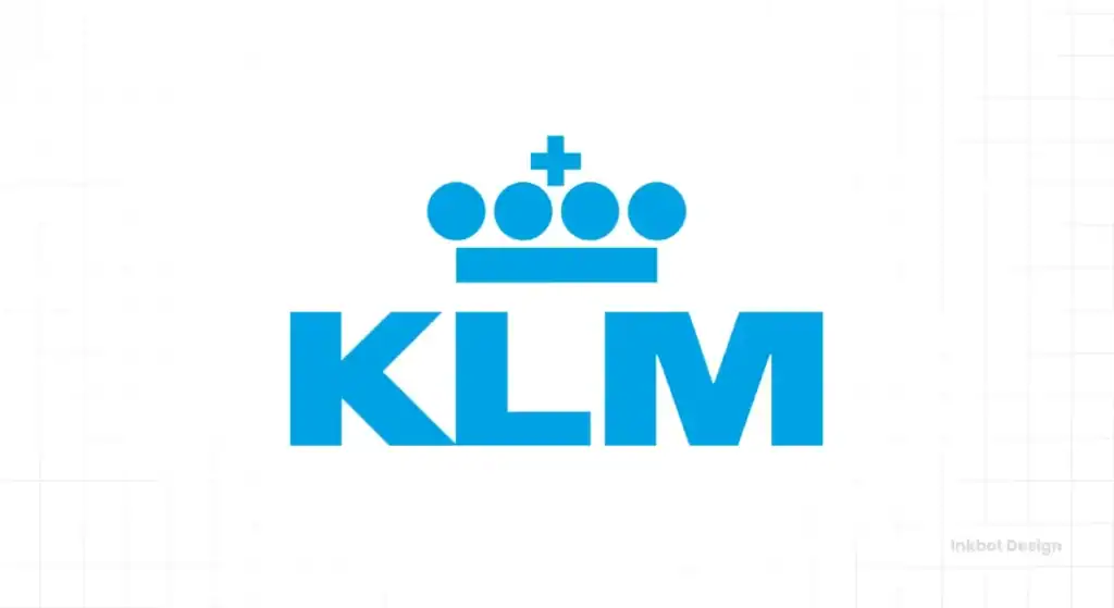
KLM Royal Dutch Airlines is the oldest airline in the world, and it still operates under its original name. And its logo looks like it. That’s a compliment. The stylised crown, a simple four-bar design, has been with the airline since the beginning. It’s been tweaked, but the core idea remains.
The mark is simple, almost stark. The crown says “Royal,” which communicates authority, legacy, and trust. The bold “KLM” is clear and instantly readable.
They’ve resisted every single trend for flashiness and stuck to their guns. The result is a brand that feels incredibly dependable.
It’s not exciting; it’s reassuring. In air travel, being reassuring is a very good thing to be.
The Lesson: Consistency builds trust. Decades of showing up with the same face say more than any flashy advertising campaign ever could. Don’t change for the sake of changing.
7. Japan Airlines (JAL): The Tsurumaru’s Return
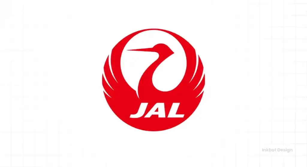
This is a story of redemption. For decades, JAL used the “Tsurumaru” or “crane circle,” a beautiful, elegant symbol of the red-crowned crane, representing loyalty, strength, and luck in Japanese culture. It was beloved.
Then, in the 2000s, they dropped it for a generic, forgettable logotype as part of a merger. After filing for bankruptcy in 2010, the new management made a critical decision: they brought the Tsurumaru back.
They understood that you don’t run from your identity in a crisis—you run towards it. The crane’s return was a powerful signal to staff and customers that the airline was returning to its core values.
The Lesson: Your customers might value your heritage more than your marketing department does. Listen to them. Your history is an asset, not baggage.
8. Singapore Airlines: The Symbol of Service
The Singapore Airlines “bird,” introduced in 1972, is another example of a brilliant, abstract symbol.
It’s derived from a dagger featured on a regional silver kris, giving it a subtle link to local heritage. But its soaring, graceful, elegant form perfectly encapsulates the airline’s brand promise.
Singapore Airlines doesn’t sell a cheap seat from A to B. It sells impeccable service, grace, and one of the best in-flight experiences in the world.
The logo is the shorthand for that promise. It’s calm, premium, and sophisticated. Every time you see it, it reinforces the brand’s position at the top of the market.
The Lesson: Your logo should be a visual promise. It should instantly call to mind the most important thing you want customers to feel about your brand.
9. Air New Zealand: A Koru with a Home
Incorporating indigenous culture into a corporate logo is a minefield. It can easily become tacky, disrespectful, or just plain wrong.
Air New Zealand navigated this perfectly. Their mark is a stylised Koru, a spiral shape from Māori art that symbolises new life, growth, and strength.
It’s not a cut-and-paste job. It was designed carefully and feels authentic to New Zealand’s unique identity.
Paired with a clean, modern typeface, it positions the airline as a proud national carrier with a deep connection to its home. It avoids the generic “globe and swoosh” trap many other national airlines fall into.
The Lesson: Authenticity beats generic corporate visuals every time. Look for what makes your brand unique—its location, culture, and story—and build from there.
10. Emirates: Selling Luxury with a Stroke
Emirates doesn’t have a symbol. The entire logo is the symbol. The distinctive Arabic calligraphy of the company’s name is the core of its visual identity.
It’s a bold, confident logotype that immediately communicates the airline’s origin and, by extension, its brand positioning.
The red and the flowing script feel opulent, exotic, and luxurious. It stands out in a sea of blue, European-style logos.
They are selling a premium, global travel experience rooted in Middle Eastern hospitality, and the logo says all of that at a glance. The tail fin, featuring only the UAE flag, is a stroke of pure confidence.
The Lesson: Your typography isn’t just for reading; it’s a massive signal of your market position. The font you choose can say “budget,” “tech startup,” “heritage brand,” or “luxury leader” before anyone reads a single word.
A Nod to Other Notable Players
A top ten list is always brutal; plenty of strong contenders were left on the tarmac. Here are a few others worth a quick, unsentimental look.
Turkish Airlines: Their mark, a white wild goose in a red circle, is brilliant. Why a goose? It’s one of the world’s highest-flying birds. It’s a simple, powerful metaphor for what an airline does.
The Lesson: A good metaphor beats a literal description any day of the week.
Hawaiian Airlines: The “Pualani” (Flower of the Sky) is one of the few times a human face in a logo works. It’s not just a person; it’s a symbol of the Aloha Spirit—the core of their brand promise. It feels personal and authentic.
The Lesson: Break the rules, but only if you have a damn good reason rooted in your unique brand story.
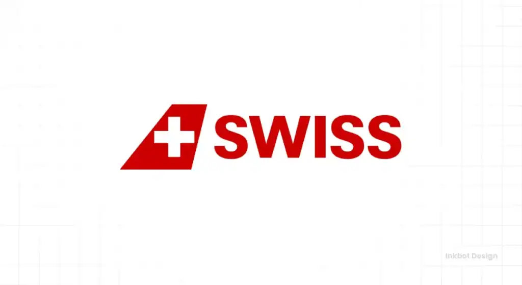
Swiss International Air Lines: The tail fin is just the Swiss flag. That’s it. A red square with a white cross. It’s the ultimate act of minimalist confidence. It screams precision, neutrality, and quality without adding unnecessary elements.
The Lesson: Sometimes, the most powerful statement is the simplest one. If your identity is strong, you don’t need to shout.
Aer Lingus: The shamrock. It’s unapologetically Irish. Like Qantas with its kangaroo, they took a universally recognised national symbol and made it their own. The recent rebrand smoothed it out, but the core idea remains potent.
The Lesson: Don’t be afraid of the obvious if the obvious is strong, unique, and true to who you are.
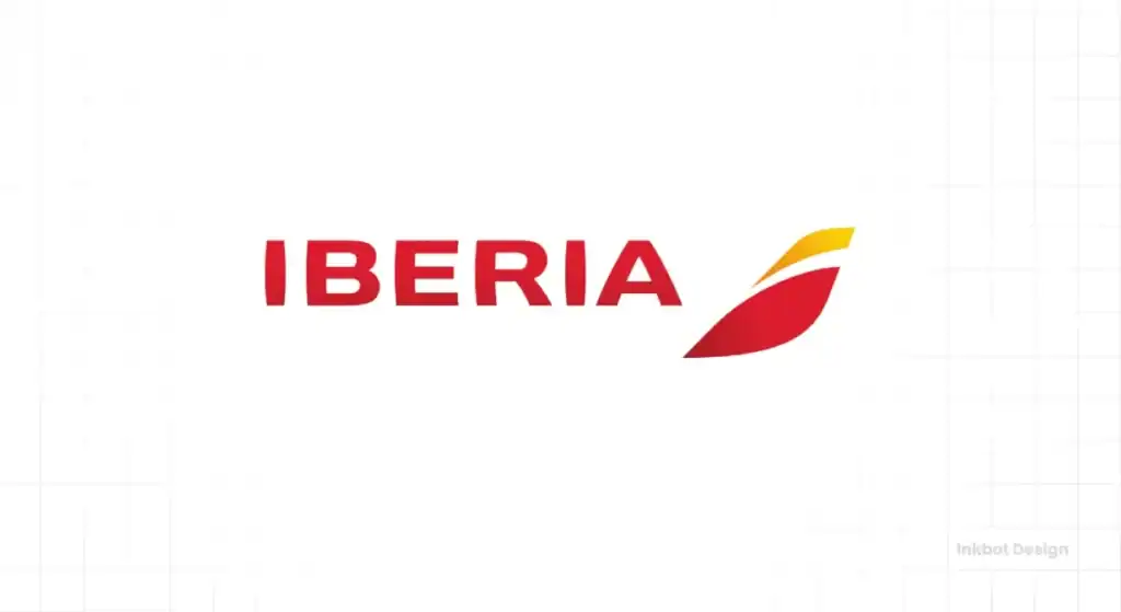
Iberia: Spain’s flag carrier uses red and yellow, the colours of the Spanish flag, in its abstract tailfin mark. It feels warm, energetic, and distinctly Spanish without being a literal flag. It connects to national pride while remaining a modern, corporate symbol.
The Lesson: Colour is a powerful shortcut to emotion and identity. Use it with purpose.
The Great Betrayal: Why Most Rebrands Are a Waste of Money
Let’s be blunt. Most rebrands are a solution looking for a problem. A new CEO arrives, or marketing gets bored, and they decide to “refresh” the brand. This usually means committing one of two cardinal sins.
The Soulless Sans-Serif Plague
The most common mistake is stripping away a character-filled, historic logo and replacing it with a bland, generic, geometric sans-serif font.
You’ve seen it everywhere. It’s a design trend that screams, “We gave up.” It trades personality for inoffensiveness.
The goal is to look “clean” and “modern,” but the result is an utterly forgettable brand, with no soul or story.
Chasing Trends Instead of Building Trust
The other sin is chasing trends. A few years ago, everything had to be a gradient. Then everything had to be flat.
A brand that changes its face every five years is a brand that doesn’t know who it is. Trust is built on consistency.
Imagine meeting someone with a completely new personality every time you see them. You wouldn’t trust them for a second. It’s the same with a brand.
Your Business Isn’t an Airline, But the Rules Still Apply
You’re not painting a Boeing 747. I get it. But the pressure is the same. Your logo has to fight for attention on a crowded social media feed, on a business card, on your website header. The principles of clarity, simplicity, and timelessness are universal.
Does your logo pass the tail fin test? Is it simple and bold enough to be recognised at a glance, even when it’s small?
Is it a symbol or a biography? Does it try to say everything or focus on one powerful idea?
Will it outlive you? Or will it look dated in three years because you chased a fleeting trend you saw on Pinterest?
Thinking about your own brand identity? Our design articles are full of these kinds of no-nonsense observations. They’re a good place to keep digging.
Stop Chasing ‘Clever’. Start Building an Asset.
A great logo is not a piece of art. It’s a piece of industrial-strength business equipment. It’s an asset that should work for you for decades, building recognition and trust with every impression.
The lesson from these high-flying giants is clear: strip away the unnecessary. Be bold. Be clear. And have the confidence to stick with it.
If you’re ready to stop tinkering and start building a real brand asset, that’s what our services are for.
For a direct, no-nonsense conversation about your business, you can request a quote here. If you want to see how we apply these principles, check out our logo design services.
Frequently Asked Questions About Airline Logos
What is the most iconic airline logo?
While highly debatable, the Lufthansa crane and the Delta “widget” are consistently cited by designers as two of the most iconic and compelling logos. Both are praised for their timeless simplicity and immediate recognisability.
Why do so many airlines use the colour blue?
Blue is overwhelmingly associated with the sky, but also with feelings of trust, stability, and professionalism. For a business where safety and reliability are paramount, blue is a very safe and common choice.
What is the “Speedbird” logo?
The “Speedbird” was a stylised bird symbol used by the British Overseas Airways Corporation (BOAC), a predecessor to British Airways. It’s considered a classic of 20th-century design, and some purists still prefer it over BA’s current “Speedmarque” ribbon.
What is the difference between a logomark and a logotype?
A logomark is a symbol or icon, like the Lufthansa crane or the Qantas kangaroo. A logotype is a logo created purely from the company’s name set in a specific typeface, like the Emirates logo.
Why did American Airlines change its famous logo?
The official reason for the 2013 change was to modernise the brand as the airline emerged from bankruptcy and updated its fleet. However, the design community criticised the move for abandoning the iconic and timeless 1967 logo by Massimo Vignelli.
Should my logo be a simple geometric shape or a more detailed picture?
This depends on your brand, but the lesson from airlines is that simple, bold shapes (like the Delta widget) are often more effective. They are easier to recognise at a distance and in small sizes, making them more versatile and memorable than a complex illustration.
How often should a company redesign its logo?
As infrequently as possible. A logo should be timeless. Minor refinements or “evolutions” every 10-20 years can be healthy to keep it sharp. Still, complete redesigns should only be considered if the business has fundamentally changed direction or the existing logo truly harms the brand.
What’s the most common mistake in airline branding?
Losing a unique, heritage-rich symbol favouring a generic, abstract “swoosh” or globe icon. This often happens during mergers or rebrands and results in losing identity and customer connection.
Does an airline’s logo affect ticket sales?
Indirectly, yes. A logo doesn’t sell a ticket, but builds brand recognition and trust. A professional, trustworthy logo can make a potential customer more confident in choosing that airline over an unknown competitor with an amateurish look. It’s a crucial piece of the overall brand perception.
What is a “livery”?
The livery is the overall design and paint scheme on the outside of an aircraft. It includes the logo, the logotype, the colours, and other graphic elements. The logo is the heart of the livery.

