9 Essential Web Design Lessons Backed by Data—Not Design School
The web design world has tutorials on creating pretty interfaces, but they rarely tell you what works.
After reviewing data from over 500 websites and speaking with dozens of successful designers, I’ve compiled these nine essential web design lessons that will genuinely improve your projects—no fluff, just results.
- First impressions matter; users form opinions in just 50 milliseconds based on visual appeal.
- Responsive design is essential; 63% of web traffic comes from mobile devices.
- Colour choices impact user perception; select hues that resonate with your audience.
- White space enhances comprehension; it should be used strategically for clarity.
- Focus on content-first design; visual elements should support, not distract from, key information.
The Truth About First Impressions in Web Design

We’ve all heard the “users judge your site in milliseconds” claim. But what does the data say? Studies from Nielsen Norman Group show visitors form their initial opinion in about 50 milliseconds—that’s 0.05 seconds. This isn’t just a fun fact; it’s why your initial visual impact matters more than your clever animations.
Visitors arriving at your site make snap judgments about credibility, professionalism, and relevance before consciously processing what they see. This psychological phenomenon, the “halo effect,” means that a visually appealing design creates optimistic assumptions about your content and services.
What does this mean for your design process? Focus on these immediate visual elements first:
- Clean layout with clear visual hierarchy
- Professional typography choices
- Purposeful colour palette
- High-quality imagery that represents your brand
Rather than trying to be clever or unique for the sake of it, aim for clarity and professionalism. The most successful websites aren’t necessarily the most creative—they’re the ones that instil confidence within those crucial first moments.
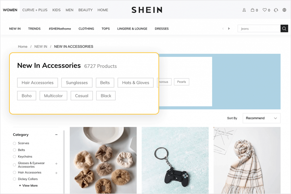
Responsive Design is No Longer Optional
Let’s be blunt: if your website isn’t fully responsive in 2025, you’re effectively turning away customers. Mobile traffic now accounts for 63% of all web visits, with specific industries seeing figures as high as 72%. Google’s mobile-first indexing means your mobile experience directly impacts your search rankings.
However, responsive design goes beyond simply “working” on mobile. Proper responsive design means:
- Deliberately considering touch interactions (fingers are less precise than cursors)
- Optimising load times for mobile networks (40% of users abandon sites that take more than 3 seconds to load)
- Adapting content hierarchy for smaller screens (prioritising what matters most)
- Testing across multiple devices and screen sizes (not just your iPhone)
Many designers fall into the trap of designing for a desktop first, then trying to cram everything into a mobile viewport. This approach inevitably leads to compromised mobile experiences. Instead, adopt a mobile-first methodology—start with the constraints of mobile, then enhance for larger screens.
A correctly implemented responsive design doesn’t just look good across devices; it delivers the correct information at the right time, regardless of how users access your site.
The Psychology of Colour Choices

The impact of colour choices extends far beyond aesthetic preferences. Colours trigger specific psychological responses and carry cultural associations that influence how users perceive and interact with your website.
Research from the University of Winnipeg found that colour impressions account for up to 90% of product evaluations. When building websites for clients, your colour selections should be driven by:
- Target audience demographics and preferences
- Cultural context and international considerations
- Industry expectations and competitors’ palettes
- Brand personality and desired emotional response
For example, financial services websites overwhelmingly use blue (trustworthiness) and subtle greens (growth). This isn’t a coincidence—it’s because these colours consistently perform better in creating the feelings of security and reliability that financial customers seek.
Don’t just choose colours because they look nice together. Each colour decision should support your website’s goals and user expectations. Colour theory in graphic design shows us that purposeful palettes drive specific user behaviours.
White Space is Your Most Powerful Design Element
White space (or negative space) isn’t empty—it’s intentional. Many novice designers make the mistake of filling every pixel with content, creating visually overwhelming experiences that reduce comprehension and increase bounce rates.
Studies from Wichita State University demonstrate that appropriate use of white space between paragraphs and in margins increases comprehension by up to 20%. The data is precise: giving your content room to breathe doesn’t just look better—it works better.
The most effective websites use white space to:
- Create a visual hierarchy by grouping related elements
- Draw attention to calls to action by isolating them
- Improve readability by giving text proper spacing
- Create a sense of sophistication and quality
Look at luxury brand websites—they typically use abundant white space. This isn’t just an aesthetic choice; it’s a strategic one that signals quality and attention to detail.
When reviewing your designs, ask yourself: “What can I remove?” rather than “What can I add?” The elements you choose not to include are often as essential as those you do.
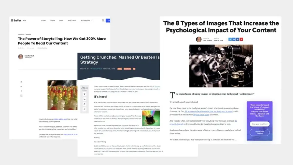
Typography Matters More Than You Think

Typography accounts for 95% of web design, according to some designers. While that might be an exaggeration, the sentiment holds—text is what most visitors come for. Yet, typography is often treated as an afterthought.
Beyond selecting fonts that “look nice,” effective web typography involves:
- Establishing a proper type hierarchy (headings, subheadings, body text)
- Setting appropriate line heights (generally 1.5× for body text)
- Creating comfortable line lengths (45-75 characters per line)
- Ensuring sufficient contrast for readability
- Selecting fonts that perform well across devices
The data backs this up: eye-tracking studies show consistent typography with a clear hierarchy reduces cognitive load and improves information retention by up to 35%.
When selecting typography, remember that your goal isn’t to impress other designers—it’s to create a comfortable reading experience for your users. Sometimes, the most effective typography choices are the ones users don’t consciously notice.
Loading Speed: The Silent Conversion Killer
Page speed might seem like a technical concern rather than a design issue, but the two are inseparable. Your beautiful design is worthless if users abandon the site before seeing it.
The statistics are sobering:
- 47% of users expect pages to load in under 2 seconds
- Conversion rates drop by 7% for each additional second of load time
- Amazon calculated that a 1-second delay would cost them $1.6 billion in sales annually
Your design decisions directly impact load times:
- Image formats and compression techniques
- Animation implementation methods
- Web font loading strategies
- Third-party scripts and resources
The most successful designers now consider performance part of the design process, not as a technical optimisation to be handled later. Tools like Google’s PageSpeed Insights should be consulted throughout development, not just at the end.
Aim for a total page load of under 3 seconds, even on average mobile connections. If your beautiful hero image adds 2 seconds to load time, it’s not worth it—no matter how visually stunning it might be.
Navigation is About Psychology, Not Menus
Website navigation is less about the menu design and more about understanding how humans process information. Hick’s Law tells us that decision time increases logarithmically with the number of choices. In practical terms, more navigation options lead to fewer decisions.
Effective navigation isn’t about cramming every page into your menu—it’s about guiding users through your site based on their goals. Consider these data points:
- Sites with straightforward primary navigation (7 or fewer options) show 50% higher conversion rates.
- Users overwhelmingly prefer predictable navigation patterns they recognise from other sites.
- Eye-tracking studies show users scan navigation menus in predictable patterns (F-pattern for horizontal menus, Z-pattern for pages)
Rather than reinventing navigation for creativity’s sake, focus on clarity and predictability. Place your navigation where users expect to find it, use recognisable labels, and prioritise the paths that matter most to your business goals.
The most effective navigation isn’t noticed—it simply works, allowing users to focus on your content rather than figuring out how to get around.
The Fold Still Matters (But Not How You Think)
The concept of “above the fold” content has evolved, but hasn’t disappeared. While varying screen sizes mean no universal fold position, the principle still applies: what users see first matters most.
Current research shows:
- Users spend 57% of their viewing time above the fold
- Essential elements placed above the fold have up to 84% higher visibility
- Scrolling behaviour has become natural, but 20% of users still rarely scroll below the fold
The lesson isn’t “cram everything important at the top”—it’s about strategic prioritisation. Your above-fold content should:
- Communicate your value proposition clearly
- Orient users to what your site offers
- Provide compelling reasons to explore further
The fold is less a physical boundary and more a prioritisation guide. Don’t fear scrolling, but don’t bury critical information without giving users a reason to look for it.
Content-First Design Always Wins
The most beautiful websites fail when they prioritise visual design over the content they’re meant to showcase. Content-first design means understanding what your users need to know and creating visual systems that deliver that information effectively.
This approach requires:
- Collaborating with content creators early in the design process
- Designing flexible systems that accommodate real content (not lorem ipsum)
- Creating visual hierarchies that guide users through information logically
- Using design to enhance content comprehension, not compete with it
When choosing between a visually impressive element distracting from content and a more straightforward solution supporting it, the data consistently shows that the latter produces better results.
Work with actual content from the beginning. Get the product descriptions and specifications if you’re designing a product page. If you’re creating a blog, work with honest articles. This approach prevents the common problem of beautiful designs that don’t work with real-world content.
Putting These Lessons into Practice
These data-backed lessons aren’t just academic—they’re practical guidelines that should inform your design process from start to finish. Rather than following design trends unthinkingly, ask yourself:
- Does this design choice support or hinder user goals?
- Am I making this decision based on data or personal preference?
- Will this element enhance the content or compete with it?
- Does this feature justify its impact on page performance?
The most successful web designers aren’t necessarily the most artistic—they’re the ones who understand how design decisions impact user behaviour and business outcomes.
If you want to implement these principles in your next project or need help applying them to your existing website, consider requesting a quote from professional designers who understand the science behind effective web design.
FAQS About Web Design Lessons
What’s more important: creativity or usability in web design?
Usability should always come first. Creative elements are valuable when they enhance the user experience, but become liabilities when they interfere with core functionality. The most effective designs find ways to be distinctive without sacrificing usability.
How often should I redesign my website?
Major redesigns typically happen every 2-3 years, but this shouldn’t be arbitrary. Instead, continuous improvements should be made based on user feedback and performance data. Complete overhauls are necessary when a user needs to change significantly or their current design fails to meet business objectives.
Should I follow current web design trends?
Be selective with trends. Adopt those that improve user experience (like simplified navigation) while avoiding purely aesthetic trends that may quickly look dated. Always question whether a trend serves your specific users and business goals.
How do I know if my website design is working?
Define success metrics before designing (conversions, engagement, specific user actions) and measure consistently. Tools like heat mapping, user testing, and analytics provide objective feedback on your design’s performance with real users.
Which design elements most impact conversion rates?
Call-to-action visibility, form design, social proof placement, and page load speed correlate strongly with conversion rates. Focus on these elements before more subtle design considerations.
Is it better to design for mobile first or desktop first?
Mobile-first design requires prioritising essential content and functionality, creating a more focused experience across all devices. Given mobile’s dominance in traffic, this approach aligns with how most users will experience your site.
How many clicks should it take to reach important information?
The traditional “three-click rule” has been debunked by research showing that users don’t mind clicking more if each step is logical. Focus on making each click predictable and valuable rather than minimising clicks arbitrarily.
What’s the biggest mistake new web designers make?
Designing for themselves rather than for users. New designers often prioritise visual impressiveness over usability or implement interesting features without considering whether users need or want them.
How do I balance brand personality with usability?
Express brand personality through consistent visual elements like colour, typography, and imagery while keeping interaction patterns familiar. Your brand should be expressed within a usability framework, not at its expense.
How important is accessibility in web design?
Beyond the ethical imperative and legal requirements, accessible design typically improves user usability. Contrast, text sizing, navigation clarity, and keyboard accessibility benefit everyone, not just users with disabilities.
Websites aren’t just digital brochures—they’re complex tools that help or hinder your business objectives. By applying these evidence-backed design lessons, you’ll create experiences that look professional and deliver results.
Remember, great web design isn’t mindlessly following rules—it’s about understanding principles deeply enough to know when and how to apply them to your specific challenges. Master these nine lessons, and you’ll be web designing with data on your side.

