
Top 5 Effective Website Design Hacks To Try
Good website design is crucial for any business to establish an online presence. An attractive, user-friendly website keeps visitors engaged, converts them to customers, and helps build brand credibility. But achieving good design can be tricky, especially with a small budget. The good news is that you can use simple, effective hacks to dramatically improve your site's design without breaking the bank.
In this post, I'll share the top 5 website design hacks I frequently recommend to clients. These are easy tweaks that impact your site's aesthetics, usability, and conversion rates. Whether redesigning your current site or building a new one, incorporating these hacks can take your design from dull to dazzling.
The hacks I'll cover include:
- Prioritising white space.
- Optimising speed.
- Choosing a Responsive Design.
- Utilise an Intuitive Navigation.
- Incorporating Visual Hierarchy.
With these few tweaks, you can craft a stunning website that looks clean, modern, and professional. Your visitors will enjoy their experience on your site, and you'll see your business goals converting at higher rates.
So, read on to learn my favourite tips and tricks for effective web design on a budget! You can build a beautiful, high-converting website with creativity and know-how without expensive designers or coding.
Top 5 Effective Website Design Hacks
1: Using Whitespace Effectively

Whitespace is a crucial element in website design that can significantly impact the aesthetics and user experience. By using whitespace effectively, you can enhance readability and create a clean and organised layout. Proper use of whitespace improves user experience and makes a sense of elegance and professionalism.
One website that effectively utilises whitespace is Nike's website. They use ample spacing between elements, creating a visually pleasing, easy-to-navigate design. Another example is the website Adobe, which uses whitespace to separate different sections and highlight essential elements, making it easier for users to focus on the content.
When incorporating whitespace in your website design, remember a few tips. First, give elements room to breathe by increasing the spacing between them. This will prevent the page from looking cluttered and overwhelming. Second, avoid cluttering the page with too much content or visual elements. Keeping the design clean and minimalistic can create a more visually appealing and user-friendly website. Lastly, use ample margins and padding to create a clean and organised layout. This will help guide users' eyes and develop a sense of structure.
Here are some additional tips for using whitespace effectively:
- Use whitespace to emphasise and draw attention to essential elements such as call-to-action buttons or critical messages.
- Consider the overall balance of whitespace and content on each page to maintain a visually pleasing layout.
- Experiment with different amounts of whitespace to find the right balance for your website design.
- Use whitespace to separate different sections or content blocks, making it easier for users to scan and digest information.
2: Optimising Website Speed
Website speed is a critical factor that can significantly impact user experience and search engine optimisation. A fast-loading website not only keeps users engaged but also improves conversion rates. Several factors can affect website speed, including large image file sizes, unoptimised code and scripts, and server response time.
To optimise website speed, you can employ various techniques. One effective strategy is compressing images without compromising quality. By reducing the file size of images, you can ensure faster loading times without sacrificing visual appeal. Another technique is minifying CSS and JavaScript files, which removes unnecessary characters and spaces. This helps reduce the file sizes of these files, leading to faster load times.
Several tools and resources are also available to measure and improve website speed. Google PageSpeed Insights, GTmetrix, and WebPageTest are popular tools that provide detailed reports on your website's performance. These tools recommend optimising your website for better speed and performance, such as enabling browser caching and leveraging content delivery networks.
Here are some additional tips for optimising website speed:
- Enable Gzip compression on your server to reduce the size of files sent to users' browsers.
- Minimise external scripts and plugins, which can slow down your website's loading speed.
- Optimise your website's database by removing unnecessary data and optimising queries.
- Consider using a content delivery network (CDN) to distribute your website's content across multiple servers worldwide, reducing the distance between users and your website's server.
3: Choosing a Responsive Design
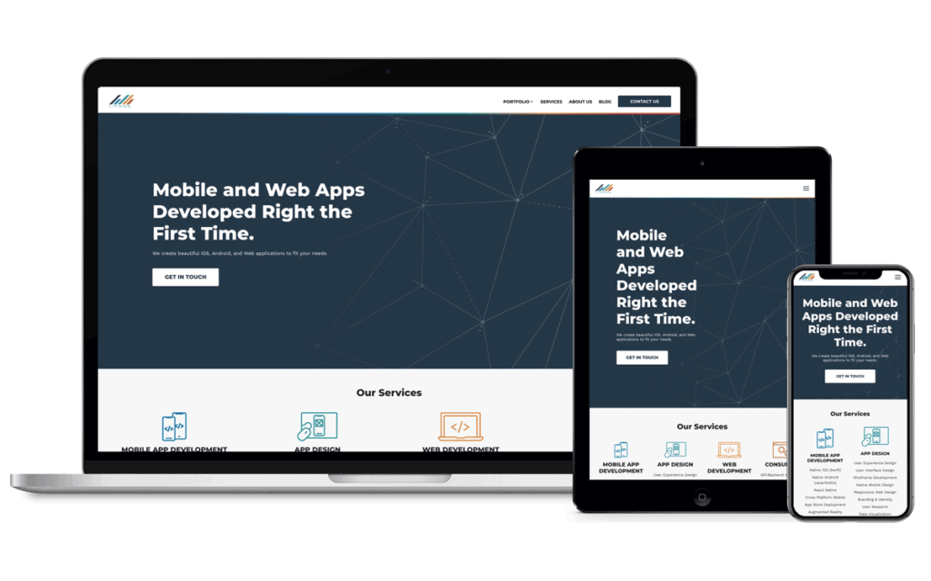
A responsive design ensures your website looks and functions well on smartphones, tablets, and desktop computers. With the increasing use of mobile devices, having a mobile-friendly website is essential for user experience and SEO.
When selecting a responsive design, there are a few considerations to remember. First, ensure compatibility with different devices and screen sizes. Your website should adapt to various screen resolutions to provide a consistent experience for all users. Second, consider ease of maintenance and updates. A responsive design should be easy to update and maintain, allowing seamless content management. Lastly, prioritise performance optimisation for mobile devices. This includes optimising images, reducing unnecessary elements, and ensuring fast loading times.
Several websites serve as excellent examples of responsive design. Apple, Amazon, and Netflix all have responsive websites that adapt to different screen sizes and provide a seamless user experience. Implementing responsive design best practices, such as using a mobile-first approach and employing CSS media queries, can help you create a responsive website that meets the needs of your users.
Here are some additional tips for choosing a responsive design:
- Test your website on various devices and screen sizes to ensure it displays correctly and functions properly.
- Consider using a responsive framework or template to simplify creating a responsive website.
- Prioritise content hierarchy and provide essential information that is visible and accessible on smaller screens.
- Optimise your website's navigation for mobile devices, using dropdown menus or hamburger menus to access different sections efficiently.
4: Utilising Intuitive Navigation
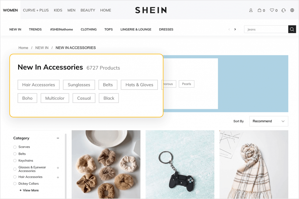
Intuitive navigation is essential for helping users easily find what they're looking for on a website. A website with intuitive navigation guides users through the content and provides a seamless browsing experience. Characteristics of intuitive navigation include simplicity, clear labels, and a logical structure.
Google, Amazon, and Airbnb are prime examples of websites with intuitive navigation. Google's homepage, for instance, features a simple and uncluttered design with a search bar prominently displayed. Amazon's navigation menu is easy to use, with clear categories and subcategories. Airbnb's website has a logical structure, with intuitive navigation that allows users to search for accommodations in specific locations easily.
When creating intuitive navigation on your website, there are a few tips to consider:
- Limit the number of menu items to avoid overwhelming users with too many options.
- Use descriptive labels for navigation links to ensure users understand what to expect when they click on them.
- Include a search bar for easy access to specific content, allowing users to find what they're looking for quickly.
Here are some additional tips for creating intuitive navigation:
- Place your navigation menu in a prominent location, such as at the top of the page or in a sidebar, to ensure it's easily accessible.
- Use clear and concise language for navigation labels, avoiding jargon or confusing terminology.
- Use visual cues like icons or arrows to indicate dropdown menus or subcategories.
- Implement a breadcrumb navigation system to show users their location within your website's hierarchy.
5: Incorporating Visual Hierarchy
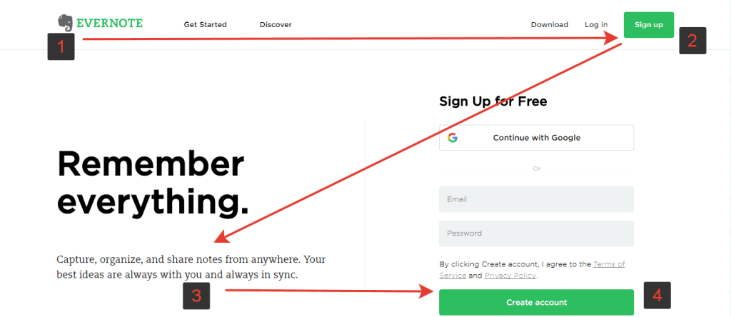
Visual hierarchy is a design principle that helps guide users' attention and prioritise essential elements on a webpage. Visual hierarchy can improve readability, enhance user experience, and increase conversion rates.
There are several techniques for creating a visual hierarchy on your website. One practical approach is using size, colour, and contrast to differentiate elements. By making essential aspects larger, using contrasting colours, and using bold fonts, you can draw users' attention to critical information. Placing essential elements above the fold, immediately visible without scrolling, is another visual hierarchy technique. Additionally, using whitespace to create separation between elements can help guide users' eyes and develop a sense of organisation.
Websites like Apple, Nike, and Adobe effectively incorporate visual hierarchy into their designs. Apple's homepage, for example, features a large image carousel with bold and contrasting text, immediately drawing users' attention. Nike's website uses size and contrast to highlight its products, making it easy for users to navigate and find what they want. Adobe's website utilises whitespace and a logical structure to guide users through their various products and services.
Here are some additional tips for incorporating visual hierarchy:
- Use a consistent visual style throughout your website to create a cohesive and unified design.
- Place essential elements in strategic locations, such as the top of the page or the centre, to capture users' attention.
- Experiment with different font sizes, colours, and styles to create a visually exciting and engaging design.
- Consider the reading patterns of your target audience and design your website accordingly, placing essential elements where users are likely to look first.
Conclusion
For those seeking to revamp their online presence, considering some top-notch website design tips, such as using whitespace effectively and employing a consistent colour scheme, can make a significant difference. Unleashing clever website design hacks, like optimising website speed and clear navigation menus, can significantly enhance your site's user experience. Implementing proven website design techniques like prioritising responsive design and incorporating visual hierarchy can bolster the effectiveness of your site.
Adhering to website design best practices, such as ensuring site speed and creating intuitive navigation, is crucial for a successful online presence. Keeping up with the latest website design trends, like the ones demonstrated by Apple and Nike, can ensure your website remains modern and engaging.

