Top 10 Best Medical Logos: The Pulse of Branding
Mates, when it comes to the world of healthcare, a strong visual identity can be the difference between “meh” and “oh yeah!”
You see, a cracking medical logo is more than just a pretty face – it’s the heartbeat of a brand, pumping life into a practice or organisation.
Think about it – when you’re lying in a hospital bed, knees knocking like Cliff Richard at a convent, that little symbol on the wall might be your only lifeline to a sense of reassurance.
A well-designed medical logo can instil trust, professionalism, and, dare I say it, even a sprinkle of comfort amidst the clinical chaos.
- A strong medical logo instils trust and professionalism in healthcare branding.
- Logos convey brand values and the essential human touch patients desire.
- Psychological elements like colour and shape affect patient perceptions.
- Effective logos serve as visual ambassadors for positive patient experiences.
- Top medical logos combine aesthetic appeal with meaningful symbolism and heritage.
Why Your Medical Logo Matters
Now, let’s get one thing straight – I’m not just waffling on about aesthetics here (though admittedly, I have a soft spot for those sleek, minimalist numbers).
No, a top-notch medical logo goes beyond mere looks. It’s a condensed snapshot of your brand’s values, expertise, and that all-important human touch that patients crave.
Think of it like this – if your logo were a person at a party, you’d want it to be the one cracking witty one-liners and making everyone feel at ease, not the sourpuss in the corner muttering about health codes. A great medical logo should be the ambassador of your practice, setting the tone and paving the way for a positive patient experience from the get-go.
Look, it’s about getting into your patient’s head, in a good way, right? The thing is, the right colours and shapes can do half the job for you before a doctor even walks into the room. It’s all about subconscious signals, the kind of stuff that builds trust without you even noticing.
Take the colour blue. You see it everywhere in healthcare, and it’s not by accident, mate. That specific colour is psychologically wired to make us feel calm, stable, and like we’re in safe hands. It lowers the heart rate, apparently.
Then you’ve got your shapes. Soft, rounded logos feel more approachable, less intimidating than something with sharp, aggressive angles. It’s the difference between a comforting pat on the back and a pointy finger, and it all registers in the brain instantly. It’s a quiet promise that says, “Don’t worry, we’ve got you.”
Unveiling the Best Medical Logos
Enough preamble; let’s dive into the real stars of the show – the top 10 medical logos that have stolen our hearts (and maybe a spare kidney or two, but shhh… we won’t tell). Brace yourselves because these bad boys will get your pulse racing.
1. Cleveland Clinic
Kicking off our list with a true heavyweight, the Cleveland Clinic’s logo is like the Cristiano Ronaldo of medical branding – sleek, iconic, and unapologetically confident. This bad boy oozes elegance with its minimalist typographic design and striking use of negative space.
But what sets it apart is the clever integration of a crosshair-esque symbol, subtly nodding to the clinic’s expertise and precision. It’s a logo that says, “Yeah, we’re kind of a big deal, but we’ll take care of you with the utmost finesse.” Swoon-worthy, indeed.
The Anatomy of Brilliance
- Clever use of negative space
- Minimalist yet striking typography
- A subtle nod to medical expertise (crosshair symbol)
- Exudes confidence and professionalism
2. Mayo Clinic
Next, we have the Mayo Clinic’s logo, a true masterclass in simplicity and symbolism. At first glance, you might think it’s just a fancy serif font with a squiggle – but oh, how wrong you’d be, my friend.
That squiggle, you see, is a meticulously crafted symbol representing the humble mustard seed, paying homage to the clinic’s humble beginnings and a core value of “planting seeds of hope.” Genius, right? It’s like a tiny visual metaphor wrapped in a sleek, sophisticated package.
A Study in Understated Brilliance
- Simple yet elegant typography
- Subtle mustard seed symbol with deep meaning
- Nod to the clinic’s humble beginnings
- Exudes sophistication and hope
3. World Health Organization (WHO)
Few can hold a candle to the iconic emblem of the World Health Organization (WHO) regarding globally recognised medical logos. This bad boy is like the Beyoncé of logos – bold, unapologetic, and commanding attention wherever it goes.
The WHO logo features a simple yet striking emblem – a stylised representation of the Rod of Asclepius. It is a symbol dating back to ancient Greece and is associated with healing and medicine.
But here’s the real kicker – the emblem is encircled by the organisation’s name in not one, not two, but a whopping six languages. Talk about a true global citizen!
A Universal Language of Healthcare
- Bold, striking emblem (Rod of Asclepius)
- Multilingual representation (six languages)
- Exudes global reach and authority
- Rooted in ancient medical symbolism
4. American Red Cross
Few can match the cross-cultural power of the American Red Cross emblem when it comes to instantly recognisable medical logos. This iconic logo has become a universal symbol of hope, aid, and resilience in adversity.
At its heart lies a deceptively simple design – a bold red cross against a crisp white background. But within that simplicity lies a depth of meaning that transcends borders and languages. The Red Cross is a powerful visual shorthand for protection, neutrality, and a commitment to alleviating human suffering, no matter the circumstances.
An Emblem of Hope and Resilience
- Simple yet powerful design (red cross on white)
- A universally recognised symbol of aid and protection
- Exudes neutrality, resilience, and compassion
- Deeply rooted in humanitarian values
5. St. John Ambulance
Moving swiftly along, we come to a logo that has saved lives (and turned heads) for over a century – the St. John Ambulance emblem. This bad boy is like the James Bond of medical logos – suave, sophisticated, and ready for action.
At its core, the logo features a bold, stylised Maltese cross, a nod to the organisation’s roots in the ancient Order of St. John. But what sets it apart is the intricate laurel wreath that encircles the cross, adding a touch of regal elegance and a subtle whisper of “we’ve got this covered, dahling.”
Sophistication Meets Service
- Striking Maltese cross design
- Intricate laurel wreath for added elegance
- Nod to the organisation’s ancient roots
- Exudes sophistication and readiness
A Sprinkling of Stats
- St. John Ambulance was founded in 1877
- The organisation has over 25,000 volunteers
- They attend over 1.5 million incidents each year
6. Médecins Sans Frontières (MSF) / Doctors Without Borders
When it comes to medical logos that pack a punch, few can match the raw, unwavering intensity of the Médecins Sans Frontières (MSF) emblem, better known as Doctors Without Borders in English-speaking regions.
This logo is like the Dwayne “The Rock” Johnson of medical branding – bold, uncompromising, and ready to take on any challenge that comes its way. At its core lies a striking combination of bold typography and a minimalist graphic representation of a person – a powerful visual metaphor for the organisation’s commitment to providing medical aid to those in need, regardless of location or circumstance.
Boldness and Humanity, United
- Bold, impactful typography
- Minimalist human figure graphic
- Exudes unwavering determination
- Represents a commitment to global aid
7. Planned Parenthood
The Planned Parenthood emblem is a beacon of warmth, inclusivity, and approachability in a sea of medical logos that sometimes feel too clinical. This logo is like that friend who always has a hug and a cup of tea ready, no matter what life throws your way.
At its heart lies a beautifully crafted symbol – a stylised representation of a mother cradling her child, surrounded by a soft, nurturing embrace. It’s a visual metaphor that speaks volumes about the organisation’s core values of compassionate care, reproductive rights, and a deep commitment to empowering individuals and families.
A Nurturing Embrace
- Stylised mother-and-child emblem
- Soft, nurturing visual aesthetic
- Exudes warmth, inclusivity, and compassion
- Represents empowerment and reproductive rights
8. American Medical Association (AMA)
Few can match the stoic presence of the American Medical Association (AMA) emblem when it comes to medical logos that exude a sense of gravitas and authority. This bad boy is like the Morgan Freeman of logos – distinguished, commanding respect, and oozing wisdom with every curve.
At its core lies a striking emblem featuring a stylised staff entwined with a serpent – a powerful visual metaphor rooted in ancient Greek mythology and the symbol of the Greek god of healing, Asclepius. Surrounding this emblem is a bold, serif wordmark that practically screams, “We mean business, folks.”
Ancient Wisdom, Modern Authority
- Striking staff-and-serpent emblem (Asclepius)
- Bold, authoritative typography
- Rooted in ancient Greek symbolism
- Exudes gravitas and medical expertise
9. Canadian Red Cross
While it may share a similar heritage with its American counterpart, the Canadian Red Cross logo has carved out a distinct identity that beautifully captures the spirit of the Great White North.
At first glance, you might mistake this logo for a sleek, minimalist abstract design. But look closer, and you’ll notice that the striking red emblem is a stylised representation of a maple leaf – a decisive visual nod to the organisation’s Canadian roots and values.
The Maple Leaf Metaphor
- The sleek, minimalist aesthetic
- Stylised maple leaf emblem
- Represents Canadian roots and values
- Exudes modernity and national pride
10. British Red Cross
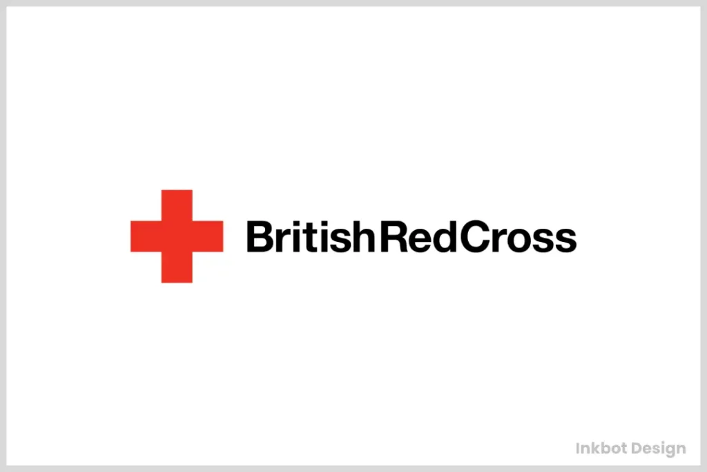
Last but certainly not least, we come to a logo that’s as quintessentially British as a spot of tea and a cheeky bit of banter – the emblem of the British Red Cross.
This bad boy perfectly blends classic aesthetics with contemporary flair, much like the nation it represents. The familiar red cross emblem lies at its core, a universal symbol of aid and compassion. But what sets this logo apart is the intricate, almost regal framing that surrounds the cross, adding a touch of traditional British elegance.
A Regal Blend of Tradition and Compassion
- Classic red cross emblem
- Intricate, regal framing
- Blends tradition with contemporary flair
- Exudes British elegance and compassion
11. NHS (National Health Service)
Right then, on to a proper national treasure, an absolute institution. The NHS logo is like the David Attenborough of branding – instantly trusted, deeply reassuring, and quintessentially British. It doesn’t need to shout or pull fancy tricks; its quiet confidence is what makes it so powerful.
The design is brilliantly simple: just the letters ‘NHS’ in that specific, familiar blue (Pantone 300, for the nerds out there) and a custom typeface called, funnily enough, NHS Reith. Its genius is in this very simplicity. It isn’t trying to be clever with hidden symbols or abstract shapes. It is a straightforward, no-nonsense promise of care, free at the point of use, and every single Brit knows exactly what it stands for just by glancing at it.
The Emblem of a Nation’s Health
- Iconic and simple typography
- Trusted “NHS Blue” colour palette
- A powerful symbol of universal healthcare
- An emblem of national reliability and trust
12. Pfizer
Now, for a logo that shows a brand can properly change its stripes. The Pfizer logo is like the Benedict Cumberbatch of the branding world – it started out famous for one straightforward thing, then completely reinvented itself as something more complex, scientific, and forward-thinking. This one had a proper transformation.
Back in 2021, Pfizer threw its old pill-shaped logo, which had been around for ages, straight in the bin. It was a seriously smart move. They replaced it with this two-tone blue ribbon that cleverly unwinds into a DNA double helix.
It was a massive statement, basically telling the world they’re not just ‘the company that makes the little blue pill’ anymore. This logo screams cutting-edge science and breakthrough research from the rooftops. It’s a clear visual signal of their shift towards a new era of gene-based medicine.
From Pill to Scientific Breakthrough
- Represents a shift to a science-first identity
- Clever and meaningful DNA double helix symbol
- Modern two-tone blue colour palette
- Exudes innovation and research leadership
The Beating Heart of Healthcare Branding
Well, there you have it, folks – a whirlwind tour of the top 10 best medical logos that have captured our hearts (and maybe a few other organs, too, but we won’t go there).
From sleek minimalism to bold symbolism, these emblems are more than just pretty faces – they’re the beating heart of healthcare branding, pumping life and meaning into the organisations they represent.
But at the end of the day, a great medical logo is more than just aesthetics – it’s a visual representation of the values, expertise, and unwavering commitment that lie at the healthcare industry’s core.
So, the next time you find yourself in a waiting room, take a moment to appreciate the power of those little symbols on the wall. They might just be the pulse that keeps us all going.
Frequently Asked Questions (FAQs)
What makes a great medical logo?
A great medical logo should balance visual appeal and symbolic meaning and represent the organisation’s values and expertise. It should be memorable, instil trust and professionalism, and serve as a visual ambassador for the brand.
Why is symbolism important in medical logos?
Symbolism is crucial in medical logos, allowing organisations to convey deeper meanings and associations through visual metaphors. Symbols rooted in ancient traditions or cultural contexts can add depth, gravitas, and a sense of heritage to a logo.
How can colour choices impact the perception of a medical logo?
Colour choices in medical logos can profoundly affect how they are perceived. For example, shades of blue often convey a sense of trust, stability, and professionalism, while red can evoke ideas of urgency, passion, and boldness. Carefully considered colour palettes can reinforce a logo’s intended message and emotional resonance.
Should medical logos prioritise simplicity or complexity?
While there is no one-size-fits-all answer, many of the most effective medical logos prioritise simplicity over complexity. A clean, minimalist design can be more memorable and versatile, conveying professionalism and approachability. However, some degree of complexity may be warranted if it enhances the symbolic or metaphorical aspects of the logo.

