The 30+ Best Sports Logos to Inspire Your Brand
Most sports logos are a chaotic mess of angry animals, confusing typography, and trendy colours that look dated in five years.
But the great ones? They are absolute masterclasses in branding.
A truly great sports logo is not a piece of art. It’s a commercial asset, a hard-working tool designed to build an emotional connection and be instantly recognisable. It has to look powerful embroidered on a £50 cap, clear as a 48-pixel icon on a betting app, and monumental on a stadium screen.
Ignoring the principles behind these iconic marks is a mistake for entrepreneurs and business owners. The same rules that make the Yankees logo timeless can make your plumbing company’s brand memorable.
This isn’t just a list. This is a breakdown of the three simple rules that separate iconic brands from the forgettable minor leagues, with over 30 real-world examples.
- Sports logos are branding assets that must be instantly recognisable and emotionally connect with audiences.
- Simplicity enhances memorability; complex logos hinder recall and impact.
- Versatility ensures a logo works across various mediums and sizes, from embroidery to digital formats.
- A good logo should convey a compelling story that reflects the brand's identity and values.
- Common logo design mistakes include cliché imagery, overloaded symbolism, and lack of scalability.
The 3 Unbreakable Rules of Great Sports Logos

Before we get to the examples, you need to understand the framework. Every great logo, sports or otherwise, is built on these three pillars. Judge any logo—especially your own—against them.
Rule #1: Simplicity Wins Championships
Complexity is the enemy of memory. The human brain is wired to remember simple shapes and forms. A complicated logo with multiple gradients, lines, and textures is difficult to process and recall.
Simple logos are confident. They don’t need to shout with extraneous details. They communicate a single, powerful idea instantly.
Rule #2: Versatility is Your Most Valuable Player (MVP)
A logo has to work everywhere. This is non-negotiable. It must be effective in one colour (for things like printing on promotional pens) and at a massive scale.
The ultimate acid test is the embroidery test. Can your logo be stitched onto a polo shirt or a hat and still be clear and legible? If it turns into a colourful, unidentifiable smudge of thread, it’s a failure as a functional brand mark.
Rule #3: Story is the Soul of the Brand
The best logos hint at a deeper meaning. This doesn’t mean cramming in hidden symbols that need an instruction manual to decipher. It means the logo reflects something core to the brand’s identity: its city, its name, its values, or its heritage.
A logo with a story feels authentic and rooted. It creates a connection that a generic symbol never can.
The Hall of Fame: Iconic Logos That Define the Game
Here are the logos that nail these rules. We’ve categorised them by their greatest strength to show you why they work and what you can learn from them.
Timeless Classics: Built to Last a Century
These logos have remained essentially unchanged for decades. They are proof that classic design never goes out of style.
New York Yankees (MLB) The interlocking “NY” is arguably Earth’s most famous sports logo. It’s pure simplicity and heritage. Created by Tiffany & Co. in 1877 for an NYPD medal, its adoption by the Yankees has made it a global symbol of excellence and tradition. It’s so simple, it’s almost unbreakable.
Montreal Canadiens (NHL) The “C” and “H” (for “Club de hockey Canadien”) are housed in a simple, bold form. The design is over 100 years old, yet it feels as modern today as it did in 1917. It’s a lesson in owning a simple geometric shape and colour palette.
Green Bay Packers (NFL) A capital “G” in a football shape. It’s dead simple. Designed in 1961, it has become an unshakeable symbol of a community-owned team with a rich history. It demonstrates that you don’t need to illustrate a “packer” to represent the name. The symbol is the brand.

St. Louis Cardinals (MLB) The “birds on the bat” is a beautiful illustration that breaks the complexity rule but gets away with it through sheer charm and history. It tells a story and evokes a feeling of classic Americana baseball. It’s been refined over the years to improve its versatility.
Detroit Red Wings (NHL) The “winged wheel” is a perfect nod to Detroit’s identity as “Motor City.” It connects the team to its home city’s story. It’s a simple concept executed with style that has remained relevant for over 90 years.
Chicago Cubs (MLB) The big red “C” around the blue “UBS” is a masterclass in straightforward, bold design. The roundel makes it a self-contained badge that works perfectly on caps, jerseys, and merchandise. It’s clean, patriotic, and instantly recognisable.
The Masterclass in Negative Space
This is where designers show their cleverness. Using the space within a logo to create a secondary image is a hallmark of brilliant branding.
Hartford Whalers (Formerly NHL) The holy grail of negative space. The green “W” sits atop a blue whale’s tail. But look in the space between them: a perfect white “H” for Hartford. It’s three ideas in one simple, elegant mark—a tragic loss for the design world when the team moved.
Minnesota Wild (NHL) At first glance, it’s a landscape scene of a forest and a setting sun. But look again. The entire shape is the silhouette of a wild animal, with the North Star as its eye. It tells a story of the Minnesota wilderness in a unique and deeply memorable way.
The Milwaukee Brewers (MLB – “Ball-in-Glove” era) are a true fan favourite for a reason. The logo appears to be a simple baseball glove. But the fingers and thumb form a perfect “M,” and the palm and pocket form a “B” for Milwaukee Brewers. It’s a genius-level concept that is sorely missed.
Washington Capitals (NHL – “Eagle” era) The late 90s rebrand produced this gem. The eagle’s body is bold and straightforward, but the negative space underneath forms the silhouette of the U.S. Capitol building. It’s a brilliant way to tie a team to its capital city without being overly literal.
Atlanta Falcons (NFL) The modern Falcons logo greatly improved over its predecessor. It’s a sleek, aggressive falcon, but look closely at the shape. The entire bird is formed as a capital “F” for Falcons. It’s subtle, sharp, and communicates motion.
Mascots That Aren’t a Cliché
It’s easy to draw an angry animal. It’s hard to create a mascot logo with personality and staying power. These logos get it right.
Chicago Bulls (NBA) Designed by the legendary Michael Jordan-era artist, Theodore W. Drake, this logo is the pinnacle of mascot design. The bull is assertive and aggressive without being a cartoonish caricature. The red-tipped horns add a focal point. It has never been changed and never should be. It is perfect.
Minnesota Vikings (NFL) This is how you do a human mascot. The “Norseman” is stylised, not realistic. The thick lines, strong jaw, and braided hair create a memorable character. It’s a symbol of regional heritage that avoids looking silly.
Toronto Blue Jays (MLB) The modern Blue Jay logo is a fantastic update that feels new and classic. The simplified bird head, combined with the red maple leaf, gives it a distinctly Canadian identity. It’s clean, proud, and passes the embroidery test with flying colours.
Denver Broncos (NFL – The “D” and horse). The old logo was a masterwork. A capital “D” with a snorting bronco inside. It was a self-contained, powerful symbol. While the current horse head is a strong mark, the classic “D” remains a lesson in integrating a mascot into a typographic form.
Miami Dolphins (NFL – Modern version) The Dolphins’ 2013 rebrand succeeded. They stripped away the helmet and cartoonish detail of the old dolphin and created a sleek, stylised, and aquatic form. It feels more elegant and dynamic, perfectly capturing the animal’s grace.
Modern Marvels & Brilliant Rebrands
These logos show that the principles of good design are alive and well.
Golden State Warriors (NBA) The Warriors’ rebrand brought back the “The City” concept with a modern twist. The logo features a stylised representation of the Bay Bridge, connecting the team to the entire Bay Area. It’s clean, geographically relevant, and feels both contemporary and timeless.
Brooklyn Nets (NBA) When the Nets moved to Brooklyn, they opted for a stark, minimalist black-and-white shield. Designed with input from co-owner Jay-Z, it’s all about urban confidence. It’s straightforward, which makes it incredibly versatile and stylish.
Juventus FC (Serie A). This rebrand was controversial among football purists, but a masterstroke from a branding perspective. They ditched the traditional crest for a hyper-minimalist “J.” It’s designed for the digital age, working as a fashion brand mark as much as a football logo. It’s brave and forward-thinking.
Liverpool FC (Premier League). While the full crest is complex, the genius of Liverpool’s brand is the standalone Liver Bird symbol. This simplified version is used on kits and merchandise, providing a clean, iconic mark steeped in the city’s history. It’s a great example of having a flexible brand system.
The Los Angeles Rams (NFL) is another controversial rebrand that works from a design standpoint. The “LA” horn is a clever typographic solution. The segmented horn is meant to be based on the Fibonacci sequence, giving it a structured, geometric feel. It’s a modern take on a classic team element.
Pure Typographic Power
Sometimes, you don’t need a symbol. The right font, artfully arranged, can be just as powerful.
Los Angeles Dodgers (MLB) The following “Dodgers” script is pure motion. It’s an iconic piece of typography that feels dynamic and exciting, perfectly capturing the spirit of baseball. It hasn’t changed much since the team moved to LA in 1958, and for good reason.
Boston Celtics (NBA) The team’s wordmark is a Celtic-inspired typography. It’s unique and immediately recognisable. Paired with the “Lucky the Leprechaun” logo, it creates a brand identity that is one of the most distinctive in all sports.
San Antonio Spurs (NBA) The classic Spurs logo brilliantly incorporates a spur into the “U” of the wordmark. It’s a simple, clever trick that makes the logo unique and memorable. It connects directly to the team’s name without needing a separate illustration.
Texas Rangers (MLB) The drop-shadow “T” on their caps is a classic. But the full “Rangers” script in red, white, and blue is a strong, patriotic, clean, well-balanced wordmark. It represents Texas without resorting to clichés like cowboy hats or state outlines.
New York Mets (MLB) The “Mets” script is another classic, but the genius is the primary “skyline” logo. The interlocking “NY” is set against a bridge silhouette inside a baseball shape, representing New York’s five boroughs. It’s a story-rich logo that connects the team to its city.
Global Icons: The World’s Game
Football crests are often complex, but the best ones are built on a foundation of simple, powerful symbols.
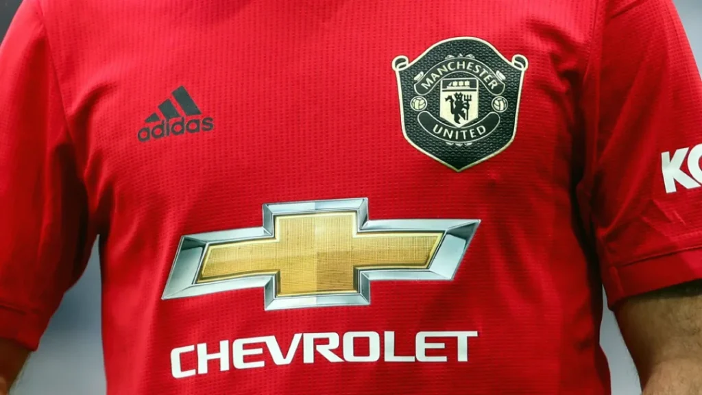
Manchester United (Premier League). The shield shape is classic heraldry. The devil, a nod to their “Red Devils” nickname, is a strong central element, and the ship at the top represents Manchester’s trade canal. It’s a crest loaded with story but still presents a bold, unified shape.
AS Roma (Serie A) The modern Roma crest is a simplified, powerful shield featuring the iconic “Lupa Capitolina”—the she-wolf feeding the mythical founders of Rome, Romulus and Remus. It’s a direct link to the ancient story of their city.
AFC Ajax (Eredivisie) The Ajax logo is a brilliant, stylised illustration. It’s a portrait of the Greek hero Ajax, but it’s drawn using only 11 lines—one for each player on the pitch. It’s a high-concept idea executed with beautiful simplicity.
Chicago Fire FC (MLS) is a fantastic rebrand from a previously maligned logo. The shape is inspired by the Chicago municipal “Y” symbol, and the flames within form a “C” for Chicago, referencing the Great Chicago Fire. It’s packed with local stories and modern style.
What Your Small Business Can Learn From a Billion-Dollar Franchise
You don’t need a billion-dollar budget to have a billion-dollar branding principle.
The lesson from these logos is discipline. The Yankees’ logo works because they resisted changing it. The Hartford Whalers logo works because a designer took the time to find a clever, simple solution.
Think about your business. A plumber doesn’t need a complex illustration of pipes and wrenches. A simple, strong wordmark or a clever monogram using a “P” and a water drop is more effective. That’s the kind of mark that looks professional on a van, an invoice, and a social media profile.
Thinking about how these principles apply to your brand is the first step in a professional logo design process. It’s about finding a simple, versatile way to tell your story.
The 3 Most Common Fumbles in Logo Design
For every great logo, there are a hundred bad ones. They almost always fail for one of these three reasons. Avoid them at all costs.
The “Angry Animal” Cliché
This is the most common trap. A business owner wants to look “strong” or “aggressive,” so they request a mascot that looks furious. The result is almost always a generic, forgettable logo resembling a thousand other minor league or high school teams. It lacks personality and a real story.
The Hidden Meaning Overload
One clever hidden element is genius. Five is a train wreck. When a logo is packed with so many symbolic ideas that it needs a page of explanation, it has failed. The goal of a logo is instant communication, not a visual puzzle. Clarity is always more important than cleverness.
The Scalability Catastrophe (Failing the Embroidery Test)
This is the most practical failure. A designer creates a beautiful, detailed logo with gradients and fine lines on a big screen. The client approves it. Then, they try to put it on a uniform or a business card, which becomes an unreadable smudge. Always design for the smallest application first.
Your Logo is an Asset, Not an Expense
A powerful brand identity is one of your business’s most valuable assets. It’s your first impression, your calling card, and the symbol of your reputation.
The best sports logos aren’t just pictures; they are the visual embodiment of history, community, and emotion. They achieve this not through complexity, but through a ruthless dedication to simplicity, versatility, and a core story. Your business deserves the same strategic thinking.
Ready to Build a Championship-Calibre Brand?
You’ve seen the principles behind the world’s most iconic brands. Applying them to your business is the next move. You’re in the right place if you need a professional, timeless identity that works everywhere. Explore our logo design services or request a no-obligation quote to get started.
Frequently Asked Questions (FAQs) About Sports Logo Design
What is the most essential element of a good sports logo?
Versatility. A logo that isn’t legible and effective across all sizes and mediums (digital, print, embroidery) is a failure, no matter how aesthetically pleasing.
Why do so many sports logos use animals?
Animals are often used to symbolise traits like strength (bears, bulls), speed (falcons, cheetahs), or wisdom (owls). The key is to do it uniquely and stylistically, avoiding the “angry animal” cliché.
How often should a sports team change its logo?
As rarely as possible. A logo builds equity and recognition over time. Rebrands should only be undertaken when the current logo is technically flawed, no longer represents the brand, or a significant event (like a team relocation) occurs.
What is the difference between a primary and a secondary logo?
A primary logo is the main mark to identify the team (e.g., the Chicago Bulls head). A secondary logo is an alternative flexible mark, often on merchandise or specific applications (e.g., the Boston Celtics’ shamrock).
Why do minimalist logos work so well for modern brands?
Minimalist logos are clean, easy to remember, and versatile, especially for digital applications like social media profile pictures and icons. Their simplicity makes them feel confident and modern.
Is negative space in a logo just a gimmick?
No. Negative space is a sign of intelligent, efficient design when used effectively. It allows a logo to communicate multiple ideas in a single, clean mark, making it more memorable and clever (e.g., the Hartford Whalers logo).
Can a logo just be the team’s name in a special font?
Absolutely. This is called a wordmark or logotype. Brands like the Los Angeles Dodgers and Coca-Cola prove that distinctive typography can be as powerful and recognisable as any symbol.
What makes a logo “timeless”?
Timeless logos are built on simple shapes, classic typography, and a limited colour palette. They avoid trendy effects, complex illustrations, and fonts tied to a specific decade.
How much does a professional sports-quality logo cost?
While a major league rebrand can cost hundreds of thousands or even millions of dollars, the principles are what matter. A small business can get a professional, high-quality logo from an agency for a fraction of that cost by focusing on practical design rather than extensive market research.
What is the “embroidery test”?
It’s a practical way to judge a logo’s versatility. Ask yourself: “Could this logo be cleanly stitched onto a hat without losing its essential detail?” If the answer is no, the design is likely too complex.


