
The 20 Best Charity Logos That Put Brand Strategy First
There’s a sea of mediocrity in charity logos.
A bland soup of holding hands, stylised hearts, globes, and happy, genderless stick figures. They feel like they were designed by a committee of well-meaning people terrified of offending anyone.
The result? They offend no one. But they don't inspire anyone, either.
They fail at their only job: to build enough trust and recognition to convince someone to hand over their hard-earned cash. Because make no mistake, that is the job. A charity is a brand. It competes for attention and money just like any for-profit business.
This isn't a list to make you feel warm and fuzzy. This is a collection of 20 commercially astute logos. They have a real, defendable idea behind them. They're here to give you practical, observational advice for your brand, whether you're a charity or a start-up.
- A charity logo must tell a smart, defendable story that inspires trust and recognition.
- Effective logos portray professionalism, ensuring potential donors feel their contributions are valued.
- Memorable logos engage viewer intelligence, facilitating a positive emotional connection and highlighting solutions.
Your Charity Logo Is a Tool, Not a Badge
Too many non-profits treat their logo as a simple badge of identity. A necessary evil. It gets slapped on a letterhead and a collection tin, which ends the thinking.
This is a massive, costly mistake. Your logo is the sharp end of your spear. It’s the single visual element people will see most often. If it’s weak, it suggests your organisation is weak.
Why Most Charity Logos Fail
The core problem is usually one of two things.
First, design by committee. Everyone gets a say, and every good, sharp, or interesting idea gets sanded until you're left with a smooth, round, useless pebble. It’s safe, it’s agreeable, and it’s completely forgettable.
Second, and this is my biggest pet peeve, is the obsession with clichés. The helping hand. The generic heart. The swooshy human figure. These symbols are visual junk food. They're easy, cheap, and utterly devoid of nutritional value.
They say nothing specific about who you are or what you do. They just scream, “I am a charity!” which is the least interesting thing you can say about yourself.
The Three Things a Great Charity Logo Does
Forget sentimental fluff. A properly effective logo—for any organisation—achieves three things:
- It tells a smart story. Or at least it hints at one. There’s a clever concept, a visual pun, or a metaphor at its core. It has a reason for looking the way it does.
- It builds trust through professionalism. It looks considered, competent, and serious. It reassures a potential donor that an amateur operation won't waste their money.
- It’s memorable. It has a unique quality that helps it stick in someone's brain. The ultimate test is whether someone can vaguely sketch or describe it to a friend. “You know, the one with the panda.”
Now, let's look at the evidence.
The Showcase: 20 Charity Logos That Work
These aren't here because of some subjective aesthetic judgment. They're here because they are built on a solid, intelligent concept. They do the heavy lifting of communication, which is the entire point of a logo.
1. WWF (World Wildlife Fund)
- The Charity: Global conservation, protecting endangered species and their habitats.
- The Logo: A giant panda, rendered in stark black and white, using negative space to form its back.
- The Brutal Honesty (Why it Works): This is the undisputed champion. The genius is multi-layered. First, using an endangered, beloved animal as the symbol is a direct link to the mission. Second, negative space is famously clever; it feels smart and rewards viewers for noticing it. Third, its black-and-white nature was originally a cost-saving measure for printing—a brilliant example of turning a constraint into a strength. It looks timeless and profound.
- The Takeaway for You: Don't be afraid of constraints. Sometimes the tightest brief produces the most creative work. And if you can build a clever “aha” moment into your design, people will remember it forever.
2. Amnesty International
- The Charity: A global movement fighting for human rights.
- The Logo: A candle wrapped in barbed wire.
- The Brutal Honesty (Why it Works): This is a powerful visual metaphor. The candle represents hope, light, and life. The barbed wire represents oppression and imprisonment. It's a story of conflict in a single image. It doesn't need to be explained. It's grim, serious, and perfectly captures the gravity of their work. It’s not trying to be your friend; it’s demanding your attention.
- The Takeaway for You: A powerful concept beats a pretty picture every single time. Find the core tension in what you do and represent it with the simplest possible symbols.
3. Goodwill
- The Charity: Provides job training and community programs, funded by selling donated goods.
- The Logo: A stylised lowercase ‘g' that doubles as a smiling face.
- The Brutal Honesty (Why it Works): It's just plain clever. The “Smiling G” takes the initial of the brand name and infuses it with personality and positive emotion. It connects the act of donating (the ‘good') with a positive outcome (the ‘will' and the smile). It's friendly, approachable, and works brilliantly whether you see the face or the letter.
- The Takeaway for You: Look for opportunities within your brand name. Is there a letter, a shape, or an idea that can be given a second life as a visual element?
4. Shelter
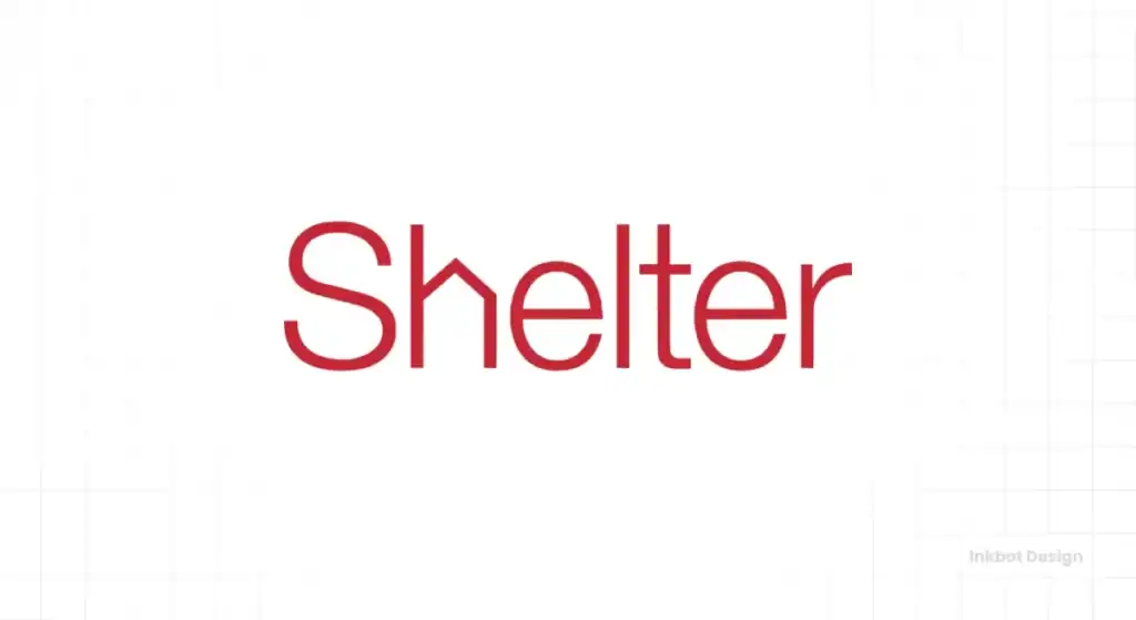
- The Charity: A UK-based charity that campaigns to end homelessness and inadequate housing.
- The Logo: A wordmark where the ‘h' is rendered to look like the simple outline of a house.
- The Brutal Honesty (Why it Works): It's brutally simple and effective. You read the word “Shelter” and simultaneously see the symbol for shelter. It requires zero mental gymnastics. The bold, red, sans-serif font feels urgent and active, like a campaigning organisation, not a passive one.
- The Takeaway for You: Don't overcomplicate it. Sometimes the most direct solution is the strongest. If your brand name contains your core concept, don't be afraid to make that the hero.
5. Macmillan Cancer Support
- The Charity: One of the largest UK charities, providing specialist health care, information, and financial support to people affected by cancer.
- The Logo: The brand name in a unique, messy, handwritten-style font.
- The Brutal Honesty (Why it Works): This masterclass uses typography to convey feeling. Cancer is messy, unpredictable, and deeply personal. A clean, corporate, sterile font would feel cold and distant. This font feels human. It's imperfect, warm, and approachable. It's a signature, not a corporate stamp. It communicates empathy without using a single cliché symbol.
- The Takeaway for You: Your font choice is not a minor detail. It can be the entire concept. Think about the personality and feeling you want to convey and choose a typeface that works for you.
6. British Heart Foundation
- The Charity: A UK charity that funds research into heart and circulatory diseases.
- The Logo: A heart shape formed by a continuous line mimicking an ECG heartbeat reading.
- The Brutal Honesty (Why it Works): Here's a perfect example of taking a potential cliché—the heart—and making it smart. By integrating the scientific reality of their work (the heartbeat line) into the emotional symbol (the heart), they create something unique and ownable. It adds a layer of medical authority to an otherwise generic shape.
- The Takeaway for You: If you must use a standard symbol, give it a clever, unique twist that connects it directly to your work. Don't just use the cliché; subvert it.
7. Médecins Sans Frontières (Doctors Without Borders)
- The Charity: Provides humanitarian medical care in conflict zones and countries affected by endemic diseases.
- The Logo: Simply the name, in a strong, stark, sans-serif typeface, often in black or red.
- The Brutal Honesty (Why it Works): This is all about tone. MSF works in some of the most dangerous places on earth. They don't need a clever symbol. They need to convey authority, seriousness, and unwavering competence. This wordmark does precisely that. It could be stamped on the side of a Land Cruiser or a medical supply crate. It’s a statement of fact, not an emotional appeal.
- The Takeaway for You: Sometimes, the strongest identity is a confident, well-chosen wordmark. It can communicate more seriousness and authority than any symbol.
8. St Mungo's
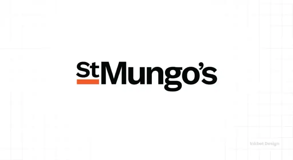
- The Charity: A charity working to end homelessness and rebuild lives.
- The Logo: A wordmark with dynamic lines and a complete stop, suggesting structure and a path forward.
- The Brutal Honesty (Why it Works): St Mungo's previous logo was a scribble. It was meant to be human, but just looked messy. This new identity is a vast improvement. It's structured and transparent. The typography feels solid and dependable. The subtle lines within the lettering suggest a journey, a pathway, or a plan to get people from one place to another. It communicates competence.
- The Takeaway for You: Your logo doesn't have to be a literal picture. Abstract lines and thoughtful typography can be used to suggest a process, a feeling, or a direction.
9. Charity: water
- The Charity: A non-profit that provides clean and safe drinking water to people in developing nations.
- The Logo: The brand name alongside the silhouette of a yellow jerry can.
- The Brutal Honesty (Why it Works): They chose a symbol of the problem and the solution. The jerry can is what people (often women and children) use to carry water, which is usually dirty. By providing a well, Charity: water makes the can a tool for life, not a burden. It's a tangible, real-world object that grounds their work in reality, not abstract concepts. The bright yellow feels optimistic.
- The Takeaway for You: Look for a single, tangible object central to your story. It can be more powerful and authentic than an abstract symbol you invent.
10. Project Semicolon
- The Charity: An American non-profit focused on suicide prevention efforts.
- The Logo: A semicolon incorporated into a friendly, hand-drawn wordmark.
- The Brutal Honesty (Why it Works): This is brilliant because it adopts a symbol that was already meaningful to the community it serves. The semicolon is used by people as a sign of survival and continuation after considering suicide (“an author uses a semicolon when they could've chosen to end their sentence, but chose not to”). By building this into their identity, Project Semicolon showed deep understanding and respect for its audience.
- The Takeaway for You: Pay attention to the visual language your customers or community already uses. Adopting an authentic, pre-existing symbol can be incredibly powerful.
11. Crisis
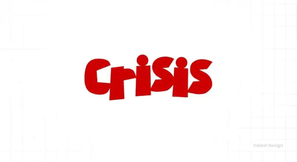
- The Charity: The UK national charity for homeless people.
- The Logo: The word ‘Crisis' with a bold blackletter style
- The Brutal Honesty (Why it Works): It’s a story in five letters and an arrow. The word ‘Crisis' represents the problem. The arrow represents the solution—a way up and out. It’s straightforward, dynamic, and full of hope. It focuses on the charity's positive action, not just the negative situation it tackles. The upward-pointing arrow is a universal symbol for improvement and progress.
- The Takeaway for You: Focus on the solution. Frame your brand's purpose as a positive transformation. How do you get your customer from point A to a better point B? Show that journey.
12. Feeding America
- The Charity: A nationwide network of food banks in the US.
- The Logo: A square mark combining an ear of wheat (representing food) with a subtle forward-pointing arrow (representing movement and efficiency).
- The Brutal Honesty (Why it Works) combines two simple, positive ideas into one robust mark. The wheat clearly says “food and nutrition.” The embedded arrow communicates their role as a logistics and distribution network. It says, “We move food to people.” The design is clean, corporate, and trustworthy, which is precisely what you want from an organisation handling millions of dollars in donations and logistics.
- The Takeaway for You: Combining two simple concepts can create a unique and meaningful mark. What are the two core pillars of what you do? Can they be visually merged?
13. Canteen
- The Charity: An Australian charity supporting young people living with cancer.
- The Logo: A vibrant, loud, and energetic wordmark that feels more like a music festival than a traditional charity.
- The Brutal Honesty (Why it Works): It completely shatters the stereotype of what a “cancer charity” brand should look like. It's not sombre, gentle, or clinical. It's for young people, so it reflects their energy, defiance, and spirit. It's a brand they can connect with on their terms. It brilliantly focuses on the person, not the patient—an audacious and compelling piece of branding.
- The Takeaway for You: Don't just design for your industry; design for your specific audience. Dare to be different from the competition. If everyone in your market is blue, be orange.
14. War Child
- The Charity: Provides assistance to children in areas experiencing conflict.
- The Logo: A stark, black bar with the word ‘WAR' in white, and a smaller, red bar underneath with ‘CHILD' in a child-like font.
- The Brutal Honesty (Why it Works): The power here is in the brutal contrast. The ‘WAR' is in a heavy, oppressive, military-style stencil font. ‘CHILD' is small, vulnerable, and looks like a child drew it. The juxtaposition is jarring and emotionally potent. It tells the entire story of their mission: protecting the small and innocent from the large and destructive.
- The Takeaway for You: Contrast is a powerful tool. Big vs. small, rough vs. smooth, rigid vs. free. What is the core contrast in your brand's story? How can you show it visually?
15. The Royal British Legion (The Poppy Appeal)
- The Charity: A UK charity supporting members and veterans of the British Armed Forces.
- The Logo: A simple, stylised red poppy.
- The Brutal Honesty (Why it Works): This is a rare case where a single symbol has become so powerful that it is the brand. The poppy isn't just a logo; it's a national icon of remembrance. Its strength comes from its deep historical roots and annual physical manifestation (the Poppy Appeal). The legion has successfully become the sole custodian of this symbol in the public's mind. It's simple, instantly recognisable, and emotionally loaded.
- The Takeaway for You: If you can find and own entirely a single, powerful symbol that represents your entire mission, you've hit the jackpot. It requires focus and long-term consistency.
16. Kiva
- The Charity: An international non-profit that allows people to lend money via the Internet to low-income entrepreneurs and students.
- The Logo: A simple, lowercase wordmark in a friendly, rounded sans-serif font.
- The Brutal Honesty (Why it Works): Kiva is a tech platform facilitating person-to-person connections. The logo reflects this perfectly. It’s not a stuffy, institutional bank. It’s modern, accessible, and human. The lowercase letters feel friendly and non-intimidating. It looks like a contemporary tech start-up that helps build trust with a digitally native lending audience.
- The Takeaway for You: Your logo should match the platform. A clean, simple, lowercase wordmark can communicate approachability and contemporary relevance if you're a tech-driven, modern business.
17. RSPB (Royal Society for the Protection of Birds)
- The Charity: A UK conservation charity working to protect birds and the wider environment.
- The Logo: A simple, elegant blue square with a minimalist bird symbol (an avocet).
- The Brutal Honesty (Why it Works): It's just clean, confident design. The symbol is a bird, but it's stylised enough to be a unique mark. The blue feels calm, natural, and trustworthy. It's a timeless design that doesn't try to be clever or trendy. It simply says, “We are the authority on birds.” And it does so with quiet confidence.
- The Takeaway for You: You don't always need a mind-bendingly clever concept. A simple, beautifully executed symbol relevant to your work can be as powerful and last much longer.
18. Mind
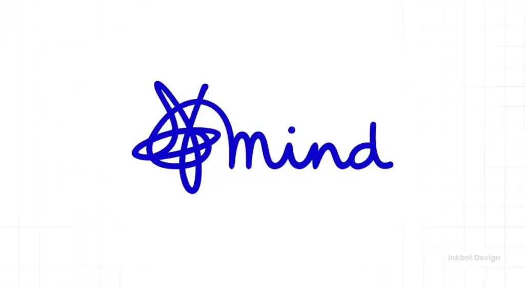
- The Charity: A UK mental health charity.
- The Logo: The word ‘Mind' in a custom “scribble” font, with a flowing line connecting the letters.
- The Brutal Honesty (Why it Works): Like the Macmillan logo, this rejects corporate perfection in favour of something human. The scribbled, fluid line suggests thoughts, conversation, and the ups and downs of a mental health journey. It’s organic and personal. The green colour is calming and associated with well-being. It brilliantly visualises an abstract concept—the state of one's mind.
- The Takeaway for You: Don't be afraid to be a bit “messy” if it's authentic to your brand. A hand-drawn or custom typographic element can inject much personality and humanity.
19. Stonewall
- The Charity: The largest LGBT rights organisation in Europe.
- The Logo: The name “Stonewall” in a bold, impactful, slab-serif font, often incorporating the equals sign or colours from the Pride flag.
- The Brutal Honesty (Why it Works): This logo is a statement. The font choice is strong, solid, and immovable, reflecting the name's origin (the Stonewall Riots). It's not asking for acceptance; it's declaring its presence. It feels like a headline or a plaque. It's a proud, loud, and unapologetic brand, and the logo's confident typography is its perfect voice.
- The Takeaway for You: A logo can declare your values. The font you choose, its weight, and its style can communicate your brand's attitude before anyone reads a single word.
20. Samaritans
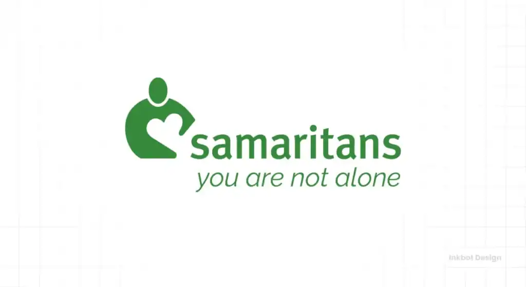
- The Charity: A registered charity aimed at providing emotional support to anyone in emotional distress, struggling to cope, or at risk of suicide.
- The Logo: A green, abstract mark that suggests two figures, a listening ear, or a point of connection.
- The Brutal Honesty (Why it Works): This abstract mark is excellent because it allows interpretation while evoking the right feeling. Is it one person leaning in to listen to another? Is it an “S” shape? It doesn't matter. The feeling is one of connection, support, and empathy. It avoids being too literal, allowing it to be a more universal and timeless symbol for listening.
- The Takeaway for You: An abstract mark can be very effective if it evokes the right feeling. It can be more inclusive and have a longer lifespan than a literal image.
So, What's the Common Thread? (Hint: It's Not a Heart)
Looking back over that list, the patterns are apparent. The best charity logos aren't just well-designed; they are well-thought-out. They share a few core philosophies.
They Have One Single, Defendable Idea
Every single logo on that list is built around one core concept. WWF has negative space. Amnesty has the candle and wire. Shelter has the ‘h' house. You can explain the idea in a sentence.
I once had a client, a small community charity, who wanted a logo that showed a hand (helping), a book (education), a sun (hope), and a tree (growth). I told them what they'd get was an incomprehensible mess.
We focused on one idea—growth—and created a simple, strong mark. The lesson is simple: you can't say everything in a tiny icon. Pick your strongest, most important idea and execute it brilliantly.
They Respect the Viewer's Intelligence
Goodwill's smiling ‘g', the WWF panda, the Crisis arrow—they don't bash you over the head. They have a small element of discovery. It's that tiny “aha!” moment when you see the hidden meaning.
That little spark of discovery creates a positive feeling, making the logo far more memorable than a literal, boring drawing. They treat you like you're clever enough to get it.
They Focus on the Solution, Not Just the Problem
This is crucial. A logo that only communicates sadness or need can be draining. It can lead to compassion fatigue. But the best logos—like Crisis, Shelter, and Feeding America—all have a sense of positive forward movement. They hint at the solution.
They communicate hope and, most importantly, competence. They make you feel that this organisation has a plan and can make a difference. They sell hope, and that’s a much more powerful motivator than guilt.
Stop Designing for a Charity, Start Designing for a Brand
So there you have it. Twenty examples of logos that prove a charity's identity doesn't need to be soft, sentimental, or safe. It needs to be smart. It needs to be focused. It requires a single, compelling idea.
The principle is identical whether you're running a non-profit or a new business.
Your logo is your single most important piece of commercial communication. It must be built on a strategic idea, communicating your value and competence in a fraction of a second.
Stop thinking about what your logo is. Start thinking about what it does.
If you want the kind of direct, no-nonsense thinking seen here applied to your brand, that's what our logo design services are for. We dissect what makes a brand tick and build an identity with a real, defendable idea.
You can request a quote here if you want to know what that might cost. Otherwise, browse more of our brutally honest thoughts on branding and design.
Frequently Asked Questions about Charity Logos
What is the most essential element of a charity logo?
A single, clear, and memorable concept. A logo that tries to say everything will end up saying nothing. Focus on one key message or story.
What colours are best for a charity logo?
There's no “best” colour. Colour choice should be strategic. Green often suggests environment or well-being (Mind, Samaritans), while red can suggest urgency or passion (Shelter, British Heart Foundation). The key is to choose colours that align with your mission's tone and help you stand out.
Should a charity logo look “corporate”?
It should look “professional.” A polished, well-designed logo builds trust and suggests the organisation is competent and will use donations wisely. “Corporate” is only bad if it feels cold or soulless.
What are the biggest clichés to avoid in charity logos?
The most overused symbols are generic helping hands, swooshy human figures, globes, and basic heart shapes. Unless you have an incredibly clever twist (like the British Heart Foundation), it's best to avoid them entirely.
How can a small charity afford a good logo?
Think of it as an investment, not a cost. A strong logo can significantly increase your credibility and fundraising potential. Prioritise a simple, concept-driven design over something complex and illustrative, which is often more expensive.
Is a wordmark (text-only logo) okay for a charity?
Absolutely. As seen with Médecins Sans Frontières, Mind, and Macmillan, a distinctive wordmark can be incredibly powerful. The font choice becomes the key creative decision, conveying tone and personality.
How important is negative space in logo design?
It can be extremely powerful, as with the WWF logo. A logo that cleverly uses negative space feels intelligent and highly memorable, but don't force it. A great logo doesn't need to use negative space.
Should our logo show the people we help?
Generally, no. Using stylised figures can quickly become cliché and generic. It's often more powerful to symbolise the action you take or the outcome you provide, rather than representing people literally.
How do we choose a symbol for our charity?
Look for something unique to your story. It could be a tangible object (Charity: water's jerry can), a visual metaphor (Amnesty's candle), or a shape found within your name (Shelter's ‘h').
How often should a charity update its logo?
Only when the current logo is no longer fit for purpose. This might be because it looks dated, doesn't work well digitally, or no longer reflects the charity's mission. Like the WWF's, a timeless logo may never need a major overhaul. Don't redesign it just for its sake.
Does our logo need a tagline?
A good logo shouldn't need a tagline to explain it. However, a tagline can be a valuable part of the broader brand identity to add context, especially for newer or less-known organisations.
Can a charity logo be playful or humorous?
It depends entirely on the mission and audience. A more vibrant and energetic identity works for a charity like Canteen, which supports young people. A more sombre tone is appropriate for a charity dealing with a very grave issue, like War Child. The tone must be authentic to the cause.

