
Symmetrical and Asymmetrical Balance in Web Design
Balance is a critical aspect when creating a visually compelling and appealing layout in web design.
As many users and web designers will agree, the website's visual balance can instantly affect the overall user experience.
A balanced composition satisfies whoever views it; users will likely pick up on it immediately. Web designers often use two types of balance: symmetrical and asymmetrical balance.
The utilisation of symmetry and asymmetry provides the basis for excellent visual balance. Accomplishing symmetrical and asymmetrical balance in web design is relatively straightforward in theory; however, doing it correctly and consistently takes significant practice.
This article will explore the principles of symmetrical and asymmetrical balance in web design. It will also cover how they work together to accomplish visual harmony and the various subtypes within each technique.
Psychological Impact of Balance in Web Design
The psychological impact of visual balance in web design plays a significant role in user perception. Research shows that symmetrical designs often convey a sense of order and stability, enhancing user trust and satisfaction.
While seeming less structured, asymmetrical designs can attract interest by invoking curiosity and engagement, making them effective for lively and innovative sites. Understanding these psychological effects aids designers in crafting experiences tailored to the desired emotional response.
- Balance is essential in web design, affecting user experience and satisfaction through visual appeal.
- Symmetrical designs convey stability and trust, while asymmetrical designs evoke creativity and engagement.
- Choosing the right balance depends on the website's goals, style, and target audience preferences.
The Definition of a Balanced Composition
By definition, a balanced design should feel aesthetically pleasing and stable. Achieving a balanced composition involves arranging positive elements and negative space without one area overpowering the other.
A composition is balanced if all elements work and fit together as a seamless and harmonious whole. Symmetry and asymmetry are methods to achieve a balanced design; however, the techniques utilised to accomplish visual balance vary in each case.
While symmetric and asymmetric balance techniques are opposites by definition, they both share the same objective of composing a balanced web design. Here is a closer look at symmetric and asymmetric balance techniques and the subtypes that fall under each.
Responsive Web Design and Balance
Responsive web design necessitates adaptability across varying screen sizes, maintaining balance throughout. Symmetrical and asymmetrical concepts must align with flexible layouts to ensure consistency.
As devices range from mobile phones to large monitors, retaining visual balance helps preserve an aesthetically pleasing experience. Web designers incorporate fluid grids and media queries to adjust content proportionally, ensuring the design remains harmonious regardless of the viewing environment.
What is Symmetrical Balance in Web Design?
In web design, symmetrical balance is a layout balanced evenly between both sides of a central axis. That means the elements on both sides of the axis are identical or share close similarities in size, shape, texture, and colour.
Achieving symmetrical balance in web design involves various techniques, including centred, grid-based, and radial layouts.
Centred Layout

A centred layout involves the placement of content like images and text in the centre of a page that mirrors it on both sides. Utilising this kind of layout helps web designers create a sense of harmony and equilibrium in the web design.
Grid-based Layout

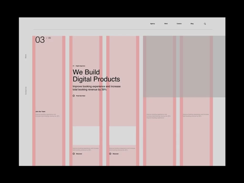
A grid-based layout involves dividing the content area into a grid and placing elements in a manner that produces a symmetrical balance. Unlike centred and radial designs, grid-based arrangements can be symmetrical or asymmetrical, depending on what the web designer needs to achieve their goal.
In symmetrical grids, elements are spaced evenly on both sides of a central axis, which results in a stable and balanced grid. In asymmetrical grids, the positioning of elements is more free-form while still conforming to the underlying structure of the grid.
Radial Layout
A radial layout involves placing elements surrounding a central point, creating a radial, spiral, or circular pattern. The arrangement of elements in this pattern allows the web designer to develop a sense of flow and movement that draws the viewer's vision toward the central point.
As mentioned, symmetrical balance in web design is typically utilised to generate a sense of order, professionalism, and stability. It can be particularly effective for industries that need to project an image of trustworthiness, like legal, e-commerce, and financial websites.
What is Asymmetrical Balance in Web Design?
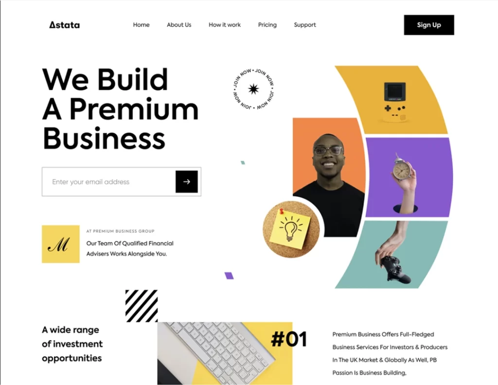
In direct contrast with symmetrical balance, asymmetrical balance is a design layout that does not have an equal balance between both sides of a central axis. Instead, an asymmetrical balance layout prioritises the visual weight of elements on both sides of the central axis.
That means the visual weight of elements on both sides of the central axis is balanced, but does not follow identical or mirrored methods. Essentially, asymmetrical balance involves the web designer using details of varying shapes, sizes, textures, and colours to generate visual tension and interest without removing the sense of balance from the overall web design.
Various techniques for achieving asymmetrical balance in web design include utilising contrasting elements, generating focal points, and the rule of thirds.
Utilising Contrasting Elements
Using contrasting elements, such as different shapes or colours, is one of the core techniques in asymmetrical balance layouts. This technique creates a balance between both sides of the web design through the visual weight of each side.
There are various ways in which contrasting elements can be utilised to attain asymmetrical balance. One excellent example is where a web designer uses a bold and large headline next to a smaller subheading. Another example is when a web designer places a brightly coloured button against a neutral background.
Generating a Focal Point
Generating a focal point involves placing one or more elements on a page that draws attention from the viewer and produces visual interest. The typical techniques for creating a focal point include using negative or white space to help draw attention and underline the most crucial elements on a page.
In some cases, web designers may even utilise directional cues like lines or arrows to lead the viewer's eyes toward the focal point. The goal of generating a focal point is to produce a design that is aesthetically pleasing, visually engaging, and effectively conveys the desired message to the viewer.
The Rule of Thirds
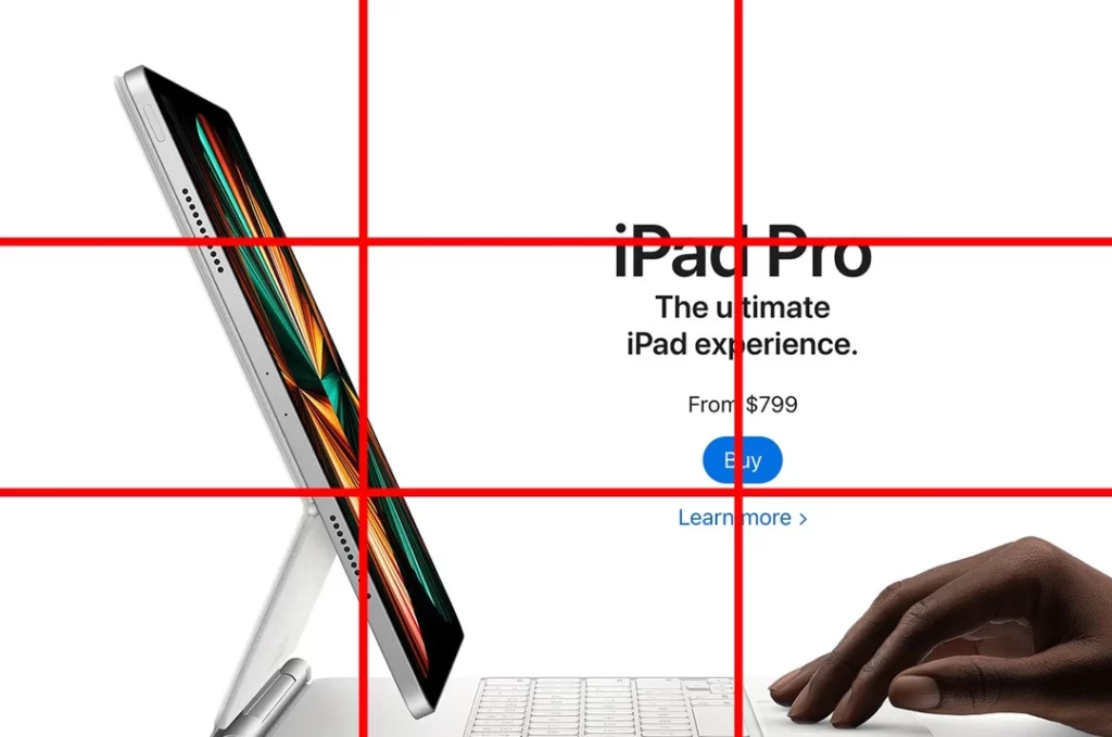
The rule of thirds refers to a composition technique in web design that involves dividing a design or image into thirds, both vertically and horizontally. This division's result is a grid containing nine boxes of equal size.
Utilising the rule of thirds to achieve asymmetrical balance entails placing the most crucial design elements at the grid intersection points. That creates a visual interest and natural balance in the overall design.
In web design, asymmetrical balance is typically utilised to create a sense of creativity, dynamism, and movement. Asymmetrical balance is effective for websites that wish to project an image of innovation or modernity.
Technology and design websites are perfect examples of websites that want to convey these messages in their web design. Additionally, asymmetrical balance can draw attention toward specific design elements or deliberately lead the viewer's eyes toward a particular piece of content.
Tools and Techniques for Achieving Balance
Designers utilise various tools to create balanced compositions effectively. Popular design software like Adobe XD and Figma includes features such as grids and smart guides to assist in aligning elements symmetrically or asymmetrically.
These tools provide flexibility, allowing experimentation with layout arrangements and spatial distribution. Using these features, designers can achieve visual harmony without compromising the creativity required for an engaging site.
Common Mistakes in Designing for Balance
Design pitfalls often occur when striving for balance. One frequent error is overloading one side of a layout, leading to a disproportionate visual weight.
Misjudging the size and scale of elements can also disrupt harmony. To mitigate these issues, designers should prioritise the focal points and regularly evaluate designs by stepping back to view the overall composition, ensuring each element contributes efficiently to a cohesive design.
Which is the Better Type of Balance?
At this point, you probably wonder which balance type is better — symmetrical or asymmetrical. If you ask any reliable web design expert, like Brain Box Labs, they will tell you that there is no superior balance type between symmetrical and asymmetrical.
That is because the effectiveness of either balance type depends on the design style, content, and website goals.
Symmetrical balance provides a sense of formality and order that might best suit websites that need a conservative and traditional brand image or identity.
In contrast, asymmetrical balance provides a sense of movement and dynamism that better fits websites requiring a more creative and modern brand image or identity.
Choosing between symmetrical and asymmetrical balance for web design ultimately depends on the preferences and requirements of a website and its target audience. Designers must consider a website's objectives, goals, visual style, and brand identity before deciding on balance and other design elements.

