21 Common Branding Mistakes & How to Avoid Them
I have stared at thousands of PDFs and listened to endless pitches. The pattern is always the same.
A business owner shows me a product that actually works, backed by a team that knows their stuff. Then, they show me their “brand”.
It is a tragedy.
They have treated their visual identity like a secondary school art project. The logo is a low-resolution JPEG. The messaging sounds like a generic robot. The colours vibrate on the screen.
Branding is not about “making things look pretty”. It is a financial instrument. It is the difference between being a commodity and being a premium choice.
If you get this wrong, you are not just hurting your aesthetic; you are increasing your Cost of Customer Acquisition (CAC) and lowering your retention rates.
Let us look at the wreckage. Here are the 21 most common branding mistakes we see at Inkbot Design, and exactly how you need to fix them.
- Establish clear branding guidelines to ensure consistency across all marketing materials, enhancing trust and recognition.
- Create a robust brand strategy by analysing competitors and defining measurable business goals for better positioning.
- Identify and engage your target audience effectively, tailoring branding to meet their needs and preferences.
What are Branding Mistakes?
Branding Mistakes are strategic or tactical errors in the creation, management, and communication of a company’s identity that disconnect the business from its target audience. These errors result in market confusion, diluted equity, and lost revenue.
Key Components of Branding Failure:
- Inconsistency: Varying visual or verbal cues across different touchpoints (e.g., website vs. packaging).
- Lack of Differentiation: Failing to articulate a Unique Selling Proposition (USP), blending in with competitors.
- Subjectivity: Decisions based on the founder’s personal taste rather than market research or customer psychology.
1: Strategic Failures (The Invisible Killers)
Before a single pixel is pushed, businesses often fail at the strategic level. These are the mistakes you cannot see, but you can feel in your bank account.
1. The “Founder’s Trap” (Subjective Design)
This is the most common issue in the SMB sector. The founder prefers blue, so the brand is blue. The founder has a fondness for intricate heraldry, so the logo features a crest. This is a fundamental misunderstanding of the task. You are not the customer. Your brand must appeal to the people paying the invoices, not the person signing the cheques.
The Fix: Remove your ego. Utilise customer personas and A/B testing to inform your aesthetic direction.
2. Skipping the Brand Identity Checklist
You would not build a house without a blueprint, yet companies launch without a brand guideline. Without a central document governing your fonts, tone, and spacing, your brand will degrade within six months. Different agencies will interpret your brand differently, leading to a “Frankenstein” identity.
The Fix: Develop a comprehensive guide. Start with our brand identity checklist to ensure you have the necessary foundations in place before scaling up.
3. Misunderstanding the Target Audience

If you try to appeal to everyone, you appeal to no one. A luxury watch brand does not use the same vernacular as a discount warehouse. When the visual language does not match the price point or the demographic’s expectations, trust evaporates instantly.
The Fix: Conduct deep ethnographic research. Know what your customers read, where they spend their time, and what they fear.
4. Lacking a Core Purpose (The “Why”)
Simon Sinek was right, even if the concept is now overused. If your brand exists solely “to make money,” consumers will smell the cynicism. Modern consumers, particularly Gen Z and Millennials, buy into values. If you stand for nothing, you fall for anything.
The Fix: Define your Mission, Vision, and Values. Make them actionable, not just plaque-worthy text in the lobby.
5. Ignoring Competitor Analysis
Copying competitors is theft; ignoring them is negligence. To differentiate yourself, you need to understand the visual landscape of your sector. If every law firm uses a serif font and navy blue, you gain a massive advantage by using a clean sans-serif and a distinctive accent colour.
The Fix: Map your competitors on a matrix (e.g., Classic vs. Modern, Exclusive vs. Accessible) and find the white space.
6. Inauthentic Tone of Voice

Using slang to sound “down with the kids” when you are a B2B insurance firm is painful to watch. Authenticity means aligning your voice with your reality. If you are a corporate entity, conduct yourself in a professional manner. If you are a challenger brand, be cheeky. Do not fake it.
The Fix: Create a “Verbal Identity” document. List words you always use and words you never use.
7. Complicating the Brand Name
If people cannot spell it, they cannot Google it. Startups often choose clever misspellings (dropping vowels, replacing ‘s’ with ‘z’) to secure a .com domain. This creates a permanent friction point. You spend the rest of your life saying, “It’s like ‘Flickr’, but without the ‘e’.”
The Fix: Prioritise legibility and phonetics over a short domain name. A .co.uk or .io is better than a confusing .com.
2: Visual Identity Mistakes (The Ugly Truth)
This is where the amateurism becomes visible. Bad design erodes trust faster than bad copy.
8. The “Kitchen Sink” Logo
A logo is an identifier, not a means of communication. It does not need to show what you do. Apple sells computers, not fruit. Nike sells shoes, not ticks. Trying to cram a wrench, a house, and a dollar sign into one logo creates a muddy, illegible mess.
The Fix: Simplify. Aim for a mark that can be drawn in the sand with a stick.
9. Relying on Trends
Remember when every logo looked like a hipster coffee shop badge with crossed arrows (X)? Or the “Web 2.0” glass reflection effect? Brands that follow trends look dated the moment the trend dies. Good design is timeless.
The Fix: Look at the history of design. Focus on fundamental principles of balance and form, rather than what is trending on Dribbble this week.
10. Poor Typography Choices
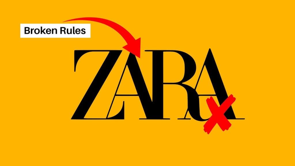
Typography carries emotion. Comic Sans screams amateur. Papyrus screams, “I gave up.” But subtler errors matter too—using a delicate hairline font for a billboard (readability failure) or a heavy slab serif for a feminine beauty brand (tonal clash).
The Fix: Limit your brand to two typefaces: one for display (headers) and one for body copy. Ensure they have high legibility.
11. Inconsistent Colour Usage
Colour increases brand recognition by up to 80%. But this only works if the colour is consistent. Coca-Cola Red is a specific hex code. If your website uses a different red to your brochures, you break the psychological link.
The Fix: Define your primary and secondary palette in RGB (screen), CMYK (print), and Pantone (spot colour). Stick to them religiously.
12. Using Stock Vectors for Logos
This is a legal minefield. If you buy a logo from a stock site for £20, you do not own the copyright. Five other companies could be using the exact same icon. You cannot trademark it. You are building your house on rented land.
The Fix: Hire a professional agency to create bespoke assets. View our Brand Identity Services for custom work that you actually own.
13. Neglecting White Space
Amateurs fear empty space. They try to fill every corner of a flyer or website with text and images. This leads to cognitive overload. White space (also known as negative space) is active; it guides the eye and conveys a sense of luxury and confidence.
The Fix: Adopt the mindset of “less is more.” If an element does not serve a function, remove it.
14. Creating Unscalable Assets
A logo must work on a favicon (16×16 pixels) and the side of a lorry. Complex illustrations with gradients and shadows become blurry at small sizes. If your logo relies on fine details, it fails the scalability test.
The Fix: Design in vector format (AI, EPS, SVG). Test your logo at a width of 20mm. If it blurs, simplify it.
3: Implementation & Management (The Silent Failures)
15. Inconsistent Social Media Presence
Your LinkedIn looks corporate. Your Instagram looks like a meme page. Your Twitter is a customer support channel. While the content changes, the visual wrapper and voice must remain consistent.
The Fix: Use templates. Create a master social media kit with pre-approved layouts.
16. Ignoring Internal Branding
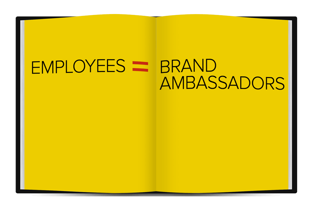
Your employees are your brand ambassadors. If they do not understand the brand values, they cannot communicate them to customers. A brand is not just external marketing; it is internal culture.
The Fix: Onboard new staff with the brand guidelines. Make them feel part of the mission.
17. Failing to Update Outdated Materials
There is nothing worse than handing out a business card with an old logo or having a website copyright footer that says “2019”. It signals neglect.
The Fix: Audit your touchpoints on an annual basis.
18. Changing for the Sake of Change
New Marketing Directors often want to “make their mark” by rebranding immediately. This is vanity, not strategy. Gap’s 2010 rebranding disaster is the prime example. They changed their iconic blue box to a generic gradient, faced a massive backlash, and reverted to the old logo within six days. Cost: millions.
The Fix: Rebrand only if there is a strategic shift in the business model or target audience.
19. Not Protecting the Brand (Trademarking)
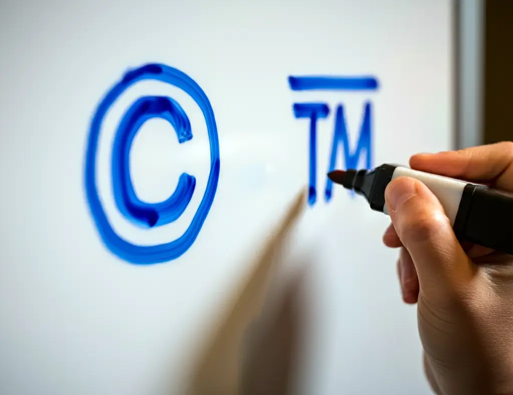
You build a reputation, only to have a competitor launch with a similar name and logo. If you haven’t registered your trademark, you have little recourse.
The Fix: Consult an IP lawyer. Register your wordmark and figurative mark in your primary territories.
20. Over-reliance on the Logo
Your logo is not your brand. Your brand is the sum of your logo, typography, photography style, customer service, and unboxing experience.
The Fix: Build a “Brand World”. Focus on textures, patterns, and sounds that support the logo.
21. Ignoring Customer Feedback
If customers consistently tell you your website is hard to use, or your packaging is difficult to open, that is a brand failure. Ignoring this data is arrogance.
The Fix: Listen. Adapt. Improve.
The Consultant’s Reality Check
I once audited a mid-sized logistics firm —a client—who was baffled as to why they were losing bids to a more expensive competitor.
I looked at their proposal document. It was written in Times New Roman, with pixelated screenshots, and three different versions of their logo pasted in headers. It looked like a scam invoice. Their competitor’s proposal was clean, branded, and authoritative.
The client said, “But our trucks are faster!”
I replied, “Nobody believes you, because your brand looks like you cut corners.”
Perception is reality. If you appear inexpensive, people assume your service is also inexpensive.
Data Insight: According to a study by Lucidpress, a consistent brand presentation increases revenue by 33%. Consistency is not just for designers; it is a revenue driver.
Comparison: The Amateur vs. The Pro
| Feature | The Wrong Way (Amateur) | The Right Way (Pro) |
| Logo Files | Saves as JPG/PNG. Pixellates when zoomed. | Uses Vector (SVG/EPS). Infinite scalability. |
| Typography | Uses system fonts (Arial, Calibri) or 5+ different fonts. | Uses a licensed type suite (Primary + Secondary). |
| Colour | Picks colours using a colour picker by eye. | Defines specific CMYK, RGB, and Pantone values. |
| Tone of Voice | Inconsistent. Sometimes formal, sometimes slang. | codified voice guidelines tailored to the persona. |
| Strategy | “I like this logo.” (Subjective) | “This logo appeals to our Persona X.” (Objective) |
The State of Branding in 2026: The AI Trap
We are now seeing a flood of “AI-generated logos”. For £10, an algorithm gives you a generic icon and a font.
Do not do this.
In 2026, the market is flooded with synthetic, generic content. The “Unique” attribute of a brand has never been more valuable. AI tools (like Midjourney) are excellent for mood boarding and concept exploration, but they cannot legally trademark the output in many jurisdictions (including the US and parts of the EU).
If you build your brand on an AI-generated image that you cannot own, you are building on sand. Use AI to assist, not to replace the strategic thinking of a human designer.
The Verdict
Branding mistakes are expensive. They cost you in lost leads, confused customers, and eventually, a full rebrand to fix the mess.
You do not need to be Apple or Nike to get this right. You simply need discipline, consistency, and a willingness to prioritise the customer’s perception over your own personal preferences.
Take a hard look at your current setup. Are you guilty of the “Kitchen Sink” logo? Is your tone of voice schizophrenic?
Fix it now, before the market fixes it for you by ignoring you.
Ready to stop making mistakes and start building an empire?
Explore our branding services or request a quote to receive a professional evaluation of your current identity.
Frequently Asked Questions (FAQ)
What is the single biggest branding mistake small businesses make?
The most damaging mistake is “inconsistency.” When a business uses different logos, fonts, or tones across its website, social media, and packaging, it erodes customer trust. A consistent brand presentation can increase revenue by up to 33%.
Why is using a stock logo a bad idea?
Stock logos are sold to multiple people. You cannot trademark a non-exclusive image, meaning a competitor could legally use the exact same logo as you. This makes it impossible to protect your brand identity or build unique equity.
How often should a company rebrand?
Rebranding should be rare. You should only rebrand if there is a fundamental change in your business strategy, a merger, or if your current brand is actively damaging your reputation. Ideally, refresh your assets every 5-7 years, while maintaining a stable core identity.
Can I design my own logo to save money?
You can, but it is risky. Professional designers understand vector scalability, colour theory, and print production nuances that amateurs miss. A poor DIY logo often costs more in the long run because it has to be redone when it fails to work on merchandise or signage.
What is the difference between a brand and a logo?
A logo is a graphic symbol. A brand is the emotional connection between the company and its customers. It encompasses the logo, as well as the tone of voice, customer service, values, and the overall experience. The logo is just the “face” of the brand.
How do I know if my brand is failing?
Signs of failure include: customers confusing you with competitors, high cost of acquisition, low customer retention, or feedback that your marketing materials look “unprofessional.” A brand audit can help identify these specific gaps.
Why is typography so important in branding?
Typography dictates legibility and mood. Using the wrong font can make your brand appear cheap or amateurish. It also affects accessibility; if your customers cannot easily read your name or offer, they will move on.
What file formats should my logo be in?
You need a Vector file (AI, EPS, or SVG) for printing and scalability—this is the master file. You also need raster files (such as PNG and JPG) for use on the web and social media. Never use a JPG for a large print banner.
Does colour psychology actually work?
Yes. Colours evoke subconscious emotional responses. Blue implies trust and security (banks), red implies urgency and hunger (fast food), and green implies health and growth (Whole Foods). Choosing the wrong colour can send the wrong signal to your audience.
How much does a professional brand identity cost?
Costs vary wildly. A freelancer might charge £1,000, while a top agency might charge £50,000+. At Inkbot Design, we offer tailored packages for SMBs. The investment should be proportional to the value you expect the brand to generate over its lifetime.
