Wordmark vs Logomark: Choosing an Identity Model
Choosing between a wordmark vs logomark is one of the most consequential technical decisions a founder makes.
Get it wrong, and you are essentially paying for “invisible branding.”
Your visual identity should be a shortcut to trust, not a puzzle for your audience to solve.
- Wordmarks provide immediate name recognition, reducing cognitive load and boosting trust for new or B2B brands.
- Logomarks excel at symbolic association and tiny sizes but need heavy marketing to build meaning and AI recognition.
- Combination marks are practical: wordmark-led for early years, add a logomark for favicons and app icons later.
- Technical concerns matter: optimise SVG size, anchor points, WCAG contrast and AI readability for performance and accessibility.
What is a Wordmark vs Logomark?
A wordmark (or logotype) is a distinct, text-only typographic treatment of a brand’s name. A logomark is an identifying symbol or graphic icon that represents the brand without relying on text.
While often used together in a “combination mark,” the choice of which element leads the identity model dictates how a brand is perceived and remembered.
Key Components of Identity Models
- Semantic Clarity: How quickly the viewer understands who the brand is (Highest in wordmarks).
- Symbolic Association: The ability to evoke abstract feelings or metaphors (Highest in logomarks).
- Technical Versatility: How the mark performs across digital and physical mediums, from favicons to building signage.
The Cognitive Science of Recognition
The human brain is wired to seek the path of least resistance, a concept known as Cognitive Fluency. When a user encounters a brand, the brain must perform “work” to decode the visual stimulus.
In the wordmark vs logomark debate, the wordmark has a distinct biological advantage: it bypasses the “translation” phase.
Research into the Bouba/Kiki Effect—a non-arbitrary mapping between speech sounds and the visual shape of objects—suggests that the physical curves or angles of your letters evoke specific subconscious emotions before the reader even “reads” the word.
For instance, a wordmark using a Humanist Sans-serif font feels approachable and organic, while a Geometric Sans-serif like Futura conveys precision and cold efficiency.
According to studies by the Ehrenberg-Bass Institute, “Distinctive Brand Assets” are most effective when they are easily linked to the brand name in long-term memory.
A logomark (the symbol) requires an “associative bridge.” The brain sees the symbol, asks “What is this?”, and then searches for the name.
A wordmark combines the symbol and the name. This is why, for new entrants in 2026, a wordmark-led identity reduces the “cognitive load” on potential customers, enabling faster trust acquisition.
The Physics of the Wordmark: Why Text Often Wins
A wordmark is the most direct route to brand recognition.
When you use a wordmark, you are not asking the viewer to translate a symbol into a name; you are giving them the name directly, styled to convey personality.
Typography as Architecture
In a wordmark, the “design” happens in the microscopic details of the letterforms.
We look at kerning (the space between individual letters), x-height (the height of lowercase letters), and apertures (the openings in letters like ‘c’ or ‘e’). These aren’t just aesthetic choices.
According to research by Nielsen Norman Group, visual clarity directly affects how users process information.
A wordmark with poor kerning or overly tight tracking fails at small sizes. For example, the Google wordmark redesign in 2015 wasn’t just about “looking modern.”
It was a technical shift from a serif font to a custom geometric sans-serif (Product Sans) to ensure legibility on low-bandwidth mobile devices and tiny smartwatch screens.
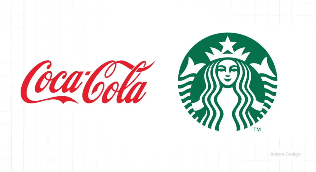
Real-World Case: Coca-Cola
Coca-Cola uses a wordmark that has remained largely unchanged since the late 19th century. It is a “Script” logotype.
The technical brilliance here is that the wordmark is so distinct that even if you see a fragment of the “C” on a crushed can, your brain completes the image.
This is high logo design psychology at work—creating “Distinctive Brand Assets” that do not require an icon to function.
The Logomark: The Pursuit of Visual Purity
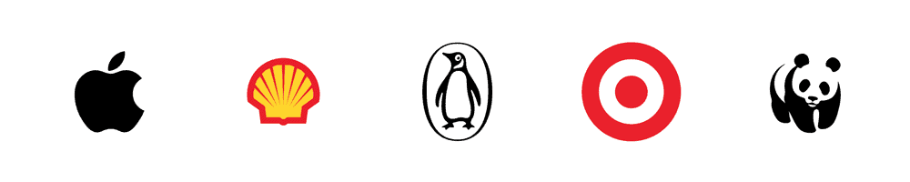
A logomark is an icon. It is a distilled visual essence. Think of the Nike Swoosh, the Apple, or the Twitter (now X) bird.
The goal of a logomark is to achieve “symbolic status,” in which the icon alone carries the full weight of the brand’s equity.
The Problem with Symbols for Startups
The mistake I see most often in my logo design and branding consultancy is a startup trying to lead with a standalone logomark.
Here is the technical reality: A symbol has no inherent meaning. The Apple logo only means “innovation” because Apple spent billions of dollars associating that fruit with high-end tech.
If you are a plumber in Birmingham or a SaaS firm in Manchester, your symbol means nothing until you’ve built the association.
Data from the Ehrenberg-Bass Institute shows that “meaningless” symbols are much harder for the human brain to encode into long-term memory than a well-executed wordmark.
You are adding a layer of friction. The user sees the symbol, wonders what it is, and then has to look for the text to find the brand name.
Technical Constraint: The 16px Challenge
Logomarks have a technical advantage in tiny spaces. A favicon (the icon in your browser tab) is usually 16×16 pixels.
A wordmark like “Inkbot Design” is impossible to read at that size. This is where a logomark—or a simplified “shorthand” version—becomes a technical necessity for responsive logo design.
Wordmark vs Logomark: The Strategic Comparison
| Feature | Wordmark (Logotype) | Logomark (Symbol) |
| Immediate Recognition | High. The name is the logo. | Low. Requires education/marketing spend. |
| Clarity at Small Sizes | Moderate to Low (Depends on length). | High (If designed for simplicity). |
| Trademark Strength | Stronger (Harder to “accidentally” copy). | Weaker (Abstract shapes often overlap). |
| Cultural Portability | Low (Language dependent). | High (Universal visual language). |
| Scalability (Cost) | Budget-friendly (Built-in recognition). | Expensive (Requires brand-building). |
The 2026 Identity Model Selector
Select the scenario that best matches your business to see the recommended model.
Wordmark (Logotype)
Why this wins: As a new entrant or B2B expert, your biggest hurdle is “Translation.” A symbol requires the user to learn what it means. A wordmark gives them the name instantly.
In 2026, this is the most mathematically efficient model for semantic search and AI retrieval. It ensures your brand name is indexed immediately without relying on “alt text” descriptions.
2026 Stress Test:
- AI Readability: 99% (Native OCR recognition).
- File Size: Extremely Light (< 2KB SVG).
- Constraint: Ensure high contrast (4.5:1) for WCAG compliance.
Combination Mark (Wordmark Led)
Why this wins: For digital products, apps, or SaaS platforms, you face the “16px Challenge.” You need a full wordmark for the website header to build trust, but you also need a distinct symbol for the app icon and favicon.
Strategy: Lead with the Wordmark for the first 3 years. Use the symbol as a secondary “accent” until your market share reaches critical mass.
2026 Stress Test:
- Versatility: High (Scale from Apple Watch to Billboard).
- Risk: Don’t let the symbol overpower the name.
- Tech: Use JSON-LD Schema to link the symbol to the text.
Abstract Logomark (Caution)
Why this is risky: Pure symbols are reserved for brands with massive equity or specific “Tribal” status (like luxury fashion or streetwear). Without the name, you are essentially invisible to new customers and search engines.
Exception: If your name is exceptionally long, use a Monogram (Lettermark) rather than an abstract shape. This retains some semantic value.
2026 Stress Test:
- Marketing Cost: High (Requires heavy spend to build meaning).
- AI Vision: Low (40-70% recognition without training).
- Advice: Pair with a strong typographic system.
Debunking the Myth: “Symbols are More Professional”
There is a persistent myth in the SMB world that you aren’t a “real” company until you have a symbol. This is rubbish.
Some of the most valuable companies in the world operate almost exclusively with wordmarks: Visa, Google, Coca-Cola, Prada, Casper, and Sony.
In fact, the IPA (Institute of Practitioners in Advertising) has noted that “fluency”—the ease with which a brain processes a brand—is a primary driver of long-term growth.
A wordmark often provides higher fluency for new brands because it removes the “decoding” step.
I once audited a client in the B2B tech space who insisted on a complex, 3D-gradient logomark. When we ran a simple eye-tracking test, 70% of participants spent their time trying to determine whether the icon was a cloud or a brain, completely ignoring the company name.
We stripped the icon, moved to a bold, custom-lettered wordmark, and their lead conversion increased because the brand felt more “established” and “direct.”
The “Middle Ground”: The Combination Mark
Most brands don’t actually choose one or the other; they use a combination mark. This involves a logomark and a wordmark working in tandem.
However, the Identity Model refers to which one is the “Hero.”
- Symbol-Led: The symbol is the primary identifier (e.g., Mastercard).
- Wordmark-Led: The text is the primary identifier, and the icon is a secondary accent (e.g., Amazon).
If you are currently evaluating logo options, I recommend a wordmark-led approach for the first 3-5 years of your business.
The Technical Physics of a Modern Identity
In 2026, a logo is no longer a static image; it is code. The efficiency of that code directly impacts your digital footprint.
As search engines and AI assistants prioritise Core Web Vitals, the “weight” of your identity model becomes a performance factor.
SVG Path Optimisation and LCP.
A wordmark typically consists of fewer “anchor points” than a complex logomark. When you export an identity as an SVG (Scalable Vector Graphics), every curve is a line of code.
A complex, illustrative logomark can balloon your header file size, negatively affecting Largest Contentful Paint (LCP).
- Benchmark: A professional wordmark should ideally stay under 2KB.
- Benchmark: An abstract logomark should aim for fewer than 300 anchor points to ensure instant rendering on 5G and satellite-link mobile devices.
Accessibility and WCAG 2.2 Standards.
Choosing between a wordmark and a logomark also has significant implications for Digital Accessibility. Under WCAG 2.2, your identity must be perceivable to users with visual impairments.
- Wordmarks: Benefit from “Alt-text” that matches the visual exactly. They are also more compatible with screen readers if the text is embedded correctly as a <text> element within the SVG rather than being converted to “outlines.”
- Logomarks: Require a more descriptive “aria-label” (e.g., “Apple Logo” instead of just “Logo”).
If you choose a wordmark, the Contrast Ratio between the letterforms and the background must be at least 4.5:1 for small text to ensure legibility for the 2.2 billion people globally with vision impairment.
The State of Identity Models in 2026
As we move deeper into 2026, the “Generative UI” trend is changing how logos function. We are seeing interfaces that adapt in real-time to the user’s context.
AI and Machine Vision
Logos are no longer just for humans; they are for machines. Google’s Vision AI and other LLM-based tools need to “read” your brand.
A wordmark is significantly easier for an AI to scrape and categorise than an abstract symbol.
If you want your brand to show up accurately in “Visual Search” or AI-generated shopping assistants, your wordmark needs to be technically robust.
Variable Fonts
The rise of variable fonts has revolutionised the wordmark. We can now create wordmarks that “breathe”—adjusting their weight and width based on the screen size or even the user’s ambient light levels.
This level of brand identity sophistication was impossible five years ago.
Designing for the “Machine Eye”: AI Vision Compatibility
By 2026, your logo will be viewed by machines as often as by humans.
Google Vision AI, Pinterest Lens, and the visual browsing capabilities of OpenAI’s GPT-5 models use “OCR” (Optical Character Recognition) and “Entity Linking” to categorise brands.
A wordmark is inherently “machine-readable.” When an AI scraper encounters the Sony wordmark, it immediately identifies the text “SONY” and maps it to the corporate entity.
An abstract logomark—like the three stripes of Adidas or the swoosh of Nike—requires the AI to have a pre-existing training set to recognise the shape as a brand.
For 2026 startups, an “Abstract Identity” is a risk. If the AI cannot “read” your symbol, your brand may fail to surface in visual shopping results or “Search by Image” queries.
To bridge this gap, many modern brands are adopting Hybrid Meta-tagging, in which the SVG code for a logomark includes JSON-LD Schema that identifies the symbol as part of a specific organisation.
However, the wordmark remains the “Gold Standard” for ensuring your brand name is indexed accurately across the Semantic Web.
The “Silent Rebrand” Failure
In my fieldwork, I often see companies attempting a “Silent Rebrand.” This is when a company prematurely moves from a wordmark to a logomark.
Gap tried this in 2010. They swapped their iconic condensed serif wordmark for a generic sans-serif with a little blue square (a logomark element). The backlash was so severe that they reverted to the old logo within six days.
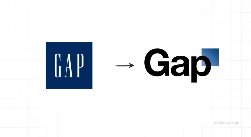
Why? Because they destroyed their “Distinctive Brand Assets.” They traded their unique typographic “thumbprint” for a generic symbol that had no equity.
Before you consider a rebrand or logo redesign, you must audit your current equity.
If people recognise your name but not your icon, you have a wordmark-led brand. Don’t throw that away because you’re bored with it.
Common Logo Design Mistakes in Choosing a Model
- The “Kitchen Sink” Approach: Trying to make a logomark that explains everything the company does. If you sell shoes, your logo doesn’t need a shoe in it (Nike doesn’t).
- Choosing Trends over Tech: Using gradients or “glow” effects that look great on a Mac Studio display but disappear when printed on a cardboard box. Check the logo design trends of 2026, but prioritise utility.
- Ignoring File Formats: Not having a specific version of your wordmark for dark backgrounds or vertical layouts. You need a full library of logo file formats.
The 2026 Identity Model Decision Matrix
Use this table to determine which model aligns with your strategic goals for the next five years.
| Feature | Wordmark (Logotype) | Logomark (Symbol) | Combination Mark (Hybrid) |
| Primary Goal | Immediate Name Recall | Emotional/Abstract Association | Versatility across all channels |
| Typical User | B2B, SaaS, Professional Services | Fashion, Tech Giants, FMCG | Retail, E-commerce, Apps |
| Mobile UX | Challenging for long names | Excellent (Icon only) | Dynamic (Responsive) |
| Trademark Cost | Lower (Text is specific) | Higher (Shapes are generic) | Moderate |
| AI Readability | 99% (Native OCR) | 40–70% (Requires training) | 90% (If text is present) |
| Ideal Persona | “The Direct Expert” | “The Visionary Leader” | “The Accessible Friend” |
| Performance | High (Lightweight SVG) | Variable (Complex paths) | Moderate |
The Verdict: Which Identity Model Should You Choose?
The decision between a wordmark vs logomark comes down to three factors: your budget, your business age, and your technical application.
- Choose a Wordmark if: You are a new brand, a B2B firm, or a consultant. You need immediate name recognition and high semantic clarity without a million-pound ad spend.
- Choose a Logomark if: You have a very long company name that is hard to read at small sizes, or if you are in a purely visual industry (like fashion or entertainment) where a symbol can become a “badge” of status.
- Choose a Combination Mark if: You want the best of both worlds—the clarity of the wordmark and the versatility of an icon for social media avatars and app icons.
If you are unsure, start with the name. A brand is a promise, and a promise is usually made in words.
The Founder’s Identity Checklist
Before approving your final design, ensure it passes these five “2026 stress tests”:
- The 16px Favicon Test: If you use a wordmark, do you have a 1:1 “shorthand” version (e.g., just the first letter) for browser tabs and app icons?
- The AI Vision Scrape: If you run your logo through Google Lens, does it correctly identify your company name?
- The Path Audit: Does your SVG master file have fewer than 500 anchor points?
- The Greyscale Test: Does the mark retain its meaning and “punch” when the colour is completely removed?
- The Legal Clearway: Has your solicitor or trademark agent performed a “Likelihood of Confusion” search on the WIPO database?
Ready to stop guessing and start building a brand that actually scales?
Explore our logo design process to see how we build identity models that win.
Or, if you’re ready to fix your branding today, request a quote and let’s get to work.
FAQ: Wordmark vs Logomark
Is a “Lettermark” different from a Wordmark?
Yes. A wordmark uses the full company name (e.g., eBay), while a lettermark (or monogram) uses initials (e.g., HBO or IBM). Lettermarks are excellent for companies with long, clunky names, but suffer from the same “meaningless” problem as symbols until they are established.
How do variable fonts impact wordmarks in 2026?
Variable Fonts allow a single font file to contain multiple variations of weight, width, and slant. In 2026, Wordmark will use this technology to be “Responsive.” On a large desktop, the wordmark may be bold and wide; on a mobile device, the same file automatically “thins” to maintain legibility.
Can a wordmark be “Too Simple”?
Rarely. In the age of digital noise, “Simple” equals “Fast.” However, a wordmark that uses a standard system font (like Arial or Helvetica) without any customisation (kerning, custom ligatures) risks failing the “Distinctiveness” test required for trademark protection by the UK Intellectual Property Office.
When is the right time to transition from a wordmark to a standalone logomark?
The “Nike Path” transition should occur only after your brand awareness exceeds 70% in your target market. If you remove your name and your customers still recognise you, you have earned the right to use a standalone symbol. Doing it too early is “Branding Suicide.”
How many colours should my logo have to achieve maximum efficiency in 2026?
For digital performance and accessibility, aim for a “Two-Tone Maximum” rule. Modern UI design often requires logos to work in “Monochrome” (pure black or white) for dark mode. If your logomark relies on a complex 12-colour gradient, it will fail in many automated AI interfaces.
Does the “Physics of Shape” affect B2B vs B2C choices?
Absolutely. Angular shapes (triangles, sharp serifs) in a wordmark denote stability, logic, and “The Expert.” Curved shapes (circles, rounded sans-serifs) denote community, comfort, and “The Peer.” Most B2B firms gravitate toward angular wordmarks to project authority.
Why did Gap’s rebrand fail?
Gap’s 2010 rebrand failed because it abandoned a high-equity wordmark for a generic one with a meaningless logomark element. It confused customers and stripped the brand of its established visual personality.
What is the best file format for a logomark?
The master format should always be a Vector (.SVG or .AI). For general use, high-resolution .PNGs (with transparency) are preferred for web, while .EPS or .PDF are used for professional printing.
Can a logomark exist without a name?
Only once a brand has achieved massive “Brand Equity.” Companies like Starbucks and Mastercard removed their names from their logos only after decades of global recognition. Startups should never do this.
How do I choose between a serif or sans-serif wordmark?
Serifs (with small feet) often feel traditional, reliable, or high-end (e.g., Rolex). Sans-serifs feel modern, clean, and tech-focused (e.g., Airbnb). The choice should align with your brand’s core values and target audience.
What is a “Responsive Logo”?
A responsive logo is an identity system that adapts to screen size. This might mean using a full wordmark on a desktop, a shortened version on a tablet, and just a logomark on a smartphone.
Does the colour of a logomark matter?
Absolutely. Colour accounts for up to 80% of brand recognition. However, a good wordmark or logomark must first work in pure black and white to ensure the “form” is technically sound.


