Supercharge Website Performance Without Costly Rebuilds
In this article, I will share some powerful, battle-tested strategies that top brands use to optimise their images and supercharge their website performance.
Whether you’re an eCommerce store, a SaaS provider, or a local brick-and-mortar with an online presence, these tactics can help you deliver a silky-smooth user experience, boost your search engine rankings, and send your profits through the roof.
This stuff works like a charm because I’ve seen it first-hand through Inkbot Design and entrepreneurial ventures.
When I revamped the Inkbot website a few months back, we were able to shave nearly a full second off our page load times – and that directly translated to a 12% increase in conversions.
So if your website is as slow as a herd of turtles carrying anvils, or if your images make your pages look like they’ve been hit by a freight train, listen up.
I’m about to share some game-changing strategies that’ll have your customers clicking “add to cart” faster than you can say “checkout”.
🔰 TL;DR: Having a lightning-fast and visually stunning website is no longer a nice-to-have – it’s an absolute must. The old saying goes, “You only have one chance to make a first impression.” And when it comes to your online presence, that first impression can make or break your business.
- Optimise Images: Reduce file sizes and implement responsive design to enhance website load times and user experience.
- Mobile-First Approach: Prioritise mobile experience, ensuring pages load quickly and images are optimised for smaller screens.
- Use Next-Gen Formats: Leverage AVIF and WebP for improved performance and image quality without extensive website overhauls.
- Automate Processes: Allow machines to manage image optimisation, reducing manual effort and ensuring a consistent user experience.
- Impact on Profits: Implementing these strategies can elevate conversion rates and enhance overall business performance.
Trim the Fat: Optimise Your Images for Blazing-Fast Load Times
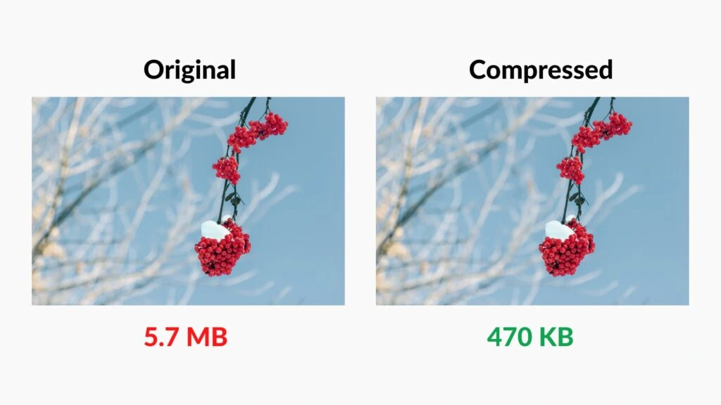
One of the biggest culprits when it comes to slow website performance? Images, my friend. Studies show that images can make up 60-80% of a webpage’s file size. 💥 That’s a ton of data that your users have to download, and if it’s not optimised correctly, it can grind your site to a crawl.
But fear not because the brands we’ll learn from today have cracked the code on lightning-fast image optimisation.
Take Shinola, for example – an American lifestyle brand based in Detroit. By implementing some strategic tweaks, they achieved a 50% reduction in page weight across their entire website. 🤯
That’s a massive improvement, translating to a 10-15% decrease in time-to-render for most of their images.
The key? They focused on two critical areas:
- Smaller Image Sizes: By reducing the file size of their images without sacrificing quality, Shinola could dramatically cut down on the data that needed to be downloaded. This improved load times and meant lower data usage for mobile users – a massive win in today’s smartphone-centric world.
- Responsive Images: Shinola tailored its images to various device types and screen resolutions, ensuring mobile users weren’t bombarded with unnecessarily large files. This responsive approach is crucial, as more than half of all web traffic now comes from mobile devices.
So, if your website currently weighs as much as a rhinoceros on a see-saw, take a leaf out of Shinola’s book and start optimising those images. Your customers (and your bottom line) will thank you for it.
The Mobile-First Mindset: Delivering a Silky-Smooth Experience on the Go
Speaking of mobile, having a “mobile-friendly” website is no longer enough. Today, you need to think “mobile-first” – and the brands we’re highlighting are leading the charge.
Take Zadig&Voltaire, a French luxury fashion brand, for example. By prioritising mobile optimisation, they improved their page speed by an impressive 66%. 🤯
How’d they do it? Using responsive images tailored to various device types and screen resolutions ensured that smartphone users weren’t stuck with unnecessarily large files.
I know what you might think: “My website is already ‘mobile-friendly’. Isn’t that good enough?”
Nope, sorry to burst your bubble, but “mobile-friendly” just ain’t going to cut it these days. Studies show that over half of consumers say they’ll reduce or stop spending at a business after a poor mobile experience. 😲 Yikes, right?
So, to keep your customers happy and your profits rolling in, you need to take a long, hard look at your mobile experience. Are your images optimised for smaller screens? Are your pages loading lightning-fast, even on 4G networks? If not, it’s time to get to work.
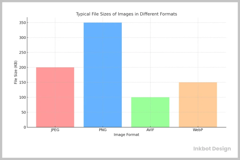
The Next-Gen Advantage: Harnessing the Power of AVIF and WebP
You might think, “Okay, I get it – optimise my images and focus on mobile. But what else can I do to turbocharge my website’s performance?”
Well, my friends, let me introduce you to the world of next-generation image formats: AVIF and WebP. 🚀
These bad boys are the secret weapons that top-tier brands are using to get a serious edge on the competition. Take Nikkei, one of the world’s largest financial news websites. By converting their images to WebP, they reduced file sizes by 38%. 💥 That’s a massive improvement, translating directly to faster load times across their site.
But the benefits don’t stop there. These next-gen formats also offer superior image quality compared to traditional options like JPEG and PNG. So, you can have your cake and eat it too – smaller file sizes without sacrificing that crisp, high-resolution look your customers crave.
I know what you might think: “But won’t that mean I have to rebuild my entire website from scratch?”
Nope, not at all! The beauty of AVIF and WebP is that they’re relatively easy to implement, and most modern browsers support them out of the box. So, you can start reaping the rewards without investing in a significant overhaul.
Automate for Efficiency: Let the Machines Do the Heavy Lifting
Let’s say you’ve got the image optimisation thing down pat. You’re using next-gen formats, your pages are lightning-fast, and your customers are happier than a kid in a candy store. But what about that ever-growing product catalogue? Or those constantly changing device and browser combinations? 🤯
Well, my friends, that’s where automation comes in. And the brands we’re highlighting today also lead the charge on this front.
Take Queensmith, a UK-based premium jewellery company, for example. They’ve got a website that serves around 180,000 images, with 25 million image requests monthly. 🤯 That’s too much visual content to manage, and it was becoming a major headache for their content team.
Before they automated their process, the Queensmith team had to manually crop and resize each image, creating dozens of variants to ensure a responsive experience across all devices and browsers. Talk about a time-suck.
But then they had a lightbulb moment: “Why don’t we let the machines do the heavy lifting?” 💡 By automating some time-consuming functions, Queensmith freed up its content team to focus on more strategic priorities. Instead of doing the tedious image cropping and resizing, they could now create a single high-resolution version for each image and let the automation handle the rest.
The result? A seamless, responsive experience for their customers, without the endless hours of manual effort. Now, that’s what I call a win-win.
Wrapping it Up: Putting it All Together for Explosive Growth.
Alright, let’s recap what we’ve learned from these top-tier brands:
- Trim the Fat: Optimise your images for faster load times by reducing file sizes and using responsive design.
- Mobile-First Mindset: Prioritise the mobile experience, ensuring your pages load lightning-fast and your images are tailored for smaller screens.
- Next-Gen Advantage: Leverage the power of AVIF and WebP to further improve performance without sacrificing quality.
- Automate for Efficiency: Let the machines do the heavy lifting regarding image management and responsiveness.
By implementing these strategies, you can create a website that’s fast, visually stunning and delivers a world-class user experience – all of which can directly impact your bottom line.
But don’t just take my word for it. 😉 Studies show that 57% of internet users say they won’t recommend a business with a poorly designed website on mobile. And with over half of all web traffic now coming from smartphones, you can’t afford to ignore this critical aspect of your online presence.
So, what are you waiting for? It’s time to put on your optimisation hat and start supercharging your website. Who knows, you’ll even be the next Shinola or Queensmith – crushing the competition and raking in the profits. 💰
And if you need a little help along the way, you know where to find me. 😉 The team at Inkbot Design is always ready to lend a hand (or a few dozen pixels) to businesses looking to take their online presence to new heights.
So, let’s get to work, shall we? The path to explosive growth starts right here.
FAQs
How much of a website’s file size typically comprises images?
Studies show that images can account for 60-70% of a webpage’s total file size.
What are the key benefits of optimising images for website performance?
Optimised images can lead to:
Faster load times
Lower data usage for mobile users
Improved SEO rankings
Higher conversion rates
What are some next-generation image formats that can improve website performance?
AVIF and WebP are two powerful next-gen image formats that offer superior compression and quality compared to traditional formats like JPEG and PNG.
How much of a performance boost can next-gen image formats provide?
Brands like Nikkei have reported up to 38% file size reductions by converting their images to WebP.
What are the critical steps to implementing a mobile-first approach to website design?
Some key steps include:
Using responsive images tailored to different device types and screen resolutions
Ensuring fast load times, even on slower mobile networks
Prioritising the mobile experience during the design and development process
How can automation help with image management and optimisation?
Automation can help by:
Dynamically resizing and reformatting images for different user environments
Reducing the manual effort required to maintain an extensive, constantly changing product catalogue
Ensuring a consistent, responsive experience across all devices and browsers
What kind of business benefits can website performance optimisation provide?
Improved website performance can lead to the following:
Higher conversion rates
Better search engine rankings
Increased customer satisfaction and loyalty
Lower data usage and hosting costs
Why is it essential to have a mobile-first mindset when designing websites today?
With around 60% of web traffic coming from mobile devices, a mobile-first approach is essential to delivering a seamless user experience and staying competitive.
How can businesses get started with implementing image optimisation strategies?
Key steps include:
Conducting a website performance audit to identify areas for improvement
Experimenting with next-gen image formats like AVIF and WebP
Automating image resizing and reformatting processes
Continuously monitoring and optimising the mobile experience
What resources or tools are available to help businesses optimise websites?
Some popular tools and resources include:
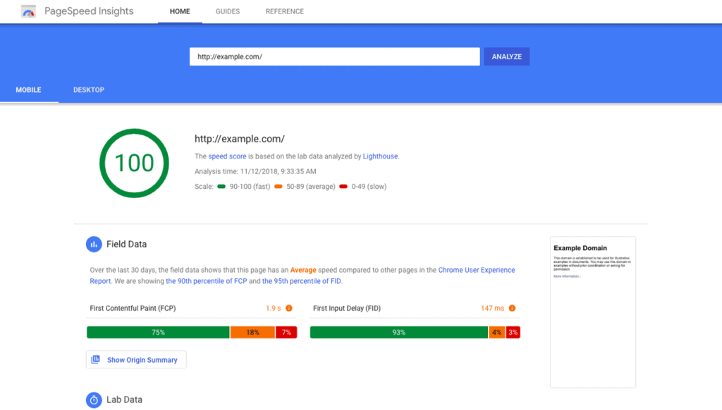
Image optimisation services like Imgix, Cloudinary, or Fastly
Website performance testing tools like PageSpeed Insights or Lighthouse
Responsive design frameworks like Bootstrap or Tailwind CSS
Image compression and conversion tools like Squoosh or Convertio