Vogue Logo History: The Evolution of an Icon
The Vogue logo is the ultimate rebuttal to the “move fast and break things” crowd.
But here is the uncomfortable truth: most people—even professional designers—actually have no idea how the Vogue logo evolved. They think it fell from the sky in its current form.
If you are an entrepreneur or an SMB owner, ignoring the technical history of this mark is a financial mistake. You are likely overcomplicating your visual identity and losing brand equity in the process.
Consistency isn’t boring; it’s profitable.
Research from McKinsey & Company proves that companies with consistent brand delivery are 20% more likely to see high growth.
- Vogue’s masthead stabilised in 1955 with a customised Didot, turning the wordmark into a lasting symbol of luxury and authority.
- Tight kerning and extreme Didone contrast create an elite, cohesive shape that signals heritage and visual dominance.
- Responsive technical evolution: optical sizing and variable fonts preserve hairline serifs across high‑density and low‑res screens.
What is the Vogue Logo?
The Vogue logo is a typographic wordmark based on the Didot typeface style, characterised by high contrast between thick and thin strokes, a vertical axis, and unbracketed serifs.
Since 1955, it has served as the fixed masthead for the world’s most influential fashion publication.
Key Components:
- The Didot Font: A neoclassical typeface that communicates luxury and technical precision.
- The Kerning: Specific, tight spacing that allows the letters to overlap slightly in certain contexts.
- The Hierarchy: A design that permits the masthead to sit behind the subject of the cover photo, signifying brand dominance.
The Illustrative Chaos of the Early Years (1892–1909)
Vogue didn’t start as a “fashion bible.” It started as a weekly social gazette for the New York elite. In this era, the logo wasn’t a logo; it was a masthead that changed at the illustrator’s whim.
Before Condé Nast bought the publication in 1909, the “logo” was often surrounded by ornate Victorian flourishes, cherubs, and hand-drawn script.

There was no brand consistency because the concept of a “brand” in the modern sense hadn’t yet existed. The masthead was an extension of the cover art, not a distinct asset.
This is a mistake I see SMBs make today. They let their social media graphics dictate the appearance of their logo.
If your logo changes its personality to fit every post, you don’t have a logo—you have an illustration.
You are failing to build long-term memory encoding, a concept the IPA (Institute of Practitioners in Advertising) identifies as essential for brand fame.
The Condé Nast Revolution and the Rise of Art Direction
When Condé Montrose Nast took over, he brought a level of rigour the publishing world hadn’t seen. He understood that to attract high-end advertisers, the magazine itself had to look like a luxury product.
During the 1920s and 30s, Vogue experimented with Art Deco typography. This was the era of Dr Mehemed Fehmy Agha, the first real “Art Director.”

Agha was a pioneer. He stripped away the Victorian clutter and introduced Sans-serif fonts like Futura to the inner pages. However, the masthead remained a moving target.
It was during this time that the logo began to interact with the era’s famous logos, competing for eye share on the newsstand. Agha’s genius was in the “white space.” He realised that for the Vogue logo to look expensive, it needed some breathing room.
The Technical Shift: From Raster to Vector Mindsets
While they didn’t have vector vs raster images in 1930, the principle was the same. Agha was looking for “scalability of intent.” He wanted a mark that looked as good on a billboard as it did on a perfume bottle.
| Feature | The Amateur Approach (Pre-1909) | The Pro Approach (Agha Era) |
| Typography | Hand-drawn, variable | Structured, geometric influence |
| Consistency | Low (changes every issue) | Medium (consistent style, variable font) |
| Hierarchy | The logo is part of the art | The logo is the frame for the art |
| White Space | Cluttered, “horror vacui” | Strategic, expansive |
1955: The Year of Stabilisation
If you want to know when the Vogue logo became “Vogue,” look at 1947–1955. This was the era of Alexander Liberman. Liberman did something that most modern CEOs are too afraid to do: he stopped changing things.
He settled on a modified Didot. Why Didot? Because Didot is the typeface of the Enlightenment. It’s mathematical. It’s cold. It’s perfect. The high contrast between the thick stems and the hairline serifs mirrored the sharp tailoring of the “New Look” in fashion.
By fixing the logo in place, Liberman created a “static asset” that gained value every month it remained unchanged. This is the bedrock of logo design psychology. When a consumer sees the same mark for 70 years, the mark ceases to be a word and becomes a symbol of “truth.”
The Didone Architecture: Why Didot Rules Luxury
The Vogue logo is not merely a “serif font”; it is the pinnacle of the Didone classification.
To understand its power, one must look at the late 18th-century work of Firmin Didot in France and Giambattista Bodoni in Italy. This style marked a radical departure from the “Old Style” types of Garamond or Caslon.
The anatomy of the Vogue wordmark relies on three immutable pillars of Didone design:
- Extreme Contrast: The ratio between the thick vertical stems and the razor-thin horizontal serifs is pushed to the limit. In 2026, this contrast is used as a visual shorthand for “expensive precision.”
- Vertical Stress: Unlike traditional fonts that have a slight tilt, Didot is perfectly upright. This creates a sense of architectural stability and formality.
- Unbracketed Serifs: The serifs (the “feet” of the letters) join the stems at a sharp 90-degree angle without any curved transition (bracketing). This makes the logo look like it was carved from stone rather than written with a pen.
For a brand, choosing Didone typography is a strategic move to align with the French Enlightenment—an era defined by logic, luxury, and the rejection of the ornate Baroque style.
When a reader sees the Vogue masthead, they aren’t just reading a name; they are subconsciously processing a 200-year-old heritage of intellectual elitism and refined taste.
Comparative Branding: Vogue vs. The Rivals
Vogue does not exist in a vacuum. Its typographic dominance is best understood by comparing it to its primary competitors in the “Big Four” of fashion publishing.
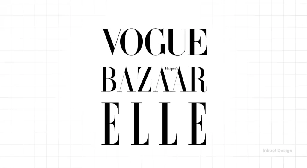
| Feature | Vogue (Condé Nast) | Harper’s Bazaar (Hearst) | Elle (Lagardère/Hachette) |
| Primary Typeface | Customised Didot | HTF Didot (by Hoefler & Co) | Custom Serif/Sans Mix |
| Tone | Authoritative, Cold, Neoclassical | Elegant, Slightly Softer, Artistic | Modern, Accessible, High-Energy |
| Logo Placement | Overlays the subject (Dominant) | Often sits behind or framed | Flexible, often smaller |
| Key Differentiator | Mathematical precision | Historical eccentricity | Fashion-forward fluidity |
While Harper’s Bazaar also uses a Didot variant, it often leans into more “human” touches and illustrative flourishes. Vogue, conversely, has leaned into “Mechanical Perfection.”
In 2026, Elle experimented with more sans-serif elements to reach Gen Z, but Vogue’s refusal to move toward “Blanding” has actually increased its brand equity.
By remaining a “Serif Holdout,” Vogue signals that it is an institution, not a trend.
The Global Evolution: Regional Nuances
While the “Vogue” wordmark is globally recognised, it is not a “one-size-fits-all” asset. Regional editions often adapt the logo to fit cultural aesthetics while maintaining the core Didot DNA.
- Vogue France (formerly Vogue Paris): Often employs a tighter kerning and more experimental use of the “V” as a standalone graphic element in digital shorts.
- Vogue Italia: Known for the most “Art Directed” covers, the logo here is frequently treated as a secondary element to the photography, sometimes obscured by up to 40% to prove the brand’s iconic status.
- British Vogue: Under various editors, the spacing of the masthead has been subtly adjusted to feel more “stately” and aligned with London’s heritage of traditional publishing.
This regional flexibility proves that a “Fixed Asset” can still be “Culturally Fluid.”
For international businesses, the Vogue model shows that you can maintain a core identity while allowing local markets to “play” with the layout and hierarchy to better connect with domestic audiences.
The “Voguification” of Everything
As we move through 2026, we are seeing a massive trend in “Blanding”—the process by which luxury brands strip their logos of all personality in favour of sterile, Sans-serif typefaces (think Burberry, Saint Laurent, and Balenciaga).
Vogue, however, has stayed its course. While others are zigging toward “minimalist boredom,” Vogue’s serif mark now stands out as a symbol of heritage.
This is a crucial lesson for rebrand and logo redesign projects: sometimes the most radical thing you can do is stay the same.
In 2026, the technical challenge for the Vogue logo is “high-density display optimisation.” Those hairline serifs that look beautiful on glossy paper can vanish on a low-res mobile screen.
The current technical team at Condé Nast uses responsive logo design principles to subtly adjust the stroke weight of the logo depending on the device’s pixel density.
This ensures the “hairlines” never actually disappear, maintaining the brand’s perceived logo design cost and value.
Why the Vogue Logo Works

In our fieldwork, we often see SMBs trying to “disrupt” their industry by choosing an unreadable, trendy logo. I tell them to look at Vogue.
Vogue isn’t disruptive. It’s authoritative.
The logo works because it obeys the laws of visual hierarchy. According to studies by the Nielsen Norman Group, users scan pages (and covers) in patterns.
The Vogue logo’s positioning at the very top, with its high-contrast letters, acts as an “anchor.” It tells the viewer exactly where they are before they look at the model’s eyes.
| Era | Primary Entity | Visual Strategy | Brand Sentiment |
| 1892-1909 | Hand-drawn Illustration | Victorian Ornate | “Social Gazette” |
| 1920s-1930s | Art Deco / Dr Agha | Geometric Sans-Serif | “Modernist & Experimental” |
| 1955-Present | Alexander Liberman | Stabilised Didone | “Institutional Authority” |
| 2026 Digital | Variable Font / UI | Sub-pixel Optimisation | “Legacy in High-Def” |
If you are struggling with your logo design process, ask yourself:
- Does my logo act as an anchor, or is it just more noise?
- Could my logo survive 50 years without a font change?
- Am I choosing a font because I like it, or because it communicates the “Root Attributes” of my business?
If you can’t answer these, you are probably making one of the common logo design mistakes that will cost you thousands in lost brand recognition.
Technical Optimisation: The 2026 “Variable Font” Revolution
In the high-resolution landscape of 2026, the Vogue logo has transitioned from a static vector file to a sophisticated Variable Font system.
The primary challenge for high-contrast serifs has always been “pixel bleed” on small screens. At small sizes, those signature hairline serifs can disappear, making the “V” look like two separate sticks and the “G” look broken.
To combat this, the Condé Nast design team employs Optical Sizing. This is a technique where the logo’s geometry actually changes based on the screen size:
- Display Weights (Covers): On 8K displays or print, the contrast is maxed out, with serifs as thin as a single pixel.
- Text Weights (Mobile Web): On mobile devices or smart-wearables, the “hairlines” are automatically thickened, and the kerning is slightly opened. This maintains the “look” of Didot while ensuring compliance with WCAG 3.0 accessibility standards.
For developers and designers, the lesson is clear: a luxury logo in 2026 must be “responsive” not just in scale, but in its very anatomy.
If your brand uses a high-contrast mark, you must implement SVG-based path optimisations or Variable Font axes to prevent your brand’s “perceived cost” from dropping due to poor digital rendering.
The Monogram: The Rise of the Iconic ‘V’
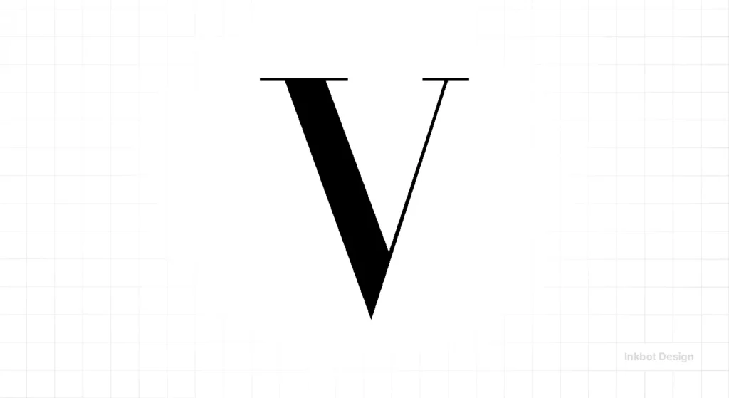
In 2026, a logo must work as a 16×16 pixel favicon as effectively as a 48-sheet billboard. This has led to the Vogue ‘V’ being elevated to a standalone entity.
The “V” in Vogue’s Didot is a masterpiece of geometry. It features a heavy left stroke and a hairline right stroke, meeting at a sharp, unbracketed point.
This asymmetrical balance is what makes it instantly recognisable even without the “ogue.”
Social media platforms like TikTok and Instagram have forced this evolution.
Because the full masthead is too wide for a circular profile picture, the ‘V’ has become the “Seal of Authority.”
This is a crucial takeaway for SMBs: when designing a wordmark, ensure that at least one letter has enough “character” to stand alone as a monogram. If your logo is just a generic font, your social media presence will always feel anonymous.
The Verdict: Consistency is the Ultimate Luxury
The history of the Vogue logo design is a transition from illustrative play to typographic power. It is the story of how a magazine masthead became a global seal of approval.
For the entrepreneur, the lesson is clear: your logo is not a playground. It is a vessel for equity. Every time you change your logo file formats, your colours, or your fonts, you are leaking money.
Stop trying to be “trendy” and start trying to be “permanent.”
If you’re ready to build a brand that lasts longer than a TikTok cycle, you need to get the fundamentals right.
We can help you navigate the complexities of logo design services and ensure your visual identity is built for 2026 and beyond.
Don’t let your brand become a historical footnote. Request a quote today and let’s build something iconic.
FAQs
Is the Vogue logo based on Bodoni or Didot?
It is primarily based on Didot. While both are Didone typefaces, Didot is generally considered more “mechanical” and “mathematical,” whereas Bodoni has slightly more curved serifs. Vogue’s choice of Didot reflects a preference for French neoclassical precision over Italian romanticism.
How does the Vogue logo achieve a “luxury” look?
Luxury is communicated through high contrast. By using extremely thick and extremely thin lines in the same letterform, the logo mimics the qualities of luxury goods—delicate yet strong, refined yet bold. This visual “tension” is a hallmark of high-fashion branding.
What is the significance of the “overlapping” letters in Vogue?
The kerning in the Vogue logo is intentionally tight. This creates a unified “shape” rather than a series of individual letters. This “tightness” suggests a cohesive, curated world that is difficult to enter, reinforcing the magazine’s exclusionary brand positioning.
Why hasn’t Vogue adopted the “Blanding” trend of 2026?
Vogue’s brand equity is tied to its status as a “heritage institution.” While brands like Burberry moved to sans serif fonts to appear “tech-friendly,” Vogue remains serif-heavy to distinguish itself as a source of “expert truth” rather than just another digital feed.
How does the Vogue logo handle digital accessibility in 2026?
The logo uses Variable Font axes to adjust stroke weight in real-time. For users with visual impairments or on lower-quality displays, the system serves a “High-Legibility” version of the logo where the hairline serifs are thickened by approximately 15% to prevent “disappearing” letterforms.
Is the Vogue logo a serif or sans-serif font?
It is a serif font. Specifically, it belongs to the “Modern” or “Didone” classification, known for its extreme contrast between thick and thin lines.
Why is the Vogue logo sometimes hidden behind the model’s head?
This is a “power move” in branding. It indicates that the brand is so recognisable that it can be identified even when not fully visible. It also creates a sense of three-dimensional depth on the cover.
How does the Vogue logo stay relevant in 2026?
Through subtle technical optimisations for digital screens. Designers adjust the stroke weights to ensure the thin serifs remain legible on high-density mobile displays without losing their “haute couture” feel.
Can I use the Vogue font for my own business?
While you can use Didot-style fonts, using the exact modified Vogue typeface could lead to trademark issues. It’s better to develop a unique logo strategy tailored to your brand identity.
What is the difference between the Vogue logo and a regular font?
The “Vogue” mark is a logotype. The kerning (letter spacing) and the specific weight of the strokes have been customised to create a balanced, proprietary visual mark that a standard font cannot replicate out of the box.
Why is consistency so important in logo design?
Consistency builds trust and recognition. As noted by Gartner, brands that maintain a consistent visual identity across all touchpoints see a significant increase in consumer “brand health” scores.
How much does a logo like Vogue’s cost to design today?
A world-class typographic identity for a global brand can cost hundreds of thousands of pounds. However, for SMBs, the focus should be on the quality of the strategy rather than the price tag alone. You can see a breakdown of logo design costs on our site.
