How to Build a Strong Visual Identity: The 2026 Guide
Visual identity is not about aesthetics or “looking professional”; it is a defensive position built on biological recognition patterns.
If your identity does not trigger a sensory memory within 0.1 seconds, you’ve pretty much donated your budget to your competitors.
Most entrepreneurs waste thousands on “pretty” logos that vanish into the digital marketplace because they prioritise personal taste over distinctive brand assets.
The stakes of getting this wrong are actually quantifiable.
Brands that redesign without a firm grasp of their existing equity lose an average of 20% in sales volume almost immediately, as seen in the Tropicana packaging failure documented by AdAge.
In the 2026 attention economy, your brand identity must serve as cognitive shorthand, allowing customers to identify your business without reading anything about you.
- Visual identity must trigger immediate recognition and build mental availability; measure Famousness and Uniqueness to protect brand equity.
- Develop a responsive logo and kinetic identity with motion signatures so your brand is identifiable in 0.5s across platforms.
- Prioritise technical excellence: SVGs, variable fonts, WCAG 2.2 compliance and fast performance to protect UX and Core Web Vitals.
- Fight AI homogeneity by choosing human-led, distinctive DBAs and iterating identity every 18 to 24 months for visual freshness.
What is a Visual Identity?
A visual identity is a strategic system of graphical elements—logos, colour palettes, typography, and imagery—that work together to create a distinctive, recognisable presence for an entity (brand).
It serves as the physical manifestation of a brand’s strategy and values.
Key Components:
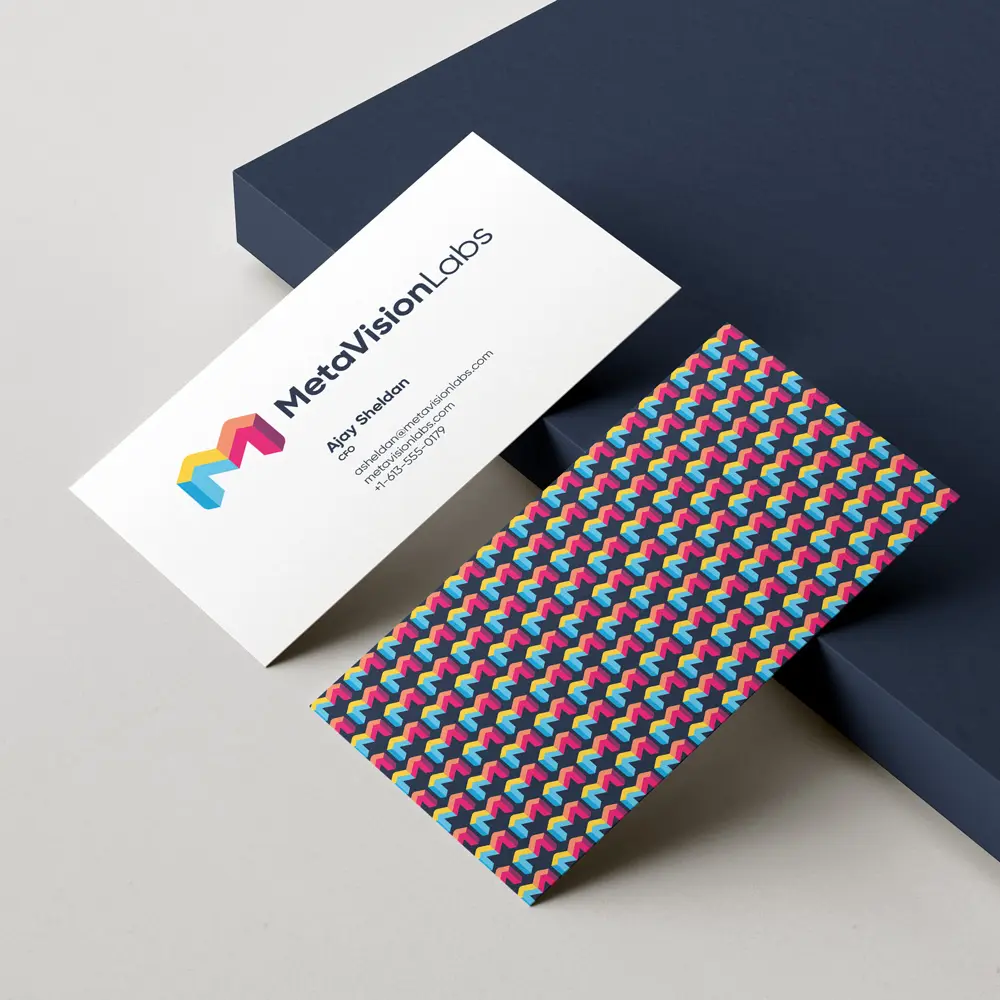
- Logo System: A primary mark and its responsive variants (submarks, favicons) that function as the primary brand anchor.
- Core Palette: A set of distinctive colours, often including a “hero” colour that achieves high mental availability through consistent use.
- Typography: A curated selection of typefaces that communicate brand personality and ensure readability across all digital and physical touchpoints.
A visual identity is a system of distinctive brand assets—including logos, colours, and typography—designed to trigger immediate biological recognition and mental availability.
The Myth of the “Timeless” Brand Identity
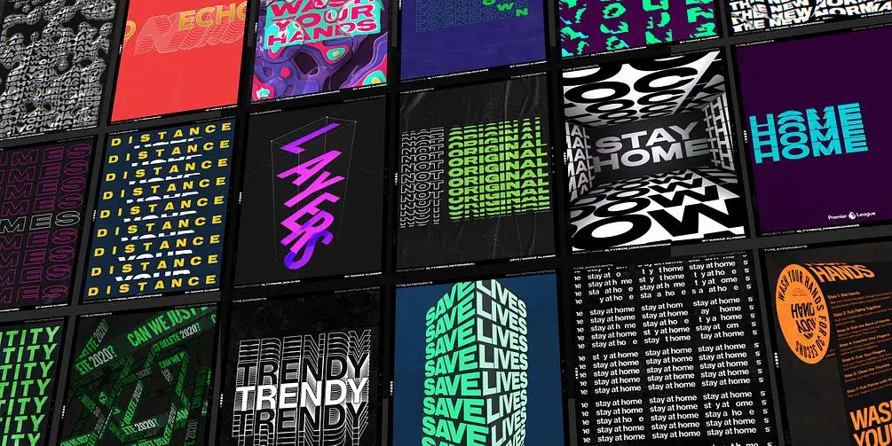
The pursuit of a “timeless” visual identity is a strategic trap that leads to stagnation and irrelevance in 2026.
Many claim that a brand should look the same for 20 years, but this ignores shifting consumer opinion and the “Visual Homogeneity Decay” seen in modern tech branding.
Timelessness was a requirement for the era of expensive signage and offset printing.
Today, digital-first brands like Spotify and Airbnb iterate their visual language every 18 to 24 months to maintain “Visual Freshness” and signal technical competence.
Sticking to a static identity for decades makes your business appear like a legacy entity that has failed to adapt to the modern economy.
According to research from the Ehrenberg-Bass Institute for Marketing Science, the goal is not to stay the same forever; it is to evolve while protecting your “Distinctive Brand Assets.”
Evolution allows you to remain relevant to new consumer cohorts while maintaining the memory structures that existing customers use to find you.
If you aren’t updating your visual execution to meet 2026 standards, you are effectively becoming invisible to the next generation of buyers.
Visual identity must evolve to survive. The idea that a brand should remain static for decades is a relic of the print era; modern brands require “Visual Freshness” to signal relevance and maintain high mental availability in a digital-first marketplace. Stagnation is a greater risk to brand equity than calculated, distinctive iteration.
Quantifying Impact: The ROI of Mental Availability
In 2026, the primary metric for visual identity is no longer “appeal” but Mental Availability.
Based on the seminal research from the Ehrenberg-Bass Institute, brand growth is driven by making a brand easier to buy by building memory structures.
A visual identity’s true ROI lies in its ability to reduce the cognitive load required for a customer to choose your product over a competitor’s.
When we talk about the ROI of visual identity, we measure two specific KPIs: Famousness (how many people know your assets belong to you) and Uniqueness (how many competitors mistakenly identify your assets as theirs).
The Mental Availability Matrix
To quantify your identity, you must audit your Distinctive Brand Assets (DBAs) against the market.
- Asset Famousness: The percentage of your target market that links a specific visual (e.g., your “hero” colour or a specific shape) to your brand name.
- Asset Uniqueness: The degree to which that visual is linked only to you. If consumers see your primary brand colour and think of three different companies, your “Uniqueness” score is low, and your marketing spend is subsidising your rivals.
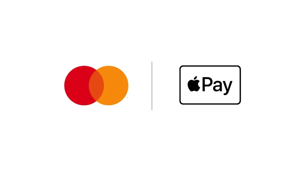
To improve these scores, you must move beyond the logo. A Mastercard-style approach—where the brand name is eventually removed from the visual mark—is the gold standard.
In 2026, if you cannot be identified by a 100px square of your brand’s texture or a 0.5-second motion clip, you are visually bankrupt.
Visual Asset Performance Benchmarks 2026
| Asset Type | Primary Metric | 2026 Benchmark | Strategic Goal |
| Logo (Responsive) | De-branded recognition | >85% | Instantly builds trust |
| Hero Colour | Category association | >60% | Owns a clear mental position |
| Custom Typography | Readability + tone | <200ms recognition | Aligns brand voice with visuals |
| Motion Signature | Recall through motion | >40% | Stands out in short-form video content |
Decoding the Visual Identity Prism
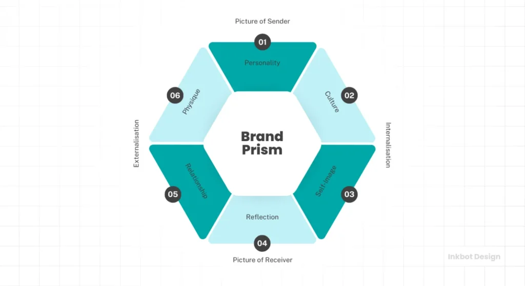
Understanding how your visuals connect to your internal strategy requires more than a mood board.
You must use frameworks such as Kapferer’s Brand Identity Prism to ensure your external visuals align with your internal culture.
Visuals are the “Physique” of the prism—the tangible, outward-facing elements. However, without a clear “Personality” or “Relationship” defined in your strategy, your visuals will lack the weight needed to convert sceptical audiences.
We often see SMBs jump straight to choosing colours before they have defined their “Culture” or “Self-image,” resulting in a visual identity that feels like a costume rather than a skin.
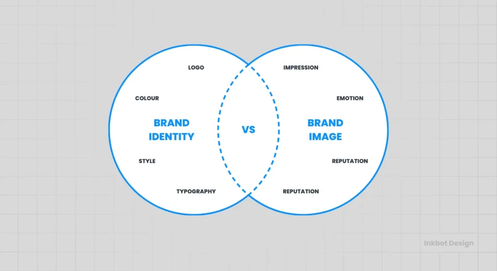
A strong identity requires a deep understanding of the gap between brand identity and brand image.
Your identity is what you project; your image is what the market perceives. When these two are misaligned, the result is cognitive dissonance.
For instance, a branding agency claiming to be “innovative” while using a generic, “timeless” Serif font and a navy-blue palette is sending a contradictory signal that lowers trust.
Beyond Static: Implementing Kinetic Identity
The static PDF brand guideline is dead. In its place is the Kinetic Identity System. A visual identity in 2026 must define how it moves.
Motion is not an afterthought; it is a primary distinctive asset that signals brand personality faster than any static image ever could.
Whether it is the “elastic” bounce of a fintech app’s loading screen or the “sophisticated glide” of a luxury brand’s transition, kinetic language creates a visceral connection. This is often referred to as UI Choreography.
If your brand guidelines don’t specify the easing curves (e.g., Cubic-Bezier values) for your digital interactions, your brand will feel disjointed across different platforms.
The Four Pillars of Motion Identity
- Entrance/Exit Logic: How do your assets appear? Sudden appearances signal urgency; fades signal elegance.
- Interaction Feedback: How does a button react when pressed? This is the digital equivalent of a “handshake.”
- Loading Narratives: Turning dead time into brand time. Instead of a generic spinner, use a Kinetic Logo fragment.
- Temporal Consistency: Ensuring that a 15-second YouTube ad and a 2-second app transition use the same “rhythm” of movement.
When developing your kinetic identity, avoid the trap of “excessive animation.” The 2026 standard is Invisible Performance—motion that feels so natural that the user doesn’t consciously notice it, but would feel its absence as a “clunky” experience.
Airbnb and Lyft have mastered this by using motion to guide the eye to the “Next Step” in the conversion funnel without overwhelming the senses.
The Role of Distinctive Brand Assets (DBAs)
A DBA is any visual element that triggers the thought of the brand in a consumer’s mind without the brand name being present.
- The Shape: Think of the Mastercard circles or the Nike “Swoosh.”
- The Colour: Think of Tiffany Blue or Cadbury Purple.
- The Pattern: Think of the Burberry check.
If you remove your name from your website and social media, would people still know it was you? If the answer is no, you do not have a visual identity; you have a collection of files.
A successful visual identity is measured by its “de-branded recognition score.” If your audience cannot identify your business after your logo is removed, your visual strategy has failed to build the necessary Distinctive Brand Assets required for long-term market dominance and mental availability.
Building Your Visual Identity Checklist
To move from a generic “look” to a strategic identity, you must follow a rigorous brand identity checklist that accounts for both creative and technical requirements.
This is not about picking what you like; it is about building what works.
1. The Logo System (Not just a logo)
In 2026, a single logo file is useless. You need a responsive system that includes:
- A Primary Mark: For headers and large-scale applications.
- A Stacked Version: For social media profiles and square footprints.
- A Favicon/App Icon: A simplified, high-contrast version for 16px to 32px scales.
- A Wordmark: A typographic-only version for clean, professional headers.
2. The Typography Stack
Typography is the “voice” of your written content. You need a design language system that defines how your type behaves across different devices.
- Heading Font: High character, used sparingly to create visual hierarchy.
- Body Font: Maximum readability, usually a Sans-Serif with a large x-height.
- Technical Specs: CSS variables for fluid scaling, ensuring your typography is accessible and mobile-friendly.
3. The Colour Architecture
Don’t just pick “Blue.” Define your:
- Primary Action Colour: Used for CTAs to drive conversion.
- Neutral Palette: Foundations for backgrounds and text.
- Accessibility Standards: All colour combinations must pass WCAG 2.2 contrast checks to ensure inclusivity and SEO health.
Technical precision in visual identity—including responsive logo variants, fluid typography stacks, and WCAG-compliant colour palettes—is a prerequisite for modern brand performance. A visual system that fails at the technical level will inevitably fail at the strategic level, regardless of its aesthetic merit.
Visual Identity in 2026: The AI Homogeneity Crisis

As of early 2026, we are witnessing a “Crisis of Sameness” driven by the mass adoption of generative AI tools. Tools like Adobe Firefly 3 and Canva’s Dream Lab have made it possible for anyone to generate “professional-looking” assets in seconds.
However, because these models are trained on existing data, they tend to produce “average” designs that represent the mathematical mean of their training sets.
This has led to a flood of generic, “AI-flavoured” visual identities that look competent but lack any distinctive soul. For the SMB owner, this is both a threat and a massive opportunity.
While your competitors are using AI to generate “perfect” but forgettable logos, you can win by leaning into human-led, idiosyncratic design choices that AI models would never suggest.
We are also seeing a shift toward “Kinetic Identity.” Static logos are becoming secondary to how a brand moves. Whether it’s an icon’s loading animation or the way a layout transitions on a mobile device, motion is now a core distinctive asset.
If your brand guidelines don’t include a motion section, you are ignoring 50% of the modern consumer’s brand experience.
Furthermore, there is a measurable ROI for brand consistency associated with high-quality, human-designed assets. Data from McKinsey & Company suggests that companies with the strongest “Design Index” scores outperformed the S&P 500 by a 2-to-1 margin over five years.
In 2026, the market is oversaturated with “AI-average” visuals; the only way to stand out is through deliberate, distinctive, and technically superior brand systems.
Inclusive Design: Visual Identity for Neurodivergence
In 2026, Inclusive Design is a competitive advantage. Traditional visual identity often ignores the needs of neurodivergent users—those with ADHD, Autism, or Dyslexia.
A “pretty” brand that uses low-contrast text, flashing animations, or cluttered layouts can cause sensory overload, leading to immediate site abandonment.
Designing for Cognitive Ease:
- Type Choice: Use fonts with “open counters” and large x-heights to help dyslexic readers.
- Colour Stability: Avoid “Vibrating Colours” (e.g., bright red text on bright blue backgrounds), which can cause physical discomfort.
- Motion Control: Always provide a “Reduced Motion” option in your digital guidelines to respect user-level OS settings.
Technical Asset Performance: Speed as a Brand Value
In the 2026 web environment, a “beautiful” brand that loads slowly is a failing brand. Your visual identity is not just a collection of colours; it is a collection of code.
The technical implementation of your assets directly affects your Core Web Vitals, particularly Largest Contentful Paint (LCP).
The SVG Revolution
If your brand assets are still primarily raster-based (.PNG, .JPG), you are penalising your user experience.
Scalable Vector Graphics (SVG) are the non-negotiable standard for 2026. An SVG logo is typically 90% smaller than a high-resolution PNG and remains crisp on 8K displays.
Variable Fonts and Performance
Instead of loading five different font weights (Regular, Bold, Italic, etc.), 2026 brands use a single Variable Font file. This reduces HTTP requests and allows for fluid typography that scales perfectly across devices.
It also allows for “Responsive Type,” where the weight of your brand’s font can subtly increase on smaller screens to maintain legibility without increasing file size.
| Technical Aspect | The Wrong Way (Amateur) | The Right Way (Pro) | Why It Matters |
| Logo Format | Raster files (.JPG, .PNG) | Scalable Vectors (.SVG) | SVGs are resolution-independent and load faster, boosting SEO and LCP. |
| Colour Selection | “I like these shades” | WCAG 2.2 Compliant Palette | Ensures 100% of your audience can read your content and avoids legal issues. |
| Typography | One generic font | Multi-tier Type Hierarchy | Creates visual structure and guides the reader toward your CTA. |
| Scalability | A single complex logo | Responsive Logo System | Maintains brand recognition at favicon and app-icon sizes. |
| Guidelines | A verbal “keep it clean” | Comprehensive Brand Portal | Ensures every employee and vendor uses the brand correctly every time. |
| Imagery | Generic AI/Stock photos | Bespoke Art Direction | AI-generated stock imagery is now a signal of “cheapness” and low trust. |
The Legal Frontier: AI, Copyright, and Asset Protection
As we navigate 2026, the use of generative AI in visual identity has created a legal “Grey Zone.”
Most business owners are unaware that assets generated entirely by AI (without significant human intervention) currently cannot be copyrighted under UK and US law.
If your “unique” logo was generated by Midjourney v7 or DALL-E 4 with a simple prompt, you may have no legal recourse if a competitor copies it exactly. To build a defensive visual identity, you must ensure a Human-in-the-Loop workflow.
The Asset Protection Checklist:
- Audit Your Origins: Can you prove the “human” origin of your core assets?
- Trademark Your DBAs: Don’t just trademark your name; trademark your “Hero” colour and unique patterns if they achieve high mental availability.
- AI-Assistance Disclosure: Maintain a record of which parts of your identity were AI-assisted vs human-created for future legal compliance.
Market Intelligence: Cost of Visual Identity in 2026
“How much does a logo cost?” is the wrong question.
In 2026, you are buying a Value-Driven Asset System. Pricing in the UK market has shifted toward “Tiered Performance Packages” rather than flat design fees.
UK Price Benchmarks 2026:
- The Founder’s Sprint (£2,500 – £5,000): Best for: Seed-stage startups. Includes: Core logo system, 2 primary colours, Google Font pairings, and a basic 5-page PDF style guide. Minimal strategic depth; focus is on “looking the part.”
- The Growth Identity (£8,000 – £20,000): Best for: Established SMBs (annual turnover £1m+). Includes: Full DBA audit, custom colour architecture (WCAG compliant), motion signatures, SVG icon set, and a live “Brand Portal” for team access.
- The Enterprise System (£35,000 – £100,000+): Best for: Large organisations or high-stakes rebrands. Includes: Full sensory identity (Haptics/Audio), proprietary custom typography, global localisation guidelines, and a 12-month “Brand Maintenance” contract.
| Budget Tier | Major Risk | Expected Lifespan | ROI Expectation |
| Low (<£3k) | Generic, AI-like design | 12–18 months | Short-term professional appearance |
| Mid (£8k–20k) | Weak internal adoption | 3–5 years | Better recall and conversions |
| High (£35k+) | Overly complex design | 7–10 years | Strong market differentiation |
The Verdict
A strong visual identity is the difference between being a commodity and being an entity. In 2026, you cannot afford to blend.
The rise of AI-generated content has made distinctiveness more valuable than ever before. Your goal should not be to create a “pretty” brand; it should be to build a memorable, functional, and technically sound system that triggers immediate recognition in your audience.
If your current identity feels stagnant, generic, or technically outdated, it is costing you more in lost opportunity than it would cost to fix it.
Stop treating design as a cost centre and start treating it as the primary driver of your brand’s mental availability.
Next Steps:
Ready to build a brand that actually stands out? Explore Inkbot Design’s services to see how we build high-performance visual systems, or browse our latest insights on branding trends to stay ahead of the 2026 curve.
FAQ
What is the difference between a logo and a visual identity?
A logo is a single graphic mark that serves as a brand’s primary identifier. In contrast, a visual identity is the entire system of elements—including typography, colours, and imagery—that work together to communicate a brand’s personality and ensure recognition across all touchpoints.
How many colours should be in a visual identity?
A professional visual identity typically includes one or two primary “hero” colours for brand recognition, supported by a palette of three to five neutral shades and functional action colours used specifically for buttons and links to drive user conversion.
Why is accessibility important in visual identity?
Accessibility ensures that your visual identity is usable by everyone, including those with visual impairments. Following WCAG 2.2 contrast standards is a technical requirement that improves user experience, expands your reach, and prevents potential legal or SEO penalties.
How often should a company update its visual identity?
Most high-growth brands iterate their visual identity every 18 to 24 months to maintain “Visual Freshness” and signal relevance. However, core distinctive assets should be protected to maintain long-term consumer memory structures and brand equity.
Can I use AI to create my visual identity?
AI tools can assist in the brainstorming phase, but using AI to generate final brand assets often results in generic, nondistinctive visuals that lack the technical precision and unique “soul” required to stand out in the market.
What is a responsive logo?
A responsive logo is a system of marks designed to scale across different devices, ranging from a complex primary version for large displays to a simplified favicon or app icon for mobile and small-scale applications.
What are distinctive brand assets (DBAs)?
Distinctive brand assets are non-name elements—such as specific colours, shapes, or sounds—that trigger a brand’s memory in a consumer’s mind, allowing recognition even when the brand name is not visible.
Do I need brand guidelines?
Yes, brand guidelines are essential for maintaining consistency as your business grows, ensuring that every internal team and external vendor uses your logos, fonts, and colours correctly to protect your brand equity.
What font should I use for my brand?
The best font for your brand depends on your personality. Still, you should always choose a type stack that includes a high-character heading font and a highly readable, web-safe body font for maximum accessibility.
How much does a visual identity cost?
The cost of a visual identity depends on the scope. Still, for a professional SMB system that includes strategy, a responsive logo, and full technical guidelines, prices in the UK typically range from £3,000 to £15,000+.


