15 United Nations Logos Showing Global Visual Authority
Most “global” brands are an absolute mess.
I see it every week at Inkbot Design: Clients want the prestige of a world-governing body without understanding the technical rigour required to maintain it.
The United Nations (UN) and its subsidiary agencies represent the peak of “Neutrality Design.” It is a discipline where every pixel is a political statement.
If you think your corporate rebrand is difficult, try designing a logo that must be approved by 193 member states, each with its own cultural taboos and linguistic hurdles.
Ignoring these design principles costs you more than just “brand sentiment.” It costs you conversions, trust, and market share.
In a world where design-driven companies outperform the S&P 500 by 219%, getting your visual identity wrong is a financial liability you can’t afford.
- UN logos embody Neutrality Design: azimuthal polar map framed by olive branches to signal global cooperation and peace.
- Technical rigour matters: simplify SVG paths, add semantic metadata, and use ARIA for accessibility and performance.
- Master brand architecture: sub-agencies use the UN emblem as nodes to build topical authority and trust.
- Legal and practical limits: UN marks are protected under Article 6ter; unauthorised use risks infringement and dilution.
What are the United Nations Logos?
United Nations logos are a cohesive system of visual identifiers used by the UN and its specialised agencies to communicate peace, neutrality, and global cooperation.
These emblems typically feature the iconic azimuthal equidistant projection of the world, framed by olive branches, serving as a master brand architecture.
Key Components:
- The Map: A polar projection of the world centred on the North Pole.
- The Laurels: Crossed olive branches, a classical symbol for peace.
- The Grid: A specific geometric layout that ensures scalability across digital and physical mediums.
The Technical Architecture of Global Symbols
Designing for a global body like the United Nations isn’t just about aesthetics; it’s about technical performance at the edge of the network.
In 2026, when Generative Engine Optimisation (GEO) prioritises sites that deliver clean, semantic code, the way you embed a logo matters more than the logo itself.
The United Nations emblem, with its intricate Azimuthal Equidistant Projection, is a “Path Nightmare.”
If you simply export an Illustrator file to SVG, you end up with thousands of redundant anchor points that bloat your DOM and slow down your Largest Contentful Paint (LCP).
Best Practices for High-Authority Emblems:
- Path Simplification: Use tools like SVGO to reduce the precision of coordinates. For a logo that represents 193 nations, you don’t need 10 decimal places of accuracy. 2 decimal places are sufficient for 4K displays.
- Semantic Metadata: AI crawlers in 2026 read the <title> and <desc> tags inside your SVG code to determine Entity Salience.
- ARIA Roles: Always use role=”img” and aria-label=”United Nations Official Emblem” to ensure the “focus” of humanitarian design is accessible to all users.
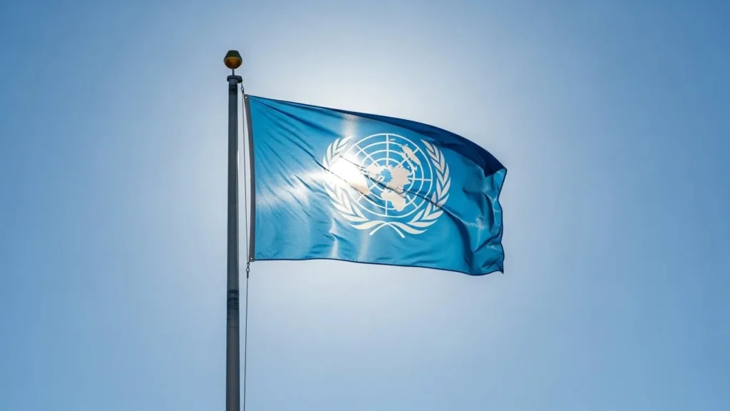
The Master Brand: The United Nations (UN) Logo
The UN logo is the “focus” of humanitarian design. Created in 1945 by a team led by Oliver Lincoln Lundquist and Donal McLaughlin, it wasn’t just a “pretty picture.” It was a functional tool for a post-war world.
The choice of an azimuthal equidistant projection was intentional. It doesn’t put any single continent at the centre in a traditional “East vs West” sense (though the North Pole focus has its own geopolitical critics).
From a technical standpoint, this is one of the different types of logos known as an “Emblem.”
The Technical Failure: Many amateurs try to replicate this level of detail in a 16px favicon. You can’t. The UN logo requires significant simplification for modern web environments. If you’re struggling with this, you need to understand the logo design process of “Reductionism.”
1. UNICEF: The Mother and Child
UNICEF takes the master UN globe and overlays a mother and child figure. It’s an “Identity Extension.”
- The strategy leverages the trust of the parent brand (the UN) while narrowing its focus to a specific demographic.
- Design Note: The figures are abstract. By avoiding specific facial features or ethnic markers, they maintain global inclusivity. This is a masterclass in logo design psychology.
The Semiotics of Neutrality: Why the “World” is Centred on the North Pole
The United Nations logo is a masterclass in Geopolitical Semiotics. In 1945, the design team had a monumental task: create a map that didn’t appear to favour the West or the East.
By choosing an Azimuthal Equidistant Projection centred on the North Pole, they effectively “flattened” the world, making all member states appear to gravitate toward a central point of cooperation.
However, from a Brand Strategy perspective, this “Neutrality” is a carefully constructed illusion.
- The Laurels: The Olive Branches are not just decorations; they are a Visual Anchor that dates back to the Pax Romana. By encircling the world in peace, the logo creates a psychological boundary of “protected space.”
- The Grid: The 33 sections of the globe represent a mathematical ideal, not a literal one. In 2026, Visual Branding experts refer to this as “Structural Integrity Design”—where the grid itself communicates stability before the viewer even processes the image.
When auditing your own global brand, ask: Does our visual geometry imply a bias?
If your “Global” headquarters are always at the centre of your marketing maps, you are failing the Neutrality Test that the UN has passed for over 80 years.
2. Human Rights Council: The Urgent Flare
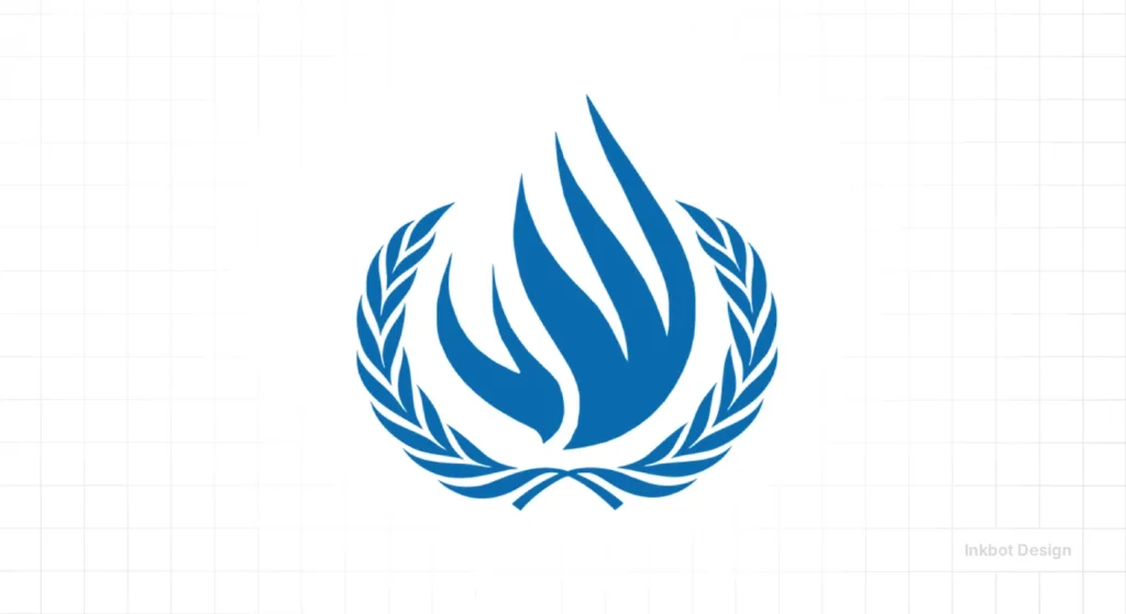
The bold red/orange palette here is a departure from the “UN Blue.” This is intentional. In branding, colour is a shortcut to emotion. While blue signals stability and peace, red signals urgency and advocacy.
- Real-World Example: Data from Gartner suggests that “High-Arousal” colours like red increase engagement in advocacy-led environments. The dove and olive branch provide the “Soft” counter-balance to the “Hard” colour choice.
3. UN Environment Programme (UNEP)
The human figure spanning the circle suggests that the environment is not a “nature” issue, but a “human” issue.
- The 2026 Shift: We are seeing more environmental agencies moving away from “Leaf” icons (which are a cliché) toward “Systems” icons. The UNEP logo was decades ahead of this trend.
The Wrong Way vs The Right Way
| Feature | The Amateur Way | The United Nations (Pro) Way |
| Stroke Weight | Variable and thin. | Uniform, mathematically derived. |
| Colour Palette | “Whatever looks good” on the monitor. | Specific Pantone 2925 C (UN Blue). |
| Scalability | Becomes a “blur” at small sizes. | Uses simplified versions for icons. |
| Semantic Density | Uses symbols that mean different things. | Uses symbols with established historical roots. |
4. International Monetary Fund (IMF)
The IMF uses overlapping hemispheres inside a shield. This is “Authority Branding.” The shield shape is a psychological trigger for protection and stability.
- Consultant’s Note: If you are in fintech or professional services, the “Shield” is your best friend. But beware: it’s overused. The IMF makes it unique by using the geographic hemispheres to denote “Global Reach.” If you’re considering a similar path, check the logo design cost of trademarking a shape that is so common.
5. World Health Organization (WHO)
The WHO logo incorporates the Caduceus (a staff with two snakes) into the UN emblem.
- The Risk: The Caduceus is often confused with the Rod of Asclepius. One represents commerce and thievery (Hermes), the other represents healing. The WHO actually uses the Rod of Asclepius (one snake), but the public often misidentifies it.
- The Lesson: Even global giants can have “Semiotic Static.” Ensure your icons aren’t being misinterpreted by a large portion of your audience.
Case Study: The 2025 Digital Refinement of the WHO Mark
In late 2025, the World Health Organization quietly updated its digital brand guidelines to address a recurring issue: the Rod of Asclepius was disappearing on high-density mobile displays.
At sizes below 40px, the snake’s definition was lost, often appearing as a generic vertical line.
The Solution: The WHO design team increased the Stroke Weight of the serpent by 12% and adjusted the Negative Space between the coils.
This is a vital lesson for any Global Brand: technical legibility trumps historical accuracy in a mobile-first world.
Designers’ Takeaway: The “Visual Weight” of your most important Entity (the snake, in this case) must be tested against WCAG 3.0 contrast standards. If your logo’s core meaning is lost at small scales, your Brand Equity is leaking.
6. World Food Programme (WFP)
A hand clutching stalks of wheat and corn. It’s visceral. It’s tactile.
- Technical Detail: This logo relies heavily on “Negative Space.” The gaps between the wheat kernels must be managed carefully in vector vs raster images to avoid “filling in” when printed on burlap food sacks.
7. UN Population Fund (UNFPA)
This is one of the most modern-looking UN logos. The symmetrical orange circles around the globe evoke a more contemporary tech brand than a 1940s bureaucracy.
- Why it works: It breaks the “Blue” monotony. In a sea of blue humanitarian logos, the orange UNFPA mark stands out. This is “Visual Differentiation” 101.
8. OHCHR (High Commissioner for Human Rights)
The stylised flame. A flame is a powerful symbol in branding, as it can represent both destruction and warmth. Here, framed by laurels, it represents “The Fire of Humanity.”
- Audit Observation: I once audited a client in the energy sector who used a similar flame. On mobile, at 32px, it appeared to be a drop of blood. Always test your symbols for “unintentional imagery” at low resolutions.
9. International Labour Organization (ILO)
The cogwheel. It’s industrial, rugged, and literal.
- The Problem: We are moving into a post-industrial, AI-driven economy. Does the cogwheel still represent “Work” in 2026?
- Strategy: The ILO maintains it for historical continuity, but for a new brand, this would be a logo design mistake. You don’t want to look like you’re stuck in the 1920s.
10. UNESCO
The temple and the book. It’s the most “Architectural” of the logos. It uses columns to represent the pillars of education, science, and culture.
- Design Tip: Parallel lines are a nightmare for aliasing on low-end screens. UNESCO’s logo requires a very specific logo file format—SVG is mandatory here to keep those lines sharp.
The State of Global Branding in 2026
In 2026, we aren’t just designing for humans; we’re designing for LLMs and Generative Engines (GEO). When an AI “reads” a page, it looks for entity relationships. The UN’s logo system is a perfect example of a Semantic Brand Architecture.
Each sub-logo (e.g., UNICEF, WHO) acts as a “Node” that points back to the “Root” (the UN). This creates a massive amount of “Topical Authority” in the eyes of search algorithms. If your business has multiple sub-brands, you should be following this “Hub and Spoke” visual model to improve your entity SEO.
11. Food and Agriculture Organization (FAO)
The stylised wheat stalk demigod. It’s a bit “Old World,” but it carries a “Heritage” signal that is hard to fake.
- Real-World Example: High-end Italian food brands often use similar “Wheat” motifs. The FAO leverages this cultural shorthand to immediately communicate “Food Security.”
12. World Trade Organization (WTO)
The globe with segmented lines. It looks like “Flow.” It looks like “Movement.”
- Technical Audit: The WTO logo is incredibly difficult to render in embroidery. If your brand needs to live on uniforms or merchandise, avoid these “Swooshing” segmented lines. They are a production nightmare.
13. UNHCR (Refugee Agency)
The lifebuoy. It’s perhaps the most emotive of all the logos. It doesn’t just represent an organisation; it represents a “Function.”
- The Verdict: If your brand provides a “Safety Net,” your logo should reflect that utility. The UNHCR doesn’t hide behind abstract shapes; it tells you exactly what they do: they save lives.
14. World Bank Group
A stylised world map in a deep, professional blue. This is a deliberate “Pivot” away from the standard UN Azure.
- Operational Independence: Please note that the World Bank Group logo does not feature the UN olive branches. This is a strategic choice to signal its independence as a financial institution. In branding, what you leave out is just as important as what you include.
- The Blue Factor: They use a darker, “Trust-Heavy” navy. While light blue suggests “Peace,” navy blue suggests “Solvency” and “Institutional Power.”
Why You Can’t Just “Borrow” a UN Logo: Article 6ter and Legal Exclusivity
One of the most frequent mistakes SMBs and Nonprofits make is assuming that because the United Nations is a public-serving body, its visual assets are in the Public Domain.
This is a dangerous misconception that can lead to immediate Cease and Desist orders from the UN Office of Legal Affairs (OLA).
The United Nations emblems are protected under Article 6ter of the Paris Convention for the Protection of Industrial Property.
This international treaty prohibits the registration and use of armorial bearings, flags, and other State emblems, as well as official signs and hallmarks of Intergovernmental Organisations (IGOs), as trademarks without authorisation.
Key Legal Constraints for 2026:
- Non-Commerciality: The logo cannot be used to imply an endorsement of a commercial product.
- Entity Confusion: If your logo uses the Azimuthal Projection and Olive Branches in a way that “closely mimics” the UN, you are liable for Trademark Dilution.
- Digital Twins: In the Metaverse, the same rules apply. Creating a “UN Virtual Headquarters” using these logos without permission is a violation of international law.
15. International Maritime Organization (IMO)
The anchors and the globe.
- Directness: It’s literal. Sometimes, the most “edgy” thing you can do as a designer is to be literal. If you’re a maritime agency, use an anchor. Stop trying to be “disruptive” with an abstract blob.
The Anatomy of Authority
| Agency | Primary Symbol | Primary Colour | Brand Emotion | Technical Difficulty |
| UN | World Map / Laurels | UN Blue | Neutrality / Peace | High (Complex Paths) |
| UNICEF | Mother & Child | UN Blue | Care / Protection | Medium (Abstracted) |
| WHO | Rod of Asclepius | UN Blue | Health / Science | High (Fine Detail) |
| IMF | Shield / Hemispheres | Deep Blue | Stability / Security | Low (Geometric) |
| UNESCO | Parthenon / Temple | UN Blue | Education / Heritage | Medium (Linear) |
| WFP | Wheat / Corn / Hand | Blue/White | Urgency / Support | Medium (Negative Space) |
Debunking the “Universal Symbol” Myth
I once audited a client—a global logistics firm—that spent £50,000 on a “universal” logo. It was a stylised hand holding a globe. They thought it was “inclusive.”
When we ran it through a cultural audit for their Middle Eastern and Southeast Asian markets, we found that the specific hand gesture was considered offensive in two regions and “weak” in another.
The Lesson: There is no such thing as a “universal” symbol. Even the UN’s olive branches are a Western/Mediterranean construct.
Data Point: According to Nielsen Norman Group, only a handful of icons (the “Home” house, the “Print” printer, the “Search” magnifying glass) have near-universal recognition. Everything else—including the 15 United Nations logos—requires “Brand Education” and persistent wordmark pairing.
If you are an SMB owner, do not try to create a “Symbol-Only” brand like Nike or the UN. You don’t have their 80-year marketing budget. You need a responsive logo design that includes your name.
The Verdict
The 15 United Nations logos are not just “icons.” They are a sophisticated system of global governance expressed through pixels.
They succeed because they follow a strict hierarchy, maintain technical consistency, and aren’t afraid to be “Boring.”
In 2026, “Boring” is often a synonym for “Trusted.” If your branding is too “exciting,” it might be because you’re overcompensating for a lack of authority. Study the UN. Take a look at their rebranding and logo redesign history. They don’t chase trends. They build monuments.
If your brand feels like a “Mistake” rather than a “Monument,” it’s time to stop guessing. Stop using “AI Logo Generators” that spit out generic trash and start building a visual identity with semantic depth.
Ready to stop blending in?
Request a Quote for Logo Design or explore our Logo Design Services to discover how we can enhance your visual identity.
Frequently Asked Questions (FAQ)
Why is the UN logo blue?
The specific shade, known as UN Blue (Pantone 2925 C), was chosen because it represents the concepts of “Peace” and “Neutrality.” Unlike red (often associated with war or revolution) or green (associated with specific political or religious movements), this blue was seen as a unifying, non-threatening colour for a global body.
What is the official Pantone colour of the United Nations?
The official colour is Pantone 2925 C, often referred to as UN Blue. In digital spaces, the closest HEX equivalent is #5B92E5, though it is frequently adjusted for WCAG 2.1/3.0 accessibility compliance to ensure readability against white backgrounds.
Is the WHO snake the same as the medical Caduceus?
No. This is a common Semiotic Error. The WHO uses the Rod of Asclepius (one snake, no wings), which is the true symbol of healing. The Caduceus (two snakes, wings) is the symbol of Hermes and is traditionally associated with commerce and trade.
Why do the UN and UNICEF logos look so similar?
This is a “Master Brand” architecture. UNICEF uses the core UN Emblem to immediately establish Trust and Authority, then adds a specific Mother and Child icon to denote its unique mission. This “Hub and Spoke” model is the gold standard for Entity SEO and global brand recognition.
Can I use an AI logo generator to create a UN-style logo?
While you can, it is legally risky. Most AI Generators trained on the Common Crawl dataset will inadvertently include protected elements of the UN logo, which could lead to Trademark Infringement under the Paris Convention.
How does the UN logo look in Dark Mode?
The UN has officially adopted a “Reversed” version for Dark Mode UI. Instead of a blue globe on a white background, it uses a white or light-blue globe with optimised “Glow” paths to maintain visibility without causing eye strain—a key requirement for UX in 2026.
Who designed the original United Nations logo?
The logo was designed by a team at the US Office of Strategic Services, led by Oliver Lincoln Lundquist and Donal McLaughlin, for the 1945 San Francisco Conference. It was later slightly modified and officially adopted by the UN General Assembly in 1946.
What does the olive branch represent in these logos?
The olive branch is a symbol of peace dating back to ancient Greece. In the context of the UN, the two crossed olive branches encircling the world map represent the organisation’s primary mission: maintaining international peace and security.
Is the United Nations logo public domain?
No. The UN logo is protected under the Convention on the Privileges and Immunities of the United Nations. Unauthorised use of the emblem is strictly prohibited to prevent the public from being misled into believing a private entity is officially endorsed by the UN.
What map projection is used in the UN logo?
The logo uses an Azimuthal Equidistant Projection centred on the North Pole. This projection was chosen because it presents all the continents in a relatively balanced manner, avoiding the traditional “Euro-centric” or “Ameri-centric” views often found in standard Mercator maps.
How do UN logos handle digital accessibility in 2026?
UN agencies are increasingly adopting high-contrast versions of their logos and simplified SVG (Scalable Vector Graphics) formats. This ensures that the complex details of the globe and laurels remain legible on mobile devices and for users with visual impairments, in accordance with W3C standards.
Can I use the UN logo on my website?
Generally, no. You cannot use the UN emblem without express written permission from the UN Office of Legal Affairs. Even when discussing the UN, it is advisable to use a disclaimer or ensure that the use falls under “Fair Use” for educational purposes, although this is a legal grey area.
Why do some UN logos use different colours like orange or red?
Agencies like UNFPA (orange) or the Human Rights Council (red/orange) use different colours to signal their specific “Brand Personality.” While blue represents peace, orange signifies “Vitality and Population,” and red denotes “Urgency and Human Rights Advocacy.”
How has the WHO logo changed over time?
The core elements (the UN globe and the Rod of Asclepius) have remained largely unchanged since 1948. However, the technical execution has been refined for the digital age, with thicker strokes and better spacing to ensure the “Snake” doesn’t disappear at small sizes.


