Branding Secrets from the World’s 25 Best Travel Logos
Most travel logos are a predictable mashup of the same four or five ideas: a swooshing aeroplane, a generic globe, a pointless compass, or a sun setting over a perfectly symmetrical wave.
They are visual clichés that say nothing, differentiate no one, and are forgotten instantly.
This isn’t a gallery of pretty pictures. This is a breakdown of 25 travel logos that actually do the work.
These logos build trust, communicate a specific feeling, and look just as good on a tiny app icon as they do on the side of a 747.
We will dissect what makes them effective so you can avoid the generic pitfalls and create a brand that stands out.
- Effective Travel Logos: Great logos evoke feelings rather than merely describe services, creating memorable and engaging brand identities.
- Key Principles: Relevance, memorability, and versatility are essential for a logo to resonate and remain impactful across various platforms.
- Avoid Clichés: Steer clear of overused symbols and focus on unique storytelling elements to differentiate your brand in the travel market.
What Separates a Great Travel Logo from a Generic One?
It comes down to one core idea: a great travel logo stops describing and starts evoking.
It doesn’t just show a plane; it evokes the feeling of seamless travel. It doesn’t just show a bed; it evokes the feeling of unparalleled comfort.
The best logos are built on three principles:
- Relevance: It fits the brand’s niche (luxury vs. budget, adventure vs. relaxation).
- Memorability: It uses a unique shape, concept, or wordmark that sticks in your mind.
- Versatility: It is legible and impactful at any size, colour, or background.
Let’s look at the brands that get it right.
Category 1: The High-Fliers – Airline Logos
Airline logos face a unique challenge. They must be identifiable from miles away, work on a plane’s massive, curved fuselage, and convey enormous trust. A flimsy logo doesn’t inspire confidence at 30,000 feet.
1. Lufthansa
The iconic “flying crane” has been around since 1918. It’s a masterclass in timeless design. The bird is stylised, elegant, and contained within a circle, making it a robust and versatile mark.
- Design Takeaway: Legacy and consistency build immense trust. Lufthansa hasn’t chased trends; its mark feels as stable and reliable as the airline.
2. Air Canada

The red maple leaf, or “Rondelle,” is brilliantly simple. It’s unambiguously Canadian without resorting to a beaver or a moose. The design is sharp, modern, and high-contrast, instantly recognisable on a tail fin against a clear sky.
- Design Takeaway: Use a national symbol, but modernise it. They distilled the essence of the country into a single, powerful geometric shape.
3. Emirates
The Emirates wordmark uses Arabic-inspired calligraphy, flowing across the fuselage. It’s not a separate icon; the word itself is the brand. It feels premium, exotic, and confident. The red and gold further reinforce the sense of luxury.
- Design Takeaway: A unique wordmark can be your logo. You don’t always need a separate symbol if your typography is distinctive and evocative enough.
4. Southwest Airlines
After years with a bland, corporate look, Southwest introduced the heart. It’s simple, friendly, and perfectly captures their brand positioning around customer service and “LUV.” It works as a standalone icon, reinforcing their ticker symbol (LUV).
- Design Takeaway: Your logo should reflect your core business differentiator. If your brand is about service, a symbol of warmth can be more powerful than a symbol of flight.
5. Hawaiian Airlines
The “Pualani” (Flower of the Sky) mark is authentic and unique. It connects the airline directly to the culture and spirit of Hawaii. It’s a real asset, not a stock graphic. This gives the brand a soul that a generic hibiscus flower never could.
- Design Takeaway: Dig deeper into the local culture for symbols. Authenticity resonates far more than a generic visual representation of a destination.
Category 2: The Digital Nomads – Booking & Tech Logos
The logo must work as a tiny app icon on your phone for travel tech. This demands absolute simplicity. These brands sell convenience and choice; their logos reflect that digital clarity.
6. Airbnb
The “Bélo” symbol was controversial at launch but is a strategic masterstroke. It’s an abstract combination of a heart, a location pin, and the letter ‘A’ for Airbnb, all meant to symbolise “belonging.” It’s a unique, ownable shape.
- Design Takeaway: Create an abstract symbol that embodies your core brand idea. It gives you a flexible asset you can own completely.
7. Expedia
The Expedia logo is simple: a wordmark with a blue circle and a yellow swooping line representing a plane. It’s more corporate, but the “arrow of possibility” is effective. It visually represents the idea of going from point A to B.
- Design Takeaway: A simple graphic element can transform a generic wordmark. The arrow adds a narrative of movement and purpose.
8. TripAdvisor
The owl, “Ollie,” is a perfect symbol for wisdom and guidance. The eyes—one green (go) and one red (no)—cleverly represent the review system of choice and recommendations. It’s a brilliant concept executed simply.
- Design Takeaway: Cleverly use familiar symbolism. The owl means wisdom, and the traffic light eyes add a second layer of meaning directly related to the product.
9. Skyscanner
The logo is an abstract representation of clouds and data points, forming a dynamic shape. It conveys a sense of possibility, data aggregation, and the sky. The gradient gives it a modern, digital feel.
- Design Takeaway: Abstract marks can capture a feeling better than literal ones. This logo feels like “the cloud” of flight data, precisely what the service is.
10. Booking.com

This one is pure pragmatism. It’s a simple, legible, and utterly unpretentious wordmark. The brand’s power comes from its name recognition, and the logo doesn’t try to get in the way. The subtle arc under the “Booking” adds a hint of a smile or a journey.
- Design Takeaway: Sometimes the strongest brand move is to let the name do the talking. A clean, well-crafted wordmark is often all you need.
Category 3: The Hosts with the Most – Hospitality & Hotel Logos
Hotel logos have to sell an intangible: an experience. They must convey luxury, comfort, reliability, or boutique charm, often with a letter or a simple symbol.
11. Marriott
The simple, classic “M” is a mark of corporate confidence. It’s a custom letterform, with the pointed peaks giving it a sense of standing tall and strong. It feels dependable and professional, precisely what you expect from a massive hotel chain.
- Design Takeaway: A strong, custom monogram can be incredibly powerful. It’s a simple, elegant solution for a brand with a strong name.
12. Four Seasons
The tree logo represents the year’s four seasons, a nod to the name. But it also evokes a sense of nature, shelter, and life. The single tree is a powerful symbol of place and stability. It feels calming and upscale.
- Design Takeaway: A literal name interpretation can work if stylised elegantly. The tree is a classic symbol that perfectly aligns with the brand’s promise of restful luxury.
13. Aman Resorts

Aman means “peace” in Sanskrit. The logo is a minimalist wordmark in a custom, softly rounded typeface. It is the definition of understated luxury. It doesn’t shout; it whispers. This perfectly reflects the exclusive, serene experience of their resorts.
- Design Takeaway: Your typography is your tone of voice. The gentle, spaced-out letters of the Aman logo communicate tranquillity before you even know what the company does.
14. The Ritz-Carlton

The lion and crown logo screams legacy, royalty, and uncompromising standards. It was created by a guest in 1965 and has been the symbol of the hotel’s prestige ever since. It feels old-world, which is precisely the point.
- Design Takeaway: For a luxury brand, leaning into symbols of classic prestige (royalty, heraldry) can effectively communicate a message of high standards and timeless service.
15. Hilton
Like Marriott, Hilton uses a simple, modern wordmark. The subtle, swooping curve connecting the H and the arc above the ‘t’ and ‘l’ gives it a touch of elegance and a sense of being sheltered or embraced. It’s corporate but not cold.
- Design Takeaway: Small typographic details can make a huge difference. The subtle ligature and arc elevate the Hilton wordmark from a standard font to a proprietary brand asset.
Category 4: The Trailblazers – Adventure & Tour Logos
These logos need to sell a promise of discovery and excitement. They must feel authentic, energetic, and trustworthy, often appealing to a younger demographic wary of corporate branding.
16. National Geographic
The yellow rectangle is one of the most recognisable logos in the world. It’s a portal. A window onto the world. It frames everything, from their magazine cover to their television content. It’s not just a logo; it’s a branding device.
- Design Takeaway: Think beyond a static mark. Can your logo become a functional part of your brand identity, like a frame or a window?
17. G Adventures
The logo combines the letter ‘G’ and a geo-pin icon, instantly connecting the brand to travel and location. It’s modern, friendly, and feels like it belongs on a digital map. The “Lo-Go” nickname reinforces its simple genius.
- Design Takeaway: Combine two relevant concepts into one simple mark. Fusing the initial and a universal icon makes it memorable and meaningful.
18. Contiki
Contiki targets 18-35-year-olds, and its irreverent, slightly chaotic wordmark is perfect for that audience. It’s not a slick corporate logo; it feels like graffiti or a stamp in a passport. It has energy and rejects conformity.
- Design Takeaway: Know your audience. A raw and energetic logo can be far more effective for a youth-focused brand than a polished, traditional design.
19. Lonely Planet
No symbol needed. The name is the brand. The simple, sans-serif wordmark is confident and direct. It’s a testament to the power of a great brand name and decades of trust. The logo simply presents it, clearly and without fuss.
- Design Takeaway: If your brand name is strong and descriptive, don’t overcomplicate it. A clean wordmark can convey all the confidence you need.
20. The North Face
Inspired by the Half Dome in Yosemite, this logo symbolises challenge and aspiration for the outdoor and adventure community. It’s a brilliant abstract design that has become synonymous with exploration.
- Design Takeaway: Associate your brand with an iconic, aspirational landmark or idea. It attaches a powerful pre-existing story to your brand.
Category 5: The Destination Makers – Tourism & Niche Logos
These logos have the difficult job of encapsulating the feeling of an entire city, state, or country. They need to create an emotional connection and a desire to visit.
21. TUI
The TUI logo is a smiley face, formed by the three letters of the name. It’s simple, friendly, and communicates the core benefit of a holiday: happiness. It works across their multiple businesses (airlines, hotels, cruises) as a unifying symbol of fun.
- Design Takeaway: Focus on the ultimate emotional benefit for the customer. TUI sells holidays, but the logo sells happiness.
22. I ❤️ NY
Designed by Milton Glaser in 1977, this is the most famous tourism logo ever. It’s a rebus—a puzzle of pictures and letters—that is instantly understood. It feels personal and passionate, like a declaration from a resident, not a government committee.
- Design Takeaway: Simplicity and human emotion are timeless. This logo’s raw, emotional appeal has allowed it to endure for decades.
23. Visit California
The free-flowing, script-style font feels like it was written in the sand or painted on a surfboard. It’s relaxed, sunny, and aspirational. It perfectly captures the laid-back, “dream big” vibe associated with the state.
- Design Takeaway: The style of your typography can instantly set a mood. This script font feels like California.
24. CanadaMark (Canadian Tourism)
The official tourism brand for Canada uses a mosaic of geometric shapes to form a maple leaf. The different colours and shapes represent the diversity of Canada’s landscapes and experiences.
- Design Takeaway: A simple, modular design system can represent a complex idea like national diversity. The logo is a collection of parts forming a recognisable whole.
25. Australian Made
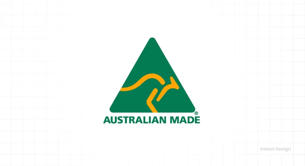
The green triangle with a yellow kangaroo is a mark of authenticity and origin. For tourists, it’s a trusted symbol of a genuine Australian product. The kangaroo is stylised and in motion, making it dynamic and recognisable.
- Design Takeaway: A “mark of authenticity” can be a powerful branding tool in tourism. It builds trust and provides a clear visual shortcut for quality.
3 Rules to Steal from the Best Travel Logos
Looking over this list, a few clear patterns emerge. If designing a logo for your travel business, focus on these three rules.
1. Stop Describing, Start Evoking
The worst logos simply state the obvious (a plane for an airline). The best ones make you feel something. Southwest’s heart evokes care. Aman’s wordmark evokes peace. National Geographic’s rectangle evokes discovery. Ask yourself: what is the core emotion I want my customer to feel?
2. Own a Shape or a Symbol
Lufthansa owns the crane. National Geographic owns the yellow rectangle. Airbnb owns the “Bélo.” These unique visual assets are unmistakable. Avoid generic shapes and create a simple, bold symbol that can become a shorthand for your entire brand.
3. Make Your Wordmark Work Harder
You don’t always need a symbol. The Aman, Contiki, and Emirates logos show that distinctive typography can do all the heavy lifting. A custom wordmark is unique by definition and can convey personality—from luxury to youthful rebellion—all on its own.
Ready to Create a Travel Logo That Actually Travels?
Looking at great logos is one thing. Creating one is another beast entirely. Your logo is your hardest-working asset—it’s the first promise you make to a traveller, and it needs to build trust in a split second.
A well-designed logo is an investment in your brand’s future. If you’re ready to start, explore our logo design process to see how we build stand-out brands.
If you already have a project in mind and want to skip the queue, you can request a quote directly. At Inkbot Design, we focus on creating marks that do the heavy lifting for your brand, so you can focus on running your business.
Frequently Asked Questions About Travel Logos
What are the most common mistakes in travel logo design?
The most common mistake is using clichés. Overused icons like globes, compasses, aeroplanes, and swooshes make a logo look generic and unmemorable. Another mistake is using overly complex designs that are hard to read when scaled down.
How do I choose the right colours for my travel logo?
Choose colours that reflect your travel niche. Blues often convey trust and calm (good for airlines and corporate travel). Greens and browns suggest nature and eco-tourism. Gold and blacks signal luxury. Bright, vibrant colours can suggest budget-friendly fun or youth travel.
Should my travel logo include a symbol or just be text?
This depends on your brand name and strategy. A strong, unique symbol (like Airbnb’s) can be highly memorable. However, a distinctive wordmark (like Contiki’s) can be very effective, especially if the brand name is catchy.
What makes a travel logo timeless?
Simplicity. Logos that rely on current design trends (like complex gradients or 3D effects) quickly look dated. The most timeless logos, like Lufthansa’s, are based on simple, bold geometric shapes and clean typography.
How important is a logo for a small travel agency?
It’s critical. For a small agency, a professional logo builds immediate trust and credibility. It shows you take your business seriously and helps you stand out from competitors in a crowded market.
Can I design my own travel logo?
You can, but it’s risky. Professional designers understand typography, colour theory, and how to create a versatile file that works across all media. A poorly designed logo can make your business look amateurish and untrustworthy.
What’s the difference between a hotel logo and a tour company logo?
A hotel logo must often convey a sense of place, comfort, or luxury. It’s about being a destination. A tour company logo must feel more dynamic and active, conveying a sense of journey, adventure, and experience.
Should my logo literally show what my travel company does?
Not necessarily. The best logos evoke a feeling rather than literally depicting a service. For example, instead of showing a hiking boot for a hiking tour company, a logo might use abstract mountain peaks to evoke a sense of adventure.
How can I make my logo unique if so many ideas are taken?
Focus on what makes your company unique. Is it your customer service? Your specific destination? Your travel philosophy? Infuse that unique story into the design. A generic business gets a generic logo; a unique business deserves a unique one.
Does my logo need to include my company’s full name?
Typically, yes, especially when you are a new business. The logo should contain your company name in a clear, legible font. Over time, as your brand becomes well-known, you can use the symbol on its own.

