Top 10 Fonts for Every Industry in 2026: Definitive Guide
Most brands look like they were designed by the same committee, using the same “safe” Google Fonts, in the same year. It is a sea of blandness.
If your business is struggling to command a premium price or your digital ads are getting scrolled past like they are invisible, your typography is likely the culprit.
In 2026, “clean” is the bare minimum. If you want to actually win, you need to understand the technical and psychological nuances of typography basics and how they apply to your specific sector.
Typography is not about “making things look pretty.” It is about information architecture, cognitive load, and trust.
According to McKinsey & Company, companies that excel in design—which typography sits at the heart of—see 32% more revenue growth.
If you are ignoring your font choice, you are literally leaving money on the table.
- Typography drives revenue and trust; great fonts yield measurable business impact and differentiation.
- Variable fonts and fluid typography are essential for performance, scalability and consistent cross‑device legibility.
- Choose fonts that match industry semantics—stability for Fintech, precision for Aerospace, warmth for Healthcare.
- Accessibility and licensing are non negotiable; use disambiguating glyphs, proper units and compliant font licenses.
- Custom typefaces pay off at scale; audit fonts, prefer variable files and limit typefaces to two core families.
What are the Top 10 Fonts?
In 2026, these selections are no longer static; they often leverage variable font technology to adapt to different screen sizes and user preferences.
A “top” font must satisfy three core elements:
- Technical Scalability: It must remain legible at 8px on a smartwatch and 800px on a digital billboard.
- Semantic Resonance: The visual “mood” of the typeface must align with the industry’s values (e.g., stability for Fintech, precision for Aerospace).
- Licensing Sustainability: The font must have a clear font licensing structure that allows for multi-channel growth without legal headaches.
1. Technology (Software & Hardware)
The tech sector has finally moved away from the “Bland-serif” era. We are seeing a return to “Functional Humanism”—fonts that feel high-tech but retain a sense of human craft.
- Inter (Variable): Still the king of UI. Its tall x-height makes it incredibly readable on small screens.
- JetBrains Mono: No longer just for code. It is being used in consumer-facing hardware specs for its “engineered” feel.
- Roboto Flex: The 2026 evolution of Roboto, offering immense control over width and weight.
- SF Pro: The gold standard for ecosystem cohesion if you are building for Apple platforms.
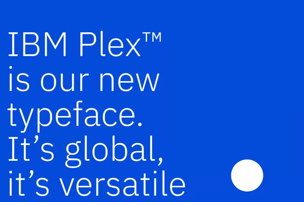
- IBM Plex Sans: A perfect blend of “machine” and “human.”
- Satoshi: A modern geometric sans with excellent typographic hierarchy options.
- General Sans: High-impact, clean, and clinical.
- Plus Jakarta Sans: Excellent for modern SaaS platforms looking for a slightly “friendlier” tech vibe.
- Geist: Vercel’s typeface—the new “cool” for developer tools.
- Albert Sans: Inspired by Scandinavian signage; perfect for hardware packaging.
The Evidence: Look at the 2024-2025 shift in AI hardware startups. They are ditching “soft” fonts for “hard” technical fonts like JetBrains Mono to signal precision.
2. Artificial Intelligence and Automation
AI brands face a unique challenge: they need to look futuristic without looking like a 1980s sci-fi film. The focus here is on “Data-Driven Elegance.”
- Input Sans: A “typewriter” vibe for the modern era.
- Space Grotesque: Quirky, tech-focused, and highly distinctive.
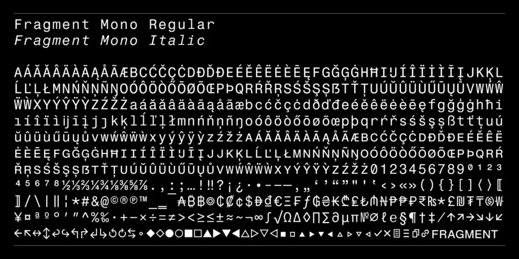
- Fragment Mono: Essential for brands showing “thought processes” or “generative streams.”
- Aeonik: A “structural” font that feels like it was designed by an algorithm.
- Aileron: Focused on mechanical neutrality.
- Founders Grotesk: For AI firms that want to feel like “The Establishment” rather than a startup.
- Manrope: Geometric but with open apertures that feel “approachable.”
- Formula Condensed: High-impact for automation brands focusing on “speed.”
- Lexend: Specifically designed to reduce visual stress—perfect for AI data dashboards.
- PP Neue Montreal: The current darling of “high-end” AI aesthetics.
As AI becomes ubiquitous, we are seeing a “rebellion against the machine” in typography. The “Artisanal AI” aesthetic combines high-tech mono-spaced fonts with “Humanist” serifs to signal that the AI is a tool for humans, not a replacement.
The AI Typography Stack:
- Primary (UI): Geist or IBM Plex Mono. These signal the “backend” power and the data-driven nature of the product.
- Secondary (Marketing): Cormorant Garamond or Fraunces. These provide a “literary” and “human” feel, suggesting that the AI has taste, wisdom, and a sense of heritage.
This pairing—the “Mechanical” meets the “Poetic”—is the defining visual trend of 2026. It moves the brand away from the “cold calculator” vibe toward a “creative partner” identity.
3. E-commerce and Logistics

In E-commerce, fonts are for selling. This means numerals must be clear, and font pairing must guide the eye to the “Add to Cart” button.
- Recia: A serif that feels contemporary and premium.
- Futura Now: The classic geometric, updated for 2026 web standards.
- Public Sans: Developed by the US government, it’s the pinnacle of “neutral utility” for logistics.
- Chivo: High-energy and “loud”—great for flash sales and shipping alerts.
- Bebas Neue: The industry standard for bold, condensed headings.
- Archivo: Designed for high-performance digital environments.
- Montserrat: Still viable for E-commerce, but only if you use the variable fonts version for better loading speeds.
- Playfair Display: For luxury E-commerce. It signals “expensive.”
- Cabin: A “friendly” sans that works well for lifestyle brands.
- Barlow: Slightly rounded, feeling “utilitarian” yet “modern.”
| Feature | Amateur Way | Pro Way (2026) |
| Pricing Numerals | Proportional figures (uneven alignment) | Tabular Lining figures (perfectly aligned in tables) |
| Font Weight | Using 7 different weights | Using 2 weights from a Variable Font (faster load) |
| Hierarchy | All caps for everything | Using X-height and Contrast to lead the eye |
4. Healthcare and Biotechnology
Trust and clarity are non-negotiable. If a patient can’t read the dosage or the instructions because of a “trendy” font choice, the consequences are literal.
- Source Sans 3: Extremely legible, even for those with visual impairments.
- Lato: “Warm” but professional.
- Nunito: The rounded terminals feel “caring” and “gentle.”
- Open Sans: The old reliable, still unmatched for mass-market healthcare.
- Merriweather: A serif designed specifically for screen reading—ideal for medical journals.
- Fira Sans: High character recognition (distinguishes between ‘I’, ‘l’, and ‘1’).
- Oxygen: Very “airy” and “clean.”
- PT Sans: Excellent for multi-lingual healthcare applications.
- Work Sans: Optimised for on-screen legibility at medium sizes.
- Heebo: A crisp, high-precision sans-serif.
Accessibility, under the European Accessibility Act and updated WCAG 3.0 standards, is a legal requirement for most commercial digital products. Typography is the most frequent point of failure in accessibility audits.
The 3 Pillars of Inclusive Type
- Character Disambiguation: As mentioned in our Healthcare section, your font must distinguish between ‘I’, ‘l’, and ‘1’. Fonts like Atkinson Hyperlegible (developed by the Braille Institute) have become the gold standard for this, featuring distinct tails and hooks on similar-looking characters.
- Relative Sizing: Using px for font sizes is a 2026 “don’t.” Accessible sites must use rem or em units, allowing the font to scale based on the user’s browser settings. This is vital for the 2.2 billion people globally with near or farsightedness.
- Colour Contrast & Weight: A font that is too thin (e.g., Hairline or Thin weights) often fails the Contrast Ratio test, even if the colour is technically black on white. In 2026, the minimum recommended body text weight on digital screens is 400 (Regular) or 450.
Technical Comparison for Accessibility
| Font Entity | Disambiguation Score | Readability (Low Light) | Best Use Case |
| Atkinson Hyperlegible | 10/10 | Excellent | Medical / Gov / Seniors |
| Open Sans | 8/10 | High | General Consumer |
| Inter | 7/10 | Moderate | Professional UI |
| Futura | 3/10 | Poor | Headings Only |
5. Renewable Energy
Brands in this sector need to balance “Nature” with “Infrastructure.” We call this “Organic Engineering.”
- Outfit: Based on the Octopus Energy brand—clean, geometric, and modern.
- Epilogue: A variable font that feels “sturdy” yet “dynamic.”
- Fraunces: For brands focusing on the “Earth” side of energy.
- Urbanist: A geometric sans that feels “city-focused.”
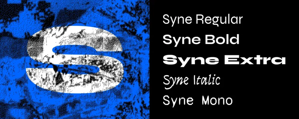
- Syne: For “disruptor” energy brands—edgy and unique.
- Tenor Sans: Elegant and “light,” like wind power.
- BioRhyme: A slab serif that feels “grounded.”
- Sora: Technical and optimised for digital interfaces.
- DM Sans: Low-contrast and “humble.”
- Jost: Inspired by Bauhaus; clean and sustainable.
6. Fintech and Digital Banking
Fintech is about the “Illusion of Solidity.” It needs to feel like a 200-year-old bank but move like a 2-week-old startup.
- Public Sans: Signals “Institutional Trust.”
- Graphik: The “corporate cool” font used by major tech banks.
- Inter: For its “pixel-perfect” reputation.
- Circular: Spotify’s font feels “current” and “global.”
- Noe Display: A high-contrast serif for “High-Net-Worth” branding.
- Manrope: For “Community-focused” Fintech.
- IBM Plex Mono: For the “crypto-native” or “technical” side of finance.
- Founders Grotesk: For “Wealth Management.”
- Work Sans: Solid, dependable, and legible.
- Avenir Next: A classic that still signals “The Future.”
The Evidence: Wise (formerly TransferWise) moved to a custom “tilted” font to stand out in a sea of Inter and Roboto. This move back to “distinction” is the core of brand typography in 2026.
7. Consumer Electronics
Think “Apple-esque” but with more “edge.” This is about precision manufacturing and tactile experience.
- San Francisco: (If within the Apple ecosystem).
- Inter: The best non-proprietary alternative to San Francisco.
- Akzidenz-Grotesk: The “OG” of technical sans-serifs.
- Helvetica Now: The modern, variable version of the world’s most famous font.
- Gilroy: Geometric, thick, and premium.
- Uncut Sans: For brands that want to feel “raw” and “industrial.”
- Syncopate: For high-end, “wide-screen” tech branding.
- Michroma: For “smart home” or “IoT” devices.
- Kumbh Sans: A multi-purpose geometric sans.
- Lexend Deca: Excellent for readability on small-screen devices.
8. Automotive (Especially EVs)
Car typography is moving away from “Chrome and Speed” toward “Software and Sustainability.”
- Eurostile: The classic “car font,” now updated for digital dashes.
- Bank Gothic: For “Rugged/Utility” EVs like the Rivian or Cybertruck style.
- Exo 2: A “techno” font that actually works.
- Audi Type: (Proprietary style)—very wide, very stable.
- Orbitron: For the “Space-age” segment.
- Rajdhani: Technical and “condensed,” like a HUD.
- Teko: High-impact for performance metrics.
- Titillium Web: Developed for the Italian government; feels “engineered.”
- Michroma: Again, for that ultra-wide “dashboard” feel.
- Saira: A massive family with every width imaginable for diverse UI.
9. Aerospace and Defence
In this industry, “Type” equals “Technical Authority.” There is no room for “flair.”
- DIN 1451: The German industrial standard. It is the definition of “Aerospace.”
- NASA Font (Danne & Blackburn): The “Worm” era aesthetic is back.
- OCR-A: For that “machine-readable” legacy feel.
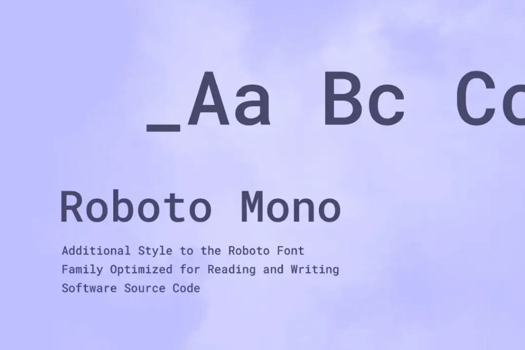
- Roboto Mono: For data-heavy flight telemetry.
- Overpass: Based on Highway Gothic; designed for “Signage and Wayfinding.”
- Share Tech Mono: For “Tactical” interfaces.
- Goldman: A “high-energy” technical font.
- Chivo: For “Heavy Lift” or “Cargo” aesthetics.
- Anta: A 2026-era “futuristic” sans with a technical edge.
- Barlow Condensed: For “Cockpit” density.
10. Consumer Products (Beauty, Wellness, Food)

This sector is seeing a “Serif Renaissance.” Brands want to feel “Organic,” “Heritage,” and “Artisanal.”
- Cormorant Garamond: The peak of “Free Luxury.”
- Oswald: For bold, “rebel” food brands.
- Quicksand: For “Soft/Wellness” products.
- Butler: A high-contrast “modern” serif.
- Tenor Sans: For “High-end Skincare.”
- Baskervville: (Yes, with two ‘v’s)—a “heavy” heritage serif.
- Bodoni Moda: The “Fashion” standard.
- DM Serif Display: For “Food & Beverage” packaging.
- Montserrat Alternates: For “Youth/Gen-Alpha” brands.
- Pinyon Script: When you need a “signature” of quality.
Debunking the “Sans-Serif Only” Digital Myth
For years, “experts” claimed that serif fonts (those with little feet) were too complex for screens. This was true when we were all using 72dpi CRT monitors.
In 2026, with 500ppi smartphone displays and 5K monitors, that advice is dead.
Research from Nielsen Norman Group suggests that the “feet” on serifs actually help the eye track along a line of text, reducing fatigue.
If your website is content-heavy (like a blog or a news site), using a modern serif like Merriweather or Charter can actually increase your “Time on Page” metrics. Don’t be afraid of the “vibe” of serif vs sans serif.
Why the Brain Prefers a Specific Type
Typography is the visual frequency of your brand’s voice. In 2026, leading brands are moving beyond “what looks good” to “what the brain processes fastest.” This is Neurodesign.
When we choose a font for a high-stakes industry like Healthcare or Fintech, we are managing the user’s Cognitive Load.
The Science of Fluency
Cognitive fluency is the ease with which the brain processes information. Research in 2025 indicated that “Humanist” sans serifs—those that mimic the stroke variability of human handwriting—reduce reading fatigue by up to 15% compared to “Geometric” sans serifs.
This is why brands like Airbnb and Duolingo have moved toward softer, more organic typefaces.
- Saccadic Eye Movements: The “feet” on serif fonts like Merriweather act as a horizontal guide, helping the eye move more smoothly across long lines of text.
- The Mirroring Effect: Our brains subconsciously mirror the “mood” of a font. A sharp, angular font like JetBrains Mono triggers a state of focus and precision, while a rounded font like Quicksand triggers a relaxation response.
The “Bouba/Kiki” Effect in Branding.
This classic psychological phenomenon shows that humans associate certain sounds and shapes with “roundness” or “sharpness.” In 2026, we apply this to typography:
- Kiki Fonts: Angular, high-contrast (e.g., Bodoni, Formula Condensed). Best for high-energy, disruptive, or luxury brands.
- Bouba Fonts: Rounded, low-contrast (e.g., Nunito, Outfit). Best for wellness, community-focused, or “helpful” AI tools.
Understanding these biological triggers allows a brand to bypass logical scepticism and build immediate, subconscious trust with the viewer.
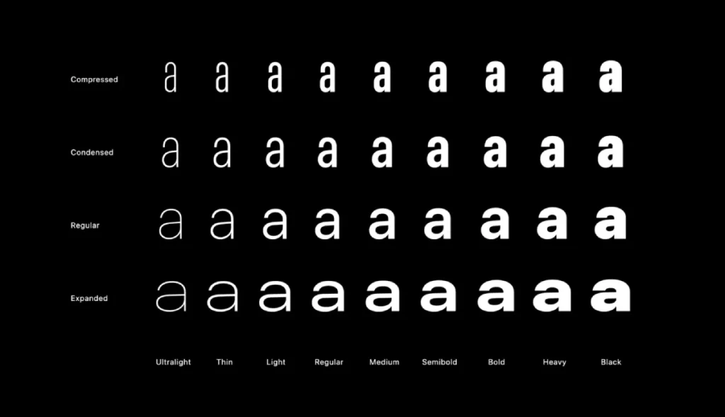
Variable Fonts & Fluid Typography in 2026
The transition from static font files to Variable Fonts (W3C font-variation-settings) represents the most significant shift in typography since the invention of the web.
In 2026, using static weights (Regular, Bold, Italic) is increasingly viewed as an obsolete practice that harms both page performance and design flexibility.
A variable font is essentially a single file that contains the entire “DNA” of a typeface. Instead of loading five different files for various weights, you load one.
This reduces Render-Blocking Resources and improves your Largest Contentful Paint (LCP). But the real power lies in the “axes” of variation: weight, width, slant, and optical size.
Implementing Fluid Typography with CSS clamp()
To ensure your typography scales perfectly from a 140-character smartwatch display to a 32-inch 6K monitor, we use fluid typography. This removes the need for dozens of media queries.
CSS

h1 {

  font-size: clamp(2rem, 5vw + 1rem, 4.5rem);

  font-variation-settings: 'wght' 700, 'wdth' 100;

}
Using the clamp() function keeps the font size within a defined range, fluidly adjusting as the viewport width changes. In 2026, we also leverage the Optical Size (opsz) axis.
This automatically adjusts a font’s letter spacing and stroke thickness based on its size—ensuring it looks delicate in a headline but remains robust and readable in a tiny caption.
Case Example: The SaaS Performance Win
A leading project management platform recently transitioned from five static Inter weights to a single Inter Variable file. By subsetting the font to include only the characters used in their UI (Latin-1), they reduced their typography payload by 72%, resulting in a 0.4s improvement in ‘Time to Interactive’.
The 2026 Font Licensing Audit: Protecting Your Equity
In 2026, font foundries like Monotype, Hoefler&Co, and Klim Type Foundry have digitised their tracking.
Using a font without the correct license is now automatically detectable by web crawlers. This has led to a surge in “Typography Compliance” lawsuits.
Common Licensing Structures
- OFL (Open Font License): Typically found on Google Fonts. Free for commercial use, but offers zero exclusivity.
- Desktop License: Covers use in design software (Photoshop, Figma). Does not cover web use.
- Webfont License: Usually based on monthly page views. If your traffic spikes, your licensing costs could jump from £50 to £5,000 overnight.
- App/E-book License: Required if the font is embedded in the code of a mobile application.
The “Custom Font” ROI
For brands with over 100 million annual page views, the cost of licensing a commercial font often exceeds the cost of commissioning a Custom Typeface.
Brands like Netflix (Netflix Sans) and Intel (Intel Clear) saved millions in licensing fees by owning their own “IP” (Intellectual Property).
If you are a high-growth scale-up, your next step shouldn’t be another Google Font; it should be a bespoke font audit to evaluate the long-term cost of ownership.
The Verdict
In 2026, your typography choice is a strategic business decision. It is the difference between being a “Generic Commodity” and a “Category Leader.”
The “Top 10 fonts” for your industry aren’t just about what looks good; they are about technical performance, legal safety, and psychological alignment. If your brand feels “off,” it’s probably your type.
Next Steps for Your Brand:
- Audit your current fonts: Are they variable? Are they licensed?
- Test for Legibility: Use a “Squint Test” or an accessibility auditor.
- Consider Custom: If you’re a market leader, stop using Google Fonts and invest in a custom typeface.
Would you like me to audit your current brand typography or help you find the perfect font combinations for your next project?
Frequently Asked Questions (FAQ)
Why are variable fonts important in 2026?
Variable fonts allow for a single file to contain multiple variations of a typeface (weight, width, slant). This reduces the number of HTTP requests, significantly improving site speed while giving designers infinite flexibility.
How do I choose between a Serif and a Sans-Serif in 2026?
It depends on the “Duration of Reading.” For short bursts of text (apps, dashboards), a Sans-Serif like Inter is superior. For long-form reading (blogs, whitepapers), a modern Serif like Charter or Merriweather reduces eye strain and increases reading speed.
Are variable fonts better for SEO in 2026?
Indirectly, yes. Because variable fonts use a single file to provide multiple weights, they reduce the number of HTTP requests and the total byte size of your site. This improves Core Web Vitals scores, which remain a key ranking factor for both traditional search and AI visibility.
What is the “Best” font for a startup with no budget?
Public Sans or Inter. Both are high-quality, frequently updated, and free under the SIL Open Font License. They provide a “professional-grade” look without the licensing overhead of commercial foundries.
How many fonts are too many for one website?
The “Rule of Two” still applies. Use one font for headings and one for body text. If you need more variety, use a Variable Font to adjust the weight or width of your existing two fonts rather than adding a third typeface, which increases load times and visual clutter.
Is it safe to use Google Fonts directly from their CDN?
In 2026, it is recommended to self-host your fonts. This avoids privacy issues (GDPR compliance) and allows you to use advanced compression, such as Brotli or WOFF2, on your own server or Edge network, resulting in faster load times.
What is “X-height” and why does it matter?
X-height is the height of the lowercase letters. A tall x-height usually makes a font much more legible on small screens.
How do I check if my font is accessible?
Use tools that check the “Contrast Ratio” and ensure the font weight isn’t too “thin” (which disappears on low-quality screens).
Why do luxury brands use Serif fonts?
Serifs carry “Historical Weight.” They remind us of printed books and high-end fashion magazines, which subconsciously signal “Expensive.”
What is a “Humanist” Sans-Serif?
It’s a font that lacks the “feet” of a serif but follows the organic shapes of traditional handwriting, making it feel more “approachable” than “Mechanical” fonts.
How do I pair fonts effectively?
Choose fonts with “High Contrast.” Pair a very “Loud” heading font with a very “Quiet” body font. Never pair two fonts that look “almost” the same.


