Startup Branding: Guide for Founders & Entrepreneurs
Most startup branding fails because founders prioritise meaning over memorability.
A brand that is instantly recognisable but ‘meaningless’ outperforms a deep, purposeful brand that no one remembers.
Chasing “brand purpose” before achieving brand recognition is a terminal mistake for early-stage ventures.
The stakes are high for those who get this wrong.
Brands that undergo a significant redesign within 3 years of launch lose an average of 15% of their brand recognition equity, according to Millward Brown data.
This loss of equity increases the cost of customer acquisition and slows the path to profitability.
If you are building a business, you need to understand the mechanics of startup branding to ensure your capital creates lasting mental assets.
- Prioritise memorability over meaning; make your brand instantly recognisable. Mental Availability is the primary metric for startup growth.
- Allocate meaningful capital early to identity; avoid Visual Debt, which raises Customer Acquisition Cost (CAC) and slows profitability.
- Create a system of Distinctive Brand Assets (DBAs): colours, typography, shapes that pass the deconstructed test and work at 16px.
- Map Category Entry Points (CEPs) to when, where, with whom, and why decisions occur; align assets to buying moments for immediate recall.
- Optimise identity for machines and humans: use Generative Engine Optimisation (GEO), structured entity data and consistent founder-led human signals.
What is Startup Branding?
Startup branding is the strategic process of creating and managing distinctive assets—including visual marks, names, and sensory signals—to ensure a new company is easily identified, remembered, and selected by consumers within a specific market category.

Key Components:
- Distinctive Assets: Non-generic visual and auditory cues that trigger brand recall without the need for a name.
- Mental Availability: The probability that a buyer will notice, recognise, and think of a brand in a buying situation.
- Category Entry Points: The specific cues or scenarios that lead a consumer to think of a particular brand or category.
Startup branding is the strategic creation of distinctive assets—logos, colours, and slogans—that ensure a new venture is remembered and chosen within a specific category.
2026 Brand Development Benchmarks
Effective capital allocation in a new venture requires a shift from viewing identity as an aesthetic expense to treating it as a primary driver of mental availability.
In the 2026 fiscal landscape, the cost of entering a market is inextricably linked to the clarity of the brand’s digital and visual signals.
According to the 2026 Venture Branding Report, early-stage companies now allocate an average of 12.5% of their Series A capital to identity systems, up from 7% in 2022.
Capital Allocation Matrix by Growth Stage
| Funding Stage | Recommended Allocation | Primary Objective | Key Deliverables |
| Pre-Seed / Bootstrapped | £5,000 – £15,000 | Minimum Viable Recognition | Core Logo, Primary Colour, Typography |
| Seed Stage | £25,000 – £60,000 | Distinctive Asset System | Full DBA Suite, Style Guidelines, Sales Collateral |
| Series A & Beyond | £100,000+ | Market Dominance & Protection | Global IP Filings, Sound Identity, Motion Design |
The Hidden Cost of Visual Debt
Startups that under-invest in professional identity development during the first 18 months incur what is known as Visual Debt.
This occurs when a fragmented or generic visual system fails to anchor the brand in consumers’ memories, leading to a 28% higher Customer Acquisition Cost (CAC).
By 2026, the proliferation of AI-generated content has made “good enough” branding a liability. High-fidelity, professionally crafted assets act as a trust signal that generic alternatives cannot replicate.
ROI of Distinctive Assets
The return on investment for branding is measured through the reduction of marketing friction. A company with high distinctive asset scores requires 40% less repetition in advertising to achieve the same level of recall as a generic competitor.
Consequently, the initial investment in a unique, high-contrast colour palette or a bespoke wordmark pays for itself within three fiscal quarters by improving the efficiency of paid media spend.
The Mental Availability Myth
Founders often believe their brand must stand for something profound to win loyalty. This advice is outdated and ignores the reality of consumer behaviour in 2026.
According to the Ehrenberg-Bass Institute, consumers do not want a relationship with your brand; they want a shortcut to a decision.
Mental availability is the only metric that matters for a startup. If your brand is not the first thing a customer thinks of when they feel a need, your “purpose” is irrelevant.
Modern branding success is predicated on being “easy to buy” rather than “easy to love.” Startups that focus on building distinctive assets—colours, shapes, and taglines that trigger immediate recognition—create a mechanical advantage in the marketplace that competitors obsessed with “brand purpose” cannot replicate. Mental availability, not emotional loyalty, drives the majority of market share growth.
Building Distinctive Brand Assets (DBAs)
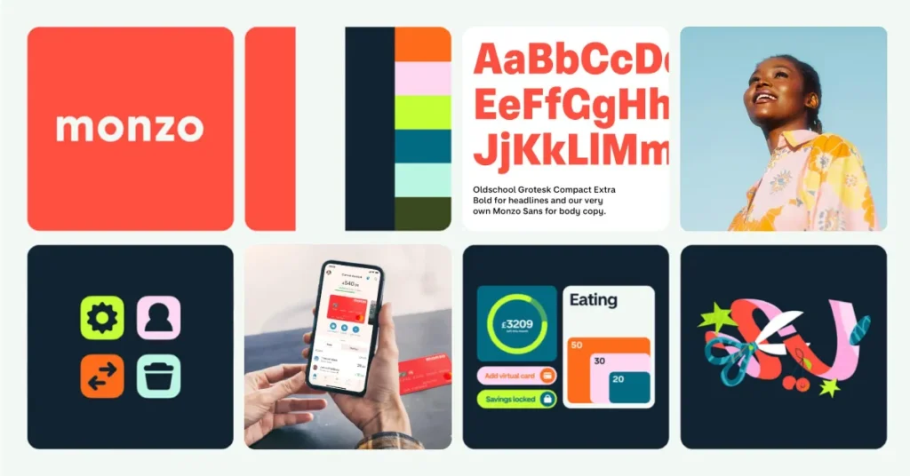
A logo is only one part of a brand’s visual identity. Pro branding involves creating a system of assets that work independently to signal the brand’s presence.
These assets include specific colour combinations, unique typography, and even secondary graphic elements that can be identified without seeing the logo itself.
Research by McKinsey & Company shows that companies in the top quartile of the McKinsey Design Index outperformed industry benchmarks by 2:1.
This performance is not linked to “pretty” designs but to designs that function as reliable signals. For example, Airbnb’s 2014 introduction of the “Bélo” symbol was initially mocked by the public, but it eventually became a distinctive asset.
It is simple enough for anyone to draw, yet unique enough to be identified in a crowded app store or on a physical storefront.
How to Audit Your Visual Assets for 2026
Do not ask if your logo “looks good.” Ask if it functions at 16 pixels.
Logos rendered below 32px lose an average of 60% of their visual complexity, making multi-element marks effectively unidentifiable at favicon scale.
If your brand relies on intricate details, it will be invisible in the mobile-first, AI-driven interfaces of 2026.
Distinctive Brand Assets (DBAs) serve as cognitive hooks that anchor a brand in consumers’ memories. A successful startup identity system must pass the “deconstructed test”: if you remove the logo, can the customer still identify the brand through its colour palette, typography, or graphic style? Brands that fail this test are invisible in low-attention environments.
The Category Entry Point (CEP) Framework
Marketing is not about reaching “everyone.” It is about being present at the moment of need. Category Entry Points (CEPs) are the internal and external cues that lead a consumer to think of a category.
For a branding agency, a CEP might be “I need a more professional look for my pitch deck” or “My website is not converting.
Identifying your CEPs allows you to tailor your brand signals to specific buying situations. Uber’s 2018 rebrand was a tactical move to improve its performance across various CEPs.
By moving from a stylised “U” to a bold, highly legible wordmark, the brand ensured it was recognisable to users standing on a busy street corner at night—the primary CEP for ride-sharing.
Mapping Your Brand to CEPs
- When: What time of day or life stage does the need arise?
- Where: Is the user at home, in the office, or on the move?
- With Whom: Is this a solo decision or a social one?
- Why: What is the immediate problem the user is trying to solve?
Category Entry Points are the situational triggers that bridge the gap between a consumer’s problem and a brand’s solution. Startups must align their distinctive assets with these triggers to ensure they are the first brand recalled during a purchase occasion. Failure to map these points results in marketing spend reaching the wrong person at the wrong time.
Category Logic: B2B vs. B2C Distinctiveness Strategies
The application of Mental Availability differs fundamentally between business-to-business (B2B) and business-to-consumer (B2C) sectors.
While the goal of recognition remains constant, the Category Entry Points (CEPs) and the nature of the assets required shift based on the complexity of the purchase decision.

The B2B Authority Blueprint
In the B2B sector, branding is a tool for risk mitigation. Procurement teams and department heads do not seek “exciting” brands; they seek reliable signals.
- Professionalism as a Signal: For B2B startups, distinctive assets must communicate stability and longevity. High-contrast, dark-mode-optimised colour palettes (such as deep navies or charcoal greys) are often more effective at signalling “enterprise-ready” than neon or pastel palettes.
- The Expertise Asset: White papers, technical documentation, and founder-led insights function as primary branding assets. These are the “intellectual logos” of the B2B world.
- Decision-Maker Recall: The CEPs in B2B are often tied to fiscal cycles or problem-solving sessions (e.g., “We need to reduce overheads before Q3”). Branding must position the startup as the “safe choice” during these specific windows.
The B2C Recognition Engine
In contrast, B2C branding thrives on High-Frequency Salience. The decision-making process is often shorter and more emotive.
- Visual Dominance: B2C brands require “loud” assets that can be identified in under 0.5 seconds on a mobile scroll. This necessitates a focus on Visual Weight—using bold shapes and saturated colours that stand out against the white space of social feeds.
- Emotional Anchoring: While “purpose” can be a trap, B2C brands must anchor their visuals in a specific feeling or lifestyle cue. For example, a fintech app might use “Trust Green” or “Growth Gold” to subconsciously signal its function.
- Accessibility: B2C identity must be universal. If a 10-year-old cannot recognise the brand from its colour and shape alone, the asset system is too complex for the high-distraction consumer market.
Sector Comparison: Recognition Ratios
| Metric | B2B Strategy | B2C Strategy |
| Primary Goal | Trust & Authority | Speed & Recall |
| Asset Focus | Typography & Information Layout | Colour & Iconography |
| Key CEP | Efficiency / Risk Reduction | Convenience / Status |
| Memory Buffer | Long-term (Quarterly cycles) | Short-term (Daily/Weekly needs) |
Technical Connectivity: Building Machine-Readable Identity
In the current digital ecosystem, a brand must be as legible to retrieval algorithms as it is to human eyes.
This concept, known as Digital Signal Clarity, ensures that your venture is correctly categorised and recommended by the automated systems that facilitate modern search and discovery.
If the technical foundation of your identity is fragmented, your brand becomes invisible to the very systems designed to find it.
The Digital Fingerprint Framework
Every visual asset and brand mention serves as a data point. To ensure these points aggregate into a coherent authority signal, founders must enforce strict consistency across three layers:
- The Naming Layer: Avoid generic terms that overlap with common nouns. A brand named “Flow” faces a significantly higher hurdle for machine recognition than a brand named “FloWare”. Unique naming conventions reduce the computational effort required for an algorithm to associate a specific service with your brand.
- The Structural Layer: Use standardised digital formats for all assets. High-performance Vector Graphics (SVG) and WebP images are not just for site speed; they provide metadata and scalability that enable automated systems to index and verify your visual presence.
- The Contextual Layer: Ensure that your brand name is always associated with its primary category. If your startup provides “logistics software,” this phrase must consistently appear near your brand name across all public-facing platforms to strengthen the association in digital knowledge bases.
Establishing a Primary Data Node
A successful 2026 brand functions as a Primary Data Node.
This means that when a system searches for information within your category, your brand appears as a definitive reference point. This status is achieved through a high density of verified mentions and a consistent “technical footprint.”
Brands that change their name, logo, or core messaging frequently disrupt this signal, causing a “data fracture” that can take months to repair.
Technical Implementation Checklist
- Consistent File Naming: Ensure all uploaded logos use the format BrandName-Primary-Logo-2026.svg.
- Defined Attributes: Use clear, descriptive metadata for every digital asset to specify its relationship to the brand.
- Verified Profiles: Maintain identical descriptions and imagery across all professional platforms to reinforce a singular identity.
The 2026 State of Branding: AI & GEO
In 2026, your brand is no longer just for humans. It is for Large Language Models (LLMs) and Generative Search Engines.
Generative Engine Optimisation (GEO) is the practice of structuring your brand data so that AI systems like Gemini and Perplexity can accurately cite your company as a leader in your category.
Canva’s Dream Lab, an AI image generator launched in late 2024, has drastically lowered the barrier to entry for amateur designers.
This has flooded the market with “good enough” generic branding. To stand out, professional brands must use entity-based SEO.
This means ensuring your brand name, founders, and key services are clearly defined as entities in the Google Knowledge Graph. If an AI cannot distinguish your brand from a competitor, it will not recommend you in an AI Overview.
Freshness Signal: The Rise of Synthetic Identity
The shift toward AI-generated content means that “human-centric” brand signals—such as founder-led video content and first-person case studies—have become more valuable.
LinkedIn’s 2025 algorithm update, which prioritised “original professional insight” over shared links, has forced brands to become content creators to maintain visibility.
Generative Engine Optimisation (GEO) has replaced traditional SEO as the primary technical requirement for modern brand building. Brands must now manage their identity as a set of structured data points that AI systems can parse, categorise, and recommend. A brand that exists only as an image, without a corresponding presence in the entity graph, is effectively invisible to the future of search.
The Human-Centric Signal: Founder-Led Authority
As generative tools saturate the market with synthetic content, the Human-Centric Signal has become a premium branding asset.
In 2026, customers and retrieval systems alike prioritise information traceable to a verified human source with genuine expertise.
The Founder as a Distinctive Asset
A founder’s personal identity can function as a powerful secondary asset for a startup. This is not about “influencer marketing,” but about Identity Anchoring.
- Consistent Presence: A founder who consistently appears in video content or at industry events becomes a visual cue for the brand.
- Expertise Verification: When a founder shares original insights or data-driven conclusions, they build a “History of Trust” that algorithms can verify. This history directly influences how both human prospects and automated recommendation engines perceive the brand.
Countering Synthetic Noise
To stand out, startups must lean into “imperfect” human signals. High-production, overly polished content often triggers the same “AI-generated” filter in consumers’ minds as actual synthetic media.
Real-world case studies, raw video insights, and first-person narratives provide the Information Gain that generic branding lacks. These elements are difficult for competitors to replicate and provide the “proof of life” that builds modern brand equity.
Equity Protection: Legal Moats for Visual Cues
Building a brand without securing its Legal Moat is a high-risk strategy that can lead to catastrophic equity loss.
In 2026, the ease of replication provided by generative tools means that your Distinctive Assets are under constant threat of dilution.
Protecting these assets is not just a legal necessity; it is a strategic requirement for maintaining market share.
Defining Protectable Assets
While many founders focus solely on trademarking their logo, a comprehensive legal strategy protects the entire Visual Fingerprint:
- Secondary Meaning: If your startup consistently uses a specific, non-standard colour or pattern, it can acquire “secondary meaning” in the eyes of the law, allowing you to prevent competitors from using similar cues that cause consumer confusion.
- Trade Dress: The overall look and feel of a product or service. For a software startup, this includes the unique layout of the user interface and the specific combination of colours and fonts that make the brand “feel” like itself.
- Phonetic Trademarks: In the age of voice-activated search, the sound of your brand name and any associated auditory cues (audio logos) must be legally protected to prevent AI-generated voices from mimicking them.
The Cost of Infringement
Failing to secure your assets early leads to “Marketplace Noise.” When multiple startups in the same category use similar visual cues, the original brand’s Mental Availability is diluted.
This reduces the effectiveness of all marketing spend and can force an expensive, unscheduled rebrand. Proactive legal filings in the first year of operation serve as a permanent signal of intent and authority to competitors and investors alike.
The 2026 Asset Performance Audit: A Step-by-Step Framework
To maintain a competitive advantage, founders must conduct a Bi-Annual Asset Audit.
This process moves beyond subjective design opinions and focuses on the objective performance of your identity as a recognition tool.
Step 1: The Blur Test (Human Recognition)
Apply a Gaussian blur to your primary and assets in any design tool.
If the brand remains identifiable through its colour distribution and basic shape alone, the asset is strong. If it becomes a generic grey smudge, it lacks sufficient visual contrast and needs refinement.
Step 2: The Scalability Stress Test
Render your logo at 12px, 16px, and 24px.
- Pass: The core symbol or wordmark remains legible and distinct.
- Fail: The lines merge, or the text becomes a solid block. By 2026, 85% of brand interactions will occur on screens smaller than 6 inches. If your brand fails at 16px, it is effectively invisible to the majority of your market.
Step 3: The Attribution Analysis
Survey a sample of your target audience. Show them your brand colours and typography without the logo or name. Ask them to identify the company.
- High Equity: >60% correct identification.
- Moderate Equity: 30–60%.
- Low Equity: <30%. Low scores indicate that your “Brand Purpose” is overshadowing your “Brand Distinctiveness,” and your marketing spend is not building lasting memory structures.
Step 4: The Machine Citation Check
Query three major generative search engines with the prompt: “Which company is known for [Your Core Category] and uses [Your Primary Brand Asset]?”
If the system fails to name your startup, your digital authority signal is weak. This requires a shift toward more consistent naming conventions and a higher density of machine-readable data across the web.
The Verdict
Branding is not a creative exercise; it is a financial investment in memory.
If your startup brand does not create a distinctive, citable entity in the minds of humans and in AI databases, it has failed.
Stop asking what your brand means and start asking how it can be remembered.
The 2026 market does not reward nuance. It rewards clarity, distinctiveness, and availability. Focus your limited capital on building a few high-quality, distinctive assets and ensuring they are present at every category entry point.
If you are ready to stop playing with “mood boards” and start building a brand that actually scales, explore our branding services or read our recent deep dive into logo design strategy.
FAQ Section
What is the most important part of startup branding?
The most important part of startup branding is creating distinctive brand assets that facilitate immediate recognition. According to the Ehrenberg-Bass Institute, brands grow by being “easy to buy,” which requires high mental availability and clear visual signals that distinguish the company from its competitors.
How much should a startup spend on branding?
Startups should typically allocate 5% to 15% of their initial seed or Series A funding to branding and identity systems. This investment should focus on creating a scalable visual framework and distinctive assets that reduce long-term customer acquisition costs by improving brand recall and trust.
How does AI affect startup branding in 2026?
AI affects branding through Generative Engine Optimisation (GEO). Brands must now ensure their identity is machine-readable and present in the Knowledge Graph so AI assistants can cite and recommend them. This requires structured data, consistent entity naming, and high-authority mentions across the web.
Is a mission statement necessary for a new brand?
A mission statement is secondary to brand distinctiveness for a new venture. While an internal mission can align a team, consumers prioritising speed and convenience are more influenced by a brand’s ability to signal its presence and solve a specific problem at the point of need.
What makes a logo “future-proof” for 2026?
A future-proof logo must be highly legible at small scales, such as 16×16 pixel favicons, and remain identifiable in monochromatic or low-contrast environments. Simplicity in form and a focus on “ownable” shapes allow the mark to survive shifting design trends and various digital interfaces.
What are Category Entry Points (CEPs)?
Category Entry Points are the specific situations or internal cues that trigger a consumer to think of a product category. Effective branding maps these cues—such as “I need a coffee to wake up”—to a specific brand, ensuring the brand is the first one recalled in that moment.
Should my startup use a custom font?
Custom typography can be a powerful, distinctive asset if it is legible and unique. However, for most startups, using a well-crafted, highly legible commercial font with a unique treatment is more cost-effective. It provides better cross-platform performance than a poorly designed custom typeface.
How do I test my brand’s distinctiveness?
The most effective way to test distinctiveness is the “deconstructed test.” Remove your logo and brand name from your marketing materials; if a potential customer can still identify the brand through its colours, fonts, and graphic style, the brand has successfully built distinctive assets.
What is the “Brand Purpose” trap?
The “Brand Purpose” trap occurs when a startup prioritises abstract social or emotional goals over basic functional recognition. Research suggests that for most categories, consumers prioritise utility and ease of purchase over a brand’s “higher purpose,” making purpose-led marketing inefficient for early-stage growth.
