Sports Branding: A Guide to Building a Fanatical Tribe
You probably think sports branding is all about the logo.
A snarling panther, a stoic Spartan, a fierce-looking bird of prey. Slap it on a jersey with a bold, aggressive font, and you’re done.
You’re not entirely wrong, but missing 90% of the picture. That’s the result, not the reason.
Great sports branding has almost nothing to do with how menacing your mascot looks. It has everything to do with creating a set of symbols for a tribe to rally behind.
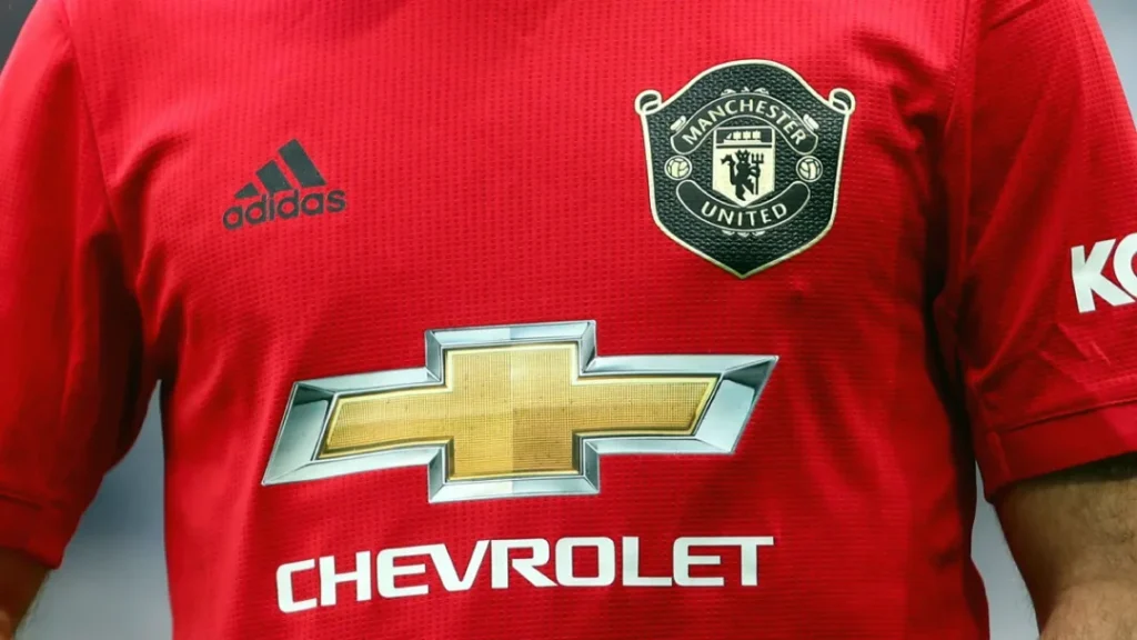
The New York Yankees’ interlocking ‘NY’ isn’t intimidating. It’s just two letters from a standard typeface. Yet, it’s one of the planet’s most potent, recognised, and emotionally charged marks.
Why? Because it’s not just a logo. It’s a banner for a global tribe.
This is the fundamental truth most get wrong. They spend all their time designing the flag before figuring out which country it is for.
- Sports branding is about creating tribal symbols and identity, not just an aggressive logo.
- Four pillars: crest, colours, typography, and story must work together as a cohesive ecosystem.
- Define your story and audience first; strategy and research guide all design choices and consistency.
- Include fans in the process; consistency and simplicity build lasting recognition and emotional loyalty.
Sports Branding Isn’t Corporate Branding in a Tracksuit
The first mistake entrepreneurs and team managers make is treating their team’s brand like they would a software company or a coffee shop.
Corporate branding appeals to logic. It identifies a customer’s problem and presents a solution. “Our coffee is ethically sourced and tastes better.” “Our software saves you time.” It’s a transactional relationship built on value.
Sports branding is pure, raw, irrational emotion.
It appeals to a fan’s sense of identity. The relationship isn’t transactional; it’s ancestral. You don’t “choose” to support a team based on a feature set. You are often born into it. It’s tied to your city, your family, your childhood.
This creates a few key differentiators that change all the rules:
- Irrational Loyalty: A customer will ditch their coffee brand after two bad cups. A fan will stick with their terrible team for 50 years, complaining every season, but still buying the new shirt.
- Community is the Product: People don’t just follow a team; they join a collective. The shared misery and occasional euphoria with fellow fans is the entire point.
- Legacy Over Everything: A tech startup wants to look like the future. A sports team’s greatest asset is often its past. Heritage, history, and nostalgia are the bedrock of its identity.
Forget B2B or B2C. This is Me2We. You’re not selling a product; you’re reinforcing an identity.
Four Pillars of Your Sports Brand Ecosystem
A powerful sports brand is an ecosystem where every element works in concert. If you get these four pillars right, they will support each other and create an identity that’s impossible to ignore. If one is weak, the whole structure wobbles.
Pillar 1: The Crest (Yes, the Logo, But It’s More Than That)
Let’s address the elephant in the room. The logo. In sports, it’s better to consider it a crest—a mark of affiliation. And the biggest pitfall is the “angry animal” cliché I mentioned earlier. It’s a lazy shortcut to looking “tough.”
Real strength comes from meaning, not menace. There are generally three successful approaches:
- The Historic Crest: Think of European football clubs like Liverpool. Their crest is a dense tapestry of history, containing city symbols (the Liver bird) and solemn memorials (“You’ll Never Walk Alone” gates). It’s not just a logo; it’s a coat of arms.
- The Abstract Symbol: This is the ‘NY’ of the Yankees or the star of the Dallas Cowboys. These marks derive their power from decades of consistent use and association with winning. They are simple, timeless, and infinitely reproducible.
- The Modern Mascot: You can use an animal or figure, but it must be done with intention. The Milwaukee Bucks rebrand is a masterclass. They took a deer—not an inherently aggressive animal—and gave it a robust, forward-facing posture and subtle basketball details in the antlers. It’s intelligent, not just angry.
The cardinal sin is over-designing. The trends of the early 2000s, with their gradients, bevels, and 15 different colours, aged like milk. Simplicity lasts generations.
Pillar 2: The Colours (Your Tribal Warpaint)
Long before you can make out the logo on a jersey, you see the colours. From the highest seats in the stadium, colour is the primary identifier. It’s the single most important visual asset for a sports team.
Your colours are your tribal warpaint. They aren’t decoration; they are identification.
When you think of Ferrari in motorsport, you don’t just think of a prancing horse; you think of a specific shade of red—Rosso Corsa. When you picture the Los Angeles Lakers, the regal combination of purple and gold immediately comes to mind. It communicates a history of Hollywood royalty and championship swagger.
A successful brand owns its colours.
This requires discipline. It means defining a strict primary and secondary palette and using it religiously. On the uniforms, on the website, on the stadium signage, and on social media graphics. Consistency is what burns that colour combination into the public consciousness.
Pillar 3: The Typography (The Unsung Hero)
If colour is the mood, typography is the voice. It’s the unsung hero that does an incredible amount of heavy lifting. The font you use on the back of a jersey, ticket stub, and hype video tells a story.
Is it a classic, strong serif font that speaks to a century of history? Is it a modern, custom-designed sans-serif that feels clean, athletic, and forward-thinking?
The Olympic Games are a brilliant example. Each host city develops a unique, custom typeface as a core of the event’s brand identity. It reflects the host nation’s culture and provides a consistent visual language across every single touchpoint, from massive banners to tiny pictograms.
Typography is not a footnote. It’s a critical tool for expressing your brand’s personality.
Pillar 4: The Story (The Reason Anyone Cares)
This is the pillar that holds everything else up. It’s the one thing a new team desperately lacks and a historic team can never afford to lose.
Your story is your why.
Why do you exist? What do you represent to your community?
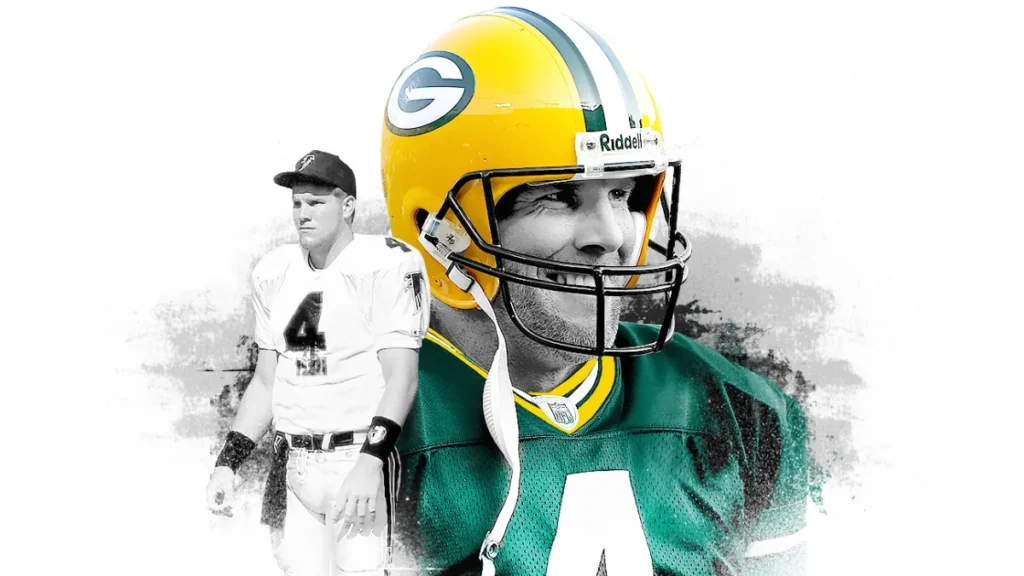
The Green Bay Packers have a powerful story. A billionaire doesn’t own them; their fans own them. This story of community ownership, of a small town competing against giants, is infused in everything they do. It dictates their every decision. It’s the reason their brand has such a powerful, authentic connection.
Are you the gritty underdog built on a blue-collar work ethic? Are you the flashy, dominant dynasty built on attracting superstars? Your story must be defined first, because it informs every design choice. Without a story, your logo is just a drawing, and your colours are just paint.
The Game Plan: A No-Nonsense Process for Building a Sports Brand
This is for the entrepreneurs, the founders of new leagues, the managers of local clubs. You can’t hire a designer and ask for a “cool logo.” That’s building a house without a blueprint.
Step 1: The Discovery Phase (AKA Don’t Skip Your Homework)
Before you open a single design program, you must answer fundamental questions.
- Who are we? What are our core values? (e.g., Resilience, Innovation, Tradition).
- What is our unique story? Is it rooted in the city’s history, the founder’s vision, or a particular style of play?
- Who are our fans? Not just demographics. What do they care about? What does being a fan of this team say about them?
- What is the competitive landscape? What do other teams look and sound like? Where is the open space for a unique identity?
Step 2: The Strategy Phase (Drawing Up the Plays)
Once you have your research, you codify it into a strategy.
- Define Brand Attributes: Choose 3-5 core attributes. For example, a new tech-focused esports team might choose: “Precision,” “Disruptive,” “Global.” An old baseball club might choose: “Authentic,” “Generational,” “Resilient.”
- Develop Tone of Voice: How does your brand speak? Is it a confident champion, a witty challenger, or a humble servant of the community? This will guide your social media, press releases, and all communication.
Step 3: The Design Phase (Executing the Vision)
Now, and only now, do you start creating the visuals. This is where the strategy from Step 2 gets translated into the pillars from the previous section. The brand attributes guide the logo design, the colour selection, and the choice of typeface.
This is the stage where everything comes together. It’s also the stage where a lack of professional guidance can cause the entire project to fall apart. Getting the system right is where professional brand identity design separates the major leagues from the local amateurs.
Step 4: The Launch & Buy-In Phase (Bringing the Fans Along)
You do not simply drop a new brand on your fans one Tuesday morning. This is the ultimate violation of the Me2We principle. They are part of the tribe and must be part of the journey.
The clumsy, drawn-out process of renaming the Washington Redskins to the Washington Football Team and finally to the Washington Commanders is a textbook cautionary tale. It felt disjointed, corporate, and devoid of fan input, leading to years of ridicule.
A better way:
- Tease the process. Let fans know a change is being explored.
- Explain the rationale. Share the “why” behind the new direction. Connect it back to the story and strategy.
- Make them feel included. This doesn’t mean branding by committee, but it does mean showing respect for their emotional investment.
Win Out: Sports Graphic Design and Branding
Your sports brand has no soul, and that’s why you can’t build a real fan base. This isn’t theory; it’s the visual playbook of winners. It deconstructs the visual language of over 80 global sports brands, revealing the strategies that create iconic identities. Stop being another generic team; learn how to build a legacy.
As an Amazon Partner, when you buy through our links, we may earn a commission.
Beyond the Basics: Where a Good Brand Becomes Legendary
The four pillars are the foundation. However, legendary status is achieved when the brand bleeds into every aspect of the fan experience.
The Uniform as a Canvas
A uniform is not just clothing. It’s the armour your tribe’s representatives wear into battle. It is a piece of mobile branding seen by millions. Some brands keep it sacred and consistent (the Yankees’ pinstripes). Others use it as a constantly evolving canvas.
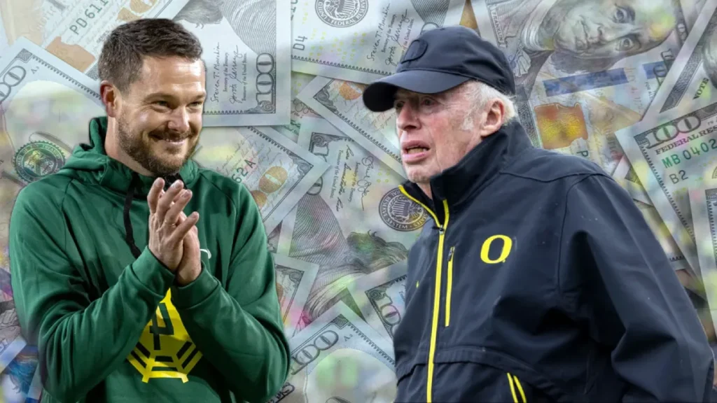
The University of Oregon Ducks football team is the ultimate example. Bankrolled by Nike co-founder and alumnus Phil Knight, their brand is built on change. With hundreds of possible jersey, helmet, and pant combinations, their identity is one of relentless innovation. The fans don’t know what the team will wear, and that anticipation has become a core part of the brand.
The Arena as the Cathedral
The physical venue is arguably the most immersive brand touchpoint you have. Places like Fenway Park in Boston or Old Trafford in Manchester are cathedrals for their fans. The smell of the grass, the colour of the seats, and the specific architectural quirks all add to the brand story.
A modern arena should be a 360-degree brand experience, from the ticketing app to the wayfinding signage to the design of the food wrappers. Every detail reinforces the tribe’s identity.
The Mascot as the Personality
Mascots are tricky. For every brilliant, brand-defining mascot like the Phillie Phanatic—a weird, hilarious creature that embodies the irreverent spirit of the city—there are a dozen forgettable, creepy, or just plain strange attempts. A mascot should be a living, breathing extension of the brand’s personality, not just a person in a furry suit.
Case Studies: The Good, The Bad, and The Complicated
Theory is one thing. Let’s look at how this plays out in the real world.
The Win: The Milwaukee Bucks Rebrand (2015)
The Bucks went from a generic red-and-green mess with a timid-looking deer to a powerhouse brand.
- Why it worked: They embraced their roots with a cream colour inspired by the local architecture. They redesigned the buck to be more formidable and athletic without turning it into an angry caricature. They developed a strong custom typeface. It was a complete, well-thought-out system honouring history while feeling decisively modern.
The Fumble: The “Busy” Logos of the Early 2000s
Many teams in the late 90s and early 2000s fell victim to the trend of complexity. They added gradients, bevel effects, and multiple outlines to their logos, trying to look “extreme” and “digital.” The result? A collection of logos that now look incredibly dated, are difficult to embroider, and are visually cluttered. It’s a powerful lesson in the value of timeless simplicity.
The Debate: The Juventus “J” Logo (2017)
Italian football giant Juventus threw out its historic, oval-shaped crest for a minimalist, abstract “J” symbol.
- The Backlash: Lifelong fans were furious. They felt the club had abandoned over 100 years of heritage to become a sterile “lifestyle brand.”
- The Business Case: The new logo is brilliant from a commercial perspective. It works perfectly on merchandise, from hats to phone cases. It’s a simple, modern mark for a global audience who may not care about the club’s specific history in Turin.
The Juventus case perfectly illustrates the central tension in modern sports branding: the pull between the global market and the local tribe. They chose the market. Time will tell if it was the right long-term move for the tribe.
Your Next Move
Stop thinking about your brand as a logo.
Start thinking of it as a system designed to give a tribe of people a clear set of symbols to unite behind. The visuals—the crest, the colours, the typography—are all in service to one thing: the story.
Get the story right, and the right visuals will follow. Build the tribe first, and they will carry your banner anywhere.
Ready to build a brand that commands loyalty?
Creating a cohesive brand ecosystem is a strategic process. Let’s talk if you’re ready to move beyond a simple logo and build a true identity for your team or league. Explore our brand identity services to see how we build brands that last. Or, if you know what you need, you can request a quote directly. The tribe is waiting.
Frequently Asked Questions About Sports Branding
What is the difference between sports branding and sports marketing?
Sports branding is the process of creating the fundamental identity of a team—its story, logo, colours, and voice. Sports marketing uses that brand to communicate with the public, sell tickets, and attract sponsors through campaigns and advertising. Branding is who you are; marketing is how you tell people.
How much does it cost to brand a sports team?
This varies wildly. A local amateur team might spend a few thousand pounds on a professional identity. A major professional franchise rebrand can cost hundreds or even millions of dollars, involving extensive market research, multiple design agencies, and a global rollout strategy.
Why do some teams change their logos so often?
Teams often change logos to signal a new era (new ownership, a new stadium), to modernise an outdated look, or to increase merchandise sales. However, frequent changes can dilute brand equity and frustrate fans who emotionally connect to the old marks.
What is the most essential element of a sports brand?
While all aspects are connected, the story and the colours are arguably the most critical. The story provides the “why” and the emotional hook, while the colours are the most immediate and decisive visual identifier for the tribe.
Can a new team create a brand with as much power as an old team?
A new team cannot instantly buy a century of heritage. However, it can build a powerful brand by creating a clear, authentic story from day one, executing a flawless visual identity system, and relentlessly focusing on building a community around that identity.
Why is fan input important in a rebrand?
Fans are not customers but stakeholders with deep emotional equity in the team’s identity. Ignoring them during a rebrand is perilous. While they shouldn’t dictate the final design, involving them in the process and respecting their heritage builds goodwill and ensures the new identity is embraced, not rejected.
Should a sports logo be literal or abstract?
There is no single correct answer. A literal logo (like a mascot) can be immediately understood, but may look dated over time. An abstract logo (like the Yankees’ ‘NY’) is timeless and versatile but relies on sustained success and marketing to build meaning. The choice depends on the brand’s core story and long-term goals.
What are common mistakes in sports branding?
The most common mistakes include: following design trends too closely, over-designing the logo with too many details, having an inconsistent visual system, changing the brand too frequently, and failing to tell a compelling story.
How does typography affect a sports brand?
Typography sets the tone. Like a classic college team, a thick, slab-serif font can feel traditional and tough. A clean, geometric sans-serif font can feel modern, fast, and technical, like a Formula 1 team. The right typeface reinforces the brand’s personality on jerseys, scoreboards, and websites.
What is a “brand ecosystem” in sports?
A brand ecosystem refers to the idea that every single touchpoint is an opportunity to express the brand’s identity. It’s not just the logo and uniform, but also the stadium design, the ticketing experience, the tone of social media posts, the mascot’s behaviour, and the halftime show. They all work together to create one immersive, cohesive world for the fan.

