RGB vs CMYK vs Pantone: Which to Use and When
That electric blue on your screen prints as a dull purple on your business cards.
The problem isn’t your designer; it’s a fundamental misunderstanding of how colour works.
Digital screens use RGB (Red, Green, Blue) light to create vibrant hues, while printers use CMYK (Cyan, Magenta, Yellow, Black) ink, which has a smaller colour range.
For guaranteed consistency, brands like Coca-Cola and Cadbury rely on the Pantone Matching System (PMS), a universal standard for exact ink formulas.
This guide isn’t about complex theory. It’s a simple framework to help you decide when to use each system so your colour is never wrong again.
- RGB is used for digital screens, employing light to create colours, while CMYK is for print, using ink to absorb light.
- Pantone ensures brand colour consistency globally with specific pre-mixed ink formulas, essential for high-stakes branding.
- Convert vibrant RGB designs to CMYK with caution; colour shifts to duller tones are common due to gamut limitations.
- For printing on paper, use CMYK; for digital displays, stick to RGB; Pantone is for specialised colour accuracy.
- Building a brand palette starts with CMYK/Pantone choices, ensuring you create accurate colour documentation for all uses.
It’s Light vs. Ink. That’s It.
Forget the acronyms for a second. The entire concept boils down to a straightforward distinction.
RGB creates colour by adding light. It’s for screens.
CMYK & Pantone create colour by adding ink that absorbs light. It’s for physical things.
That’s it. That’s 90% of the battle. One is made of light, the other is made of pigment. They will never be the same, just as a photograph of a lamp is not the same as the lamp itself. Understanding this single point is the key to a consistent brand.
RGB: The Language of Screens
Any colour you see on a monitor, phone, or TV is an RGB colour.
What is RGB, Really?
RGB stands for Red, Green, and Blue. It’s an additive colour model.
Think of a completely dark room.
If you point a red spotlight at a wall, you see red. Add a green spotlight, and the overlapping area becomes yellow. Add a blue spotlight, and the area where all three overlap becomes pure white.
You start with black (no light) and add light to create a spectrum of colour.
This process allows for a massive range of colours—approximately 16.7 million. Digital images can have such intense, glowing neons and brilliant blues. They are made of light.
When You Absolutely MUST Use RGB
The rule is simple: if it will only ever be seen through a screen, it must be RGB.
- Websites and web design
- Social media graphics (Instagram posts, Facebook banners, LinkedIn profile images)
- Digital advertisements
- Video content
- App interfaces
- Digital presentations (PowerPoint, Google Slides)
The Telltale Sign of RGB: The Hex Code
For web applications, RGB colour is expressed as a six-character hexadecimal code, or “Hex code.” For example, Meta’s iconic blue is #0866FF. This is the code your web developer needs to ensure the colour on your site is precise. Handing them a CMYK or Pantone value for your website is like giving a baker a recipe in a language they don’t speak.
CMYK: The Workhorse of Printing
CMYK is the standard for the vast majority of professional printing. If you’re printing on paper, you’re almost certainly dealing with CMYK.
What is CMYK?
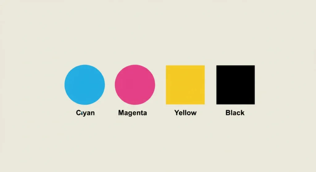
CMYK stands for Cyan, Magenta, Yellow, and Key (which is Black). It’s a subtractive model.
You start with a white surface (paper) that reflects all light. When you add a dot of cyan ink, it absorbs the red light, making the surface appear cyan. You are subtracting light from the white paper. This is why it’s called a subtractive process.
Commercial printers lay down tiny dots of these four ink colours in varying patterns to create the illusion of a full-colour image. This is called “process printing.”
When to Use CMYK (Almost All of Your Printing)
Use CMYK for any full-colour designs printed on paper.
- Business cards, flyers, and brochures
- Magazines and catalogues
- Posters and banners
- Most product packaging
Online printers like Vistaprint and MOO have built their business on efficient CMYK digital printing.
The Inevitable Disappointment: The RGB to CMYK Shift
Here lies my biggest pet peeve. People see a “convert to CMYK” button in a program like Canva or Photoshop and assume it’s a magic wand. It is not. It is a messy compromise.
The range of colours CMYK can produce (its “gamut”) is significantly smaller than RGB’s. You simply cannot print a colour made of light using ink that absorbs light. You can’t print a colour brighter than the white on the paper.
When you convert a vibrant RGB design to CMYK, the software does its best to find the closest possible match within its limited range. This almost always results in vibrant colours becoming duller. Your electric blue becomes navy. Your lime green becomes olive.
It’s like trying to recreate a symphony using only a piano, a violin, a cello, and a flute. You can get a decent approximation, but some notes and textures will inevitably be lost. Don’t blame the printer for this; it’s a limitation of physics.
Pantone (PMS): The Specialist for Brand Perfection

If CMYK is the workhorse, Pantone is the thoroughbred racehorse. It’s a specialist tool for a particular job: absolute, uncompromising colour consistency.
What is Pantone? And why is it Different?
Pantone, or the Pantone Matching System (PMS), is not a mix of four inks. It is a single, specific, pre-mixed ink formula. This is called “spot colour.”
Think of it this way: CMYK is like mixing your paint at home by eye. Pantone is like going to a hardware store and buying a specific can of Dulux paint—like ‘Farrow & Ball’s ‘Elephant’s Breath’. You know that number corresponds to an exact formula, and you can buy another can a year later and it will be identical.
The PMS is a universal standard. A designer in London can specify ‘Pantone 286 C’, and a printer in Tokyo will use the same ink formula to produce the same shade of blue.
The Only Times You Should Worry About Pantone
For most small businesses, CMYK is perfectly adequate. You only need to consider the extra cost of Pantone in a few specific situations.
- Brand Consistency is Non-Negotiable: Your brand colour is your identity and must be identical everywhere. Think of Coca-Cola Red (Pantone 484 C) or Tiffany Blue (Pantone 1837 C). They use Pantone to ensure their colour is perfect on a can, a box, a bag, or a sign, anywhere in the world.
- Simple One or Two-Colour Jobs: If you’re printing a large run of items with a simple logo, like 500 t-shirts with your one-colour logo, it’s often more accurate and sometimes even cheaper to use a single spot colour ink rather than a four-colour CMYK process.
- Printing on Unusual Materials: CMYK is designed for paper. Pantone spot colours often provide a much more reliable and vibrant result when printing on fabric, plastic, metal, or glass.
Stop Asking for it on Your Website
This is the second great misunderstanding. You cannot have a “Pantone website.” A monitor uses light (RGB) to create colour. It does not contain tiny pots of Pantone ink.
Pantone provides official RGB and Hex code “equivalents” for its colours. But these are just simulations—the closest possible approximation that can be achieved with light. The colour on screen will never perfectly match the swatch in a physical Pantone book. Demanding it is demanding the impossible.
The Simple Decision Framework for Business Owners
Stop trying to memorise the science. Just answer these questions in order.
Question 1: Where will this design live?
- On a screen ONLY? (Website, social post) -> Use RGB. You’re done.
- Printed on paper? -> Go to Question 2.
- Printed on something else? (T-shirt, mug, sign) -> Go to Question 3.
Question 2 (For Paper): Is it a standard, full-colour job with photos or complex graphics?
- Yes? -> Use CMYK. This covers 95% of your print needs, from business cards to flyers.
- No, it’s a simple 1-3 colour design where perfect accuracy matters more than photos? -> Go to Question 3.
Question 3 (For Merchandise/Accuracy): Is having the same shade of colour, every single time, worth potentially paying more for?
- Yes? -> Use Pantone. Discuss this with your designer and printer from the start.
- No, “close enough” is good enough? -> Return to CMYK and accept that minor variations between print runs are normal.
How to Build a Bulletproof Brand Colour Palette

To avoid chaos, build your brand colours correctly from day one.
Step 1: Start with the Most Restrictive Model. Don’t fall in love with a super-vibrant RGB colour you can never print. Choose your primary brand colour(s) in CMYK or Pantone first. This is your “source of truth.”
Step 2: Find the Official Equivalents. Once you have your primary print colour, use a tool like the Pantone Colour Bridge or have your designer find the official CMYK and RGB/Hex equivalents.
Step 3: Document Everything. Create a one-page brand style guide. This isn’t complicated. It’s just a simple reference sheet. List all three versions for your primary and secondary colours.
- Example: My Brand Blue
- Pantone: PMS 286 C
- CMYK: 100, 75, 0, 0
- RGB: 0, 51, 153
- Hex: #003399
Step 4: Use the Right Code for the Right Job. When you need a website update, send your developer the Hex code. When you order business cards, send the printer the CMYK values. When you order embroidered hats, send the supplier the Pantone code. Simple.
So, Which One is “Best”? (Hint: You’re Asking the Wrong Question)
None of them is “best.” It’s a fundamentally flawed question. A hammer isn’t “better” than a screwdriver. They are different tools for different jobs.
The correct question is always: “What is the right tool for this specific medium?”
Stop worrying about the acronyms and start with the destination. Decide where the design will live—on a screen, paper, or a t-shirt—and the correct colour model becomes obvious. Get this right, and you’ve solved your brand’s colour headaches before they even begin.
Getting colour right is foundational to a professional brand. An experienced design process is essential if you’re building an identity from scratch and want to ensure it looks sharp and consistent everywhere it appears. We build brands with this “Medium First” mindset from day one.
Explore our graphic design services to see how we build brands that work everywhere. Or, if you’re ready to start, you can request a quote directly on our site.
RGB vs CMYK vs Pantone (FAQs)
What is the main difference between RGB and CMYK?
The main difference is that RGB is an additive colour model used for digital screens (it creates colour with light), while CMYK is a subtractive colour model used for printing (it creates colour with ink).
Can I use an RGB file for printing?
You shouldn’t. While some printers will accept an RGB file, they must convert it to CMYK. This automated conversion often leads to disappointing, dull colours. It’s always best to provide a file in the correct CMYK format.
Why do my printed colours look different from my screen?
Because screens (RGB) and printers (CMYK) use entirely different methods to create colour. Screens emit light, allowing for a much broader and more vibrant range of colours (gamut) than ink on paper can physically reproduce.
When should a small business invest in Pantone colours?
A small business should only invest in Pantone when absolute colour consistency across different products and materials (e.g., printed boxes, embroidered uniforms, and vehicle wraps) is a top priority and worth the potential extra cost.
Is Pantone more expensive than CMYK?
For full-colour printing (like a photo), CMYK is standard. Using Pantone inks for a 1, 2, or 3-colour job can sometimes be more cost-effective than a CMYK process, especially on large runs. However, adding a Pantone spot colour to a standard CMYK job will almost always increase the cost.
What is a Hex code?
A Hex code (e.g., #FFFFFF for white) is a six-digit code used in web design and development to represent a specific RGB colour. It’s the language web browsers use to display colour.
Does Canva use RGB or CMYK?
By default, Canva designs are created in RGB, as it’s primarily used for digital graphics. While you can download a PDF for printing, which converts the colours to CMYK, be aware of the potential for colour shifts as described in this article.
How do I find the CMYK or RGB equivalent of a Pantone colour?
The most reliable way is to use the official Pantone Colour Bridge guide, which shows Pantone colours alongside their closest CMYK, RGB, and Hex equivalents. Your graphic designer will have access to these tools.
What is “spot colour”?
Spot colour is a printing method that uses a specific, pre-mixed ink, such as a Pantone ink. This differs from “process colour,” which uses dots of Cyan, Magenta, Yellow, and Black (CMYK) to simulate a full spectrum of colours.
What should I put in my brand style guide for colours?
For each of your primary brand colours, you should list four values: the Pantone (PMS) code (if you have one), the CMYK values, the RGB values, and the Hex code. This ensures you have the correct code for any application.
Why is the ‘K’ in CMYK for black?
The ‘K’ stands for “Key.” In four-colour printing, the black plate is the “key plate” used to add detail, depth, and contrast to the image. It also avoids confusion with ‘B’ for Blue in RGB.
Can a single logo file work for both print and web?
No, not optimally. You should have two primary versions of your logo file: an RGB version (often in .PNG or .SVG format) for all digital uses, and a CMYK or vector-based version (in .AI, .EPS, or .PDF format) for all print uses.


