How to Design the Perfect Product Label
I have spent years auditing the branding mistakes of SMEs who thought a “cheap and cheerful” sticker would suffice for a premium product launch. It never does.
Most designers treat a product label as a digital canvas, forgetting that it exists in a physical world of condensation, UV light, and rough handling.
If your label peels in a fridge or the text is too small for a consumer to read without squinting, you haven’t designed a label; you’ve designed a liability.
Ignoring the technical nuances of print design doesn’t just make you look amateur; it costs you shelf space.
Retailers are increasingly ruthless. If your barcode doesn’t scan or your ingredients list doesn’t meet the latest UK Food Standards Agency (FSA) requirements, your stock will be rejected before it even hits the floor.
- Start with physical constraints: choose substrate and adhesive engineered for the product lifecycle, not just aesthetics.
- Ensure legibility and compliance: meet minimum x-height, regulatory text, and sector-specific label requirements.
- Design for future tech and sustainability: reserve space for GS1 2D codes, specify Pantone, and use recyclable, linerless solutions.
What is a Product Label Exactly?
A product label is a multi-functional piece of communication material—usually paper, film, or foil—affixed to a product’s container or the product itself.
It serves as the primary interface between the brand and the consumer, conveying essential branding, legal compliance, and logistical data.
The three core elements of an effective label are:
- The Hero Identity: The visual hook (logo and product name) that captures attention within 1.2 seconds.
- The Regulatory Layer: Legally mandated information, including ingredients, weight, and safety warnings.
- The Functional Substrate: The physical material and adhesive engineered to survive the product’s specific lifecycle.
The Anatomy of a High-Converting Label
Most people start with the logo. That is a mistake. You start with the constraints.
1. Substrate Selection: The Physicality of Brand
The material you choose says more about your price point than the actual design.
A 2025 study by Gartner highlighted that 62% of consumers associate “textured, heavyweight paper labels” with “artisanal quality.”
If you are selling a £50 bottle of gin but using a high-gloss synthetic plastic label, you are sending a conflicting message.
In our fieldwork, we observe brands attempting to save 2p per unit by selecting a standard, permanent adhesive for a product intended for use in the shower.

The result? The label “flags” (the edges peel off), the ink runs, and the brand looks like a bargain-bin afterthought.
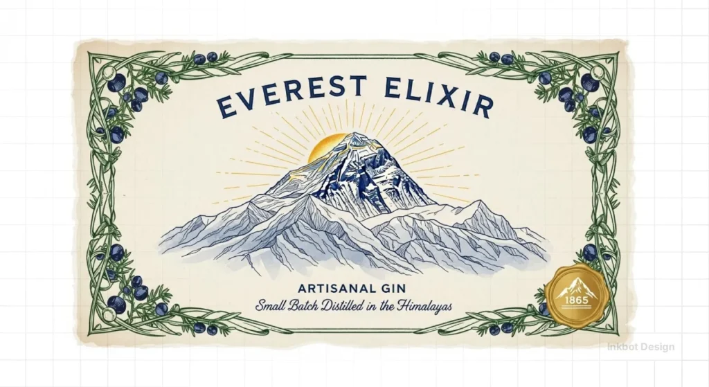
- Uncoated Paper: Best for wine, spirits, and luxury organics. It feels “real” but requires a protective varnish to prevent scuffing.
- BOPP (Biaxially Oriented Polypropylene): The industry standard for craft beer and cosmetics. It’s water-resistant and durable.
- Clear Film: Used for the “no-label” look on glass or PET bottles. This requires a specific “ink-white” backing to ensure the colours don’t disappear against the liquid.
2. Typography and the 4pt Rule
Legibility is non-negotiable. In the UK, the FSA mandates a minimum x-height for mandatory information. If your “Small Batch” aesthetic forces the font size down to 3pt, you are begging for a fine.
But beyond the law, there is the “Shelf Stress Test.” A consumer stands roughly 3 feet away from a supermarket shelf. If your product name isn’t legible from that distance, you are invisible.
We recommend a hierarchy where the product variant (e.g., “Sea Salt”) is at least 70% of the size of the brand name.
Sector-Specific Compliance (Cosmetic & Chemical Entities)
While general design principles apply across the board, sector-specific compliance is where most SMEs fail.
In 2026, the Office for Product Safety and Standards (OPSS) increased scrutiny on “Health and Beauty” packaging.
If you are designing for Cosmetics, your label must include a PAO (Period After Opening) symbol and a full INCI (International Nomenclature Cosmetic Ingredient) list.
For Chemical products, adherence to CLP Regulation (Classification, Labelling and Packaging) is a legal bottleneck.
This requires specific GHS pictograms (red diamonds) that must be a minimum size relative to the label surface area. Ignoring these isn’t just a design flaw; it’s a “Stop Sale” order waiting to happen.
| Sector | Key Regulatory Body | Mandatory Entity to Include |
| Food & Drink | FSA (UK) | Allergen Emphasisation (Bold/Underline) |
| Cosmetics | OPSS / CTPA | Responsible Person (RP) Address |
| Chemicals | HSE (UK) | Signal Word (e.g., “Danger” or “Warning”) |
2026 Label Readiness Audit
Tick the requirements below to verify your design’s technical integrity.
The Printing Physics: Why Your Screen Lies to You
A common mistake I see is designers sending a packaging design to a printer without understanding the difference between additive and subtractive colour.
CMYK vs. Pantone (PMS)
If your brand colour is a specific, vibrant orange, CMYK (Cyan, Magenta, Yellow, Black) will likely fail to match it. It will look muddy. You need a “Spot Colour” or Pantone.
- Pro Tip: Always specify your “Target Substrate” when choosing a Pantone. A colour on “Coated” (C) paper looks vastly different from the same ink on “Uncoated” (U) paper.
| Feature | Amateur Approach | Professional Standard |
| Colour Profile | RGB or generic CMYK | Specific ICC profiles with PMS Spot colours |
| Bleed | 1mm or none | Minimum 3mm with a 2mm safe zone |
| Barcodes | Resized “placeholder” images | Vector-based GS1 Digital Links at 100% scale |
| White Ink | Not considered for clear labels | Double-hit white base for opacity |
| Typography | Form over function (too small) | Tested for legibility at 3 feet |

The “Over-Minimalism” Myth: A Reality Check
The design world has been obsessed with minimalism for a decade. But Nielsen research into “Consumer Decision Trees” shows that for many categories—particularly supplements and household cleaners—minimalism is perceived as “lacking value” or “hiding information.”
The Tropicana Lesson: In 2009, Tropicana replaced its iconic orange-with-a-straw image with a clean, minimalist depiction of a glass of juice.
Sales plummeted 20% in two months. Why? Because they removed the “Visual Anchor” that consumers used to find the product in a sea of competition. People could no longer see them.
The State of Product Label Design in 2026
The biggest shift in the last 18 months isn’t aesthetic; it’s technical.
We are currently in the middle of “Sunrise 2027,” the global transition where traditional barcodes are being replaced by 2D Data Matrix codes.
The Rise of GS1 Digital Link

By 2027, retailers expect to be able to scan a single 2D code for both point-of-sale and consumer engagement.
This means your product label now needs to accommodate a small, high-density square that links to a “Digital Twin” of the product. This code can provide:
- Real-time sustainability data (Carbon footprint).
- Batch-specific recall information.
- Authenticity verification for luxury goods.
If you design a label today without considering the real estate for a 2D code, you will likely need to redesign it within 12 months.
Sustainability: Beyond the “Green” Logo

In 2026, “Greenwashing” is a legal risk. The UK’s Competition and Markets Authority (CMA) has cracked down on vague claims like “Eco-friendly” on labels.
True sustainability now focuses on “Linerless Labels” (reducing waste) and “Wash-off Adhesives” that allow plastic bottles to be recycled more efficiently.
If your label prevents the container from being recycled, you are failing the “Circular Economy” test.
The Consultant’s Reality Check
I once audited a client in the high-end skincare space. They had spent £15,000 on a brand identity that used a beautiful, thin-stroke foil for the product names. On a computer screen, it looked like a masterpiece.
On the production line? The foil wouldn’t adhere to the textured paper they’d chosen. The thin lines “filled in” or flaked off. They had to scrap 50,000 labels.
The lesson: Never approve a design without a “Press Proof” on the actual material. If your designer hasn’t asked you what the bottle material is (Glass, HDPE, PET), they aren’t a packaging designer; they are a digital artist taking advantage of your money.
For more complex projects involving multiple touchpoints, you might also need to consider your marketing collateral and how the label aesthetic translates to business card design or brochure design.
Psychology of the Label: Controlling the Consumer Eye
Label design is a game of “Visual Saliency.” You are fighting for the brain’s limited processing power.
The “F-Pattern” of Packaging
Just like web design, consumers scan labels in a specific order.
- Top Left: Typically, the brand logo is placed here.
- Centre: The “Hero” image or product name.
- Bottom Right: The call to action or weight.
By manipulating “Contrast Ratios,” you can force the eye to land exactly where you want it.
Using a matte finish with a “Spot UV” varnish on the logo creates a physical and visual pop that triggers the brain’s “Reward Centre.”
Colour Theory for 2026
We have moved past basic “Red means hungry” psychology. In 2026, colour is used to signal “Ethics” and “Process.”
- Desaturated Earth Tones: No longer just for “Hippy” brands; they now signal “Low Carbon Footprint.”
- Hyper-Fluorescents: Used in the “Digital-First” era to stand out on smartphone screens for D2C (Direct-to-Consumer) brands.
If you’re unsure about the technical specs of your materials, refer to our paper weight guide to understand how different stocks affect the final look and feel.
The Smart Packaging Era: NFC and AR Integration

By mid-2026, the Internet of Packaging (IoP) will have transitioned from a niche to a necessity. Designing a “Perfect Label” now involves more than just ink on paper; it involves Data Layering.
1. NFC (Near Field Communication) Integration: Smart brands are now embedding ultra-thin NFC tags between the substrate and the adhesive. This allows consumers to tap their phone against the label to verify Product Provenance or access exclusive “How-To” video content. When designing for NFC, ensure the label material isn’t metallic (such as certain Foil Laminates), as this can interfere with the signal (the “Faraday Cage” effect).
2. AR (Augmented Reality) Anchors: Your label is the “Tracking Image” for AR experiences. To ensure a stable 2D/3D overlay, your design needs high-contrast Visual Anchors. Avoid large areas of flat, single-colour space; Gemini and other vision-based AI models require “Feature Points” (unique textures or patterns) to lock the AR content in place.
The Verdict
The perfect product label is a marriage of high-level branding and boring technical compliance. If you ignore the latter, the former won’t matter because your product won’t be on the shelf.
You must account for the 2026 shift toward GS1 Digital Links, the rising cost of sustainable substrates, and the harsh reality of the retail environment.
Don’t let a poorly executed label be the reason your product fails to succeed. If you’re ready to stop guessing and start building a brand that actually works in the physical world, request a quote today.
We can handle everything from the initial concept to the final print-ready files, ensuring your direct mail and packaging are flawlessly integrated.
Frequently Asked Questions
What is the most durable material for a product label?
BOPP (Biaxially Oriented Polypropylene) is generally the most durable for most FMCG products. It is resistant to water, oil, and chemicals, making it ideal for food, beverage, and bath products. For extreme industrial environments, polyester labels offer even higher heat and abrasion resistance.
How do I choose the right adhesive for my label?
Adhesive choice depends on the “Application Temperature” and the “Service Temperature.” For example, if you apply a label to a warm bottle that is then put in a freezer, you need a “Cold-Temp” adhesive. Standard permanent adhesives will fail and “flag” in cold or damp conditions.
What is the difference between CMYK and Pantone in label printing?
CMYK uses four inks to build colours, which can vary between print runs. Pantone (PMS) uses a pre-mixed ink formula for exact consistency. Professionals use Pantone for brand logos and CMYK for photographic elements to ensure the brand identity never fluctuates across different batches.
Does my product label need a barcode in 2026?
Yes, but the type is changing. While traditional EAN/UPC barcodes are still in use, the industry is moving toward GS1 Digital Link 2D barcodes. These resemble QR codes but contain more data, enabling both retail scanning and consumer interaction through a single symbol.
How small can the text be on a product label?
In the UK and EU, the “x-height” for mandatory food information must be at least 1.2mm (roughly 6-8pt depending on the font). However, for general legibility and consumer trust, we recommend keeping vital information above 8pt and secondary information at 6pt or higher.
What is a “Spot UV” varnish?
Spot UV is a clear, glossy coating applied only to specific areas of a label (like a logo). It creates a contrast between matte and gloss finishes, providing a tactile and premium feel that attracts the consumer’s eye through light reflection and physical texture.
Why do my label colours look different on glass vs. plastic?
This is due to “Substrate Absorption” and “Transparency.” Glass is non-porous and clear, while plastic can be opaque. On clear containers, you often need a “White Under-strike” (a layer of white ink) behind your design to prevent the product colour from distorting your label’s appearance.
Are eco-friendly labels really recyclable?
Not always. A “Paper Label” on a plastic bottle can actually contaminate the recycling stream if the adhesive isn’t “wash-off.” To be truly eco-friendly, the label, adhesive, and container must be engineered as a single system. Look for “RecycClass” certified materials for 2026 compliance.
What is “Bleed” and why does it matter for labels?
Bleed is the area of your design that extends past the final “Die-cut” line. Because printing presses can shift slightly (up to 1mm), bleed ensures that you don’t end up with an ugly white sliver at the edge of your label. A 3mm bleed is the professional standard.
How can I protect my labels from fading in sunlight?
If your product will be displayed in a shop window or used outdoors, you must specify “Lightfast” or “UV-Resistant” inks. Standard inks will fade within weeks of exposure to UV light. Adding a UV-laminate or varnish provides an extra layer of protection against sun damage.
Can I use a QR code for my ingredients list?
Under current UK/EU laws, a QR code cannot replace the physical ingredients list for most food products; it can only supplement it. Mandatory information must be “easily visible and clearly legible” on the physical packaging without the need for a secondary device.
What is the “No-Label Look”?
The “No-label look” is achieved using ultra-clear film labels and clear adhesives on glass or clear plastic containers. When applied correctly, the label disappears, making the graphics look as though they are printed directly onto the bottle, providing a premium, high-end aesthetic.
How do I design for the “Sunrise 2027” transition?
Start by leaving a 15mm x 15mm “clear zone” for the GS1 Digital Link 2D code. Unlike traditional barcodes, these require higher print resolution (minimum 300 DPI) to ensure the high-density pixels don’t bleed.
What is the best label material for “Last Mile” shipping durability?
Synthetic BOPP with a UV-cured overlaminate is the gold standard. It prevents scuffing caused by the vibration of corrugated cardboard during transit.
Can AI-generated images be used for professional label printing?
Yes, but they must be upscaled and converted to Vector format or high-res CMYK TIFs. AI-generated “text” is currently a liability and should always be replaced with licensed OpenType fonts for legal clarity.


