Designing a New Business Card? Avoid These 8 Common Mistakes
Let’s talk about that scene in American Psycho.
There is exquisite tension as Patrick Bateman and his Wall Street colleagues compare business cards: the subtle off-white colouring, the thickness, the perfectly chosen typeface.
It’s a parody, of course, but it’s built on a fundamental truth: people judge you by your business card.
A business card isn’t dead. A LinkedIn request hasn’t replaced it.
A bad business card, however, is a liability. It’s a tiny, 3.5-by-2-inch rectangle of incompetence you willingly hand to a potential client or partner. It silently screams “amateur,” “cares little for detail,” and “probably uses default settings for everything else in their business, too.”
The good news is that most failures are entirely predictable and avoidable. They fall into a handful of common traps. As a design agency, we’ve seen them all. Repeatedly.
Here are the eight critical mistakes you must avoid when designing your new business card.
- Avoid overcrowding with information to maintain clarity and professionalism on your card.
- Use legible typography with appropriate kerning to enhance readability and presentation.
- Ensure design consistency with your brand identity for coherent recognition across platforms.
- Invest in quality materials and finishes to create a tactile impression that reflects your brand's value.
Avoid These 8 Common Business Card Design Mistakes
Mistake #1: The ‘Kitchen Sink’ Approach (Cramming Too Much Information)
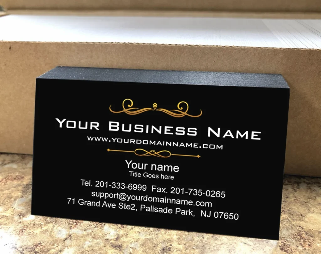
The most common mistake is treating a small piece of cardstock like your full-page ad in the Sunday paper.
The impulse is to include everything: your name, title, company name, logo, physical address, website, email, office phone, mobile phone, fax number (in 2025, really?), and icons for your six social media profiles.
The result is a cluttered, illegible mess. It projects desperation, not professionalism.
Why Less is More
White space is not space; it’s a powerful design element. It gives your information room to breathe. It allows the recipient’s eye to find what matters quickly.
A crowded card causes cognitive overload; disengaging is the default human reaction to overload. Your card goes straight into the bin, or worse, onto a desk where it’s visually ignored forever.
The Core Information Rule: What Must Be There
A business card has one primary job: to connect a person to you and your business. Everything else is secondary. The absolute essentials are:
- Your Name: The person.
- Your Company Name / Logo: The brand.
- A Primary Method of Contact: Usually your email address or phone number.
- Your Website URL: The digital front door to your business.
That’s it. Anything beyond this must fight for its right to be there.
What to Leave Out (And Where to Put It Instead)
Your complete list of services doesn’t belong on your card. It belongs on your website. Your gallery of social media icons is visual noise.
If a client is interested, they will find you. The best solution is to put your social links on your website’s contact or footer section. Drive them to one place—your website—which can then direct them everywhere else.
Mistake #2: Committing Typographical Crimes
Typography is making written language legible, readable, and appealing when displayed. On a business card, it’s 90% of the design. Getting it wrong is a fatal flaw.
Illegible and Inappropriate Font Choices
Choosing a font because it looks “fancy” or “cool” is a recipe for disaster. Overly ornate script fonts can be impossible to read at a small size.
Novelty fonts like Papyrus or Comic Sans have been so overused and misused that they carry negative connotations.
Stick to clean, professional typefaces. You can rarely go wrong with classics.
- Sans-serif fonts like Helvetica, Open Sans, or Futura offer a modern, clean feel.
- Serif fonts like Garamond, Caslon, or Minion Pro project a more traditional, established, and trustworthy image.
The key is readability. If someone has to squint to read your name, you’ve failed. Your font size should rarely go below 7pt.
The Kerning Catastrophe: Ignoring Letter Spacing
Poor kerning makes your text look unprofessional and jarring. Kerning is adjusting the spacing between letters to create a visually pleasing result. Most amateur design tools and templates use default metric kerning, which can lead to awkward gaps or letters that are smashed together.
A designer will meticulously adjust the kerning, especially in your name and company logo, ensuring the spacing is balanced. It’s a subtle detail that makes a massive difference in perceived quality.
A Hierarchy That Doesn’t Guide the Eye
Not all information is equally important. Your name should be more prominent than your email address.
Amateur designs often give every piece of text the same size and weight, forcing the reader to work to find what matters. This is covered in more detail in Mistake #5.
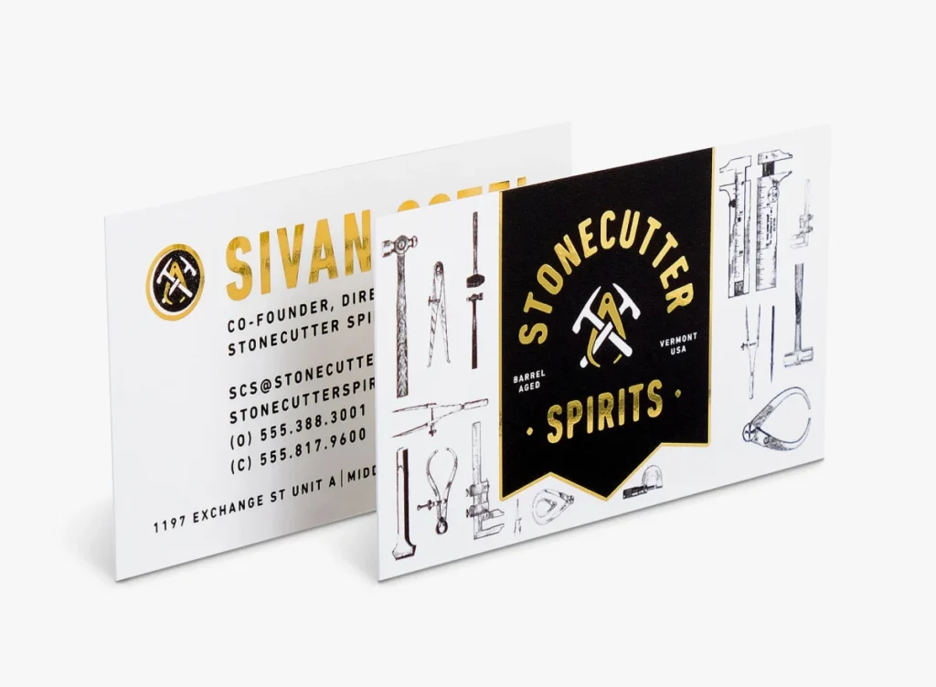
Mistake #3: Completely Ignoring Your Brand Identity
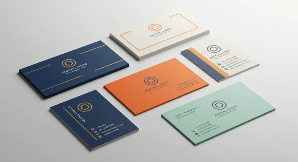
Your business card is not an isolated project. It is a direct, physical extension of your brand. It must look and feel like it comes from the same company that owns your website, runs your social media, and sends your emails.
Your Card is a Puzzle Piece, Not a Standalone Island
If your website uses a minimalist aesthetic with a specific shade of blue and the font Proxima Nova, your business card should not be a riot of colour using the font Times New Roman.
This inconsistency shatters brand recognition. It creates a sense of disjointedness and unprofessionalism. The colours, fonts, logo usage, and overall tone must be consistent across all platforms.
The Perils of Template-Based Design
This is where many entrepreneurs go wrong. They see a £10 deal on Vistaprint or use a free Canva template and pick something that looks “nice.”
The problem is that this template has zero connection to their actual brand. It wasn’t designed with their logo, colours, or audience. Thousands of other businesses are likely using the same design.
A template-based card says you have a template-based business.
How a Card Reinforces (or Destroys) Your Brand Promise
Think about what your brand promises. Are you a high-end luxury consultant? A flimsy, glossy card destroys that promise.
Are you a cutting-edge tech startup? A stuffy, traditional card with a serif font feels wrong. The card must visually and tactilely match the brand story you’re telling everywhere else.
Getting this right is the core of a professional brand identity, a critical asset ensuring consistency and building trust.
Mistake #4: Skimping on Paper and Print Quality
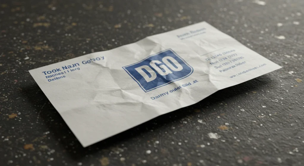
You can have the most brilliant design in the world, but if you print it on cheap, flimsy card, you’ve wasted your effort. The physical feel of the card is a powerful, subconscious messenger.
The Handshake Test: Why Tactile Feel Matters
A business card is a physical interaction. When you hand it to someone, they touch it. This is the “handshake test.“
A thin, bendy card feels cheap and unimportant. A thick, substantial card feels premium and authoritative. It has literal and figurative weight. This first tactile impression sets the tone for how they perceive your business.
Understanding Paper Weight (GSM)
Paper thickness is measured in Grams per Square Metre (gsm).
- < 300gsm: Too flimsy. This is standard flyer or cheap postcard territory. Avoid it.
- 350-400gsm: This is the sweet spot. It feels substantial and professional without being overly rigid. This should be your minimum standard.
- > 400gsm (up to 600gsm+): This is luxury territory. Cards this thick (often called “duplexed” or “triplexed” with a coloured edge) make a profound statement.
Don’t settle for the default “value” stock. Ask for paper samples. Feel the difference for yourself.
Finishes That Make an Impact: Spot UV, Embossing, and More
The finish adds another layer of tactile and visual interest.
- Matte Lamination: A smooth, non-reflective finish that looks modern and sophisticated.
- Gloss Lamination: A shiny, reflective finish that can make colours pop, but can sometimes look dated or cheap if not done well.
- Spot UV: Applying a high-gloss varnish to specific areas (like your logo) to make them stand out against a matte background.
- Embossing/Debossing: Pressing a die into the card to create a raised (emboss) or indented (deboss) effect, adding physical texture.
- Foil Stamping: Applying metallic foil to certain areas for luxury.
These finishes cost more, but they transform a simple card into a memorable object.
Mistake #5: A Confusing or Non-Existent Information Hierarchy
Visual hierarchy is the principle of arranging elements to show their order of importance. A strong hierarchy guides the reader’s eye through the information in the order you intend. A weak hierarchy creates a confusing jumble.
What’s the First Thing You Want Them to See?
When someone glances at your card for two seconds, what information do you want them to absorb? For most people, it’s their name or the company logo. That element should be the most visually dominant thing on the card.
After that, what’s the second most important? The third? Design your card by consciously answering this question.
Using Size, Weight, and Colour to Direct Attention
You create hierarchy using visual cues.
- Size: The most essential elements are larger.
- Weight: Bolder text stands out more than light text.
- Colour: A splash of a bright brand colour can draw the eye to a key element, like your website URL.
- Placement: Elements at the top or in the centre are perceived as more important.
Your name might be in 11pt bold text, whilst your contact details are in 8pt regular text. This simple difference creates an instant, effective hierarchy.
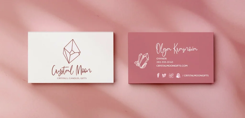
Case Study: A Good vs. Bad Hierarchy
- Bad Hierarchy: Logo, name, title, phone, and email are all the same size and font weight, arranged in a simple list. The eye doesn’t know where to start.
- Good Hierarchy: The logo is prominent but balanced. The name is the largest and boldest text element. The title is smaller, underneath the name. The contact info is grouped and is the smallest text on the card, but still perfectly legible. The eye is naturally led from brand to person to action.
Mistake #6: Designing in a Digital Vacuum (Forgetting Print Rules)
Designing for print is fundamentally different from designing for a screen. Ignoring the technical requirements of a commercial printer is a surefire way to get a final product that looks disastrously different from what you approved on your monitor.
The Cardinal Sin: Designing in RGB for a CMYK World
- RGB (Red, Green, Blue) is the colour model used for digital screens. It’s an additive process where colours are created by adding light.
- CMYK (Cyan, Magenta, Yellow, Key/Black) is the colour model used for professional printing. It’s a subtractive process where colours are created by subtracting brightness from white paper using ink.
The RGB colour gamut is much broader than CMYK. If you design using a vibrant, electric blue in RGB, it will look dull and muted when converted to CMYK for printing. Professional designs are created in CMYK from the start to ensure colour accuracy.
Bleed, Trim, and Safety Margins Explained
You cannot design right to the edge of the card. Physical printing and cutting are not 100% precise.
- Trim Line: The final, intended edge of the business card.
- Bleed: This is an extra 3mm (usually) of your background colour or image that extends beyond the trim line. If the cutting machine is off by a fraction of a millimetre, the bleed ensures you don’t end up with an ugly white sliver on the edge of your card.
- Safety Margin: This is an area inside the trim line (usually 3mm). You must keep all critical text and logos inside this safety margin to guarantee they aren’t accidentally trimmed off.
Any professional designer works with these guides. Any print-ready file must have them.
Resolution Matters: Avoiding Pixelated Logos and Text
Images for the web are often saved at 72 DPI (Dots Per Inch). This is far too low for print. Print requires a resolution of at least 300 DPI to look sharp and crisp. Using a low-resolution logo file downloaded from your website will result in a blurry, pixelated mess on the final printed card. Always use vector files (.ai, .eps, .svg) for logos, as they can be scaled to any size without losing quality.
Mistake #7: The Dreaded QR Code Blunder
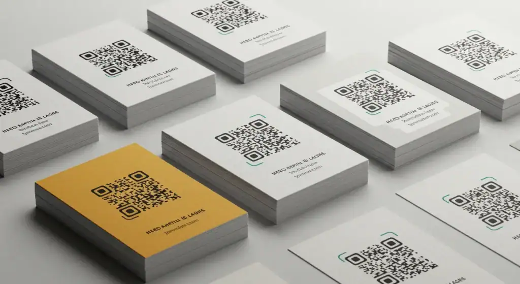
QR codes can be helpful. They can bridge the gap between your physical card and your digital presence. However, 9 out of 10 business cards get them wrong.
Why the Default QR Code Looks Cheap
The standard, black-and-white, pixel-dense QR code generated by most free online tools is visually jarring. It’s an ugly black box that disrupts the flow of your carefully considered design. Slapping it in the corner as an afterthought is a design crime. It signals that you value function over form, which is not a good message for a brand.
How to Integrate a QR Code Aesthetically
A QR code does not have to be black and white. It can, and should, be integrated into your brand’s colour scheme. You can also change the shape of the “pixels,” embed a small logo in the centre, and reduce the data density to make it look cleaner. Custom QR code generators allow for this aesthetic control. It is an intentional and sophisticated part of the design when done right.
Does Your Card Even Need a QR Code?
Before adding one, ask why. What value does it provide that a simple, clean URL does not? If it just links to your homepage, it’s often redundant. A good use case is linking to a specific portfolio, a video introduction, or a calendar booking page. Leave it off if you don’t have a compelling, value-added destination.
Mistake #8: Forgetting the Card’s Ultimate Purpose
Why are you handing this card out? The answer to this question should dictate the design. Many people design a generic card without ever considering its primary job.
Is It a Simple Contact Exchange?
A minimal, clean, and elegant design is perfect if your card’s only job is to provide your name and email after a meeting. The goal is clarity and professionalism. The focus should be on premium paper stock and impeccable typography.
Is It a Mini-Portfolio or a Call to Action?
If you’re a photographer, the back of your card may be one stunning, full-bleed photograph. If a consultant offers a free discovery call, the card could be designed around that specific call to action, with text like “Scan to book your free strategy session.” The design becomes a direct marketing tool.
Designing with a Specific Goal in Mind
A card designed to get someone to visit your e-commerce store will look very different from one designed to get them to call you for legal advice. By defining the desired action you want the recipient to take, you can create a card that is not just a passive information holder, but an active tool for achieving a business goal.
You’ve Avoided the Mistakes. Now What?
Avoiding these common pitfalls puts you ahead of 90% of the competition. It shows you understand that every single touchpoint with a client matters. A business card is not an expense; it’s a strategic brand asset.
Getting these details right is the difference between a card tossed into a drawer and one pinned to a board. It’s the foundation of a professional, cohesive, and trustworthy brand identity.
Ready to Create a Card That Works?
If you’ve read this far, you grasp that a great business card is an investment in perception. For a serious business owner, ensuring it’s done right isn’t a luxury; it’s a necessity. If you’re ready to create a brand asset that makes the right first impression, every single time, we should talk.
Request a no-obligation quote from Inkbot Design today.
Frequently Asked Questions (FAQs)
What is the standard business card size in the UK?
The standard size of a business card in the UK and most of Europe is 85mm x 55mm. This differs slightly from the US standard of 3.5″ x 2″ (approximately 89mm x 51mm).
What is the absolute minimum font size for a business card?
To ensure readability for most people, the absolute minimum font size should be 7pt. 8pt to 11pt is a much safer and more effective range for critical information like your name.
Should I put my photo on my business card?
This depends heavily on your industry. A professional headshot can be very effective for real estate agents, public speakers, or consultants where a personal connection is paramount. For most other sectors, like a tech company or a law firm, it’s often seen as unnecessary or unprofessional.
What is the difference between CMYK and RGB?
RGB (Red, Green, Blue) is the colour model for digital screens like monitors and phones. CMYK (Cyan, Magenta, Yellow, Black) is the colour model for four-colour process printing. All files sent to a printer must be in CMYK format to ensure the colours on paper match what you intended.
What does ‘bleed’ mean in printing?
Bleed is a small area of your design (usually 3mm on all sides) extending beyond the card’s final trim edge. It’s essential because it prevents a thin white border from appearing on your card if the cutting blade is slightly misaligned during production.
What is the best paper weight for a business card?
A weight of 350gsm to 400gsm is considered the professional standard. It feels sturdy and high-quality without being excessively thick or expensive. Anything below 300gsm will feel flimsy.
Is a vertical or horizontal business card better?
Horizontal is the traditional and most common orientation. Vertical cards can stand out, but can be awkward to read and store in traditional cardholders. A vertical orientation is often better for brands that want to appear modern, artistic, or unconventional.
Do I need a professional to design my business card?
While you can use templates, an experienced designer ensures brand consistency, proper file setup for print (bleed, CMYK, resolution), and a unique design that sets you apart. The investment often pays itself by preventing costly print errors and creating a more effective marketing tool.
What information is essential on a business card in 2025?
The essentials are your name, company/brand, a primary contact method (email or phone), and website. Everything else is optional and should only be included if it serves a specific purpose.
What’s the difference between embossing and debossing?
Embossing creates a raised, 3D effect on the paper stock by pressing it between two dies. Debossing creates an indented effect by pressing a die into the front of the paper. Both add tactile texture and a premium feel.

