The Top 10 Military Logos & What They Teach Businesses
Most modern corporate branding is weak. It’s a sea of flimsy justifications, design-by-committee blandness, and logos so “minimal” they have zero personality. As a designer, I’m tired of it.
I’m tired of clients inventing post-rationalised “meaning” for a swoosh. I’m tired of logos that look great in a 50-page brand guidelines deck but fall apart as a social media icon. And I’m deeply tired of brands that forget their logo has a job: to identify, unite, and stand for something.
This is why I’m obsessed with military logos.
For entrepreneurs, this isn’t just a history lesson. Military insignia is the original, high-stakes branding. We’re not talking about selling more widgets but about unit cohesion, immediate identification (friend or foe), and building a legacy people are willing to fight and die for.
These aren’t just patches; they are some of the most functional and famous logos on the planet, and they hold lessons that your average SaaS startup desperately needs to learn. They are the antidote to corporate fluff. They are about function.
- “Flimsy Meaning.” A corporate client tells me their blue circle represents “synergy and global reach.” It’s nonsense. A military logo’s meaning is non-negotiable and baked in. A skull means death. An anchor means the sea. An eagle means air power. It is clear, direct, and indisputable.
- “Illegible Complexity.” The trend of hyper-detailed, gradient-filled emblems. They are useless. A military roundel must be identifiable on the side of a jet moving at 500 mph. A unit patch must be clear from 20 feet away. That is the ultimate test of a scalable, functional logo.
- “Design by Committee.” A modern logo often gets neutered by 12 VPs on a Zoom call, all wanting to “make it pop.” Military logos are steeped in the iron-clad rules of heraldry—a visual language thousands of years old. The symbolism is ancient, and the authority is absolute.
- Prioritise clarity and function: a logo must be instantly recognisable at any size, like the RAF roundel.
- Use clear symbolism: choose simple, unambiguous symbols that tell your mission and tools at a glance.
- Create a motto/heraldry: a short, commanding tagline and a lockup of core symbols build identity and cohesion.
- Avoid “stolen valour”: don’t co-opt military imagery; build authentic, earned authority instead.
The Top 10 Military Logos: A Designer’s Breakdown
Let’s dissect why these work and what your business can steal from them.
1. The U.S. Marine Corps: Eagle, Globe, and Anchor (EGA)
- Design Analysis: I believe this is one of the most successful logos ever created. It’s a complete mission statement in one image. The Eagle (a bald eagle, specifically) represents the United States. The Globe (showing the Western Hemisphere) represents their global reach. The Anchor represents their naval traditions and connection to the U.S. Navy. It’s perfectly balanced and stacked.
- Why it Works: It’s a “lockup” that tells a story: “We are an American force, we operate globally, by sea and by air.” The scalability is slightly hampered by the detail on the globe and feathers (hence the 4/5), but its simplified versions are still instantly recognisable.
- Business Takeaway: Can your logo tell your entire story at a glance? Does it show your scope (the globe), your nature (the eagle), and your heritage (the anchor)?
2. British Special Air Service (SAS)
- Design Analysis: This is pure, distilled attitude. You have the “flaming” or “winged” Excalibur sword, symbolising righteous, swift power. The motto, “Who Dares Wins,” is arguably the greatest tagline ever written. The whole thing is contained within a shield/scroll shape, a classic heraldic device.
- Why it Works: It combines a powerful, aggressive symbol (the sword) with an ethos. The brand is the logo. It’s simple, high-contrast, and the dark blue and white give it a covert, professional feel. It defines an elite, “tip of the spear” brand.
- Business Takeaway: Your motto/tagline is part of your logo. Does it challenge your customer or team? “Who Dares Wins” is an invitation and a threat. It sets a high bar.
3. The Royal Air Force (RAF) Roundel
- Design Analysis: This is the ultimate example of functional, minimalist design. It’s not meant to be beautiful; it’s meant to be seen. Born in WWI, this “Identification Friend or Foe” (IFF) mark had one job: to be identified from a distance and at high speed, from any angle, to prevent being shot down by your side.
- Why it Works: High-contrast concentric circles are the most basic, visually clear shape. It’s scalable to any size—a tiny mark on a tail fin or painted on a massive hangar. It has no orientation; there’s no “upside down.” It is a pure, absolute function.
- Business Takeaway: Is your logo clear? Not just “clever,” but clear? Can it be seen on a tiny browser favicon and still be you? The RAF roundel is the ancestor of every great, simple app icon. It prioritises recognition above all else.
4. U.S. Navy SEALs (The “Trident”)
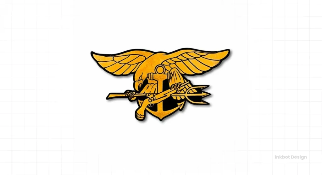
- Design Analysis: Formally known as the Special Warfare Insignia, the “Trident” is another masterpiece of storytelling. The Anchor (Navy heritage), the Eagle (air/freedom), the Trident (sea/divine power), and the Flintlock Pistol (land/unconventional warfare). It literally says “Sea, Air, and Land.”
- Why it Works: It’s not just a logo; it’s a qualification. You don’t get this in a welcome packet; you earn it. This makes it one of the most powerful brands in the world, signifying an impossible barrier to entry. Its complexity (a 3/5 on scalability) is its feature, not a bug—it’s meant to be worn on a uniform and examined up close.
- Business Takeaway: Your brand can signify exclusivity and expertise. Is your “logo” (a certification, an award, a badge) something people strive for? This is branding as a reward.
5. U.S. Army Special Forces (The “Green Beret” Crest)
- Design Analysis: Unlike the SEALs, the SF crest is more heraldic. The core symbols are the Crossed Arrows (representing the unconventional, guerrilla tactics of Native Americans) and the Dagger (the Fairbairn-Sykes, a tool of silent, special operations). The motto, “De Oppresso Liber” (To Free the Oppressed), is a mission statement, not a boast.
- Why it Works: The logo represents the method (arrows) and the mission (motto). It’s less about individual prowess (like the Trident) and more about a collective job. It’s a brand for “warrior-diplomats.” The simple crossed arrows are also used as a standalone, highly scalable branch insignia.
- Business Takeaway: What is your method? What is your mission? A logo can communicate how you do what you do, and why you do it. “To Free the Oppressed” is a “value proposition.”
6. U.S. Space Force
- Design Analysis: I’m including this as a lesson in modern branding. The public reaction was mockery when this was unveiled: “They stole the Star Trek logo!” The design is a delta (a common symbol in air/space) with a Polaris star (guidance).
- Why it Works (or Doesn’t): The design is clean and scalable. The problem was the rollout and the context. It proves that a logo doesn’t exist in a vacuum. Its “Legacy” score is a 1 because it has none and failed to create a new one, instead tripping into a pre-existing pop-culture one.
- Business Takeaway: Public perception is your brand. You can’t just drop a new logo and expect people to get it. You must manage the narrative. The Space Force failed to own their story, and “Star Trek” owned it for them.
7. Legio X Equestris (Caesar’s Tenth Legion)
- Design Analysis: We’re going back 2,000 years. Roman legions were the first corporate brands. Each had a name, a number, and an emblem (a “Signum”). Caesar’s 10th Legion, his most famous, used the Bull.
- Why it Works: Imagine you’re a Gallic tribesman. You see a banner with a bull coming. It means power, stubbornness, and strength. It’s a simple, terrifying, and unambiguous symbol. It works on a banner, a shield, or a coin. This is the original, high-authority, high-legacy brand.
- Business Takeaway: Don’t overthink it. What is the single most powerful animal or object that represents your ethos? Strength? (Bull). Speed? (Horse). Vision? (Eagle). Sometimes, the most ancient symbols are the most effective.
8. The Jolly Roger
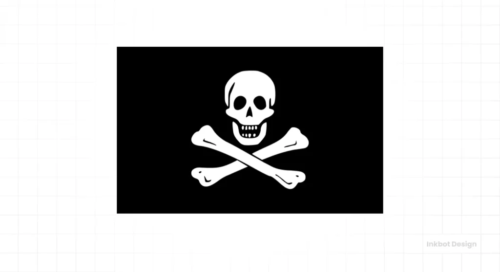
- Design Analysis: This is the ultimate “negative” brand. A non-state actor with a perfect logo. The Skull (death), Crossbones (danger), and Black Flag (no quarter, surrender or die). It had a simple, clear message.
- Why it Works: It was functional psychological warfare. If a merchant ship saw this flag, they knew exactly what the “brand promise” was. It was so effective that ships would often surrender without a fight. That’s a powerful identity. It’s scalable, high-contrast, and has 5/5 for Authority/Intimidation.
- Business Takeaway: Your brand should communicate a clear “promise” or “consequence.” What happens when your customers don’t use your product? (e.g., a cybersecurity firm’s logo should imply danger without them, and safety with them).
9. French Foreign Legion
- Design Analysis: The “Grenade à sept flammes” (seven-flamed grenade) is a powerful, self-contained symbol. The grenade represents an elite, explosive force (grenadiers), and the seven flames are symbolic.
- Why it Works: The brand of the Foreign Legion is “a second chance.” It’s where you erase your past and forge a new identity. The logo is that new identity. It’s a simple, powerful, and slightly archaic symbol (the old-timey grenade) that reinforces their unique, time-honoured traditions.
- Business Takeaway: Your brand can be an identity for your customers. People join the Foreign Legion. Do people “join” your brand? Think of Apple, Harley-Davidson, or CrossFit. They offer an identity, not just a product, often symbolised by a simple logo.
10. Mossad
- Design Analysis: Israel’s intelligence agency logo is a fascinating case. It features the Menorah (a symbol of the state of Israel) inside a crest, with the motto, “By way of deception, thou shalt do war.” (Though this was reportedly changed.)
- Why it Works: It’s a chilling juxtaposition. A symbol of peace and light (the Menorah), combined with a motto of deception. It’s a brand of paradox: a public logo for a secret agency. The authority comes from what it doesn’t show. It’s a brand that says, “We are an official, sanctioned part of the state, and we operate in the shadows.”
- Business Takeaway: Your brand can be about what you don’t say. Sometimes, authority comes from quiet confidence, not a loud boast. It shows you are part of a larger, official system (the Menorah) while hinting at your unique, “secret” capability (the motto).
What’s the Difference? Insignia vs. Logo vs. Brand
Let’s get our terms right.
- Brand: This is the entire experience. It’s the reputation, the “gut feeling” people have. For the U.S. Marines, the brand is “First to Fight,” “The Few, The Proud,” discipline, and grit.
- Logo (or Insignia): This is the visual symbol of that brand. The Eagle, Globe, and Anchor (EGA) is the logo for the Marine brand.
- Heraldry: This is the ancient design system that governs these symbols. It’s the rules for how colours, shapes, and creatures (known as “charges”) are combined.
For a business owner, this means your logo isn’t your brand. It’s the standard your brand rallies around. It’s the flag.
The Inkbot Design ‘Military Logo’ Analysis Matrix
To prove this, I will not just show you a list. I’m going to analyse them. From ancient history to today, I’ve selected 10 of the most effective military logos and graded them on the criteria that matter for any business.
- Symbolism: Is the meaning clear, powerful, and immediate?
- Scalability: Does it work on a jet, a patch, and a letterhead?
- Authority/Intimidation: Does it command respect or fear?
- Legacy: Does it connect to a deeper history and mission?
Here is the breakdown.
| Logo / Insignia | Symbolism (1-5) | Scalability (1-5) | Authority (1-5) | Legacy (1-5) |
| 1. U.S. Marine Corps (EGA) | 5 | 4 | 5 | 5 |
| 2. British SAS | 5 | 5 | 5 | 4 |
| 3. RAF Roundel | 4 | 5 | 3 | 5 |
| 4. US Navy SEALs (Trident) | 5 | 3 | 5 | 4 |
| 5. US Army Special Forces | 5 | 5 | 4 | 4 |
| 6. U.S. Space Force | 3 | 4 | 2 | 1 |
| 7. Legio X Equestris (Bull) | 5 | 5 | 5 | 5 |
| 8. The Jolly Roger | 5 | 5 | 5 | 4 |
| 9. French Foreign Legion | 4 | 4 | 4 | 5 |
| 10. Mossad | 5 | 4 | 5 | 4 |
Common Design Elements & Themes in Military Branding
As you can see, these logos aren’t random. They follow a clear design language.
- Symbols of Power: Eagles, lions, bulls, bears. They communicate dominance and vision.
- Tools of the Trade: Swords, arrows, anchors, wings, rifles. They communicate function and capability.
- The Motto (Tagline): Always short, powerful, and in a “command” tone. “Who Dares Wins,” “Semper Fidelis,” “De Oppresso Liber.”
- Containment Shapes: Shields, circles, and crests. These are vital. They make a complex set of symbols feel like one object. This makes the logo scalable, legible, and easy to apply to any surface.
How to Apply Military-Grade Principles to Your Business Logo
So, you’re a small business owner. You run a bakery, a software company, or a consulting firm. You shouldn’t use a skull and crossbones. But you must learn these lessons.
1. Don’t Be Literal, Be Symbolic.
You’re not a commando. Using actual military hardware, skulls, or “operator” imagery (the “Stolen Valour” of branding) just makes your SaaS company look ridiculous and disrespectful.
- Instead, think about your tools. A lawyer’s “tool” is a book or scales (justice). A developer’s “tool” is a bracket {} or a network (process). A baker’s “tool” is wheat or a rolling pin.
2. Define Your “Why” and Make it a Motto.
The military has “De Oppresso Liber.” What’s yours?
- Bad: “Synergistic Business Solutions.”
- Good: “We Build Things That Work.” “Your Problem, Solved.” “Order From Chaos.”
3. Prioritise Clarity Over Cleverness.
The RAF Roundel won the ultimate A/B test (live or die). Your logo must pass the “squint test.”
- The Test: Squint your eyes and look at your logo. Does it just turn into a fuzzy, unrecognisable blob? If so, it’s too complex. A strong logo holds its shape.
4. Build Your Own “Heraldry.”
Combine your core symbols into a “lockup.”
- Example: A local security firm.
- Bad Logo: A complex drawing of a German Shepherd.
- Good (Heraldic) Logo: A Shield (protection) + a Key (access/security) + a Watchtower (vigilance).
This tells a complete story and is far more professional.
Getting this right—translating your complex mission into a single, powerful, and functional symbol—is the hardest part of branding. It’s where the real work of a professional logo design process happens. It’s not just drawing a cool picture, but also building a standard. This is the principle we follow in all our work at Inkbot Design.
The Big Mistake: ‘Stolen Valour’ in Corporate Branding
I have to end on a warning. A massive, cringe-worthy trend of non-military businesses (especially in the US) co-opting military symbols exists.
- The gym that uses a Spartan helmet.
- The coffee company that uses a rifle-and-skull crest.
- The IT contractor that calls its service tiers “Operator” and “Commando.”
This is a critical brand-positioning error.
- It’s Disrespectful: It trivialises the earned nature of these symbols.
- It’s Confusing: Are you a coffee company or a militia? Your brand is sending mixed, and frankly, unhinged signals.
- It’s a Cliché: It’s the laziest way to say “we’re tough” or “we’re high-quality.”
The lesson from military logos is to build your legacy, symbols, and “earned” brand—not to steal someone else’s.
If your brand is currently stuck in this “tacticool” trap and you’re not sure how to build authority without resorting to clichés, it’s time for a professional consultation. You can request a quote for a brand strategy session with us, and we’ll help you find your authentic power.
Your Logo is Your Standard. Make it Count.
Military logos are the ultimate expression of functional design. They are not art. They are tools of identity, unity, and purpose.
For your business, your logo is your flag. It’s what your team rallies behind and what your customers learn to trust. It should be a symbol of your mission, your values, and your promise.
It doesn’t need to be complex. It just needs to be true.
If you’re ready to create a brand identity with a military-grade logo’s clarity, function, and authority, explore our logo design services. Or, if you’re just starting, read more of our advice on the Inkbot Design blog.
10 Frequently Asked Questions (FAQs)
What is the most famous military logo?
The U.S. Marine Corps Eagle, Globe, and Anchor (EGA) is arguably one of the most famous and effective, telling a complete story of global reach, national allegiance, and naval tradition.
Why do so many military logos use eagles?
The eagle is an ancient symbol of power, vision, freedom, and air superiority. It’s a classic charge in heraldry used to represent empires and elite forces (e.g., Roman Legion, U.S. Navy).
What can a small business learn from military logos?
Clarity, function, and symbolism. Your logo must be instantly recognisable (like the RAF roundel), tell a story (like the USMC EGA), and represent your core mission (like the SF “De Oppresso Liber”).
What is the difference between a logo and military insignia?
A logo (like for a business) represents the brand. An insignia (like the SEAL Trident) is often an earned qualification badge. It is the identity, not just a symbol for it.
Why is the RAF roundel considered an excellent logo?
It is the pinnacle of functional design. It has one job: Identification Friend or Foe (IFF). It’s high-contrast, has no “up” or “down,” and is scalable from a 1-inch sticker to the side of a building.
What is “Stolen Valour” in branding?
This is a term for non-military businesses (like a coffee shop or gym) using military-specific symbols (skulls, rifles, Spartan helmets) to seem “tough.” It’s a common cliché that is often disrespectful and confusing.
What’s a good example of a military motto?
The British SAS’s “Who Dares Wins” is considered one of the best. In three words, it’s a challenge, a promise, and an entire ethos.
Why did you include the Jolly Roger (pirate flag)?
The Jolly Roger is a perfect example of a “negative” brand. It was a functional logo used for psychological warfare, with a clear, unambiguous “brand promise” of “surrender or die.”
What’s the key to a “scalable” logo?
Simplicity and a strong silhouette. It must be recognisable whether it’s a tiny app icon or on a massive billboard. Complex, detailed logos are not scalable.
How can I make my logo feel more “authoritative”?
Use strong, balanced shapes (like shields or circles), clear symbols, and a simple, high-contrast colour palette. Avoid thin lines, complex gradients, or “flimsy” script font.


