More is More: A Guide to Maximalism in Branding
Let’s start with a truth that makes most brand consultants uncomfortable. For the last decade, we’ve been told that less is more. Clean. Simple. Minimalist.
The result? A sea of sameness. An endless scroll of sans-serif logos, muted colour palettes, and soulless websites that are technically “clean” but utterly forgettable. This widespread aesthetic called “Blanding” is born from a fear of being “too much,” and it has created a landscape where most brands are simply “not enough.”
The antidote to being forgettable isn’t to add more for the sake of it. The antidote is to have more to say.
This is where maximalism comes in, not as a trend, but as a strategic choice. It’s a powerful option for the brave and businesses that want to be remembered.
- Maximalism is a strategic, controlled approach—curated complexity that embeds narrative, not random decoration or accidental clutter.
- Use four pillars: a unifying idea, deliberate hierarchy, an expansive but cohesive palette, and strategic negative space.
- Choose maximalism only if your brand sells an experience, targets niche individuality, and can afford high-quality execution.
What is Maximalism, Really? (Hint: It’s Not Hoarding)
Before we go any further, we need to clear the air. Maximalism in branding is not about cramming your logo, three fonts, seven colours, and a stock photo of a handshake onto a business card.
That isn’t a design strategy. That’s a cry for help.
Ditching the Misconceptions: Chaos vs. Control
The biggest mistake business owners make is confusing complexity with chaos. By accident, many brands arrive at a maximalist look—years of inconsistent design choices, bolted-on logos, and clashing marketing materials. This is “accidental maximalism,” and it’s just noise.
Strategic maximalism is controlled chaos. It is curated complexity. Every single pattern, colour, and typographic flourish serves a purpose. It’s the difference between a symphony and a toddler banging on a piano. Both are loud, but only one has a composer.
True maximalism is deliberate, layered, and rich with meaning. It doesn’t just add decoration; it embeds narrative into every pixel and print.
The Core Principles of Strategic Maximalism
To understand it, look for these five signatures. They are the building blocks of a maximalist brand identity.
- Layering & Depth: Stacking visual elements like patterns, textures, images, and type to create a rich, three-dimensional feel.
- Repetition & Pattern: Using recurring motifs, symbols, and intricate patterns to build a cohesive and immersive brand world.
- Rich Colour Palettes: Employ an expansive and often unconventional range of colours to harmonise a specific mood.
- Narrative & Symbolism: Ensuring every detail connects to the core brand story, from a tiny icon to a background texture.
- Contrast & Juxtaposition: Intentionally placing dissimilar elements next to each other—like a classic serif font over a punk-rock pattern—to create energy and visual interest.
When to Go Big: Is Maximalism Right for Your Business?
This is not a style for everyone. Adopting a maximalist identity for a brand built on speed and simplicity is like putting racing stripes on a tractor. It just doesn’t compute.
You must be honest about who you are, what you sell, and who you sell it to.
Green Lights: When Maximalism Works Wonders
Consider going maximalist if you tick these boxes.
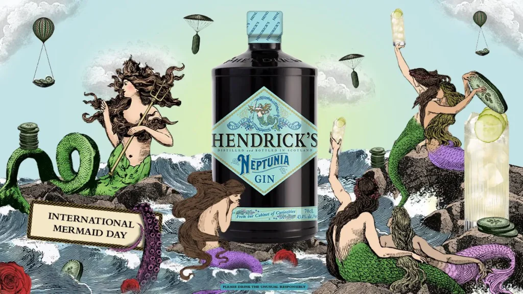
- Your Brand Sells an Experience, Not Just a Product. Think boutique hotels, artisanal coffee shops, craft breweries, or high-end creative services. If the feeling, the atmosphere, and the story are what people buy, maximalism gives you a bigger canvas to paint on. Hendrick’s Gin is a perfect example; its Victorian-esque, surrealist branding creates a world of peculiar charm before you ever taste the gin.
- Your Target Audience Craves Individuality. You’re talking to creatives, collectors, luxury consumers, or niche hobbyists who reject mass-market blandness. These audiences see their choices as a form of self-expression. A maximalist brand allows them to signal their unique taste.
- Your Brand Story is Genuinely Rich and Complex. Heritage brands with deep histories or founder-led businesses with a multi-faceted mission can use maximalism to tell their whole story. A simple logo can’t convey 100 years of history, but a layered design system can.
Red Flags: When to Step Away From the Paint Cans
Maximalism can be a brand killer if used in the wrong context.
- Your Brand Promise is Simplicity and Efficiency. If you sell a productivity app, a data analytics tool, or a minimalist piece of furniture, a complex visual identity actively works against your core message. It creates a cognitive dissonance that repels customers.
- Your Budget is Rock-Bottom. This is a hard truth. Maximalism done poorly looks incredibly cheap. A bad minimalist design might look boring, but a bad maximalist design looks like a cluttered, amateurish mess. It requires high-quality illustration, photography, and expert layout to pull off.
- You Don’t Have a Clear Story to Tell. This is the most critical failure point. If you don’t have a strong, coherent narrative, maximalism will only amplify your brand’s confusion, and you’ll just add more noise to an empty signal.
The Four Pillars of Maximalist Design That Actually Works
If you’ve decided to explore this path, you can’t just start throwing things at the page. You need a framework. A real strategy requires structure, even if the final output looks wildly expressive.
Pillar 1: The Unifying Idea (Your ‘Anchor’)
Every successful maximalist brand is built around a single, powerful unifying idea. This is your anchor in the storm of colour and pattern. Without it, you have nothing.
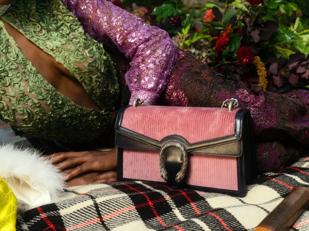
Think of Gucci under Alessandro Michele. The look included florals, animal prints, 1970s tracksuits, and historical references. It shouldn’t have worked, but it did. Why? Because the unifying idea was clear: romantic, intellectual nostalgia. Every piece, however eclectic, felt like it was discovered in the attic of a well-travelled, eccentric professor.
Don’t just start designing. First, define your brand’s anchor in one, story-rich sentence. “We are…” what? “Victorian futurists?” “Cosmic surf-rock?” “Urban botanists?” Get that right, and your design decisions have a filter.
Pillar 2: Deliberate Hierarchy (The ‘Loudest Voice’)
A common failure is treating every element equally, which creates an oppressive wall of visual noise. Your design must guide the viewer’s eye.
Even in a crowded room, you can only focus on one conversation at a time. The same applies to design. You must decide what the “loudest voice” is on any piece. Is it the headline? The product image? A wild illustration?
Use these tools to establish a clear hierarchy:
- Scale: Make the most crucial element significantly larger than the others.
- Colour: Use your brightest, most saturated colour for the focal point.
- Placement: Position the key message where the eye naturally falls (usually top-centre or left).
- Isolation: Create a small pocket of clear space around your main element.
Pillar 3: A Cohesive (But Expansive) Palette
Maximalism liberates you from the tyranny of the two-colour logo. But it doesn’t mean a free-for-all. A maximalist palette is expansive, not random. It might contain 8-10 colours, but they are all chosen to work together to create a specific mood.
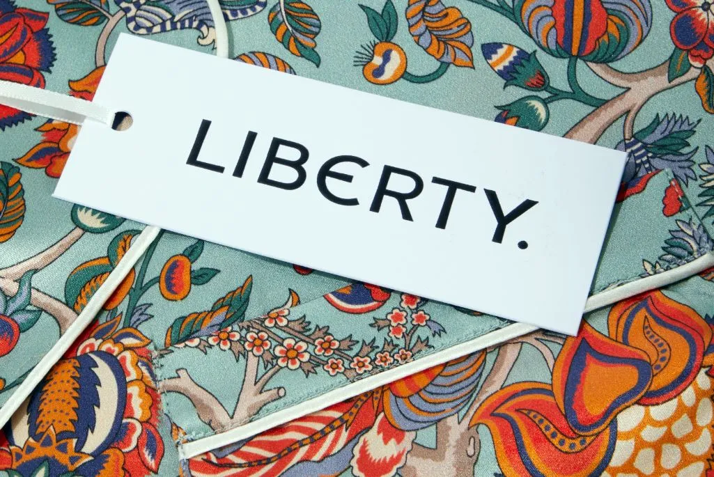
Look at a brand like Liberty London. They are famous for their dense, intricate floral patterns. The designs are incredibly complex, but the colour palettes within each fabric are masterfully controlled. They feel rich and harmonious, not chaotic.
Patterns themselves can be a unifying element. A specific illustration style or a recurring geometric shape can tie together a wide range of applications, creating a brand that is recognisable from its texture alone.
Pillar 4: The ‘Breathing Room’ Paradox
This is the most counterintuitive pillar. Even maximalism needs negative space. It’s just used more strategically.
Instead of vast fields of white, maximalism uses negative space to group related items together and to create moments of rest. Think of it as creating “islands of calm” within the design. A tight cluster of text and imagery might be surrounded by a small, clean margin, separating it from the next cluster.
This prevents the design from overwhelming the viewer entirely. It gives them a place to land, process a chunk of information, and then move on to the next. Without these small moments of relief, the brain simply checks out.
Maximalism in Practice: From Your Website to Your Packaging
Theory is great. But how does this apply to the tangible assets your business needs? It requires a brutal commitment to both creativity and practicality.

Your Website: More Than Just a Digital Brochure
A maximalist website can be an immersive experience. Think layered background textures, animated illustrations, varied typographic styles, and a rich, deep colour scheme. It’s a chance for your visitors to build a world.
But here’s my biggest pet peeve: this strategy lives or dies on its mobile execution. A visually dense desktop design will become an unreadable, slow-loading catastrophe on a phone if not adapted. You must design a simplified, mobile-first version that captures the spirit of your maximalist brand without sacrificing usability. This isn’t optional; it’s the cost of entry.
A strong brand needs a strong foundation to build upon. See how our professional graphic design services can make that strategic core for you.
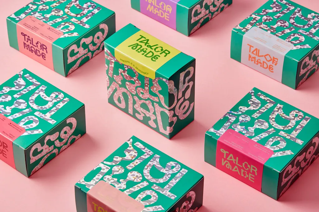
Packaging: The Unboxing Experience on Steroids
Packaging is where maximalism truly shines. It transforms a simple container into a memorable and shareable experience.
Imagine you’re running a small business like “The Gilded Serpent Apothecary,” selling artisanal soaps.
- Minimalist approach: A beige box with your logo.
- Maximalist approach: A box covered in a dark, botanical illustration of snakes and herbs. When you open it, the inside of the box is lined with a contrasting gold foil pattern. The soap is wrapped in tissue paper printed with tiny alchemical symbols. A small card tells the story of one of the key ingredients.
Which one feels more valuable? Which one gets photographed and posted on Instagram? It’s not even a contest.

Social Media: Creating a World, Not Just a Grid
Forget the perfectly manicured, single-colour-palette Instagram grid. A maximalist social media presence feels more like a vibrant, ever-evolving scrapbook or mood board.
It’s a curated collection that reflects the brand’s world. This means you can and should mix:
- Rich, detailed product photography.
- Custom illustrations and patterns.
- Bold, expressive typography-only posts.
- Behind-the-scenes video clips.
- User-generated content that fits your vibe.
The consistency comes from the story, attitude, and expansive palette, not from applying the same filter to every post.
The Bottom Line: Maximalism is a High-Conviction Bet
Choosing minimalism is safe. Nobody was fired for picking a nice, clean sans-serif font and a muted blue. It’s the default. It’s forgettable, but it’s safe.
Choosing maximalism is a high-conviction bet on your own brand. It is a deliberate decision to be aggressively memorable.
It will absolutely alienate some people. They will find it “too busy,” “too loud,” or “too weird.” Good. They were never your people anyway.
The goal of maximalism is not to appeal to everyone. It is to be utterly irresistible to a specific tribe—your tribe. It’s about building a brand full of personality and story that your ideal customers feel like they’ve finally found a place where they belong.
The only question left is: are you brave enough to be interesting?
Maximalism: The Graphic Design of Decadence and Excess
You’ve been told ‘less is more’ for a decade, and now your designs are invisible. That advice is obsolete. This is the playbook for maximalism. Learn to embrace a rich aesthetic with vibrant colour, tactile materials, and decoration to create work that people actually feel. Stop being forgettable.
As an Amazon Partner, when you buy through our links, we may earn a commission.
Your brand deserves more than just to blend in. Let’s discuss whether you’re ready to make a bold statement but need a strategic hand to guide the chaos. Explore our services to see how we build unforgettable brands, or request a quote if you already have a vision.
Frequently Asked Questions (FAQs)
What is maximalism in graphic design?
Maximalism in graphic design is an aesthetic philosophy characterised by complexity, layering, rich colour, and multiple patterns. It is the opposite of minimalism and focuses on creating a rich, narrative-driven visual experience rather than stripping elements down to their basics.
Is maximalism a good branding strategy for a small business?
It can be highly effective if the brand’s product, story, and target audience align with the style. It works best for businesses selling an experience, targeting a niche audience that values individuality and has a complex story to tell. It is not recommended for brands built on simplicity or efficiency.
What is the difference between maximalism and clutter?
The difference is strategy and control. Clutter is random, inconsistent, and lacks a clear message or hierarchy (“accidental maximalism”). Strategic maximalism is controlled chaos; no matter how complex, every element is deliberately chosen to support a central narrative and guide the viewer’s eye.
How do you create a maximalist colour palette?
A maximalist palette moves beyond 2-3 primary colours. It might include 8-10 colours, but they are all selected to create a specific, harmonious mood. The key is to ensure the colours are related through tone and saturation or are used in balance to support a clear visual hierarchy.
Can a tech company use maximalism?
It’s rare, but possible. Early Mailchimp used a quirky, personality-driven, maximalist-adjacent style to stand out in a sea of corporate SaaS brands. It would be a poor choice for a tool promising clean, simple productivity, but could work for a tech brand focused on creativity, community, or entertainment.
Does maximalism work for web design?
Yes, but it requires careful adaptation for mobile devices. A maximalist website might feature layered backgrounds, custom illustrations, and dynamic typography on a desktop. The mobile version must simplify these elements to ensure fast load times and excellent usability while retaining the brand’s unique spirit.
What are some famous maximalist brands?
Gucci (under Alessandro Michele), Versace, Hendrick’s Gin, and Liberty London are all excellent examples of brands that use maximalist principles effectively in their branding, packaging, and marketing.
How do you ensure a maximalist design is readable?
Through a strong visual hierarchy. Using scale, colour, contrast, and strategic “breathing room” (negative space), a designer first guides the user’s eye to the most critical information, ensuring that key messages are not lost in the visual complexity.
Is maximalism just a passing trend?
While its popularity ebbs and flows, maximalism itself is not a trend. It’s a design philosophy with roots in historical movements like the Baroque, Art Nouveau, and Victorian eras. It often re-emerges as a reaction against periods of dominant minimalism.
What’s the first step to creating a maximalist brand identity?
The first step has nothing to do with design. It’s about defining your “Unifying Idea” or core brand story. Without a strong narrative anchor, any attempt at maximalism will devolve into meaningless clutter.


