30 Logo Design Tips That Will Transform Your Brand Overnight
Branding’s not just about fancy fonts and colours—it’s your first impression and can either make or break your business! ⚡
Your logo is often the first thing potential customers see, so it needs to wow them in seconds. In my journey with Inkbot Design, I’ve learned that a killer logo can set you apart in a crowded marketplace.
Want to stand out? 🎨 You’ve come to the right place.
Here are 30 logo design tips to elevate your brand and keep those competitors sweating. Let’s dive in!
- Simplicity and cleanliness are crucial for logos to ensure instant recognition and memorability.
- Understanding your audience helps tailor your logo to resonate emotionally and meet their needs.
- Colour choices should evoke desired emotions and align with your brand message for better connection.
- Typography matters greatly; legible, complementary fonts contribute significantly to brand identity.
- Logos must be versatile, timeless, and reflective of cultural sensitivity to ensure long-lasting appeal.
Simplicity is Key

A strong logo speaks volumes without uttering a single word. It’s the first impression that sticks. When you think about it, the most straightforward designs carve out the most profound space in our minds. Take your logo from try-hard to timeless. Aim for uncomplicated—design for longevity. Trust me, a minimalist approach can work wonders for your brand.
Keep It Clean
The secret to a standout logo is cleanliness. You don’t want your audience struggling to decipher what you offer. Consider your logo a welcoming doorway to your brand; it should be open and inviting, not cluttered with distractions. When you prioritise cleanliness, you enable instant recognition. You want your customers to know you’re the brand they can trust at first glance.
Avoid Clutter
Simplicity isn’t just a trend; it’s a game-changer. To truly engage your audience, focus on stripping away anything that doesn’t add value. The purpose of your logo is to represent your brand. When you throw in too many elements—colours, fonts, shapes—you create confusion.
No one wants to decipher a riddle to understand your business. The more complex your logo, the more likely it will be forgotten. Let’s face it: in that rush of modern life, you need your message to hit hard and fast.
To ensure your logo remains memorable, think of it like packing for a trip. You wouldn’t throw in every piece of clothing you own, right? You’d edit down to what’s crucial. Your logo deserves the same treatment. Ditch the filler.
Focus on what represents your business best. It’s about conveying your message in a crisp, straightforward way. Your audience will appreciate that fact! Just consider it like decluttering your home: less is more.
Understand Your Audience
Some folks think branding is all about flashy designs and catchy taglines. Wrong! It’s centred on understanding your customers and what makes them tick. Your logo might gather dust on the shelf if you can’t relate to your audience. Let’s explore the first step of this journey.
Know Their Needs
You have to step into the shoes of your audience. What are their pain points? What solutions are they looking for? A logo isn’t just a pretty picture; it represents your audience’s needs. When you grasp these elements, you can create a logo that resonates with their desires, making your brand feel more like a friend than a stranger.
Research Target Demographic
Target your research like a hawk on a mouse! Who are the people buying from you? What age, gender, and interests do they have? You can uncover what draws them by diving deep into your target demographic. A slick logo might work wonders for Gen Z, but it won’t wow the baby boomers.
Their behaviours, preferences, and lifestyles shape how you design your logo. It’s like tuning a guitar before a great show. 🎸 You wouldn’t play a rock anthem to an audience craving smooth jazz. So, sift through market surveys, browse social media conversations, and pull insights from competitors.
Look for patterns in demographics that scream out for attention. Understand the emotions tied to their choices—those little nuggets can make a massive difference in how your logo lands. Play your cards right, and your logo becomes a beacon that draws your ideal customers right in. 🌟
Colour Psychology
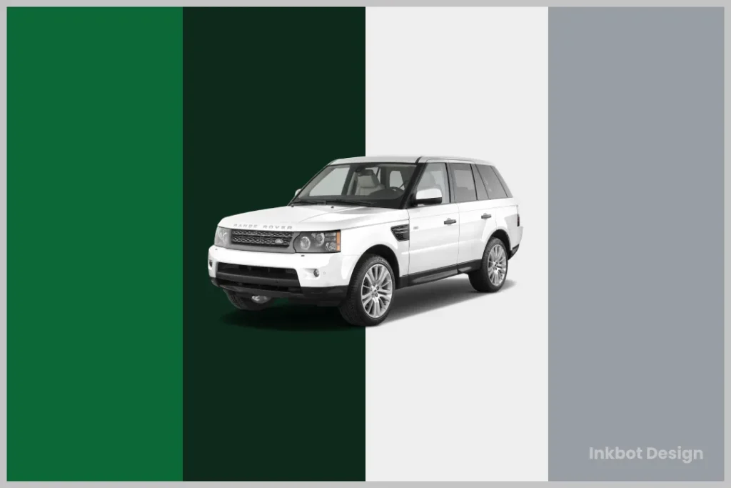
Assuming you want your logo to resonate with your audience, colour will play a pivotal role. The hues you choose can speak volumes—sometimes without you even saying a word. Your brand can evoke trust, excitement, or nostalgia with the right palette. But if you miss the mark? Let’s say your logo might gather more dust than attention.
Choose Wisely
An array of colours exists, and each carries its influence. Are you gunning for passion? Red might be your best bet. Or perhaps you’re after a calming vibe—think blue. Make sure your chosen shades align with your brand’s message. A tycoon in trendy salmon pink? You do not want quite the image of authority.
Evoke Desired Emotions
To make your brand memorable, your colour choices should do more than look good; they should connect emotionally with your audience. A colour scheme should guide the feelings and perceptions you want your customers to associate with your brand.
A well-thought-out colour can stir feelings of love, tranquillity, or excitement. For example, consider how green often relates to growth, harmony, and freshness—perfect for wellness brands. On the other hand, a bold black can convey sophistication or power—great for a luxury brand. Tap into your audience’s psychology by picking shades that resonate with them.
You don’t want potential customers confused or indifferent when they look at your logo. Just think: if you had a dollar for every time a colour choice fell flat, you’d have enough to make your version of Elon Musk’s next Tesla. Be intentional, be thoughtful, and watch as your brand transforms overnight! 🌈✨
Typography Matters
Despite how easily you can overlook it, typography plays a massive role in your branding. A well-designed logo relies on much more than just imagery; the fonts you choose tell a story about your brand’s personality.
Think about it: if you walk into an office decked with geek chic decor and see Times New Roman plastered everywhere, you probably don’t feel the vibe. That’s why it’s crucial to pay attention to typography.
Select Right Fonts
Assuming you want your logo to stand out, beware of using too many fonts. Stick to one or two complementary styles. Mixing three or four fonts might look artsy on Pinterest, but it muddles your brand’s identity. Look at logos that inspire you; see how their font choices align with their messaging. Even the font size can make or break your design—play around until you find what clicks!
Ensure Readability
You’ll want your logo to be instantly recognisable, which means readability is key. If no one can decipher your brand name because the font’s too ornate or tiny, what’s the point? In a world where people swipe left on unreadable content faster than they slam a door in someone’s face, your logo needs to grab attention quickly.
Right off the bat, opt for clear, bold fonts. Logos often get viewed in various sizes—from tiny social media icons to giant banners—so ensure your text holds up in any scenario. Test your logo in multiple sizes. Can you still read it? If not, you might be heading for a significant branding blunder.
Play with weight, spacing, and styles until you find the perfect combination.
But here’s the kicker – your audience should feel an emotional connection to the text as much as they do to the image itself. Like that time, you opened a book based solely on its cover and font choice! Choose wisely; your typography is as much a part of your brand story as your products are.
Versatility

For your logo to make a lasting impression, it must shine across all platforms. Think about it—your logo will appear on everything from business cards to massive billboards. You’re losing potential impact if it doesn’t hold up in these different sizes or formats.
Design for All Mediums
You never know where your logo might end up. Whether online, in print, on merchandise, or even as an app icon, you want it to be instantly recognisable. Test your design at both small and large scales. If you can’t see it clearly at thumbnail size, it’s time to rethink your approach.
Adapt to Different Uses
For your logo to shine, it should be adaptable. Whether on a woven tag of a shirt or plastered across a digital ad, it should maintain its essence. A versatile logo retains its integrity no matter how it’s used. It should look equally fantastic if you’re sporting a gigantic sign or a minute social media avatar.
Versatility is key to a successful logo. Businesses that understand this create flexible designs suitable for any context. Think about the Nike swoosh or the McDonald’s arches. They’re simple but effective, transitioning from restaurant menus to sports gear. Test your logo in various scenarios to make sure it still resonates.
Will it look good in black and white? How does it resonate on a phone screen? It could spell trouble if it falls flat in any respect. An adaptable logo keeps your brand alive in the ever-changing landscape. Don’t settle for a one-trick pony! 🐴 Instead, aim for something that can flex and flex that brand muscle! 💪
Memorability
Your logo should stick in people’s minds like honey on toast. If your logo isn’t unique, it’ll get lost in the sea of sameness. You want something unforgettable that resonates with your audience. No one wants to be “that” brand with the generic logo—right?
Create Unique Logos
Dig deep into your brand’s identity to craft an outstanding logo. Think about what sets you apart. Do you have a unique story or a quirky personality? Let that shine through your logo. A distinctive logo is the heart and soul of your brand—it’s got to be you.
Aim for Recognition
Any logo worth its salt aims for instant recognition. Your logo should be instantly identifiable, even when seen just for a hot second. Think of the golden arches of McDonald’s or Nike’s swoosh—even at a distance, you know who they are! It’s not magic; it’s recognition.
This kind of recognition doesn’t happen by chance. It requires strategy. Consistency is your best friend here. Use your logo across all platforms: websites, social media, and packaging. Your audience will start associating that logo with your WORK—your products, the experience, and the emotions tied to your brand.
Have you ever felt that warm fuzziness when seeing a logo you love? That’s what you’re aiming for! Consider platforms like Inkbot Design for guidance in this process. Keep your designs simple yet meaningful. Why complicate things? Creativity and a clear vision will increase your chances of being remembered! 🎨
Consistency is Crucial
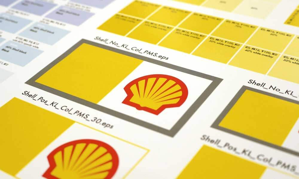
Unlike some might think, having a strong brand isn’t just about a flashy logo. It’s about what consistency brings to the table. Think of your logo as the face of your business; if it changes too often, it might start to look like a dodgy Tinder profile. You want your audience to recognise and trust you, right? This is where maintaining cohesion comes in.
Maintain Brand Cohesion
The key to a memorable brand is unity. Every element should harmonise, from your logo, colours, and typography. When your visuals create a cohesive language, your audience is likelier to engage and stay loyal. A jarring design can confuse your customers faster than a bad joke at a wedding!
Align Across Platforms
Let’s get into the nitty-gritty of aligning your brand across various platforms. Brand recognition isn’t just about standing out; it’s about sticking out for the right reasons. Imagine walking into a café, and the menu looks different every time—confusing. Your logo should maintain a consistent look no matter where it appears.
Brand consistency ensures your logo, colours, and messaging are the same whether someone sees your Instagram feed, website, or business card. It’s like wearing the same outfit every time you go out; it builds your identity. You want your customers to associate your brand with quality and reliability.
People might think there’s something off if your logo differs on social media from your website. They could even question your credibility!
Keeping that design uniform across platforms reinforces your brand and fosters trust. Don’t let your brand look like it’s having an identity crisis. Align it, and watch your brand’s recognition soar! 🚀
Feedback Loop
Many designers overlook the feedback loop, thinking their logo is perfect. Spoiler alert: it’s rarely the case! A tight feedback loop can spot flaws and enhance your design, giving your brand that extra punch it needs. I’ll explain why testing and involving others is key to nailing your branding. 🚀
Test and Iterate
Feedback is like the secret sauce in your design journey. Don’t just slap a logo together and call it a day. Once you think you’ve got a solid design, take it for a spin. Please share it with trusted friends or colleagues. Collect constructive criticism. Adjust and refine. The more you iterate, the sharper your logo becomes.
Involve Stakeholders
Any brand worth its salt has a few stakeholders to consider. Engage your team, clients, or anyone interacting with your brand. Their insights can illuminate blind spots you didn’t even know existed. Nothing’s more dangerous than a logo that looks great to you but leaves others scratching their heads.
Iterate based on their feedback. You’d be surprised how impactful a fresh pair of eyes can be. You might think your vision is spot on, but having others chime in helps you avoid major pitfalls. They may point out colours that clash or elements that confuse them. Stakeholders are more likely to champion your brand when they feel involved. Win-win! 🌟
Emotion Over Logic
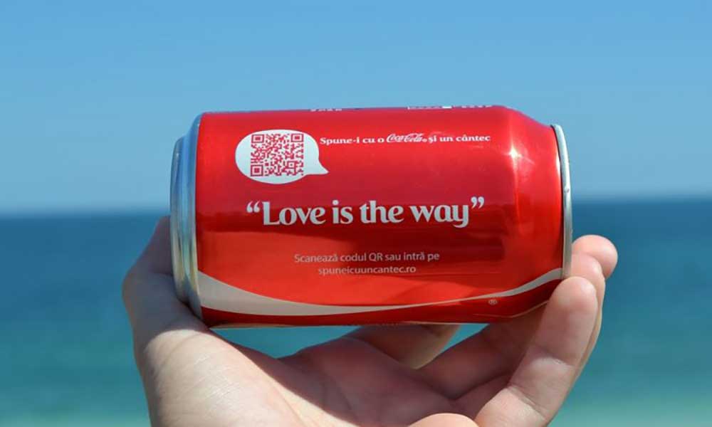
Despite what some might say, your logo’s job isn’t just about looking good on a business card. It’s about igniting feelings and connections. So, ditch the logic; focus on emotion instead.
Evoke Feelings
If you want your brand to stand out, tap into resonant emotions. Think of your favourite brands. What feelings do they conjure? Whether it’s excitement, nostalgia, or trust, your logo should evoke similar sensations. A great logo does more than represent; it speaks to your audience’s hearts.
Connect with Audience
Connect with your audience by being relatable and authentic. Over time, you’ll build a community that feels allegiance to your brand, not just a fleeting interest. You’re not just “selling”; you’re fostering a relationship.
Think about how people felt when a giant tech company released a new product. They weren’t just thrilled about the gadget. They loved how it made them think, belong, be consequential, or even be enlightened.
Over the years at Inkbot Design, I’ve learned that consumers love brands that resonate with their stories. They want to see themselves reflected in your logo. Think of a local café with its warm colours and inviting aesthetic. It doesn’t just serve coffee; it offers a sense of home.
Connections grow when your branding mirrors your audience’s values and lifestyle. Are you grabbing attention? Are you creating loyalty? That’s the power of emotional branding. Because in the end, people don’t just buy products; they buy experiences—and your logo is the first chapter of that story.
Scalability
Keep your branding future-proofed. Scalability in your logo design is imperative to keep up with growth. Whether you’re a one-person show or running a burgeoning empire, your logo should adapt quickly without losing its identity. As your brand evolves, you should consider how it looks on everything from business cards to giant billboards.
Think Long-Term Growth
With every new venture, you want your logo to remain relevant. Avoid getting caught up in current trends that may quickly fade. A timeless design keeps its appeal even as your brand changes. Plan for growth and your logo will become integral to your brand’s success story!
Size Adjustability
Little details matter, especially regarding how your logo performs across various platforms. You need a sharp design, whether on a smartphone, a desktop, or a massive billboard. Your logo should scale seamlessly. The problem most businesses face is getting a logo that appears perfect in one format but becomes unrecognisable in another.
You can achieve size adjustability by creating a simple yet versatile logo. Think about your logo as a chameleon. It needs to blend into various environments without losing its essence. Avoid intricate details that can disappear when scaled down. A great example? Coca-Cola’s iconic script – it’s straightforward yet instantly identifiable.
Don’t be afraid to experiment. Test how your logo transforms in different sizes. You’d be surprised how a little tinkering can lead to a design that shines in every format! 🌟 Plus, be mindful of where it will be shown: social media, packaging, or events. Each space needs a logo that commands attention without any hiccups!
Visual Hierarchy

Now, let’s investigate the art of visual hierarchy. This is how you’ll guide your audience’s eye through your logo design, like a tour guide leading visitors through a museum. A well-structured visual hierarchy highlights what’s most important, ensuring your viewers zero in on the key elements of your brand.
Guide Viewer’s Eye
If you want to captivate your audience from the moment they see your logo, use size, colour, and placement to your advantage. More prominent elements naturally draw the eye first. A bold colour can make a logo pop! Just don’t forget about balance—too much, and it is chaos; it’s too little and boring.
Prioritise Important Elements
Forcing your viewers to guess what matters is a rookie move. Prioritise the most vital aspects of your logo to ensure they capture attention immediately.
It’s about making decisions straightforwardly and quickly. Place your brand name prominently—this is your identity, after all. If you’ve got a tagline, keep it concise and secondary. And think about contrast. If everything shouts for attention, nothing stands out. Think of it like a concert: let the guitars blast while the drummer holds the rhythm—less noise means more impact.
With your design, it’s a balance. Decide what needs the limelight and ensure it gets it. Every logo tells a story; make sure yours has a beginning that catches the eye and an end that leaves a mark.
Storytelling
Once again, we’re entering into the world of storytelling. It’s not just a lovely add-on; it’s the backbone of your logo design. A great logo doesn’t just look pretty; it tells a story about you and your brand. Engage your audience by letting them into your world. If your logo can evoke emotion, you’ve already won half the battle. The key is to weave your brand’s narrative into the logo, giving it a life of its own.
Embed a Narrative
Any good logo weaves a narrative. Think about the best brands; their logos speak volumes. Whether it’s the swoosh of Nike or the golden arches of McDonald’s, they tell a story beyond mere visuals. Your brand’s ethos should shine through. Please don’t shy away from the deeper meanings of your business; share them. Infusing your logo with storytelling elements transforms a mere graphic into a talking point.
Capture Brand Essence
Storytelling isn’t simply an art; it’s a method for capturing your brand’s essence. Your logo should represent the core values of your business and what it stands for. The challenge lies in simplifying complex ideas into recognisable shapes and colours. Think of your logo as the face of your company; it needs to convey trust, reliability, and familiarity. The right logo can evoke the right emotions – it has to resonate with your audience personally. Just like Inkbot Design does for its clients!
The essence of your brand should breathe life into your logo. You want it to scream authenticity and passion. If you’re running a sustainable clothing line, your logo should nod to eco-friendliness. Think about materials, colours, and shapes that reflect your values. If it feels forced, it won’t stick with your audience. You might find inspiration in current events – movements that align with your brand’s philosophy. The most potent logos become symbols for something bigger. Choose wisely!
Avoid Trends
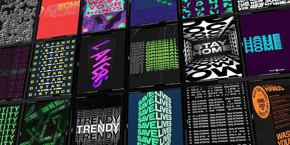
Not all logos are created equal—trendy ones often fade away faster than a flash in the pan. You want your logo to stand the test of time, not become a relic of 2021.
Focus on Timelessness
One of the biggest mistakes you can make is to chase after the latest design fads. Go for a logo that has a clean, classic feel. Think about brands like Coca-Cola or Nike. Their logos have stood firm for decades. That’s what you want. Less pink fluffy unicorns, more enduring simplicity.
Ensure Enduring Appeal
On this journey, think about what makes your brand unique. Your logo should resonate with your audience for years. If you design a logo based on today’s trends, there’s a high chance you’ll need a new one soon. And we know rebranding is more than just a headache; it can also be costly.
The truth is, trends come and go faster than you can say “new iPhone release.” So why tie your brand image to something that might look outdated in a year or two? Strong logos embody lasting values. Picture this: you walk past a coffee shop with an ultra-modern logo. It screams trendy, right? But a classic, warm design instantly gives you that comforting vibe.
A logo is your brand’s introduction. You want it to speak about longevity and reliability. Emphasise your strengths, and create a visual that’s relevant now but will scream ‘I’m here to stay’ for years to come. It’s all about the balance. You don’t need to take the world by storm today; you must be around when the storm passes. ☕💪
Negative Space
Unlike most design elements, negative space is often overlooked. But trust me, it’s your secret weapon. It can define shapes, create balance, and even add depth to your logo. Think of it as the invisible hand guiding the viewer’s attention. You’ve probably seen logos where the background itself tells a story. Now, it’s time for you to unlock that potential for your brand.
Use Effectively
Any logo that incorporates negative space effectively can spark curiosity. It adds a layer of sophistication without being pretentious. Consider FedEx’s clever use of the arrow between the letters—it creates an instant association with speed and precision. So, consider how to use negative space to elevate your design.
Create Clever Designs
Clever use of negative space can make your logo unforgettable. Think of it as a visual pun. To stand out, you need designs that leave a lasting impression. A well-thought-out negative space can turn a simple logo into a powerful storytelling tool, engaging viewers without them even realising it.
Picture this: a small coffee shop with a logo highlighting a coffee cup in the centre, while the white space around it cleverly forms a bean or even a heart. It conjures warmth and passion. Now you’re making people think, and that’s what good design is all about! Like a well-placed punchline, the surprise element of negative space can leave your audience smiling.
Who doesn’t love a good riddle? So, as you sketch out ideas, ask yourself—how can I turn this design on its head and challenge conventional wisdom? You might find the spark to take your brand to the next level. 🚀
Brand Values
After you’ve worked to craft a strong logo, it’s time to align it with your brand values. This is where the real magic happens. Your logo isn’t just a pretty face; it embodies what your business stands for.
It’s a visual shortcut to your mission, vision, and determination. So, let’s roll up our sleeves and investigate how to make your logo a genuine representation of your brand’s soul. Think of it as the beating heart of your business – you wouldn’t want a logo that skips a beat.
Reflect Them
Even if your logo looks stunning, it could send the wrong message if it doesn’t reflect your brand values. Your audience needs to see what you stand for. Integrate elements that resonate with your brand’s core principles, like colours, shapes, or even fonts that scream, “This is who we are!” Keep in mind that it’s about creating that instant connection.
Communicate Ethos
Assuming you’ve thought long and hard about your brand’s ethos, communicating it through your logo is non-negotiable. You want your audience to understand what drives you by looking at your logo. So, toss aside the thought that a logo is merely decorative! Treat it like a messenger that broadcasts your values loud and clear.
A logo that communicates your ethos encompasses the very essence of your brand. A perfect example is how Nike used a simple checkmark to signify movement and ambition. In an age where people align themselves with values, if your logo encapsulates elements like integrity, innovation, or sustainability, you’re not just selling a product but building a tribe.
Everyone loves an underdog story, but no one roots for a confused one. The clearer you are about your ethos, the more your audience will relate. So, what does your logo say about you? Is it speaking the same language as your brand values? 🧐
Research Competitors
You need to understand the playing field to elevate your logo design. Look at what your competitors are doing. What’s their vibe? What logos catch your eye? Use this intel to tweak your designs. You don’t want to blend in like a wallflower at a party. You want to grab attention and keep it.
Stand Out
With countless brands vying for attention, your logo must be a beacon in a sea of sameness. Think bold colours, clever symbols, and unique typography. You might want that sleek, minimalist look everyone’s raving about. But how often have you scrolled past something that looks like everything else? Be that intriguing stranger at the pub who instantly draws people in.
Identify Differentiators
To carve your path, dig deep into your competitors’ logos. What do they all have in common? What’s missing? Use that insight to make your mark. Your logo should scream uniqueness.
Research their logos and see how they present their brand. Look for trends—often, you’ll find that every player in your niche plays it safe with the same colour palette or design style. Now, this is your opportunity. Challenge conventional wisdom. Be bold! If everyone’s using blue, why not stand out with a vibrant orange?
Your goal is to identify differentiators that make you pop. Maybe it’s an illustration that echoes your brand story or a quirky font that captures your essence. The most successful logo designs are the ones that tell a story—your story. So, get creative, reflect on your unique values, and ensure your logo embodies them. Your logo can and should be a conversation starter.🎉
Cultural Sensitivity
To make your logo design resonate globally, you must dive deep into cultural sensitivity. Your brand isn’t just a logo; it’s a message. Understanding how symbols, colours, and designs are perceived in different cultures is vital. This isn’t just a nice-to-have; it’s a must-have to avoid cultural misunderstandings that could tank your brand overnight.
Be Aware of Context
With a little bit of homework, you can avoid the pitfalls of cultural faux pas. It’s about looking beyond your backyard. Keep an eye out for your design elements’ historical and social context. What’s benign in one culture could be offensive in another. You wouldn’t want your company to be the villain in someone else’s story accidentally, would you?
Respect Cultural Nuances
One of the most vital aspects of cultural sensitivity is understanding the intricate details that can shape perceptions. Respect the subtleties that come into play. Did you know that colour meanings vary widely? In some cultures, red symbolises luck, while in others, it signifies warning.
Your design should account for these differences to convey the right message. For example, when I launched my brand, Inkbot Design, I spent weeks practically immersed in research. I discovered that what I thought was a cool design element had utterly different meanings abroad. Talk about a “facepalm” moment!
So, dig into the cultural nuances—it could make or break your brand’s global perception.
Iconography
Your logo is more than just a pretty picture. It’s your brand’s first impression; a big part is using compelling iconography. The correct symbols can tell your audience more than a thousand words. So, let’s dive in and unlock some secrets to making your brand pop!
Use Symbols Effectively
One of the best ways to strengthen your logo is by integrating symbols that resonate with your brand’s essence. Whether it’s a lightbulb for ideas or a shield for protection, these symbols can convey messaging quickly. Just be cautious—overthinking symbols can lead to confusion. Choose wisely and make them work for you, not against you.
Convey Clear Messages
For your audience to connect with your message, you must convey it. The magic happens when your logo incorporates symbolism that aligns perfectly with your brand ethos. Think about familiar iconic shapes that evoke emotions and spark curiosity. It’s like inviting your audience into your world before they even read a word.
The most effective logos instantly convey what your brand stands for. For instance, you wouldn’t want a coffee shop using a sun as its primary symbol—it just doesn’t fit. Your logo should tell a story at a glance. Let’s say you’re in the eco-friendly sector. Using a leaf or a tree directly communicates your commitment to sustainability.
Not every logo needs intricate detail; sometimes, less is more. Just think of the famous Nike checkmark—simple yet powerful. It screams, “Just do it”, without even saying it. Focus on clarity, and let your logo be the silent ambassador of your brand. After all, a clear message isn’t just about visuals—it’s about igniting emotion, too! 🌟
Adaptability
It must also adapt for your logo to stand the test of time. Consider how brands evolve their visuals—Apple didn’t just stick with their old, bulky logo. They transformed it to stay relevant. You should, too. Your logo must be flexible enough to cater to different applications, from social media icons to large banners. A rigid design won’t cut it in today’s fast-paced world.
Be Ready for Change
For a brand to thrive, you must be prepared to ditch your vintage design for something fresh. Trends shift. Markets evolve. You could be left behind if your logo isn’t ready to pivot. Look at Blockbuster; they didn’t adapt, and now they’re just a memory. Don’t let that be your fate.
Embrace Evolutions
If you have a logo that reflects who you are today, perfect! But don’t get too attached. Evolutions are necessary for growth. Like a tree sheds leaves, your brand can shed old visuals to flourish.
Look at Pepsi; they regularly refresh their logo to keep it modern and appealing. It’s not just about aesthetics; it’s about staying ahead of the competition. Customers love a brand that shows it can change and adapt. Isn’t that what life’s about?
Growth and development. Aim for a look that evolves with you. Because staying stagnant? Well, that’s just dangerous. You want your logo to reflect your growth trajectory, not a relic of where you started. Trust me, it’ll pay off in the long run.
Professionalism
All business owners dream of a brand that stands out, right? It all starts with a professional logo that reflects your values and purpose. A shabby design can scream, “I’m not serious!” even if your products are top-notch. To build trust, your logo must look like it’s been crafted carefully—not thrown together in a rush. 🏃♂️ So, hold off on the DIY logo-maker; invest in something that represents you.
Invest in Quality Design
Whenever you approach a logo design, consider it an investment in your brand’s future. A high-quality design pays off more than a quick and cheap option. A solid logo resonates with your audience and leaves a lasting impression 🖼️. You’re not just getting a pretty picture; you’re shaping perceptions.
Seek Skilled Designers
On the flip side, opting for skilled designers can be a game-changer. You want someone who doesn’t just know how to use design software but gets branding. A top-tier designer will understand your vision and convert it into a logo that sings your brand’s song. 🎶
Seek designers with a portfolio that makes you say, “Wow, I want that! Check their track record. They should show versatility, creativity, and a knack for taking a brief and running with it.
Whether starting a local café or expanding your startup like Inkbot Design, having the right designer can elevate your logo into a powerful marketing tool. Plus, it’s a long game—cut corners today, and you’ll end up with a muddled identity tomorrow. Who wants that?
Final Words
To wrap up, your logo is more than just a pretty picture; it’s the face of your brand. ✨ By applying these 30 logo design tips, you’ll catch eyes and foster loyalty. Think about it—last week, my mate launched a new café. With a killer logo, he attracted customers like moths to a flame. 🎉
Make sure your design tells your story. Challenge the norm; don’t settle for mediocre. Your logo can hypnotise your audience and turn casual glances into engagements. So, design with purpose, and watch your brand transform overnight! 🚀
FAQ: 30 Logo Design Tips That Will Transform Your Brand Overnight
What are the top three logo design tips I should know?
All right, let’s cut to the chase. Firstly, make it simple. A logo should be so clear that a toddler could recognise it. Secondly, focus on timelessness. You don’t want your logo to look dated in a year or two. Finally, ensure it’s versatile. Your logo must shine on everything from business cards to billboards without losing charm.
Can I DIY my logo or hire a professional?
Sure, you can go DIY. But here’s the kicker: you might end up with something that looks like it was made during a drunken night in Paint. 🎨 Hiring a professional like Inkbot Design might cost more initially, but it’s an investment. A good logo can elevate your brand from ‘meh’ to ‘whoa’ in no time.
What should I avoid when designing my logo?
Oh boy, here comes the laundry list. Avoid clichés like the overly-used globe or swoosh. No one’s impressed. Steer clear of too many colours. Your logo isn’t a rainbow. Lastly, don’t be too trendy. If your logo resembles a TikTok filter, it’s a one-way ticket to mediocrity.
How do colours impact logo design?
Colours set the mood. Red screams excitement, blue brings trust, and green? That’s your eco-friendly, ‘I love the planet’ vibe. 🌍 Choose wisely based on your brand’s personality. Do not forget, it’s not just about what looks pretty. It’s about what resonates with your audience. Think of it like choosing your outfit for a first date; dress to impress!
Why is typography important in logo design?
Typography is like the voice of your brand. A fancy script might say ‘luxury’ while a bold sans-serif screams ‘modern’. Pick a font that aligns with your brand’s message. And for Pete’s sake, make sure it’s legible. If people squint at your logo, you’ve got issues.
How can I tell if my logo is effective?
Great question! If your logo resonates with your audience, that’s a win. Ideally, it should be memorable. Ask yourself: can people recall it after one glance? Please test it out on friends or family. Return to the drawing board if they can’t describe it in less than a minute.
Do you have any tips for creating a logo that stands out from the competition?
Absolutely! Start by doing your homework. Look at your competitors and avoid their pitfalls. Your logo shouldn’t just be unique; it should tell a story. What makes you different? What’s your unique selling point? Wrap that into your design. Think of it like crafting a great novel; every element contributes to the bigger picture. 📖
There you go! With these tips, you can take your logo design game to the next level. Do not forget that it’s not just about aesthetics; it’s about connecting with your audience. Your logo is the face of your brand, so make it count!
