Liquor Branding: Guide to Strategy, Bottle & Label Design
The liquor and spirits market is the world’s most saturated, cut-throat, and unforgiving retail category.
I’ve been a branding consultant for over a decade, and I’ve seen countless entrepreneurs pour their life savings into a new gin, whisky, or vodka. They obsess over the liquid, the distillation, the botanicals. Then, they treat the branding as the final 5%—a quick label design, often done by a friend, a cousin, or a cheap contest site.
Six months later, they’re sitting on 10,000 bottles of unsold stock, wondering why nobody is buying their “award-winning” spirit.
The failure isn’t in the bottle. It’s on the bottle. It’s the costly, painful result of confusing a nice label with a genuine brand identity.
Before we get into the “how-to,” let’s clear the air. Here are the things I see ambitious founders get wrong every single day.
- The “Local” Crutch. “It’s a local gin!” So what? Every town has three local gins. “Local” is a distribution fact, not a brand story. It’s not a differentiator; it’s the bare minimum table stake.
- Chasing Trends. “Minimalist apothecary bottles are in!” “Let’s do a pink gin!” “How about a rustic, hand-stamped logo?” That trend is over by the time you’ve navigated the legal and production hell to get to market. You look like a follower, not a leader.
- The “Story” Is Just “I Like Gin.” A compelling brand story isn’t about your personal journey of discovering you enjoy drinking. It has to connect to a unique place, a provable process, or a genuine philosophy.
- Ignoring the Back Bar. You designed a beautiful, intricate label that looks stunning in a close-up photo. But it’s an unreadable, invisible smudge on a dark, crowded back bar, 10 feet away. You forgot your other customer: the bartender.
- Impractical Packaging. That stunning, top-heavy custom bottle? It doesn’t fit in a standard speed rail. That beautiful wax-dipped cork? It takes a bartender 30 seconds to open mid-service. They will grow to hate your brand and will never recommend it.
If any of those sound familiar, keep reading. Your brand’s life depends on it.
- Branding is the product’s first sale — strategy before design; the label must earn the initial purchase in three seconds.
- Define a clear target audience and pick a single lane; "everyone" is not a viable audience.
- Create an authentic, ownable story tied to place, process, or philosophy — not just "we like gin."
- Design for real use: 10-foot readability, bartender workflow, scalability, and legal compliance.
- Match perceived value to price: bottle silhouette, closure, print finishes and packaging must justify the cost.
The Sobering Reality: Why Most New Liquor Brands Die
Think about the last time you stood in the spirits aisle. It’s a wall of noise.
Hundreds of bottles, all screaming for your attention. You have, at most, three seconds to make a decision. In those three seconds, you’re not judging the liquid. You can’t. You are 100% judging the brand.
Your bottle is a silent salesman. Its job is to:
- Interrupt the customer’s scan.
- Inform them of the category (Gin? Vodka? Rum?).
- Intrigue them with a promise (Premium? Craft? Fun? Traditional?).
- Persuade them that this bottle is worth £40 more than the Smirnoff next to it.
The brutal truth is that in spirits, the branding is the product. At least, it is for the first purchase. The liquid only determines the second purchase. But you will never get to the second purchase if the brand fails to make the first sale.
The market is flooded. Thousands of new SKUs are launched globally every year. You are launching a rowboat into a hurricane without a watertight, strategic, and professional brand.
Stop “Designing” and Start Strategising
Founders always come to me and say, “I need a label.” No, you don’t. You need a strategy.
A logo is not a brand. A label is not a brand. A brand is the entire ecosystem of meaning that surrounds your product. It’s the story, the position, the audience, the price point, and the visual identity, all working in perfect harmony.
Before you ever open Adobe Illustrator, you must be able to answer these four questions with absolute clarity.
1. Who the Hell Are You Talking To? (Your Audience)
If your answer is “everyone,” you’re finished. Everyone” is not a target audience.
Are you selling to:
- The Connoisseur? They care about cask strength, single-barrel, and non-chill filtering. They read tasting notes. Your brand needs to speak a language of heritage, expertise, and detail. (Think: The Macallan, Redbreast)
- The Cocktail Experimenter? They’re 25-40, host dinner parties, and want a “secret weapon” ingredient. They want a bottle that looks cool on their bar cart. Your brand needs to feel contemporary, bold, and inspiring. (Think: St-Germain, Aviation)
- The Gift-Giver? This person is buying for someone else. They are motivated by “perceived value.” Does the heavy bottle, foil-stamped box, and elegant typography look worth £70? (Think: Johnnie Walker Blue Label, Clase Azul)
- The On-Trade Buyer? This is the bar manager. They care about price, pour cost, versatility, and whether the bottle is easy to handle during a busy service.
Your brand cannot be all of these things. Pick a lane.
2. What’s Your “Why”? (Your Brand Story)
This is where you move past “local.” Your story is your single greatest asset.
A client once came to me with a “Welsh coastal gin.” I stopped him. “That’s not a story. That’s a fact.” We dug deeper. He foraged for botanicals on a specific, windswept cliffside where, according to local legend, a mythical kingdom was lost to the sea.
Now we have a story.
We didn’t just make a “coastal gin.” We built a brand around the “Lost Lands” of Welsh mythology. The bottle had a subtle texture like sea-worn glass. Celtic markings inspired the logo. The story was on the back label.
Bad Story: “We’re two friends who love whisky, so we started a distillery.” (Who cares?)
Good Story: “Our whisky is aged in ‘quarter casks’ because smugglers used them in the 19th century to transport whisky by packhorse. We’re reviving a lost tradition.” (That’s interesting.)
Your story must be authentic, memorable, and ownable.
3. The Competitor Scan: Finding Your Gap
You must know the shelf you’re about to fight for. Go to a dozen liquor stores. Take photos.
- What colours dominate the gin shelf? (Answer: usually blue and green).
- What bottle shapes dominate vodka? (Tall, slender).
- What typography dominates rum? (Nautical, rustic, pirate-esque).
Your job is not to fit in. Your job is to stand out. If the entire gin shelf is blue, you have two choices: be the most blue, most premium blue bottle on the shelf, or be the complete opposite. Be bright orange. Be stark white. Be matte black.
When Hendrick’s launched, the gin world was about “London Dry” and classic juniper. They came out in an opaque black Victorian apothecary bottle and talked about cucumbers. It was so weird that it created a new category. That is a strategy.
4. Defining Your Position & Promise
This is the intersection of your price and your “why.” What are you promising the customer?
- Premium Luxury: (e.g., Dalmore) “This is an expensive, rare, and sophisticated statement.” The branding must be flawless—heavy glass, perfect print, heritage cues.
- Craft & Process: (e.g., Bruichladdich) “We are obsessed with the details.” The branding can be technical, almost industrial. It’s about transparency.
- Accessible Quality: (e.g., Tito’s Handmade Vodka) “This is a great product without the nonsense.” The branding is straightforward, honest, and “undesigned.”
- The Disruptor: (e.g., Dead Man’s Fingers) “We are breaking the rules of a boring category.” The branding is loud, illustrative, and attitudinal.
You cannot be a “premium luxury” brand with an “accessible quality” label. The cognitive dissonance will kill the sale.
The Anatomy of a Liquor Brand: More Than a Label
Once you have your strategy, now you can start designing the assets. Every piece is a “design territory” that must communicate your brand story.
1. The Bottle (Vessel)
This is your brand’s silhouette. It’s the first thing people see from a distance.
- Stock Bottle: Cost-effective, fast, and available from suppliers. Your challenge is making an ordinary bottle look unique through labelling and finishing.
- Custom Mould: Extremely expensive (£50k-£250k+) and time-consuming. This is a huge, high-risk, high-reward play. Get it right and have an icon (e.g., the Clase Azul tequila decanter). Get it wrong, and you’re bankrupt.
2. The Closure (The “Opening Ritual”)
The closure subconsciously communicates quality.
- Natural Cork: Premium, classic, expected for high-end whisky, wine, and cognac. Creates a satisfying “pop.”
- Synthetic Cork: A good, reliable alternative.
- Screw Cap: Standard for vodka and many gins. It’s about function and speed. Don’t put a screw cap on a £150 whisky.
- Wax Dip / Custom Stopper: A “craft” signal. It can be beautiful, but expensive and difficult to scale. (See Pet Peeve #5).
3. The Label & Typography
This is your billboard. It’s not just “the label”; it’s a system of labels.
- Paper Stock: Is it thick, textured, and cotton-based (heritage, craft)? Or is it a “no-label-look” clear film (modern, clean)?
- Print Finish: This is where you signal the price. Embossing (raised logo) and debossing (indented) add tactile quality. Hot foil (gold, silver, copper) screams premium.
- Typography: Your font choice is 90% of your brand’s voice. Is it a classic Serif (traditional, heritage)? A clean Sans-Serif (modern, approachable)? A custom script (personal, bespoke)?
4. The Secondary Packaging (The Box)
If your spirit is over £40, it will likely be bought as a gift. The “unboxing” is part of the experience. A flimsy cardboard box devalues the bottle inside. A rigid, magnetic-closure box with a satin-lined interior reinforces the premium price.
This table breaks down how every component works to build your brand.
The Anatomy of a Spirit Bottle: Key Design Territories
| Component | Strategic Purpose | Key Decision / Question |
| The Bottle (Vessel) | Sets the primary silhouette. Conveys premium/value. | Custom Mould (Iconic, high-cost) vs. Stock (Accessible, low-cost)? |
| The Closure | The “opening ritual.” Communicates quality. | Natural Cork (Premium), Synthetic Cork (Reliable), Screw Cap (Functional), or Wax Dip (Craft)? |
| The Front Label | The “Billboard.” Holds the brand name & core info. | What is the one thing they must see from 10 feet away? (The name? The logo?) |
| The Back Label | The “Sales Pitch.” Holds the story & legal info. | Is your story compelling? Is the text readable? Is it legally compliant? |
| The Neck Label / Tag | A secondary “shout” or legal seal. | Can this add a “craft” touch (e.g., batch number, signature) or hold a tax strip? |
| The Print Finish | Subconscious signal of price and quality. | What finishes match the price? (e.g., Foil, Embossing, Varnishes, Die-Cuts). |
| The Box / Tube | The gift/display experience. Protects the bottle. | Is this a gift-first product? Does the unboxing experience feel special? |
Case Studies in Liquid Success (And Failure)
The best way to learn is to look at the winners.
The Disruptor: Aviation Gin
- Before Ryan Reynolds: It was a good, but standard, craft gin.
- The Strategy: Rebrand as a new, smoother “American Gin,” distinct from the “London Dry” juniper-bombs. The brand story was about versatility and lifestyle.
- The Branding: Art Deco, almost industrial. It feels like it’s from the 1920s, but also perfectly modern. The black-and-silver colour palette is clean and confident. It looks like the bottle a cool, witty, successful person (like Ryan Reynolds) would drink. They sold a lifestyle, and the £610m acquisition proved it worked.
The Power of Simplicity: Tito’s Handmade Vodka
- The Category: Dominated by Russian “iceberg” branding (Grey Goose, Belvedere) and flashy, frosted bottles.
- The Strategy: An anti-brand. The “Handmade” story was the core. It’s about a guy in Texas making good vodka, period.
- The Branding: It’s almost “undesigned.” A beige paper label. A simple, functional font. It looks like something you’d get at a farmer’s market. This intentional “lack of design” screams, “I’m just good vodka, no nonsense.” It built a multi-billion-dollar brand by feeling honest and approachable.

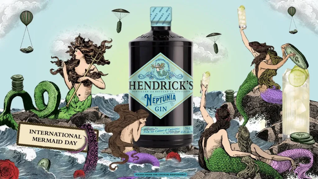
The Icon: Hendrick’s Gin
- The Category: Stale, boring, dominated by Gordon’s and Beefeater.
- The Strategy: “This is not your grandfather’s gin.” Create a surreal, Victorian world.
- The Branding: An opaque, black, apothecary-style bottle. A strange, engraved-style label. And the story? Cucumber. It was weird, confusing, and utterly brilliant. It gave bartenders something to talk about. It created a cult. The brand is not just the bottle; it’s the entire eccentric, cucumber-obsessed universe they built.
The Boring-But-Critical List: Legal, Logistics, & Launch
You can have the best brand in the world. If you ignore this section, you will fail.
1. The Legal Minefield (TTB, FSA, etc.)
Every country has strict, non-negotiable rules for alcohol labelling.
- Alcohol By Volume (ABV) must be in a specific font size and location.
- The standard volume (e.g., 70cl, 750ml) must be clear.
- You cannot make false claims (e.g., “healthiest vodka”).
- The “class” of spirit must be correct. Is it “Gin”? Or a “Gin Liqueur” (if it has too much sugar)? Is it “Spirit Whisky” or “Whisky”?
Get your labels professionally reviewed by a legal specialist before you print 50,000 of them. Submitting to the TTB (US) or getting FSA guidance (UK) is critical.
2. Scalability: That Hand-Tied Twine Was a Bad Idea
I see this constantly. A founder designs a beautiful package with a hand-numbered label, a hand-tied rustic twine, and a hand-dipped wax seal.
It’s lovely for your first run of 100 bottles.
What happens when a national retailer puts in an order for 20,000 units, due in three weeks? You are now in “hand-tied-twine-hell.” Your “craft” feature has become an anchor that sinks your business.
Your branding must be scalable. Ask yourself: “Can a machine do this?” If not, you have a problem.
3. The Sell-In: Your Brand vs. The Distributor
You don’t just sell to customers. You first have to sell to distributors and bar managers. These are tough, cynical, seen-it-all buyers.
Your brand needs a “sell-in sheet.” This is a one-page summary that has:
- A clear, beautiful shot of your bottle.
- Your brand story (in 25 words or fewer).
- Your audience and price point.
- The “Why”: Why will this sell? What gap does it fill?
- Tasting notes and signature cocktails.
If you can’t explain why your brand will move off their shelf, they will not stock it.
My Client Horror File: Common Branding Pitfalls to Avoid
This summarises the most common, expensive mistakes I’ve seen. We use this as a checklist for our own clients.
Common Liquor Branding Pitfalls & How to Fix Them
| Pitfall | Why It Fails | The Strategic Fix |
| The “Me Too” Design | You’re launching a rum, so use a pirate font and a parchment-paper label. You look like a cheap copy of the category leader. | Find a unique visual angle. If they zig (nautical), you zag (modern, minimalist, urban). Look at what everybody else is doing, and do the opposite. |
| Ignoring the On-Trade | Your bottle has a tiny, delicate font. It looks great on Instagram but is invisible on a dark back bar. Bartenders can’t find it. | The 10-Foot Test: Put your bottle on a shelf. Walk 10 feet away. What can you read? Your brand name or logo must be instantly identifiable. |
| The Impractical Package | A beautiful, tall bottle that doesn’t fit a standard shelf. A wide, fat bottle that bartenders can’t grip with one hand. | The Bartender Test: Take your 3D-printed prototype to 10 bartenders. Ask them: “Would you hate this?” Be prepared for honest, brutal feedback. |
| Story Doesn’t Match Price | You’re charging £60 for a whisky, but it’s in a stock bottle with a simple paper label and a screw cap. | The “perceived value” is zero. The branding must justify the price. Use a heavier bottle, a natural cork, and high-end print finishes (foil, embossing). |
| Forgetting Your Digital Shelf | Your brand looks excellent in person, but the text is unreadable on a tiny website thumbnail. | Check your design as a 100×100 pixel icon. Is it still recognisable? This is your “digital shelf” presence. |
How We Tackle a Liquor Brand (Our Process)
We don’t start with fonts when a client comes to Inkbot Design for a liquor brand. We force them to answer the hard questions first.
Our process is built on strategy, not just aesthetics.
- Discovery & Strategy: We are brand consultants first. We dig into your audience, your market, your “why,” and your price point. We run competitor audits. We don’t write a single code line or draw a logo until this blueprint is approved.
- Concept & Territory: We build 2-3 distinct visual “worlds” for your brand based on the strategy. This is more than a logo; it’s a moodboard, a tone of voice, a colour palette, and a “vibe.” (e.g., “The Modern Alchemist” vs. “The Rugged Traditionalist”).
- Design & Refine: We go deep once you’ve chosen a territory. This is where the logo, label system, bottle sourcing, typography, and secondary packaging are designed, refined, and perfected. We get legal feedback and ensure scalability.
- Guidelines & Rollout: We deliver the final files and, more importantly, provide a Brand Book. This is your bible. It tells you exactly how to use (and how not to use) your logo, colours, and fonts, ensuring your brand looks professional and consistent everywhere.
Our brand identity services are built on this strategic foundation. We’re not just creating a label; we’re building a business.
Your Brand is Your First, and Last, Impression
Your liquid might be the best in the world. But nobody will ever know if your brand doesn’t convince them to pick up the bottle.
In the spirits business, you don’t get a second chance to make a first impression. That impression is your brand. It’s your promise of quality, your story, and your entire sales pitch, all condensed into a few square inches of glass and paper.
Don’t treat it like an afterthought. Don’t cheap out on it. And don’t give the job to your cousin.
The spirits shelf is a warzone; you might be unarmed. If you’re serious about not just launching, but lasting, then it’s time to build a brand worth reaching for.
Let’s Build a Brand That Sells
If you’re ready to move from “nice idea” to “serious business,” we should talk. We’ve built brands that get noticed, stocked, and sold.
Check out our brand identity services to see our whole process, or if you’re ready to get started, request a quote today.
FAQs About Liquor Branding
What is liquor branding?
Liquor branding is the complete strategic and visual process of creating a unique identity for a spirit (like gin, whisky, vodka, or rum). It goes far beyond a label, including the brand story, target audience, price position, bottle shape, logo, typography, and marketing messages.
Why is branding so crucial for spirits?
Because the market is incredibly saturated, customers cannot taste the product on a crowded shelf. Their only purchasing tool is the brand. To win the sale, the branding must communicate quality, flavour, and story in seconds.
How much does professional liquor branding cost?
It varies wildly, but you are not just “buying a logo.” A comprehensive brand identity from a professional agency, including strategy, logo, label design, and packaging, can range from £10,000 to £50,000+ for a full-scale launch.
What’s the difference between a stock bottle and a custom bottle?
A stock bottle is a standard, pre-designed bottle you can buy “off the shelf” from a glass supplier. It’s cost-effective and fast. A custom bottle is a unique shape moulded exclusively for your brand. It’s costly and time-consuming but creates a powerful, ownable brand icon.
What is a “brand story” and why do I need one?
A brand story is the “why” behind your product. It’s not just “we like gin.” It’s a compelling narrative about your unique process (e.g., “foraged botanicals”), your heritage (e.g., “a lost family recipe”), or your philosophy (e.g., “zero-waste distilling”). It gives customers a reason to connect with you emotionally.
What are the most critical legal details for a liquor label?
This depends on your country, but typically you must clearly state the Alcohol By Volume (ABV), the net volume (e.g., 70cl), the class/type of spirit, the country of origin, and a government warning (if required). All information must be accurate and meet minimum font size requirements.
What is TTB approval?
In the United States, the Alcohol and Tobacco Tax and Trade Bureau (TTB) must approve every alcohol label before it can be used in commerce. This “Certificate of Label Approval” (COLA) ensures your label is legally compliant.
How do I choose a name for my liquor brand?
Choose a name that is memorable, easy to pronounce, and legally available. You must conduct a trademark search to ensure the name hasn’t already been taken. A good name often hints at your brand story.
What is “on-trade” vs. “off-trade”?
On-trade refers to sales where the product is consumed on-premises (e.g., bars, restaurants). Off-trade refers to sales where it’s consumed off-premises (e.g., liquor stores, supermarkets). You must design your brand to work in both environments.
What’s a common design mistake for liquor brands?
Making the design too complicated. An intricate label with 10 fonts and gold foil might look “premium” up close, but it’s an unreadable mess from 10 feet away on a dark back bar. Clarity and a strong silhouette often beat complexity.
How important is the bottle’s closure (cork vs. screw cap)?
Extremely important. It’s a key signal of quality. A natural cork signals “premium” and is expected on high-end whisky or cognac. A screw cap signals “function” and “value,” and is perfect for a vodka or a high-volume gin. Using the wrong one creates brand confusion.
Should I include cocktail recipes on my bottle?
On the main label? No, it’s too cluttered. But it can be an excellent addition to a neck tag, the back label, or (even better) your website, accessed via a QR code. It helps the customer understand how to use your product.


